WinEdu, like its predecessor CC Book, is a company that excels in creating advanced learning guild books for students. With development over the years, WinEdu has oriented itself to become a leading education corporation in Vietnam, particularly in the fields of devices, online education, and offline education.
Challenges
Coming to Tree, WinEdu wants to build a strategic, methodical, and sustainable identification system that lays solid foundations for future brand image development. WinEdu’s founding team desires a youthful, dynamic, and flexible brand image with high synchronicity and academia.
Solutions
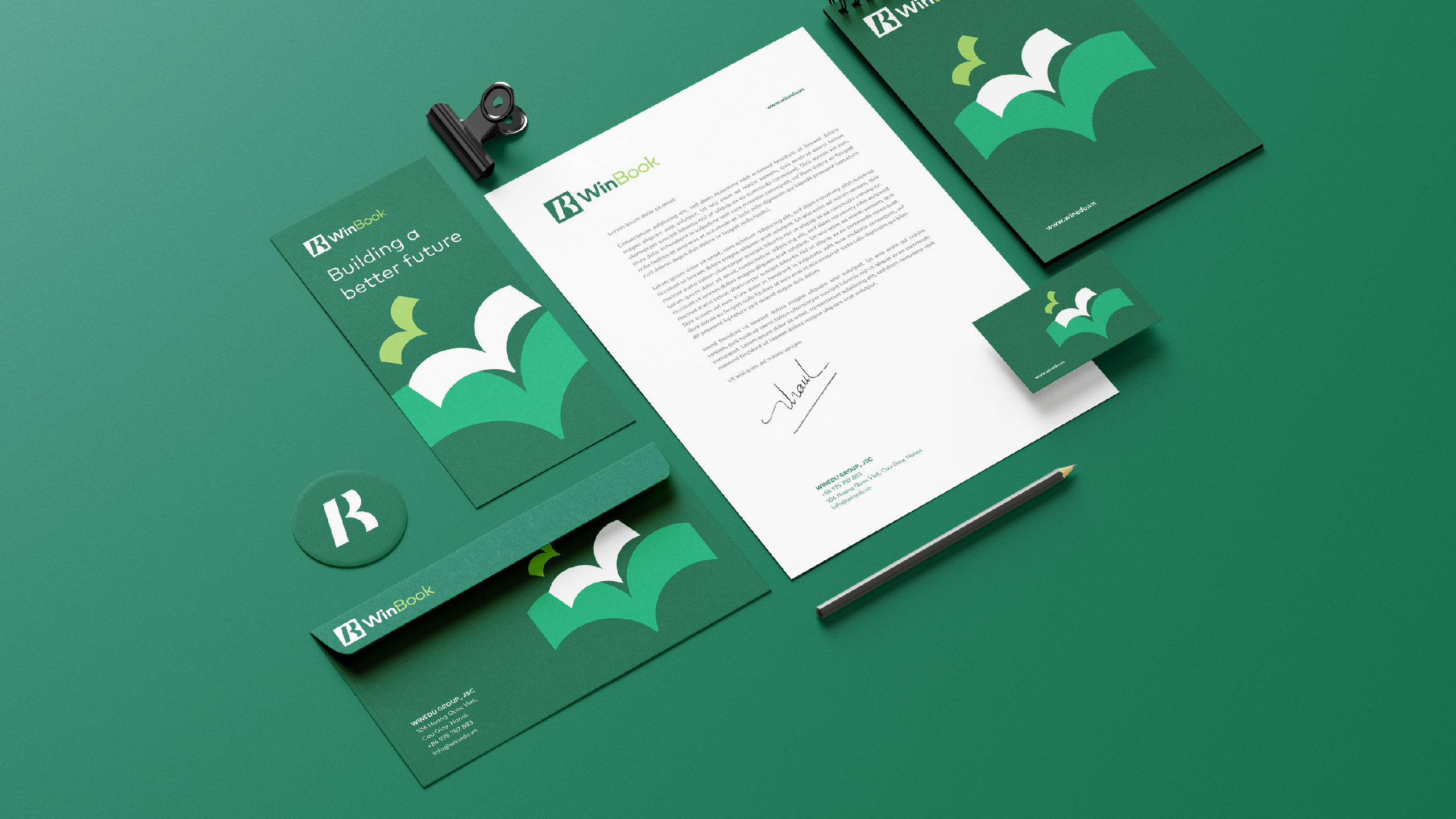
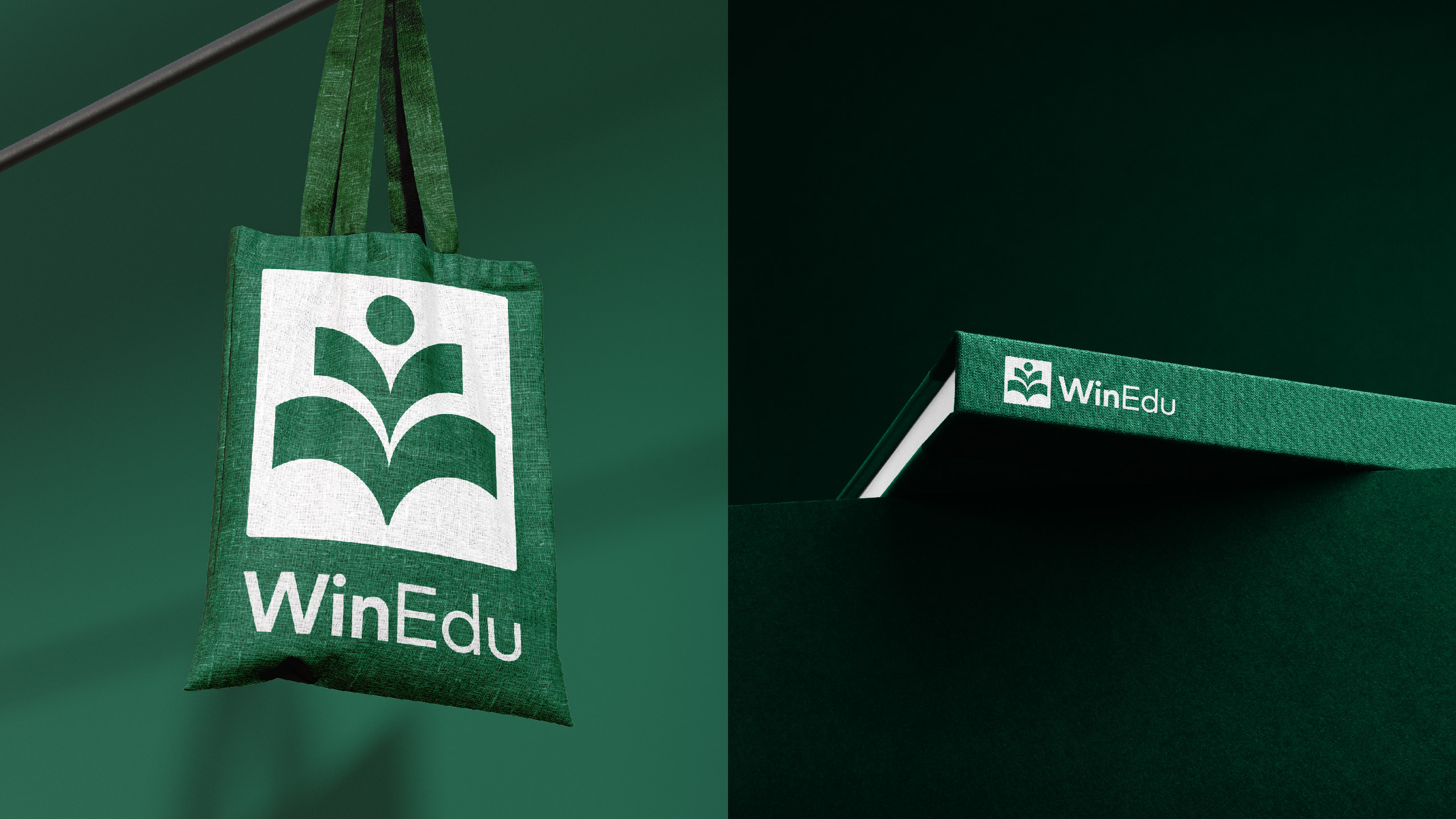
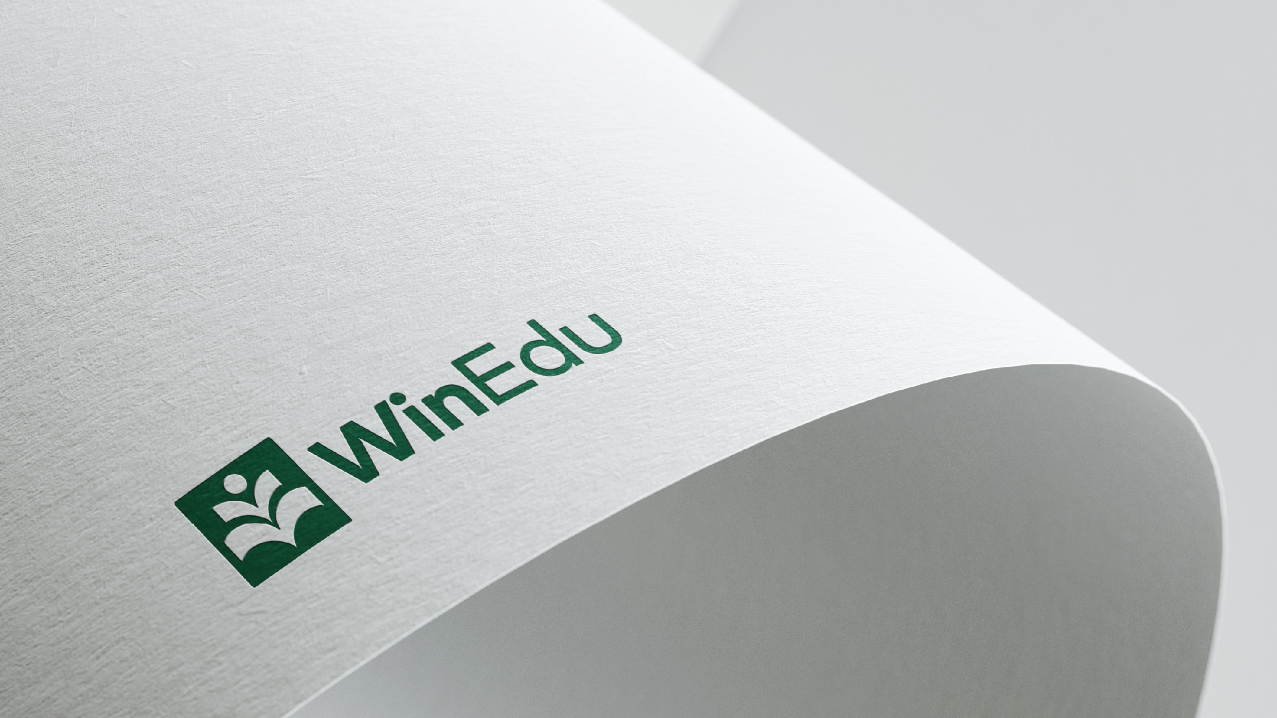
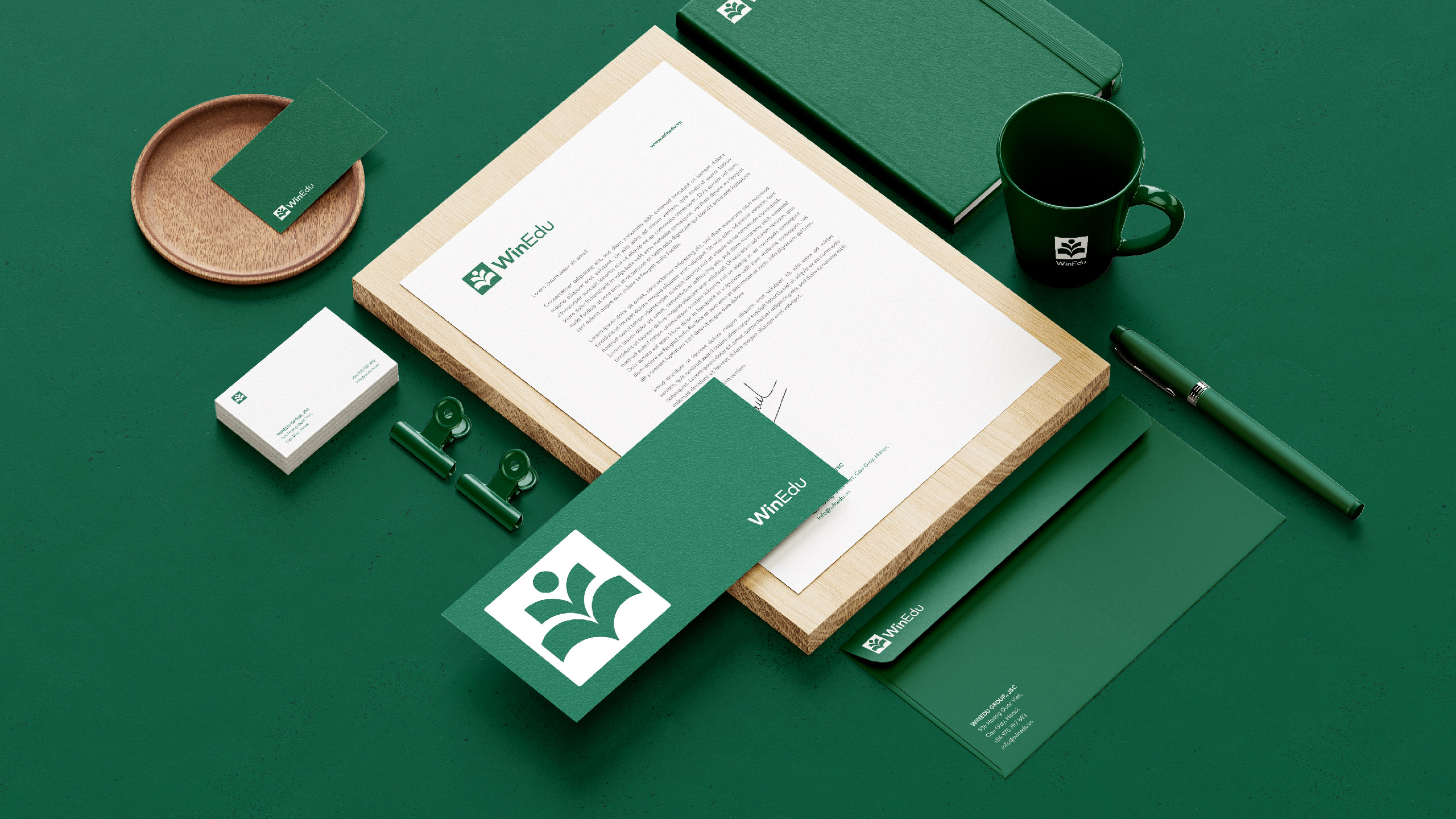
After researching, Tree Creative chose the image of a book as the main subject for the design with the color green as the core element for building a new image for the brand.
Books represent education— voices of knowledge— and the symbolic image of a “bird’s wing,” symbolizing students as birds flying far and high. This is also the visual development element of the brand and serves as a guideline for the overall brand strategy and brand image.
The color green represents trust and vitality while still ensuring the academic character that the brand is aiming for.
With long-term development in mind, Tree has built a strategy based on the Branded House structure, building sub-brands bearing the characteristics of the parent brand. This is a solid structure that will feature the identity of WinEdu.
Results
A long-term brand development strategy and a complete identity system have helped WinEdu establish a uniform brand identity and a more precise view of the brand’s development direction.




CREDIT
- Agency/Creative: Tree Creative
- Article Title: WinEdu, WinBook Branding Design By Tree Creative
- Organisation/Entity: Agency
- Project Type: Identity
- Project Status: Published
- Agency/Creative Country: Vietnam
- Agency/Creative City: Tree Creative
- Market Region: Asia
- Project Deliverables: 2D Design, Logo Design
- Industry: Education
- Keywords: Education, Branding, Logo
-
Credits:
Agency: Tree Creative


