


Laithwaites, the UK’s original home-delivery wine retailer, has a new brand identity designed by Manchester creative agency Love.
Tapping into the spirit of fun and adventure at the heart of the business, the rebrand brings trailblazing tales of wine discovery to the fore to help Laithwaites build rapport and reputation with a new generation of wine explorers.
With almost half a million subscribers built up over 50 years in the wine business, Laithwaites is recognised as one of the pioneers in direct-to-consumer wine retail. But with an increasingly crowded market and constant innovation in D2C subscriptions across sectors, they realised the importance of staying relevant and the opportunities a refreshed brand identity would bring.
CEO of Laithwaites, David Gates, says: “We’ve been dedicated to breaking down barriers between winemakers and consumers since 1969 – and we’ve achieved great success in the process. This rebrand is about doubling down on our reason for being and reiterating what we’ve been saying since the start. But in a bolder, more confident way. Like great wines, wine lovers come from everywhere and every age group. We now have a brand that speaks to them all.”
Rooted in a spirit of adventure
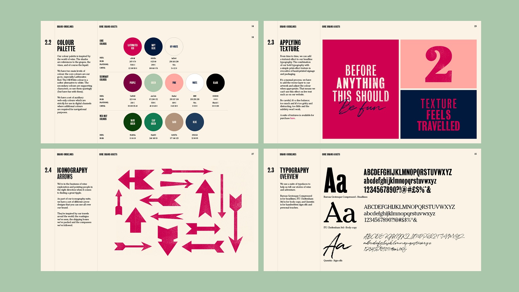
Channelling the company’s founding ethos and building on founder Tony Laithwaite’s legendary musings on the world of winemaking, the new identity is alive with colour, texture and personality. Visually and verbally, it speaks to Laithwaites’ love of wine and the world around it enabling the brand to engage more readily with a much wider demographic.
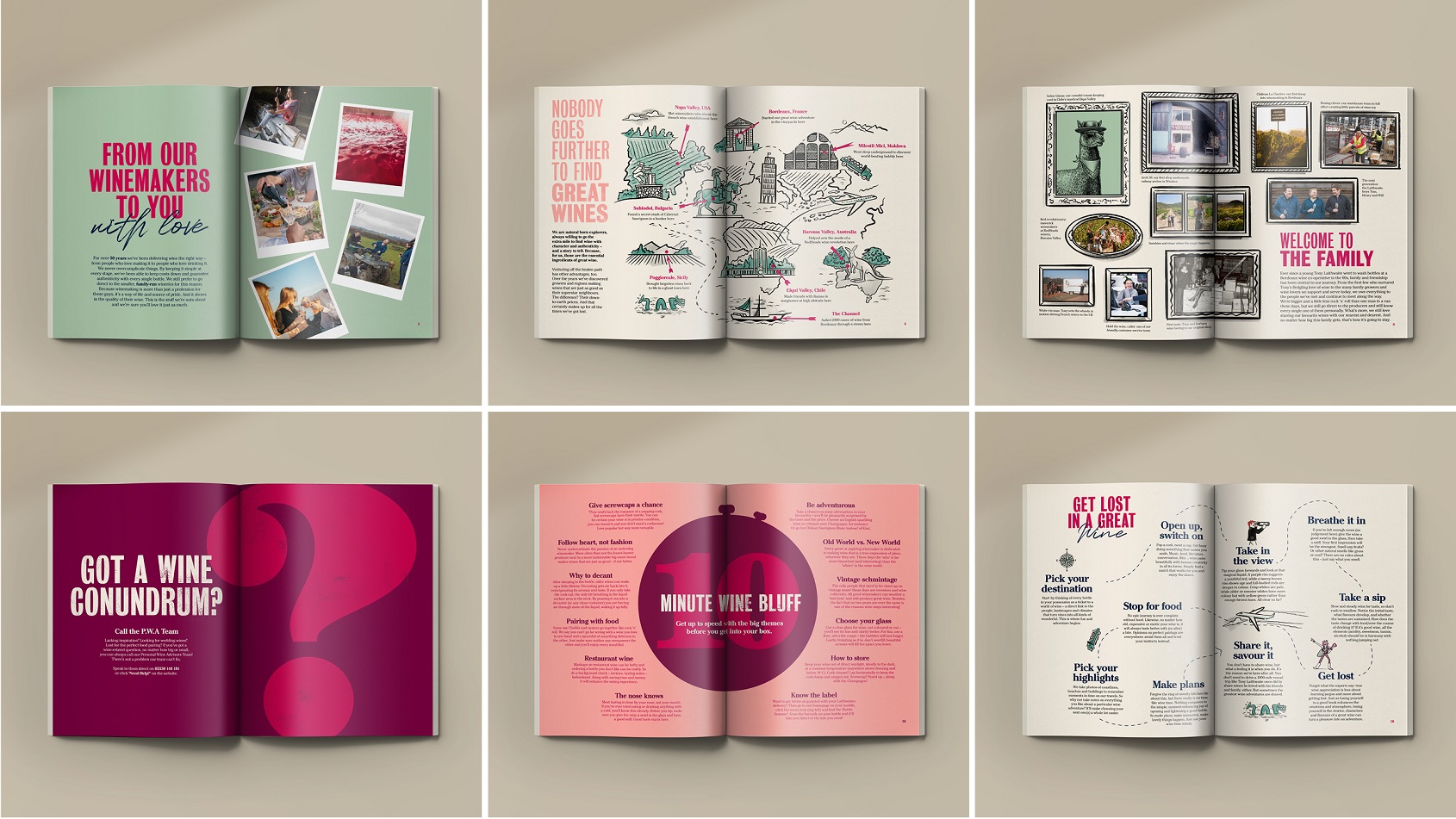
Inspired by their trailblazing trips to undiscovered wine regions and continued discovery of exceptional, off-the-beaten track winemakers, the new Laithwaites brand promise, ‘Your compass to a world of wine adventure’ sets an exciting and involving course. It invites all wine lovers on a journey – regardless of experience or knowledge.
Down-to-earth design and comms
Laithwaites has built its success on the relationships it has forged with winemakers and customers over the years, so the principles underpinning the new brand stem from a simple, down-to-earth truth: they are wine nuts, not wine snobs. They have and always will be champions of a more inclusive, less elitist world of wine.
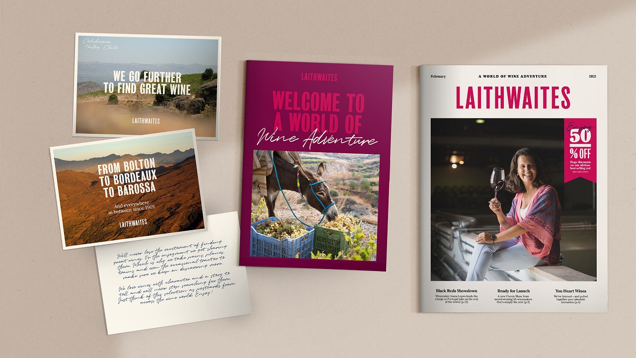
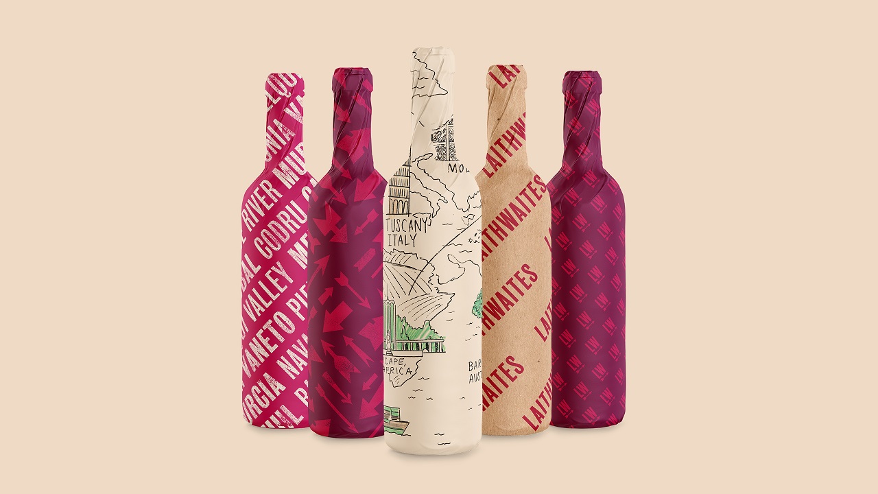
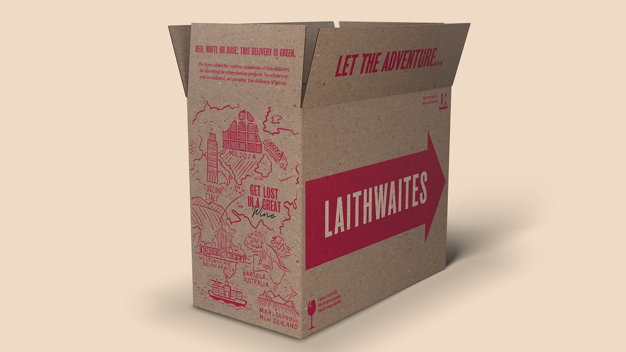
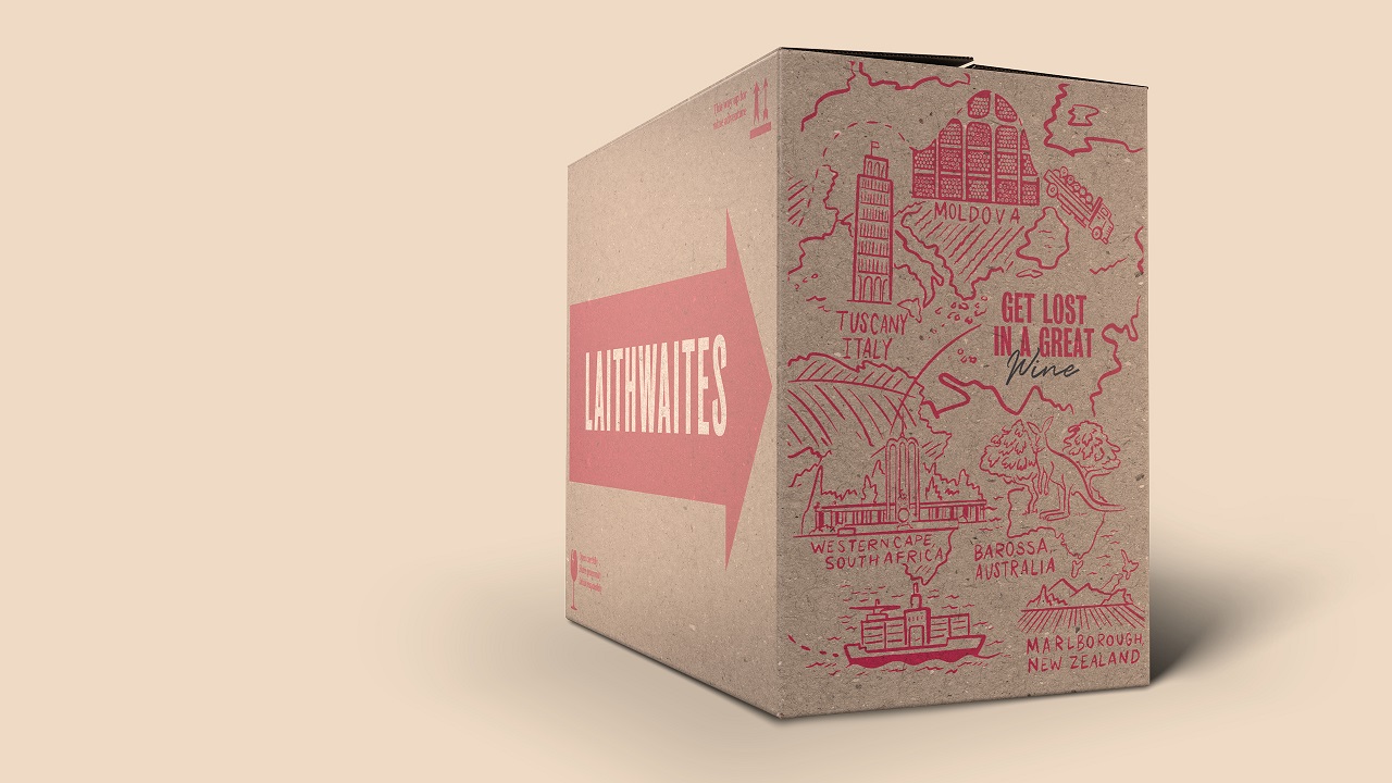
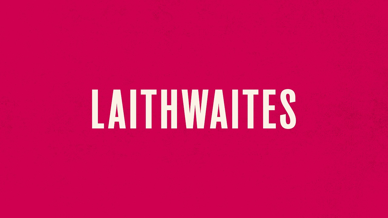
As such the visual identity leads with human and hand-crafted touches. Block printed type, iconography, handwriting and witty and whimsical illustrations recall well-travelled wine cases and the early sketches of a young Tony Laithwaite. Recreated in bold caps, with new brand colours and no apostrophe, the logomark is a much clearer signpost for the inclusive and modern business they are today.
Interviews with Tony, his wife (and original business partner) Barbara, their three sons and the wider Laithwaites leadership, heavily influence the new tone of voice. Complementing their existing wine writing in print and online, it gives the brand a single, larger-than-life voice to help them broadcast a unique backstory, perspective and personality across all customer comms.
David Palmer, Executive Creative Director at LOVE, says: “No other wine business has a story like Laithwaites. From one man in a van to a household name – it’s the stuff of legend. This gave us solid ground on which to build the new brand. Staying true to the roots and personality of the business, we created something that – while very different from where they were – is all about them. Full of colour, warmth, humour, mischief and love, this rebrand is what decades of wine adventure looks and feels like. Faithful to a pioneering business and irresistible to anyone who loves discovering new wines.”
The new identity rolls out across Laithwaites print and digital platforms today.
CREDIT
- Agency/Creative: LOVE
- Article Title: Wine Specialist Laithwaites Rediscovers Its Adventurous Roots with Love
- Organisation/Entity: Agency
- Project Type: Identity
- Project Status: Published
- Agency/Creative Country: United Kingdom
- Agency/Creative City: Manchester
- Market Region: Europe
- Project Deliverables: Brand Architecture, Brand Design, Brand Guidelines, Brand Rejuvenation, Brand World, Packaging Design
- Industry: Food/Beverage
- Keywords: Wine
-
Credits:
Creative Director: David Palmer


