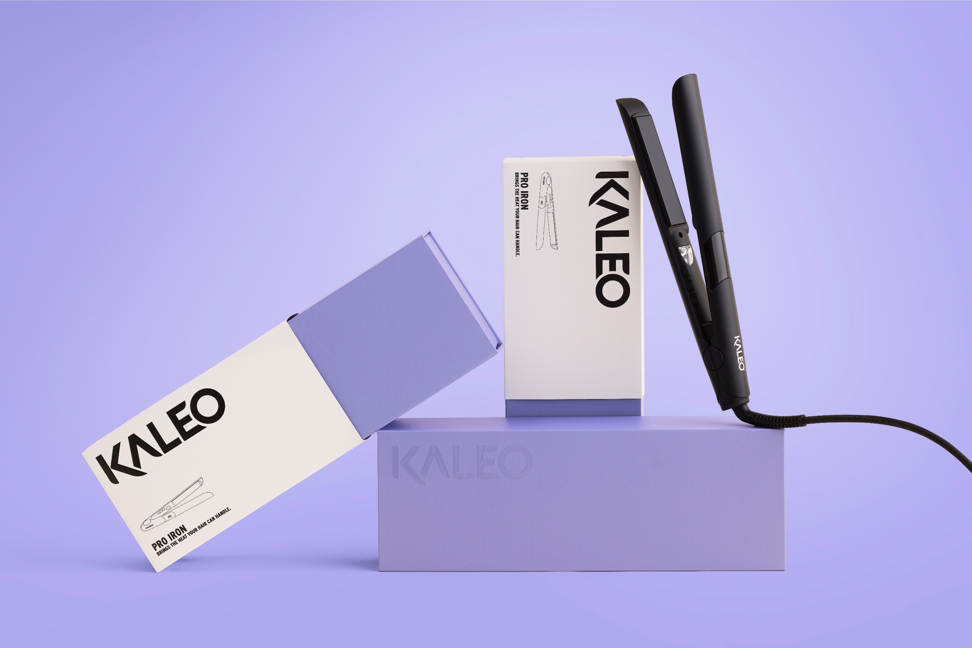
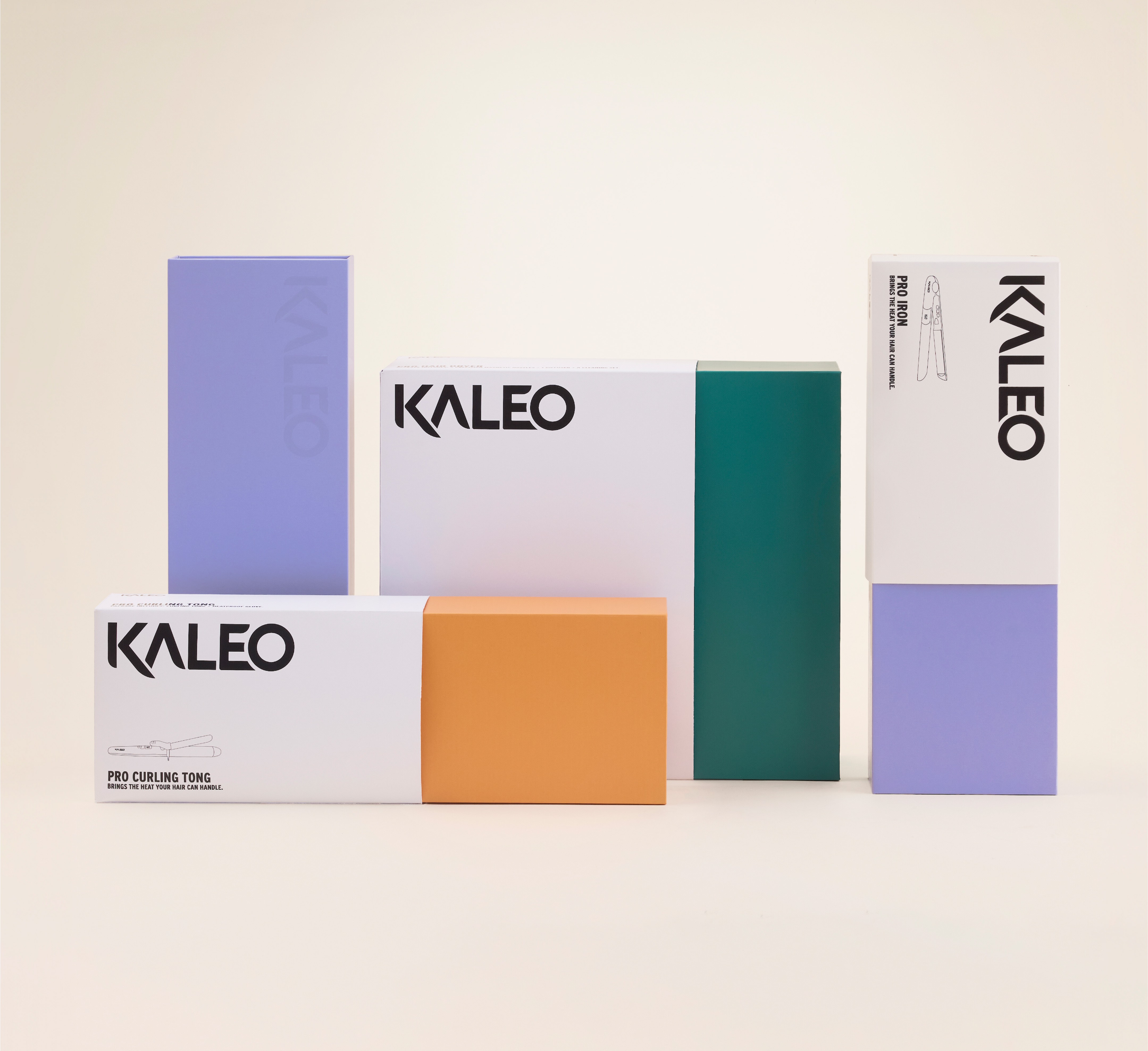
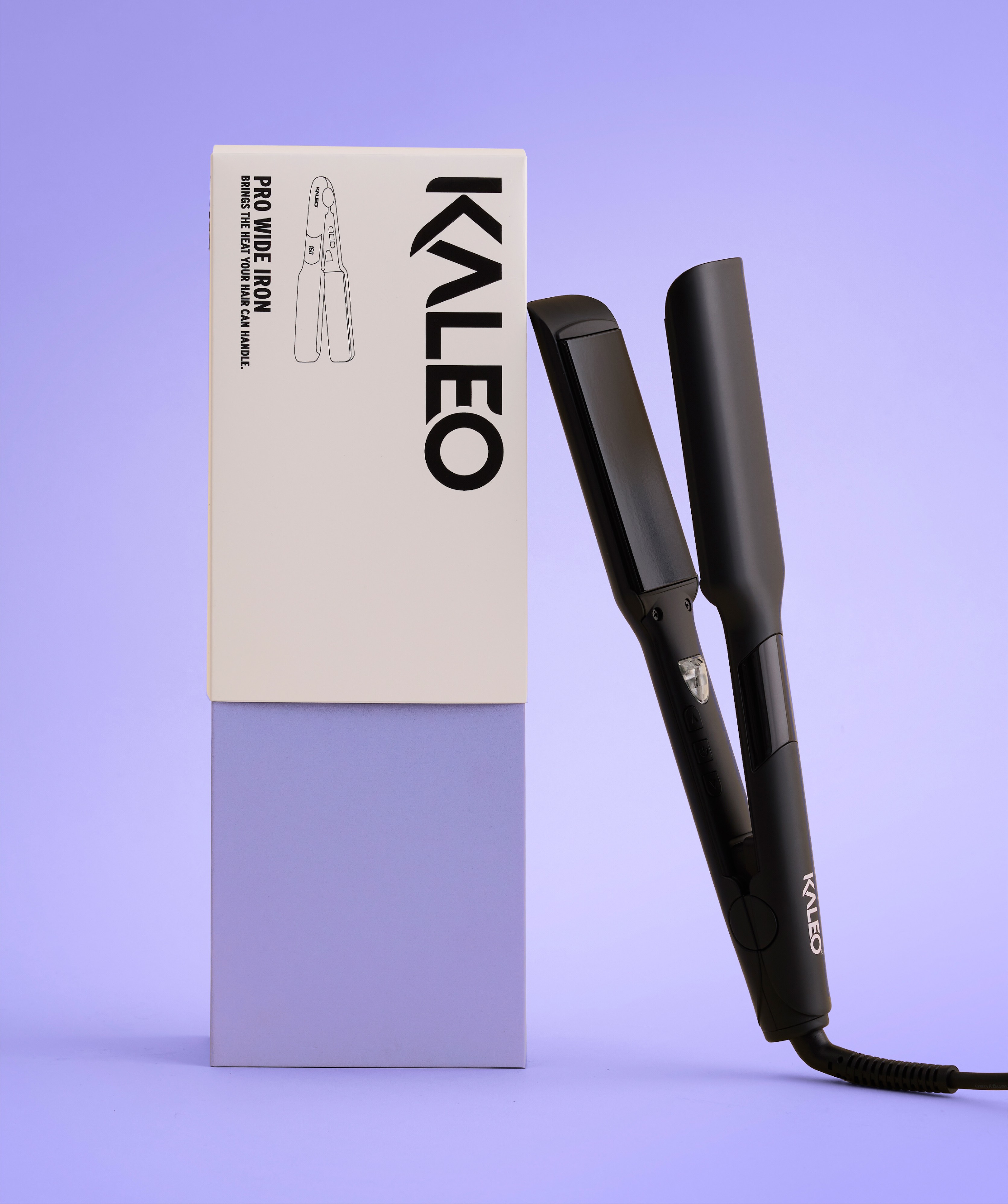
Kaleo, a premium electronic hair tools brand, came to us with a clear brief: let’s turn up the heat.
When we first met them, their packaging was trying to communicate sustainability. Brown cardboard, geometric shapes, and earthy tones were all begging consumers to consider a more ethical electrical.
Detonating the truth bomb.
In our strategic work, we dropped a truth bomb: electronics will never read as sustainable. And, while you’re reeling from that one: your customers don’t care about sustainability anyway. At least not when it comes to their hair tools.
Our industry research showed that hair tool consumers care about efficacy above all else. And at this price point, they expect quality, too. Then we looked at the other tool boxes on the shelf and realised they were 50 shades of Dyson grey and Millennial beige. We used this intel to push Kaleo’s packaging in a new direction: premium and tech-forward, but with a bright and creative twist. We assured the business that brown cardboard might be out, but the new packaging would still be recyclable.
Creating space for impact.
The first step in refining the boxes was simplifying the copy on pack. The newly punchy, sleek messaging fell out of our updated voice design for the brand. We replaced generic beauty industry platitudes with key messages like ‘Bringing the heat your hair can handle.’, a quippy take on their temperature-adjusting, follicle-saving tech. With the copy streamlined, the eye could finally breathe.
Bringing the heat to design.
In with the new, out with the grey. We introduced a bold colour system to segment Kaleo’s range. This helps the boxes stand out and spark conversation from salon shelves, as well as giving the brand flexibility to expand its range by exploring other colours with the same tonal value. A UV spot logo was a no-brainer for adding a touch of futurism.
Finally, a crisp, white slipcase creates attention-grabbing contrast while its satin finish adds tactility to the luxurious unboxing experience. These slips feature an updated take on the category’s sombre 3D renders, replacing them with bespoke line illustrations of the tools for easy recognition on shelf.
Testing the temperature.
These boxes do everything but grow wings and fly off the shelf. The new packaging uses visual and copy cues to help salon stylists sell the tools to consumers and appeal to stylists themselves with their blend of quality tech and creativity. Once we saw the work on the shelf, we conducted a quick temperature check. And our suspicions were confirmed: the design sizzles.


CREDIT
- Agency/Creative: Willow & Blake
- Article Title: Willow & Blake Brings the Heat with Premium Packaging for Kaleo Hair Tools
- Organisation/Entity: Agency
- Project Type: Packaging
- Project Status: Published
- Agency/Creative Country: Australia
- Agency/Creative City: Melbourne
- Market Region: Oceania
- Project Deliverables: Art Direction, Brand Architecture, Brand Design, Brand Guidelines, Brand Identity, Brand Strategy, Brand Tone of Voice, Copywriting, Creative Direction, Packaging Design, Packaging Guidelines
- Format: Box, Sleeve
- Industry: Beauty/Cosmetics
- Keywords: Beauty, hair technology
-
Credits:
Designer: Frances Peck
Designer: Noah Zawertailo
Design Director: Shaun Ponton


