


Brand Identity
Rudy’s is a craft beer brand shaped by the extreme energy of Southern California’s outdoor sports scene and the rhythm, resilience, and tenacity of UK Rude Boy culture. It is grounded in the idea that beer, sport, and music have always brought people together, especially those who are driven by creativity, grit, and a “make something from nothing” mentality.
The brand speaks to people who push themselves toward meaningful goals and bring intensity and humor into everything they do. Rudy’s is confident, bold, and deliberately playful.
Creative Direction
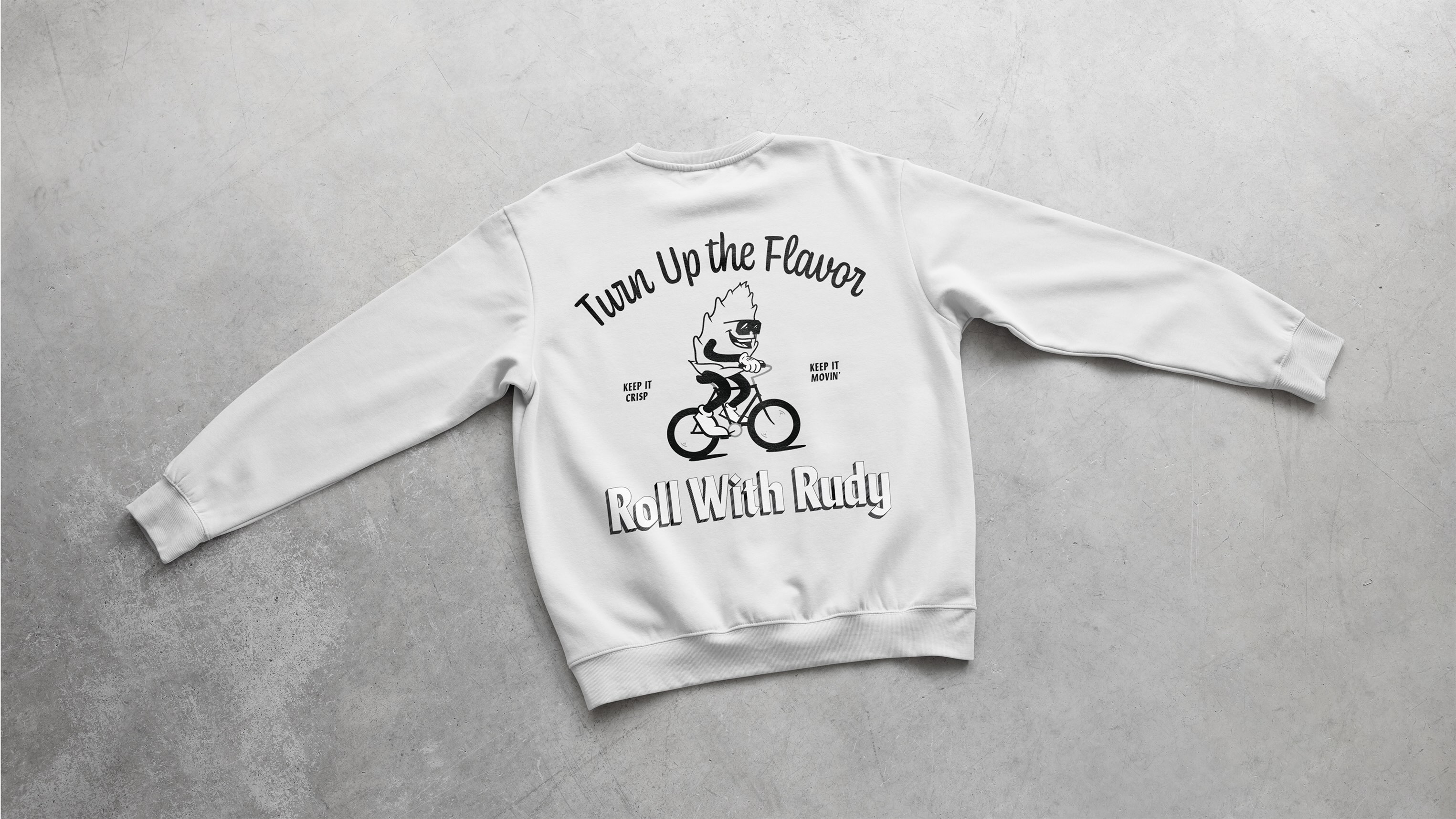
Rudy’s visual language pays homage to traditional beer styling with a modern twist. It finds a balance between grit and approachability. Bold typography, high contrast colors, and hand drawn illustrations evoke a retro sensibility without slipping into nostalgia.
This visual approach creates a world that feels alive, something you want to grab and crack open while bike packing, skating with friends, or vibing to tunes. Every touchpoint reflects the energy and social vibrancy at the heart of Rudy’s.
Design Elements
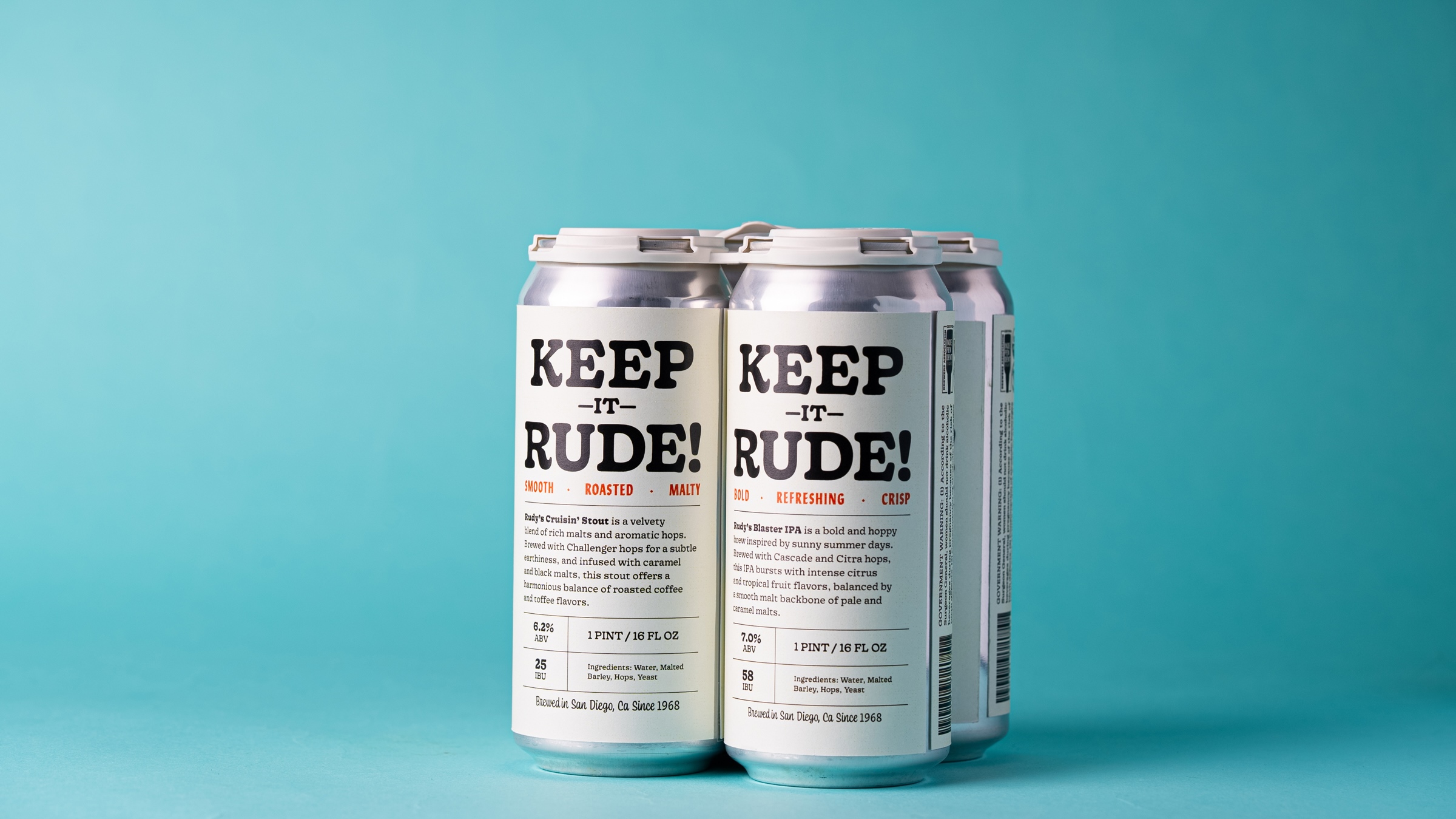
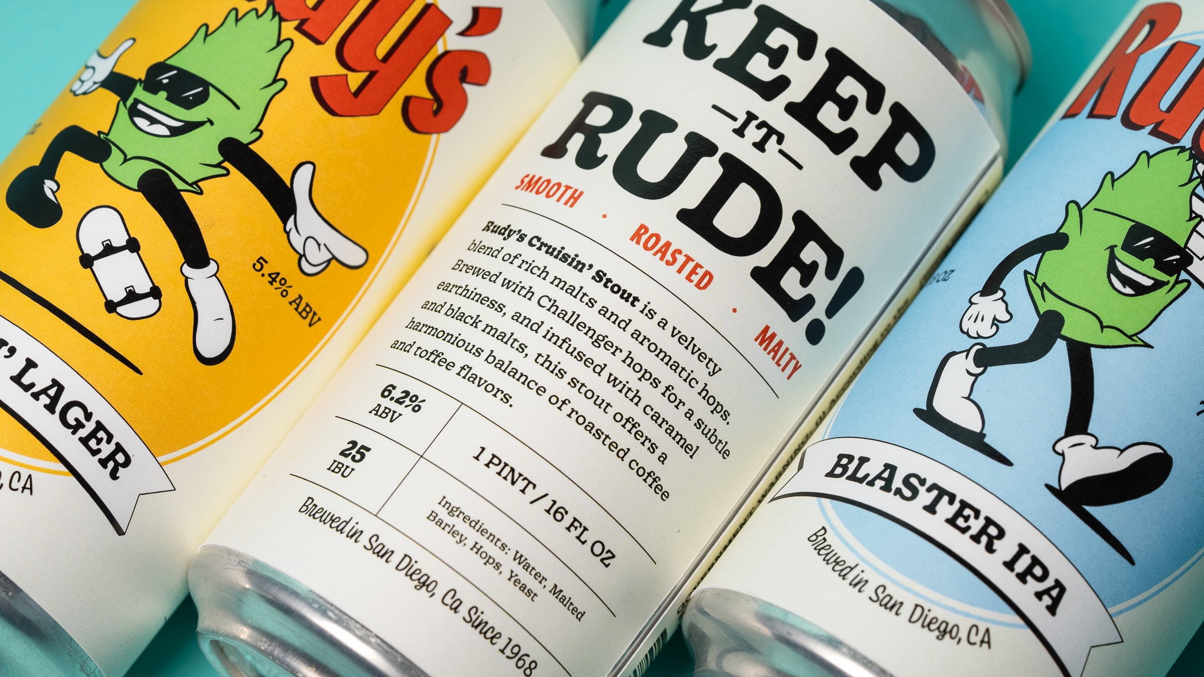
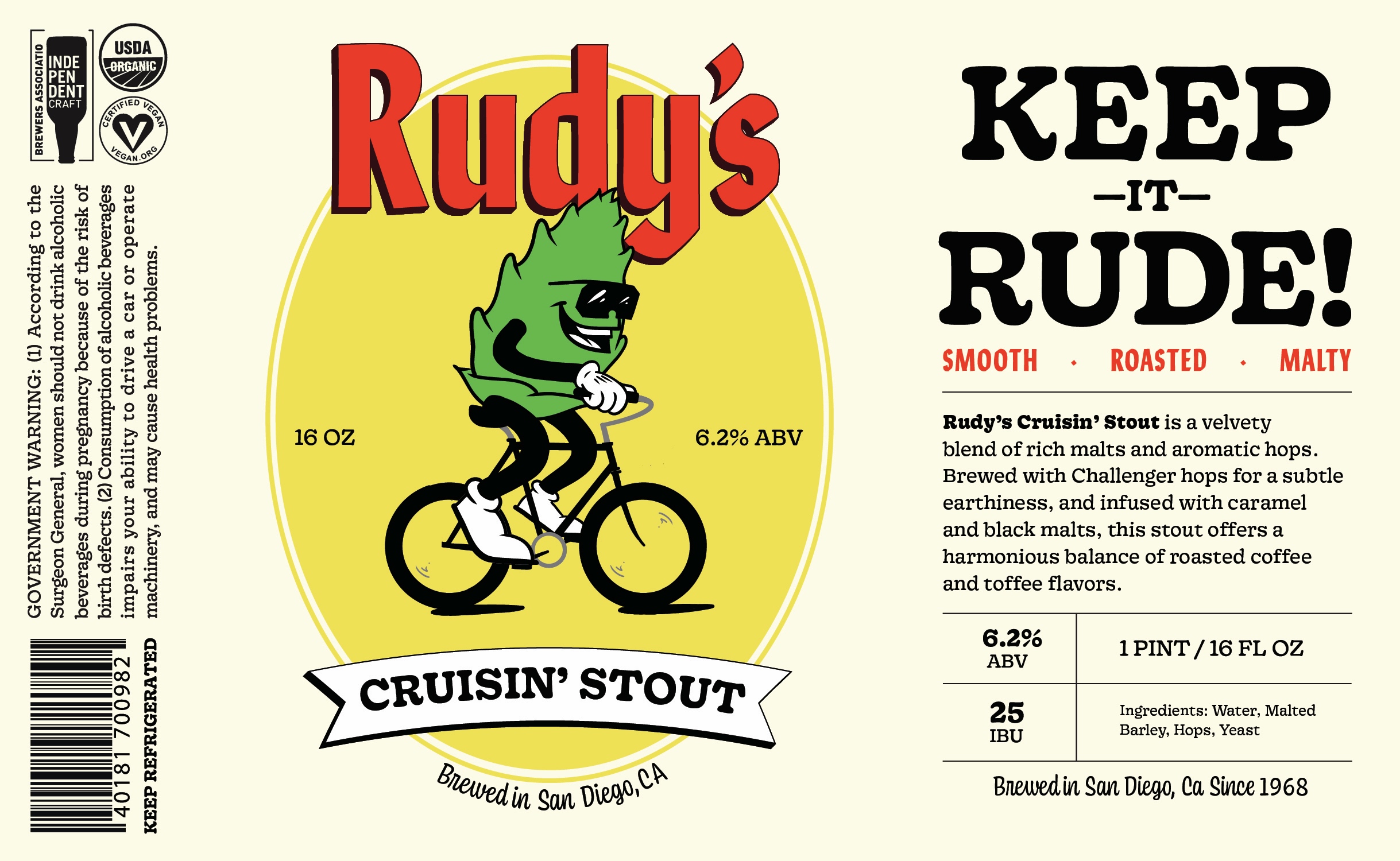
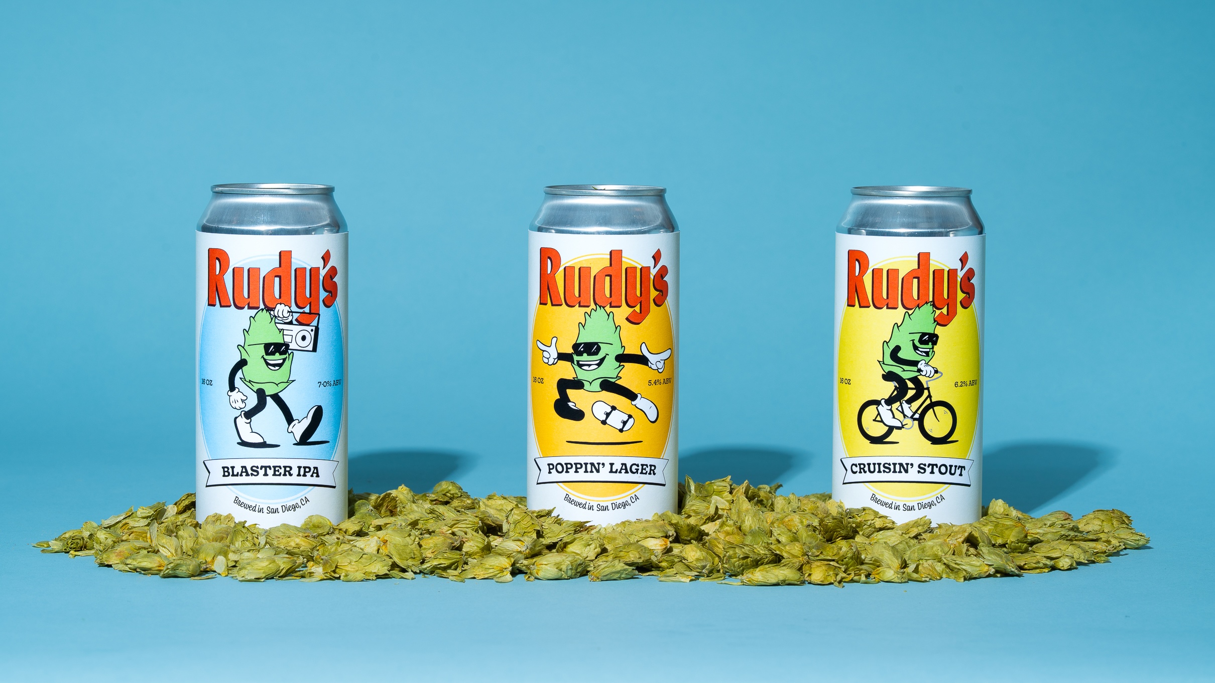
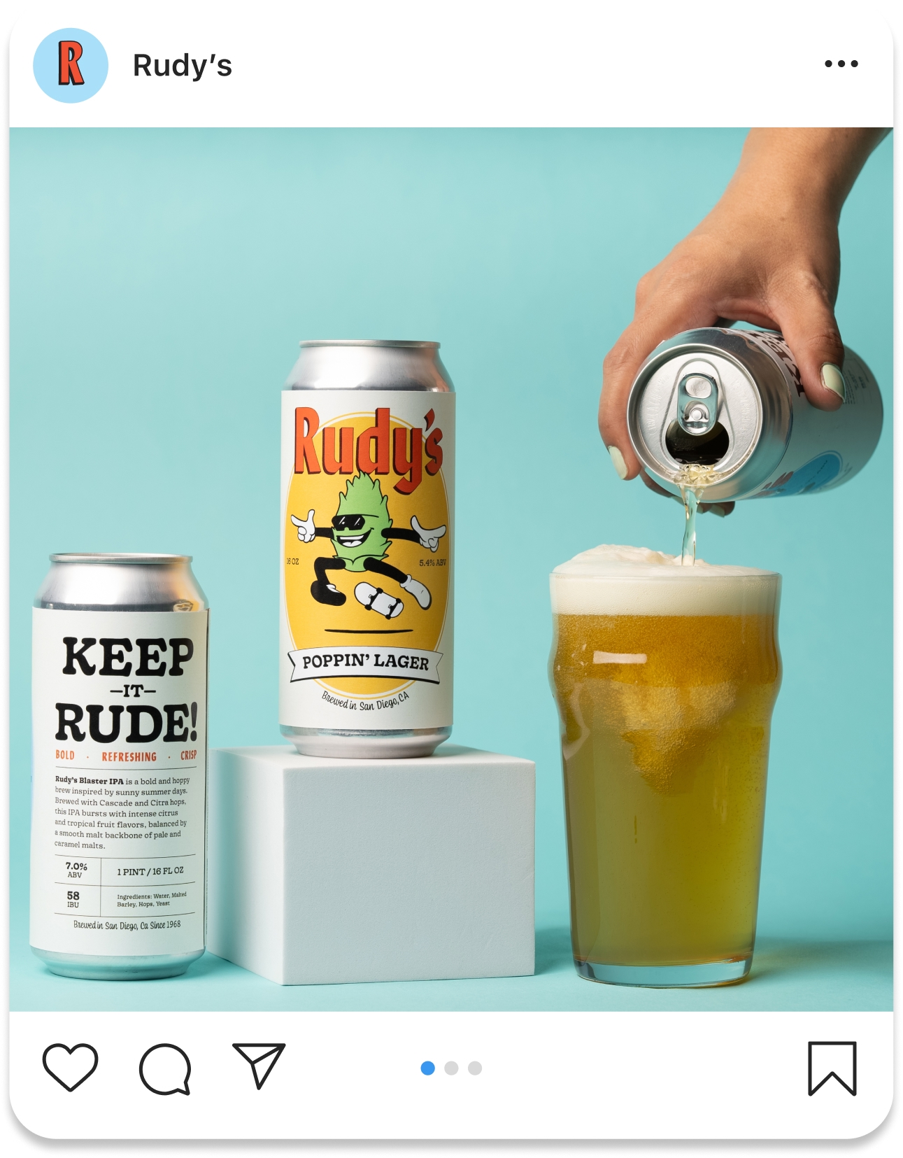
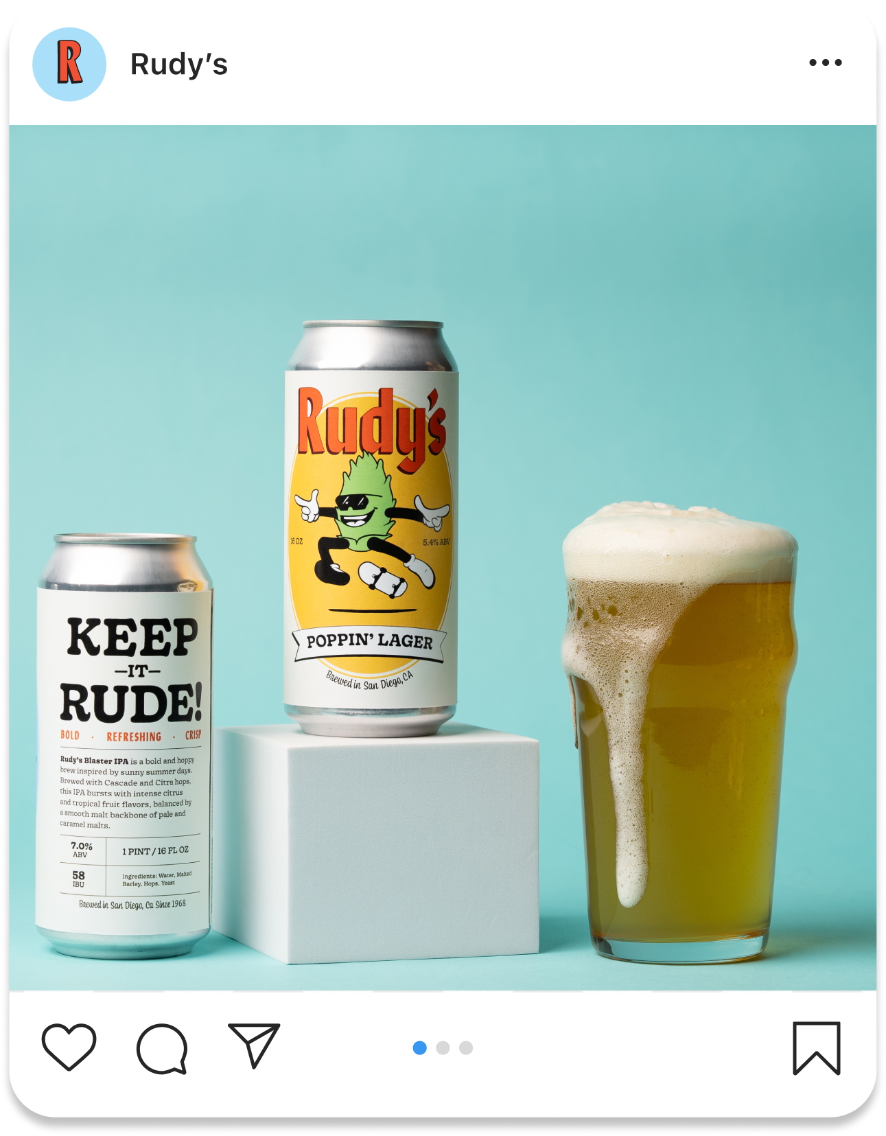
The label system is designed to make an impact from every angle, ensuring clarity, personality, and strong shelf presence. At its center is Rudy, the hop shaped mascot. Hops define craft beer’s distinct flavor and separate it from the ordinary, making Rudy the perfect symbol. The mascot injects humor, character, and instant recognition for the initiated.
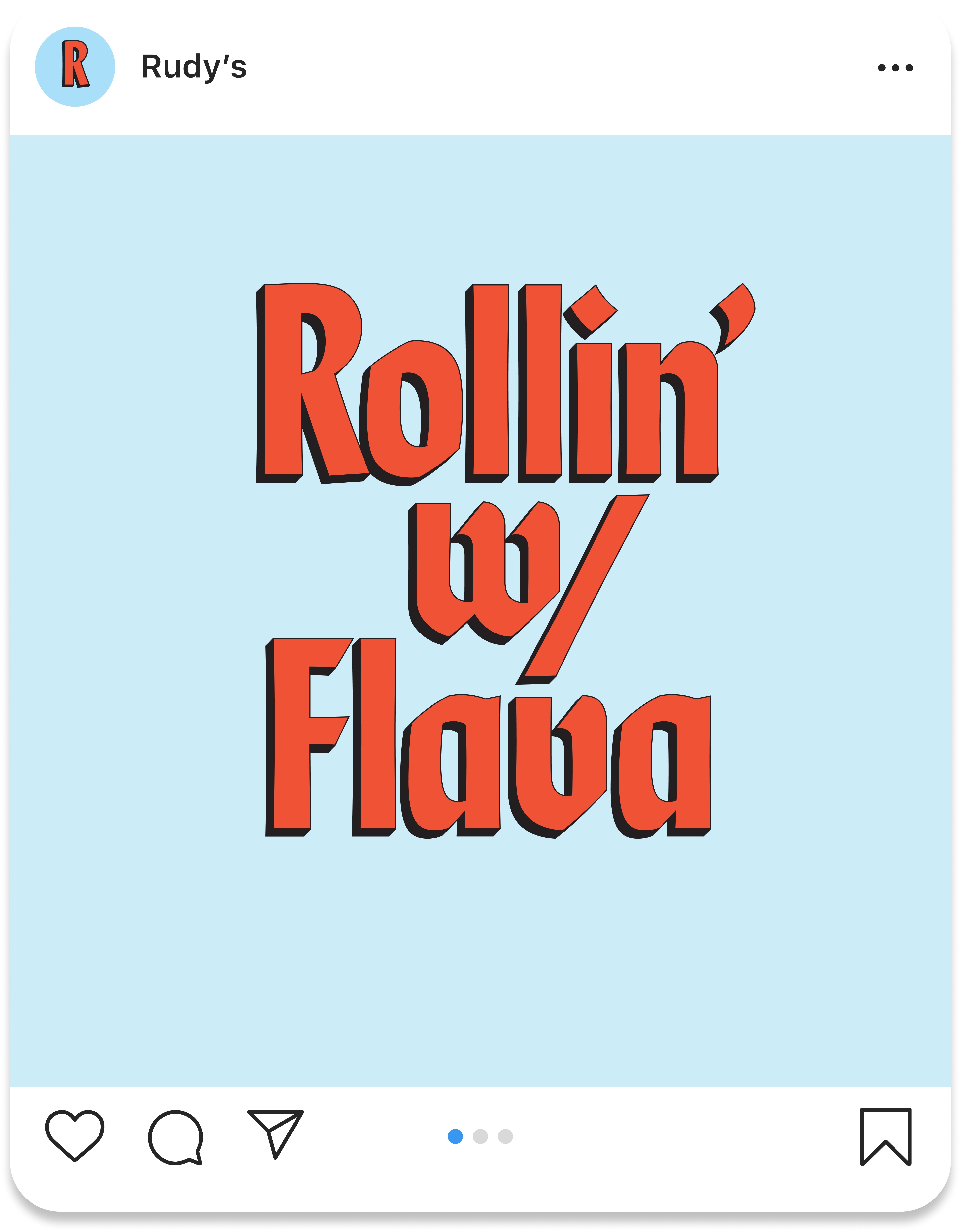
The type palette reinforces the brand’s energy and range. Lydia, with its modern calligraphic edge, reflects Rudy’s rough and ready personality while nodding to traditional beer craft. Gooper, a bold old-style fatface serif, adds warmth and irreverence, balancing Lydia with playful charm. Coniferous, an expressive script inspired by National Forest typography, ties the system back to the outdoors and complements the hand drawn illustrations, reinforcing the adventurous spirit and sense of movement.
Each label communicates flavor notes, ABV, and essential information at a glance while maintaining cohesion across the system. Punchy color palettes paired with illustrated scenes amplify the brand’s character, capturing the energy of classic beer labels through a modern, lively perspective.
Market Differentiation
Rudy’s positions itself as more than a beer; it is a cultural object. In a craft beer landscape often divided between minimalism and pure heritage driven tradition, Rudy’s stands apart with personality. Bold typography, a memorable mascot, and culturally informed design create an identity that is both social and socially relevant, appealing to adventurous, engaged drinkers.
Demographic
Rudy’s connects with culturally engaged adults aged 21 to 45. They gravitate toward brands rooted in community, social connection, and modern artisanry, making Rudy’s a natural fit for active, culturally attuned lives. The brand resonates across social platforms, merchandise, lifestyle touch points, and experiences where culture, movement, and beer intersect.
CREDIT
- Agency/Creative: Will Gordon
- Article Title: Will Gordon Shapes a Dynamic Beer Identity for Rudy’s Blending Sport, Music, and Cultural Attitude
- Organisation/Entity: Student
- Project Type: Packaging
- Project Status: Non Published
- Agency/Creative Country: United States
- Agency/Creative City: San Diego
- Market Region: North America
- Project Deliverables: Brand Creation, Brand Design, Illustration, Label Design, Packaging Design, Product Photography
- Format: Can
- Industry: Food/Beverage
- Keywords: Brand Identity, Lifestyle Branding, Packaging Design, Beer Label Design, Typography, Hand Drawn Illustration, Character, Design Mascot Design, Graphic Design, Creative Direction, Visual Storytelling Design, System, Modern Retro Aesthetic, Pop Culture
-
Credits:
Professors: Sean Bacon & Bradford Prairie


