


Brand Identity
Oeste is a contemporary wine project born from the high desert of Baja California. Shaped by place, process, and a spirit of experimentation, the project prioritizes expressive fruit and low-intervention winemaking. Its name, “Oeste” (meaning “west”), gestures toward movement, possibility, and exploration, rather than heritage, convention, or pastoral clichés.
The brand reflects a region in constant evolution of shifting climate, innovative viticulture, and nontraditional approaches to craft. The identity embraces restraint, subtle symbolism, and tactile nuance, creating a quietly symbolic system that mirrors both the vastness of the desert and the dynamic character of the wines themselves.
Creative Direction
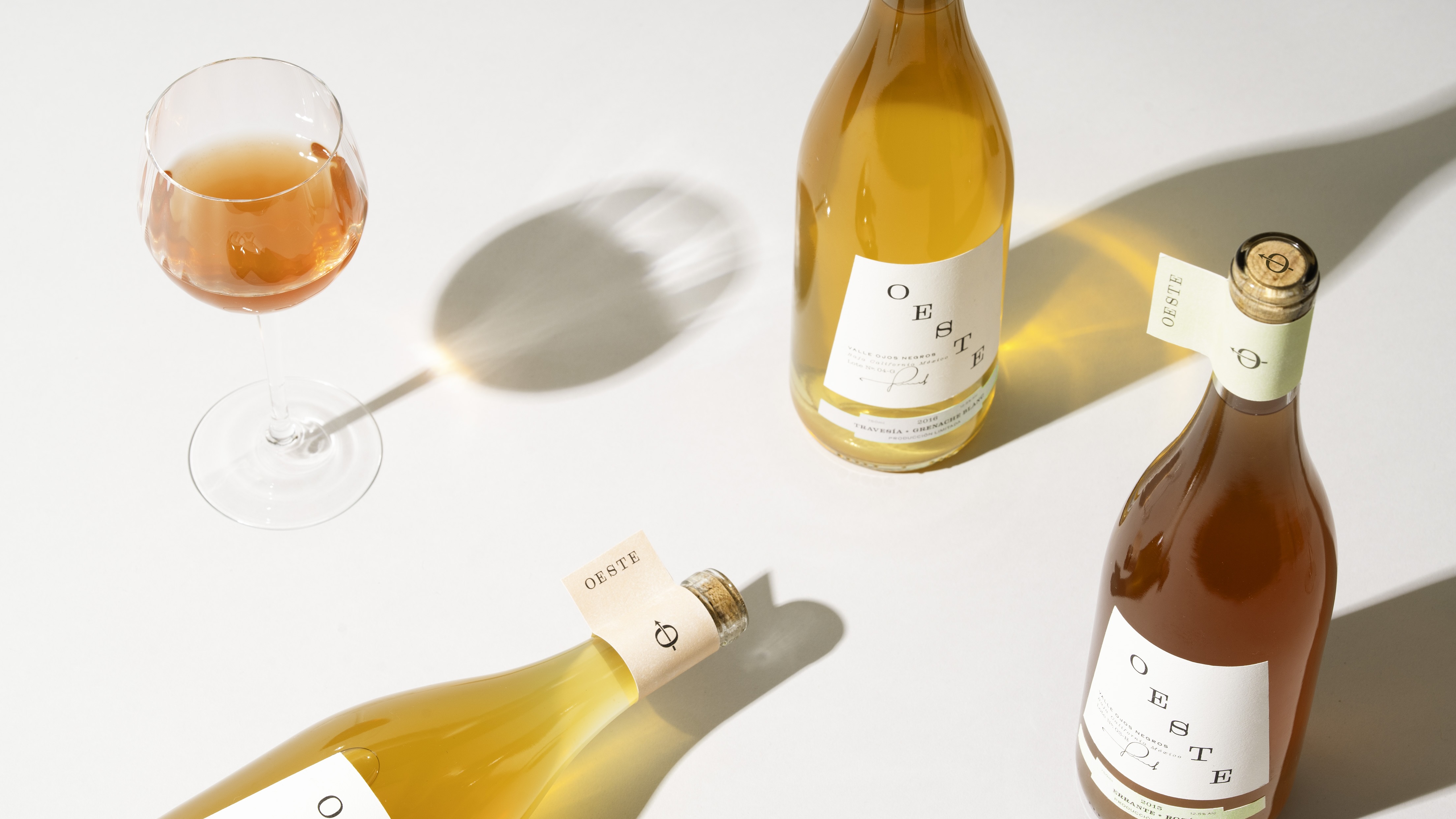
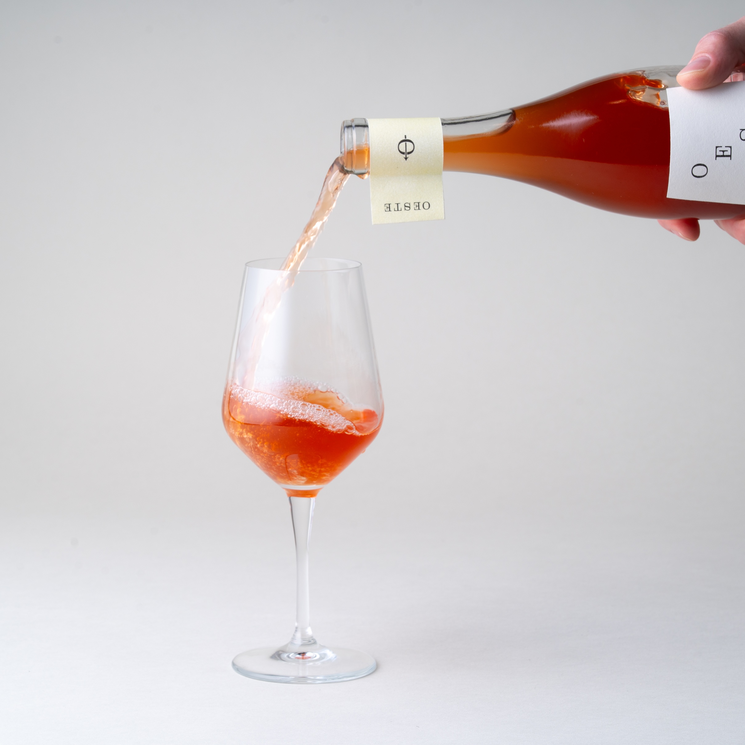
The creative direction blends minimalism with expression, presenting a modern interpretation of Mexican design without resorting to rustic stereotypes. Instead of ornate embellishment, the design relies on quiet storytelling. Sun bleached colors reference the landscape, while typography emphasizes balance, structure, and restraint. Texture, asymmetry, and negative space play essential roles, allowing origin, method, and personality to take center stage. The tone is sophisticated yet understated, offering a contemporary expression of regional identity.
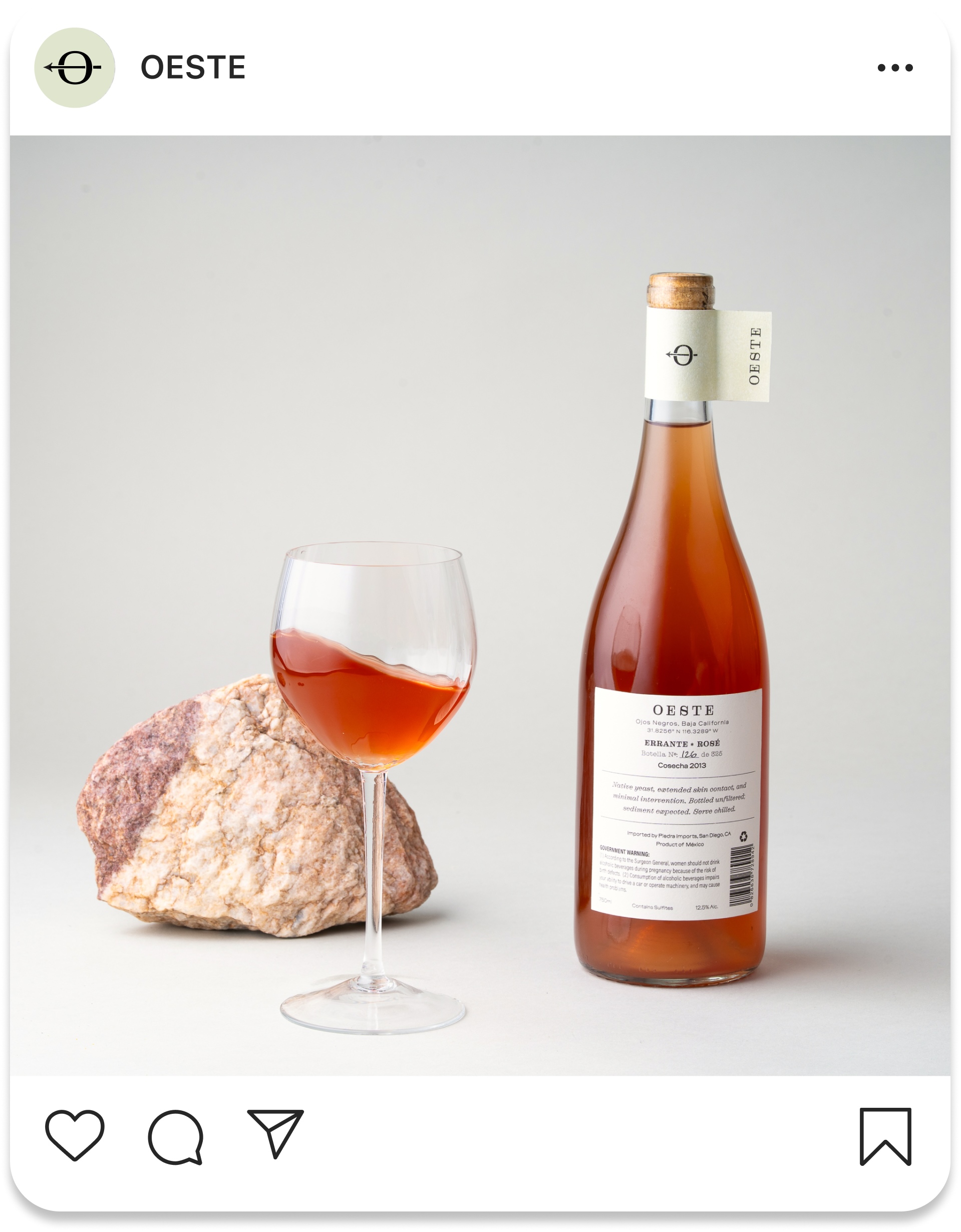
Design Elements
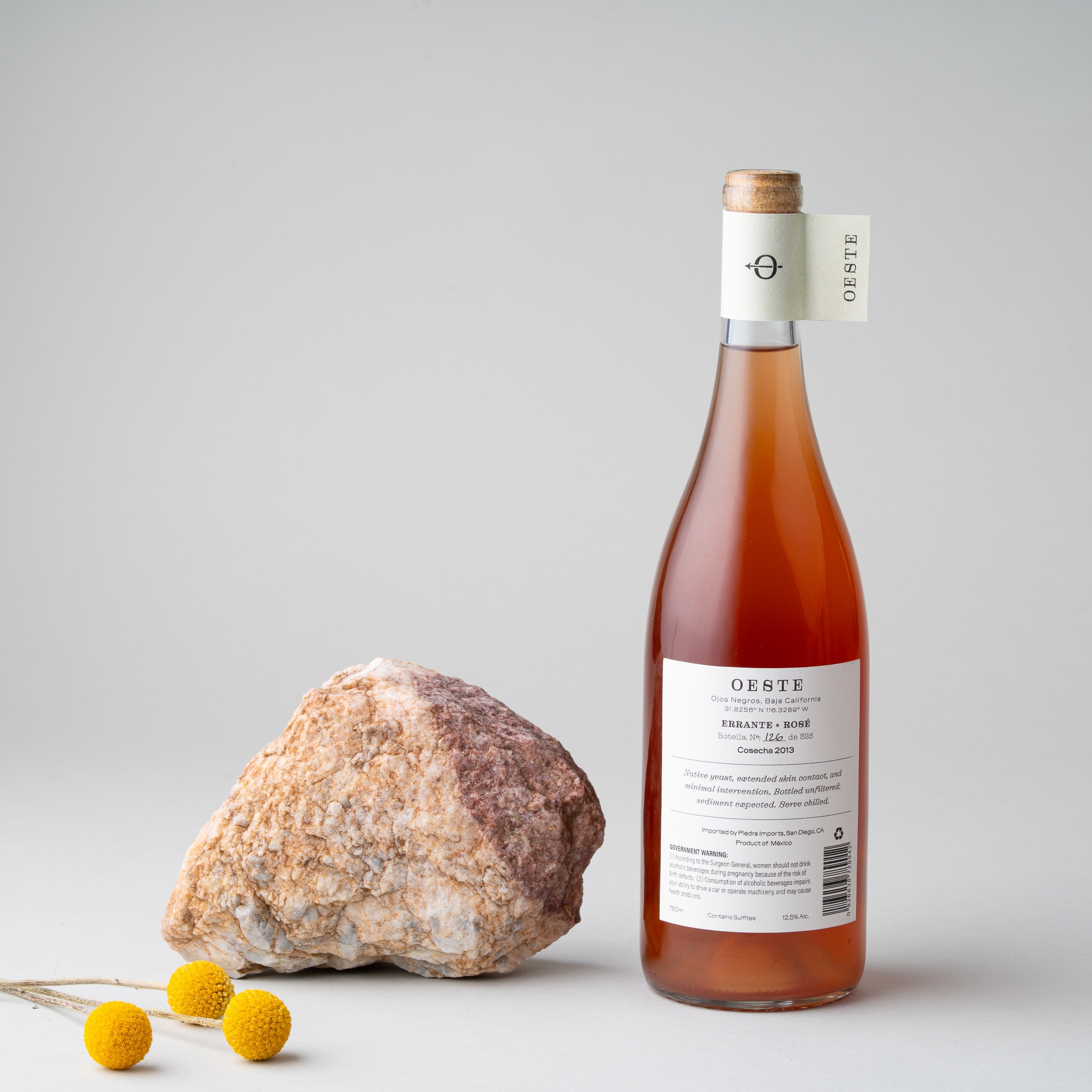
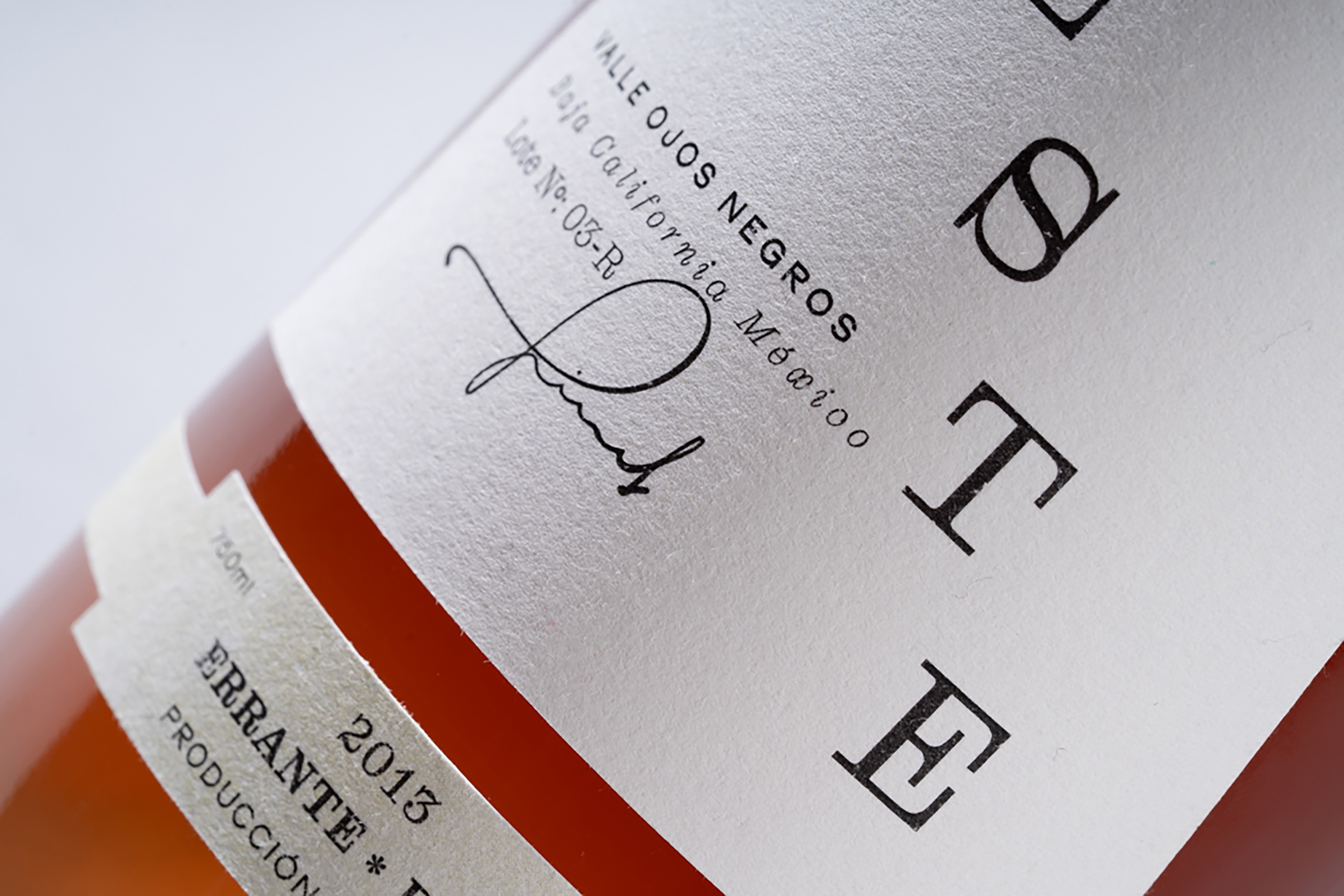
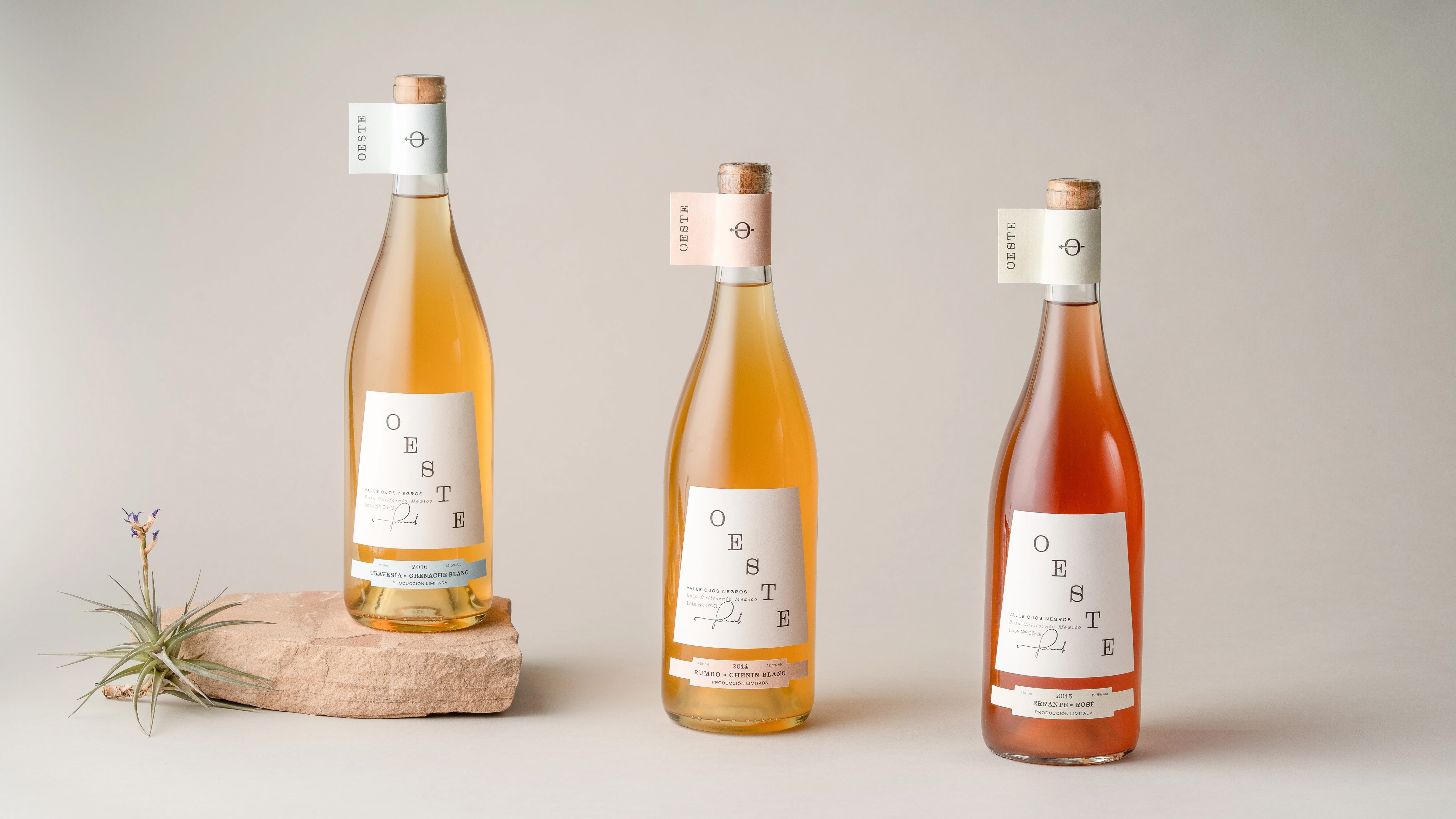
Typography drives the system with a refined pairing of a distinctive Clarendon which introduces warmth and personality, while a modern sans serif adds clarity and contemporary tension. The typographic contrast reflects the project’s duality of tradition and experimentation, landscape and craft.
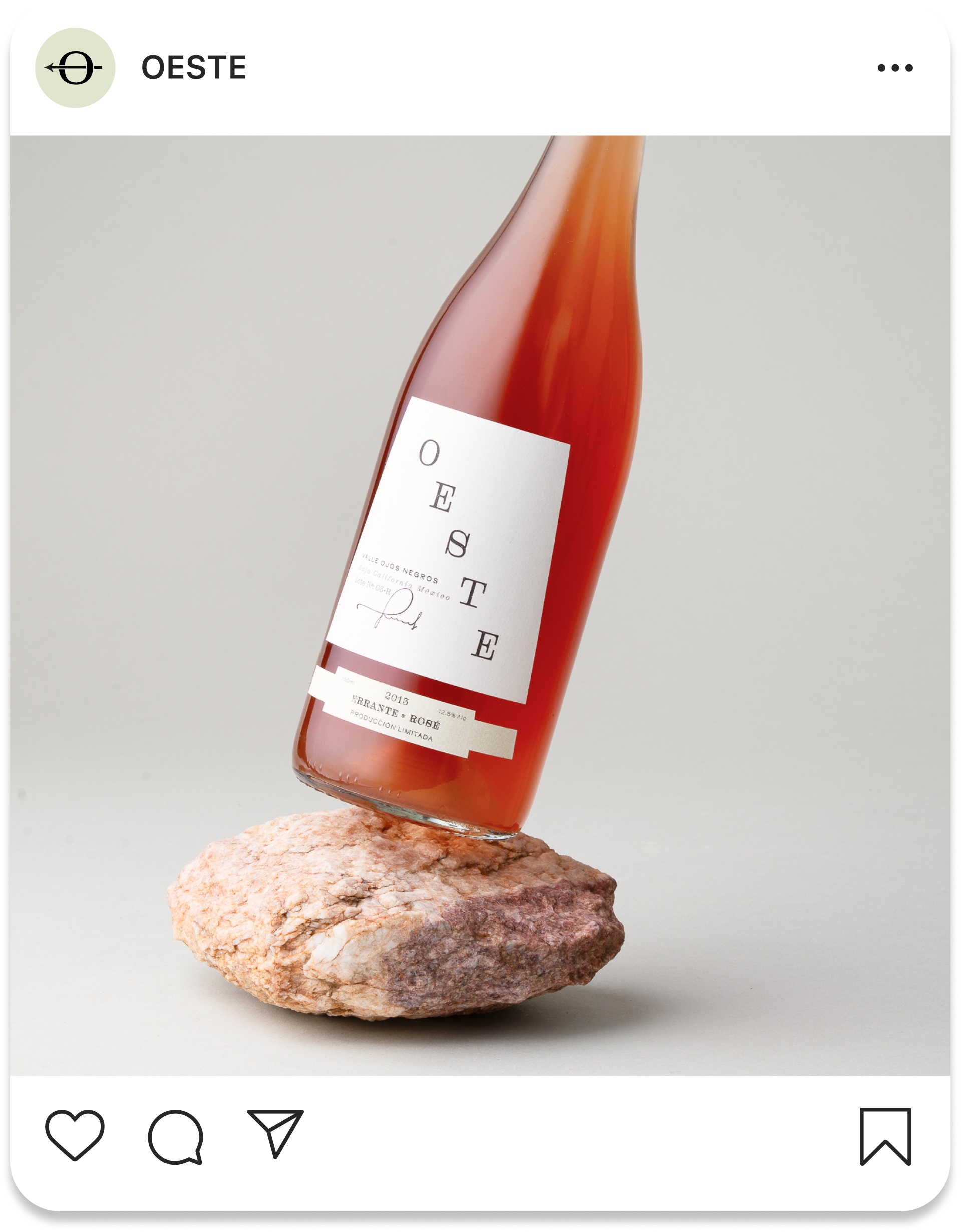
Label design is intentionally restrained, using white space, proportion, and subtle references to desert’s natural color and texture. Across the collection, each bottle retains the individuality of its varietal and lot system while contributing to a cohesive visual language.
Market Differentiation
Oeste diverges from wine brands that rely on luxury cues or nostalgia. Instead, it foregrounds experimentation, regional storytelling, and modern craft. This positions Oeste as a wine for the curious, for consumers who value narrative, process, and discovery as much as flavor.
Demographic
Oeste speaks to connoisseurs aged 30–50 who value thoughtful design and authentic, fresh experiences. These consumers seek connection and are drawn to modern, design forward brands that reflect both craft and creativity.
CREDIT
- Agency/Creative: Will Gordon
- Article Title: Will Gordon Presents a Minimal, Texture-Led Identity for Oeste That Elevates Regional Storytelling Through Subtle Symbolism
- Organisation/Entity: Student
- Project Type: Photography
- Project Status: Non Published
- Agency/Creative Country: United States
- Agency/Creative City: San Diego
- Market Region: North America
- Project Deliverables: Label Design, Packaging Design, Product Photography
- Industry: Food/Beverage
- Keywords: WBDS Student Design Awards 2025/26 , Packaging, Labels, Product Photography, UI design, Illustration, Art Direction, Mexico, Mexican, Wine
-
Credits:
Professors: Sean Bacon & Bradford Prairie


