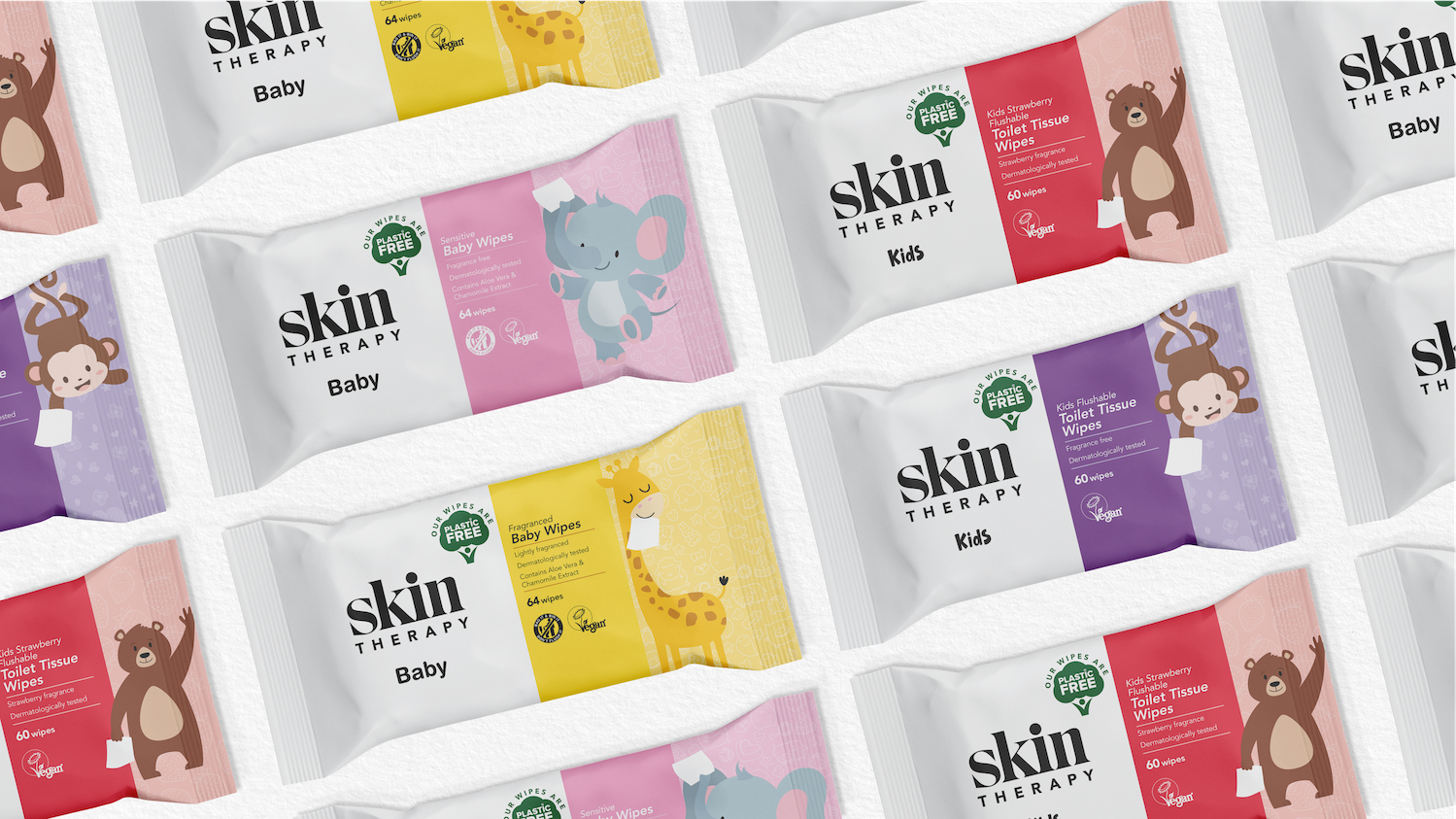
Design and branding agency Free the Birds has created a new brand and packaging identity highlighting sustainability for wilko. Focusing on two product lines Household Wipes and Skin Therapy Wipes, both ranges are made by the family-owned homes and gardens retailer and sold in its 414 stores nationwide.
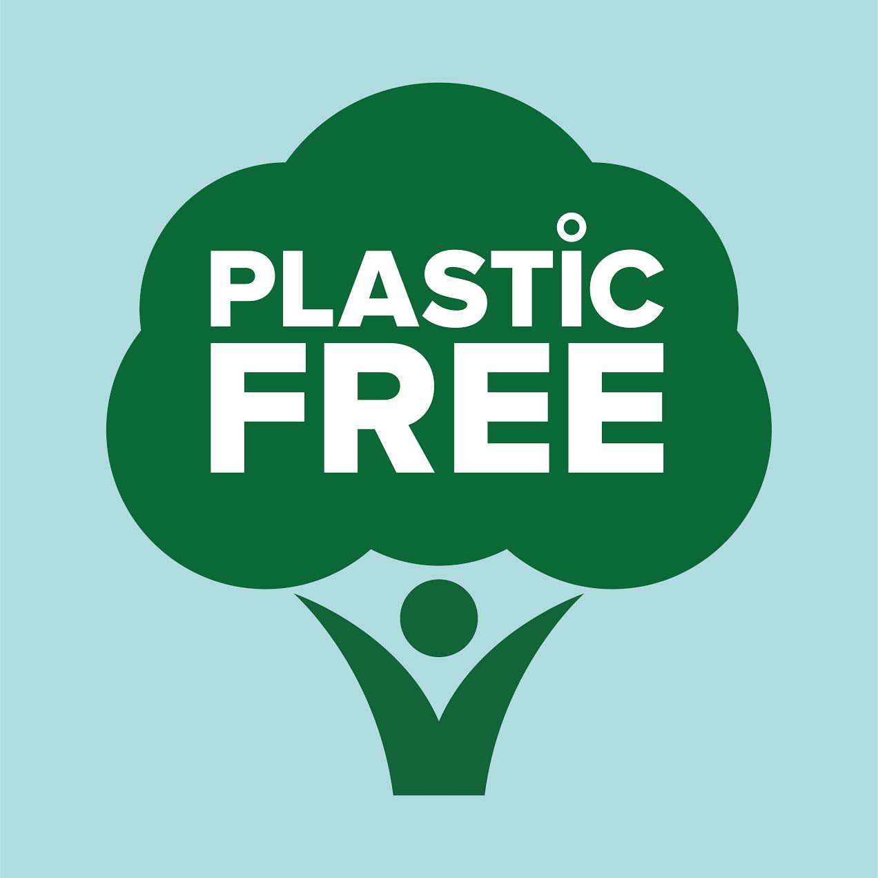
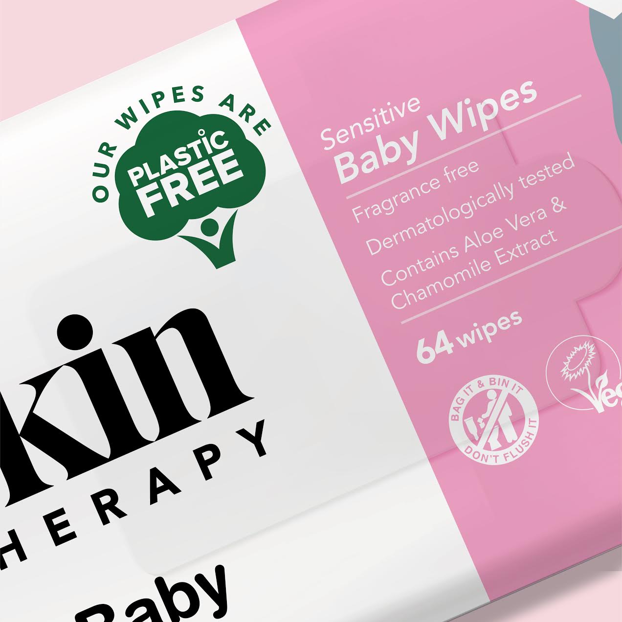
wilko’s Household and Skin Therapy wipes are now manufactured and packaged using a renewable plant-based viscose from sustainable sources. Free The Birds designed the “Tree of Life” logo which features on both ranges, using an image that represents nature and durability while signposting wilko’s plastic-free credentials.
For the Household range, Free The Birds updated packaging to hero the wilko branding, by modernising the colour palette and updating the imagery by projecting cleaner cues to the customer. The fragrances remain the same, but humorous names have been replaced with more functional alternatives: “Shine On” becomes “Polish Wipes” in the new-look range. There are 22 products in total, including wipes suitable for decorating, pets, cleaning, motoring, beauty and baby variants.
For the Skin Therapy wipes, the new look introduces a stand-out logo to reflect the brand’s confidence, helping it to compete against other branded products in store by presenting it as a more uniquely credible skincare offering.
wilko CEO Jerome Saint-Marc said: “As a family business we’ve a strong 90-year heritage of being an ethical retailer and striving to make greener choices for our stores, our communities and our customers. We’re proud to be the first retailer to go completely plastic free for all our wipes across every category. That’s why it was important for us to find a branding partner to work alongside our talented internal product development and packaging team to bring our ambition to life.”
Nick Vaus, Partner and Creative Director at Free the Birds, said, “We are delighted to have worked with the wilko team on this ground-breaking initiative highlighting brand responsibility and the world we all share. The ‘tree of life’ identity is a clear and effective shorthand that wilko can apply beyond its wipes and into other ranges. The
image connects the human form to the tree symbol, signalling that something has changed for the better without interrupting consumers’ navigation of their favourite products. The whole project has been a great exercise in improving both on-shelf and digital recognition while decreasing the negative impact we have on the planet.”
wilko began its partnership with Free The Birds by appointing the design consultancy to create a new identity for its two ranges of wipes, but the brief was later expanded to include a design that would introduce a bold expression of the retailer’s plastic-free ambitions.

CREDIT
- Agency/Creative: Free The Birds
- Article Title: wilko and Free The Birds Create Designs for a More Sustainable Future
- Organisation/Entity: Agency, Published Commercial Design
- Project Type: Packaging
- Agency/Creative Country: United Kingdom
- Market Region: Europe
- Project Deliverables: Packaging Design, Product Naming
- Format: Pouch, Sachet
- Substrate: Plastic


