


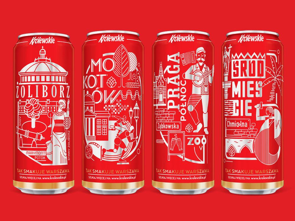
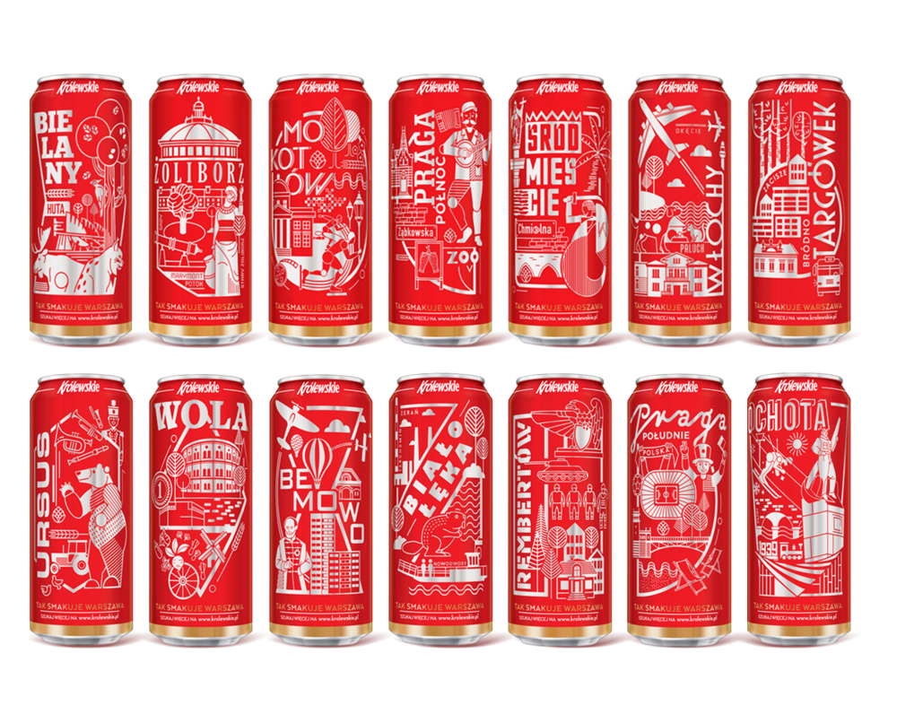
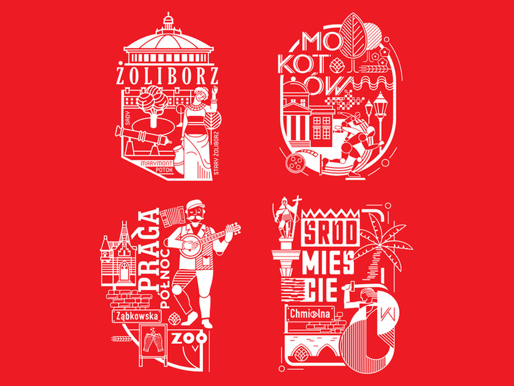
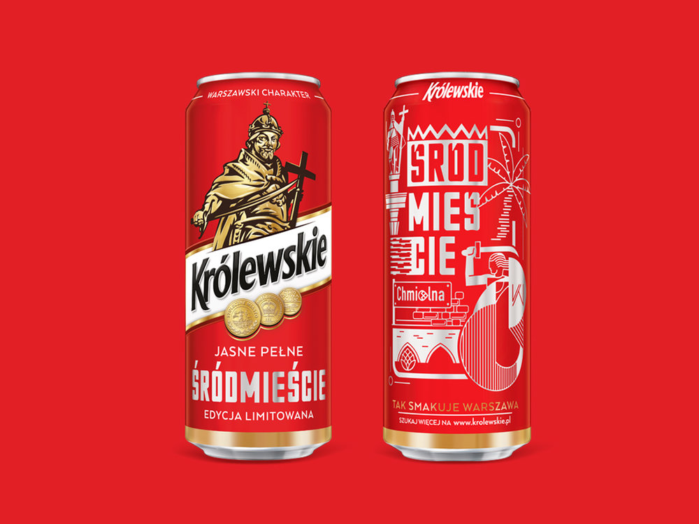
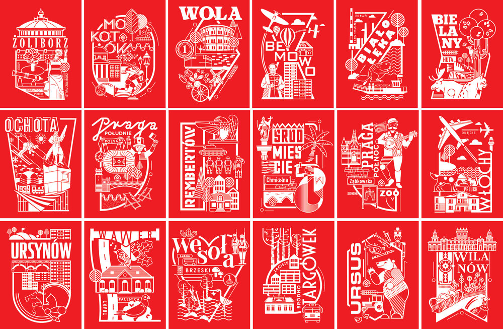
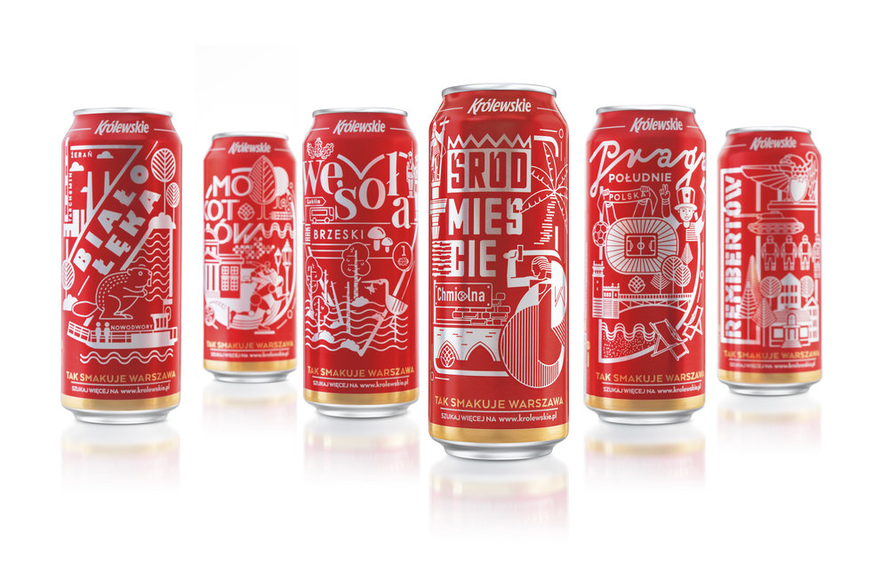
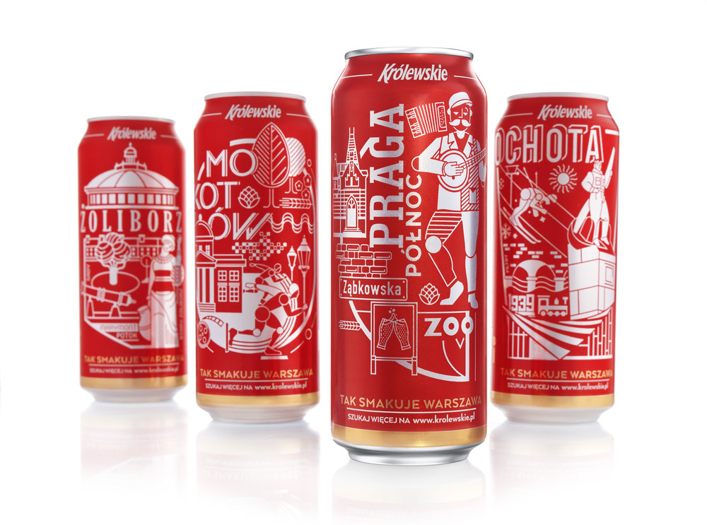
” This set of beer cans, shows a range of greatest spots in WarsawWILK Studio has developed the idea and graphics of the limited edition of packaging for the Królewskie brand. The new version of the most popular beer in Warsaw, PL, entered the market in March 2017. The slogan “This is how Warsaw tastes” has never been more authentic.Królewskie is a beer with powerful local character, strongly associated with the place of origin and its inhabitants. The owner of the brand, Grupa Żywiec, introduced nineteen cans. The graphic design of eighteen of them represents the most important symbols of each of the capital’s districts. In addition, nineteenth can is dedicated to Warsaw itself.”Working with Królewskie as a Warsaw brand, we came up with an idea of using the city’s districts on products. By implementing the concept, we faced the demanding task of illustrating and preparing for printing over a dozen layouts using Dynamark® technology – assesses Marek Repetowski, Art Director in WILK Studio – Remembering Warsaw strong roots of the brand, we have chosen the most characteristic venues in every district, creating a kind of city map included in the collection of cans. Brand commercial slogan: This is how Warsaw tastes – became real.” ”
CREDIT
- Agency/Creative: WILK Studio
- Article Title: WILK Studio – District Cans for Królewskie beer
- Project Type: Packaging
- Format: Can
- Substrate: Metal


