


Centering on a house-shaped mascot, Ding’s branding embraces ‘dopamine design’ and flies in the face of the traditional, staid industry norms.
London-based branding studio Wildish & Co. has created the bold, personality-packed branding for Ding, a new home services platform offering trusted, qualified tradespeople through a transparent, subscription-based model.
Ding’s parent company HomeServe – an established name in the home repairs and improvements industry, spanning services like plumbing, electrics, heating, and boiler repairs – approached Wildish & Co. in July 2024 to create the entire brand identity for the then-nameless app-based platform, including its naming, execution of the brand strategy, its visual and verbal identity, creative direction, illustrations, motion design and more.
While Ding is part of HomeServe, it occupies a separate, unique space in the consumer market to its parent company; and so Wildish & Co. opted for a playfully mascot-centric, disruptive approach that turns its sector on its head.
“Ding is all about cutting through the noise of traditional home repairs,” says Sam Fresco, founder of Wildish & Co. “The app needed to make home repairs as simple and reliable as ordering a pizza, with an identity that fosters trust and emotional connection in a highly competitive market.”
‘From ours to yours’ – a human-centric brand
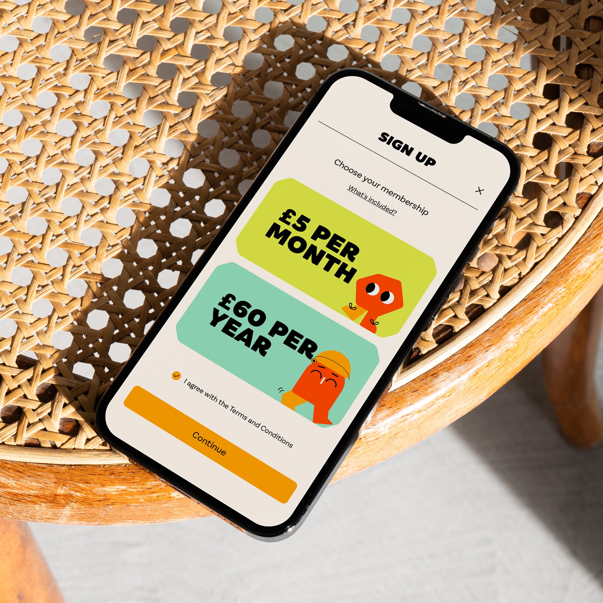
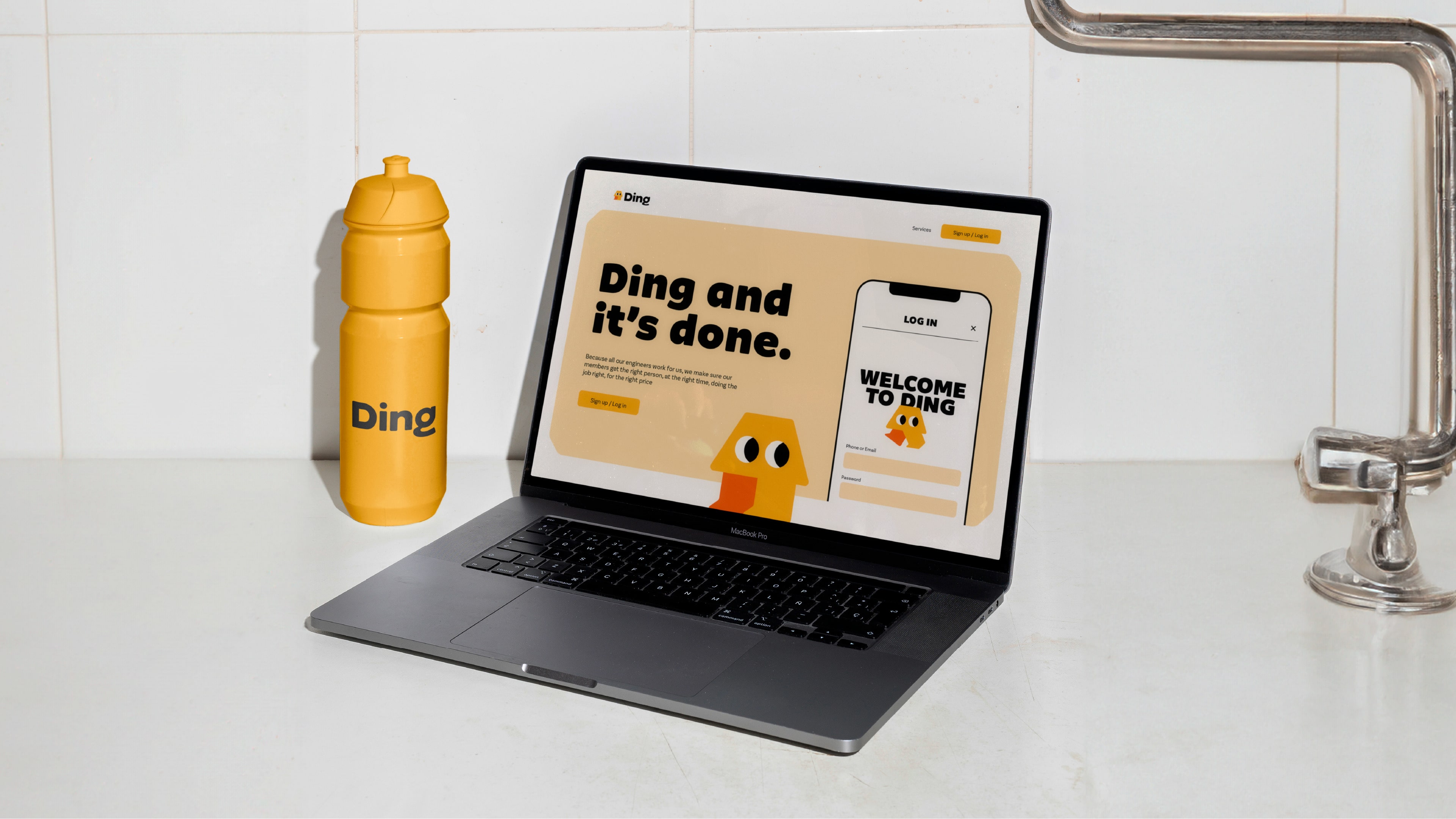
The strategy phase identified a neighbourly quality as central to Ding and crystallised this in the brand platform ‘From ours to yours.’
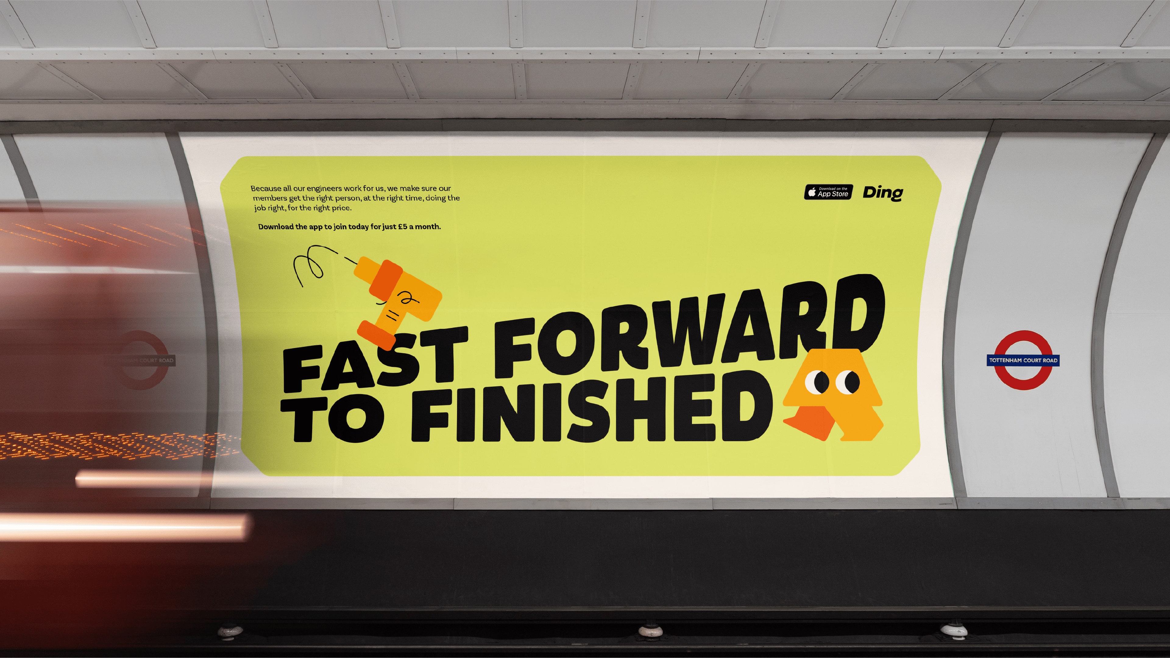
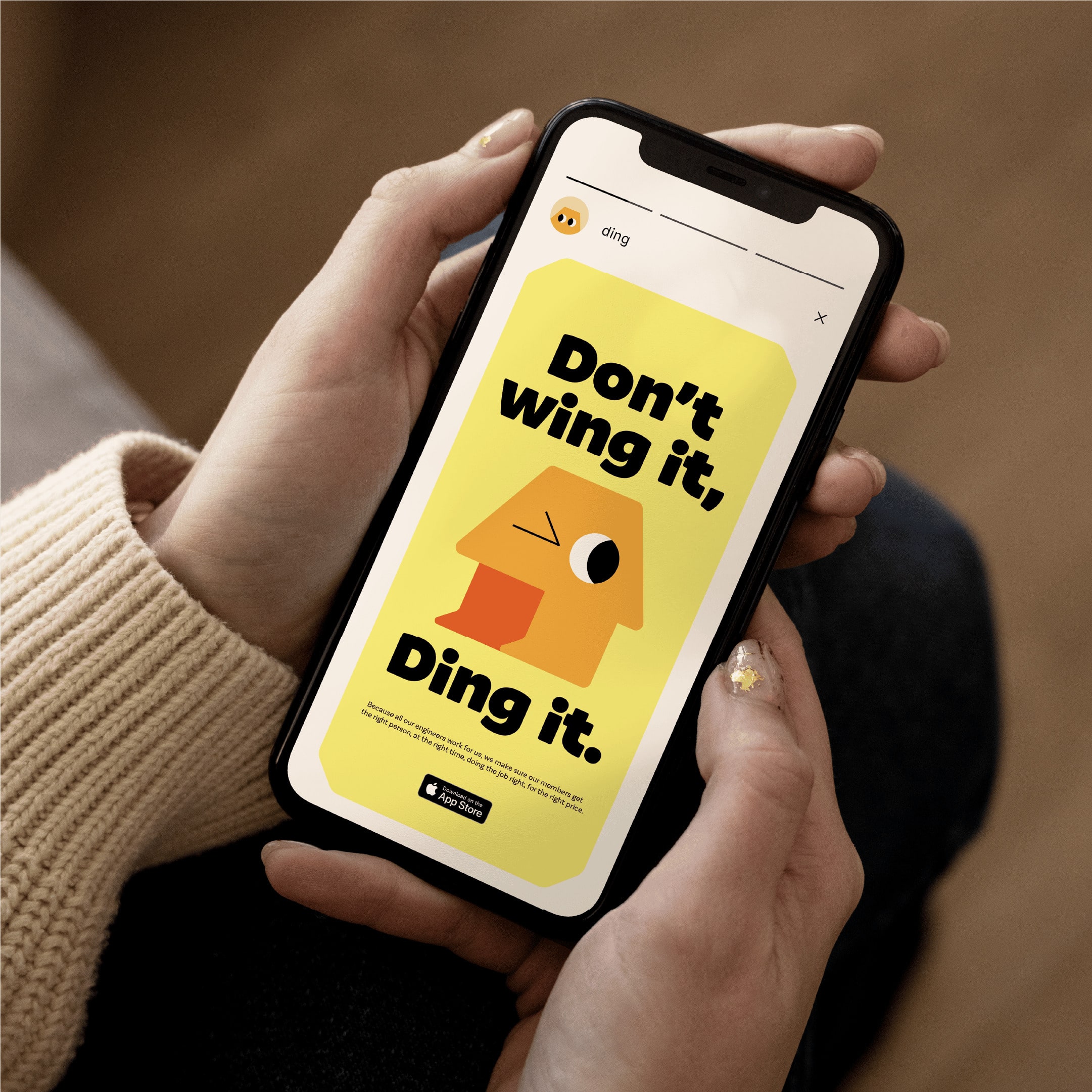
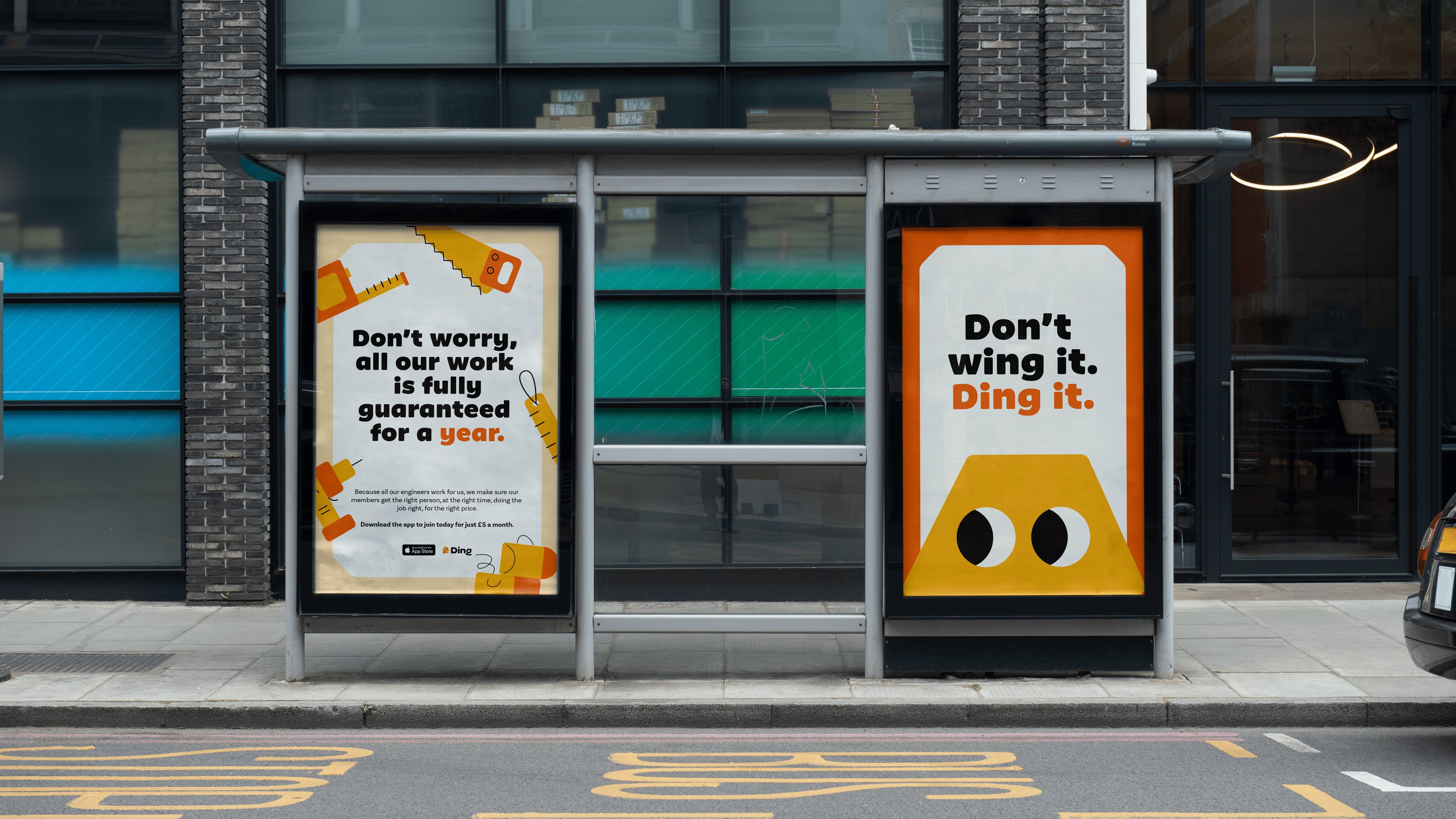
The name was chosen for its simplicity and memorability, chiming with the platform’s core purpose – offering reliable, straightforward services – and reinforcing the tagline ‘Just Ding and it’s done.’ “’Ding’ sounds like a notification sound or a doorbell, signifying the job is complete,” explains Fresco.
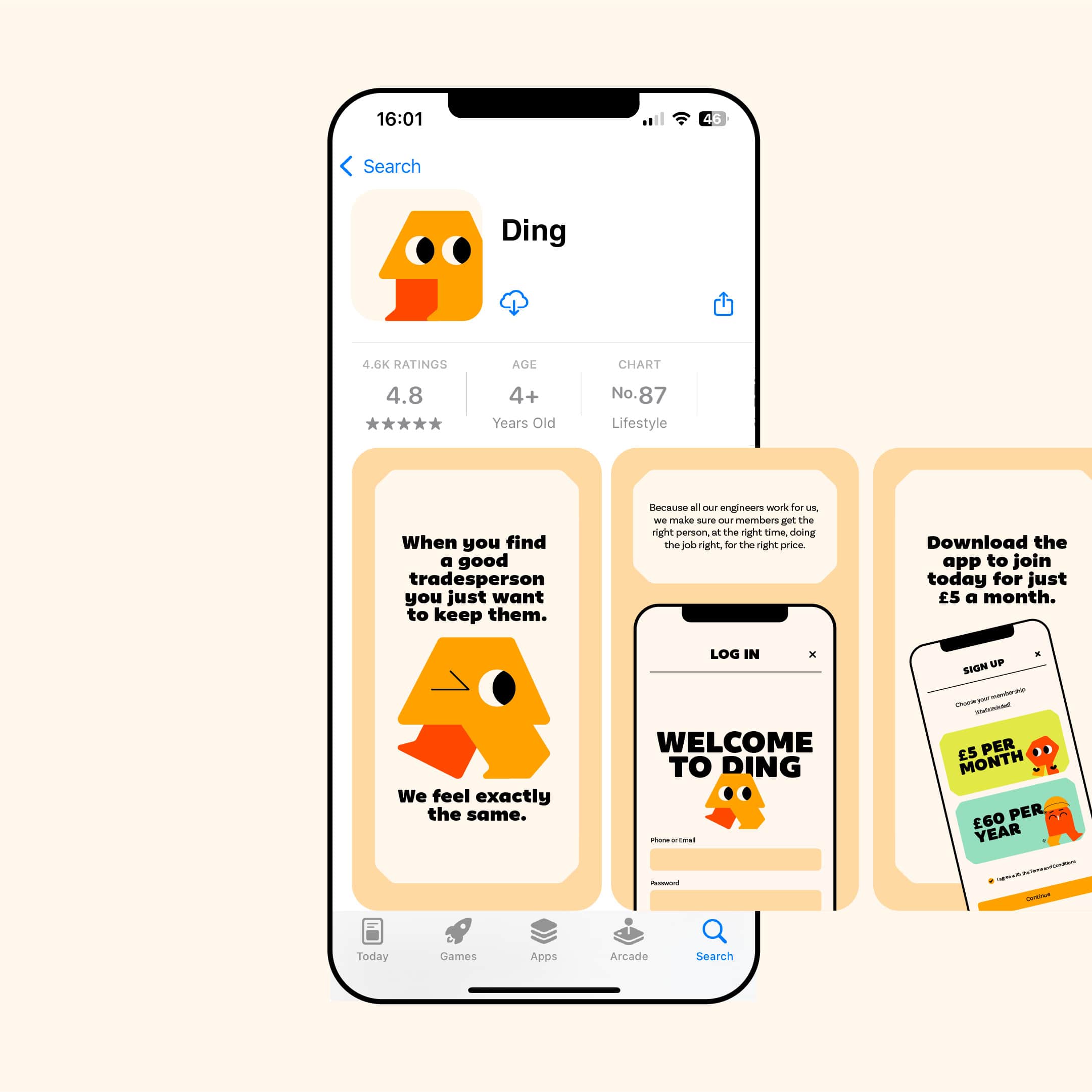
At the heart of the identity is a house-shaped brand mascot – also called Ding – personifying the brand’s approachability, confidence, and unique approach. The character can be used as a static graphic device or in an array of animated forms; and has nine unique facial expressions.
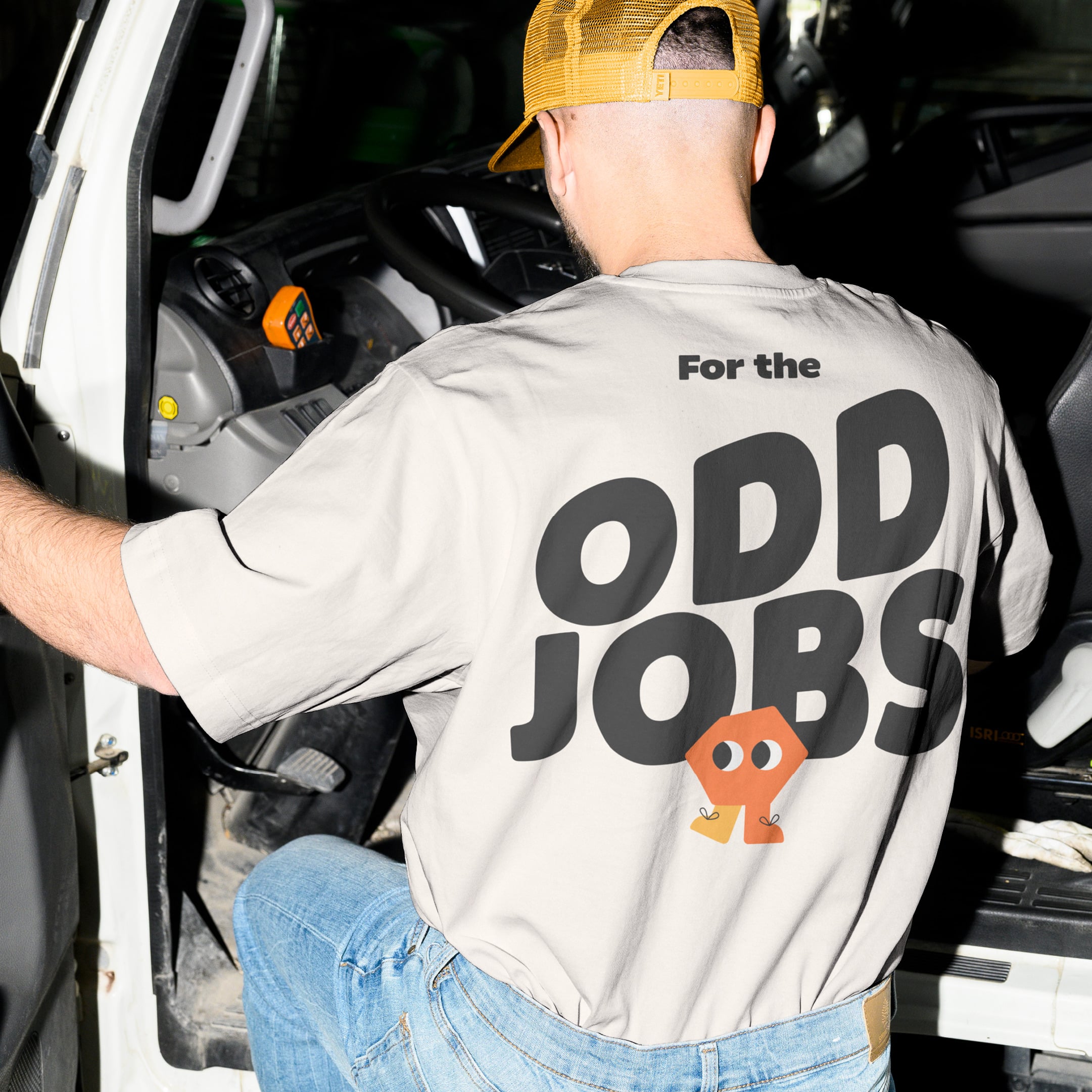
Wildish & Co. also created a suite of ‘job’ characters such as Big, Odd, Urgent and Tricky; as well as more than 30 illustrations to represent every aspect of Ding’s services through succinct, simple icons such as a saw, tap, boiler, tape measure, and shower.
Further icons using simple thick black linework were designed specifically for the Ding app to aid user functionality while aligning with the overarching brand personality through visual nuance such as rounded corners.
“Stock images of people holding tools felt inauthentic,” says Fresco. “Custom illustrations help demystify the home repair process by turning complex tasks into relatable, visual cues and create a unique, human-centric brand.”
This focus on illustration also allowed for more flexibility in visual storytelling, creating dynamic imagery that could evolve as the brand grows and is easily adapted for different formats.
Upending a traditionally serious industry
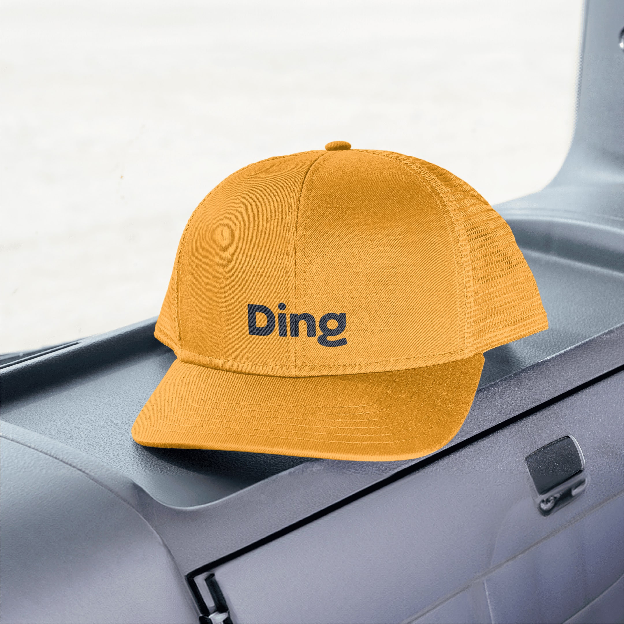
In-keeping with the identity’s focus on clarity, the primary colour palette is stripped right back to three different shades of orange, supported by a secondary palette of ownable green, yellow and blue tones. The colours were selected to evoke energy, and modernity, setting Ding apart from the more pared-back, corporate shades commonly seen in the home repair industry.
Likewise, Wildish & Co. selected Kookie Black as the main brand font – a rounded sans-serif typeface described by its creator, type foundry F37, as “the friendliest font imaginable”. This is supported by Work Sans, which is used for body copy thanks to its clarity and readability.
These colourways and type choices further communicate Ding’s playful yet professional tone, helping to reinforce its message of speed, efficiency, and trust.
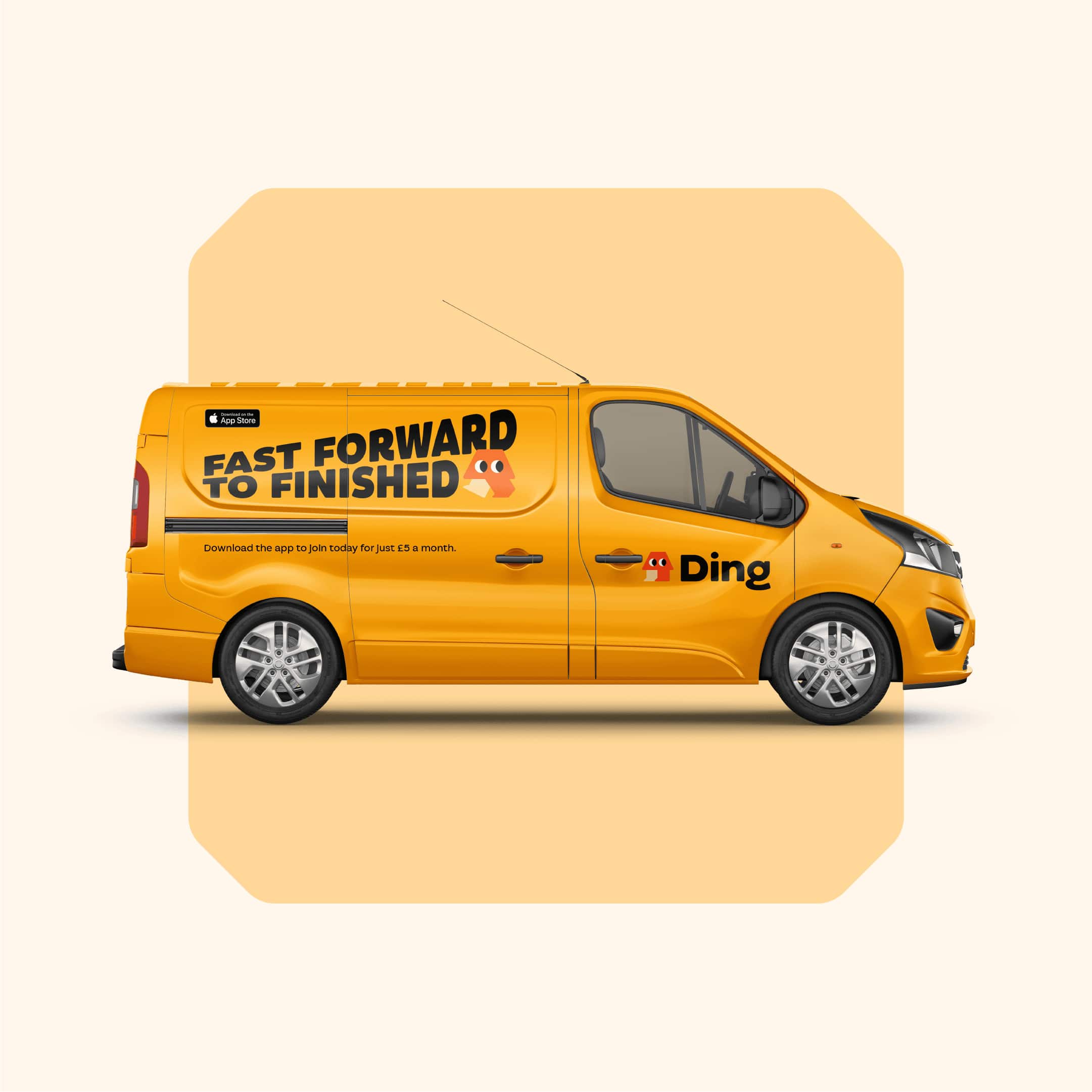
Ding’s messaging and verbal identity is warm but efficient; with a tone of voice that deliberately avoids jargon and unnecessary complexity and slogans including ‘Don’t wing it, Ding it’ and ‘Fast forward to finished.’
“Home services can be confusing: Ding needed to be simple, transparent, and dependable,” says Fresco. “The brand had to speak to homeowners who want control, but also inject a sense of fun, warmth, and approachability into a traditionally serious industry.”
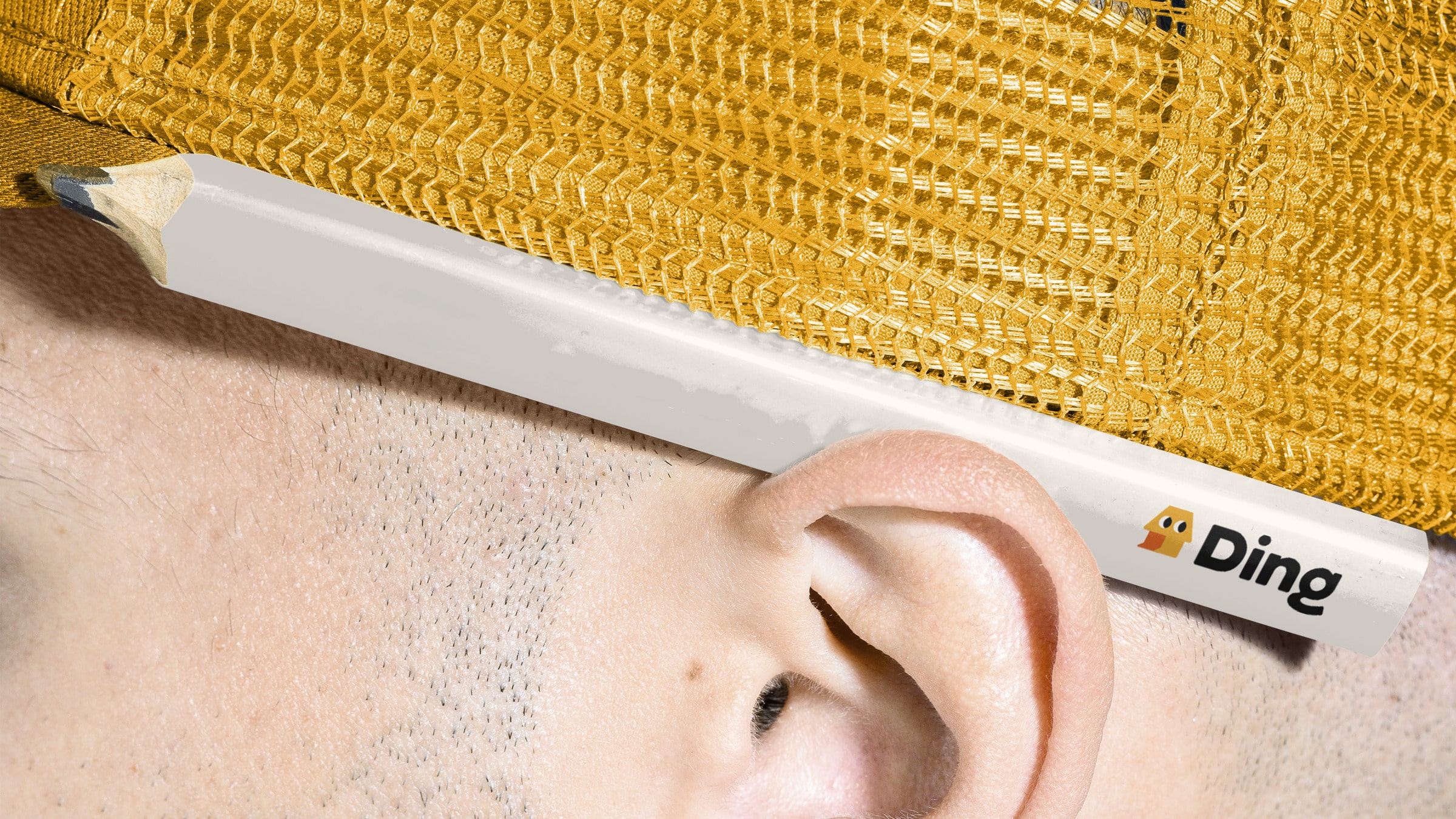
Ding launched in December 2024, with Wildish & Co’s branding appearing across all touchpoints including the app, website, social media campaigns, branded merch, stationery and more.
CREDIT
- Agency/Creative: Wildish & Co.
- Article Title: Wildish & Co. Transforms Home Repairs Market with Vibrant Illustrations and Iconography for Ding
- Organisation/Entity: Agency
- Project Type: Identity
- Project Status: Published
- Agency/Creative Country: United Kingdom
- Agency/Creative City: London
- Market Region: Europe
- Project Deliverables: Animation, App Design, Brand Creation, Brand Design, Brand Guidelines, Brand Identity, Brand Mark, Brand Naming, Brand Tone of Voice, Branding, Copywriting, Icon Design, Illustration, Motion Graphics, Tone of Voice
- Industry: Technology
- Keywords: home repairs, home services, app, utility,
-
Credits:
Creative Director: Jake Allnutt
Designer: Alisha Mann
Andy Churlish: Motion Designer
Harm Kerkhof: Brand Partner
Gabie Shadbolt: Copywriter
Sam Fresco: Director


