


Nooly – A Better Kind of Syrup
An identity and packaging system for a modern syrup brand that blends indulgence with better-for-you values—bringing clarity, personality, and consistency across every touchpoint.
Born from a vision to set a new standard in the syrup category, Nooly emerges as a fresh alternative in a market long dominated by overly sweet, one-note products. It redefines what a syrup can be—combining indulgent flavor with natural, clean ingredients and reduced sugar content. The result is the same satisfying sweetness and richness people love, but without the artificial additives or excess. Designed for coffee lovers, home baristas, wellness enthusiasts, and busy parents, Nooly offers a guilt-free way to elevate lattes, matcha, mocktails, and desserts.
The challenge was twofold: to communicate health-conscious benefits (low sugar, gut-friendly, prebiotic) without slipping into “supplement brand” territory, and to stand out in a competitive landscape with a visual identity that feels playful, nostalgic, and trustworthy.
Widarto Impact approached this challenge by building a strategic identity system grounded in Nooly’s brand personality: playful, modern, and warm—underpinned by a structured visual foundation. The goal was to make health benefits approachable while keeping the brand aspirational and fun.
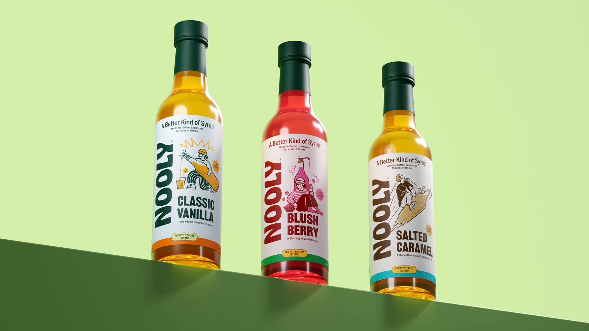
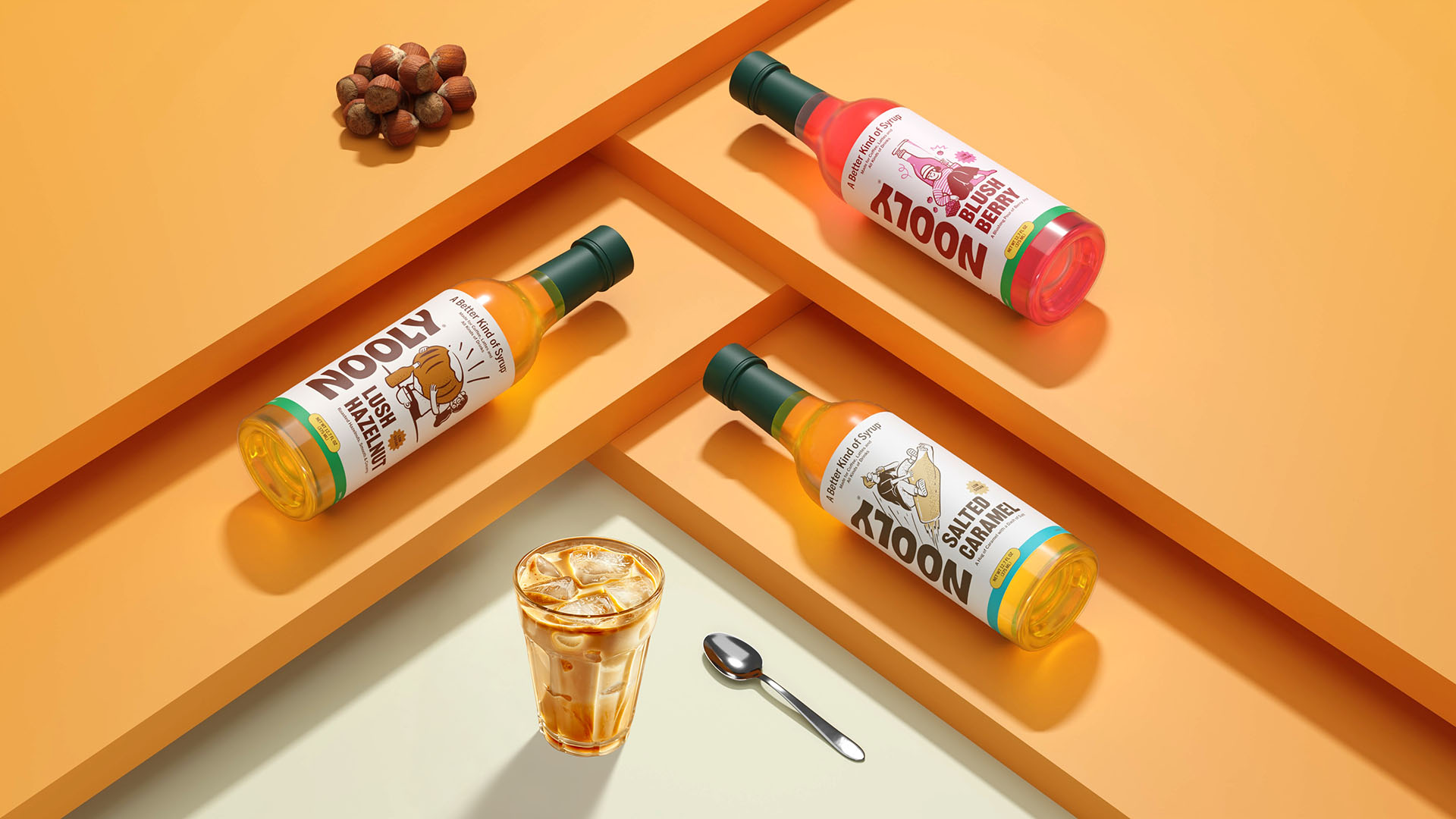
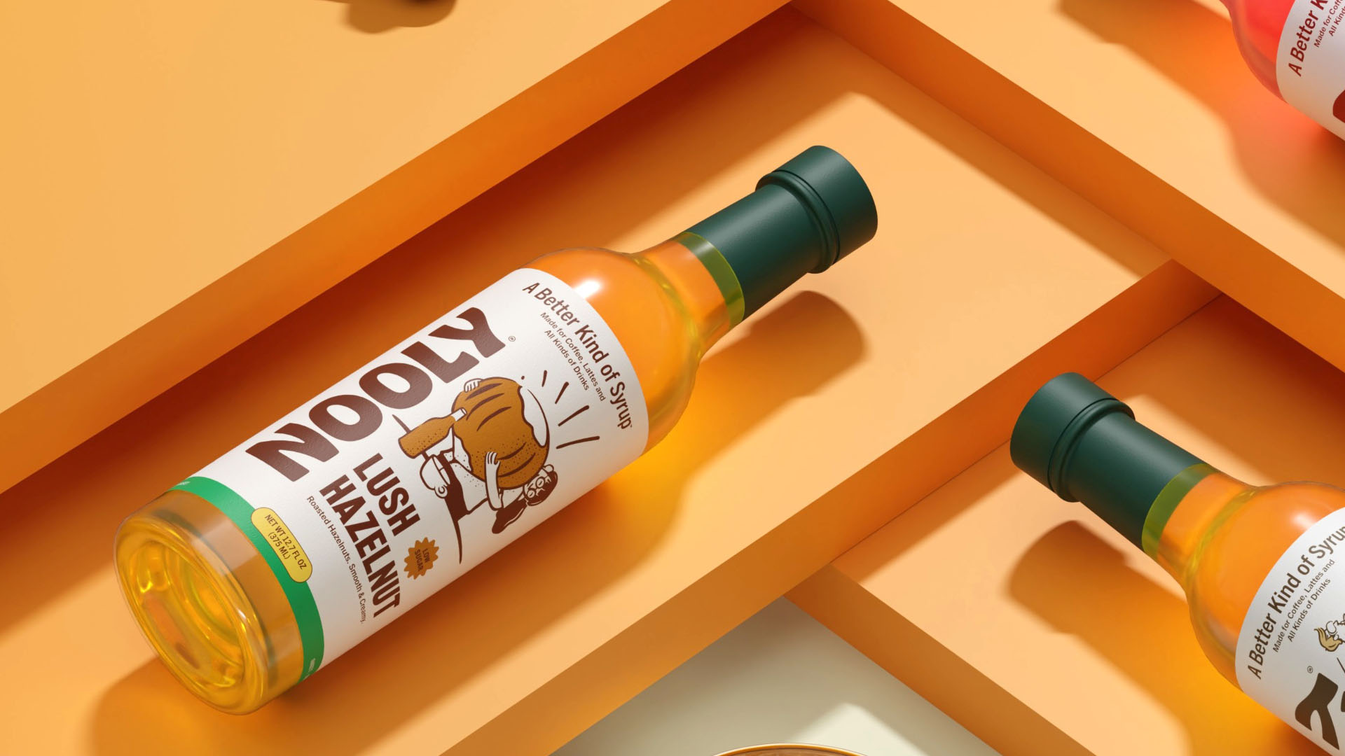
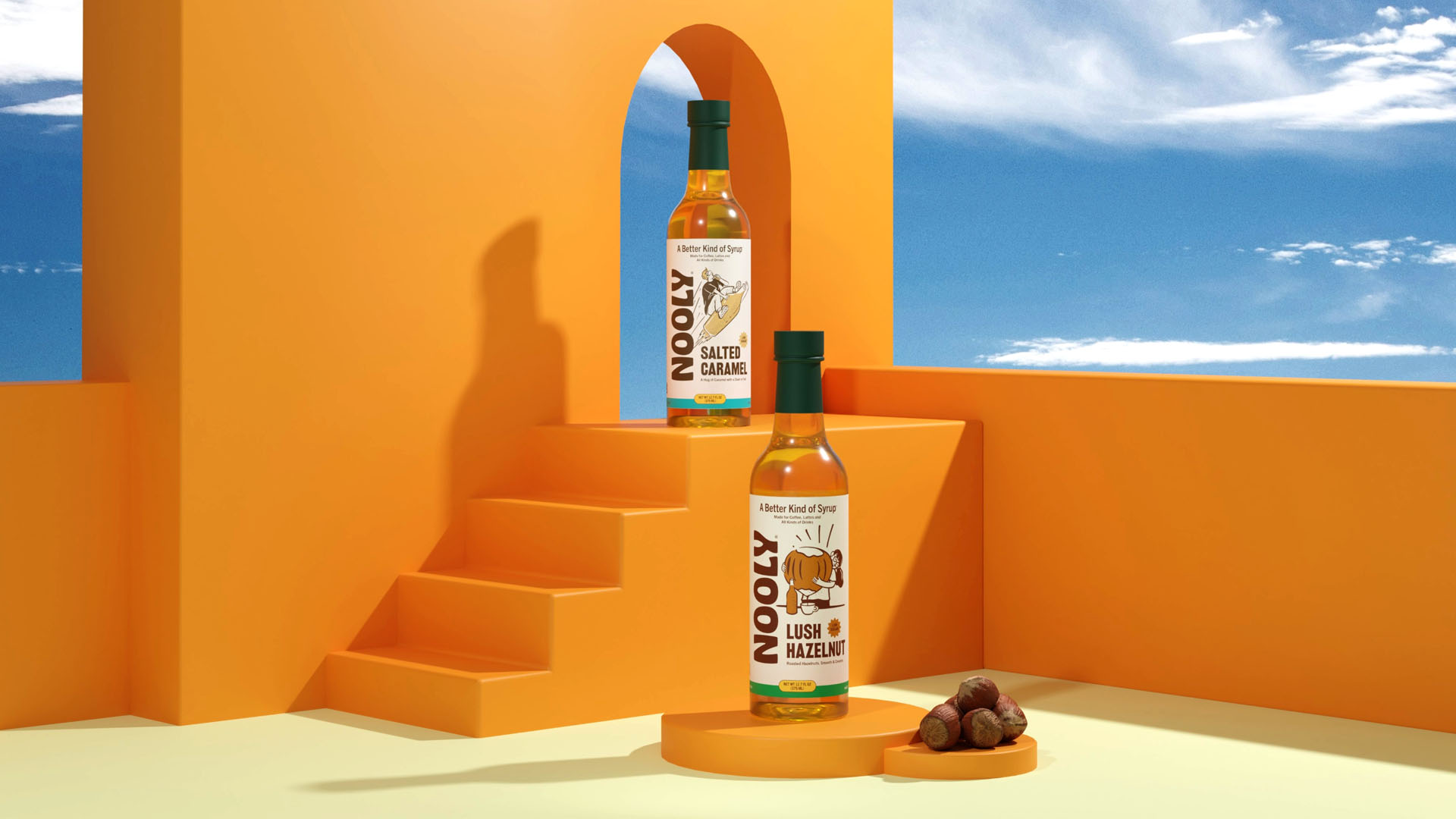
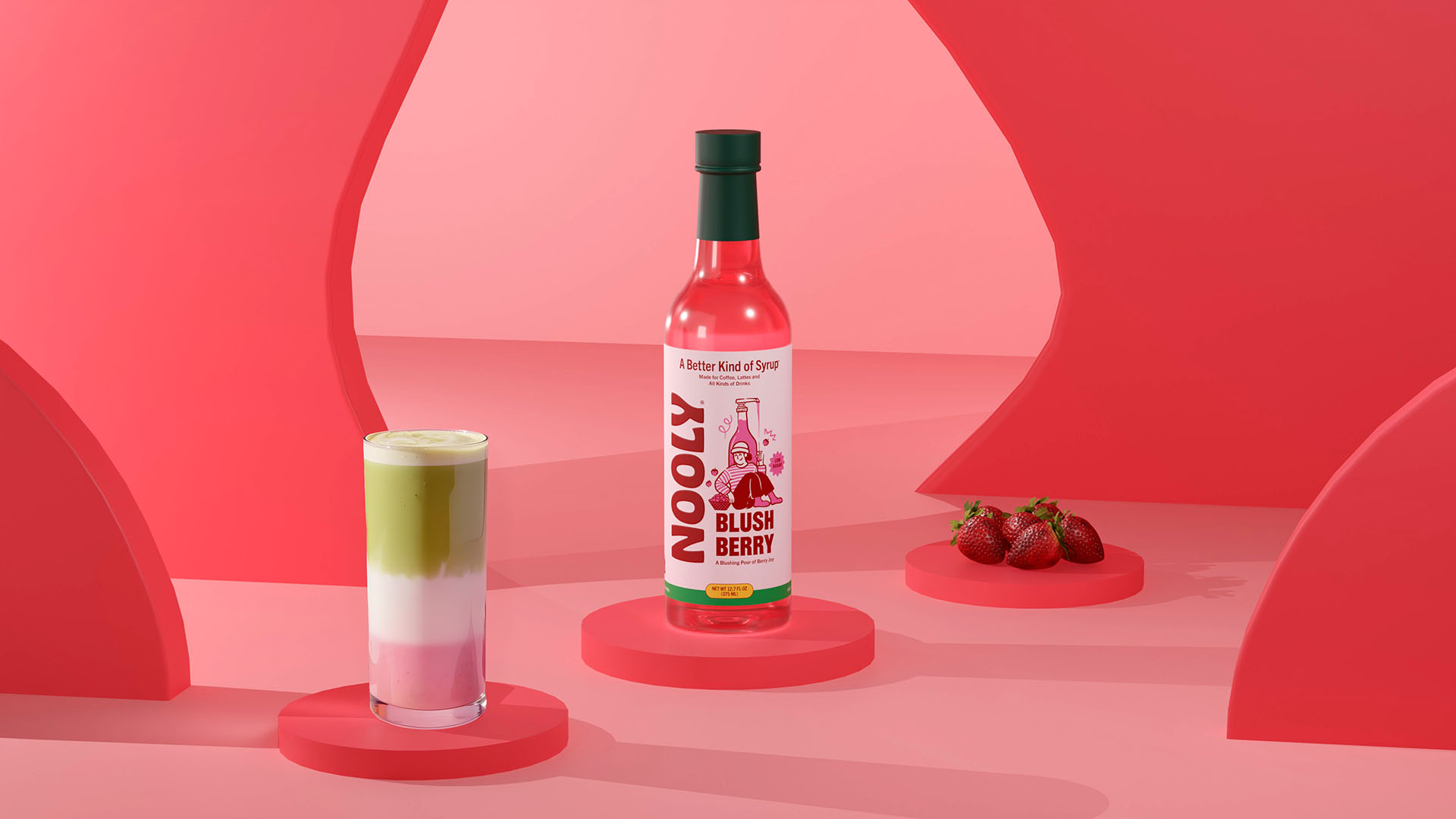
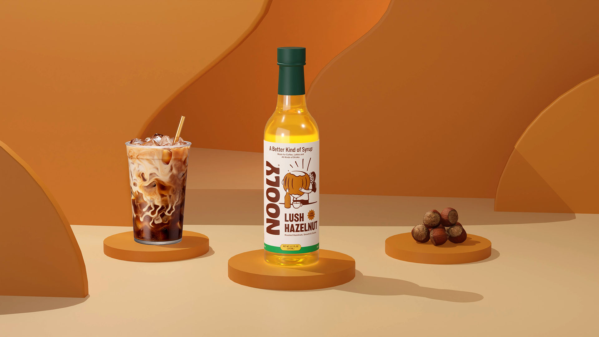
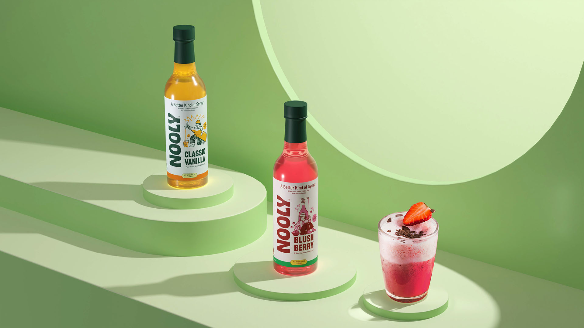
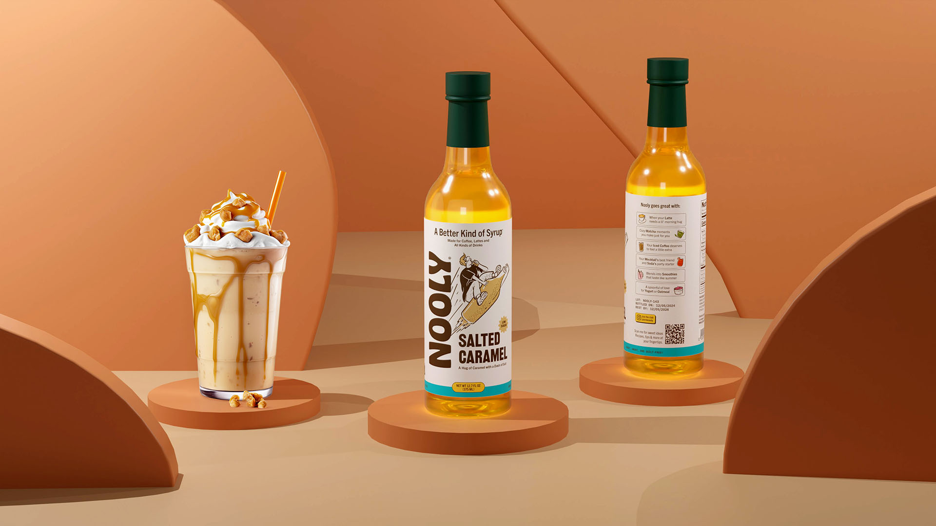
The Nooly logotype, crafted using Hobeaux by OH no Type Co, merges retro charm with contemporary energy—capturing the brand’s playful spirit while maintaining clarity and visual strength at any scale. Its bold proportions ensure shelf standout, while organic detailing reinforces the crafted, real-ingredients narrative. This ensures Nooly’s look is ownable, instantly recognisable, and adaptable across packaging, digital, and experiential touchpoints.
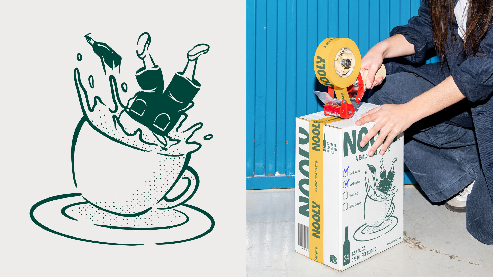
A series of doodle comic hybrid illustrations were developed to give each flavor its own distinctive personality. This style provides high flexibility—scaling from print to digital without losing character—while creating an engaging, flavour-led storytelling layer. The color palette, drawn directly from each variant’s profile, supports intuitive navigation, enhances appetite appeal, and strengthens brand cohesion.
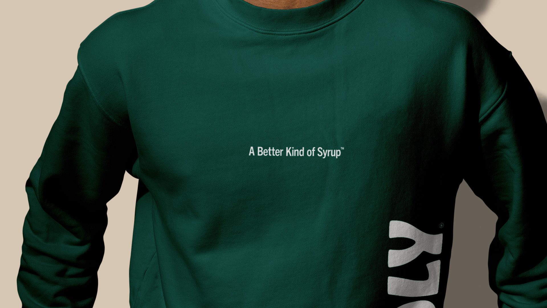
The tagline “A Better Kind of Syrup” acts as the narrative anchor—bridging functional claims (low sugar, prebiotic, natural ingredients) with an emotional promise: all the indulgence, none of the guilt. It appears organically across packaging and communications, reinforcing recall and unifying the brand voice.
A carefully considered typographic hierarchy ensures the brand name, flavor, and key benefits are captured at a glance—whether on a supermarket shelf, café counter, or in an Instagram post. Designed with a digital-first mindset, the identity transitions seamlessly from bottle to screen, ensuring Nooly’s world remains coherent, engaging, and ownable across every interaction.
CREDIT
- Agency/Creative: Widarto Impact
- Article Title: Widarto Impact Delivers a Playful and Modern Identity for Nooly Syrup
- Organisation/Entity: Agency
- Project Type: Packaging
- Project Status: Non Published
- Agency/Creative Country: Indonesia
- Agency/Creative City: Trenggalek
- Market Region: North America
- Project Deliverables: 3D Design, Brand Identity, Copywriting, Graphic Design, Illustration, Logo Design, Motion Graphics, Packaging Design
- Format: Bottle
- Industry: Food/Beverage
- Keywords: FMCG packaging design, FMCG branding agency, Strategic packaging design, FMCG Branding, Global brand identity design, Food & beverage packaging design, Beverage label design, Brand identity for beverage startups,
-
Credits:
Creative Director: Eko Widarto
Illustrator: Dwiken Maulana
3D Artist: Besta Ramadhan


