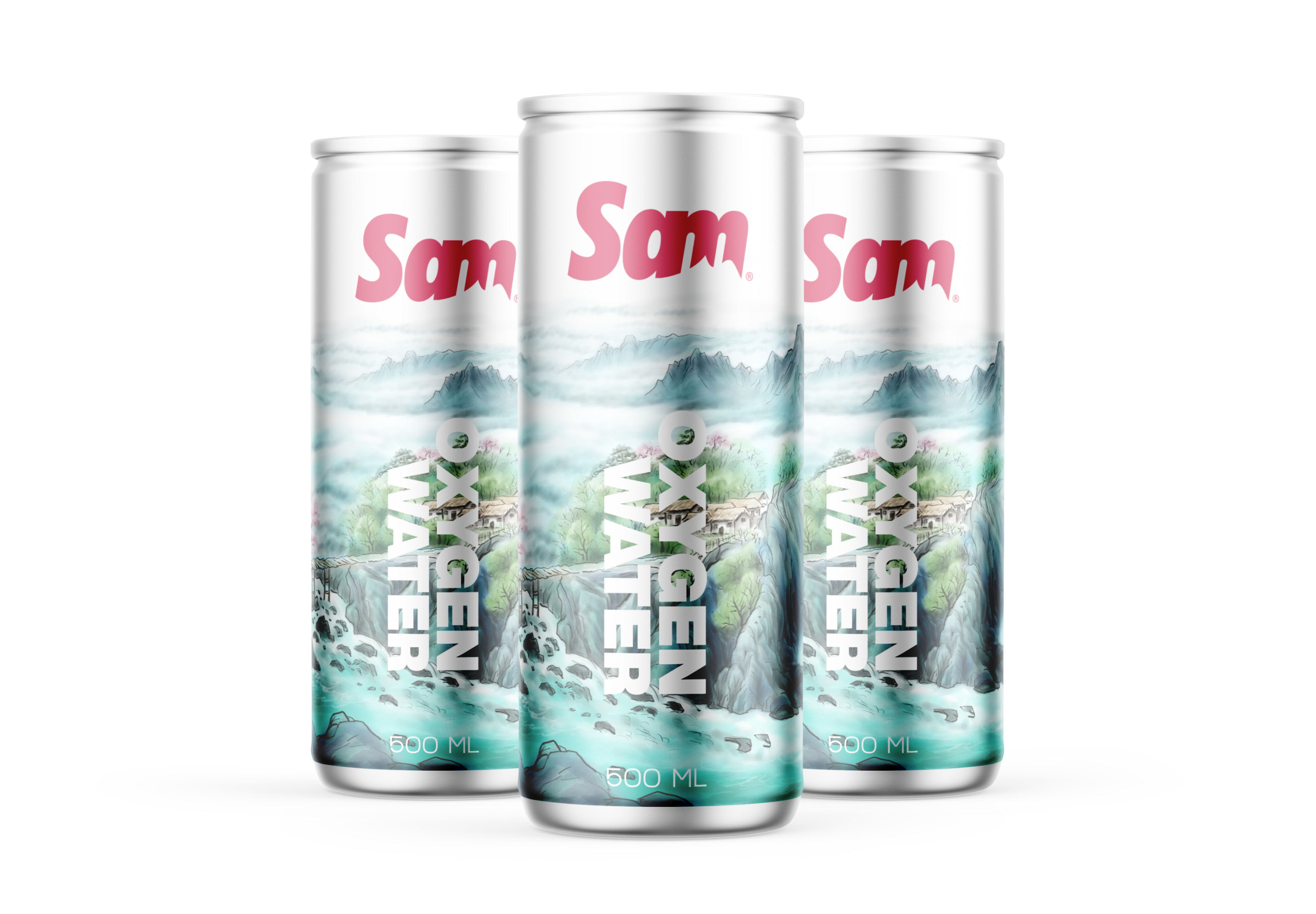
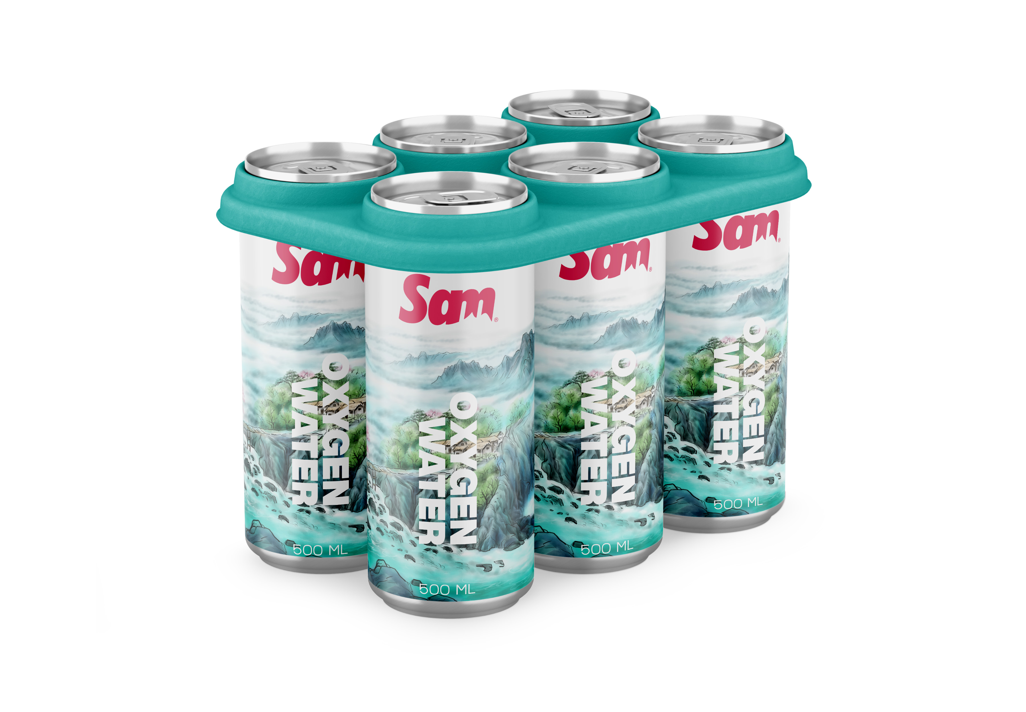
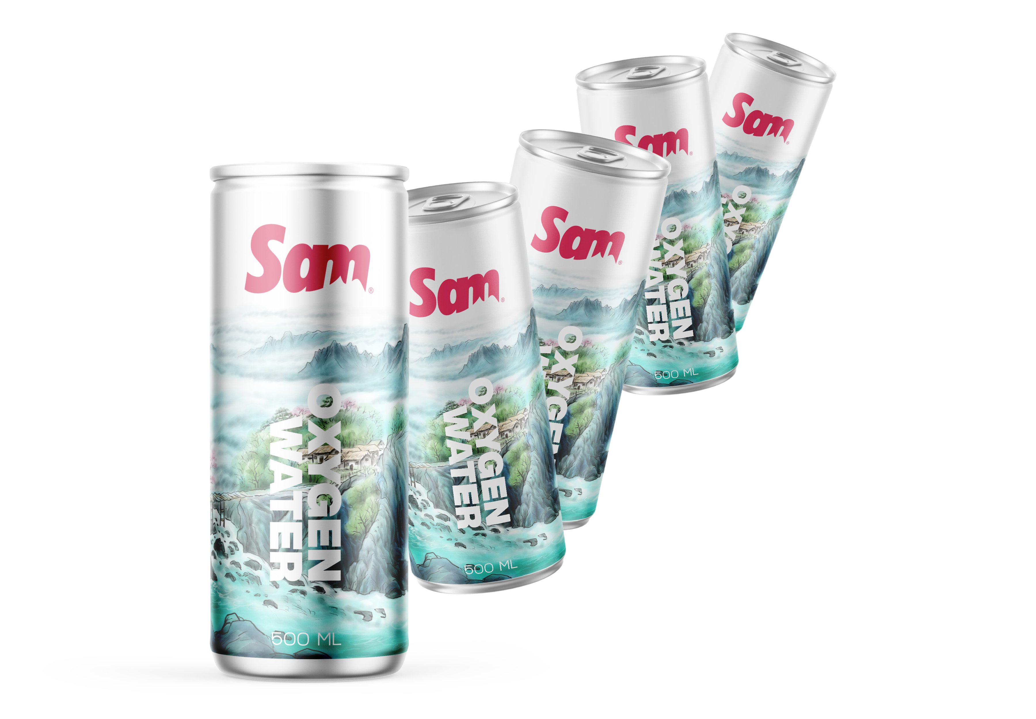
One of Sam’s mineral water development products is Oxygen Water. There are many competitors for this brand category in the market.
There are a number of things that need to be done in detail such as competitive analysis and visual appearance of packaging on the shelf compared to competing products.
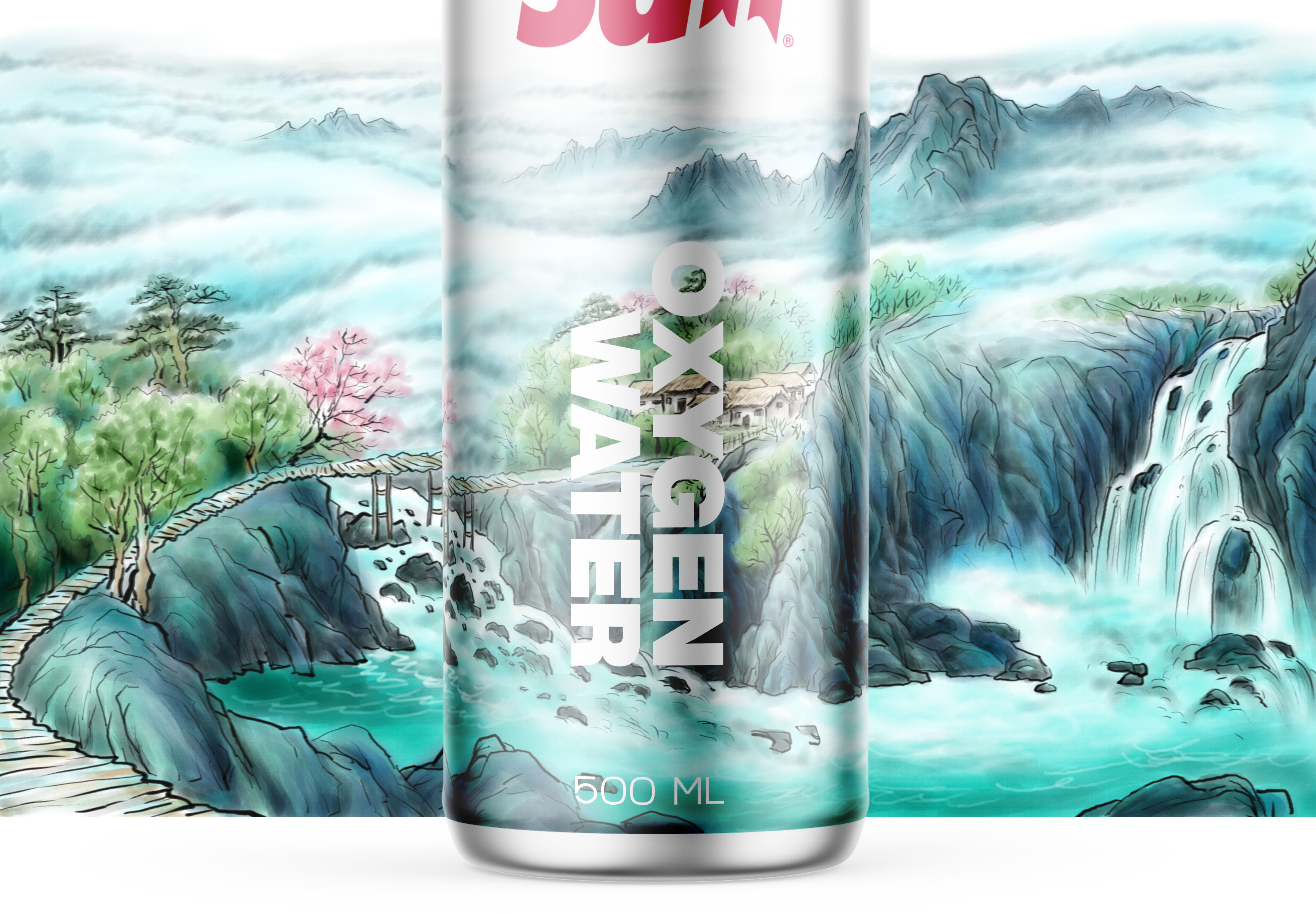
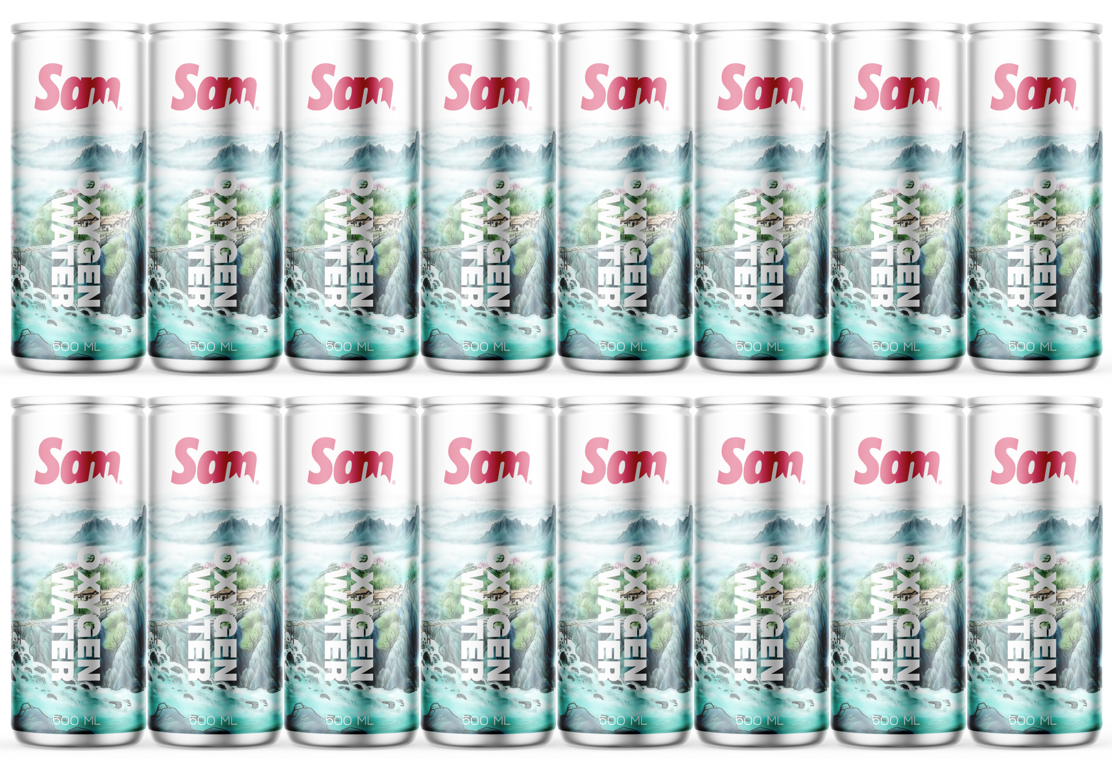
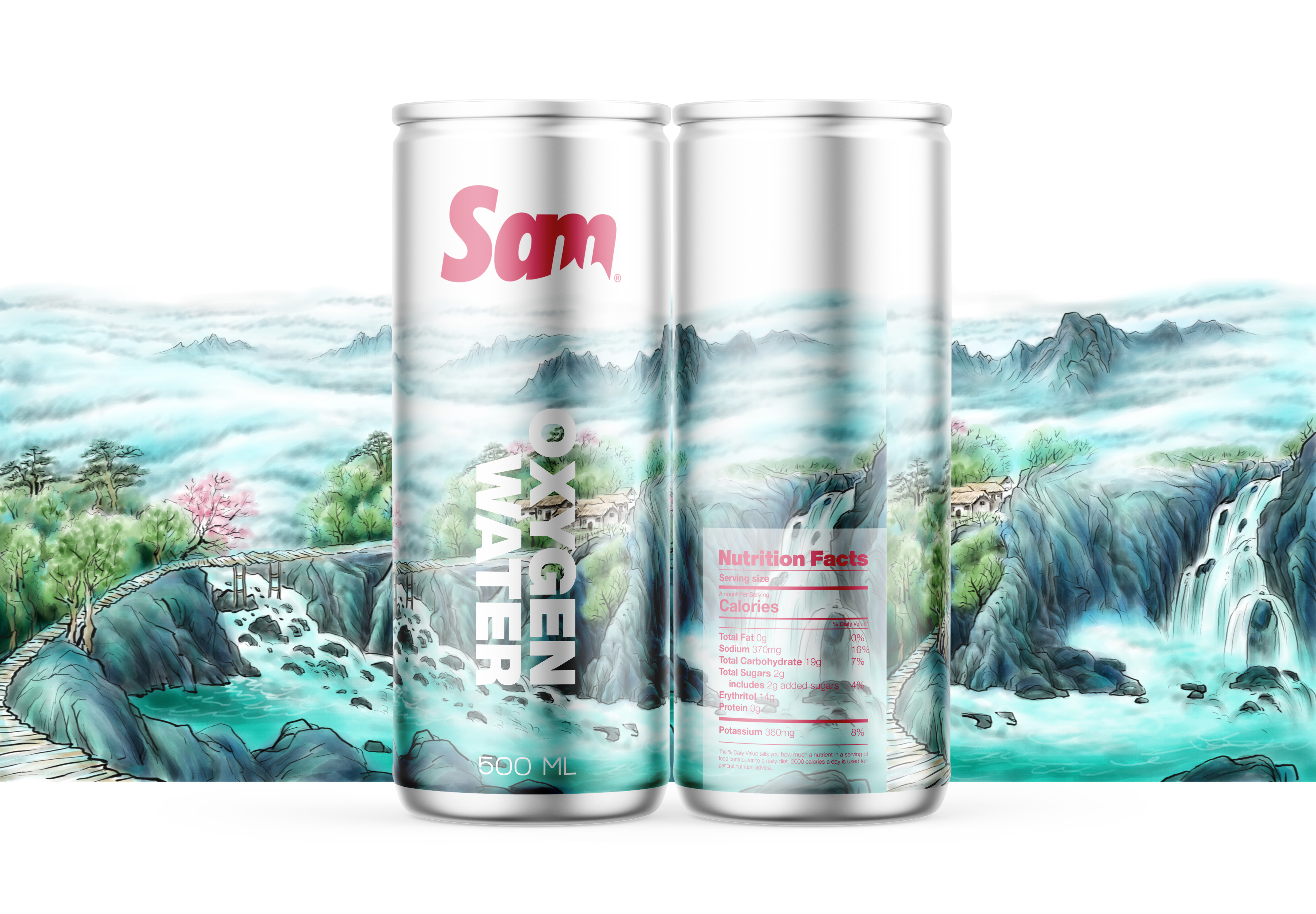
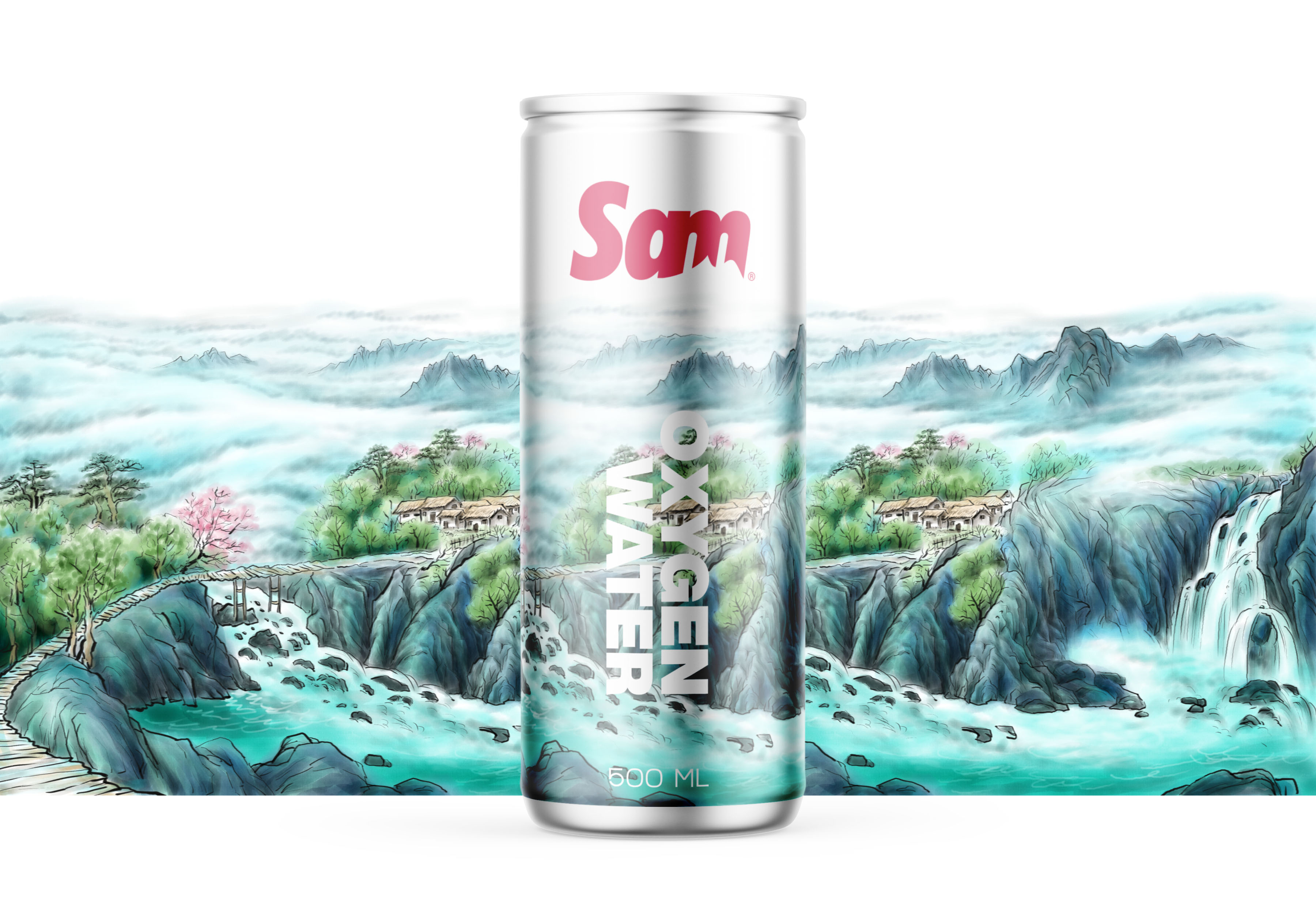
From all that we finally concluded that the design of cans must be bold, displaying the freshness of natural elements, dynamic and casual and modern looks.
We make a beautiful natural illustration where this is the “Stopping Power” of packaging when potential customers search for drinking water on oxygen store shelves.
CREDIT
- Agency/Creative: Widarto Impact
- Article Title: Widarto Impact Creating “Nature Touch” for SAM Oxygen Water Can Packaging
- Organisation/Entity: Agency, Published Commercial Design
- Project Type: Packaging
- Agency/Creative Country: Indonesia
- Market Region: Asia
- Project Deliverables: Brand Architecture, Brand Creation, Brand Guidelines, Brand Identity, Brand Strategy, Graphic Design, Identity System, Illustration, Packaging Design, Research, Retail Brand Design, Tone of Voice
- Format: Can
- Substrate: Metal
FEEDBACK
Relevance: Solution/idea in relation to brand, product or service
Implementation: Attention, detailing and finishing of final solution
Presentation: Text, visualisation and quality of the presentation


