


With the increasingly trending coffee business in the world, coffee has become the most popular drink in the world, beating other types of drinks. Many coffee business owners continue to innovate to increase brand awareness, become more artistic and increasingly complex.
Widarto Impact has created a visual identity and packaging for SA&B to stand out from the competition. We make coffee back to the beginning, about simplicity. Widarto Impact takes a straightforward, simple, and iconic visual approach.
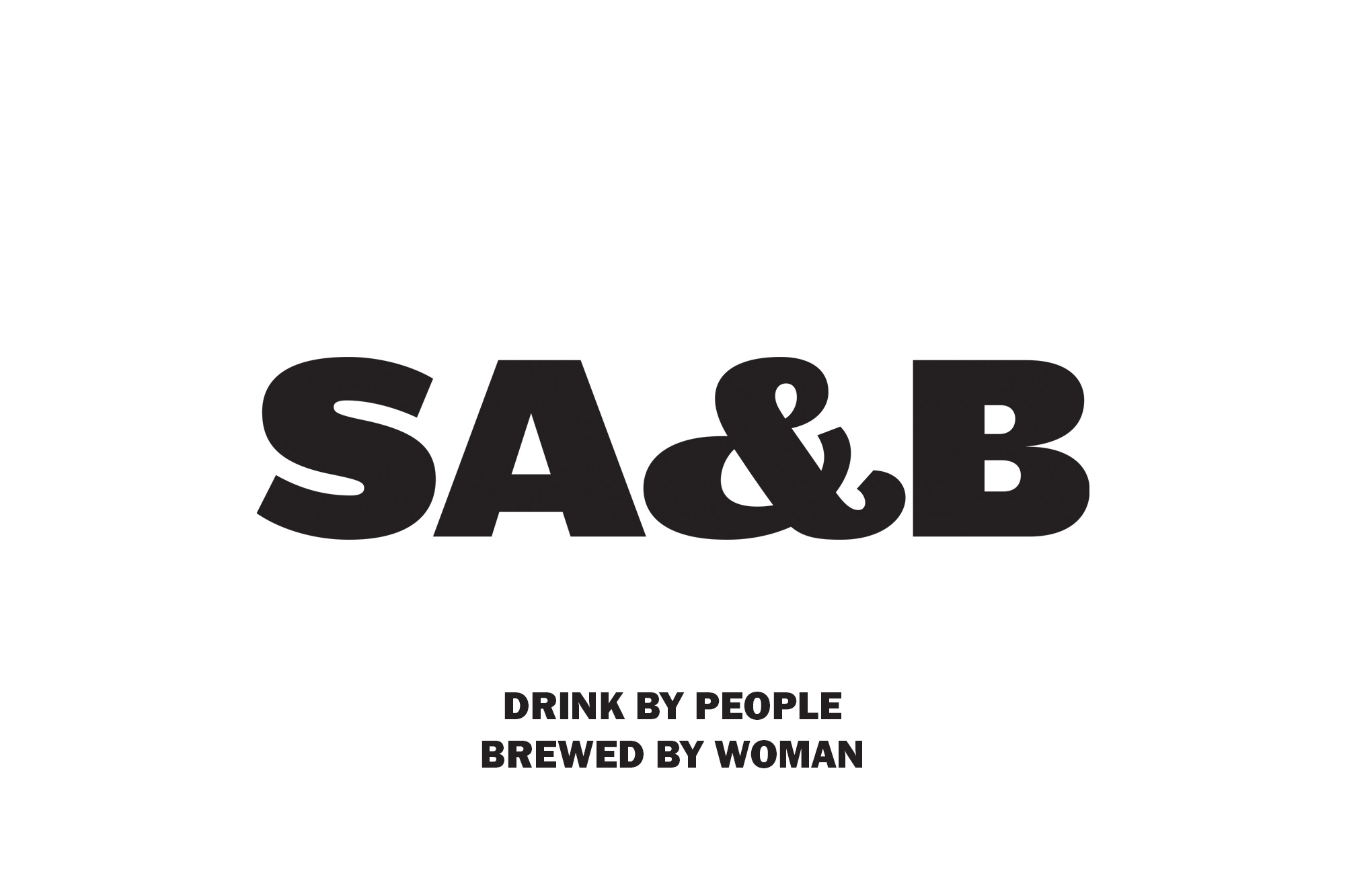
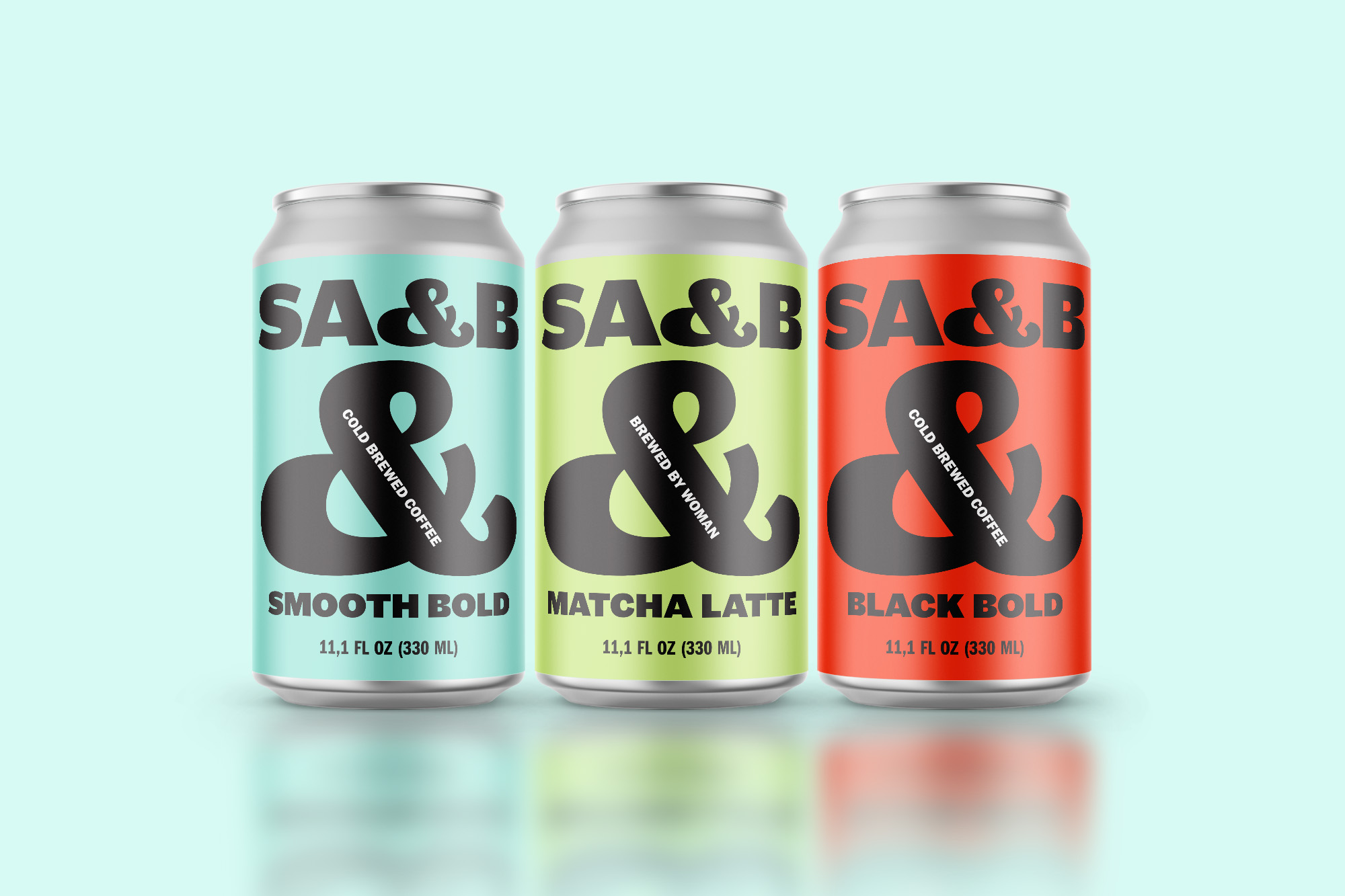
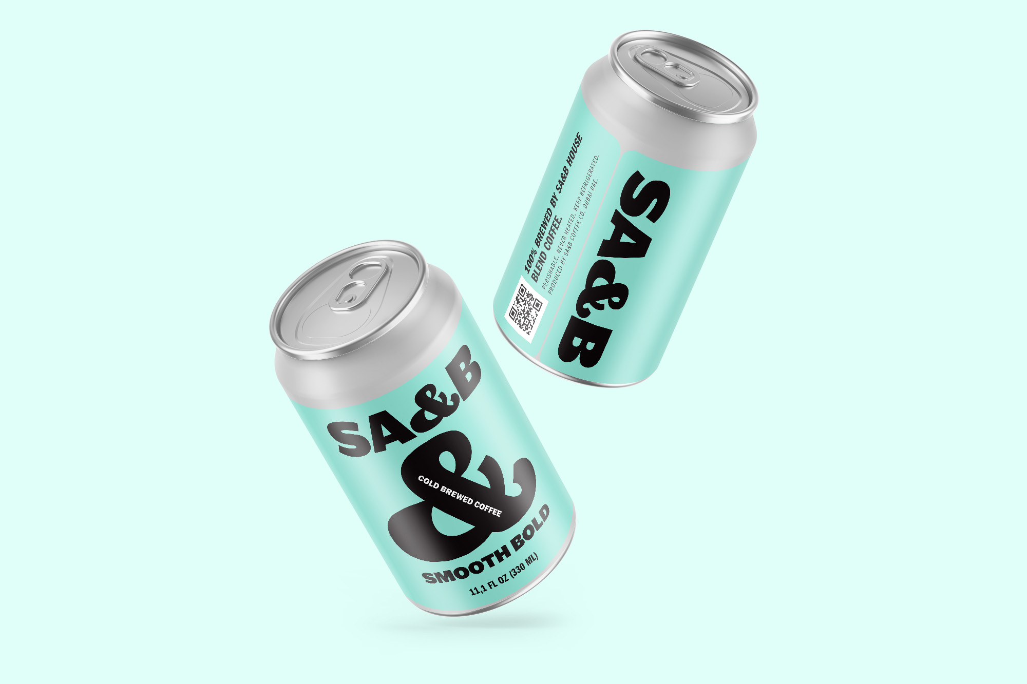
We consult with clients to do the naming. The naming is short, and bold is different from the others. A name that is not just a name, but becomes part of the brand’s visual identity. SA&B comes from the phrase “Stand Alone & Brave”, where drinking is a way of attention, my time and happiness.
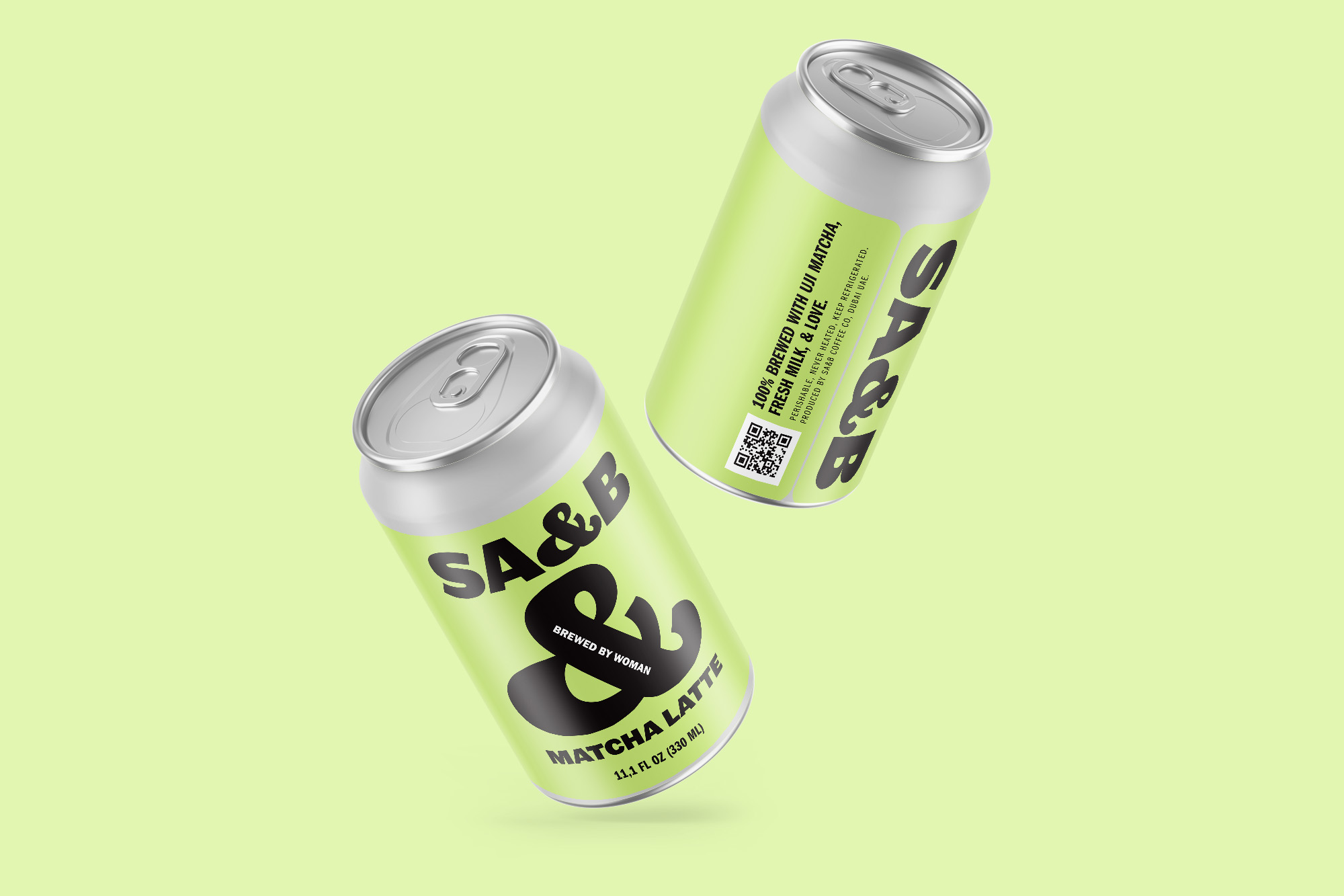
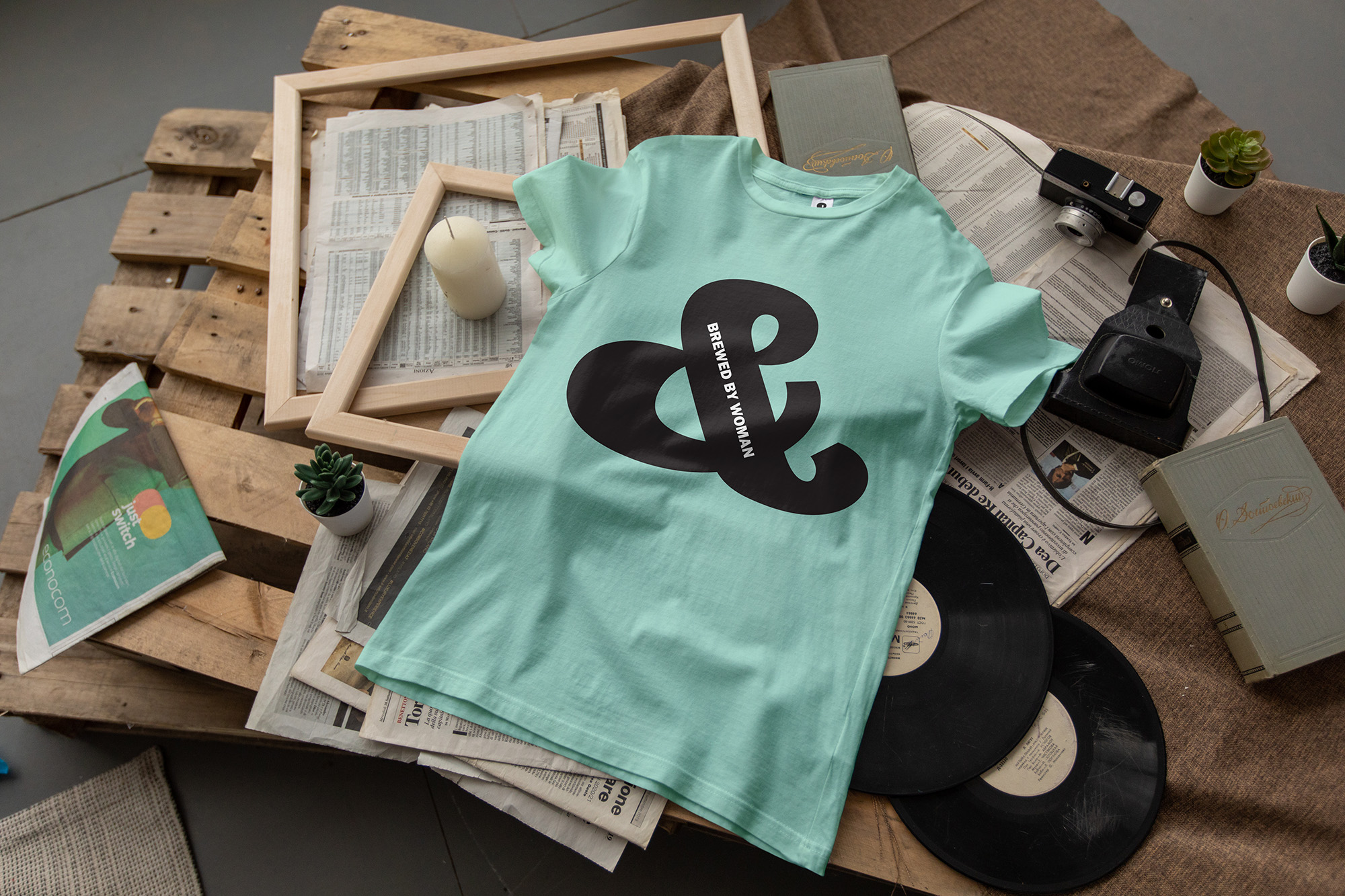
Where the brand owner is a female barista who designs all SA&B drink recipes, Widarto Impact wrote the slogan “Brewed by Woman”, unique, short, and powerful.
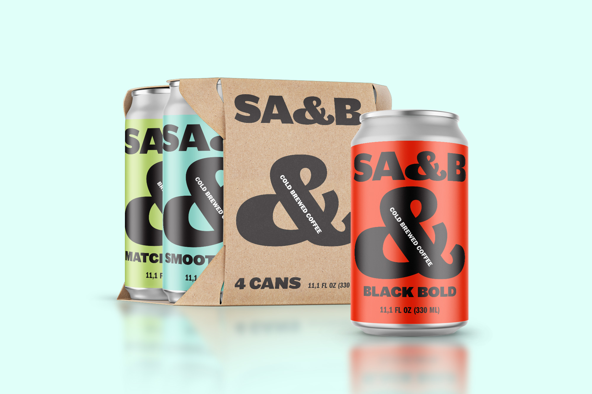
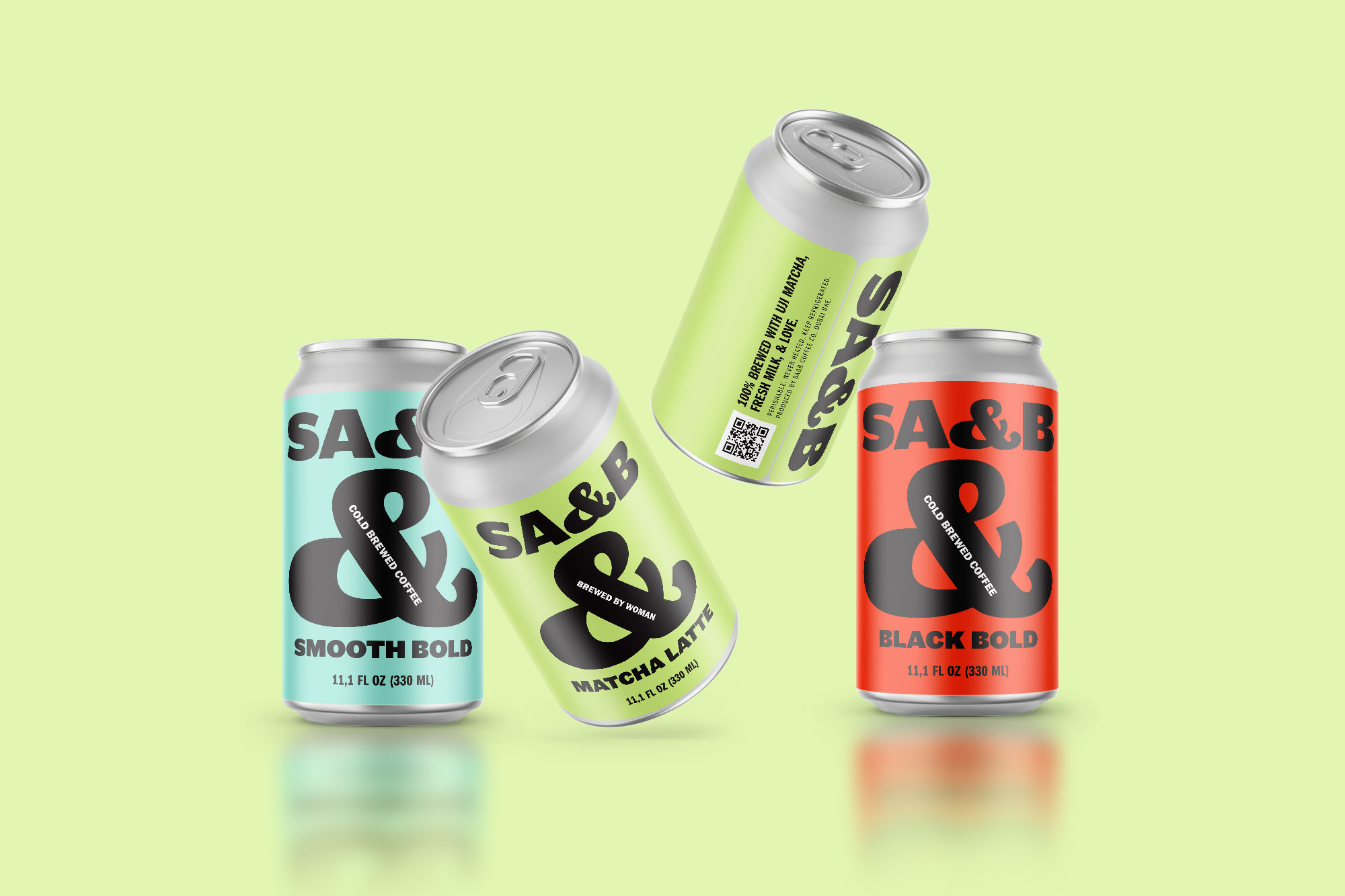
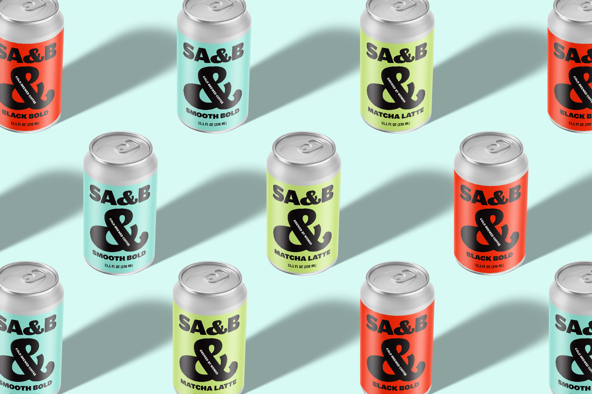
With the “&” sign as an iconic visual identity that will be displayed throughout all brand communications.
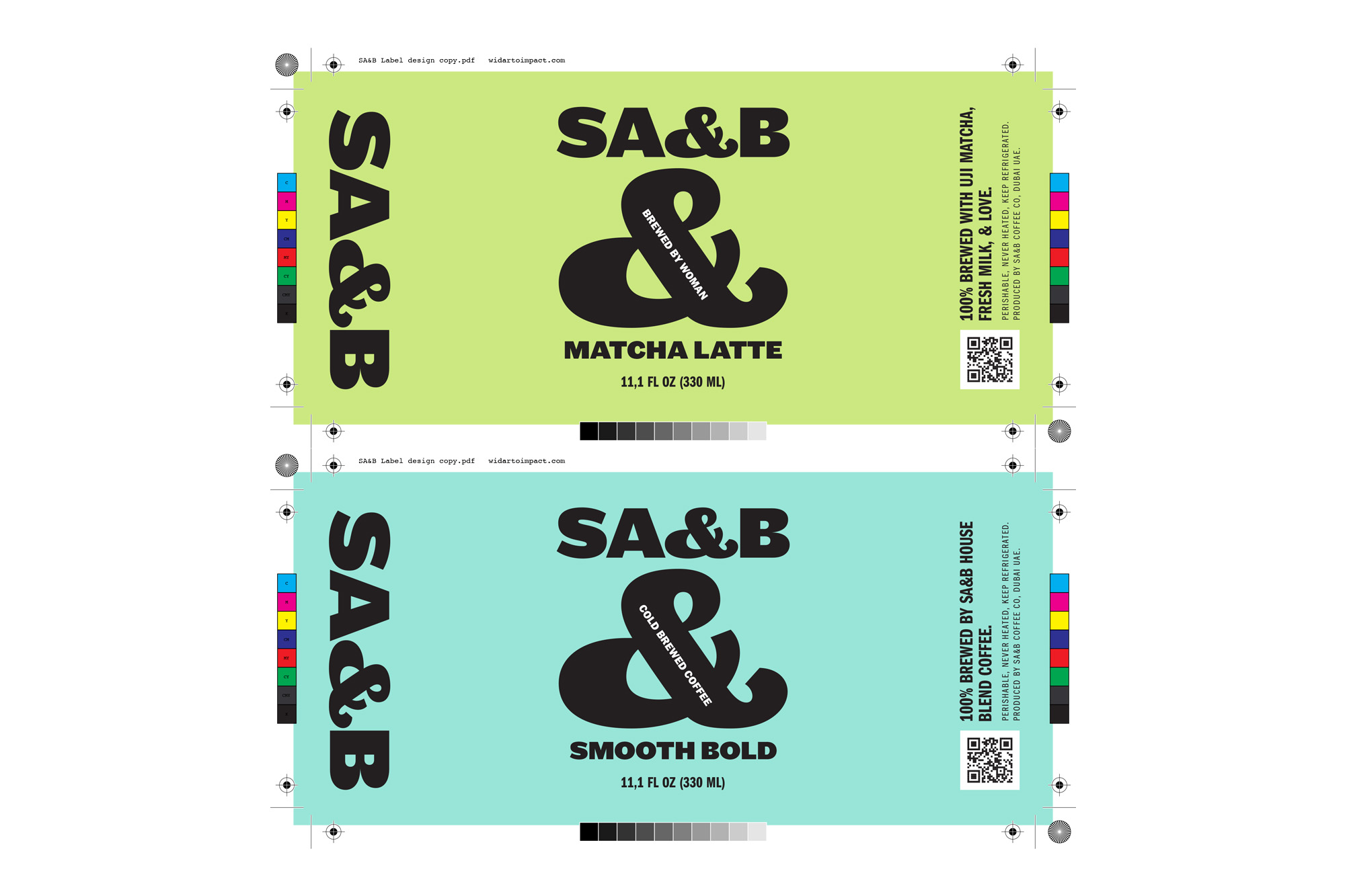
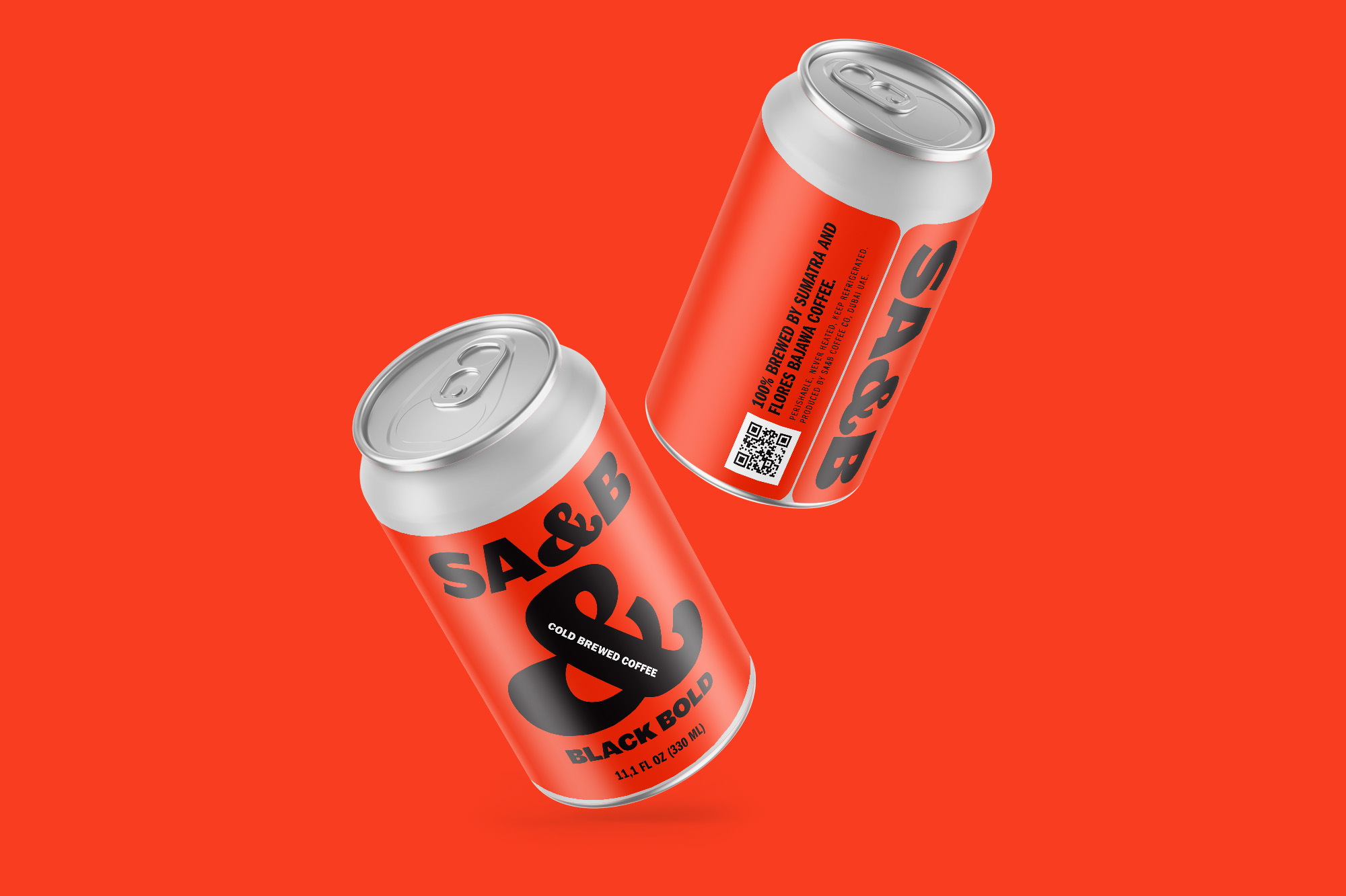
This simplicity carries over to all elements of the packaging, giving creative space to icons and colours to convey the product message. The designers of Widarto Impact developed a basic design framework by choosing a type of typography that is simple but has a strong character. The logo and flavor names are made from the Maple typeface, combined with the Franklin Gothic URW font for the product description.
Each type of beverage variant is distinguished based on the background color by a large “&” sign with a tagline attached to the sign. The colors chosen represent the impression of playful, and sometimes bold. This adjusts the type of variant and tagline of each product. But must reduce the impression of luxury and classic.
CREDIT
- Agency/Creative: Widarto Impact
- Article Title: Widarto Impact Brings SA&B Coffee Out of Competition With an Iconic Visual Identity
- Organisation/Entity: Agency
- Project Type: Identity
- Project Status: Published
- Agency/Creative Country: Indonesia
- Agency/Creative City: Surabaya
- Market Region: Middle East
- Project Deliverables: Brand Identity, Brand Naming, Packaging Design
- Industry: Food/Beverage
- Keywords: Cold Brew Packaging Design, Coffee Branding, Coffee Brand Identity, Ready to drink coffee, Branding Agency Riyadh, Branding Agency Jeddah, Branding Agency Makkah, London Branding Agency, Indonesia Branding Agency, Branding Agency Jakarta, Branding Agency Australia, Branding Agency Surabaya, Design for Packaging, Brand Identity Design, Coffee Brand Identity, Visual Identity,
-
Credits:
Chief Creative Director: Eko Widarto


