


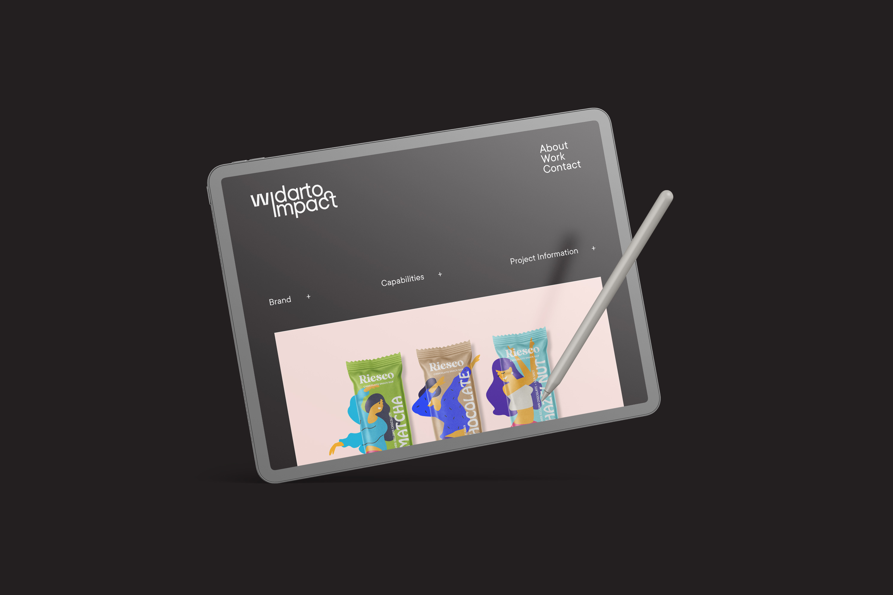
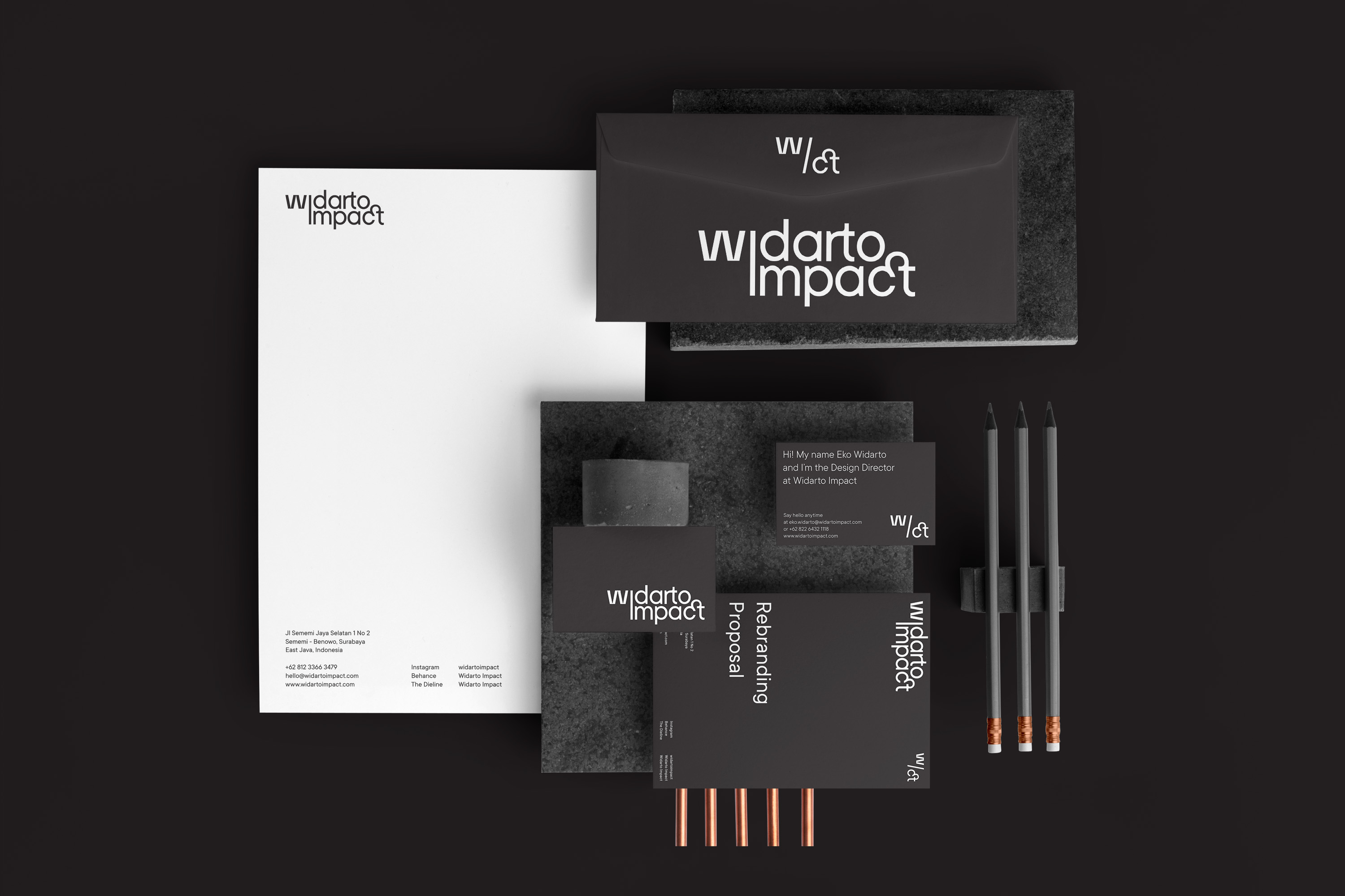
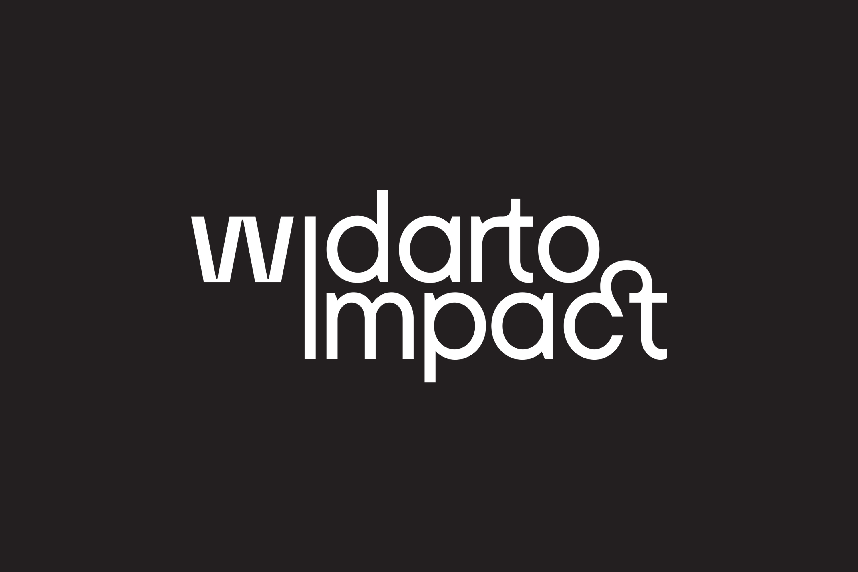
Widarto Impact is an independent branding & packaging design agency from Surabaya, Indonesia. This year, Widarto Impact has changed its logo more simply, flexibly, and added the word “Impact” to the Widarto logo which was previously only written Widarto.
The impact on the Widarto logo communicates that Widarto is not only making designs but is more about a strong brand communication strategy and has an impact on client business growth, specifically supporting increased product sales. But it also increases the value of the brand image itself.
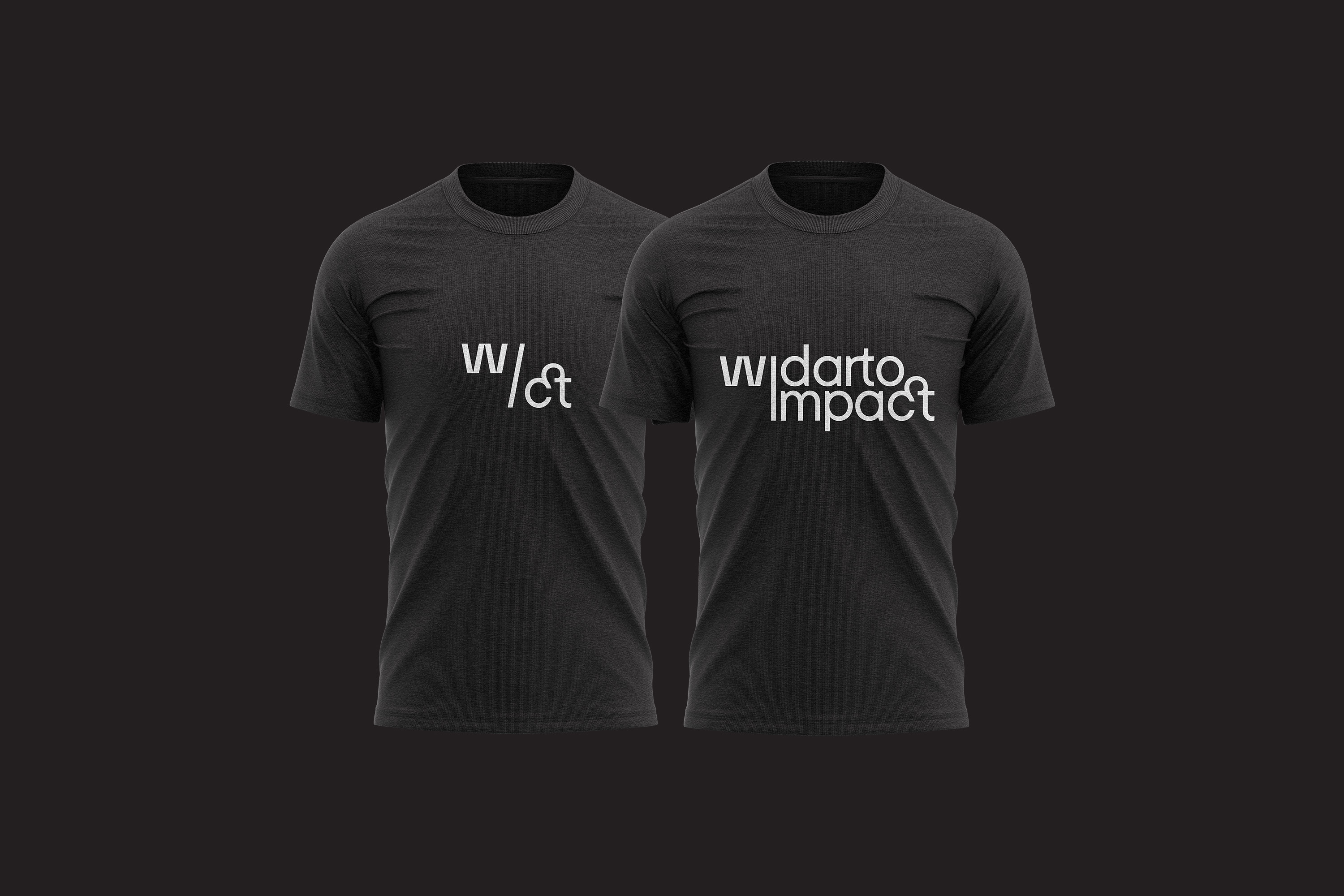
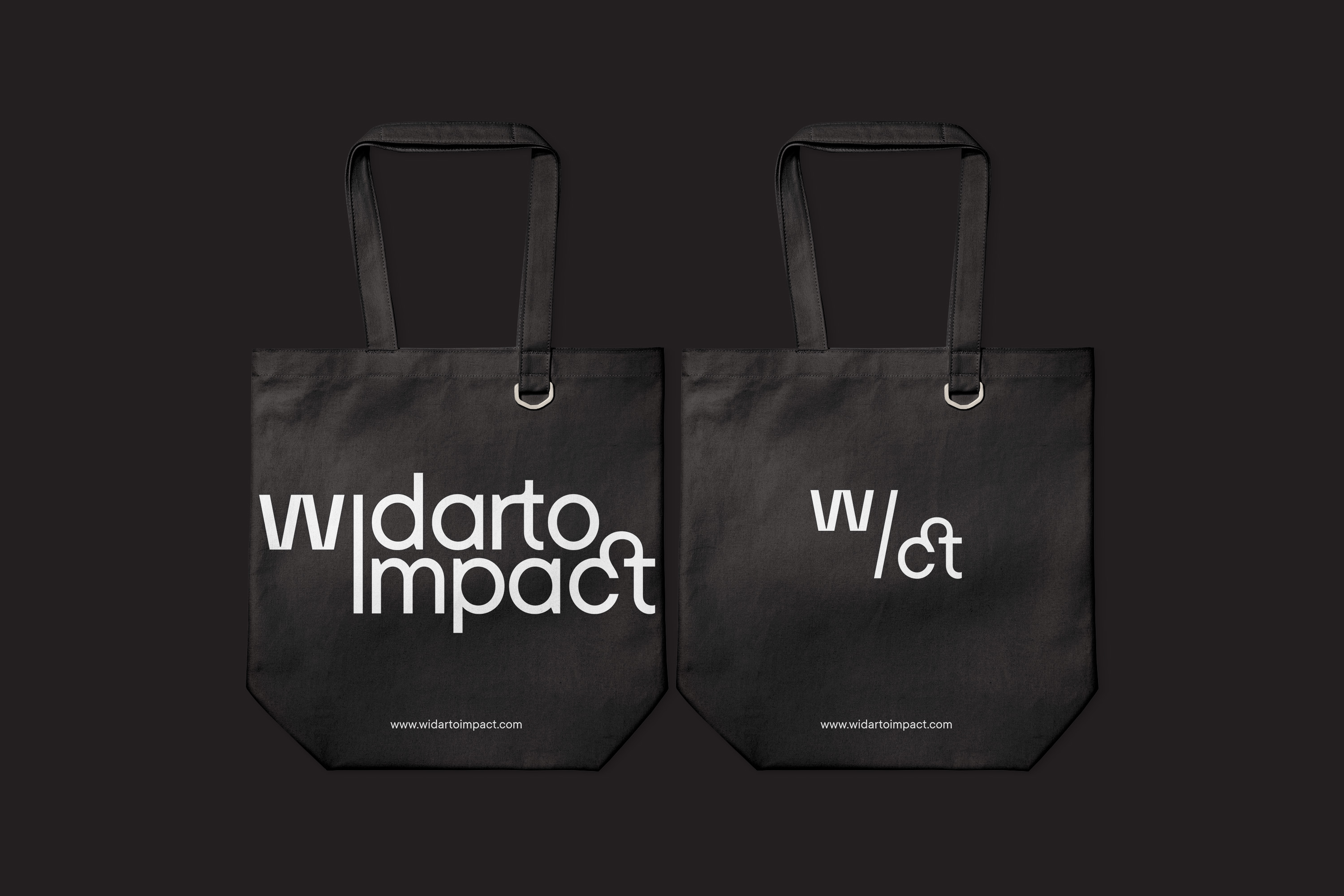
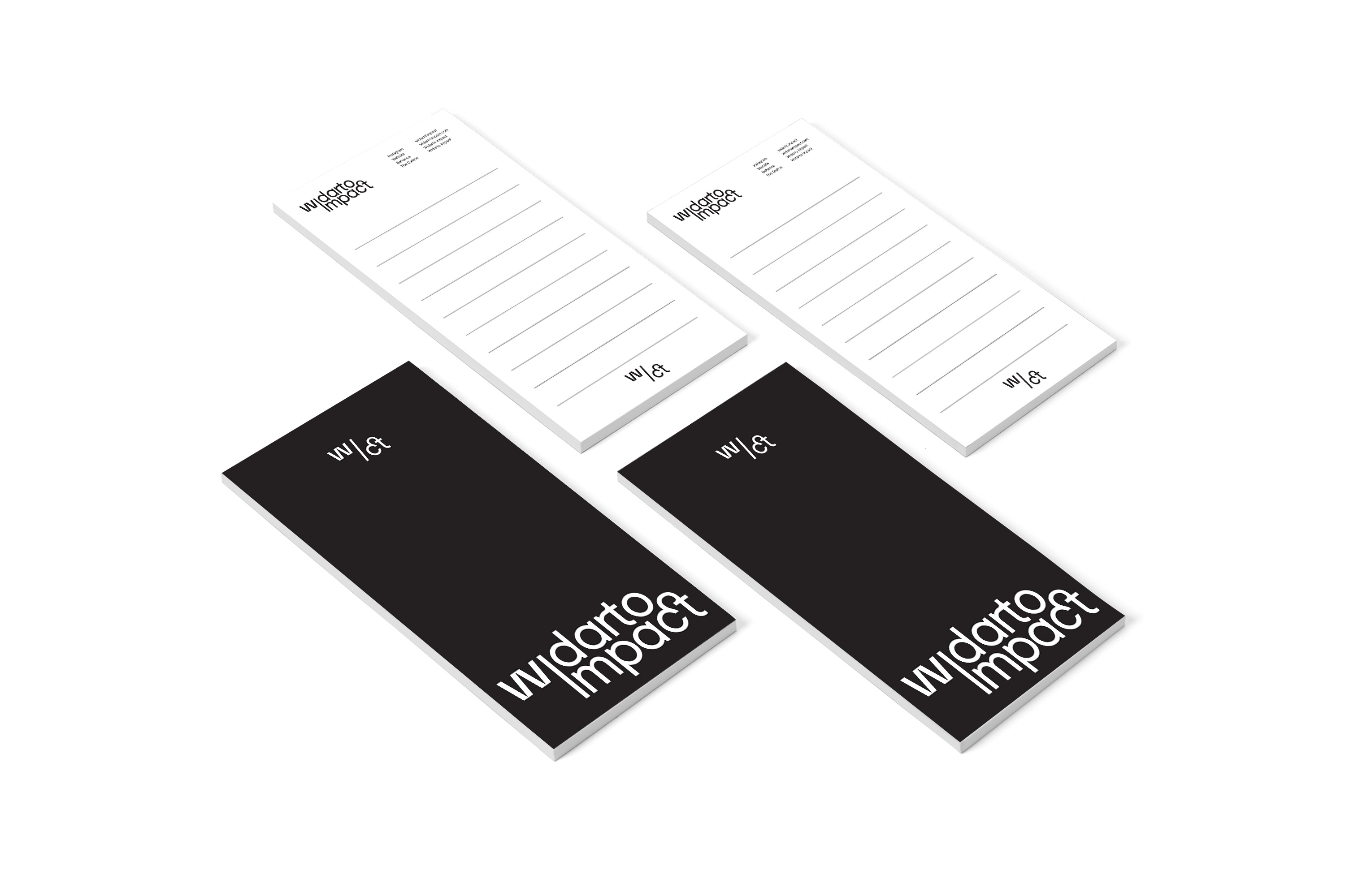
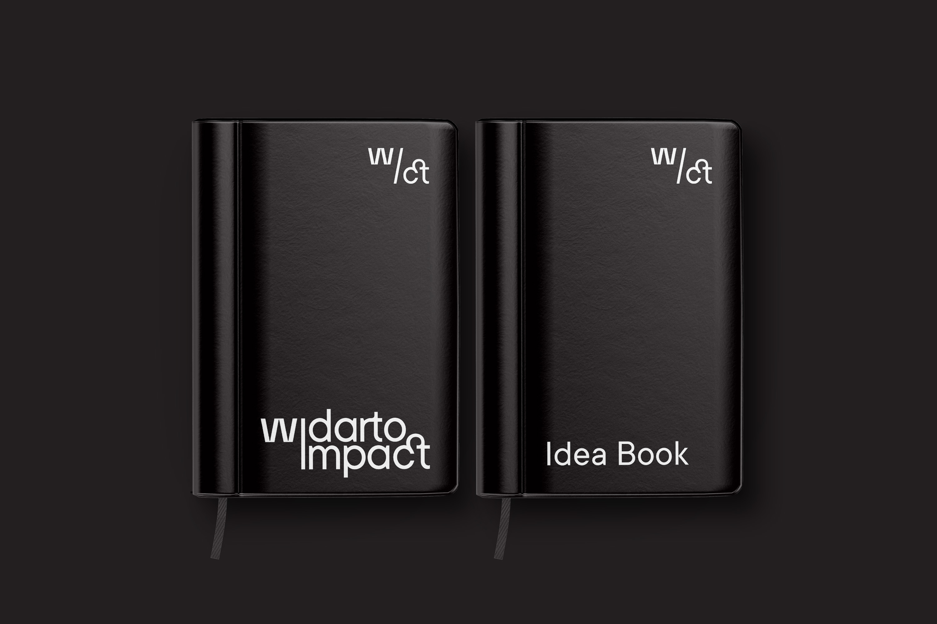
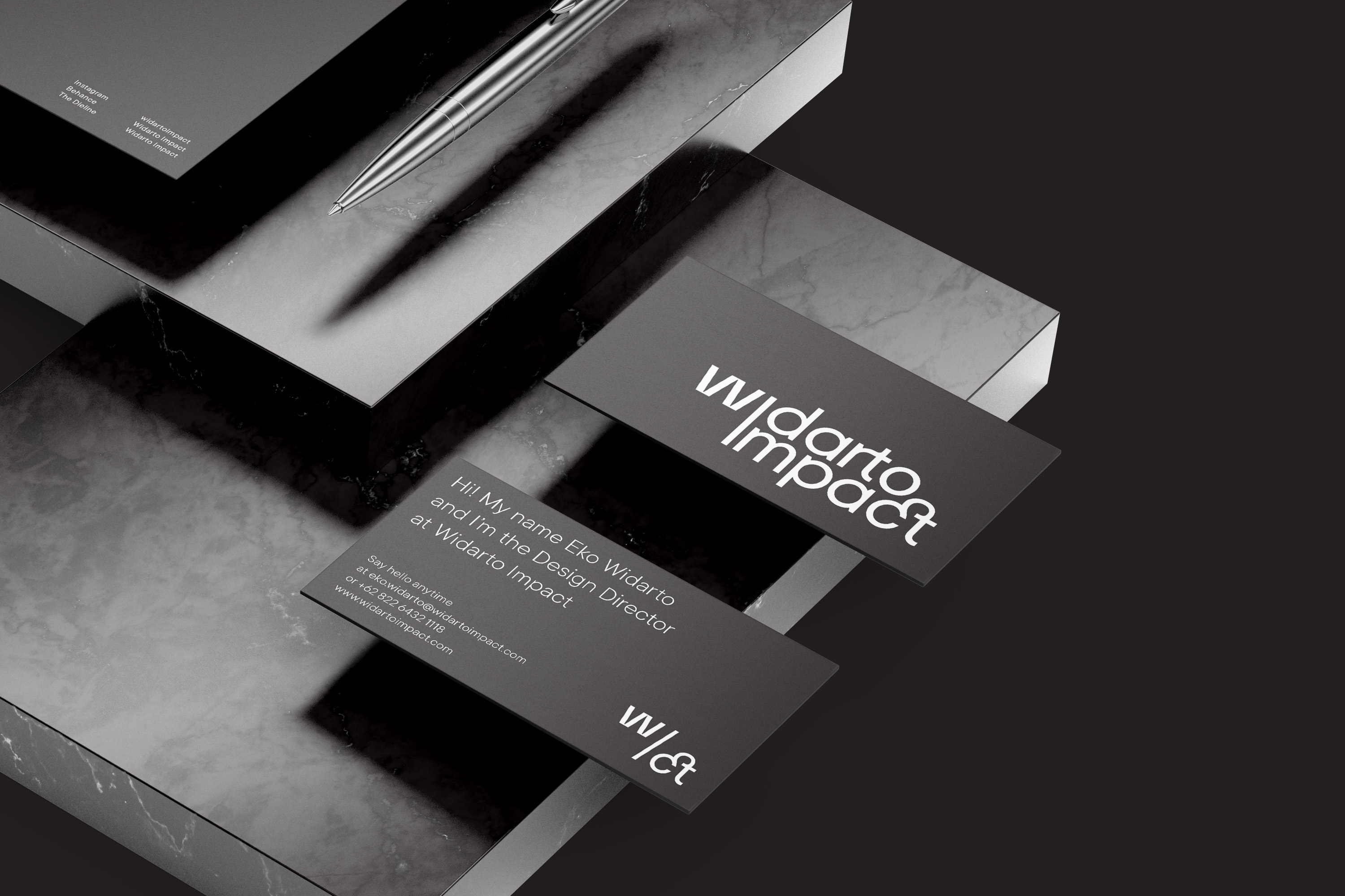
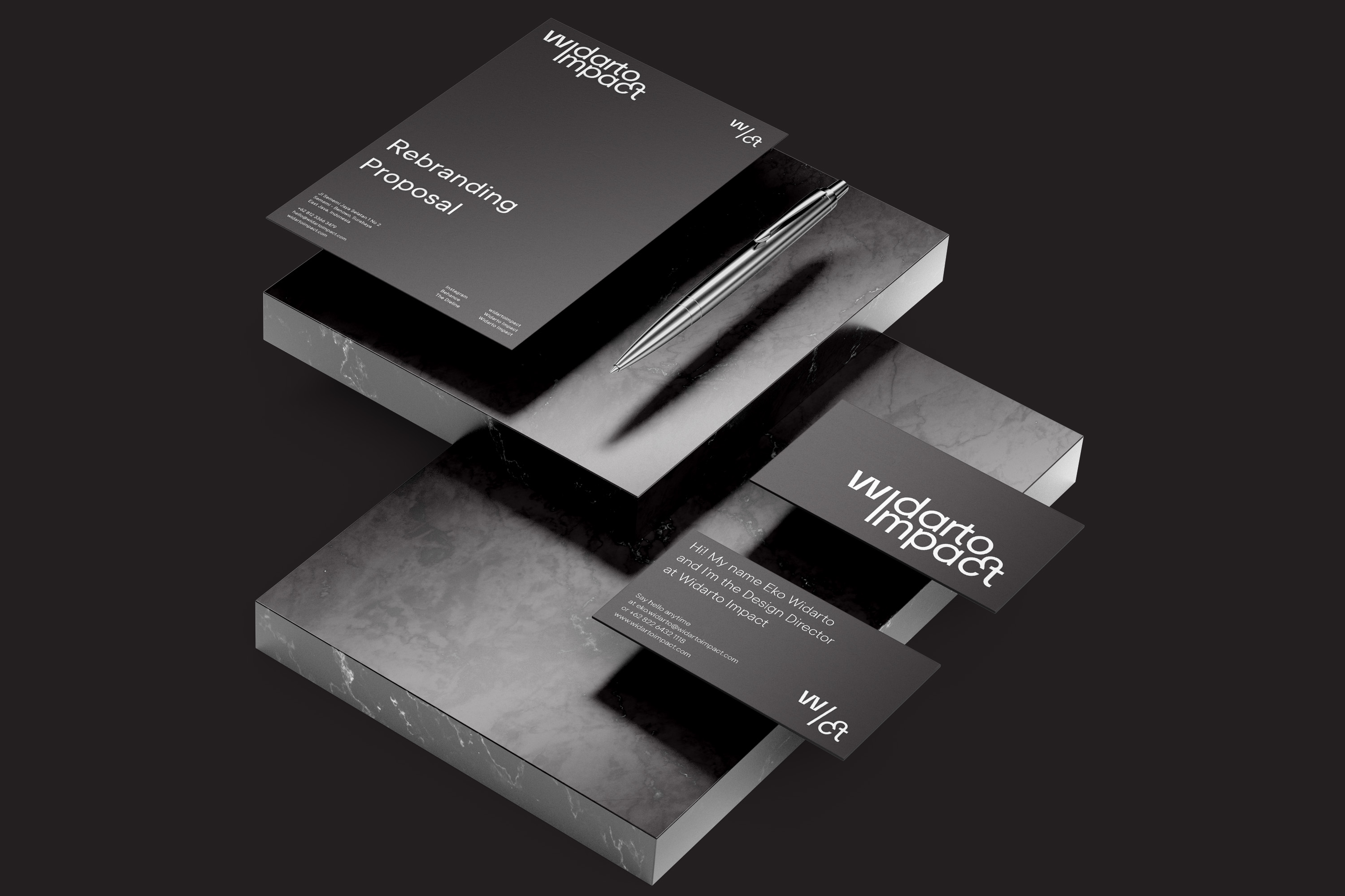
The Widarto Impact logo is also symbolized by W / CT which stands for Widarto Impact itself.
For the company’s colors, Widarto Impact still maintains strong basic colors, black and white.


CREDIT
- Agency/Creative: Widarto Impact
- Article Title: Widarto Impact Brand Identity Redesign
- Organisation/Entity: Agency, Published Self Promotional Design
- Project Type: Identity
- Agency/Creative Country: Indonesia
- Market Region: Global
- Project Deliverables: Brand Creation, Brand Experience, Brand Guidelines, Brand Identity, Brand Redesign, Brand Refinement, Brand Rejuvenation, Brand Strategy, Branding, Graphic Design, Identity System, Rebranding, Research, Tone of Voice
- Industry: Retail
- Keywords: Redesign, Logo Redesign, Brand identity, Brand identity design, logo design, design agency, Asia Design Agency, Indonesia Design Agency, Branding, Graphic Design Studio, Branding Agency Jakarta, Branding Agency Surabaya, Branding Agency Indonesia
FEEDBACK
Relevance: Solution/idea in relation to brand, product or service
Implementation: Attention, detailing and finishing of final solution
Presentation: Text, visualisation and quality of the presentation


