


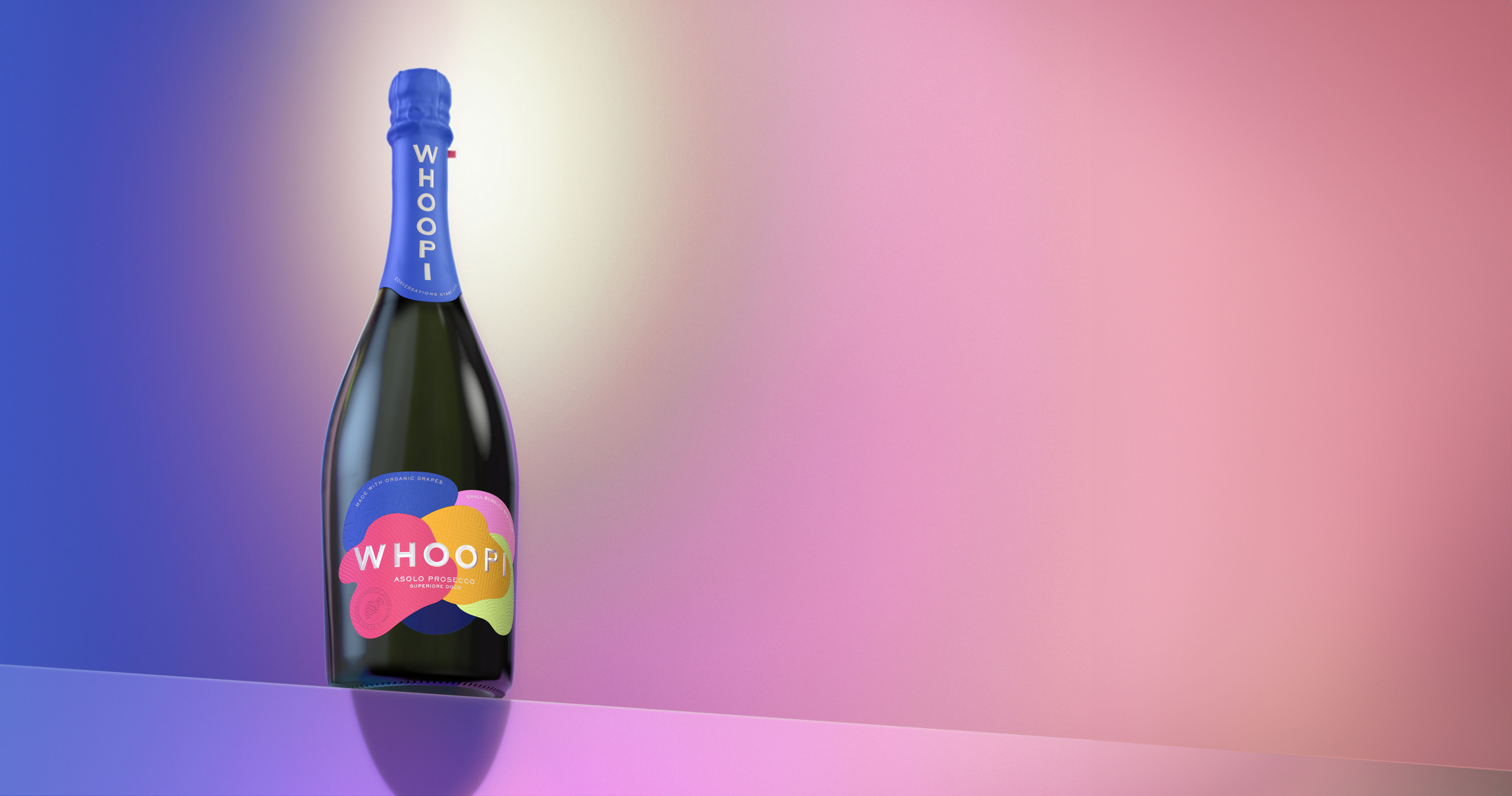
Whoopi Prosecco. Tiny Bubbles. Big Taste.
Whoopi Goldberg needs no introduction. The life and soul of any festive occasion, with a love for hosting, it is only right that she has her own prosecco brand. Whoopi Prosecco is a pioneer in the premium and organic prosecco space – created using Asolo Hills organic Glera grapes, grown to the exacting Veneto standards. With tiny bubbles and a big taste, It’s vibrant. It’s authentic. Just like you.
The newest design was imagined by award-winning design firm, Butterfly Cannon, with the challenging task of capturing the essence of Whoopi and her Prosecco Brand in a premium label and design. “Our creative platform ‘Conversation Starters’ was inspired by Whoopi’s love of entertaining and her innate ability to bring people together. We wanted to create a centerpiece – something that could be placed in the middle of a table and get people talking, “ says Natalie Alexander, Co-founder, Butterfly Cannon
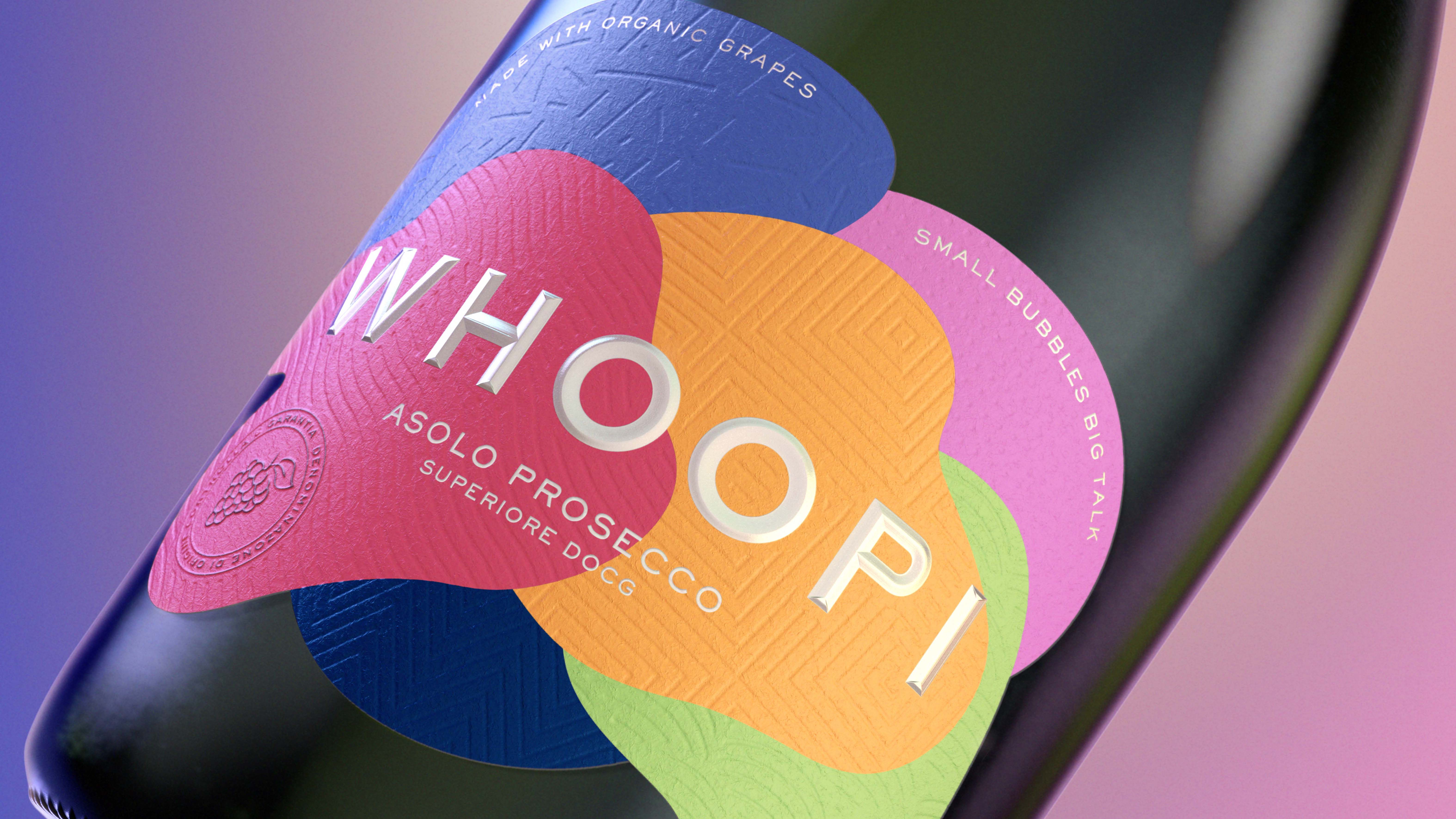
The design is a bold and vibrant interpretation of one of Whoopi’s get-togethers, where different personalities and conversations flow together. Colors, patterns and textures meet in a layered, artistic and expressive design that captures Whoopi’s vivacious energy. The color palette is striking – a welcome change from the muted tones you tend to see in the prosecco space. Different debossed patterns on each of the colored shapes represent different personalities and culture coming together.
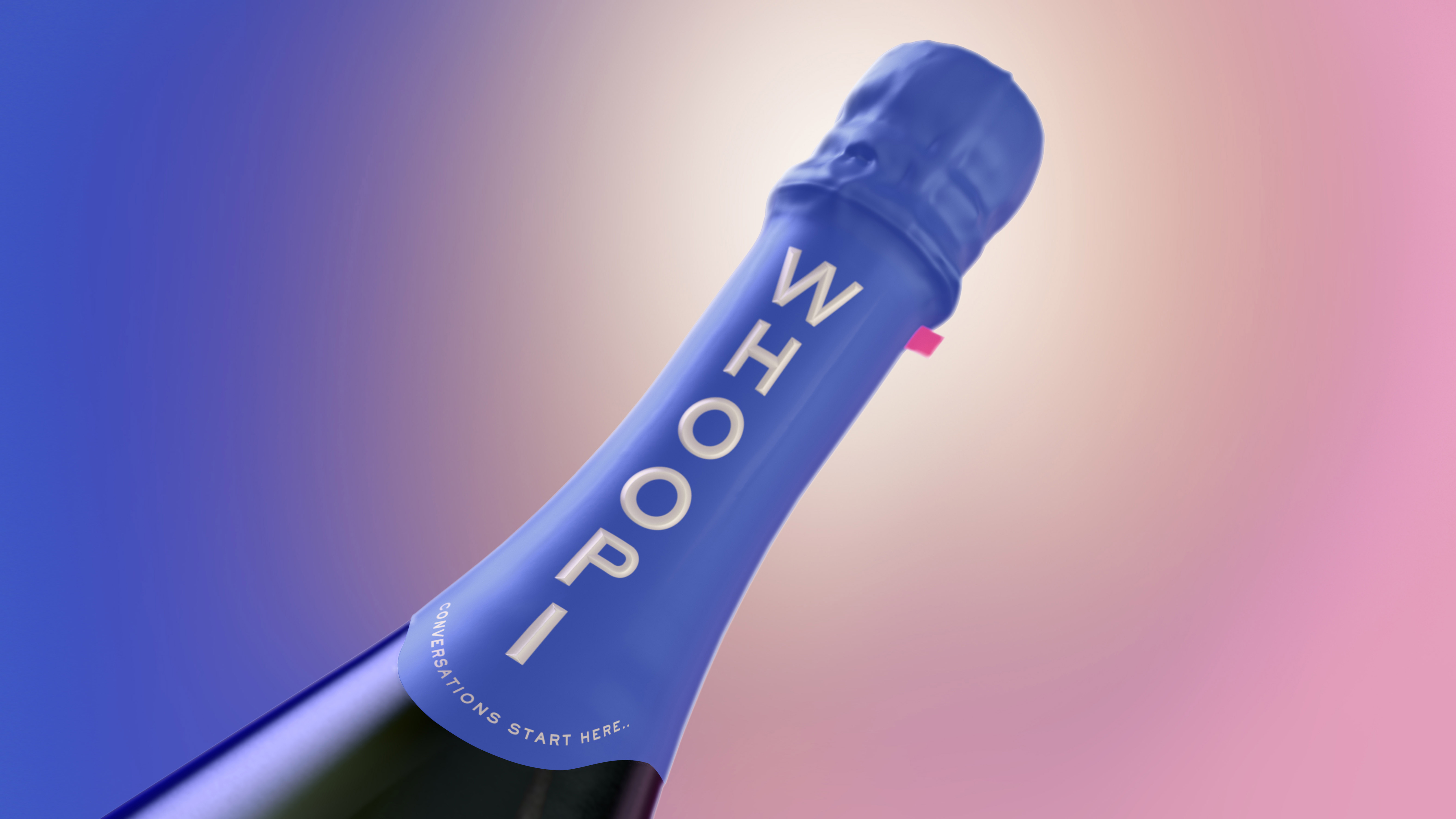
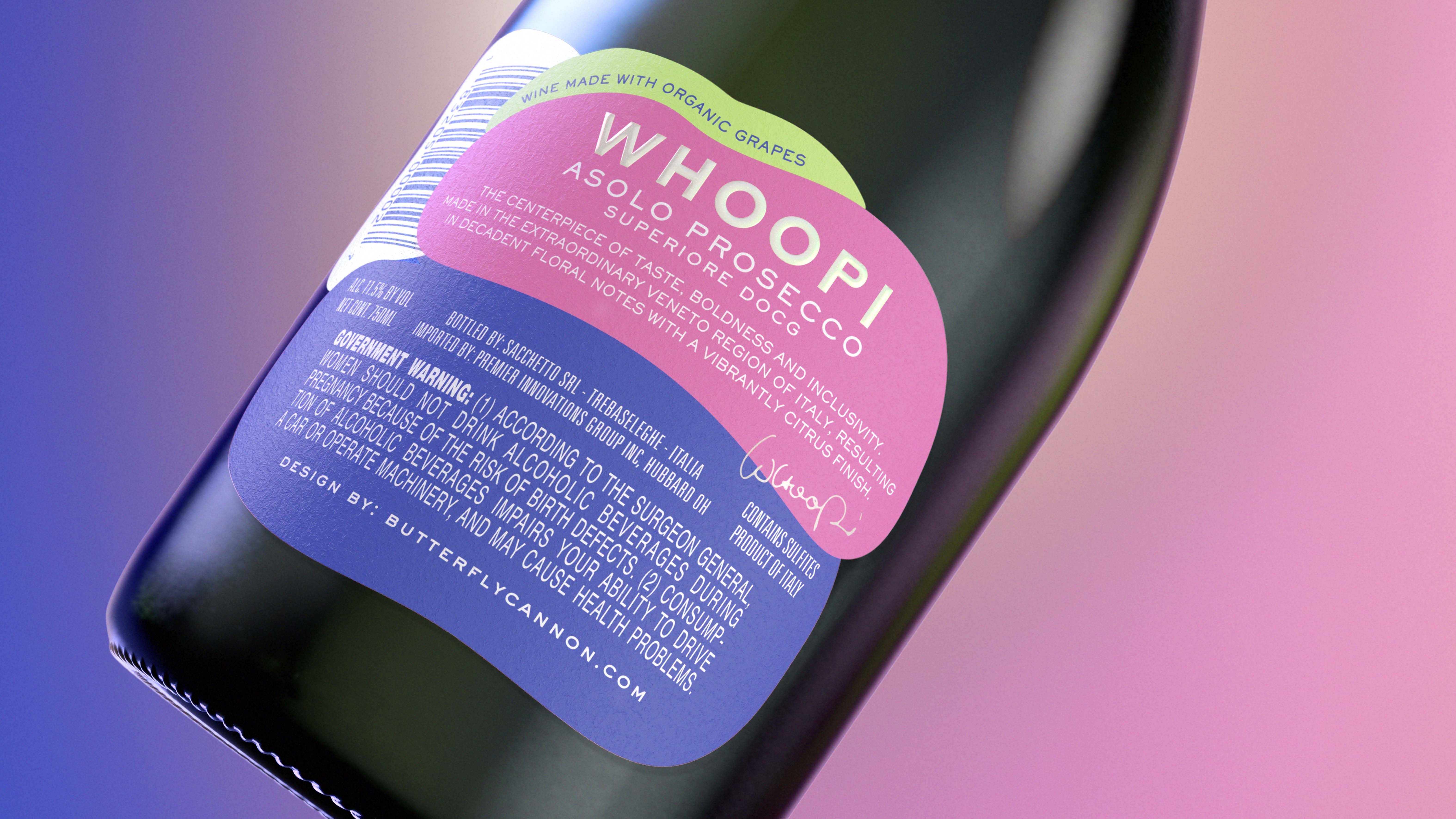
The joy is in the details with the design. From the playful copy to be discovered on the labels, to the pink pull tab waiting to be opened. Once unwrapped, a pop of contrasting green inside the neck closure is revealed. Elevating details such as foiling, micro-embossing and debossing add to the playful elegance of the design. As do the authentic quality cues such as calling out the Asolo provenance, superior DOCG certification and organic grapes. The same attention to detail is carried over into the back label, elevating an area of pack that can often be neglected.
“The folks at Butterfly Cannon completely get me and my love for hosting and have brought this to life in a stunning design to usher in an exciting new era for Whoopi Prosecco,” says Whoopi.
CREDIT
- Agency/Creative: Butterfly Cannon
- Article Title: Whoopi Prosecco Unveils a Vibrant Design by Butterfly Cannon: A Captivating Blend of Personality, Culture, and Elegance
- Organisation/Entity: Agency
- Project Type: Packaging
- Project Status: Published
- Agency/Creative Country: United Kingdom
- Agency/Creative City: London
- Market Region: Global
- Project Deliverables: 2D Design, 3D Design, Brand Guidelines, Packaging Design
- Format: Bottle
- Industry: Food/Beverage
- Keywords: Whoopi Goldberg Prosecco Brand Redesign
-
Credits:
Marketing Manager: Chris Joscelyne


