


Manchester-based creative agency LOVE presents Wildmoor, a new range of luxury blended Scotch whiskies from William Grant & Sons (WG&S). The type of project that every creative agency dreams of, Wildmoor saw LOVE work closely with WG&S to identify what the luxury whisky category was missing and build a whole new brand proposition around it: a more modern imagining of how Scotch is perceived and what it stands for.
Over the years, WG&S has built an unrivalled stock of high-aged scotch whiskies, some of which has been blended to reflect the epic, rugged beauty of Scotland’s wilder places. LOVE was brought on board to help fashion these stocks into a new-to-world brand that would reflect both the incredible liquid craft of these whiskies and the wilderness inspiration that sits behind them. A brand that would confidently sit in an emergent world of exploration and escapism among luxury consumers.
Will Peacock, Global Luxury Director at WG&S, says “We had a vision for Wildmoor; to create a whisky that embodies Scotland’s wildest places; the awe-inspiring landscapes and the unrivalled private reserve of the family. It brings a new style of luxury blended Scotch whisky to the category, fuelling curiosity and elevated experiences that the discerning consumer is seeking out.”
David Palmer, LOVE owner and executive creative director, explains: “As someone who spends time in Scotland’s wilder places, I couldn’t be more excited about Wildmoor. An opportunity to reimagine Scotch whisky in a fresh, contemporary and most importantly, elevated way, through a distinct, modern design language and soulful photography.”
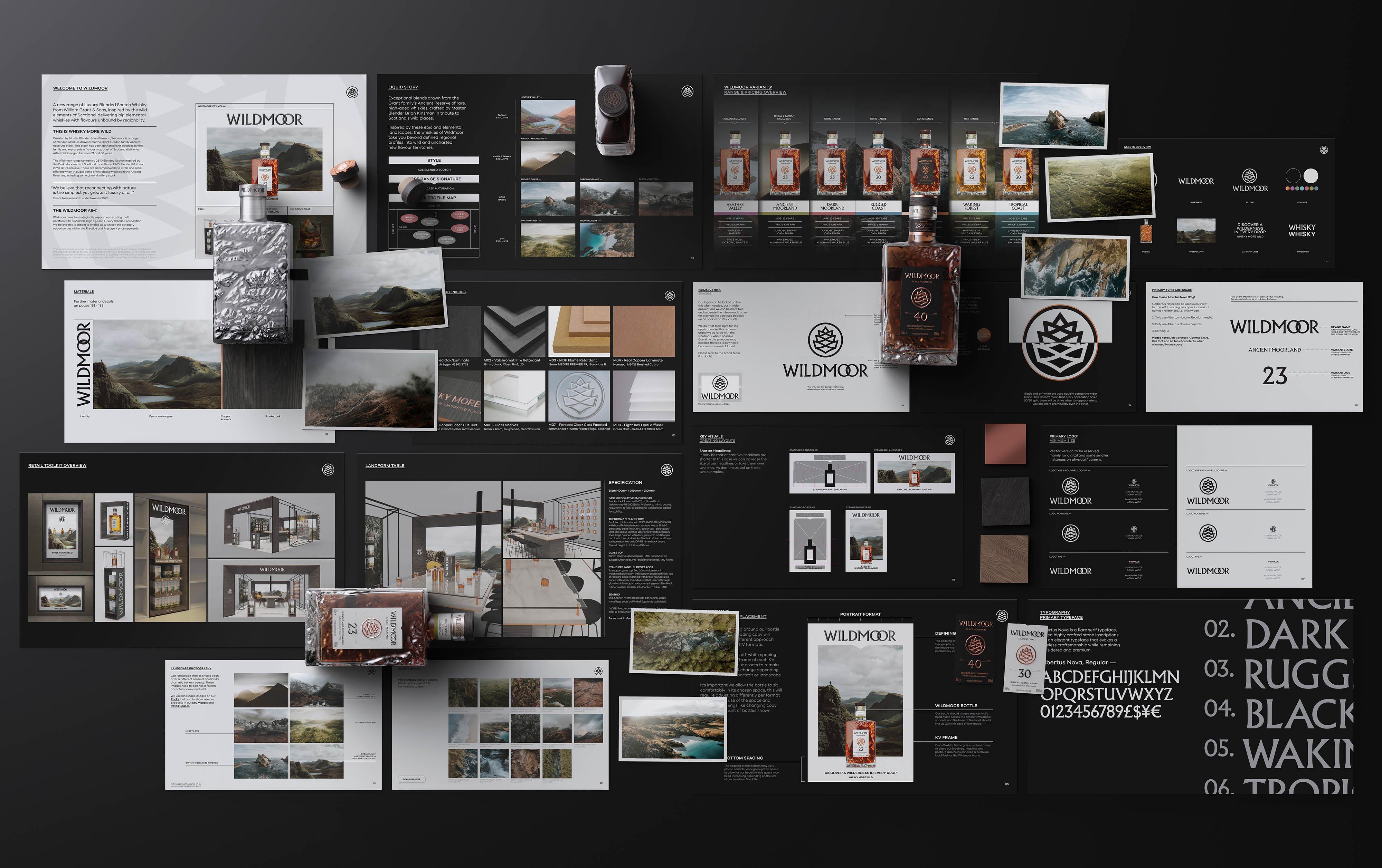
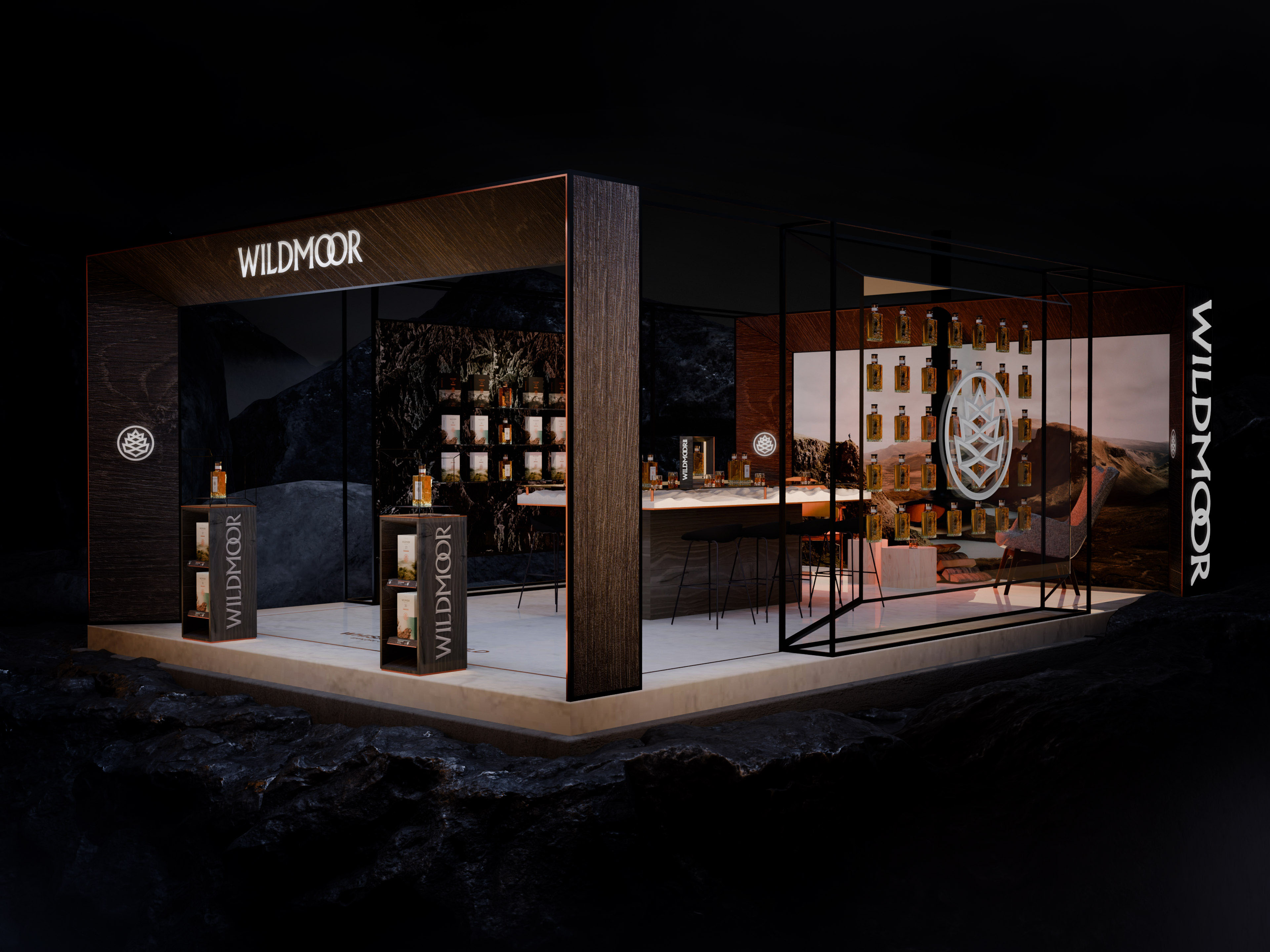
Strategically supporting WG&S’s existing portfolio, the project scope spanned brand strategy, naming, identity design, glass structural design, packaging, art direction, photography, key visuals and retail design. It also included a comprehensive toolkit for activation in global markets.
Speaking to a thirst for nature and escapism
LOVE initially worked with WG&S to formulate where the most compelling business opportunity lay, based on extensive explorations of the category, consumer base, competition, purchase occasions and the emerging cultural movements that inform both the whisky category and wider cultural trends.
The strategy was born from a creative gap in the market – the identification of an emergent urge for escapism and return to nature among city-dwelling luxurians. With an initial focus on Asia, the brand connects with the region’s modern affluent consumer that has a strong appetite for luxury drinks but with an aesthetic sensibility not currently served by scotch brands in the sector.
Delving further into this audience, LOVE and WG&S recognised the strong existing passion for whisky but also the opportunity to present a new take on Scotch specifically – one that steers clear of traditional depictions of sun gilded glens and tartan.
Wildmoor takes advantage of this white space in a way that can resonate at a global level. It is forged for those with a discerning eye for something authentic, real and elemental. It reimagines the depiction of Scottish provenance to conjure a more visceral version of Scotland, executed through a stylistic, minimalist aesthetic that has become increasingly popular through Japanese spirits brands.
Cementing whisky’s space in culture
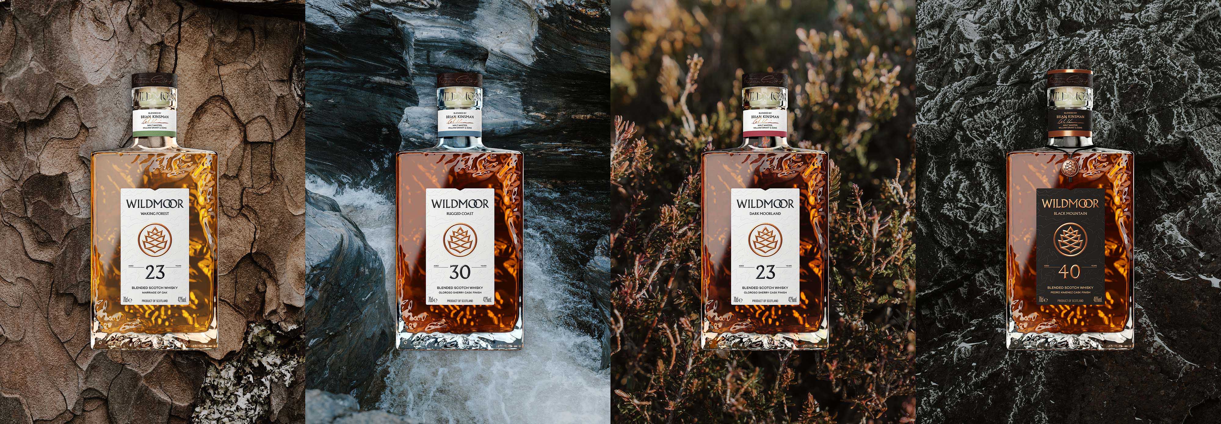
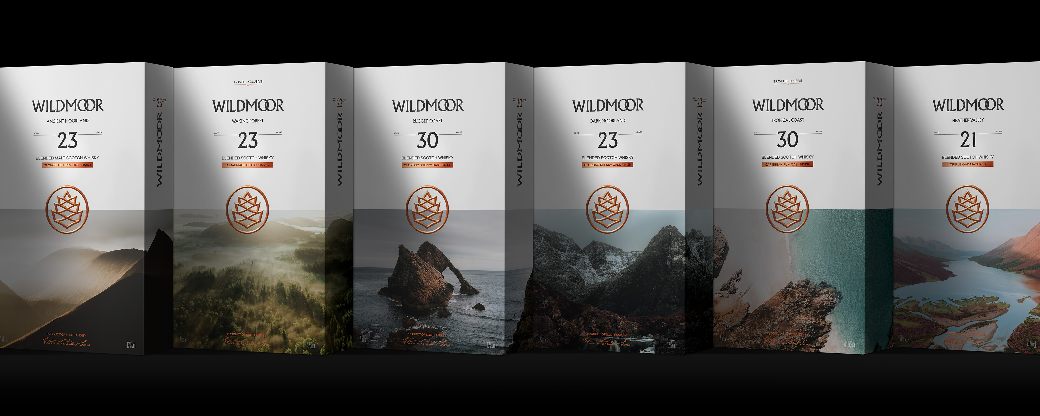
The launch of Wildmoor is a big and exciting commercial play for the company, which is releasing seven different blends as part of the range – a testament to the strength of the idea.
With a strong, emotive name that speaks of ruggedness and a certain heathery sweetness, the new brand is totally distinct from its main competitors – mainly cognacs, a popular choice in the Asian market, and more established whisky brands.
Wildmoor’s ‘disruptive’ positioning looks to appeal to an audience that’s led by the cultural zeitgeist. While Gen Z and Millennials often associate whisky with tradition, quality and craft, a new brand would have to actively work to challenge perceptions of the category as lacking cultural relevance or shared values.
While the new range primarily focuses on this target market of “discerning escapists”, the brand had to be flexible enough to stretch and scale across different consumer segments, price points, formats and future markets.
Capturing Scotland’s rugged wilderness
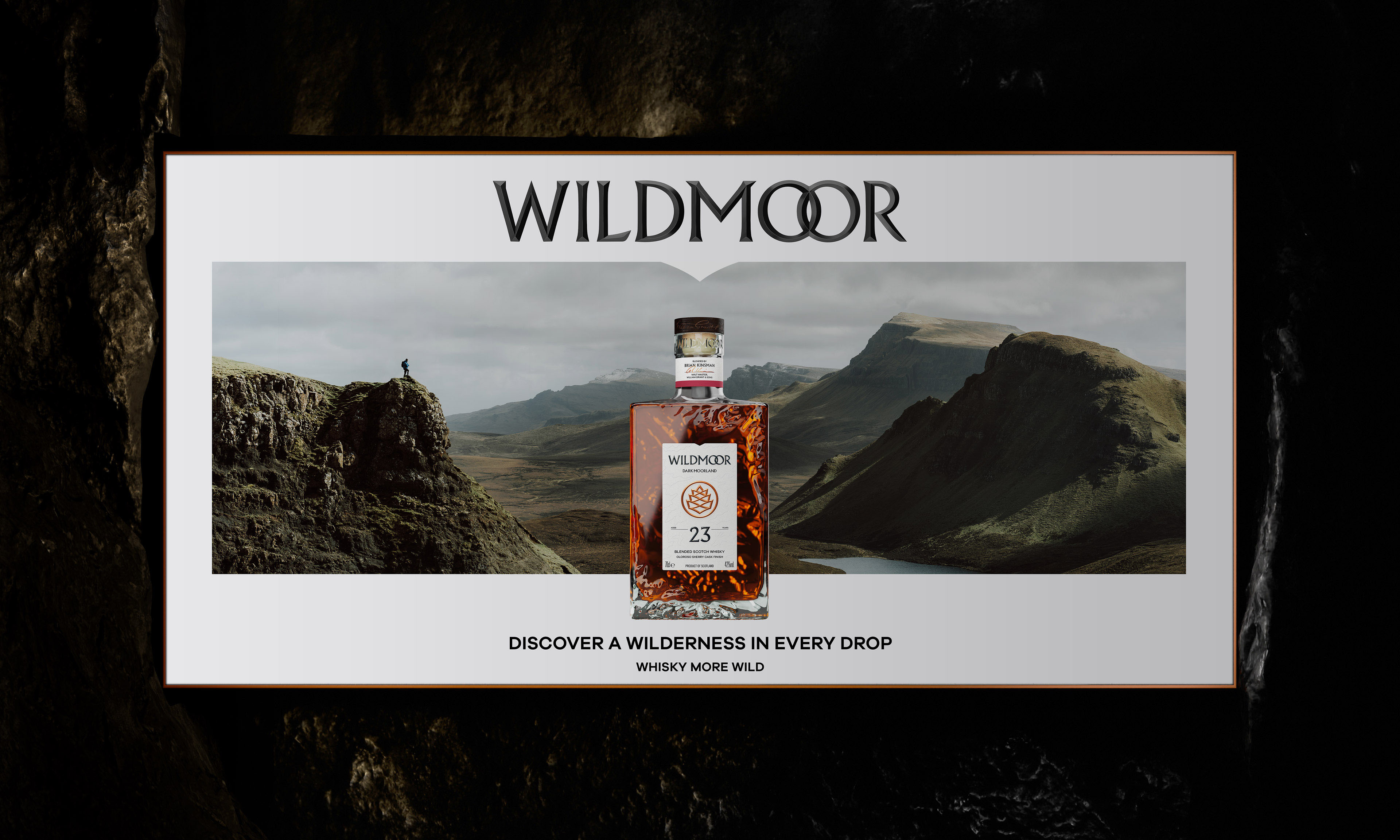
Seizing the opportunity to break the category mould, the visual identity for Wildmoor is bold and contemporary. With a “chiselled from stone” aesthetic that gives it an enduring, timeless quality, it captures the drama of the wilderness without disrupting the subtle sense of optimism that underpins the brand’s confident and adventurous messaging.
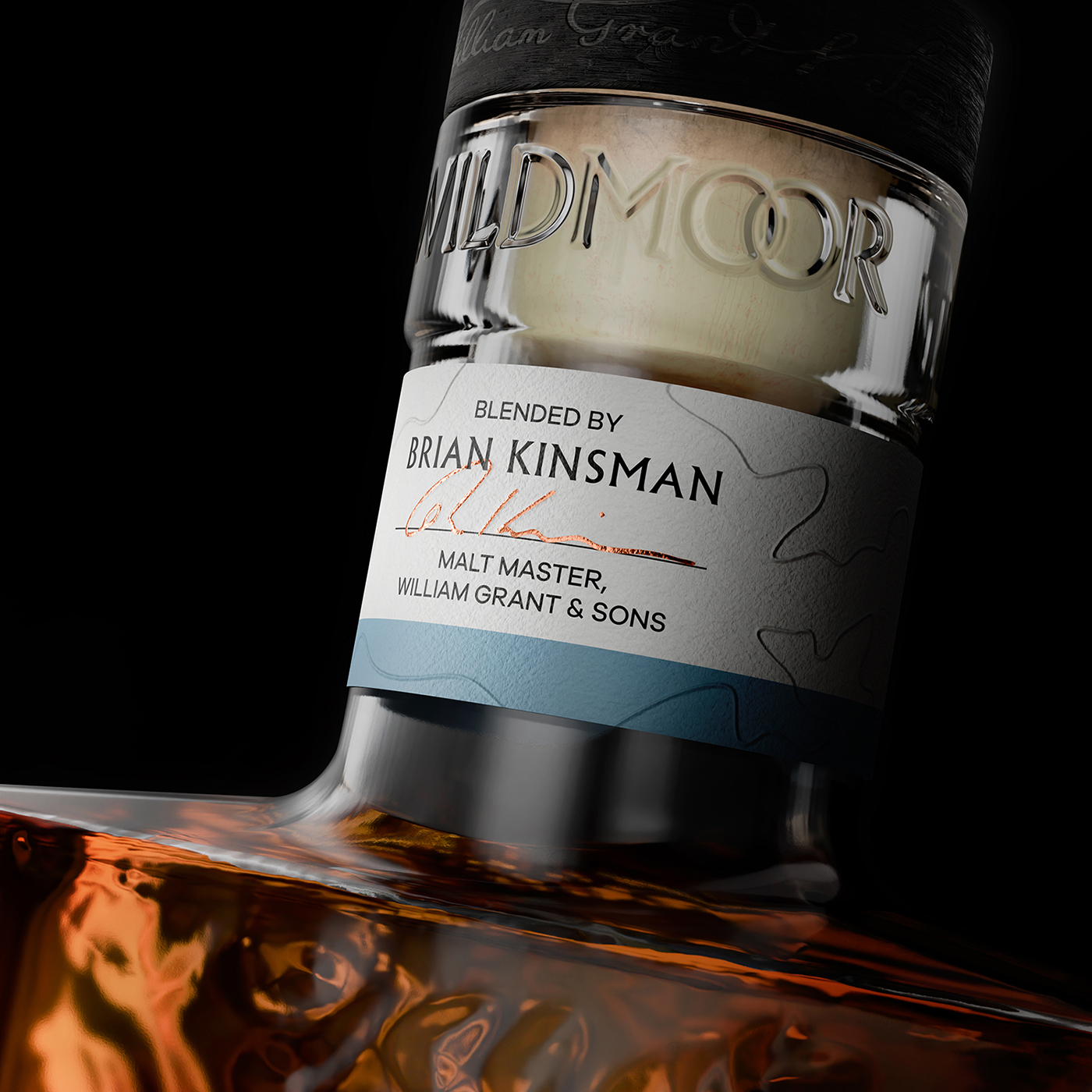
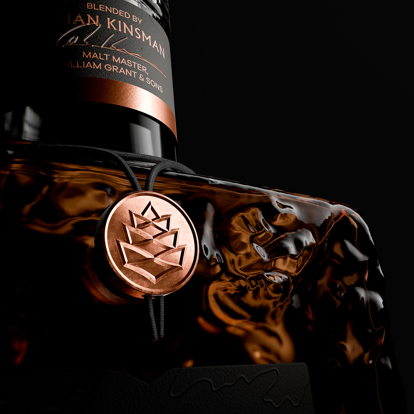
This cinematic terrain is reinforced through the brand mark, using Wildmoor’s ‘W’ and ‘M’ letters to construct a Scottish pinecone form and, with the wordmark, give a sense of ”valleys, mountain peaks, waves and moorlands”, says Chris Jeffreys, creative director at LOVE. These assets both use a subtly dimensional embossed style across all applications.
Like the logo graphic device, the Wildmoor wordmark plays with typographic overlaps, the linking of the two ‘o’ characters hinting at two whisky barrels being blended together. It creates a highly distinctive, recognisable brand asset. To achieve greater standout, both the logomark and wordmark appear in black across all applications except the 40-Year-Old pack where everything reverts to copper to stand out on its black background.
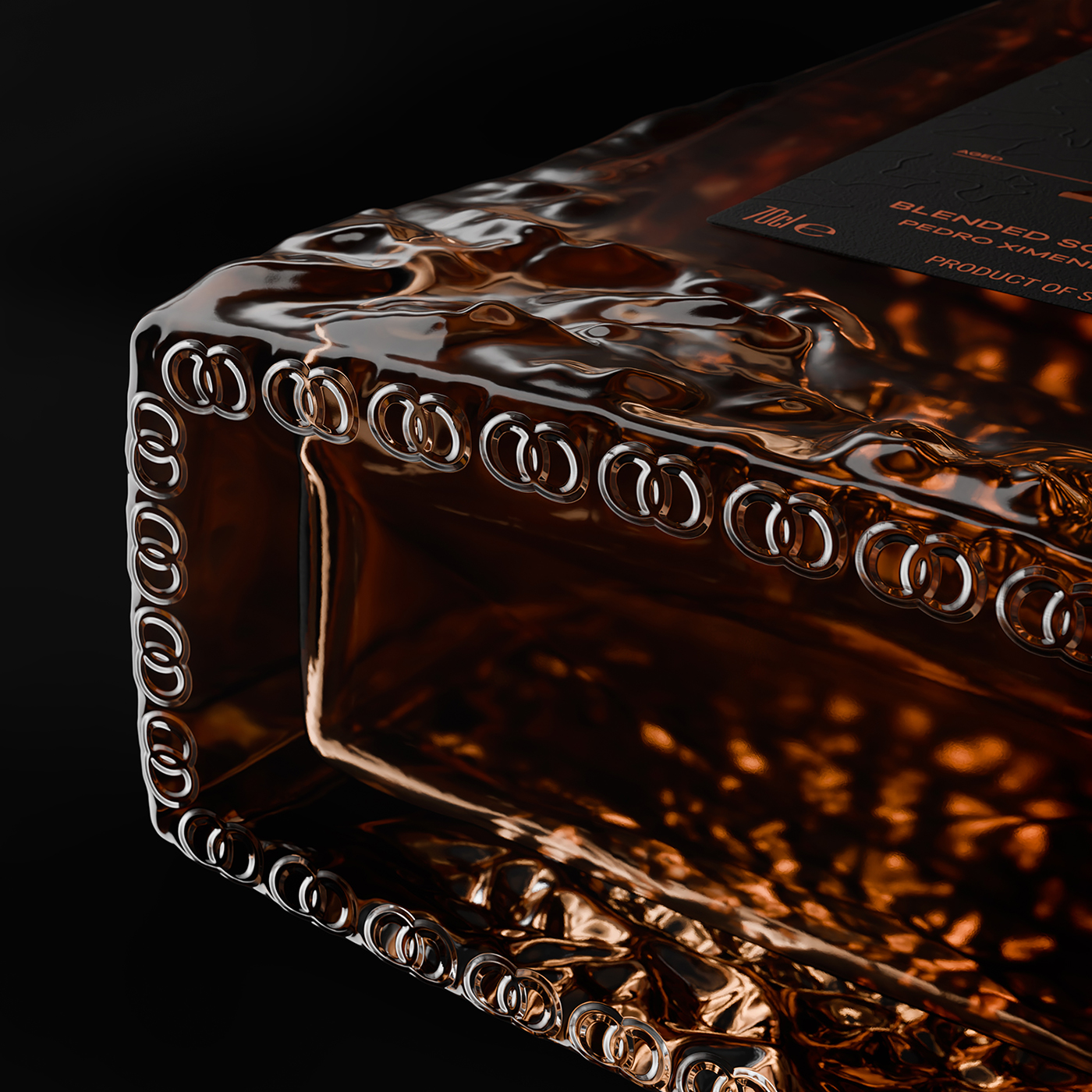
What really sets Wildmoor apart though – enhancing its luxury credentials in an innovative way – is its bottle, with the agency and WG&S setting out to create a bottle that would feel like it had been cut from the very landscape it sought to express.
“The bottle is a distinctive brand asset that is drawn from open-source topographical Scottish landscape models – a literal slice of Scottish landscape that captures the elemental textures and forms,” Jeffreys explains. “From rural lowlands to unspoilt uplands, coastlines, rivers and lochs, the bottle acts as a physical panorama of the rugged beauty of Scotland.”
“It takes a brave client and a lot of trust in the agency, to create a product that feels totally new to the market,” adds Palmer. “It’s been an exciting challenge to create a brand from scratch. The result is a whisky that sits in a space that other brands don’t occupy. We knew WG&S had a lot of ambition with this innovation – a luxury whisky with wide appeal – and Wildmoor could be a significant player.”
Wildmoor is now available to buy in Selfridges and The Whisky Shop. It will be available in China, Singapore and Changi airport later in the month before going live in Taiwan and Korea in June.
CREDIT
- Agency/Creative: LOVE.
- Article Title: Whisky Gets Wilder: LOVE Captures Scotland’s Rugged Beauty in new Launch for William Grant & Sons
- Organisation/Entity: Agency
- Project Type: Identity
- Project Status: Published
- Agency/Creative Country: United Kingdom
- Agency/Creative City: Manchester
- Market Region: Asia, Global
- Project Deliverables: Art Direction, Brand Architecture, Brand Creation, Brand Design, Brand Experience, Brand Identity, Brand Mark, Brand Naming, Brand Strategy, Brand World, Branding, Packaging Design, Structural Design
- Industry: Food/Beverage
- Keywords: Whisky branding, Japanese minimalism, luxury scotch whisky, Scottish highlands, Scottish wilderness, soulful photography, glass design, scottish pinecone
-
Credits:
Creative Agency: LOVE
Client: William Grant & Sons


