


Whiskas has been a leading brand in the petcare category since 1936, committed to creating a world where all cats purr more with their portfolio of delicious products. There was a collective ambition to redefine Whiskas as a legacy brand and category leader by making it an experience-driven brand to ensure the refreshed identity would achieve the next generation of brand building. Our help was enlisted to develop an updated look in the form of a new brand identity and portfolio packaging design that would unlock emotional engagement with pet parents and celebrate the brand’s distinctive assets to stand out in the competitive petcare market.
The current identity for Whiskas felt static, disconnected, lacked relevance, and was built for the analogue world. Research insights confirmed that consumers saw the current brand as outdated and disengaged, something we wanted to directly address across the brand refresh without losing the brand’s soul. The task at hand was to amplify and contemporise Whiskas’ key distinctive brand assets to work in a digital-first world and develop a brand identity that was unmistakably Whiskas.
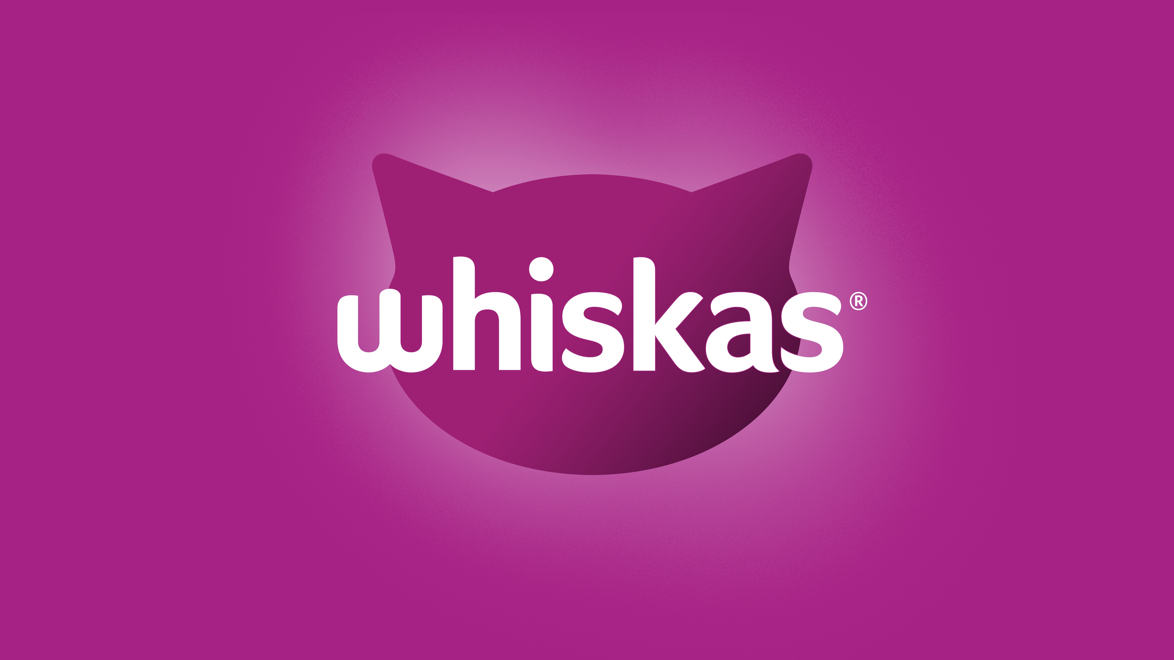
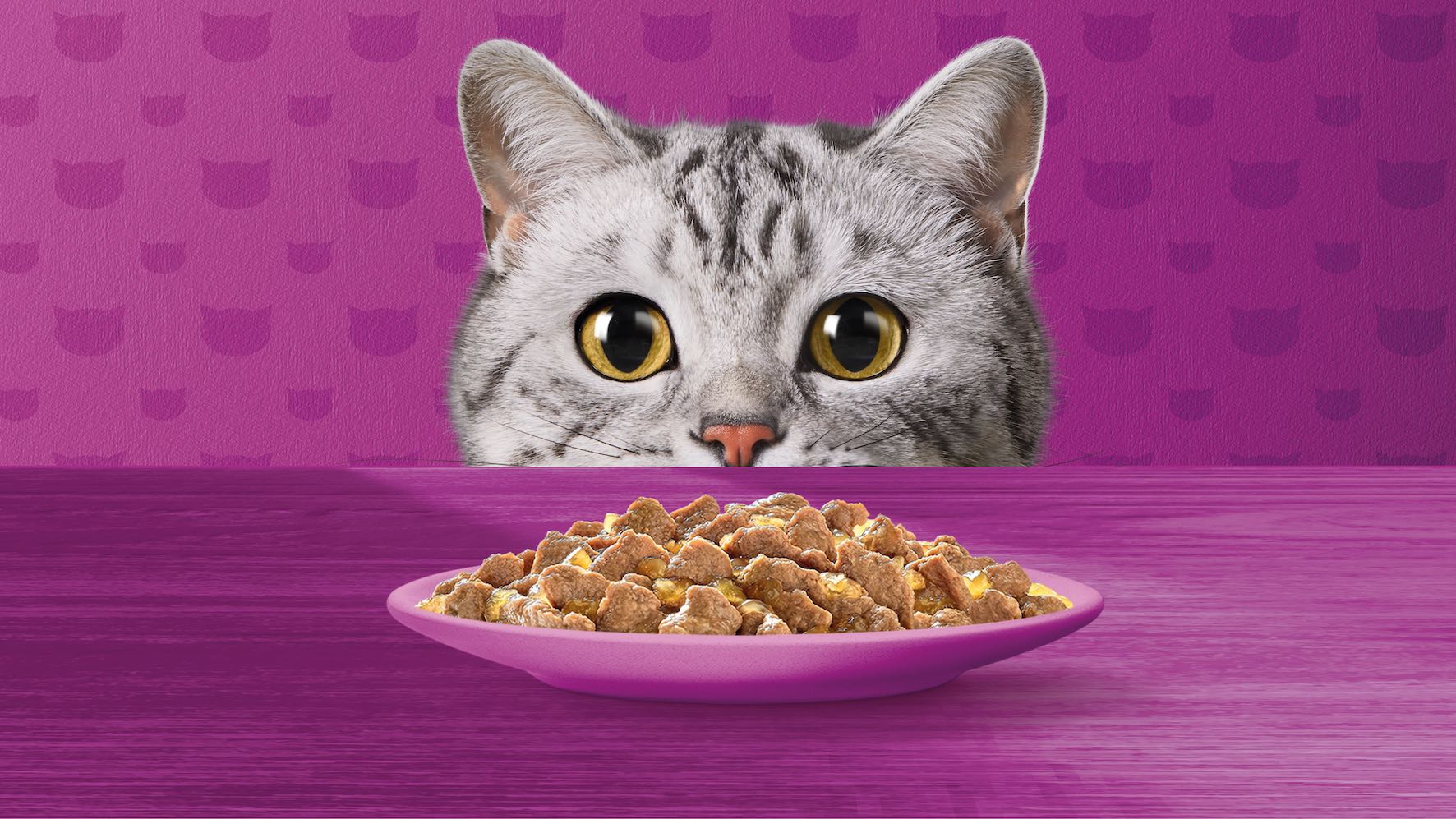
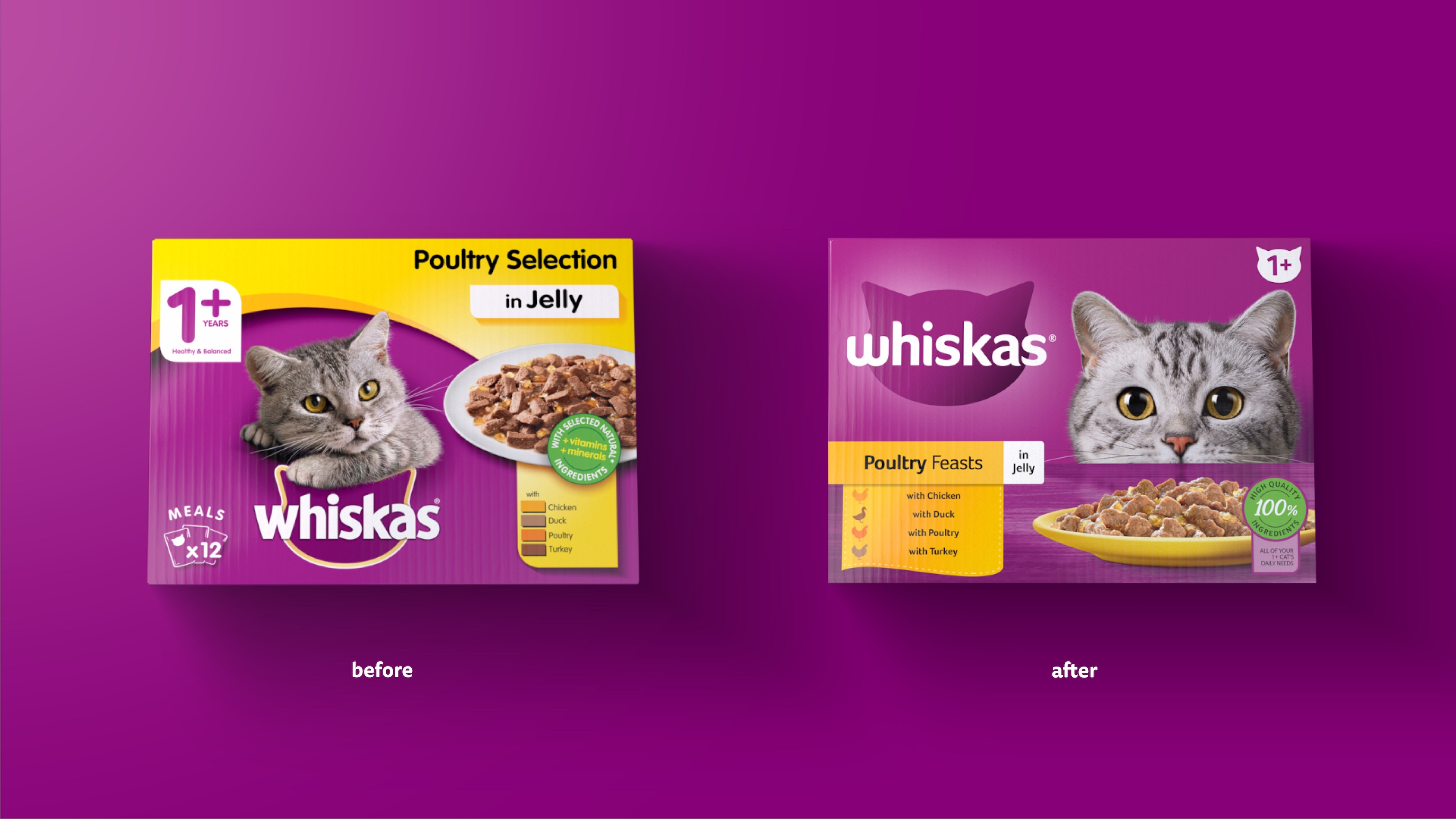
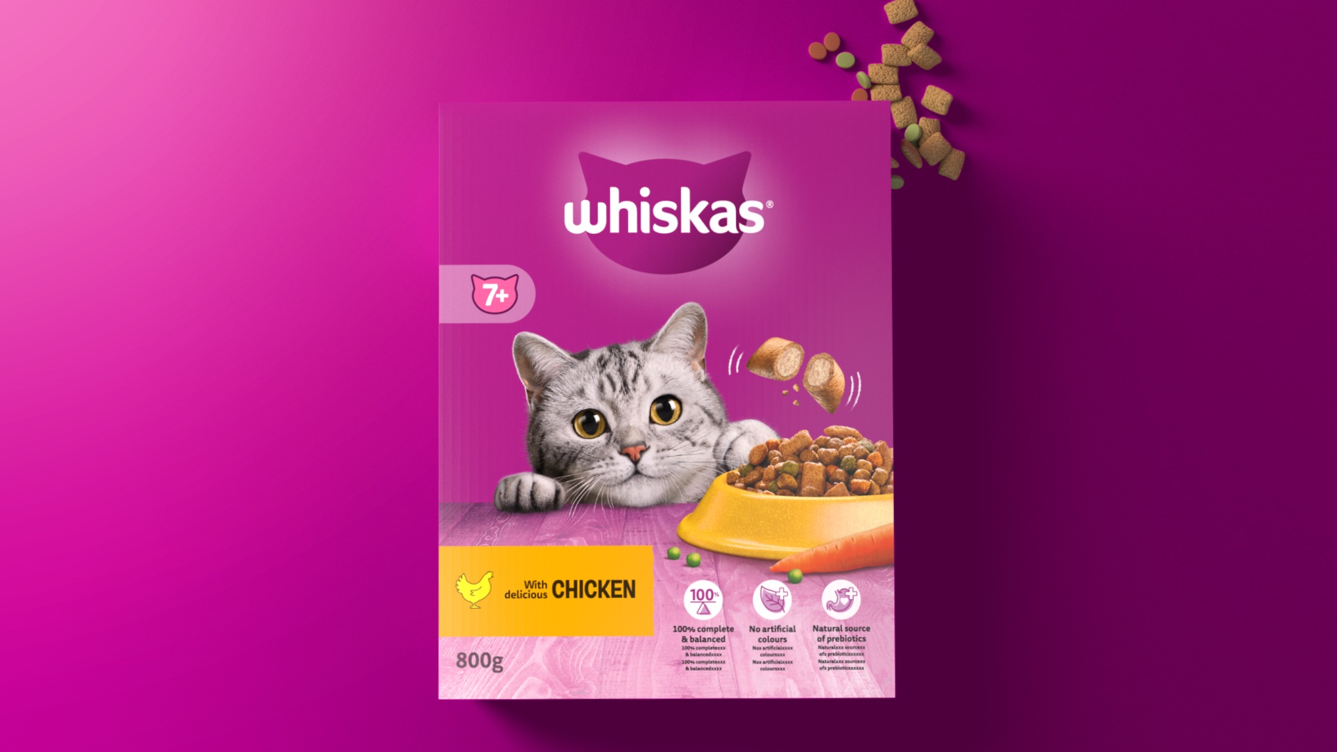
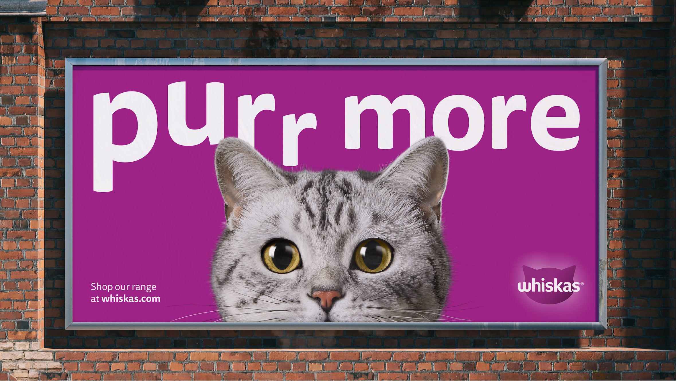
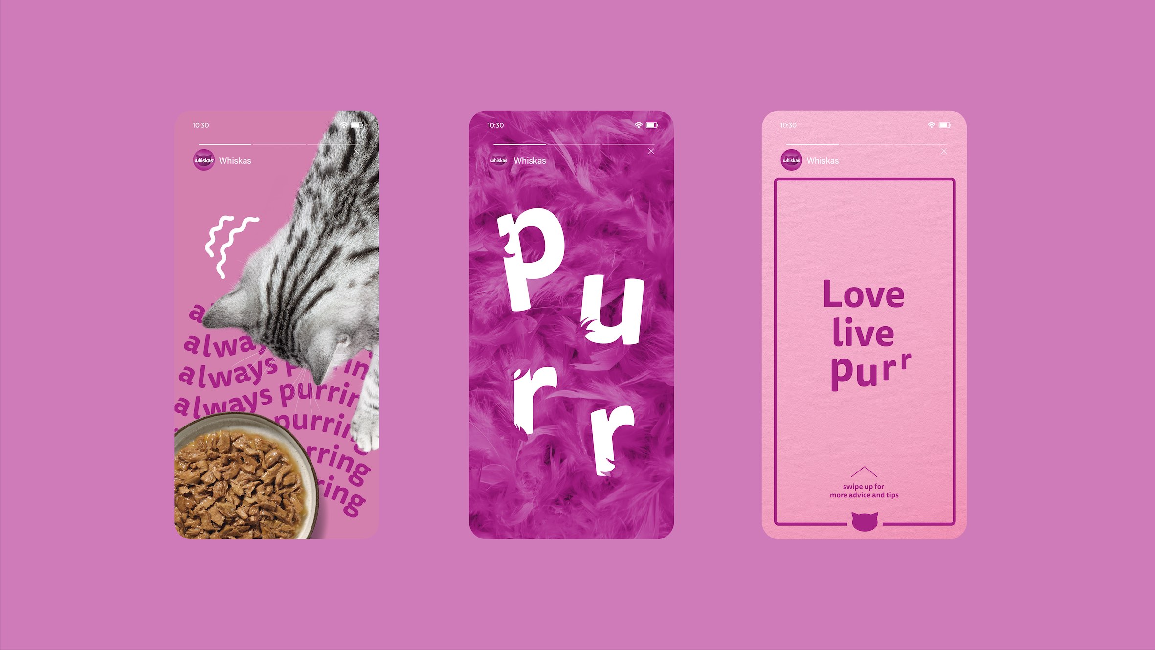
We sought to build on Whiskas’ assets to create a brand world that was legendary and iconically always new in its ability to future-proof design equities and innovate for the future of the petcare category. We identified the opportunity to elevate the ‘W’ brand flag, evolving it into an engaging asset as part of the updated brand mark that brought the cat characterisation to life by imitating a cat’s mouth. Whilst the original Whiskas brand presented a static and passive cat, the updated identity brings Tommie the cat to life to establish a key emotional relationship on and off-pack. This has been achieved by simplifying and amplifying distinctive assets to ensure that the brand world heroes the special relationship between cat and cat parent. We put Tommie at the heart of the brand, having her big cat eyes front and centre looking directly at the pet parent as opposed to a static off-side stare locked up to the brand flag, enabling cultural storytelling. The updated design heroes Whiskas’ iconic assets to ensure the brand flag plays on distinctive cat characteristics and is instantly recognisable in the blink of an eye.
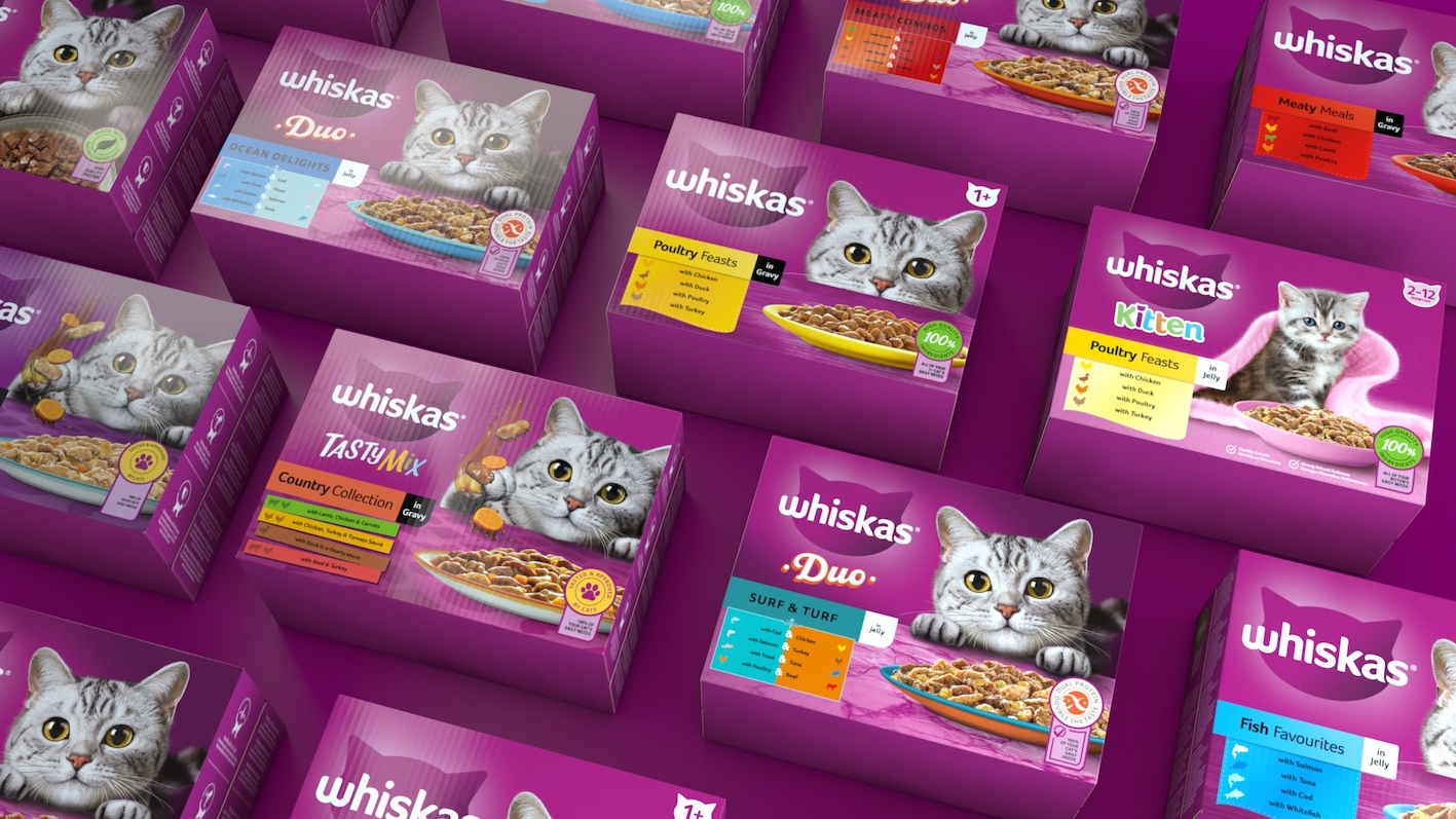
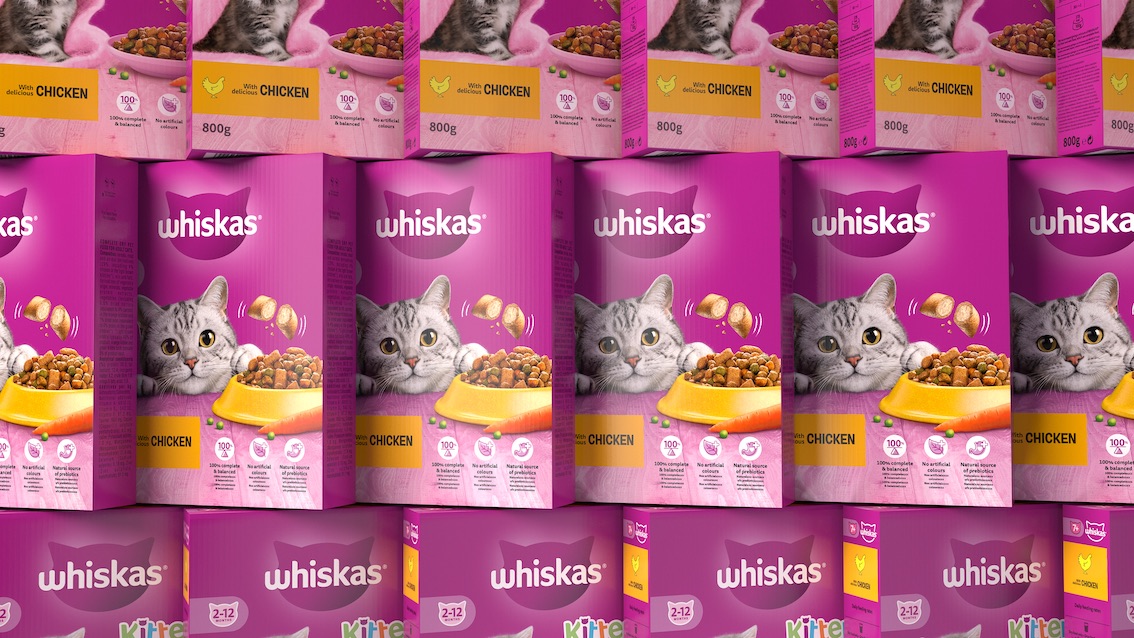
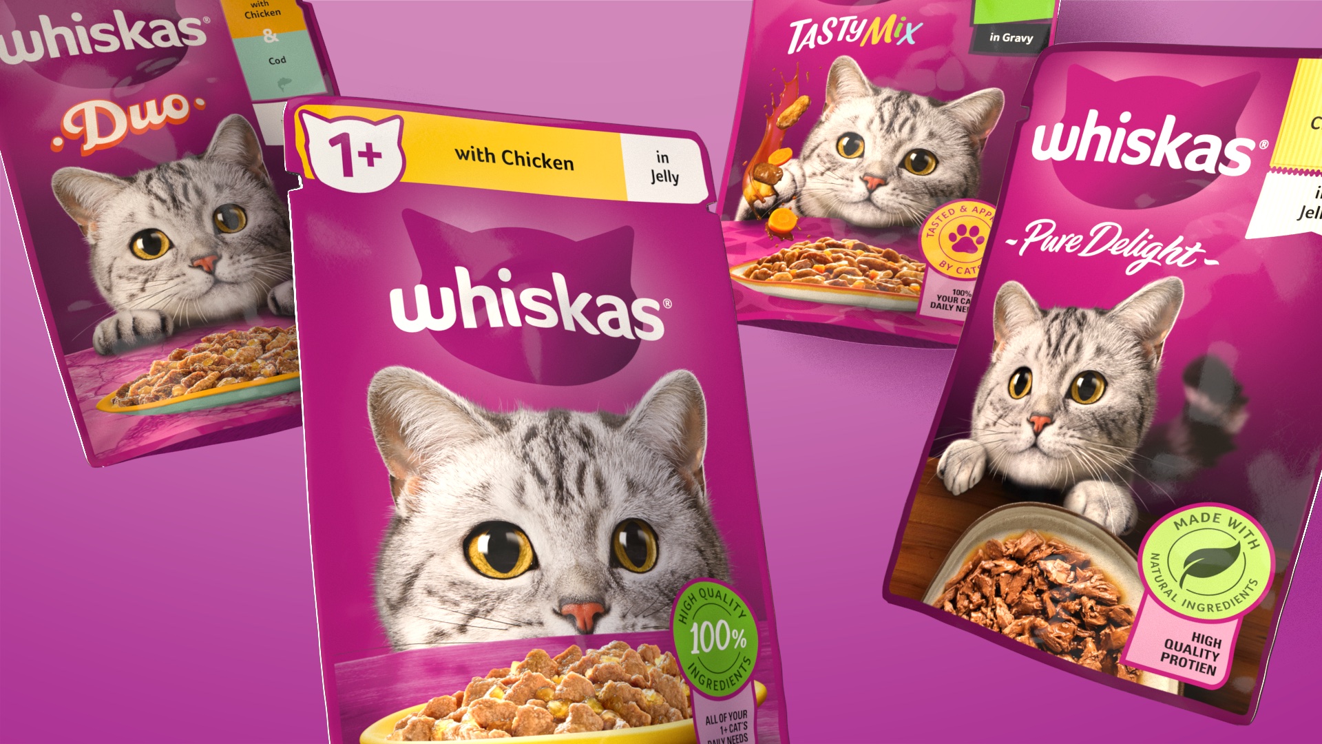
The revived brand identity and updated portfolio packaging design celebrates Whiskas’ distinctive brand assets to ensure the brand is instantly recognisable, yet fit for a digital-first world. Across our portfolio packaging re-design, we developed a clear design system to ensure pop, pace and pull at shelf with our pet parents. Pop being delivered through our distinctive purple, creating a strong brand block on shelf ensuring we are instantly recognised. Pace was achieved by celebrating Tommie with her at the heart of our pack. Her eye-catching and expressive personality, along with signaling variety, was helping to remind about heartwarming moments each pet parent can relate to. Finally, pull was delivered through a clear navigation system with bold and graphic colours, icons and claims, enabling easy consumer navigation at shelf. With our clear design principles and key Distinctive Brand Assets, we were able to re-invent the brand to be iconically always new, whilst always unmistakably Whiskas with our pet parent at the heart.
CREDIT
- Agency/Creative: Elmwood London
- Article Title: Whiskas: Bringing Cattitude to the Category
- Organisation/Entity: Agency
- Project Type: Identity
- Project Status: Published
- Agency/Creative Country: United Kingdom
- Agency/Creative City: London
- Market Region: Europe, North America
- Project Deliverables: Brand Identity, Packaging Design, Rebranding
- Industry: Retail
- Keywords: Rebrand, Brand Identity, Distinctive Brand Assets, Iconicity, Heritage, Packaging, Portfolio Packaging
-
Credits:
Executive Creative Director: Kyle Whybrow
Head of Client Partnerships: Sheila Buchet
Client Partner: Charlotte Bennett
Senior Account Manager: Lily Lyth
Chief Provocation Officer: Greg Taylor
Strategy and Provocation Officer: Esther Hastings
Head of 2D and 3D Animation: Oli Minchin
Senior Designer: Sam Povey
Senior Designer: Jack Bannerman
Senior Designer: Mike Preston
Senior Designer: Mimi van Helfteren
Design Director: David Walsh
Animator: Doug Brown


