Aleksić Winery, founded in Vranje (Republic of Serbia) in 2006, was established by three sisters whose love for wine was deeply rooted in family tradition. This family-owned winery stands as a testament to their unwavering belief in themselves and the quality of their craft.
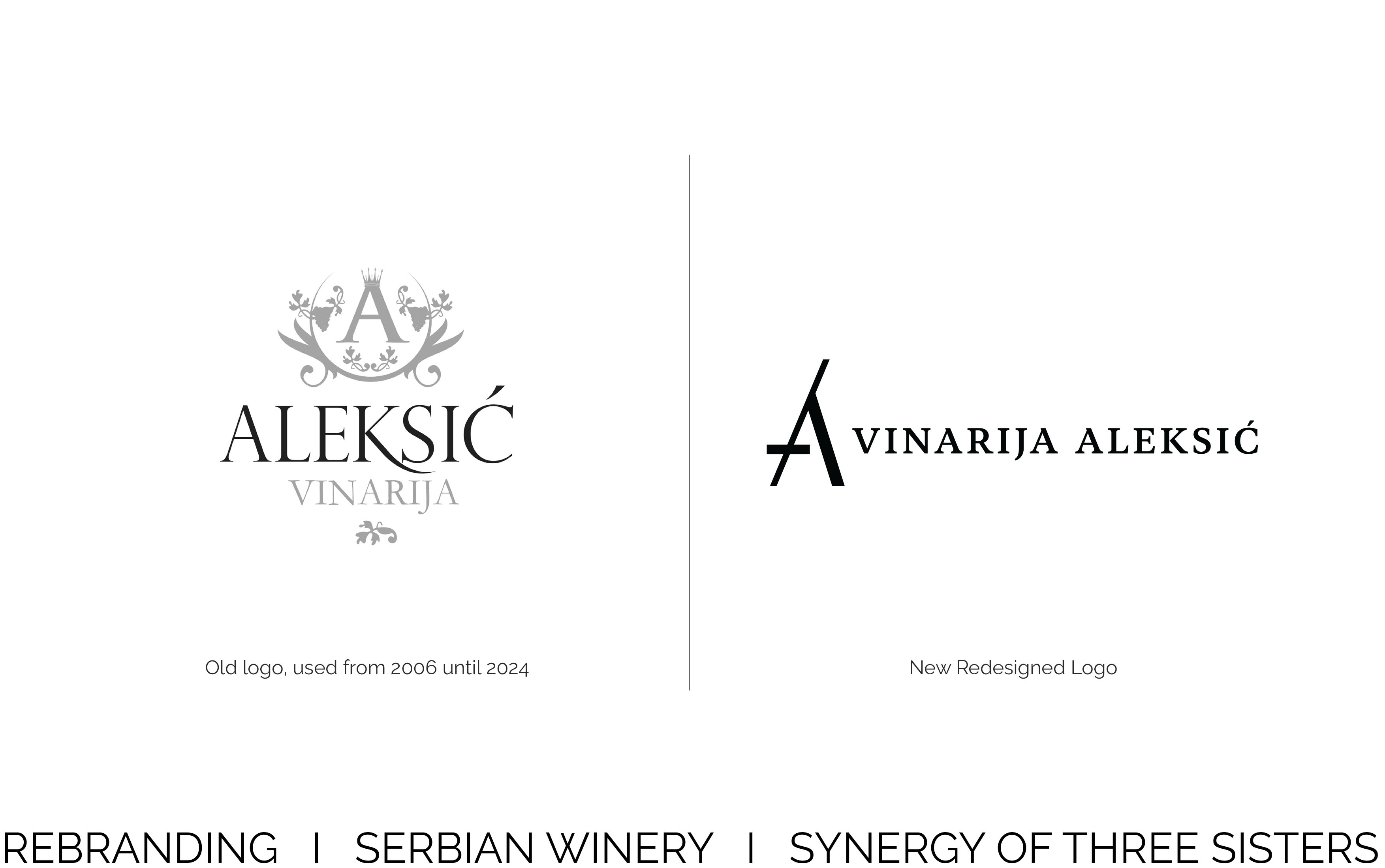
The rebranding project aimed to create a fresh visual identity that reflects the current values of Aleksić Winery: creativity, innovation, and unwavering self-confidence. Through this transformation, the new identity captures the essence of their unique vision and modern approach to winemaking.
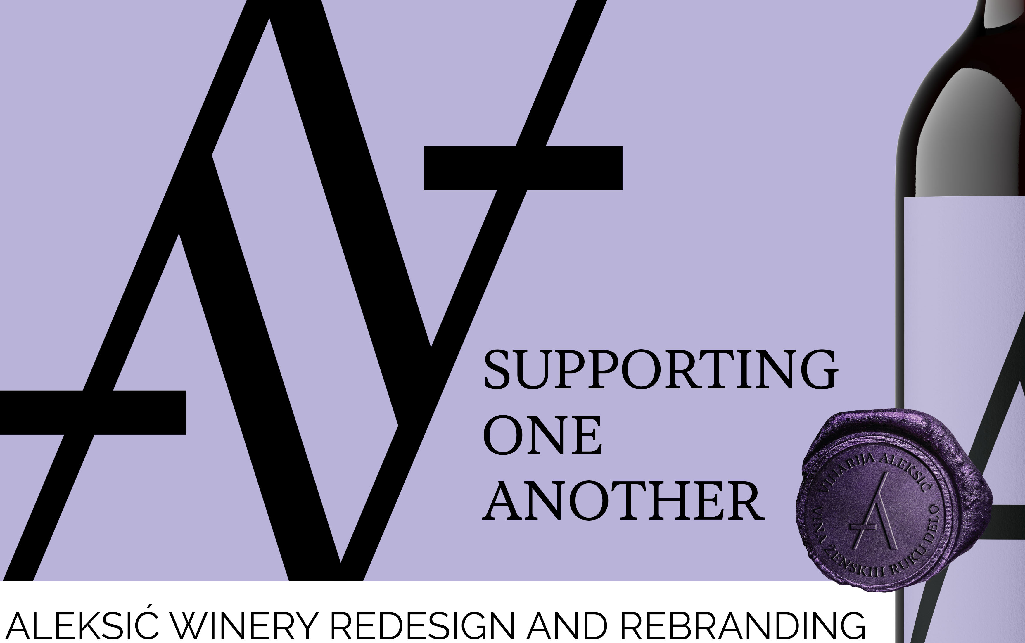
Concept of the New Logo: “Supporting One Another”
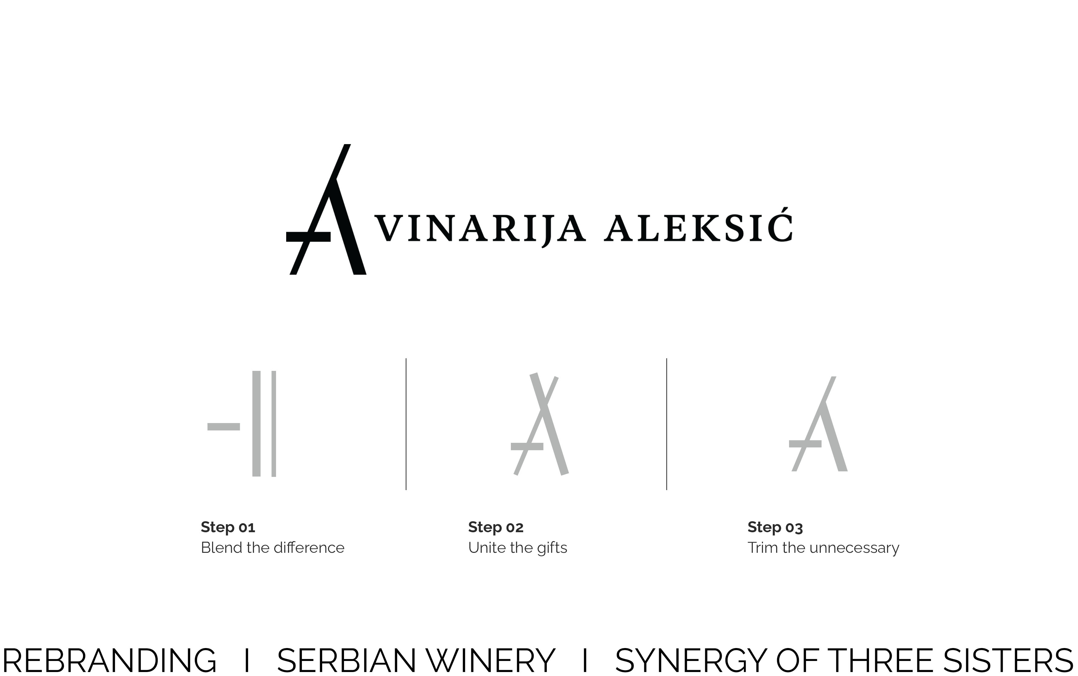
This project focuses on designing a distinctive and meaningful logo for Aleksić Winery, symbolized by the letter “A.” The logo consists of three unique elements, each representing a different characteristic. The first element acts as a pillar, the second as a supportive diagonal, and the third stabilizes the connection, together forming the recognizable shape of the letter “A.” Each line carries a unique “gift” that contributes to the overall design.
The elements are intertwined and unified through their typology and color, while differing in length and thickness. This reflects a growth process, much like personal development, where unnecessary aspects are refined or removed. The final form of the logo presents the letter “A” in a distinctive and authentic way, symbolizing the growth and evolution of Aleksić Winery.
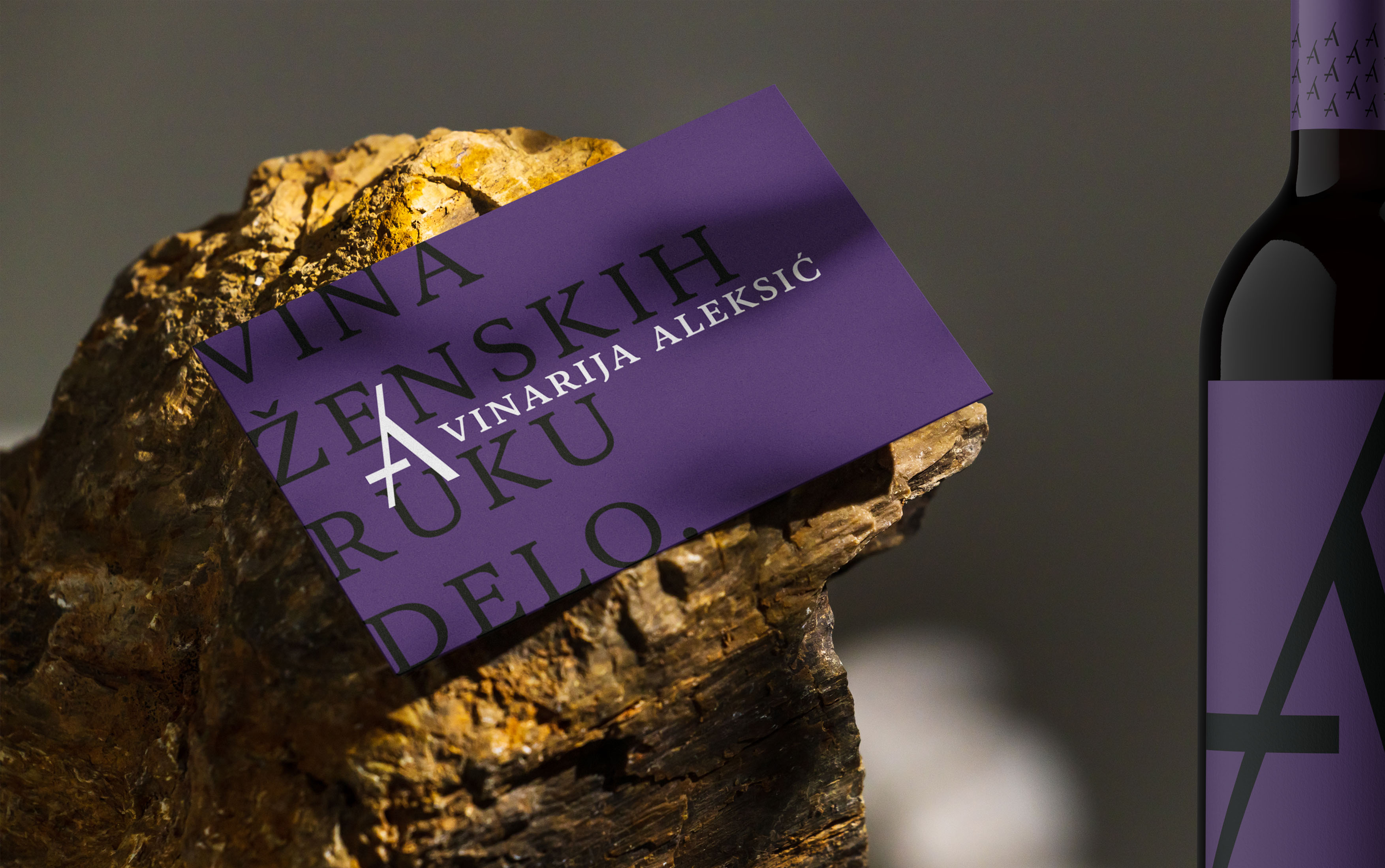
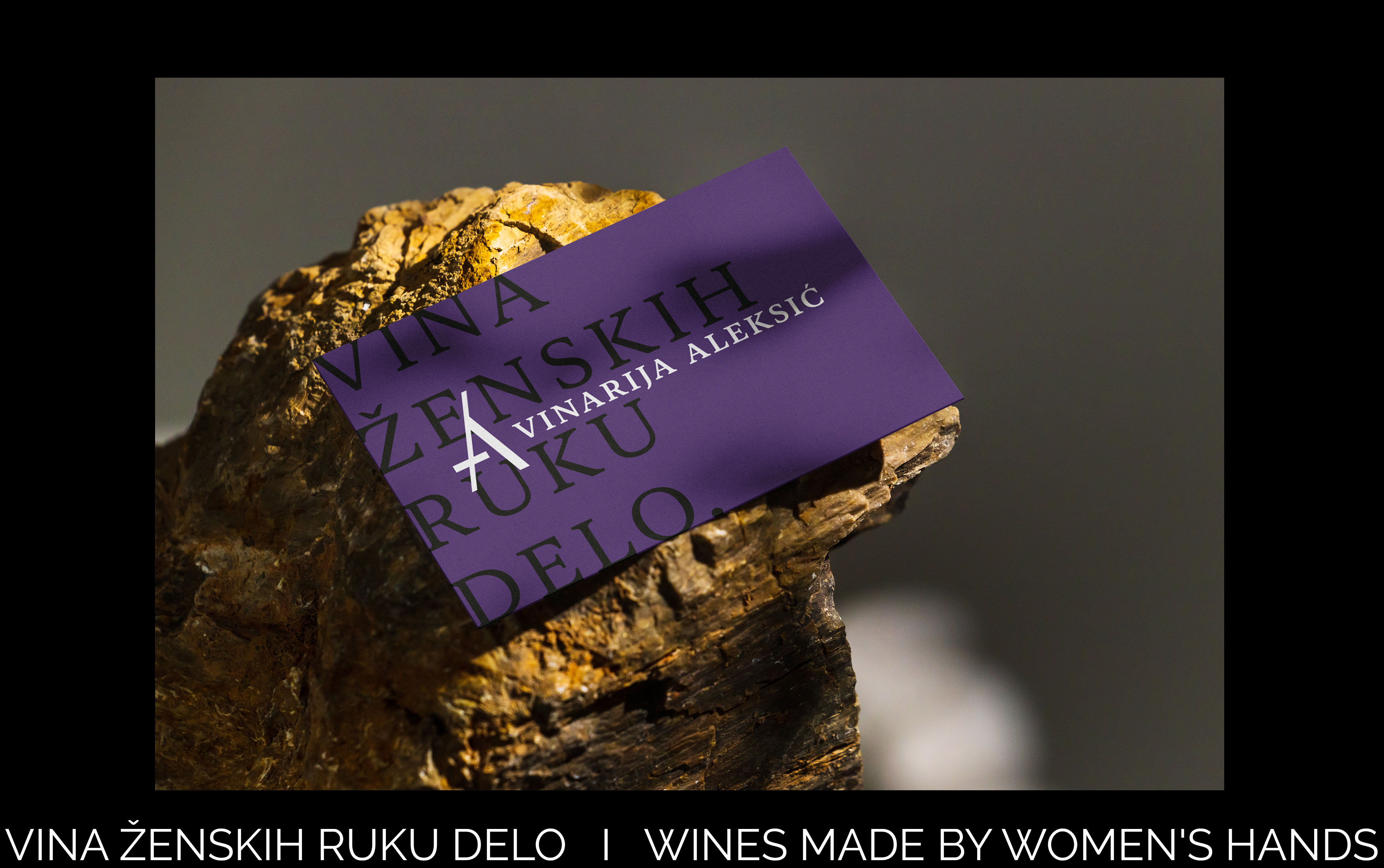
In terms of color, a purple hue was selected to emphasize innovation and uniqueness. A cooler tone compared to the previous branding reflects maturity and experience. The chosen fonts add an air of elegance and femininity, perfectly complementing the winery’s new visual identity.
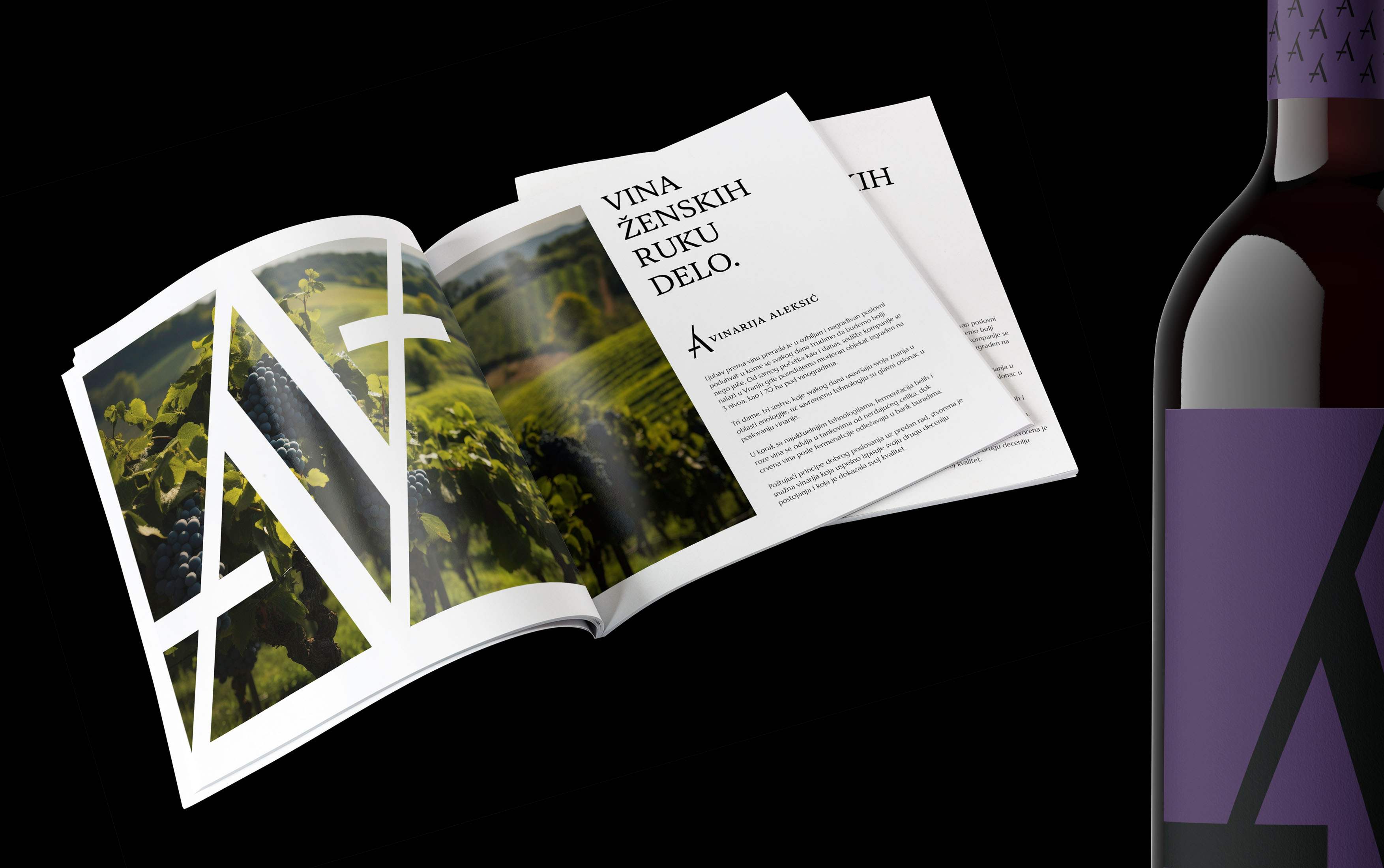
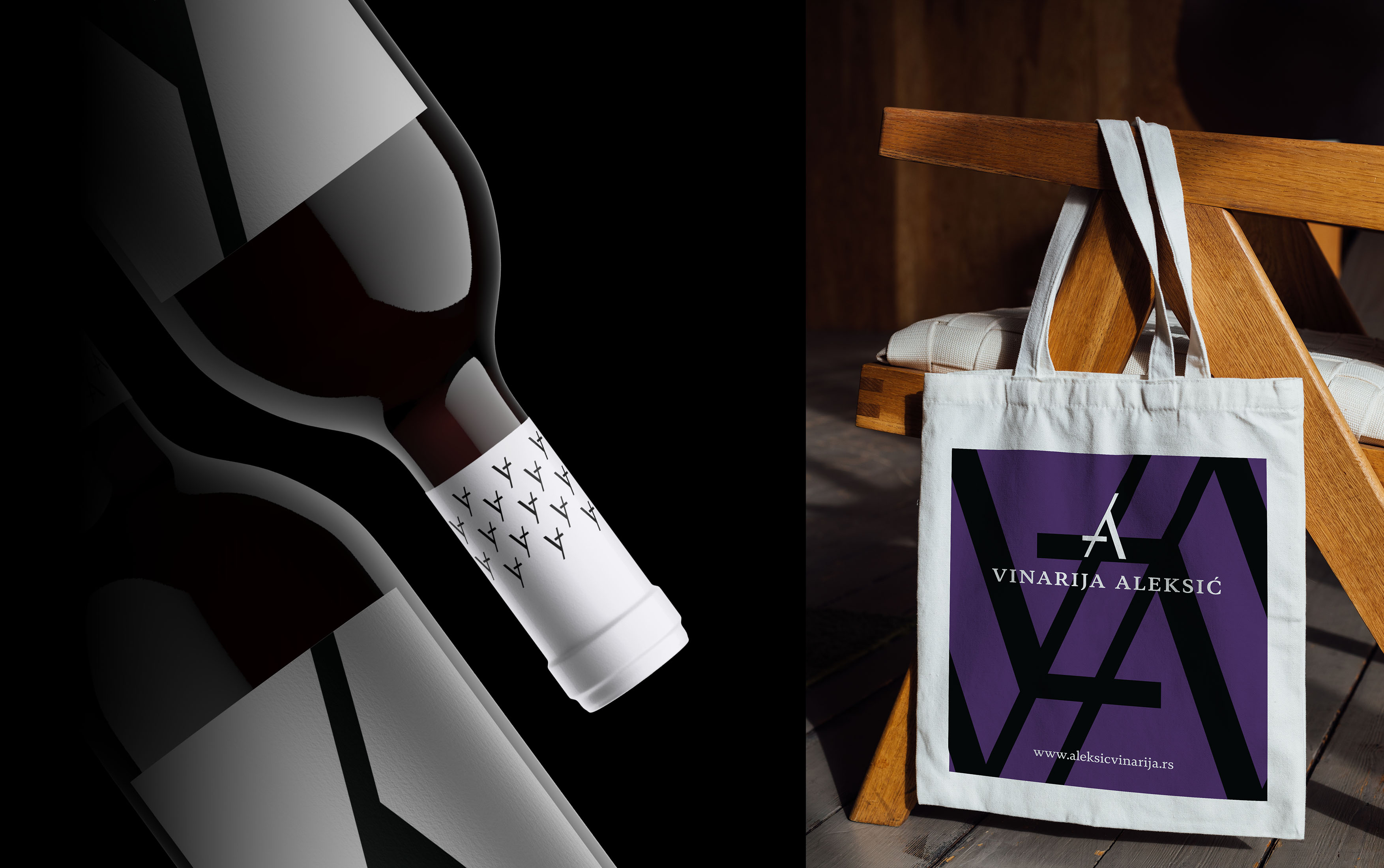
As part of this project, a new visual identity for the wine capsules was created. The capsules will vary in color depending on the wine label, while a pattern formed from the letter “A” will remain consistent. This approach ensures improved brand recognition among wine enthusiasts.
Aleksić Winery’s slogan, “Wines Made by Women’s Hands,” has been skillfully incorporated into new visual identity, further emphasizing the brand’s unique story and values.


CREDIT
- Agency/Creative: Winelabelgoddess
- Article Title: Where Tradition Meets Innovation: Aleksić Winery Redesigned by Winelabelgoddess
- Organisation/Entity: Agency
- Project Type: Identity
- Project Status: Published
- Agency/Creative Country: Serbia
- Agency/Creative City: Belgrade
- Market Region: Europe
- Project Deliverables: Art Direction, Brand Identity, Brand Redesign, Rebranding
- Industry: Food/Beverage
- Keywords: winery, rebranding, redesign, brand, artist
-
Credits:
Creative Direction / Design:: Jovana Mandić


