


Who? Not all creatives fresh out of college have the right skills to succeed in the commercial world. Graduates, freelancers and small studios may be bright sparks but also want to achieve more, and ignite their creativity. Where Lightning Strikes is an online School of Creativity helping creatives in the Moving Image, Film, and Design fields to reach their creative goals and be more business savvy with online courses and mentoring. Learning directly from industry professionals, artists, musicians and inspiring creatives who will share their main principles, insights and secrets, delivered via engaging video based lessons and private mentoring. The School is less corporate than it’s competitors and more electrified, with a punky attitude of ‘learning it well then breaking it better’.
The brief was to create a new brand that captured the spirit of the school that stood apart from other more traditional competitors. We needed to convey the energy and excitement of what the school could deliver, and also to give a sense of the mostly online community.
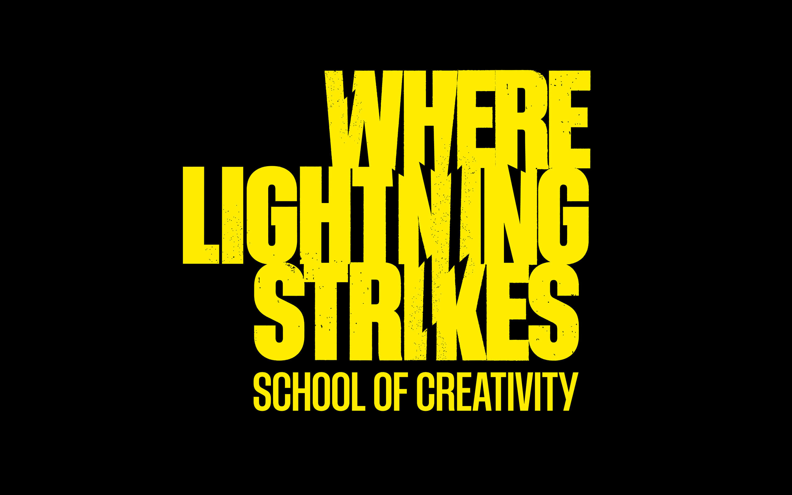
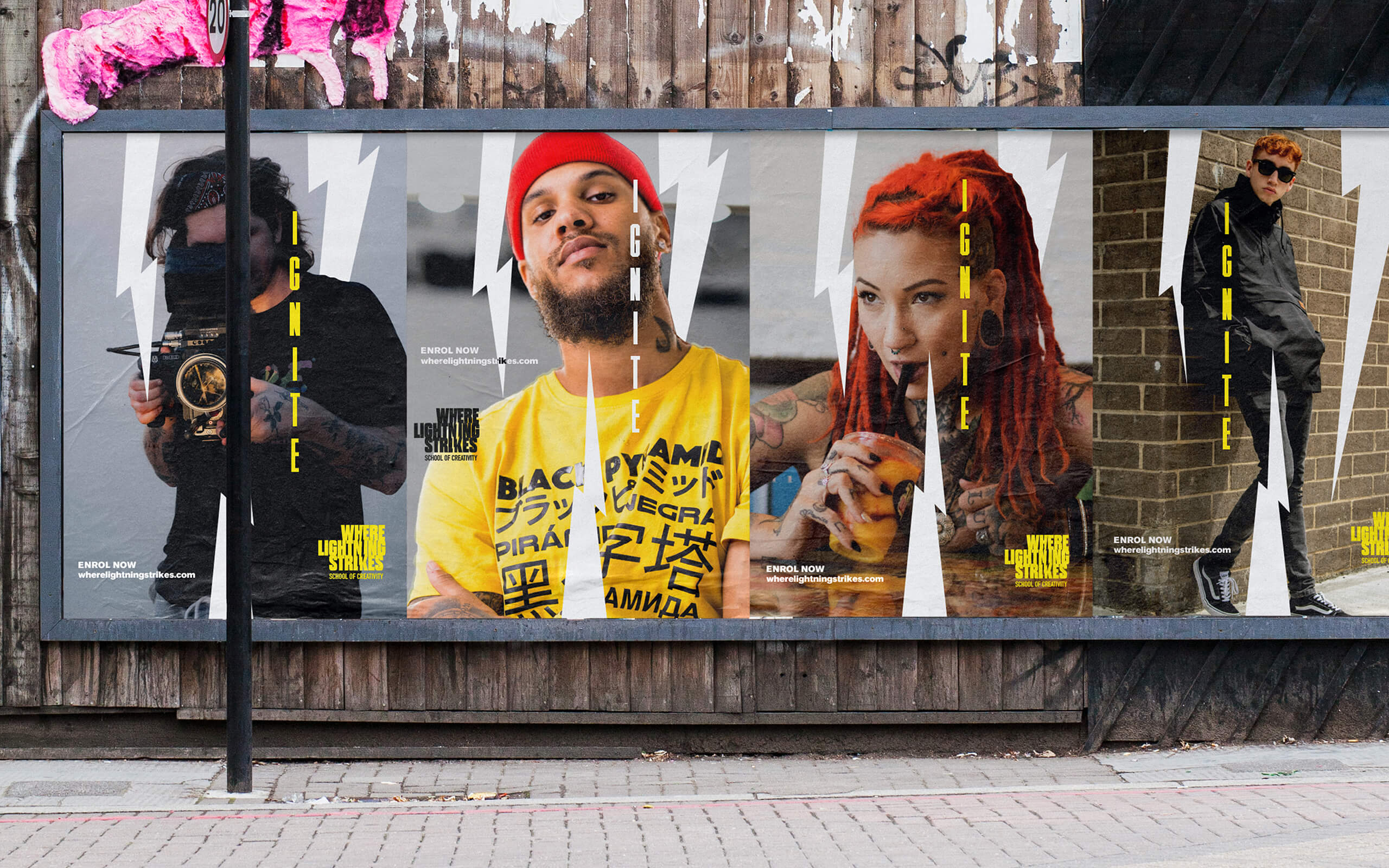
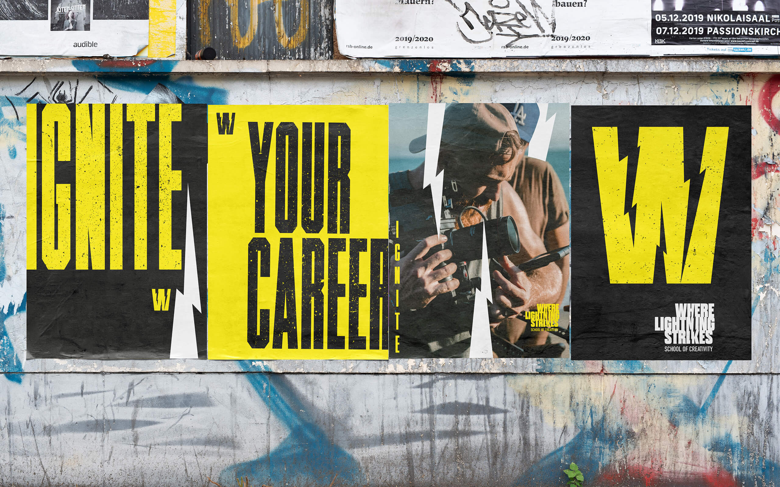
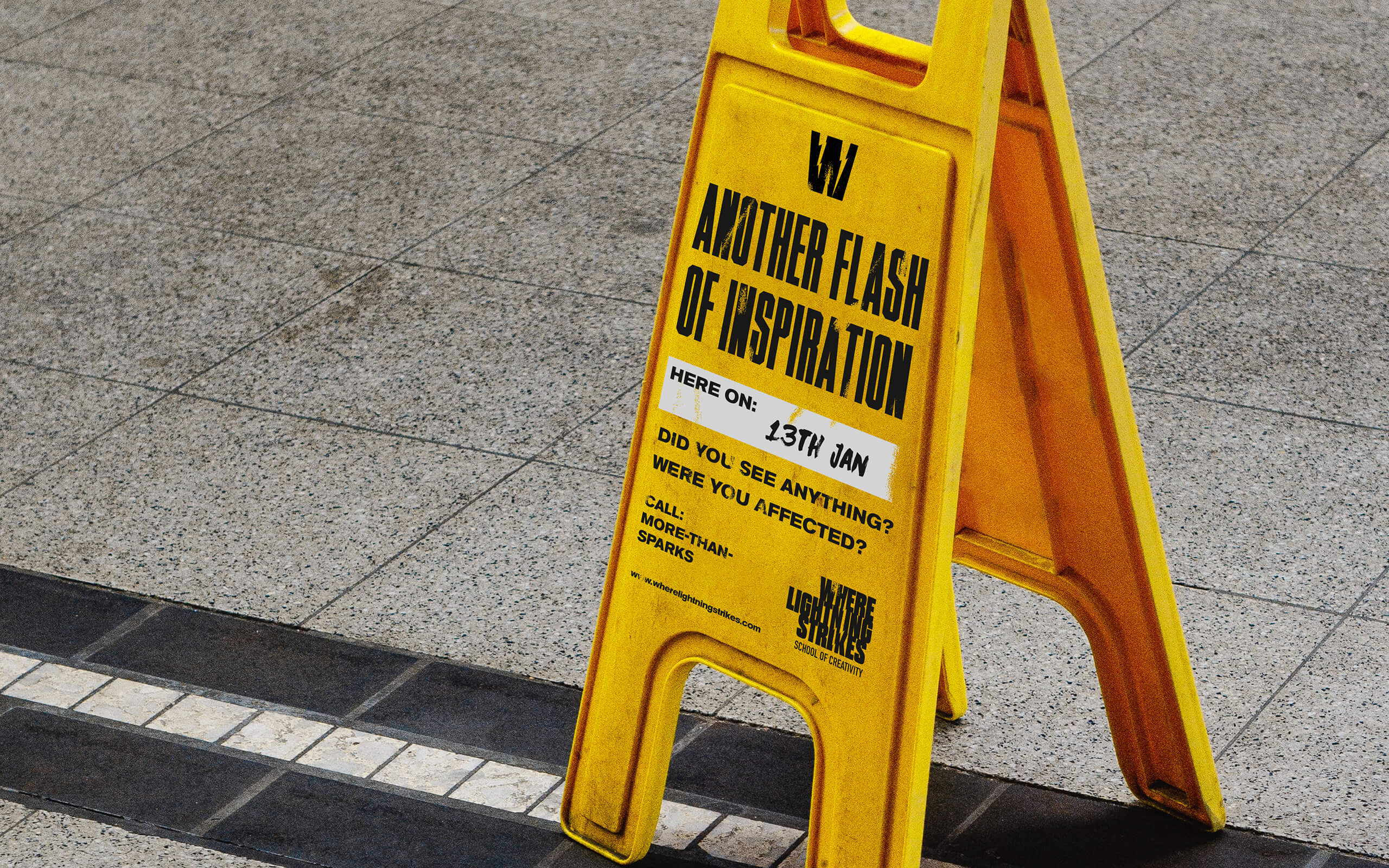
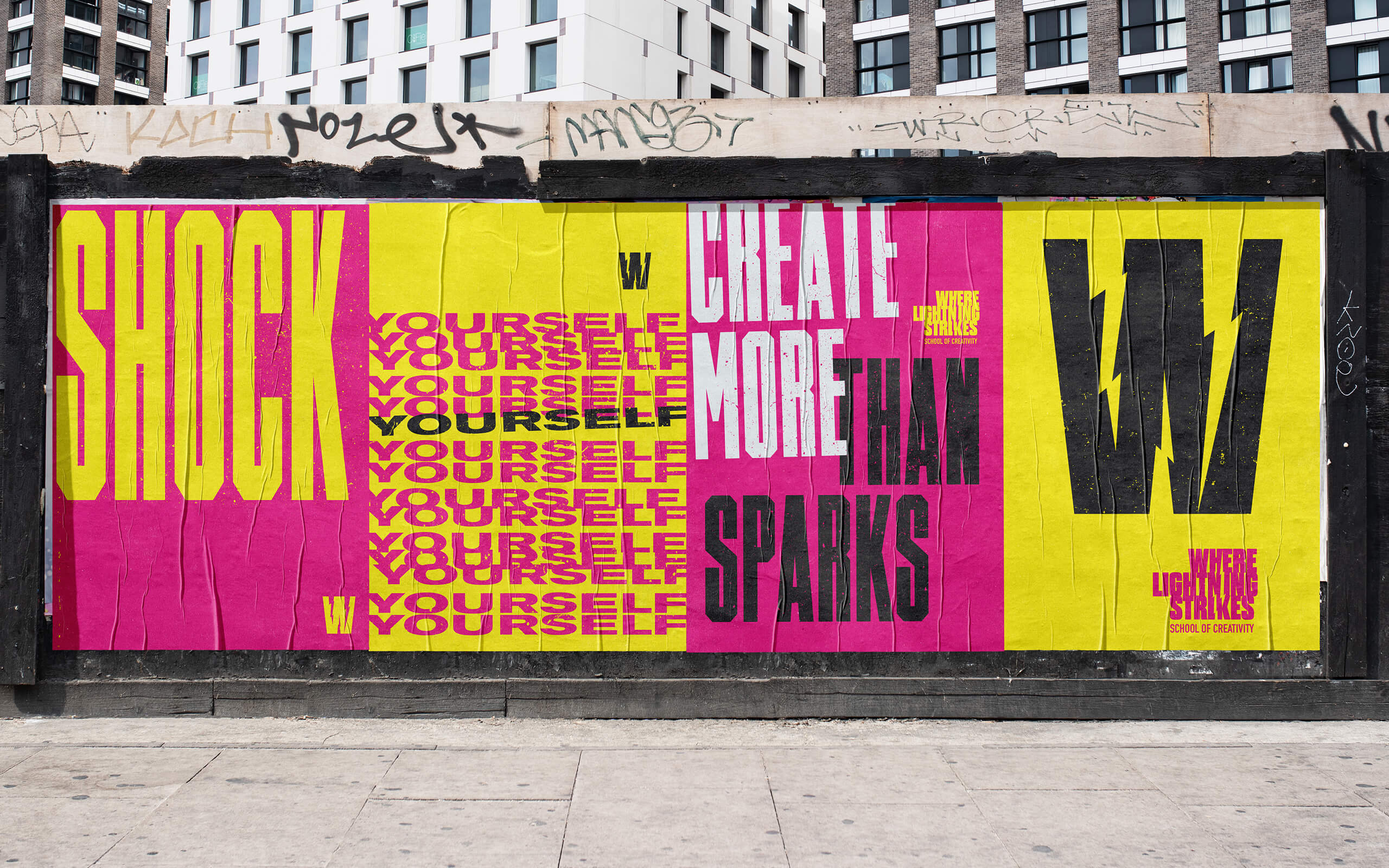
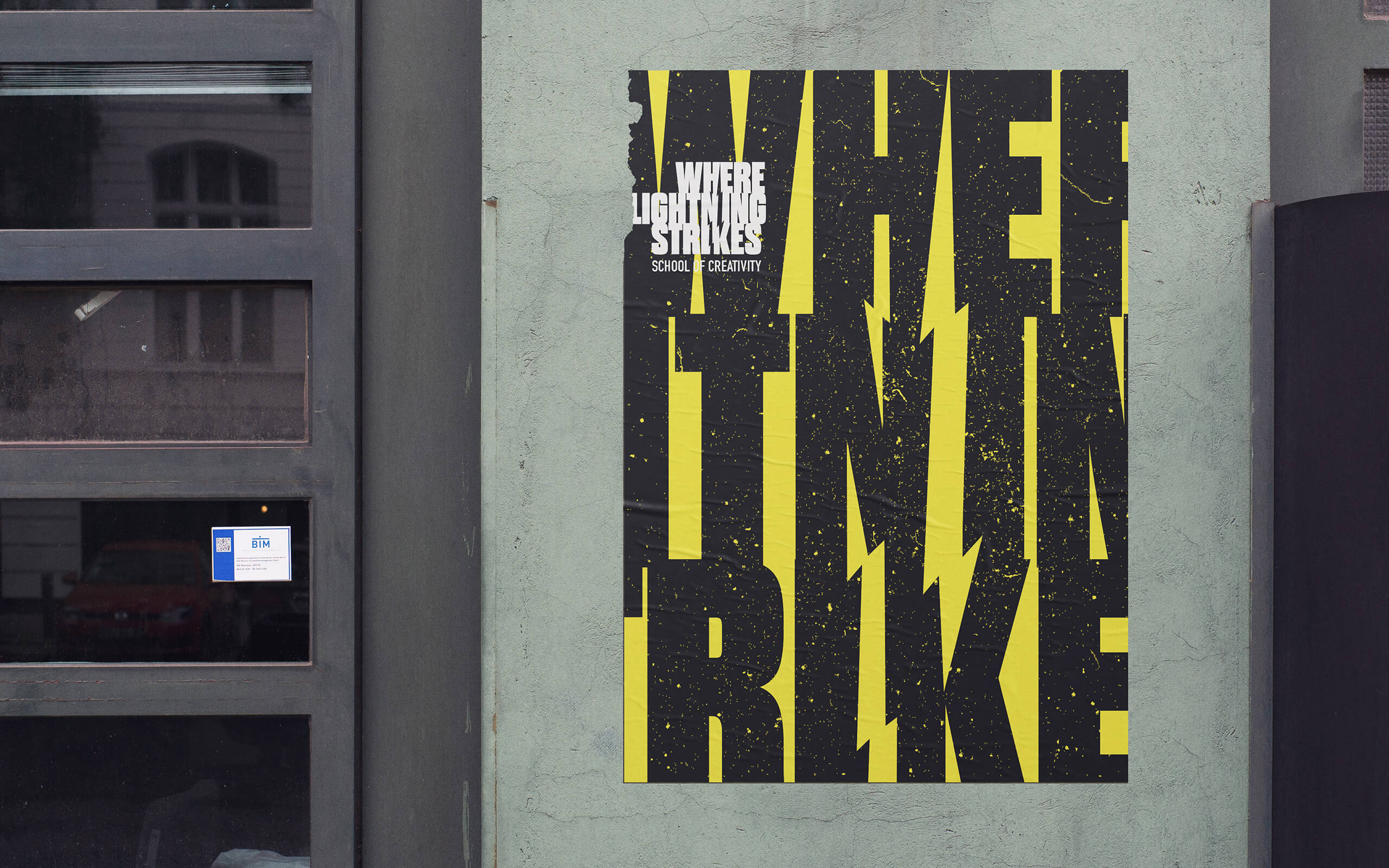
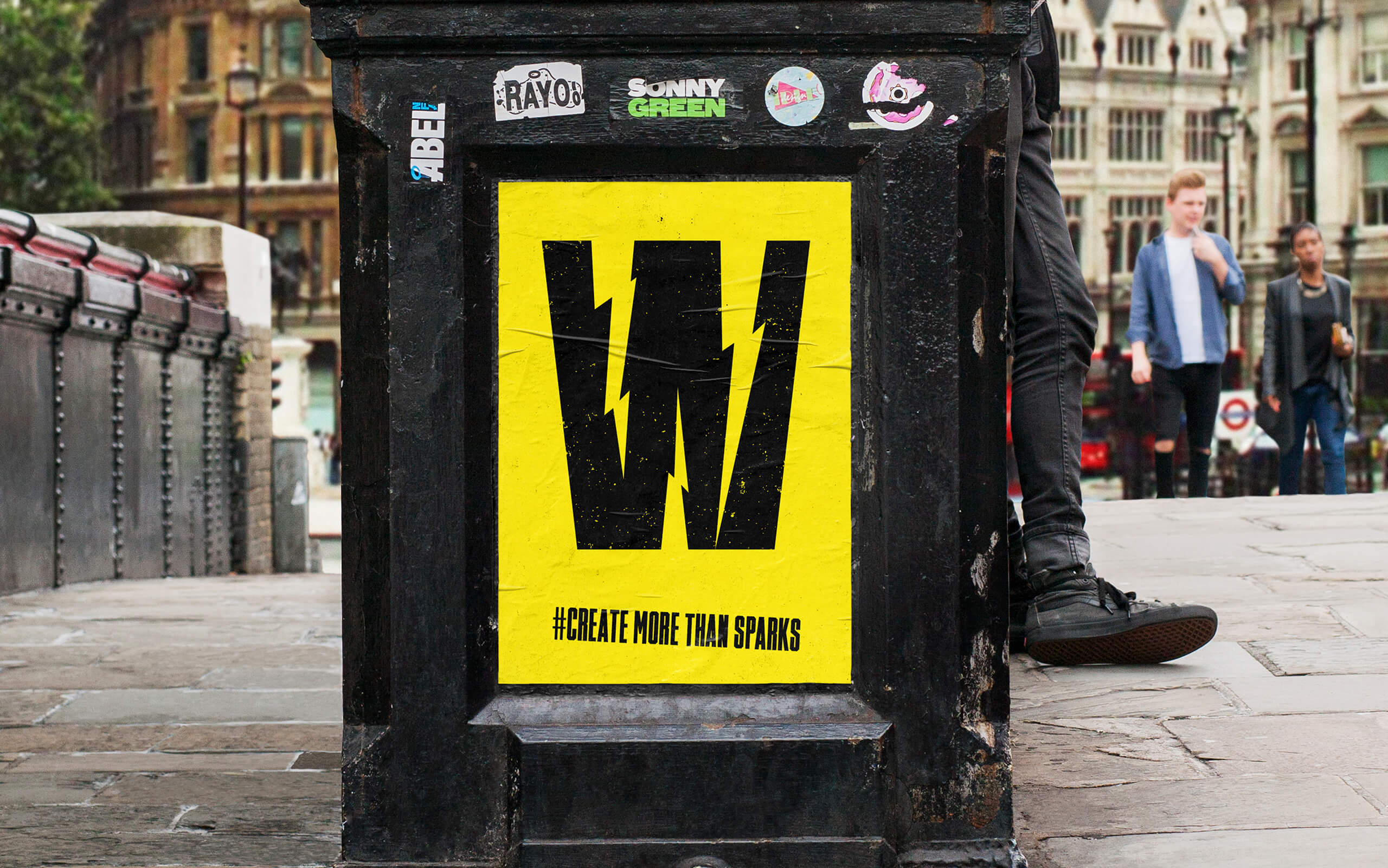
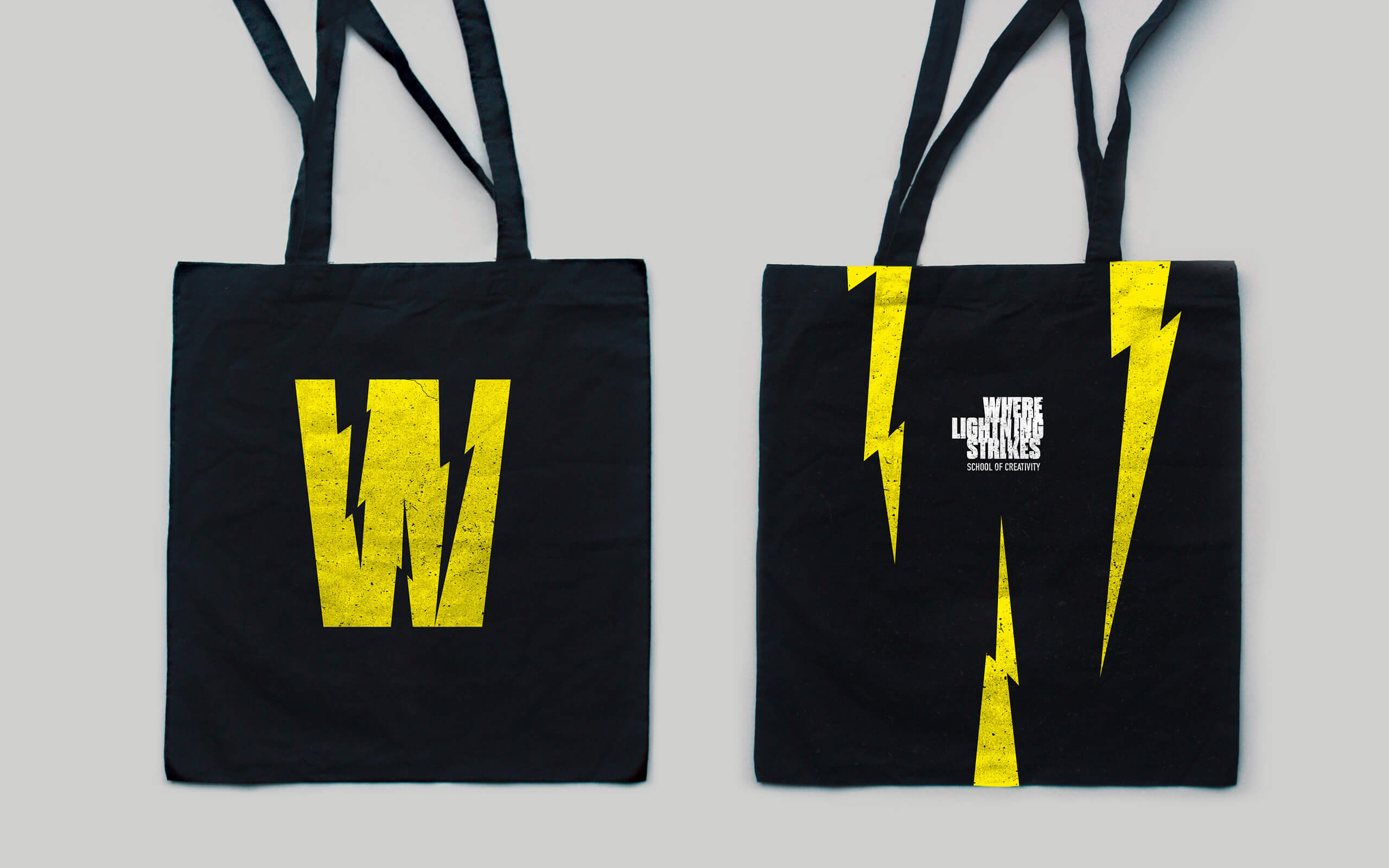
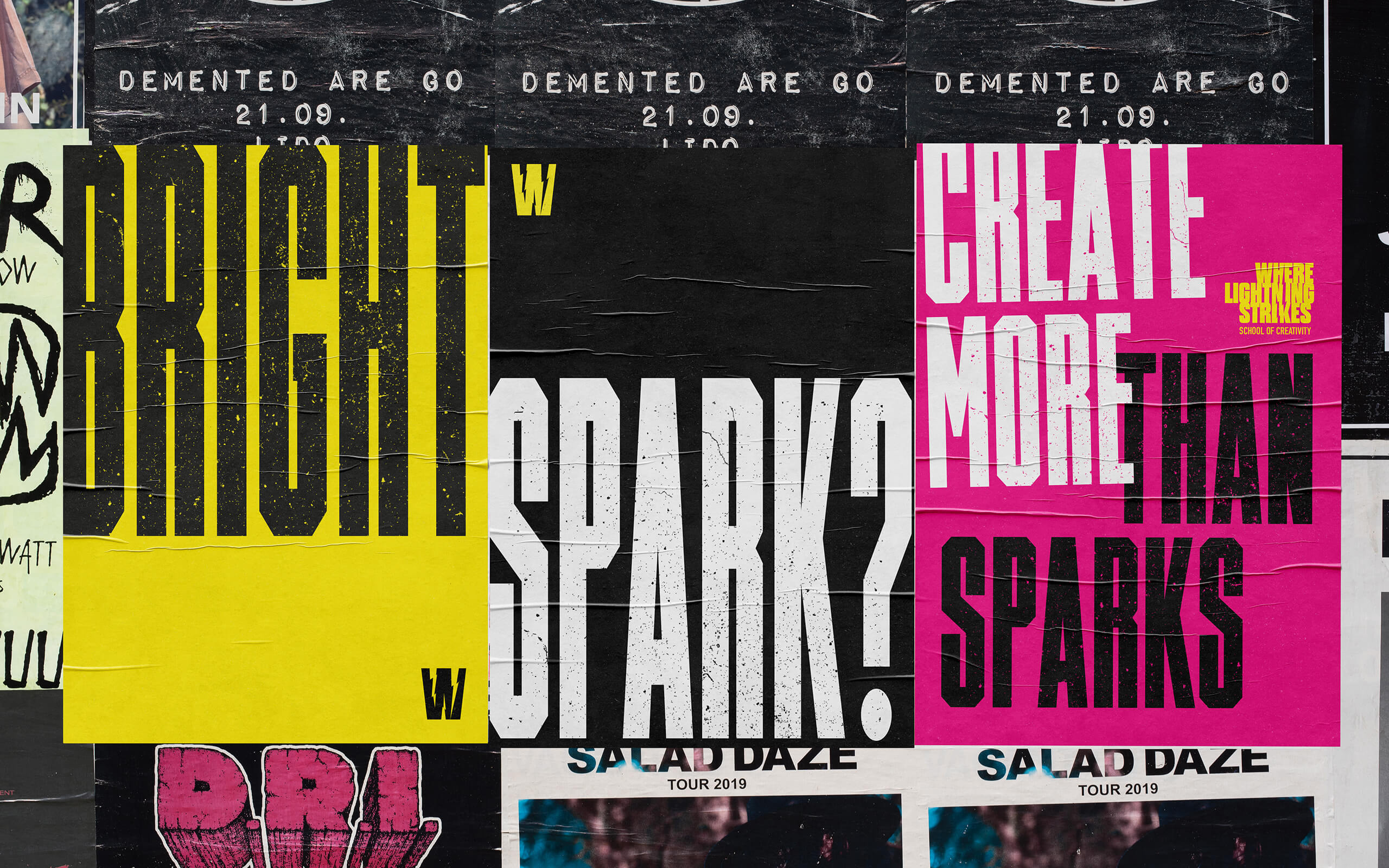
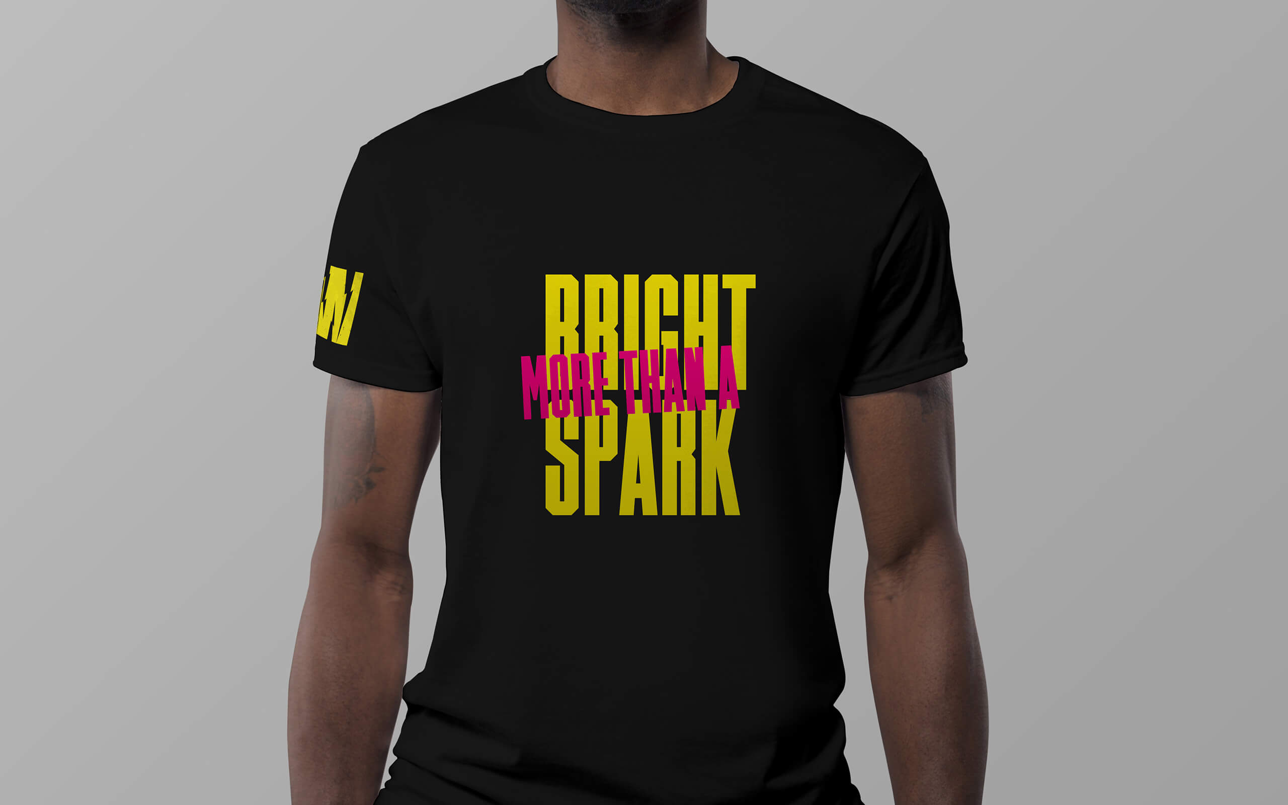
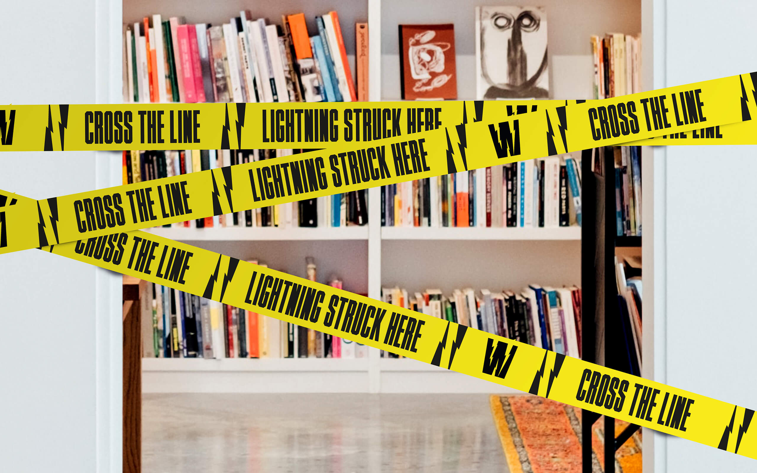
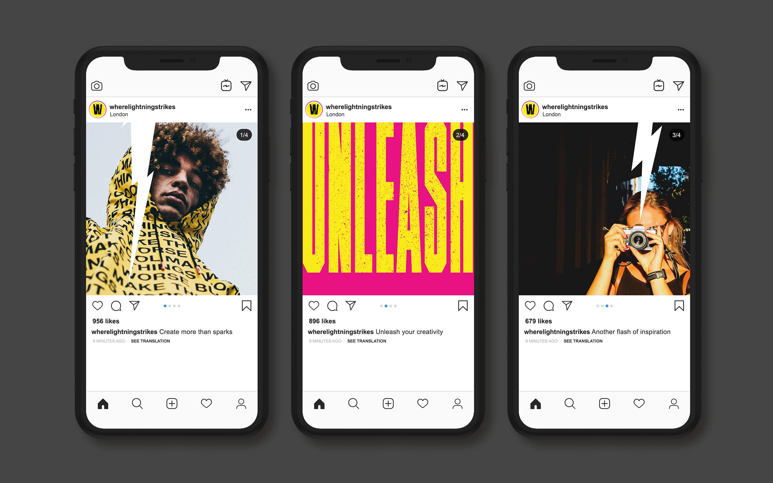
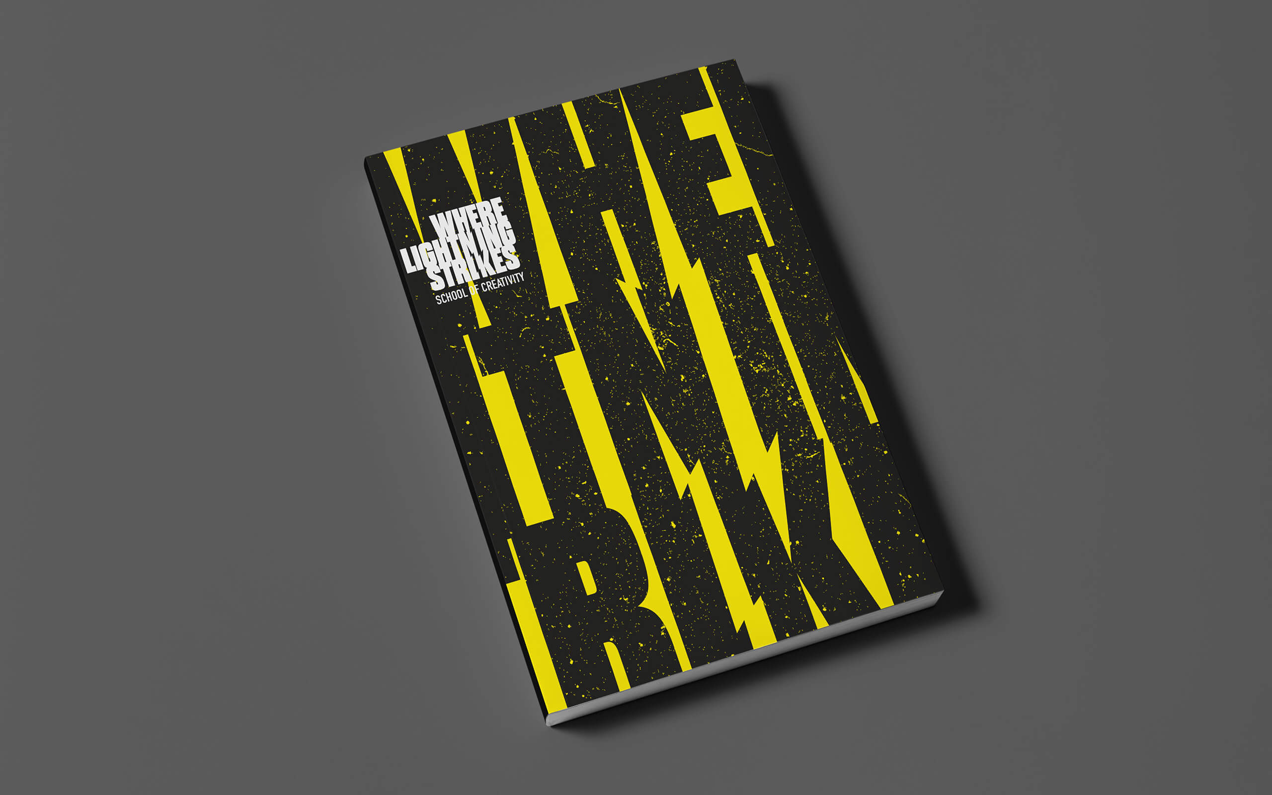
What? Taller Design collaborated with founder and Principal Eugene Riecansky to create an energised Brand Identity to launch the School. The lightning bolts, symbolising the flashes of inspiration, became integral in the negative space of the logo and wordmark. The bolts then echoed the ‘W’ shape when integrated in imagery and graphic applications. A punky colour palette of black, yellow and pink gave a nod to the ‘learn it well, break it better’ ethos, adding an irreverent attitude to learning how to be different. The tone of voice challenged and inspired young creatives to be more, find more and shock themselves by what they could achieve. The result was an electrified visual language inspiring students looking to ignite their careers. A fresh perspective on a gap in the market that turned into OOH, online, print and event collateral.
The lightning bolts, symbolising the flashes of inspiration shared by the teachers, became integral in the negative space of the logo and wordmark. The dynamic graphic bolts were also extracted from the icon and integrated with imagery and other applications, giving energy and recognition at all scales. A vibrant punky colour palette of black, yellow and pink gave a nod to the irreverent ethos.

CREDIT
- Agency/Creative: Taller Design
- Article Title: Where Lightning Strikes School of Creativity Brand – Taller Design
- Organisation/Entity: Agency, Published Commercial Design
- Project Type: Identity
- Agency/Creative Country: United Kingdom
- Market Region: Europe
- Project Deliverables: Brand Creation, Brand Identity, Brand Strategy, Brand World, Branding, Identity System, Tone of Voice
- Industry: Education
- Keywords: Online Learning, School, Creativity, Moving Image, Design


