Long Live Interesting.
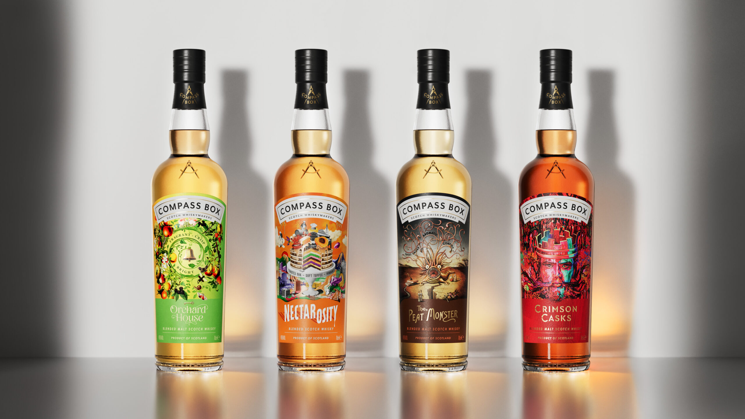
This was the sentiment we looked to echo for Compass Box as they prepared to launch their new core range of whiskies—each one vibrant, daring, and pushing the boundaries of what whisky can be. Far from traditional, these whiskies are explorative and bold, designed for those who embrace the unexpected.
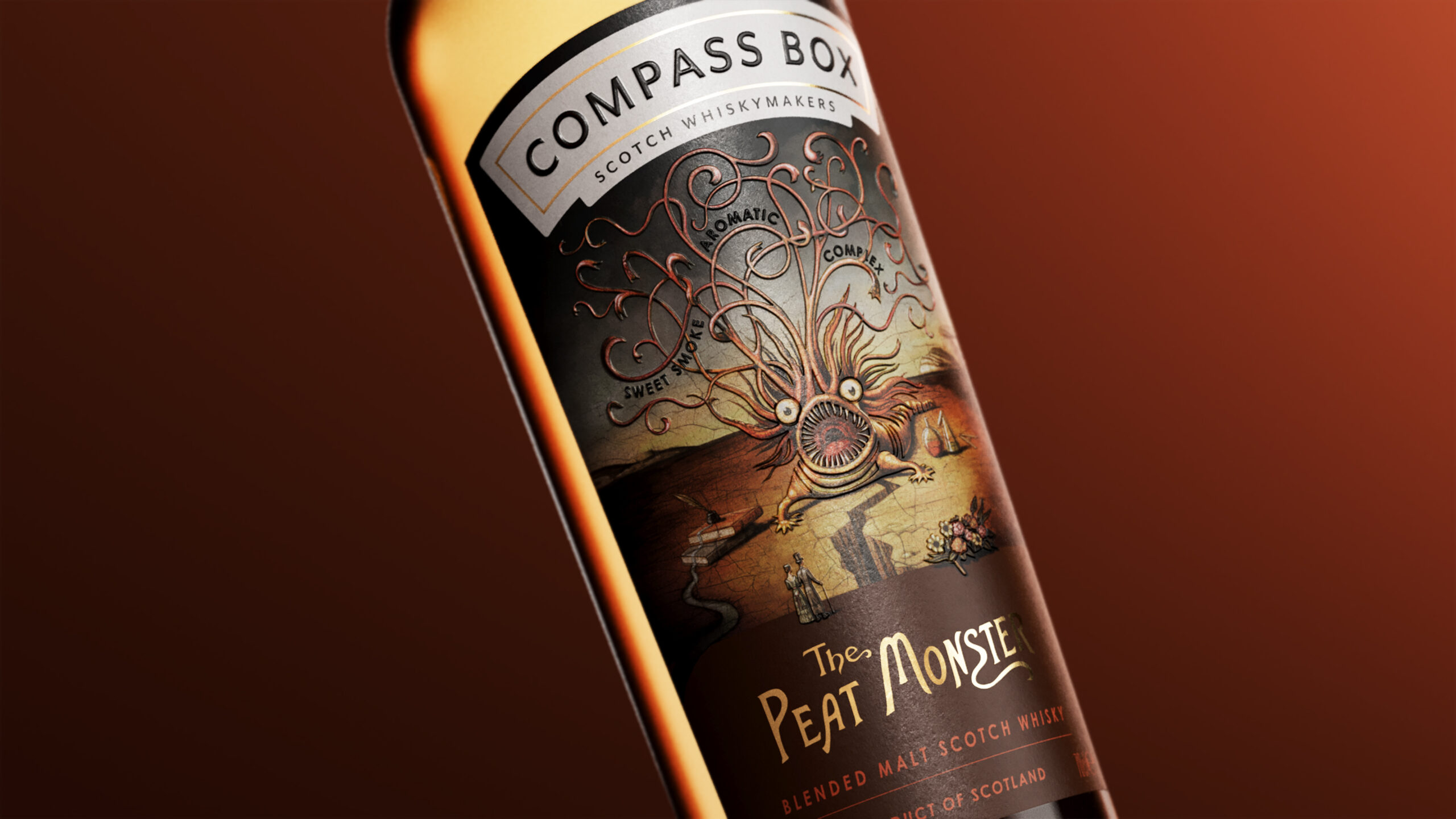
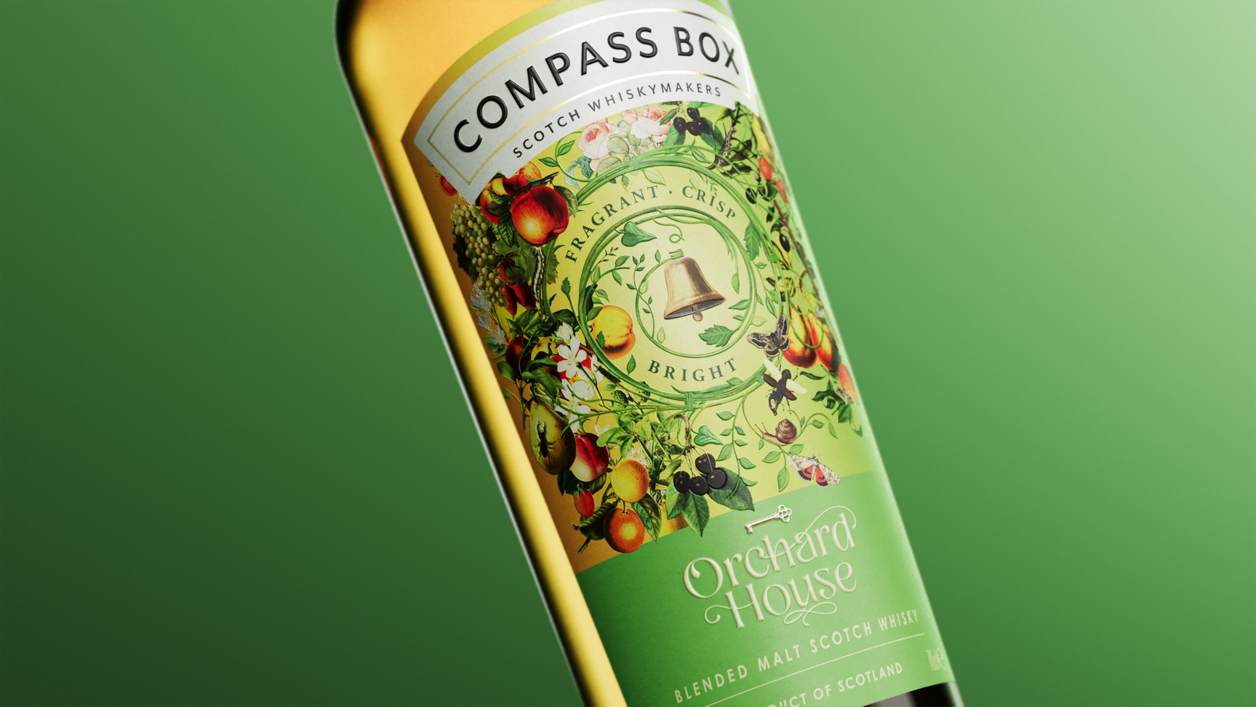
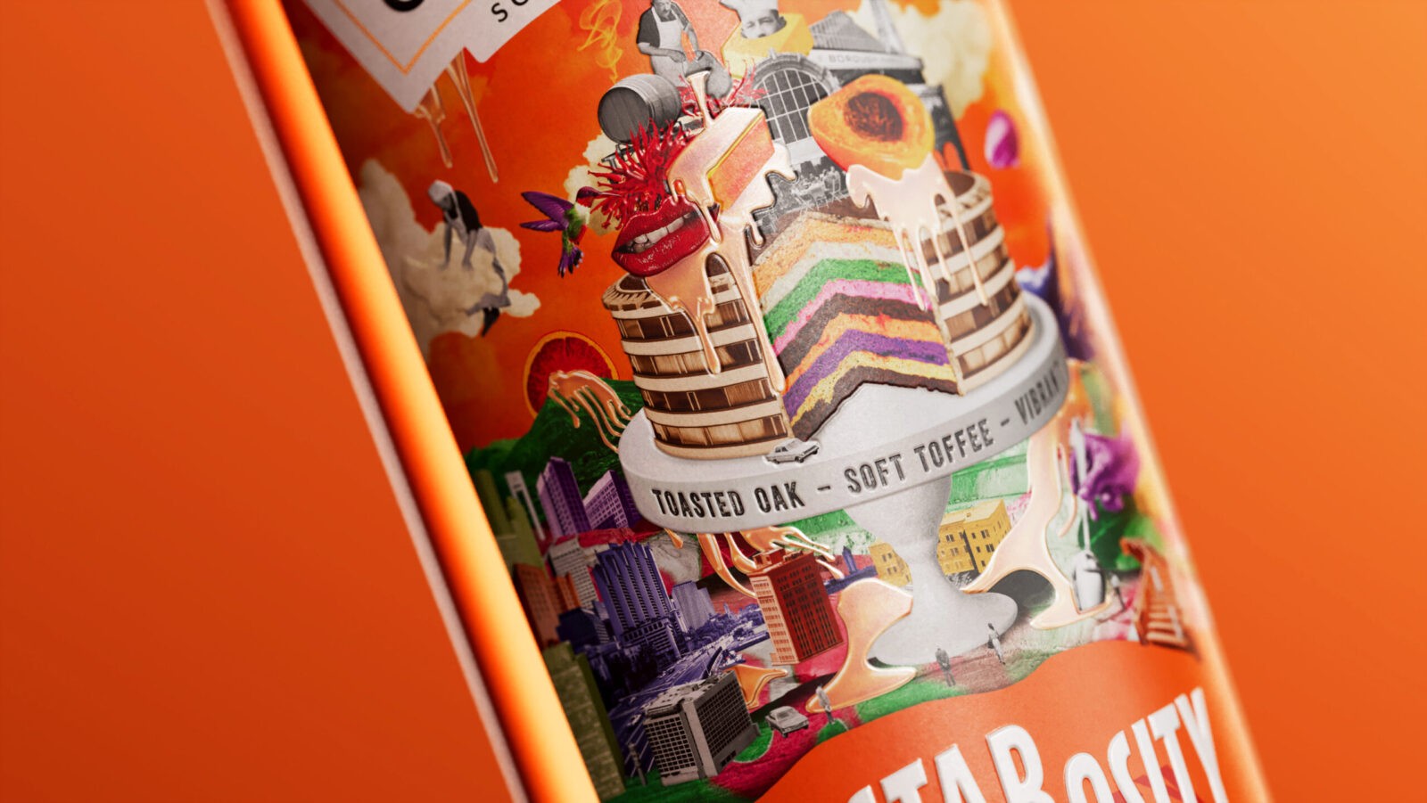
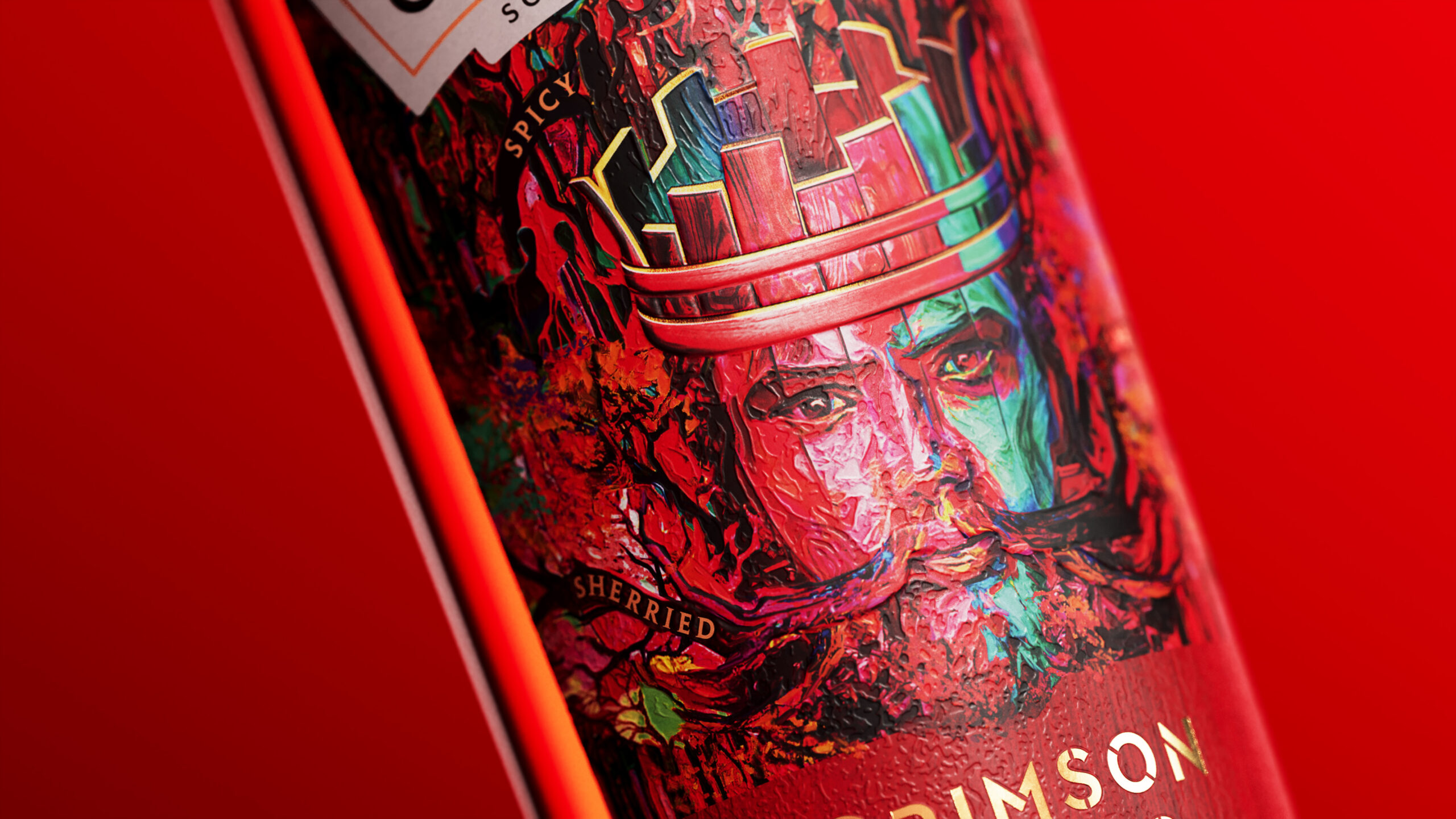
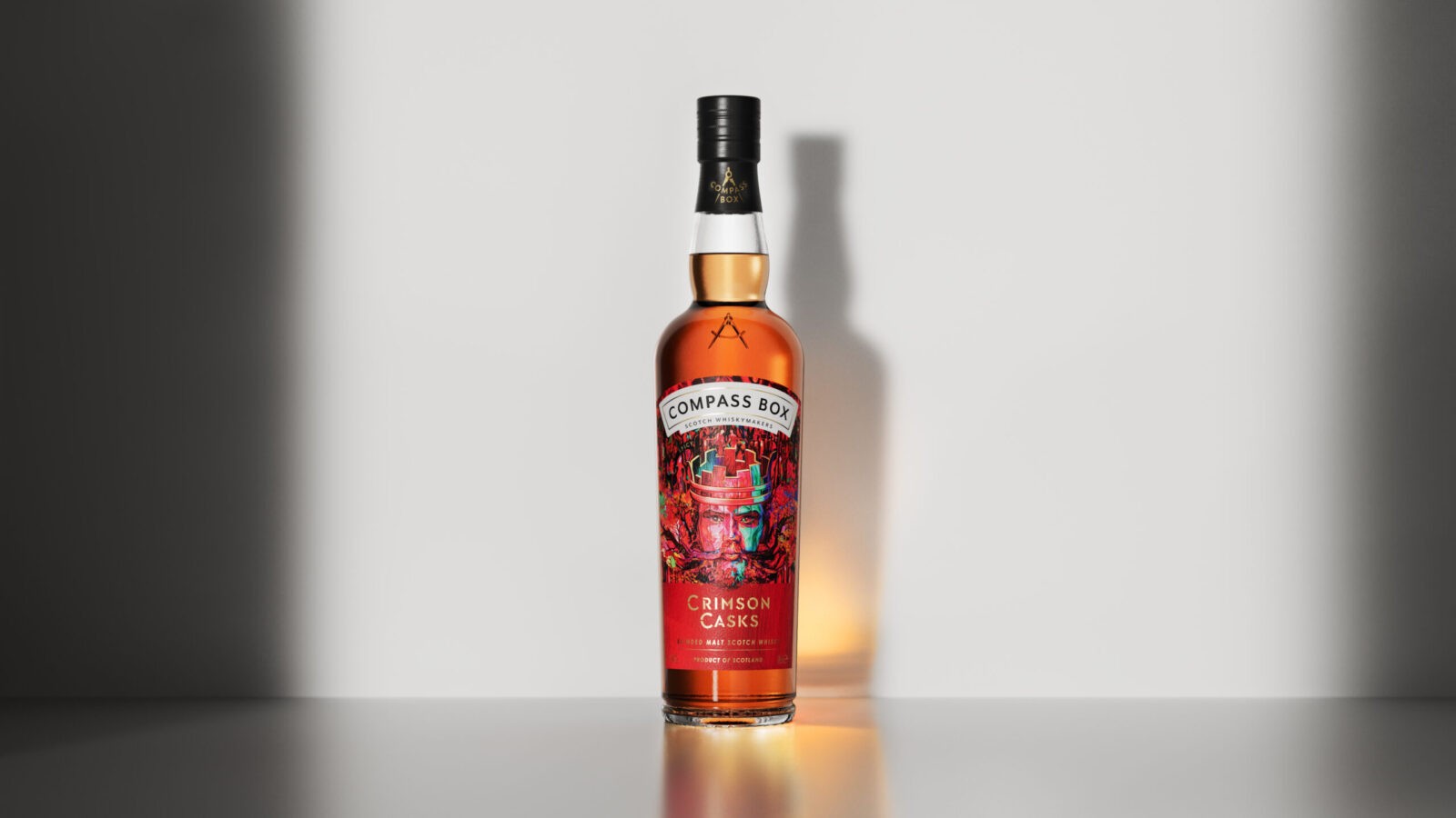
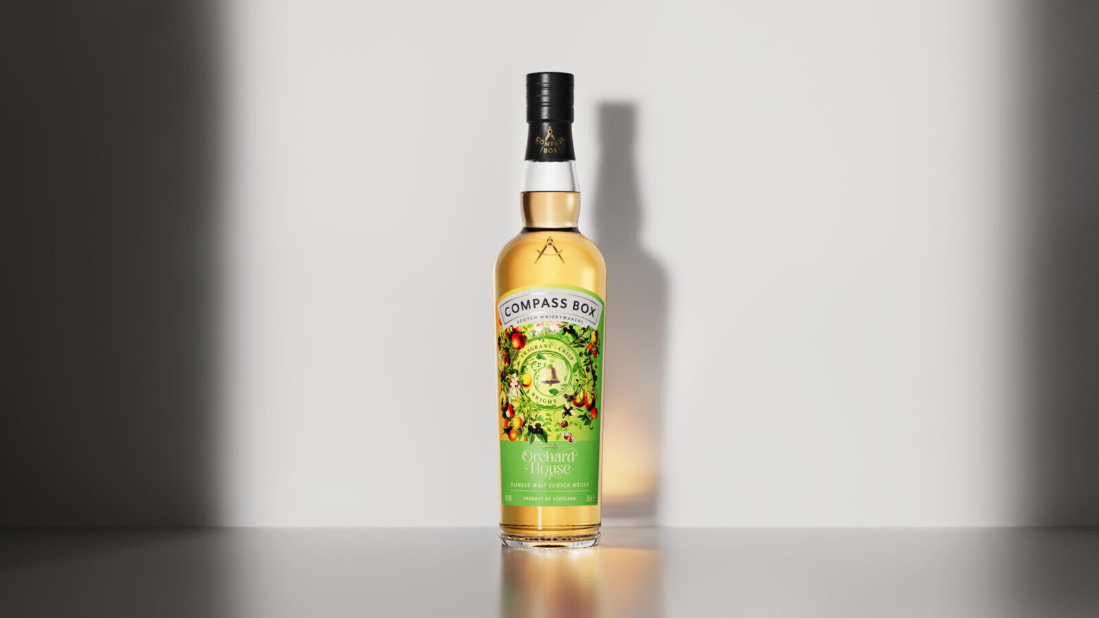
We started by delving deep into the design of each bottle. From intricate illustrations to bold, eye-catching colours and considered finishing touches, every detail was intentional. We meticulously recreated these designs as digital twins, ensuring each bottle’s personality and rich liquid hues were perfectly captured on screen. The visual language was clear: let the whisky itself take center stage. Clean, consistent lineups gave us the flexibility to showcase the product in a way that felt cohesive but still allowed each expression to shine on its own. The goal? To create visuals that stood apart from traditional whisky imagery—category-challenging content for a brand unafraid to break the mold.
The key piece of the launch was a dynamic animation, designed to showcase all four core whiskies. Each whisky was paired with a background that reinforced its individual character, while the movement was designed to feel energetic and adventurous—something you wouldn’t typically see from a whisky brand. This motion added a sense of fun and excitement while highlighting the intricate details of Compass Box’s unconventional labels. A flexible approach meant that the final piece could be easily edited down to allow each expression to have its own short animation, allowing for ease of use across various touch points.
The result is a premium, versatile animation that feels fresh, bold, and perfectly aligned with Compass Box’s vision. It’s more than just an animation—it’s a celebration of what makes their whiskies unique, embracing the interesting and welcoming those who do things a little differently.
Boring is dead. Long Live Interesting.
CREDIT
- Agency/Creative: Where Giants Roam
- Article Title: Where Giants Roam Delivers Dynamic Whisky Visuals for Compass Box’s Core Collection
- Organisation/Entity: Agency
- Project Status: Published
- Agency/Creative Country: United Kingdom
- Agency/Creative City: Edinburgh
- Project Deliverables: Visualisation
- Industry: Food/Beverage
- Keywords: WBDS Agency Design Awards 2024/25
- Keywords: WBDS Agency Design Awards 2024/25


