Founded in 2014 in Annecy, France, Stone & Wood is a real estate agency that caters to clients seeking authenticity in a place where nature reigns supreme.
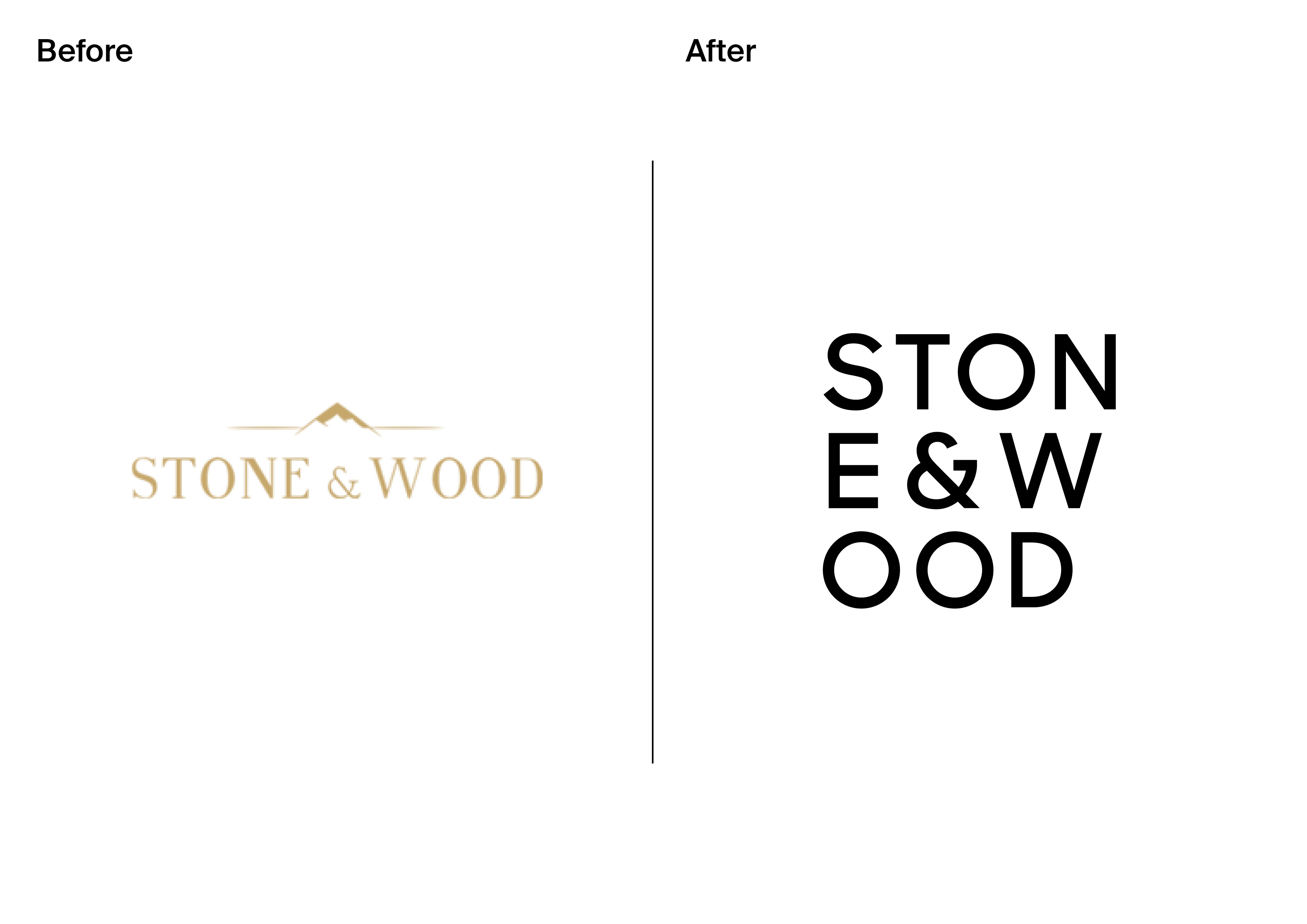
In the five years since their founding, the agency had evolved and needed an updated brand image that remained true to their core values. Our mission was to help the agency shed its old skin as it embraced more modern and authentic branding.
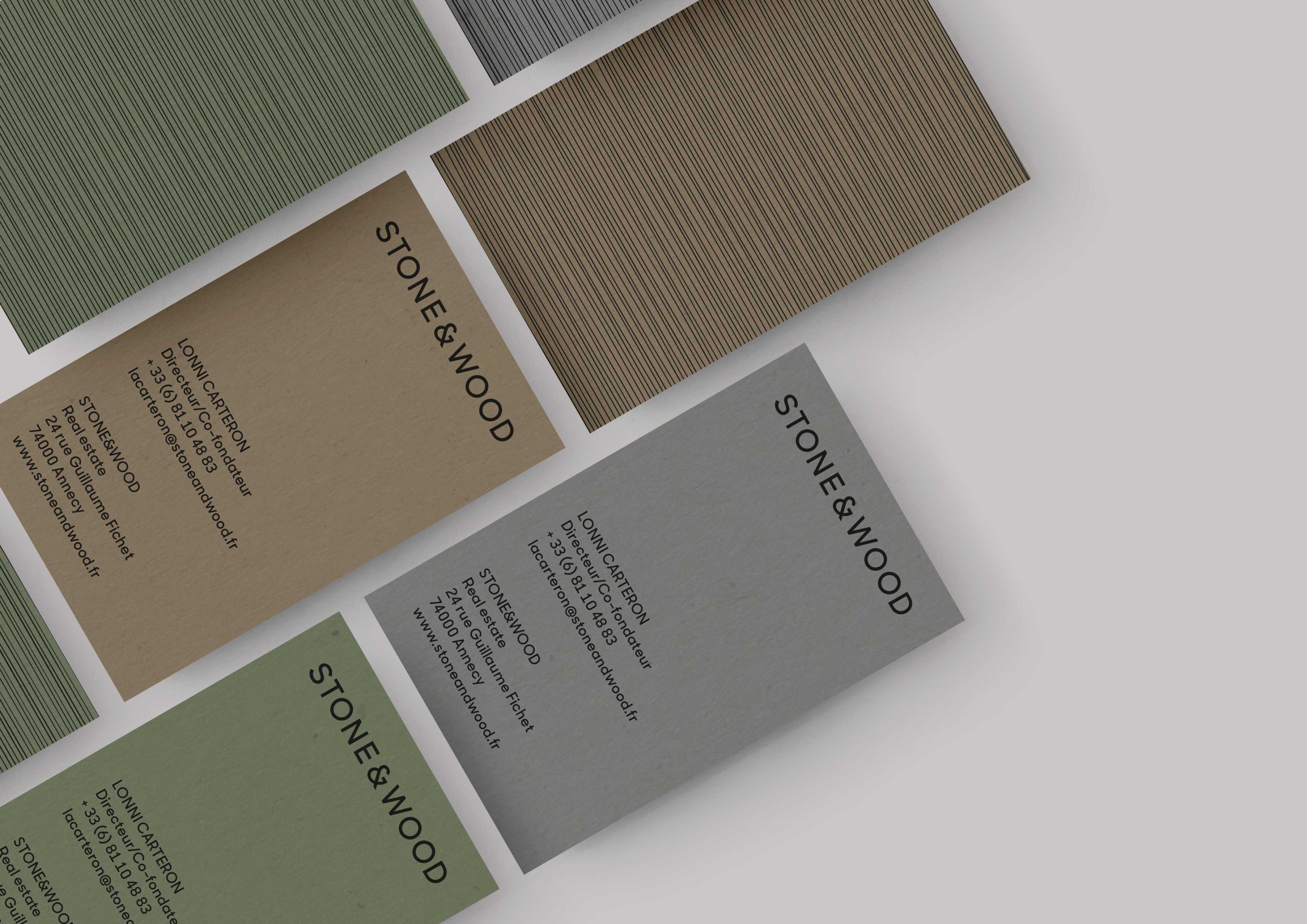
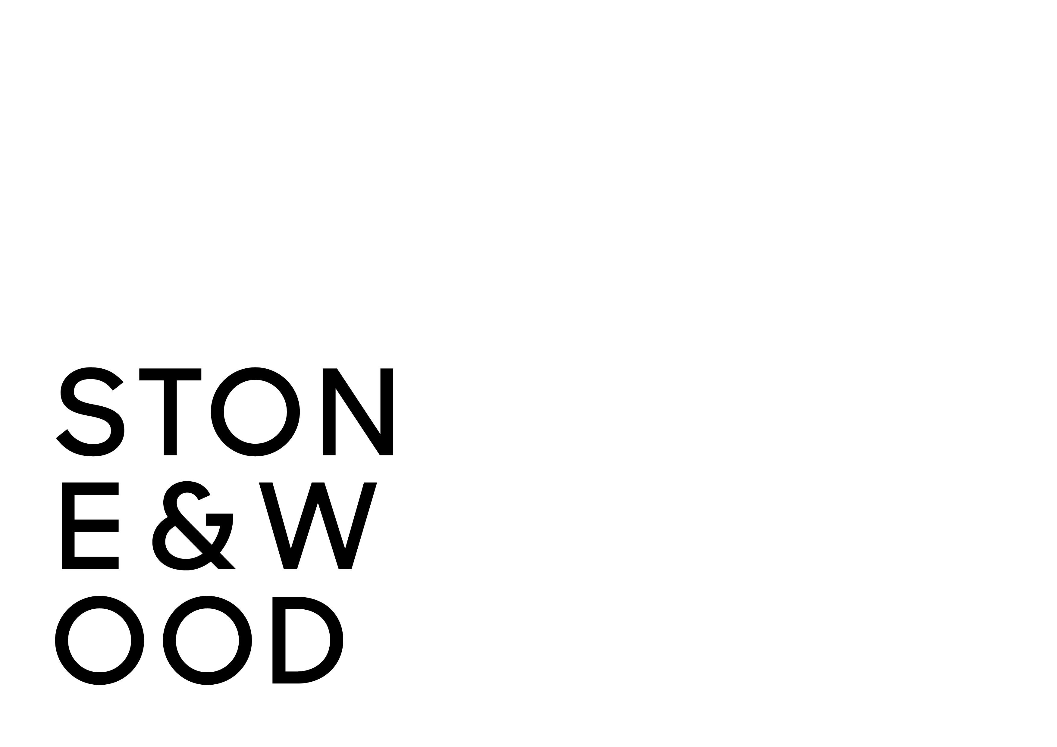
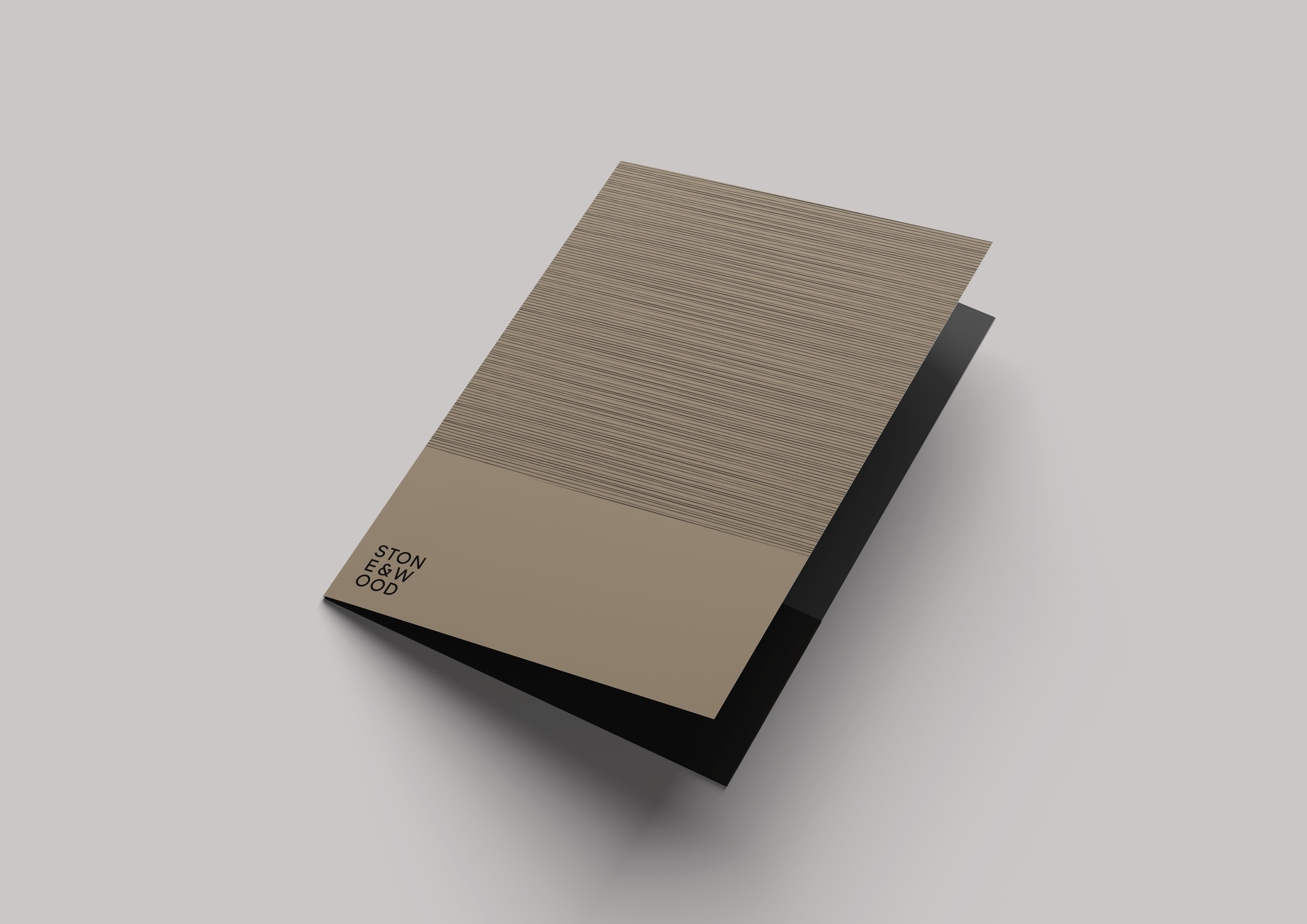
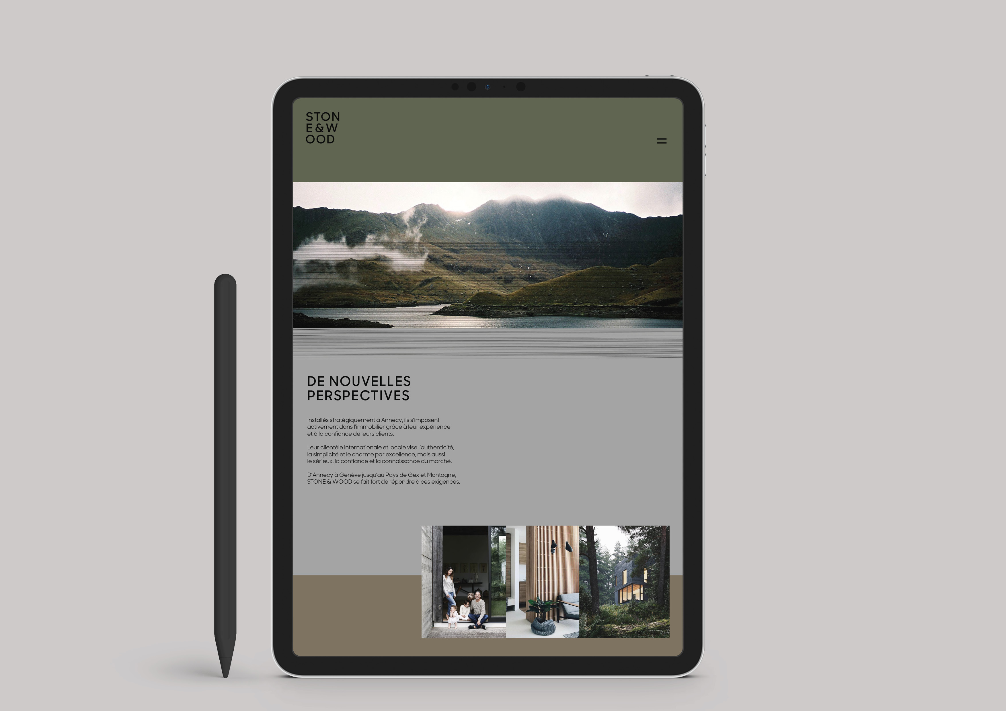
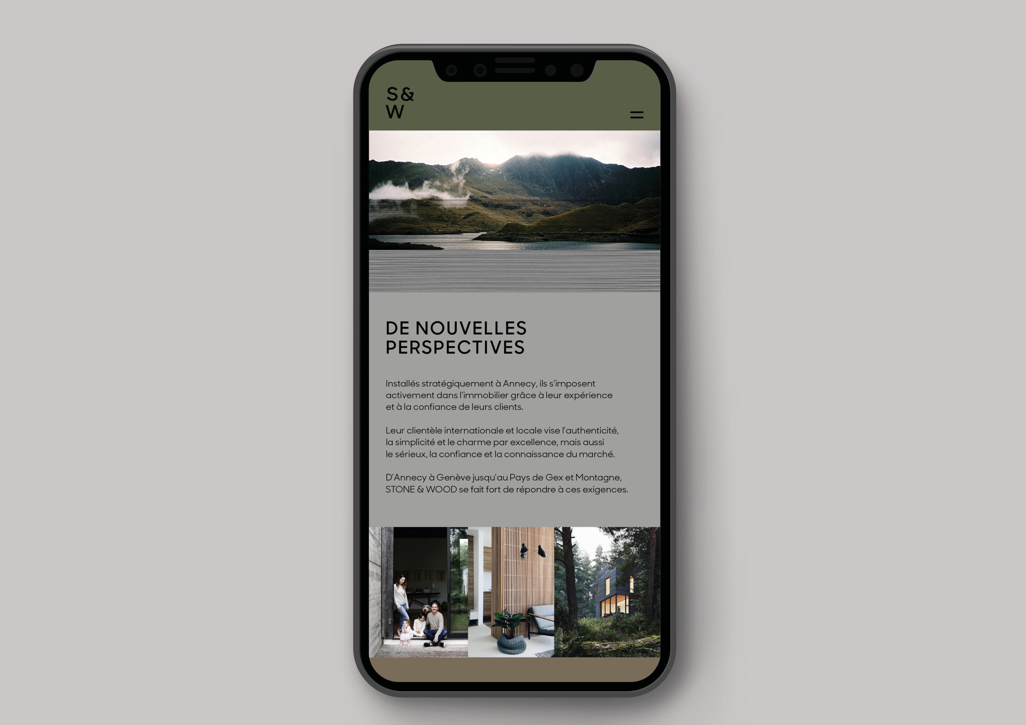
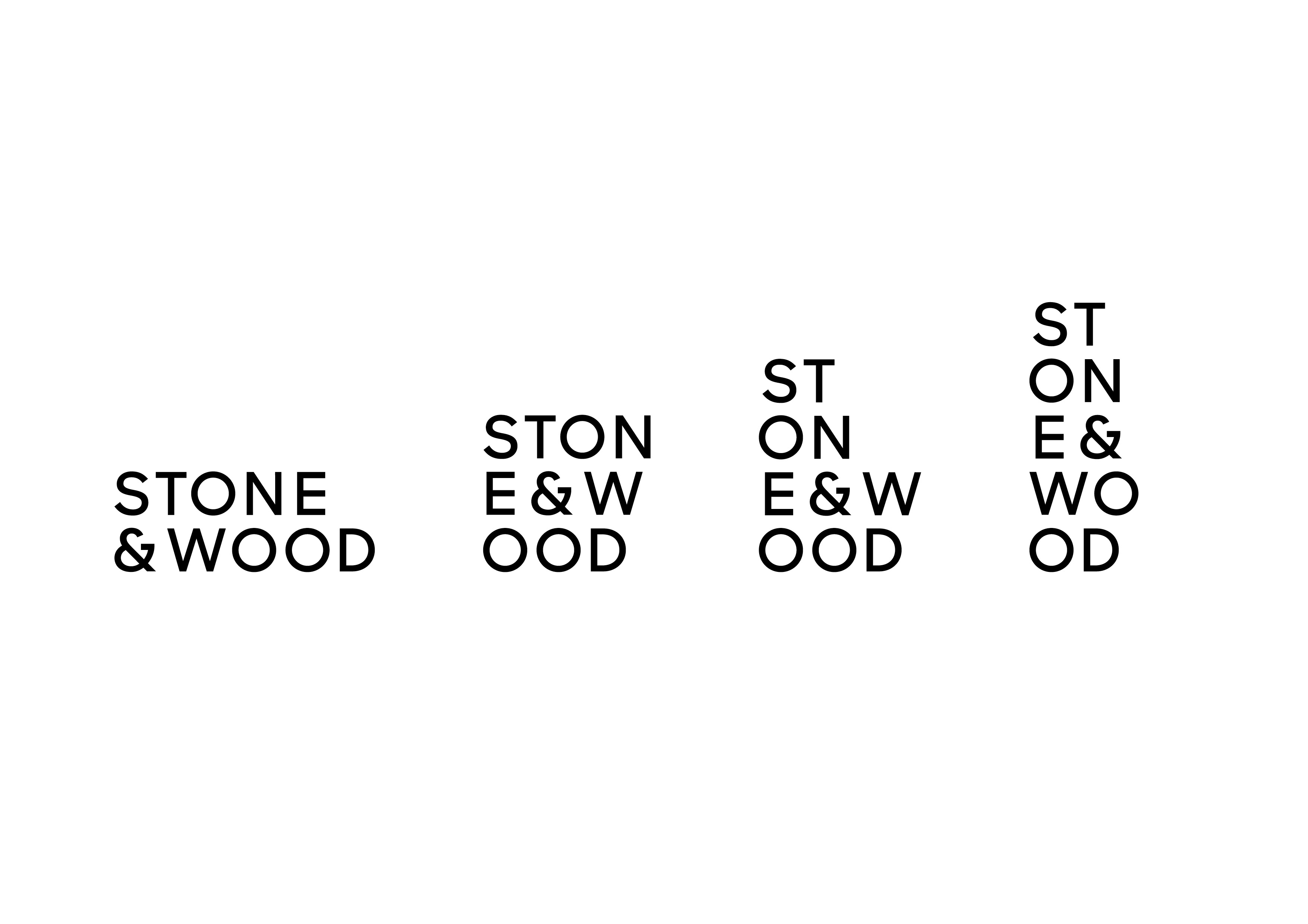
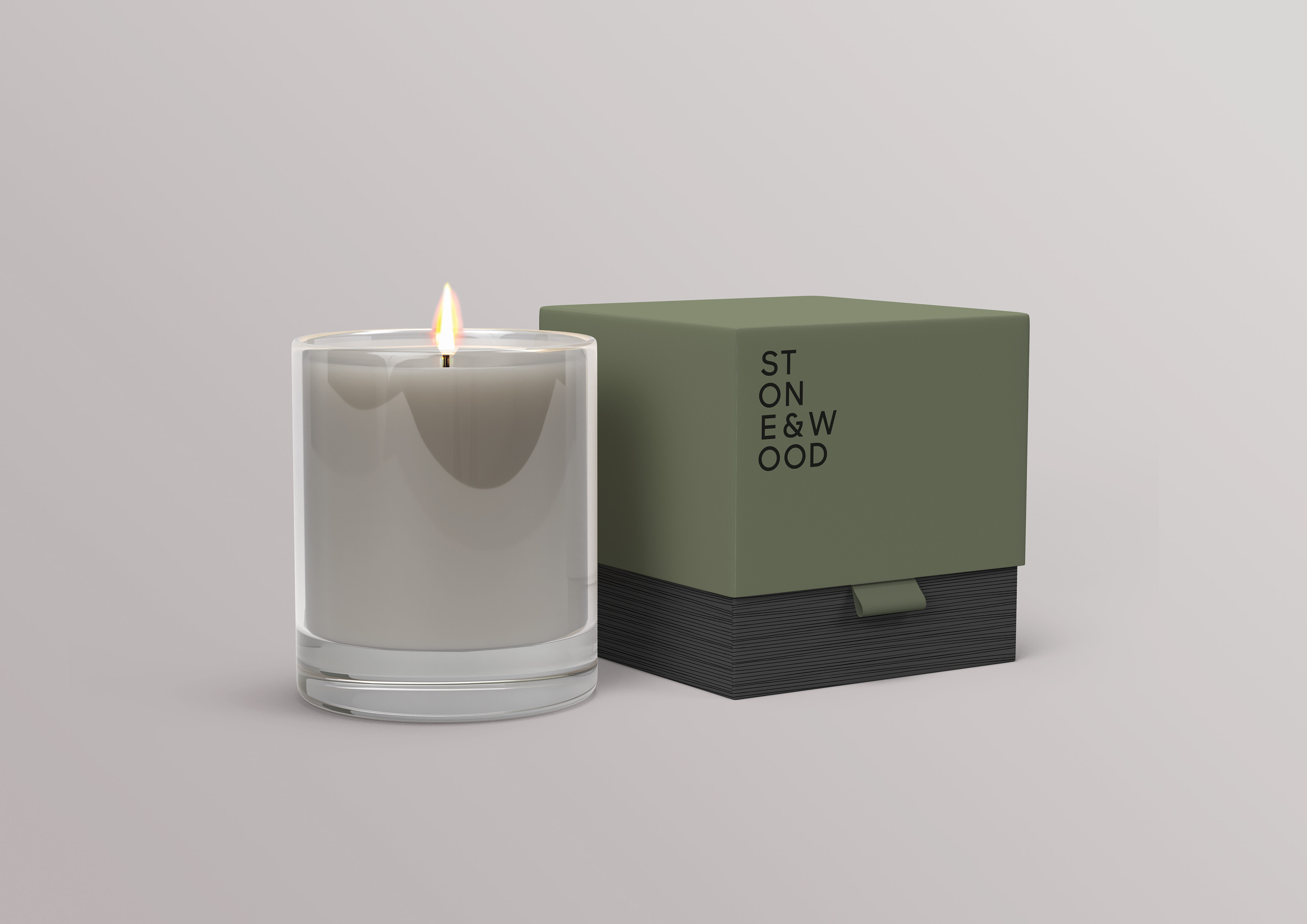
Using our Brand Methodology, we built a graphic design ecosystem inspired by the organic structures of stone and wood, foundation materials for most Stone & Wood properties. We chose the “Sharp” font, designed by the New York foundry of the same name, as it provided a strong yet simple base for our designs that embraced not just one version, but multiple variations of the brand’s logo. The design unfolds across all forms of communication, from stationary letterhead, to office signage and website design, all of which exude an elegance that’s beautifully complimented by colours inspired by the region’s natural wonders.
CREDIT
- Agency/Creative: Hymn
- Article Title: When Real Estate Rhymes With Authenticity
- Organisation/Entity: Agency, Published Commercial Design
- Project Type: Identity
- Agency/Creative Country: Switzerland
- Market Region: Europe
- Project Deliverables: Brand Design, Brand Identity, Brand Redesign, Brand Refinement, Brand World, Graphic Design, Identity System, Rebranding
- Industry: Real Estate
- Keywords: Real Estate, Branding, Website, Corporate Identity, Motion Identity, Pattern, Annecy, France


