RiD, Australia’s pioneering insect repellent brand, has been a trusted shield against insect bites since 1956.
Over the decades, RiD’s visual identity remained relatively consistent, even as the market grew and diversified around it. Consumers’ needs changed and its on-shelf impact started to decline as simply being recognisable was no longer enough.
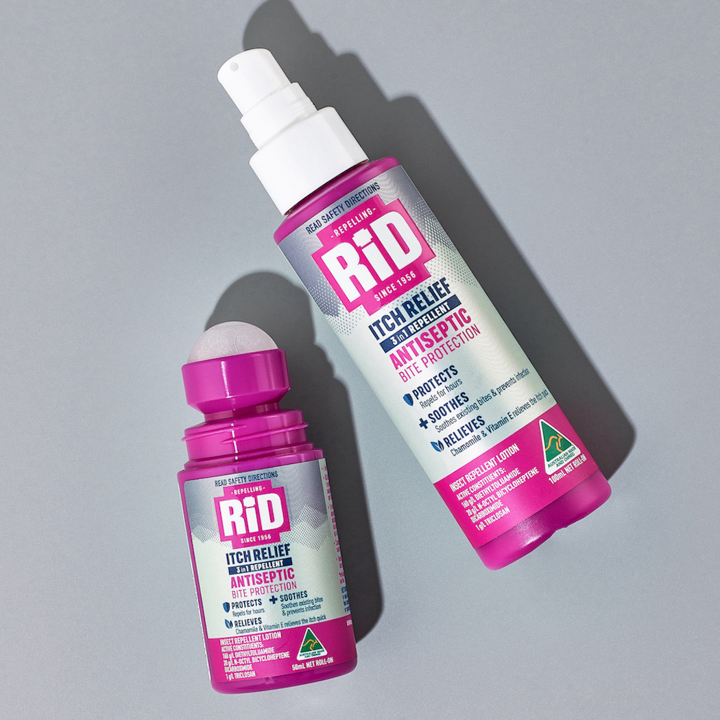
RiD’s unique formulation of the highest quality DEET combined with a fly repellent and healing antiseptic to prevent inflammation, has always distinguished it from other household brands. It supports the needs of today’s consumers’ preference for one product that effectively repels the dangers of vector-borne diseases while administering gentle healing properties. Yet this dual message of function and care was lost on the pack and consequently lost in consumers’ minds too.
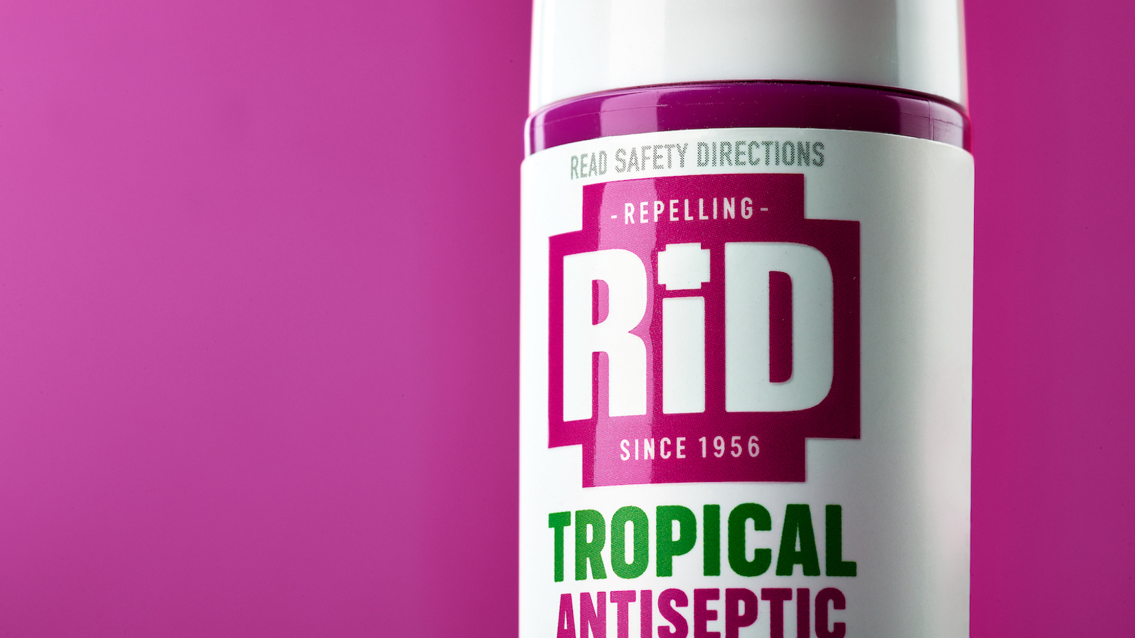
Branding agency WhatCameNext_ was briefed to create an “exciting” brand narrative and visual identity that embraced ideas around the efficacious formula and usage. This inspired an iconic brand mark, enabling RiD to clarify its unique benefit story whilst delivering the world in which it exists.
Glenn Kiernan, Executive Creative Director of WhatCameNext_, shared, “Where RiD’s previous branding lacked standout, confidence and interest, the refresh now effectively humanises, connects and communicates the function and care benefits that have been intrinsic in the brand for generations.”
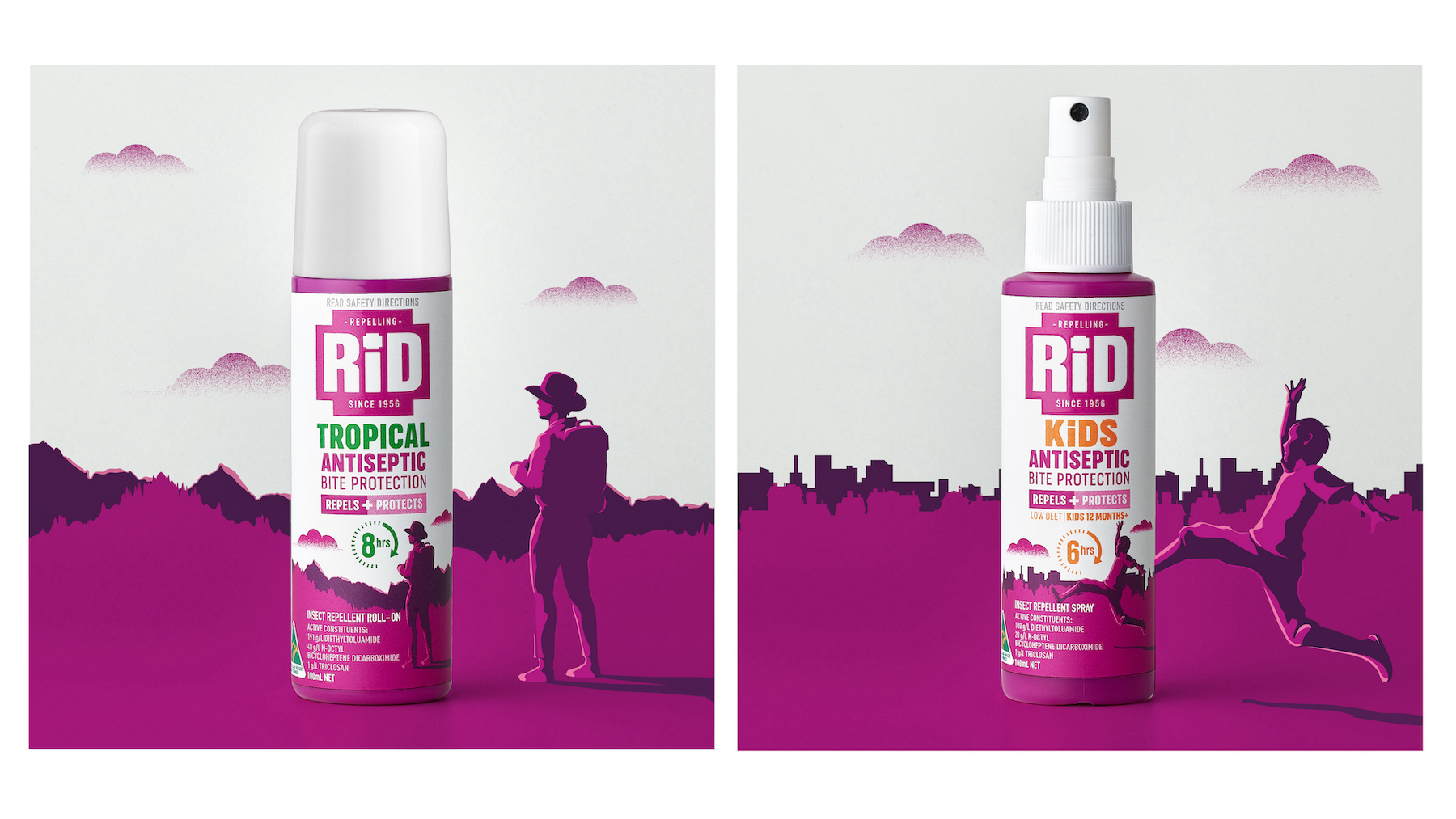
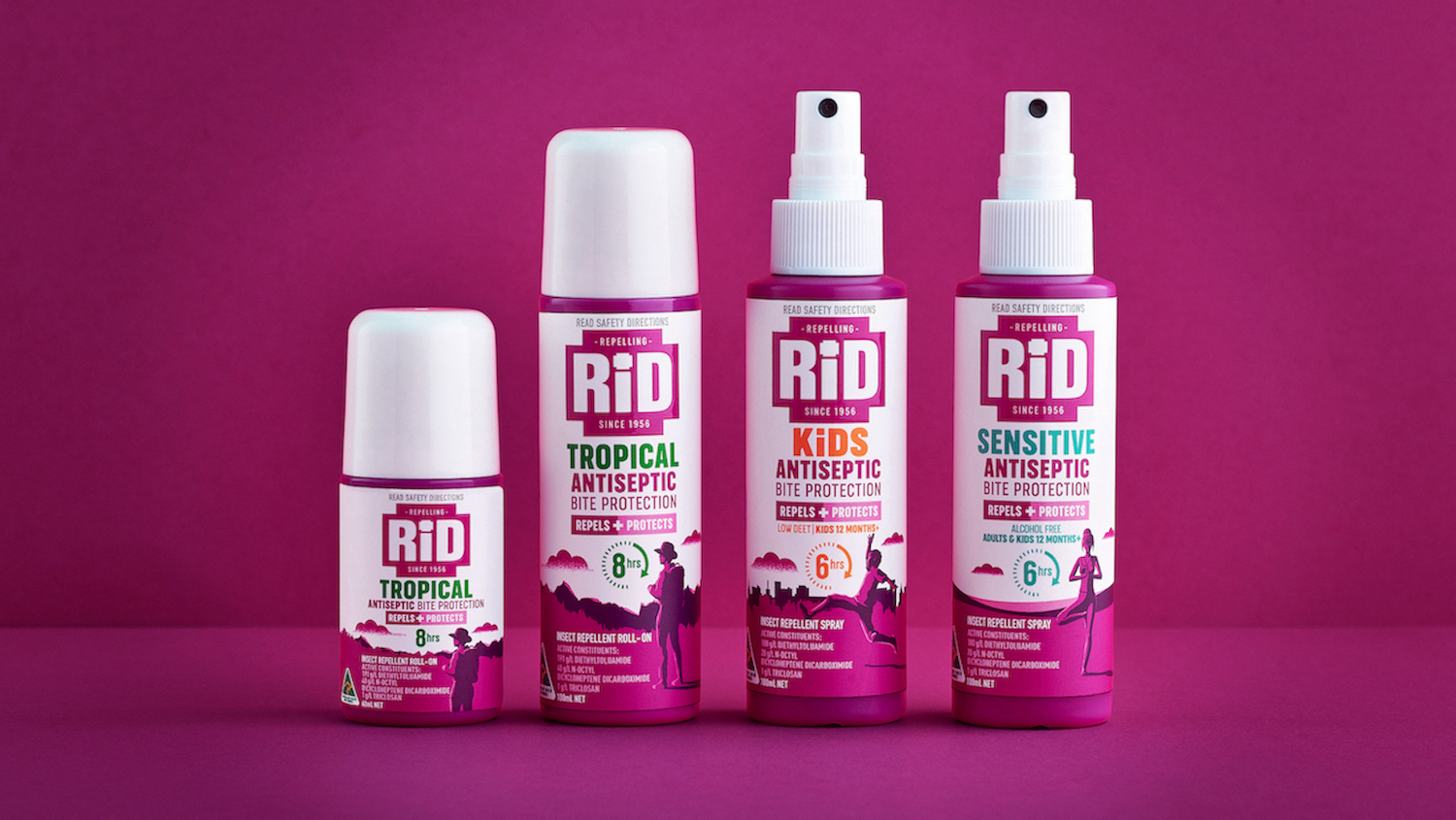
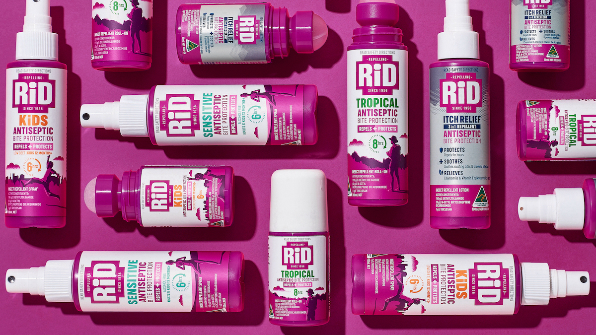
Within the packaging, the mosquito character and dominant pink are superseded by a clean white background to enhance the brand’s medicinal attributes and create space for relatable illustrations of the audience embracing the great outdoors.
A collection of multifunctional story-telling assets has been created to appear throughout marketing comms and ensure the dual message – repel and protect – never gets lost again.
Rob Milne, Marketing Manager at RiD, feels, “For the first time, our brand is telling the full story to the next generation of families looking for a gentle but highly effective repellent.”
CREDIT
- Agency/Creative: WhatCameNext_
- Article Title: WhatCameNext_ Refreshes Australian Insect Repellent RiD to Connect with Today’s Explorers
- Organisation/Entity: Agency
- Project Type: Packaging
- Project Status: Published
- Agency/Creative Country: Australia
- Agency/Creative City: Sydney
- Market Region: Oceania
- Project Deliverables: 3D Design, Brand Design, Brand Identity, Brand Mark, Brand Redesign, Brand Refinement, Brand Rejuvenation, Branding, Design, Packaging Design
- Format: Bottle
- Industry: Health Care
- Keywords: Insect repellent, First Aid, Protection, Healing properties, Repel & Protect
-
Credits:
Executive Creative Director: WhatCameNext_


