


The challenge was clear: to create a visual identity that reflected the young and irreverent soul of a ready-to-drink cocktail brand, targeting an audience between 25 and 45 years old. The client desired a bold project, capable of expressing modernity and ambition, while also being flexible enough to adapt to the introduction of new products.
“WFD: A Name, A Revolution”
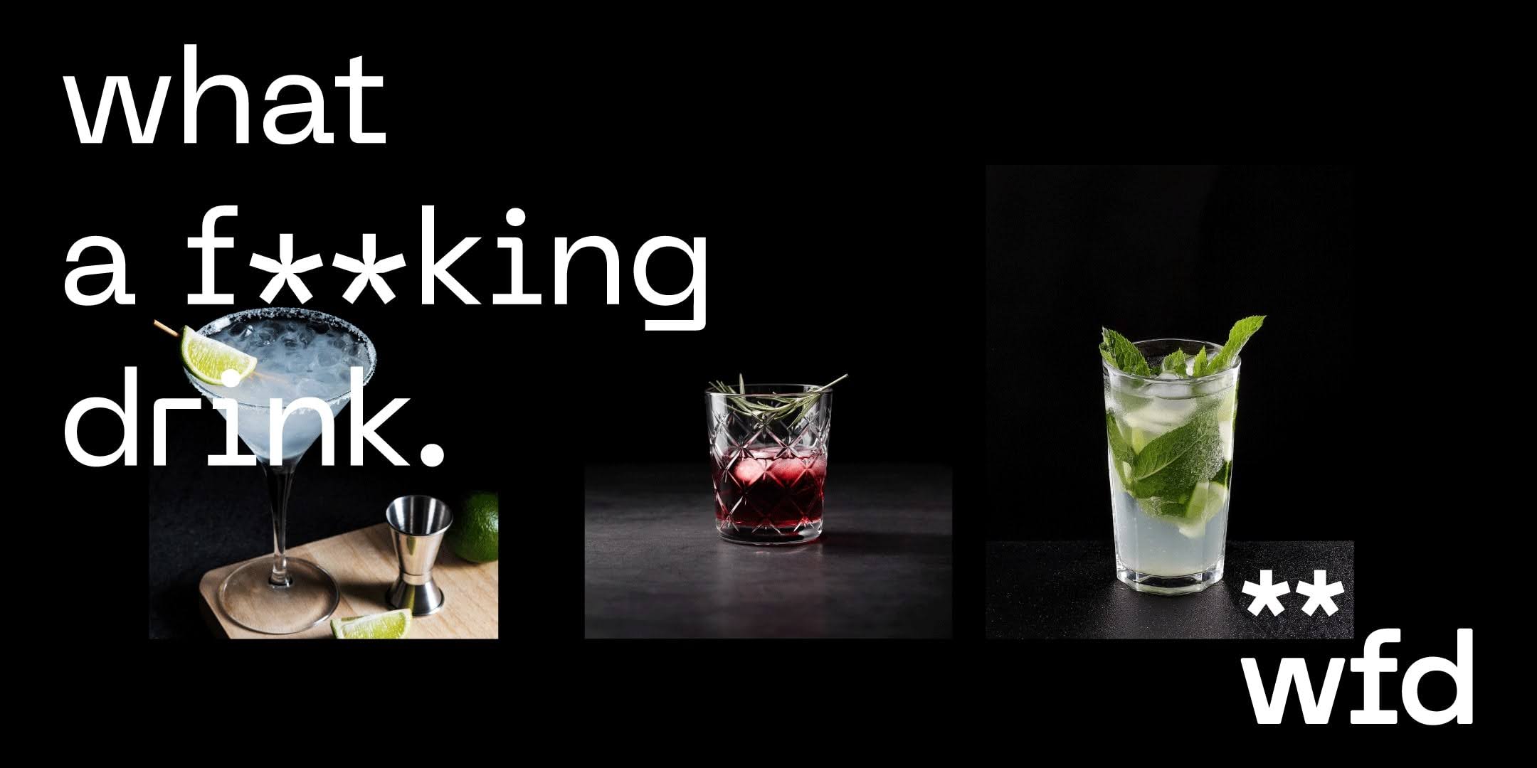
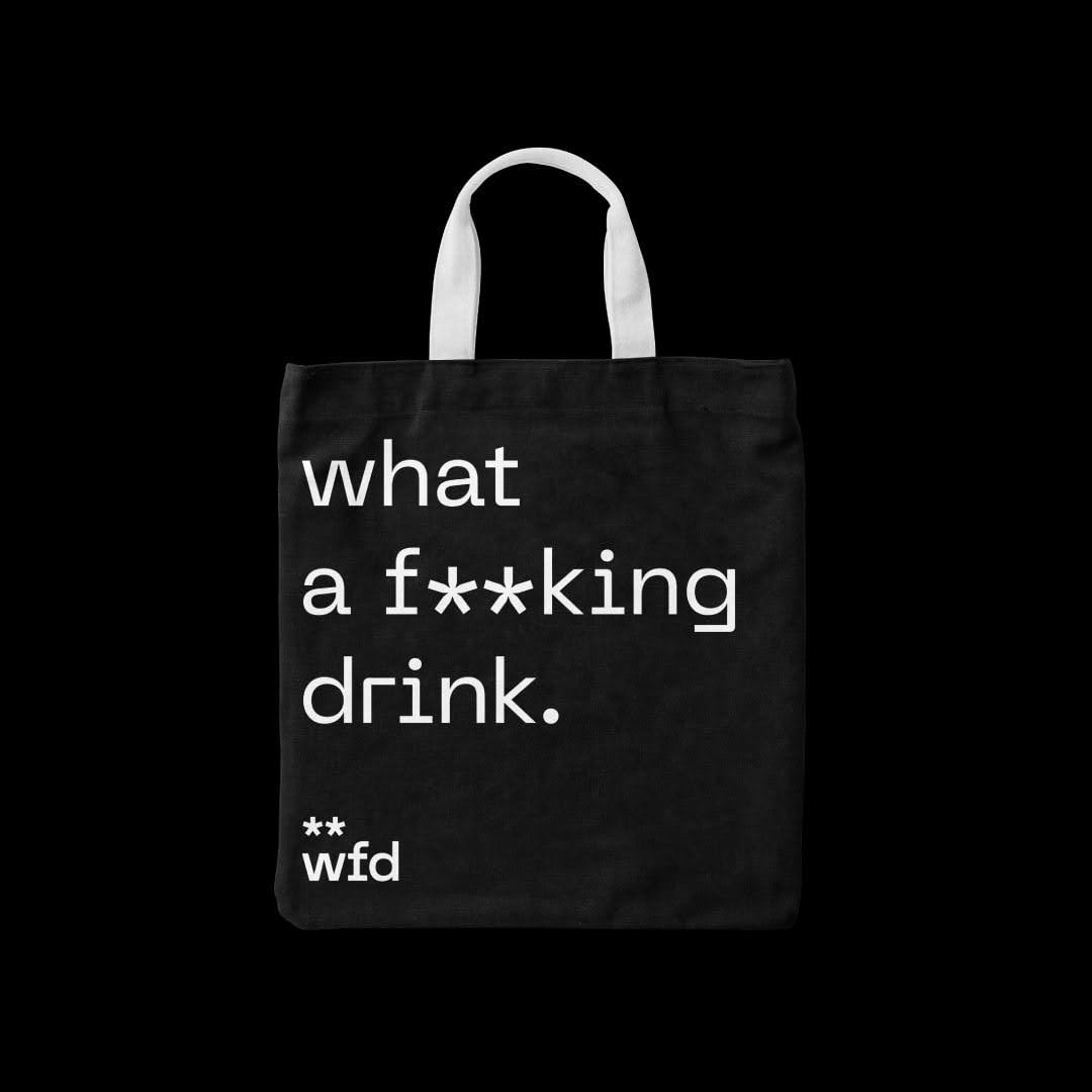
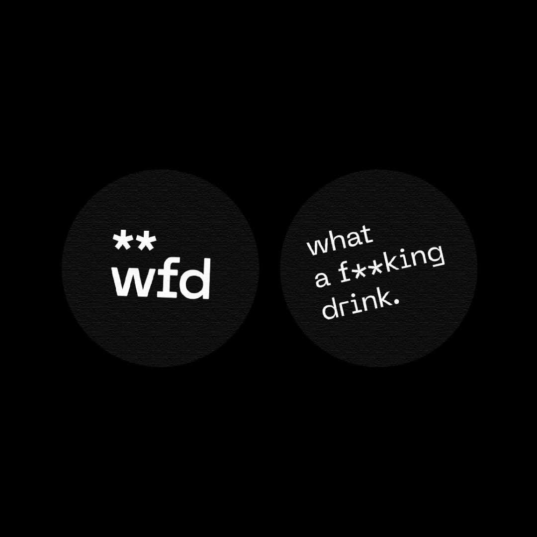
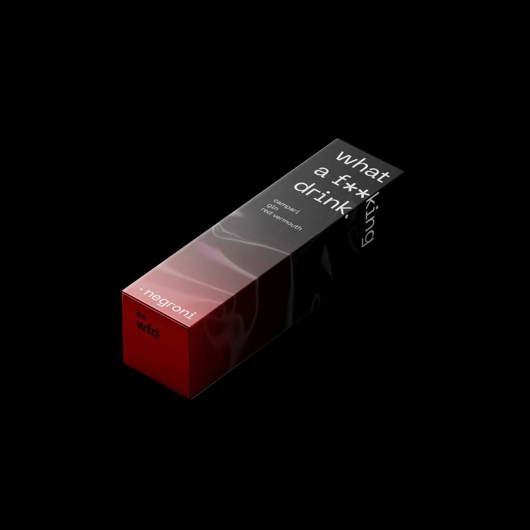
From the brief analysis, the communication concept WFD was born, an acronym for What a F**king Drink. A provocative name that grabs attention and immediately communicates the essence of the brand: an intense and unexpected taste experience.
“Minimal Design, Maximum Impact”
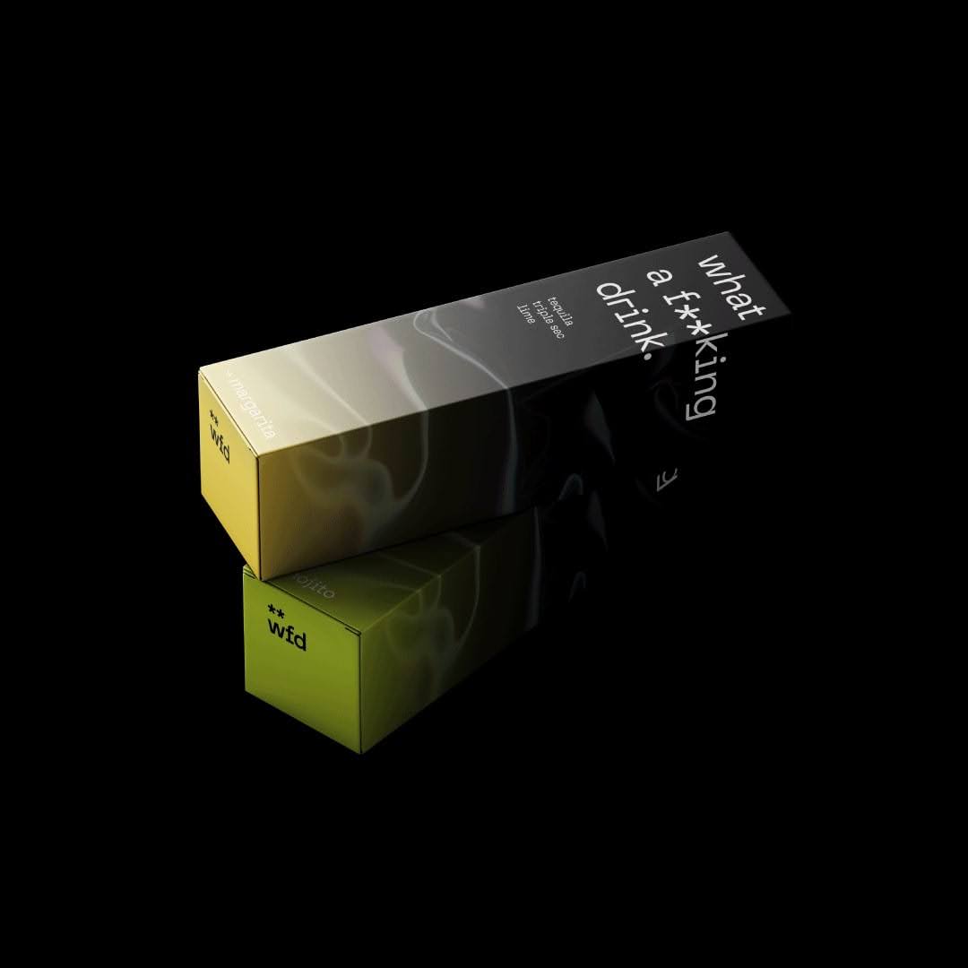
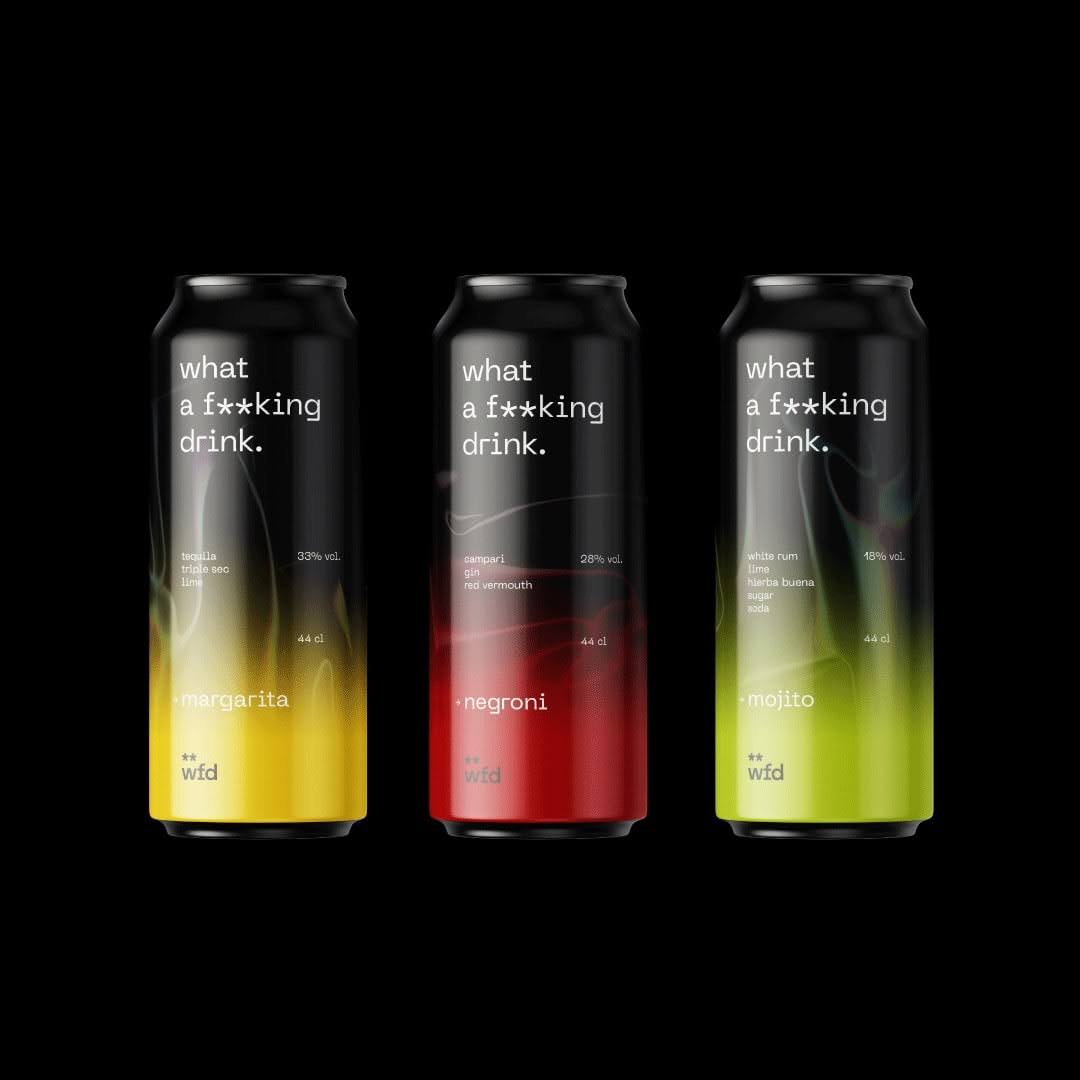
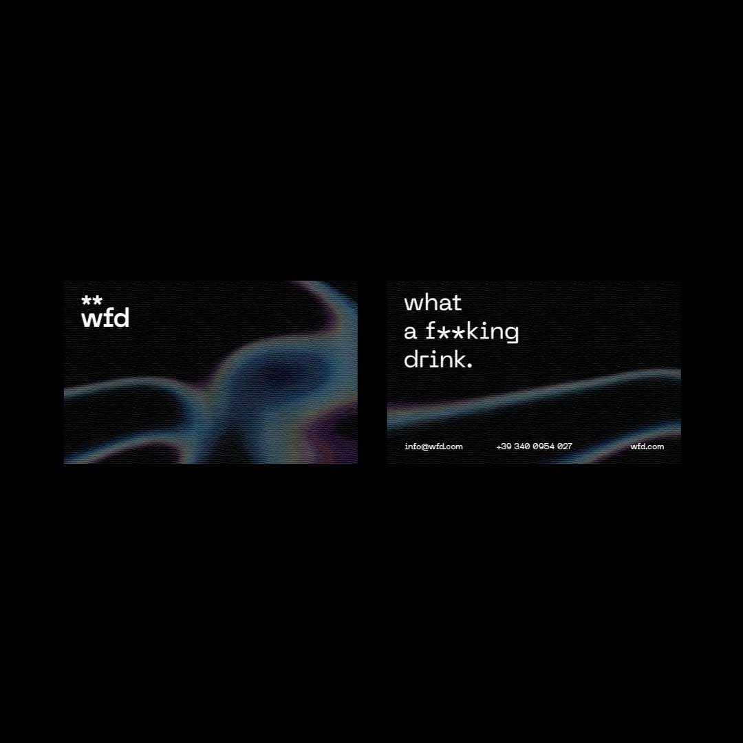
WFD’s visual identity is characterized by a minimalist and contemporary design, based on a careful choice of colors: black and white as a base, on which vibrant and distinctive colors are grafted for each cocktail variant. This chromatic choice creates a strong visual contrast, which underlines the originality and energy of the brand.
“Personalized Packaging for a Unique Experience”
Each WFD can is a work of art in itself. The labels, customized for each cocktail, are a true visual manifesto that communicates the essence of the product and creates a complete sensory experience. The consumer is thus involved in a journey of discovery, appreciating not only the taste but also the aesthetics of the product.
“The WFD project has allowed us to:”
Create a strong and memorable visual identity: The name, slogan, and design have stood out in the competitive landscape, attracting the attention of the target audience.
Communicate the essence of the brand: The visual identity perfectly conveys the brand’s values: youth, irreverence, quality, and innovation.
Generate strong engagement: The captivating packaging and the unique consumption experience have stimulated consumers’ curiosity and encouraged sharing on social media.
CREDIT
- Agency/Creative: Fraom
- Article Title: Wfd + A Bold Brief for a Revolutionary Brand by Fraom
- Organisation/Entity: Freelance
- Project Type: Identity
- Project Status: Published
- Agency/Creative Country: Italy
- Agency/Creative City: Catania
- Market Region: Global
- Project Deliverables: Brand Design, Brand Identity, Brand Naming, Brand Strategy, Branding, Graphic Design, Label Design, Logo Design, Packaging Design
- Industry: Food/Beverage
- Keywords: Brandi dentity, logo design, packaging design, label design
-
Credits:
Graphoc designer: Francesco Santoro


