The Background
“The word symphony is derived from the Greek word σύμφωνος (symphōnos) which essentially means “harmonious”. At Westbury, we pay homage to musical maestros with a collection that aims for genius levels. Every drop slowly builds to a monumental crescendo. These are prodigious compositions from the world’s best vineyards — liquid music in a bottle.” The Grand Reserve is a wine that makes a statement. A magnum opus. A masterpiece.The Mills Groupe
The Project
This is one of the most difficult yet extremely challenging projects I have ever done. Everything here was very different – even the color scheme we decided to use. But this is the only way to make a premium private label wine stand out among its rivals. Packaging, the design itself, this is what really matters when you only see the wine bottle, but you don’t know what’s inside. You judge on the way how it looks.
Westbury Grand Reserve Private Label Design started with a single email I received late in the evening from US-based clients. I always respond to such emails instantly because my huge experience with the US market taught me to expect inspiration, challenge and non-traditional requests from this part of the world.
Westbury was no exception from the rule, and it was also a whole new path I had to walk through discovering more and more different aspects of wine packaging design.
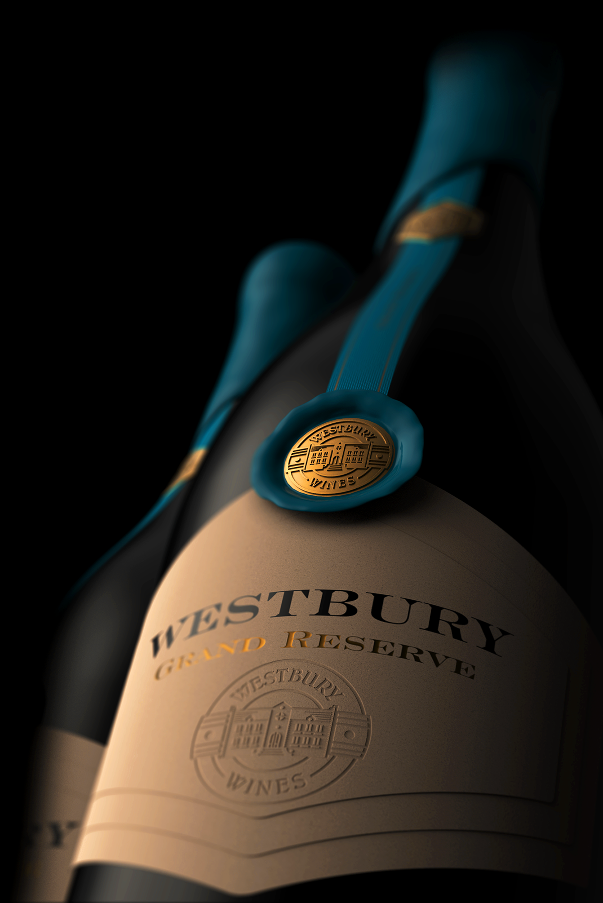
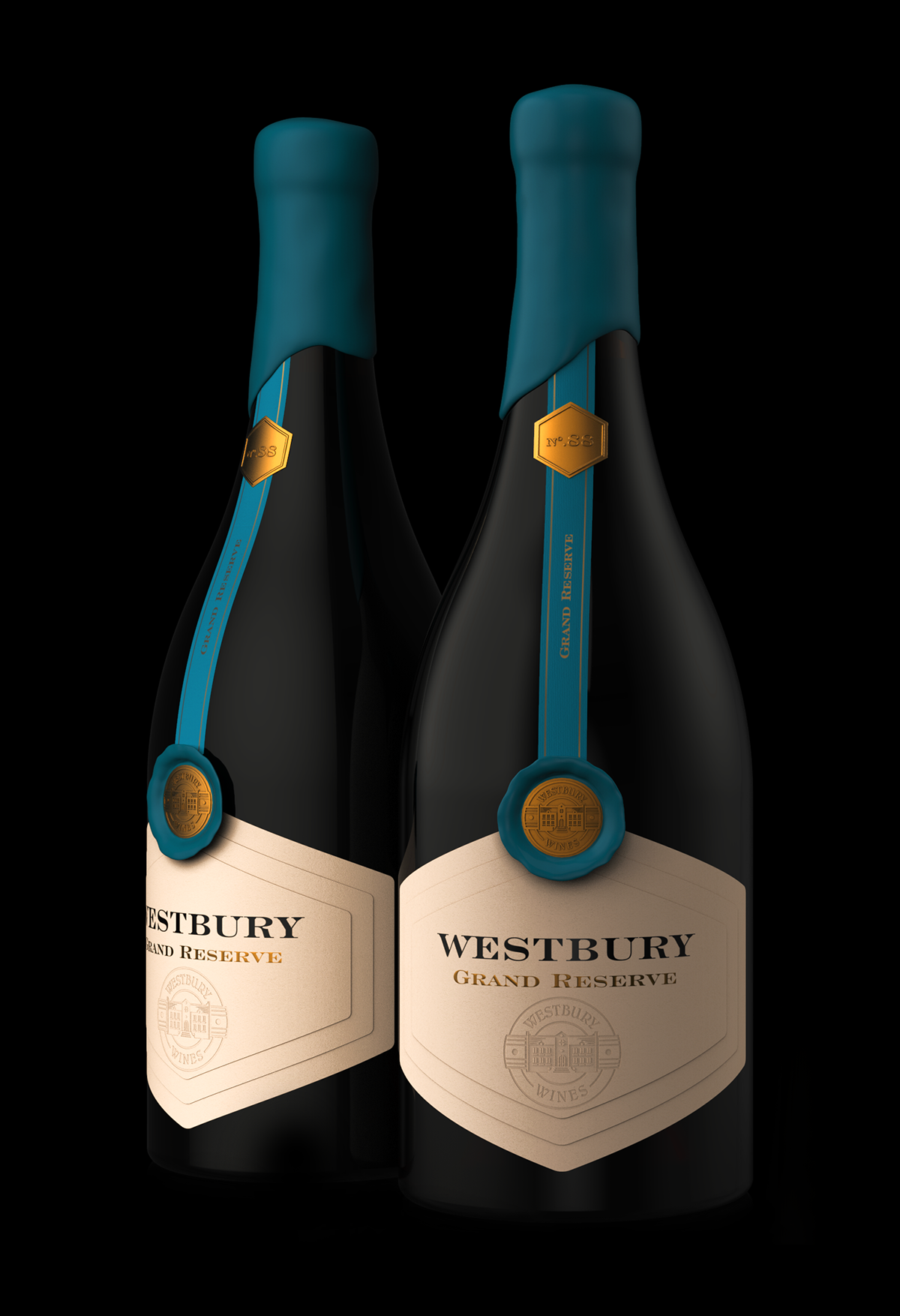
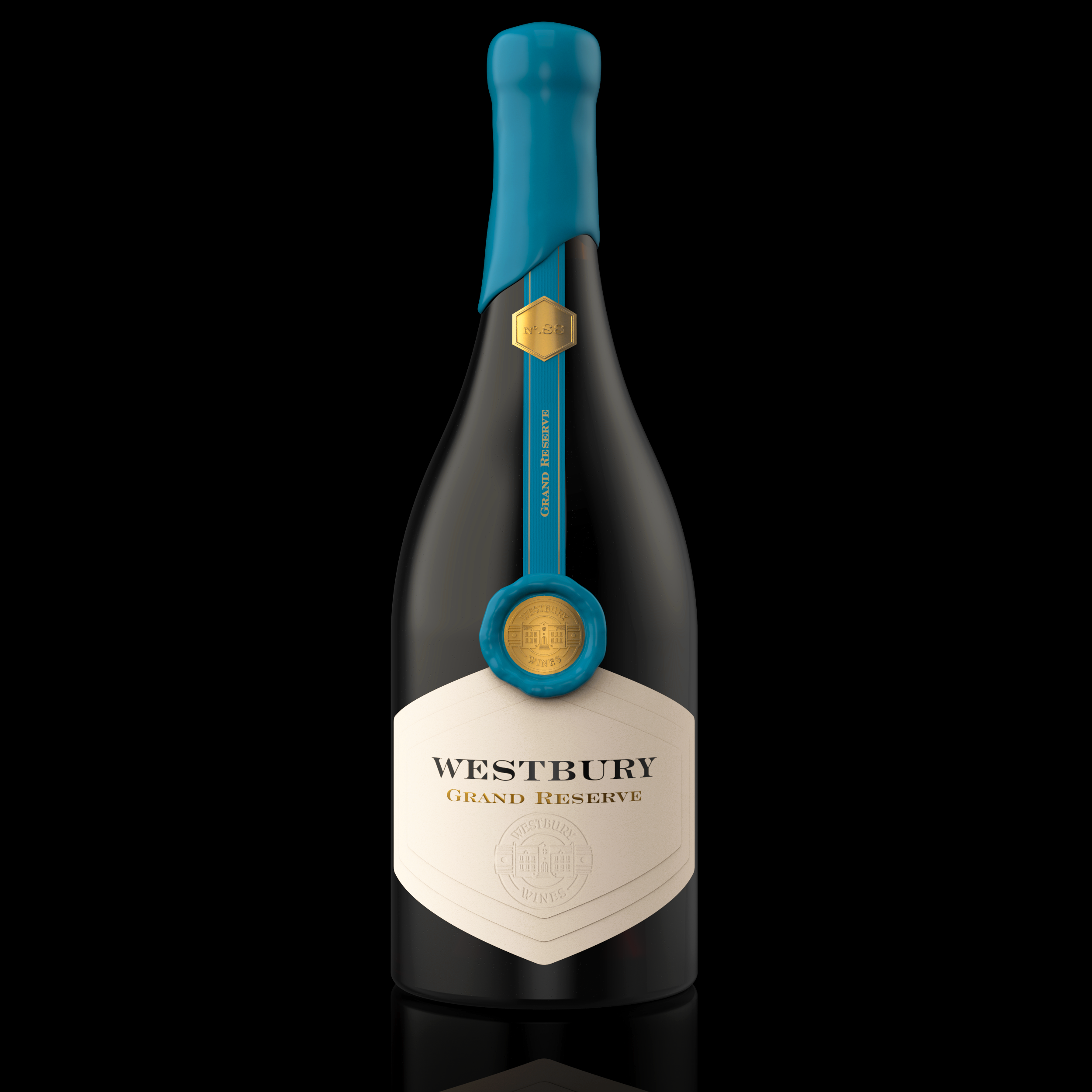
You could see from the name that it is a special wine. So-called ‘normal’ or ‘ordinary’ wines usually have front, back label, and capsule. In Westbury Grand Reserve everything was complicated in a good way. First, we decided to use sealing wax on top. Then my client requested a long vertical stripe starting from the top of the front label and going all the way along the bottleneck to the backside stopping right before the top of the back label. Of course, that was not all. I was also commissioned to design special sealing wax with the brand logo that should apply and cover the start of the stripe. I never did stuff like this before in my practice but when you want to dress up a premium private label wine, you have no choice but start working and giving the best you could.
Last but not least, this was my crazy idea, I decided to make a simple wine label with three layers of paper applied one over another. Putting such label on the front of the bottle in combination with the rest of the elements I mentioned above, makes the wine look very classy, serious, authentic yet non-traditional and modern. At the top layer, we printed the brand name and stamped with deep embossing the Westbury logo.
I also needed somehow to enhance even more the overall presence of the wine bottle and this is how the idea to use turquoise blue came out. This color is rarely used for red wines and in some aspects, it is even avoided because it is a cold one while red wines are usually associated with warm or neutral colors. I was fully aware of this and I knew that when I design private wine labels I have to think out of the box, break the rules and traditions and create an unique packing very different from the rest of the premium wines on the shelf.
At the end of this short story, I’d like to share with you my personal admiration for Mr. Michael Mills – he is the man behind the Westbury Grand Reserve Private Label. A very bold person and entrepreneur who took without any sign of hesitation every challenge around this prestigious wine project.


CREDIT
- Agency/Creative: the Labelmaker
- Article Title: Westbury Grand Reserve Private Label Design
- Organisation/Entity: Agency, Published Commercial Design
- Project Type: Packaging
- Agency/Creative Country: United States
- Market Region: North America
- Project Deliverables: Brand Creation, Branding, Graphic Design, Packaging Design, Product Architecture, Retail Brand Design
- Format: Bottle
- Substrate: Glass Bottle


