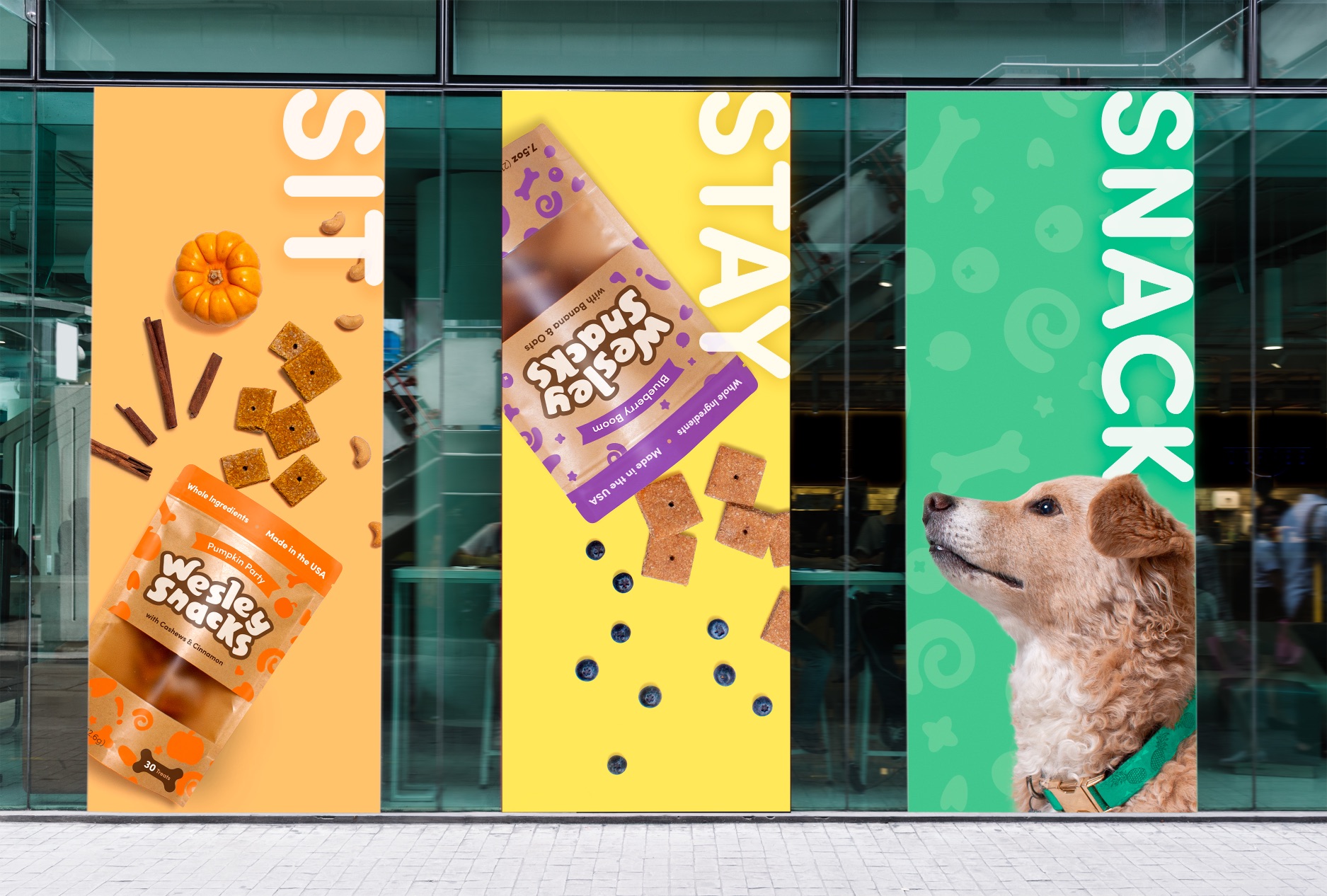
Starting in our home kitchen, Wesley Snacks began as an experiment in looking for the best biscuit for our treat-loving mutt. Inspired by the lack of dog treats with minimal, easy-to-pronounce ingredients, Wesley Snacks aims to be the healthy alternative to traditional empty-calorie treats.
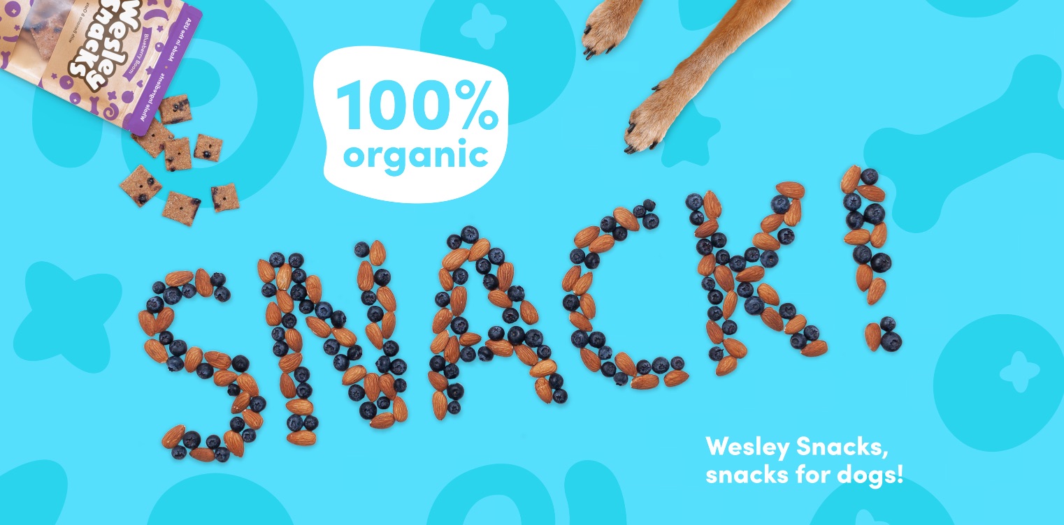
Dogs are the best and they deserve the best. If we want our pups to live longer, healthier lives it starts with what we feed them. Like humans, the best foods are whole foods. Our Chief Taste Tester, Wesley, is quite fond of fruits, vegetables, and whole grains. Specifically: Blueberries, Bananas, and Pumpkin Puree. Combining these main ingredients with a simple Gluten-Free Oat Flour Base we were able to produce a filler-free snack that smells delicious too!
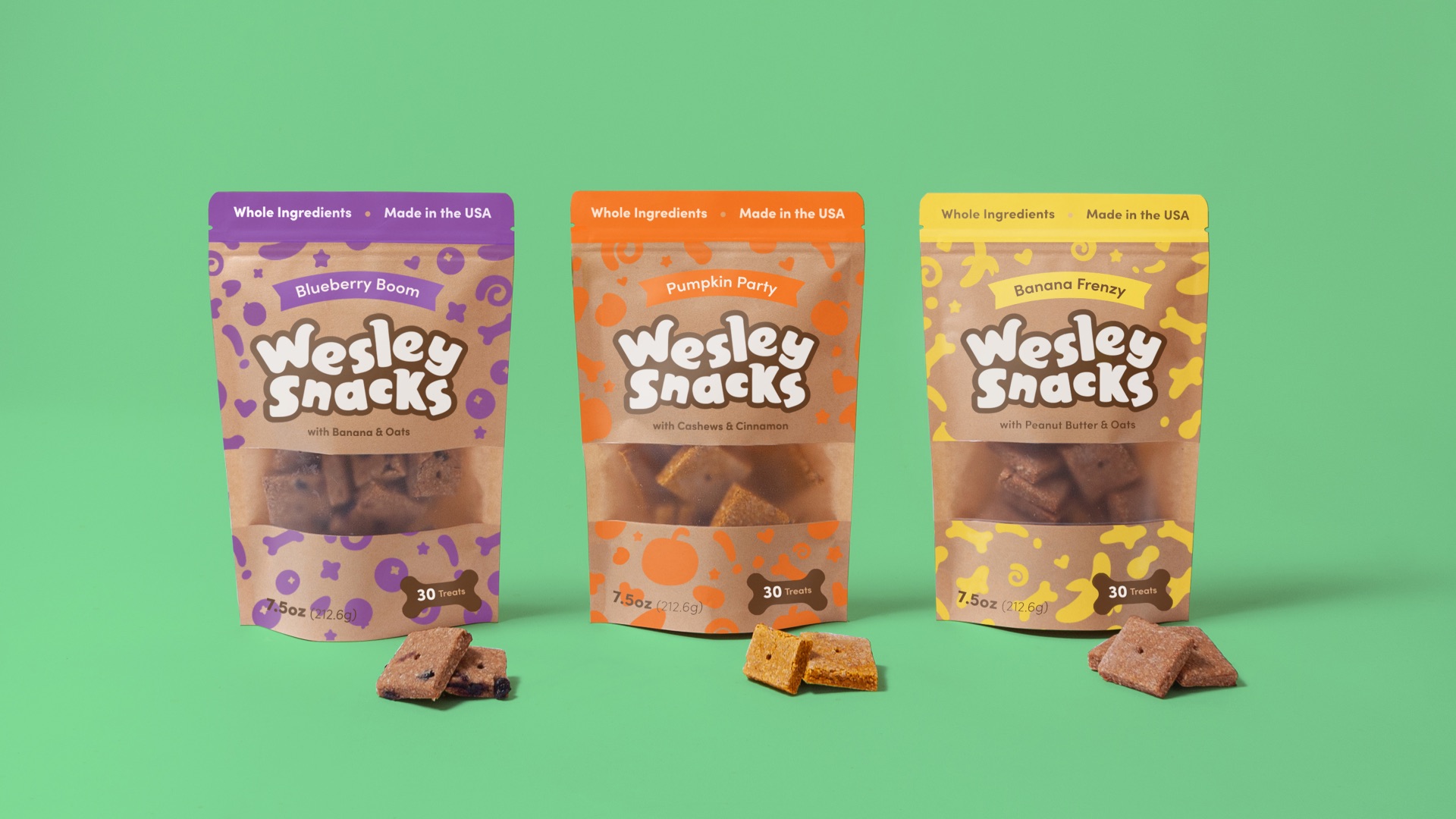
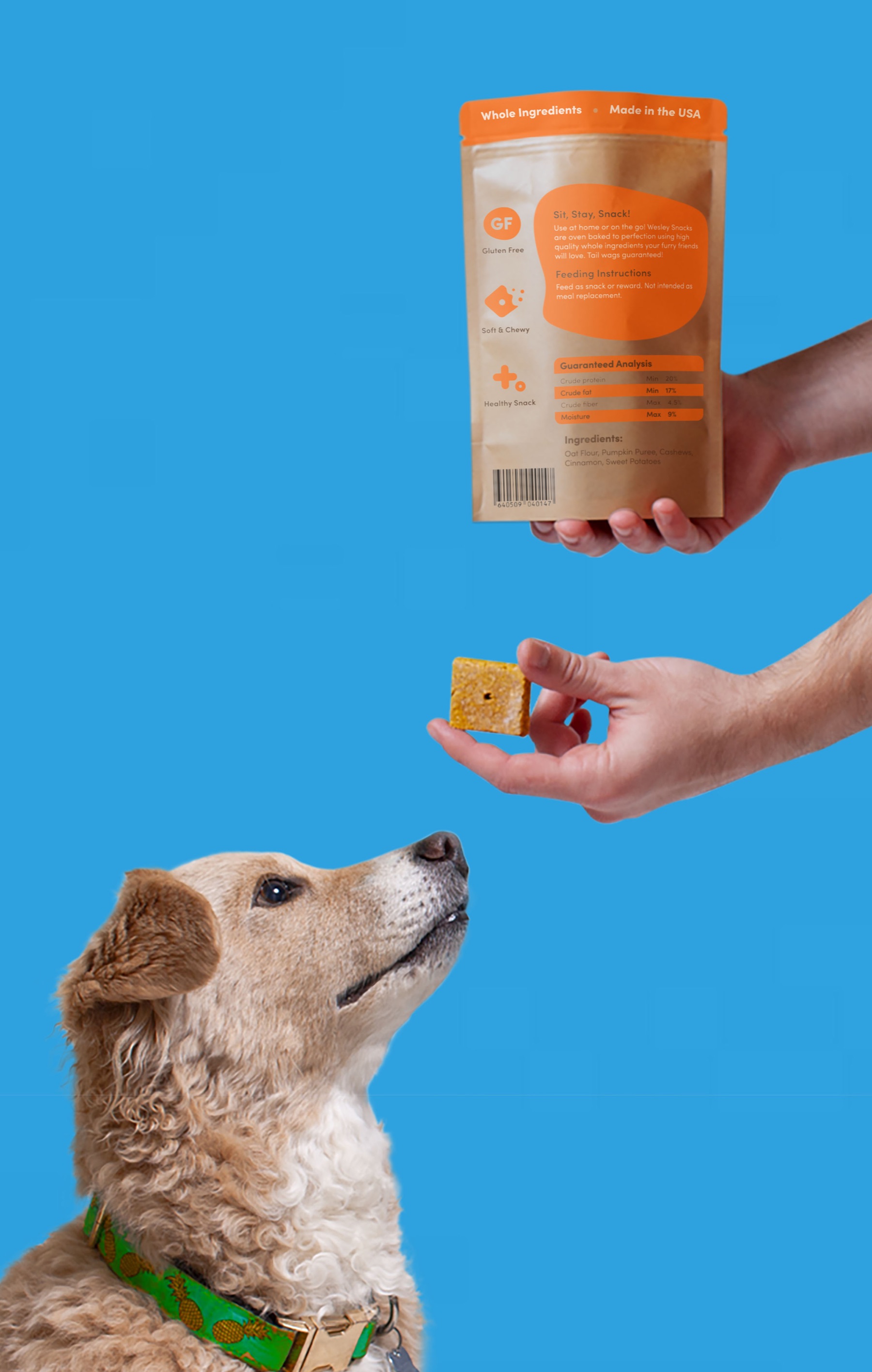
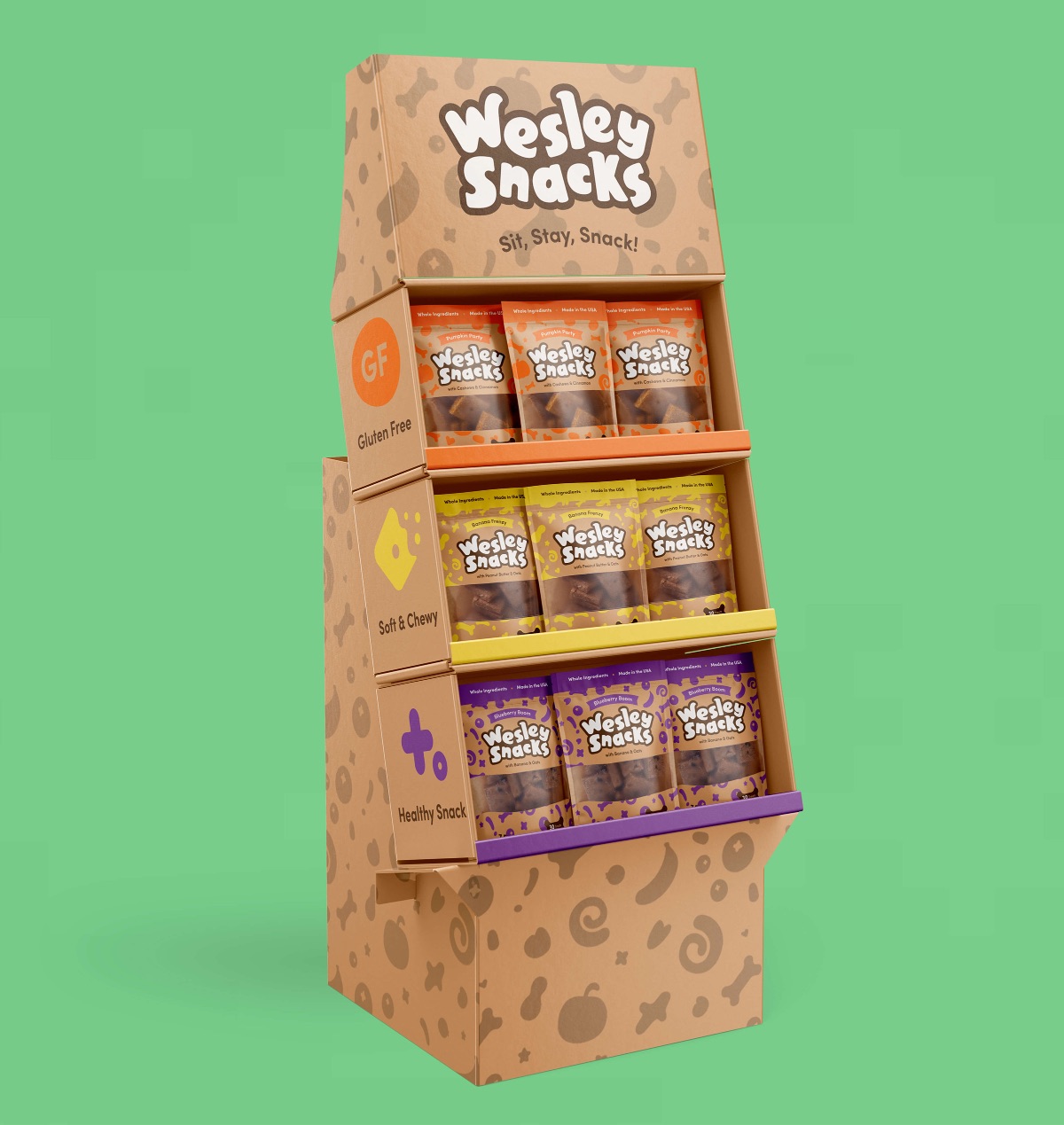
With the aroma of Wesley Snacks naturally appealing to our four-legged friends, the next step was to create packaging that would appeal to dog owners. To stand out amongst the pack of different treats on today’s pet store shelf, we used the bright, vibrant colors of our main ingredients as a guide to distinguish between each flavor and create a whimsical, differentiating pattern. Paired with a neutral substrate these patterns and large bubbly logotype really pop off the shelves in comparison. The back of the package includes icons that highlight the best features of Wesley Snacks and provides another layer of trust in the ingredients.
To help dog owners make the best decision for their BFF (Best Fur Friend) we were proactive in keeping the top ingredients front and center. In addition, a large window was included for consumers to see the size, texture, and weight of the snack before purchase. Clean rounded typography helped create clear navigation.
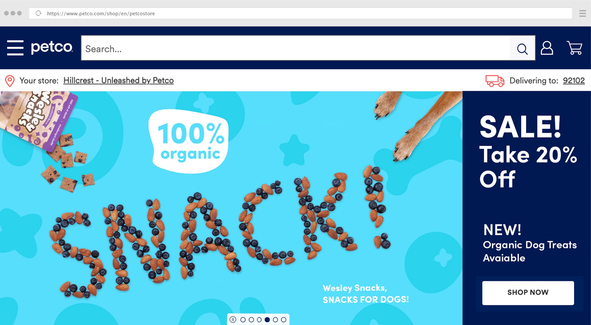
The result is a successful brand and identity design that promotes health, trust, and whimsy. Sit, Stay, Snack with Wesley Snacks!
CREDIT
- Agency/Creative: Antonio Mustico
- Article Title: Wesley Snacks Packaging Design Concept
- Organisation/Entity: Student
- Project Type: Packaging
- Project Status: Non Published
- Agency/Creative Country: United States
- Agency/Creative City: San Diego
- Market Region: North America
- Project Deliverables: Packaging Design
- Format: Bag
- Substrate: Plastic
- Industry: Food/Beverage
- Keywords: WBDS Student Design Awards 2021/22
-
Credits:
Educational Institution: San Diego City College - Graphic Design
Educator's Name: Bradford Prairie, Sean Bacon


