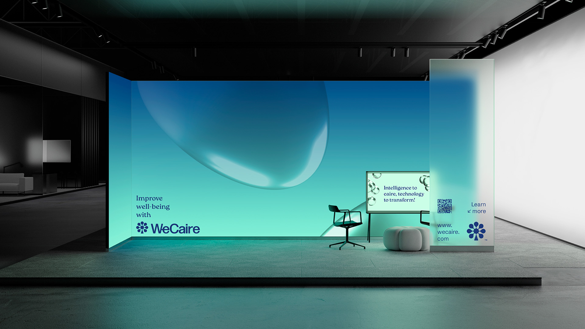
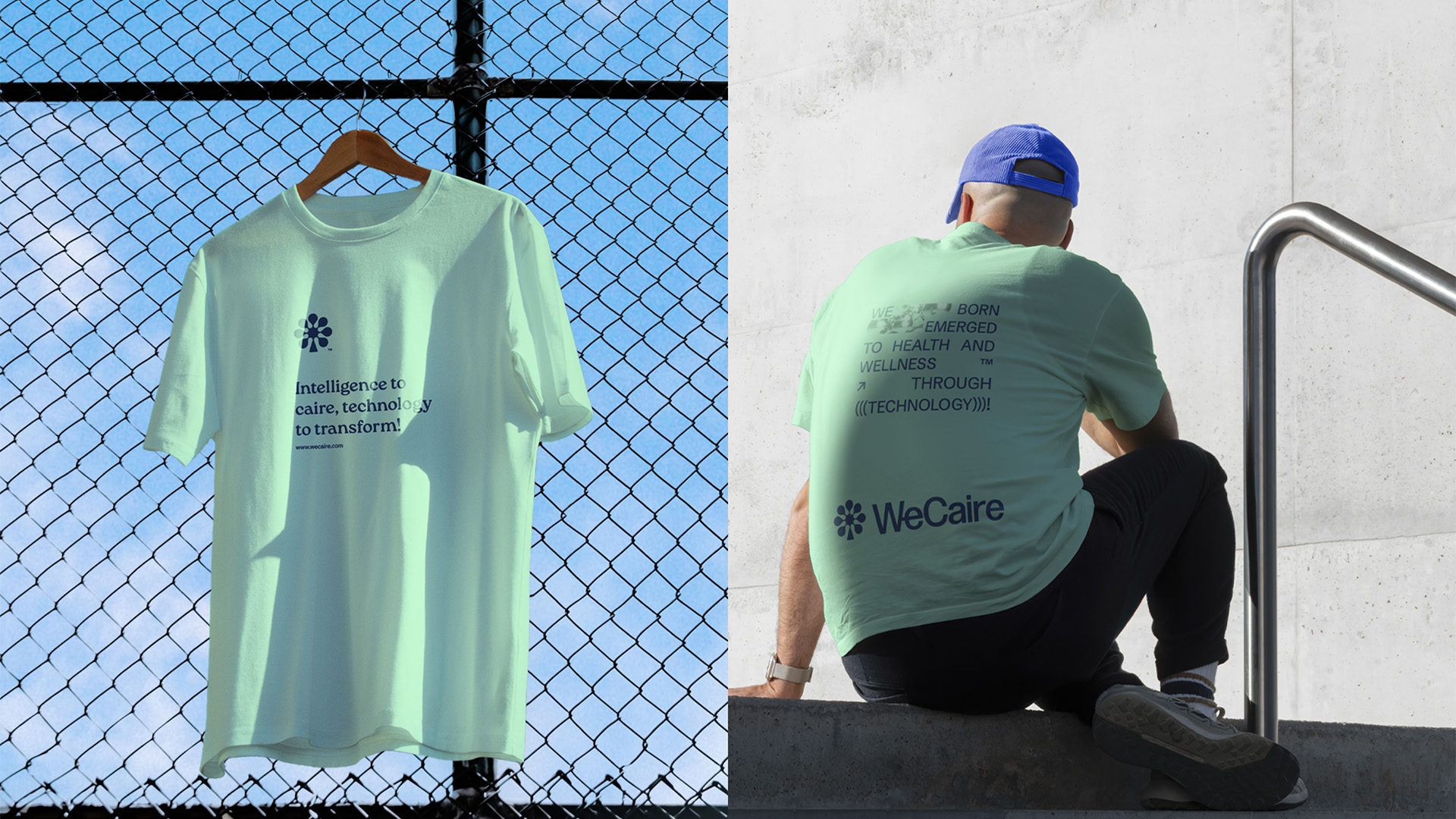
Intelligence to caire, technology to transform!
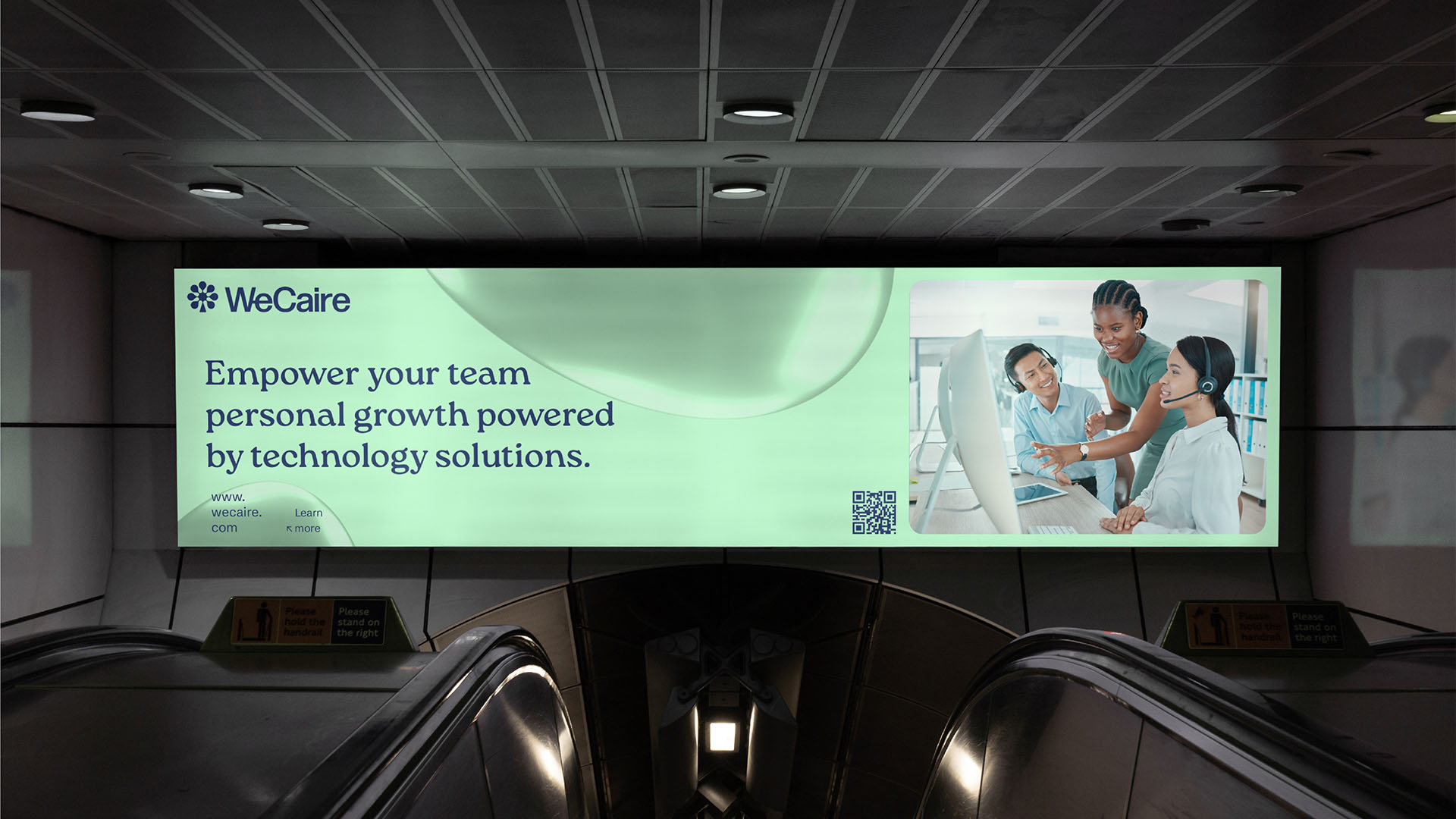
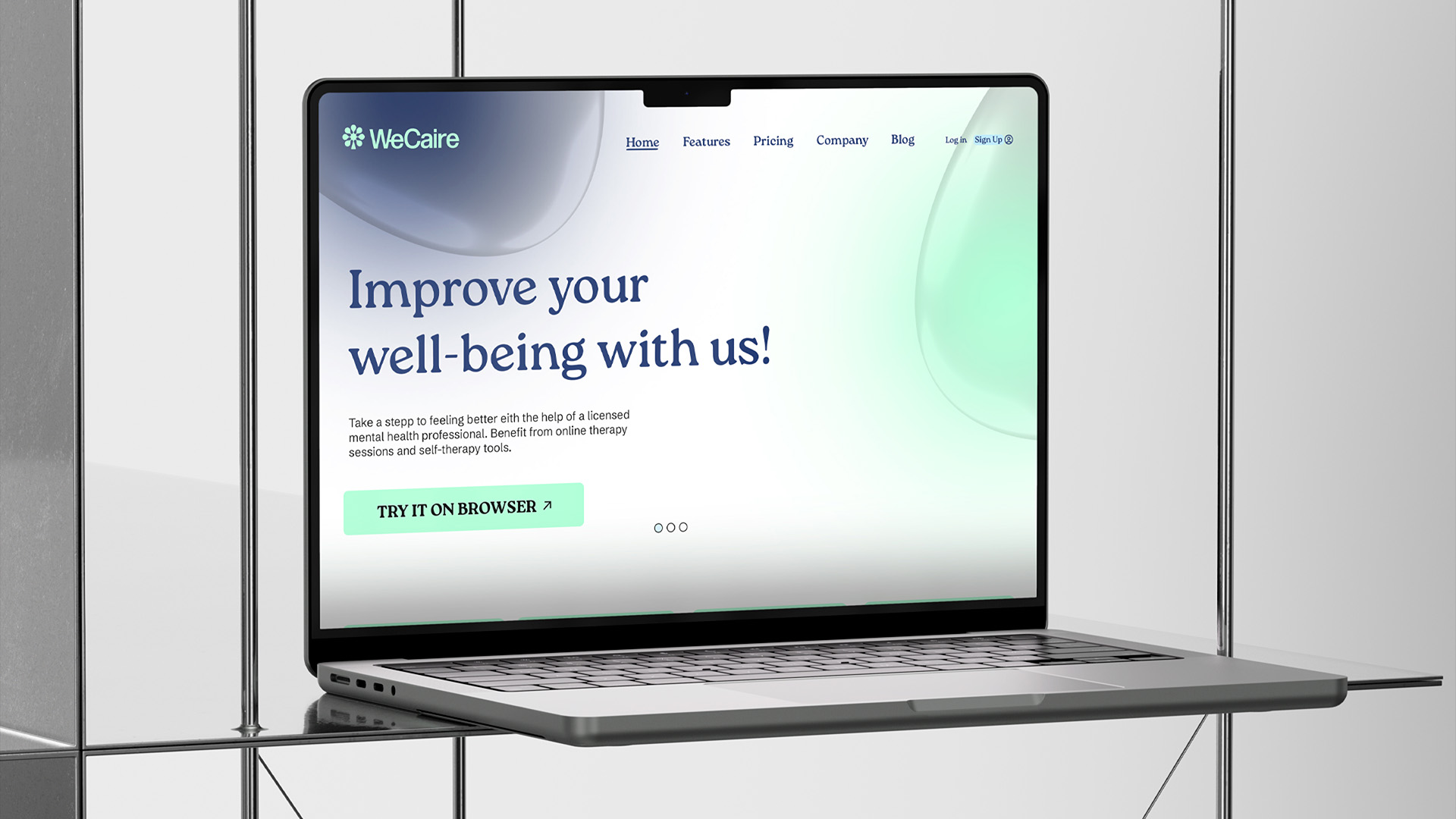
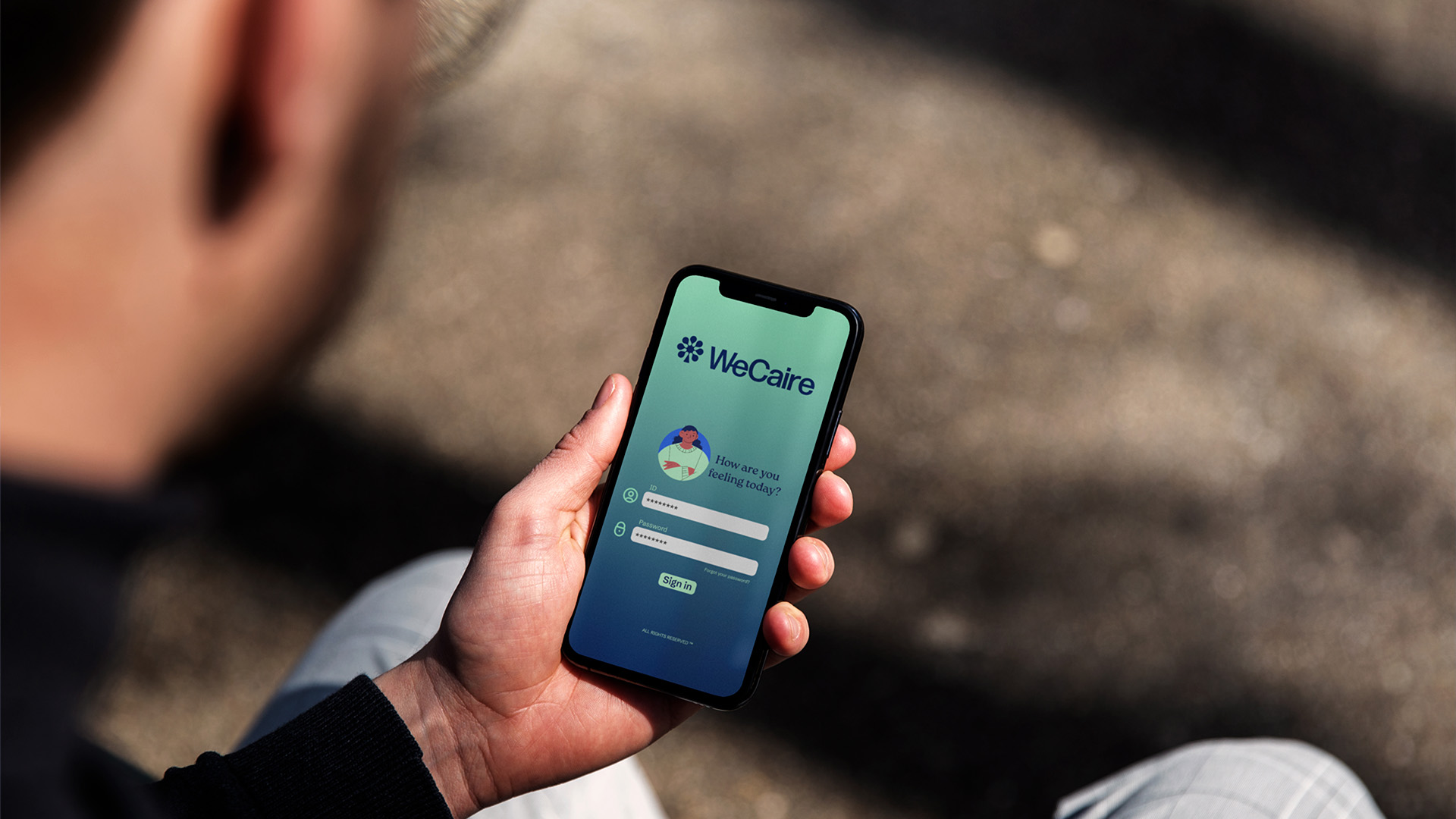
WeCaire has emerged as a revolutionary digital platform, harnessing the power of artificial intelligence to connect individuals on a journey of personal growth. Its mission is to empower people to reach their full potential by facilitating access to specialized experiences, tools and resources.
With a purpose of transforming technology into well-being, WeCaire directs its efforts towards improving the mental health and performance of both individual users and companies.
Through an advanced AI approach, WeCaire provides personalized advice, resources and training, acting as the essential link between individual aspirations and industry expertise.
The brand name, “We”, symbolizes the importance of teamwork, joint effort and people-centred solutions. The term “Caire” alludes to the AI-driven approach, highlighting the platform’s technological advantage and its crucial role in promoting innovation.
Challenge and results
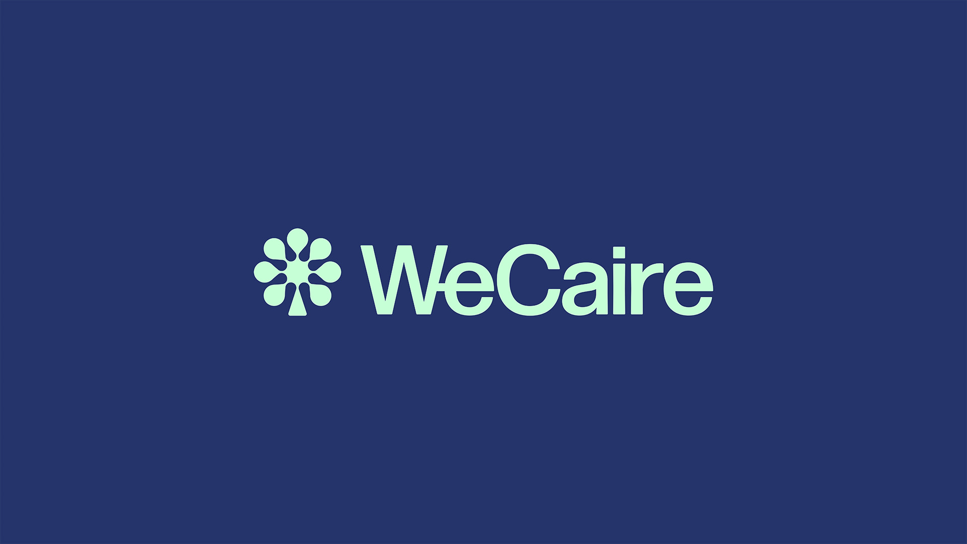
The design of the symbol perfectly integrates the image of a tree, universally recognized for its growth and well-being, with the central structure that resembles a neuron, symbolizing the transmission of information related to technology. The base of the symbol was designed to represent the branches of a tree and with a solid base to represent stability.
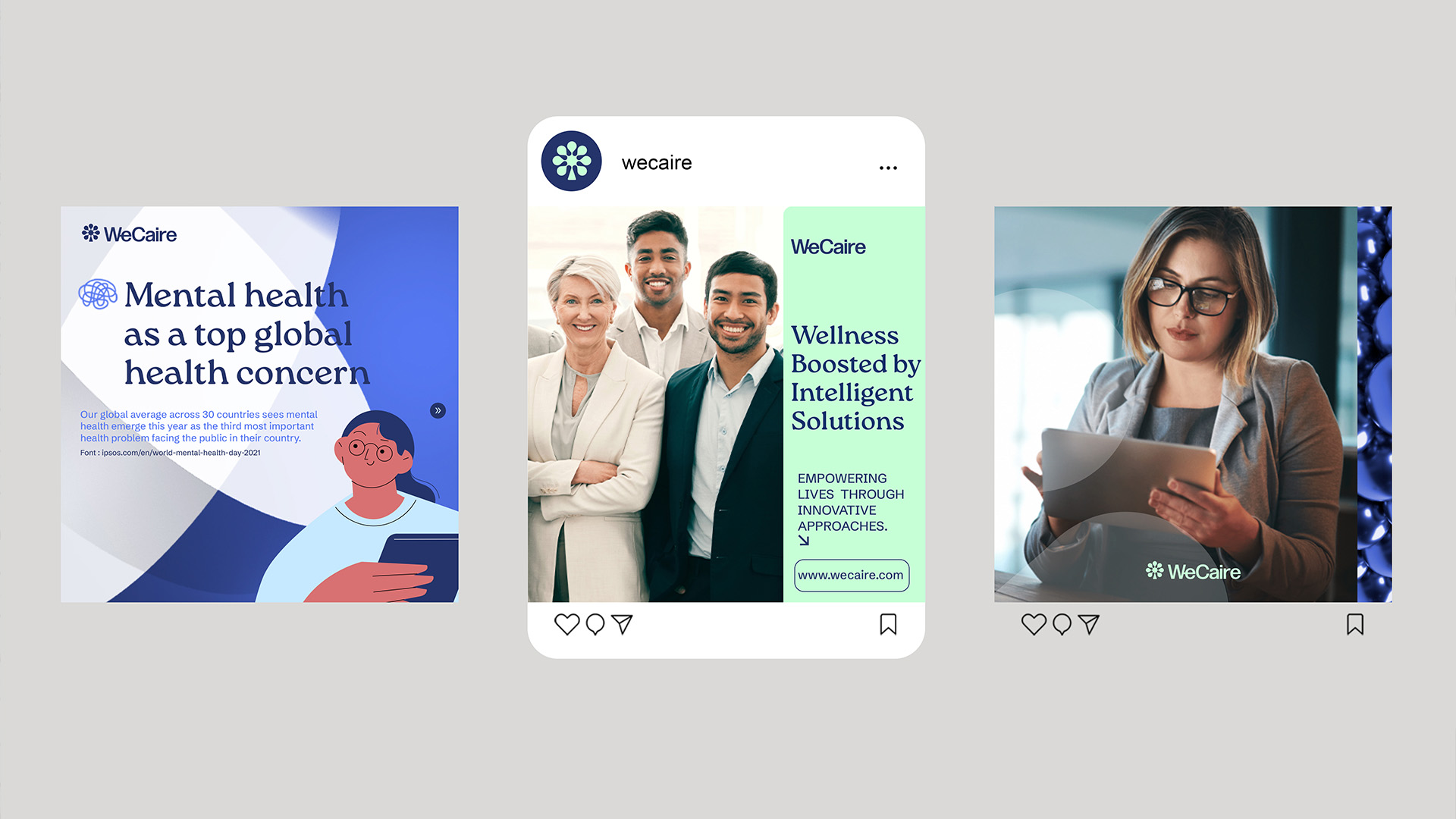
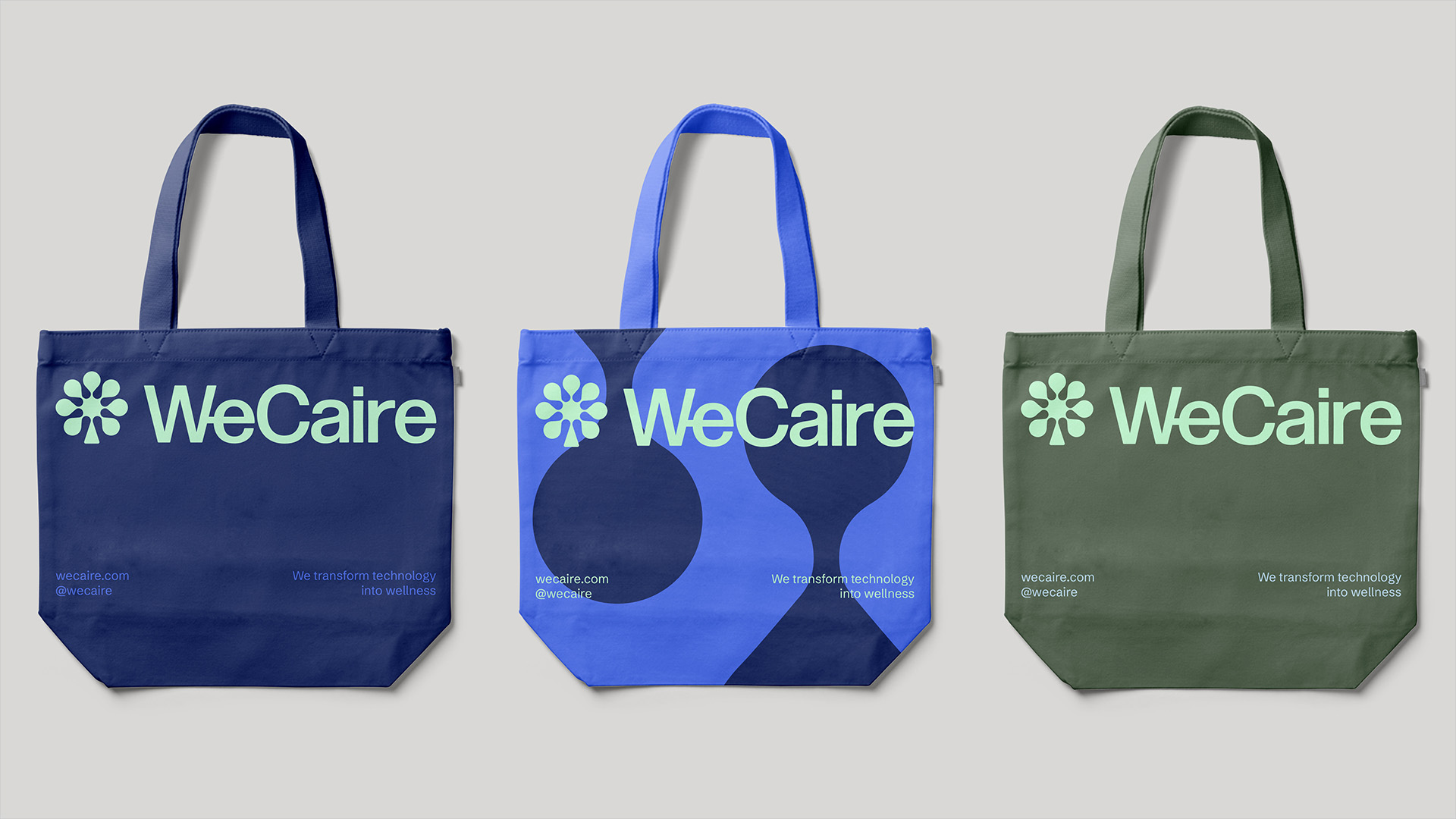
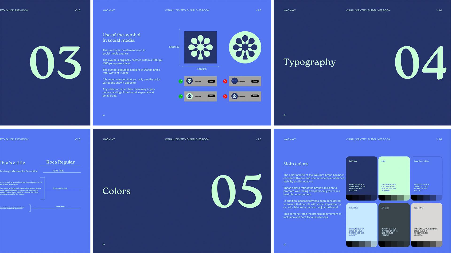
The established colors were applied to possible ramifications within WeCaire, thinking of combinations to differentiate each solution and specific audience. In addition, the sense of a diverse community is evident, as the brand aims to make the platform accessible to both users and experts. In addition, the sense of a diverse community is evident, as the brand aims to make the platform accessible to both users and experts.
Throughout the project, our main goal was for WeCaire to emerge as an important ally for companies’ well-being and mental health. The aim is to convey a clear message with a sense of inclusion while ensuring that the design is modern and timeless, to maintain relevance as the brand evolves.

CREDIT
- Agency/Creative: Joao Marcos Design
- Article Title: WeCaire Brand Design
- Organisation/Entity: Freelance
- Project Type: Typography
- Project Status: Published
- Agency/Creative Country: Brazil
- Agency/Creative City: Natherlands
- Market Region: Europe
- Project Deliverables: Art Direction, Brand Design, Brand Identity, Motion Graphics
- Industry: Technology
- Keywords: Care, Tech, Innovation, AI, Digital
-
Credits:
Brand Design: Joao


