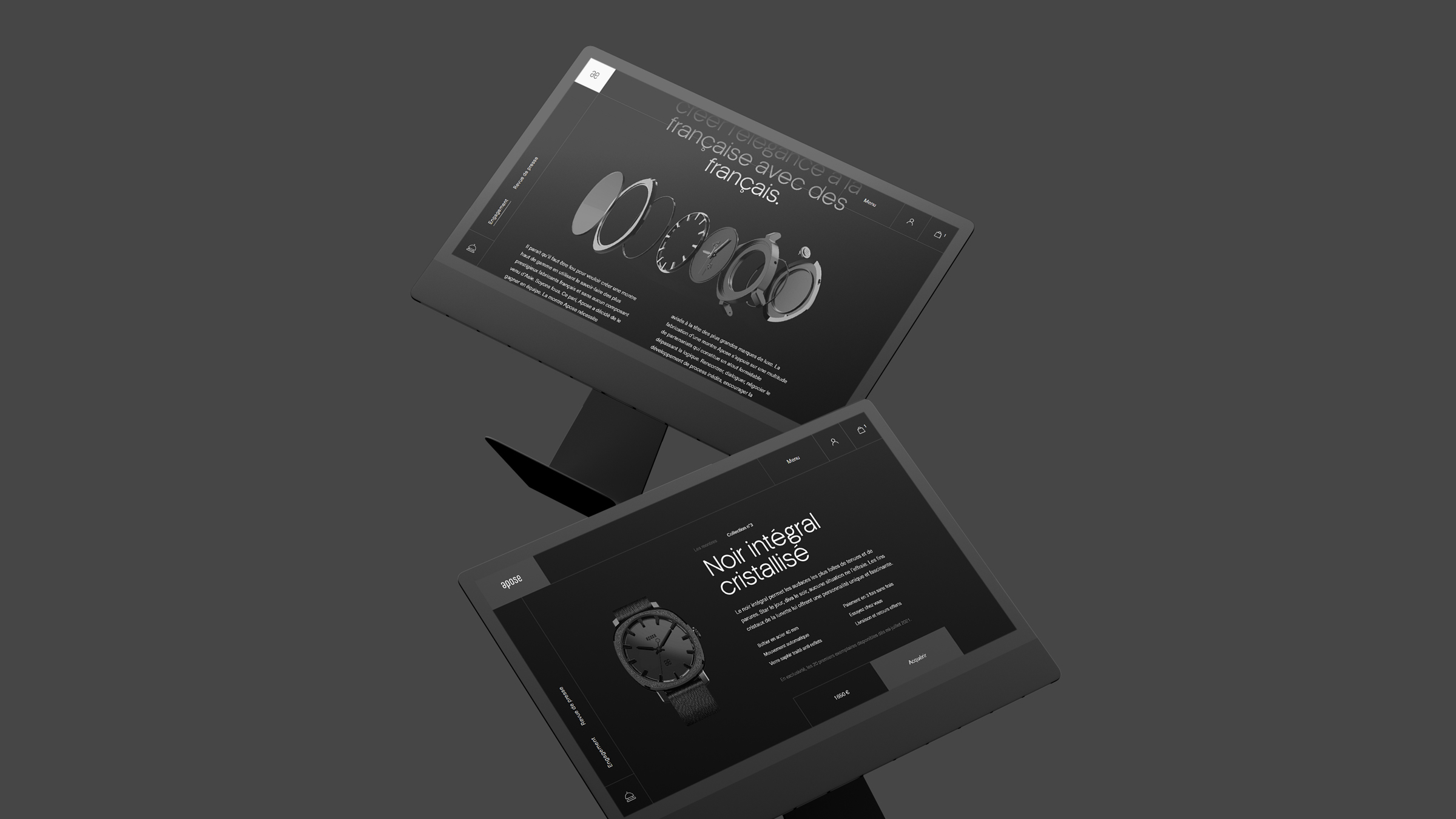
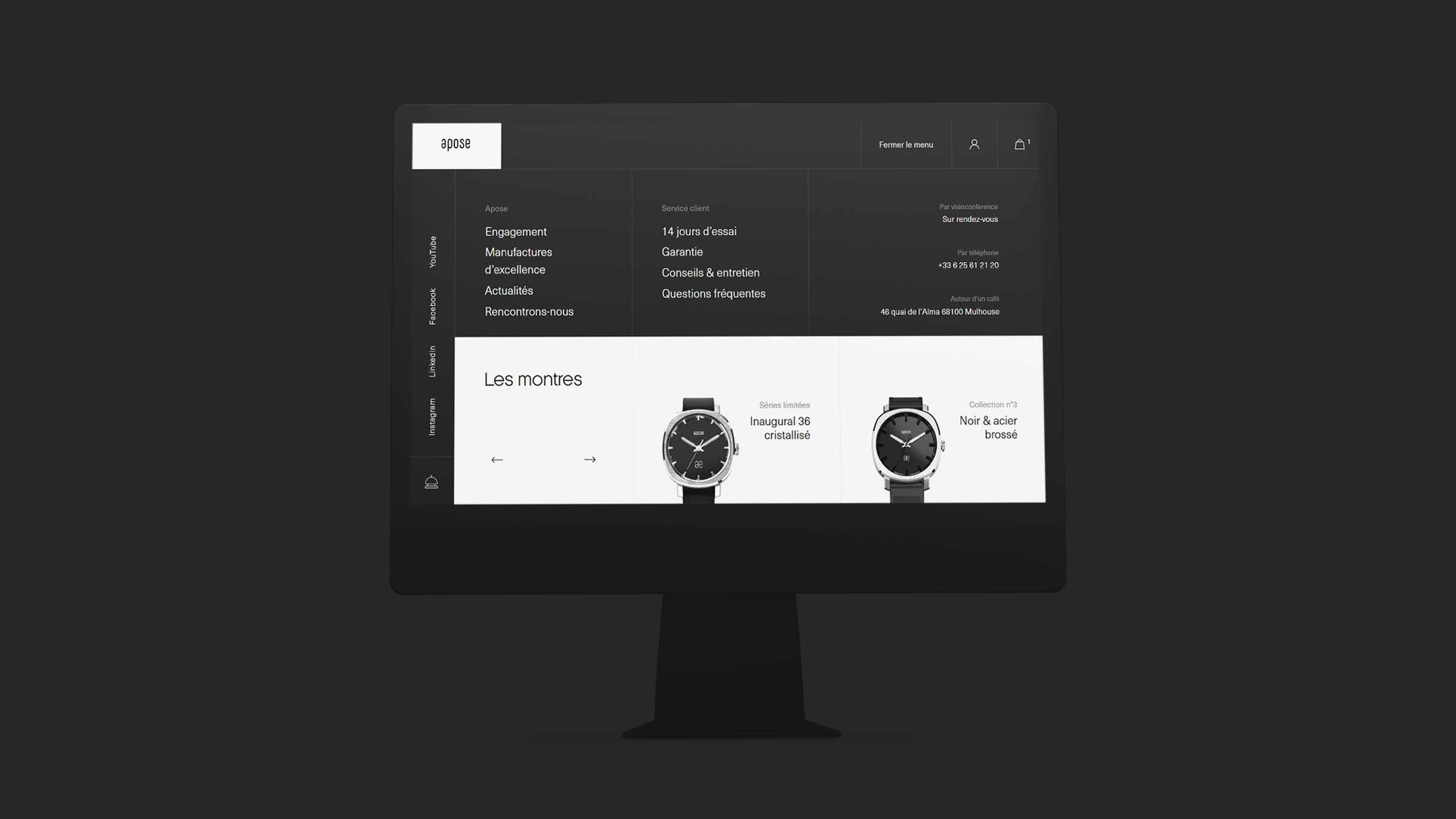
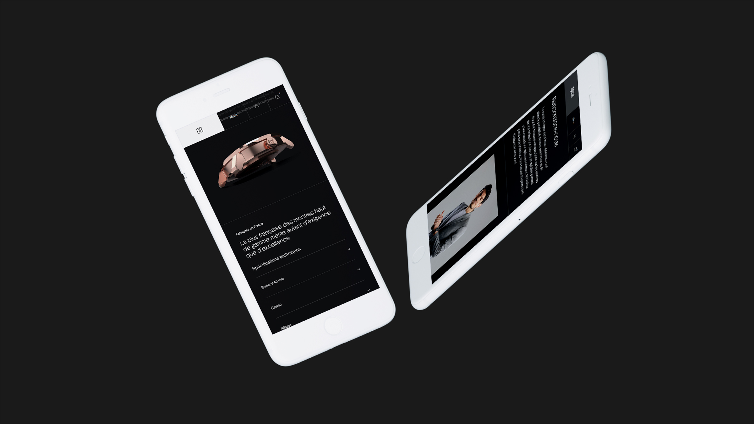
Brands like Apose do not have a long heritage or vast networks of celebrities to use. However, Apose watches win when it comes to defining and targeting their market. The homepage alone lets you know this is a luxury brand even without saying it explicitly.
Most aim to blend customer experience and shaping perspectives and attitudes towards the brand in general with every model building towards the overall brand image. A good example is the website of Apose. Apose creates for the French elegance lovers, a collection of pure, automatic, luxury, unique design watches, manufactured and assembled in France, exclusively sold online. The website of Apose provides a platform to reach the clientele and the design a way to differentiate this new french brand. With the help of the web agency Mars Rouge, based in France, Apose implements stunning luxury watch website design to differentiate the new french brand from the competition.
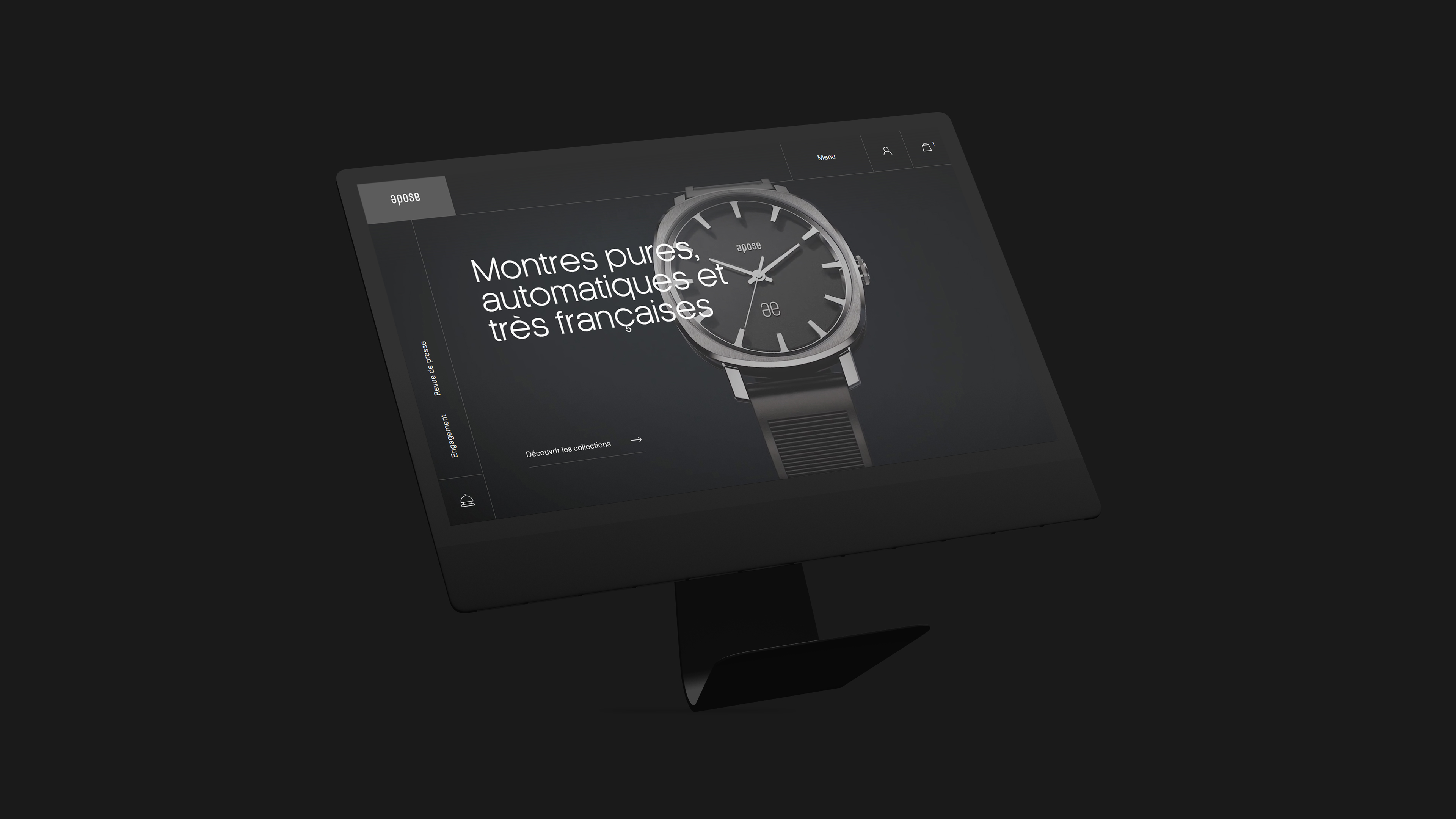
The homepage starts with a video showcasing a watch model of the brand. The captivating take pulls you into knowing more about the brand and the site uses varied high-quality content to deliver on this. Upon landing on their homepage, users are greeted with intricate motion. A fluid, slow-moving video plays naturally in the background, displaying the products in detail with close-up shots.
The dark background on the site is dense and immersive, which provides a contrast for the watch photos and the white and grey font colors. It makes the whole layout easy on the eyes as the pictures seem to be stepping or floating out in the shadows. The illuminating light animations around them creates an elegant and luxury feel different from what you would have got with another background.
Motion isn’t just found on the landing page video on Apose’s website. Each scroll brings parallax-like scrolling effects. Text, images and accent boxes reverb in and out of the frame as users scroll throughout the homepage. The overall effect is that you are immersed and get a consistent feel and experience in the site. It cuts down on bounce rate, provides a premium feel and succeeds in keeping the visitor engaged throughout.
These effects add an innovative touch the website design that compliments the innovation of the products while also drawing attention to important information. The hamburger menu and logo design are sticky as visitors scroll, ensuring navigation is user-friendly and easy.


CREDIT
- Agency/Creative: Mars Rouge
- Article Title: Web Design for Apose Watches by Mars Rouge
- Organisation/Entity: Agency
- Project Type: Digital
- Project Status: Published
- Agency/Creative Country: France
- Agency/Creative City: Mulhouse
- Market Region: Europe, Global
- Project Deliverables: User Experience, User Interaction, Web Design
- Industry: Fashion
- Keywords: Website, watches, luxe, Apose, ecommerce
-
Credits:
Creative: Mars Rouge
Client: Apose


