WAVE is an innovative music production and label focused on music producers and beatmakers. His unique approach values sound and visual aesthetics, essential in the current music scene. WAVE are the different styles of Trap, they are also sound waves and are also linked to Bruce Lee’s concept of ‘Be Water, My Friend’. This concept says that you need to be like water and adapt, evolve. And that’s what a successful producer needs, to be a curator, a researcher, an adventurer.
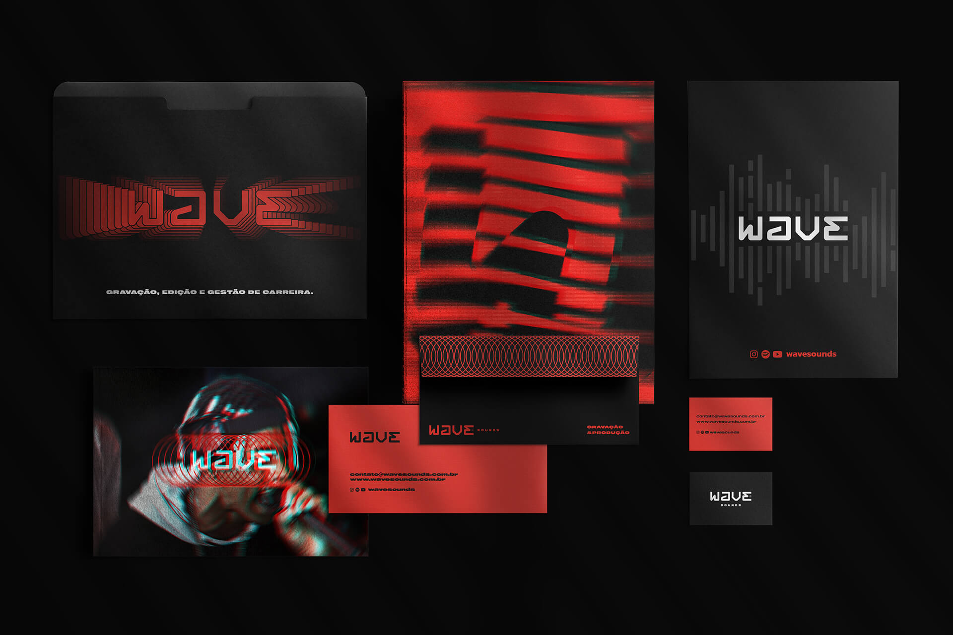
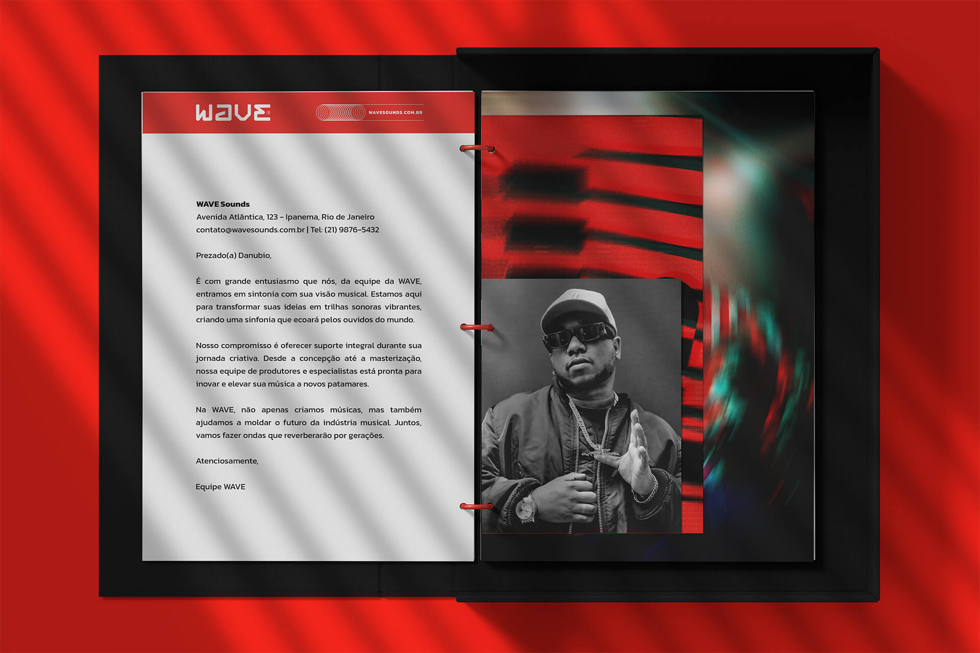
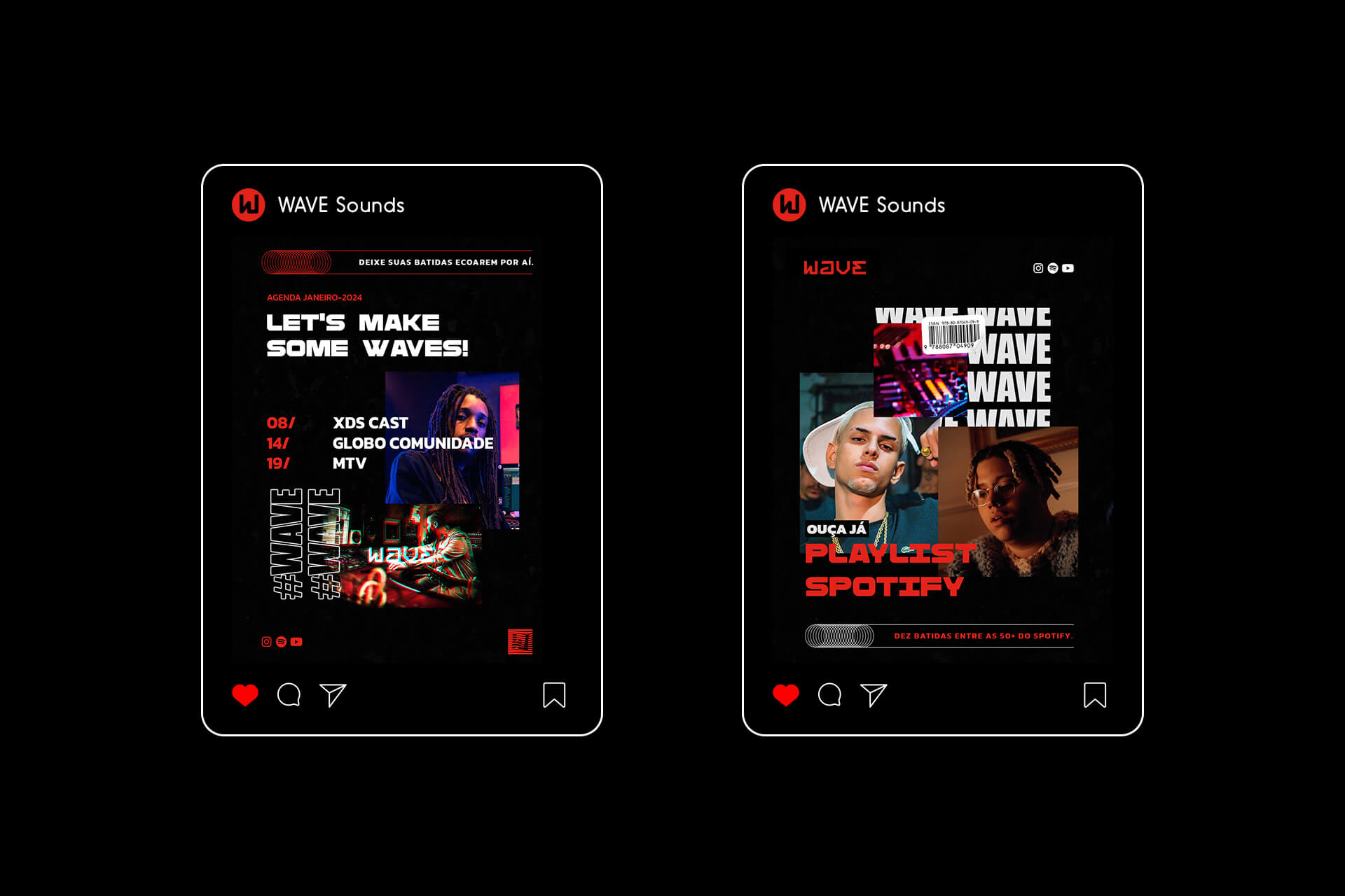
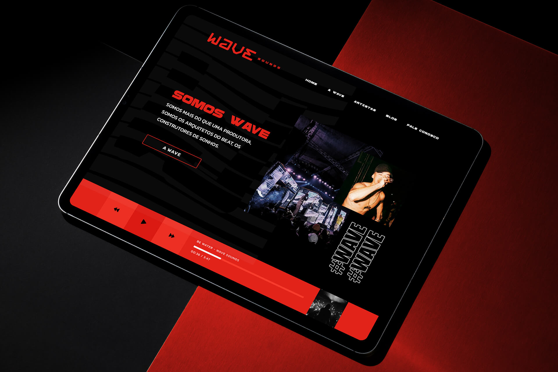
The visual identity project for WAVE aims to create a unique and impactful graphic representation that encapsulates the brand’s essence and vision. We seek to convey the boldness and innovation inherent to modern music production.
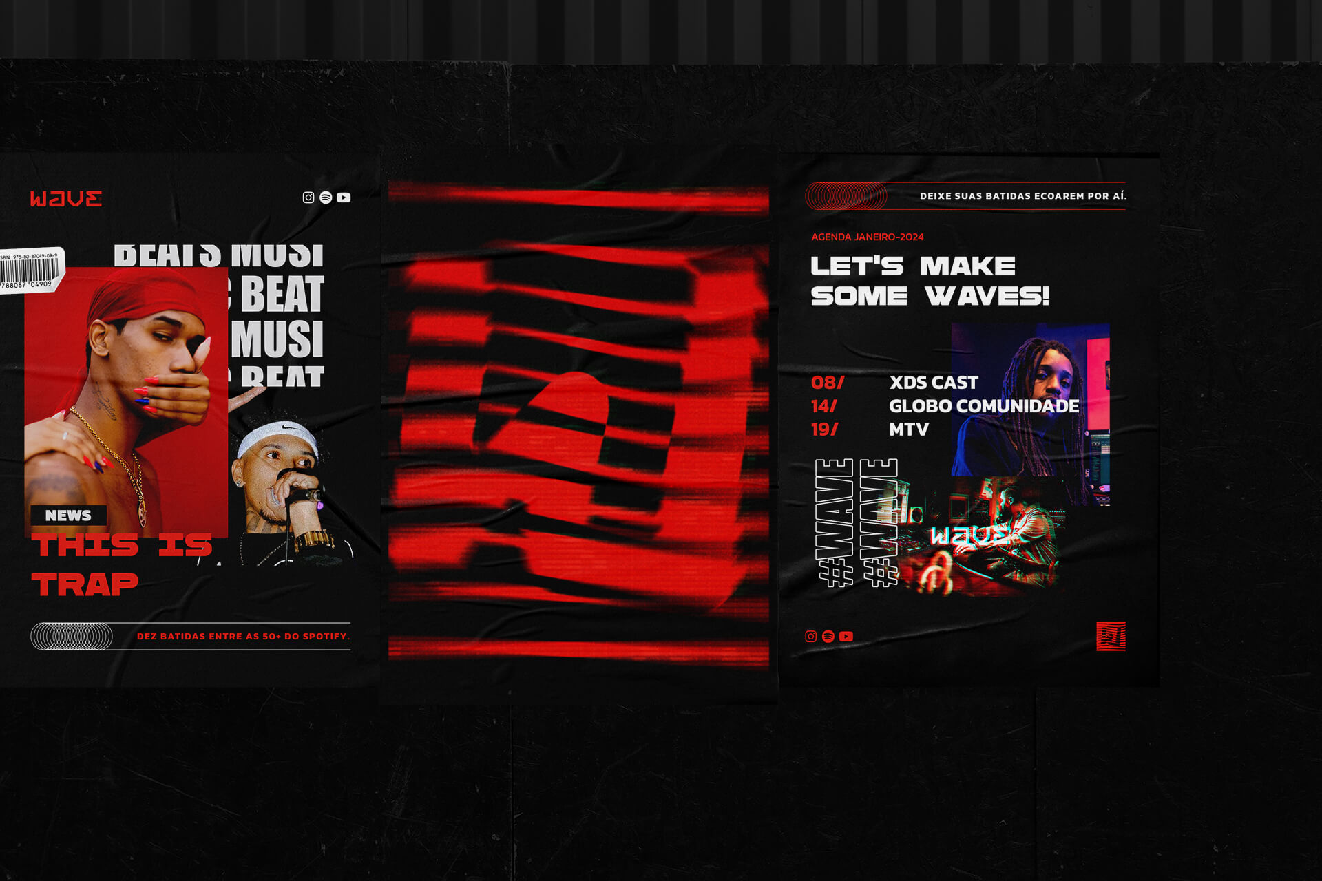
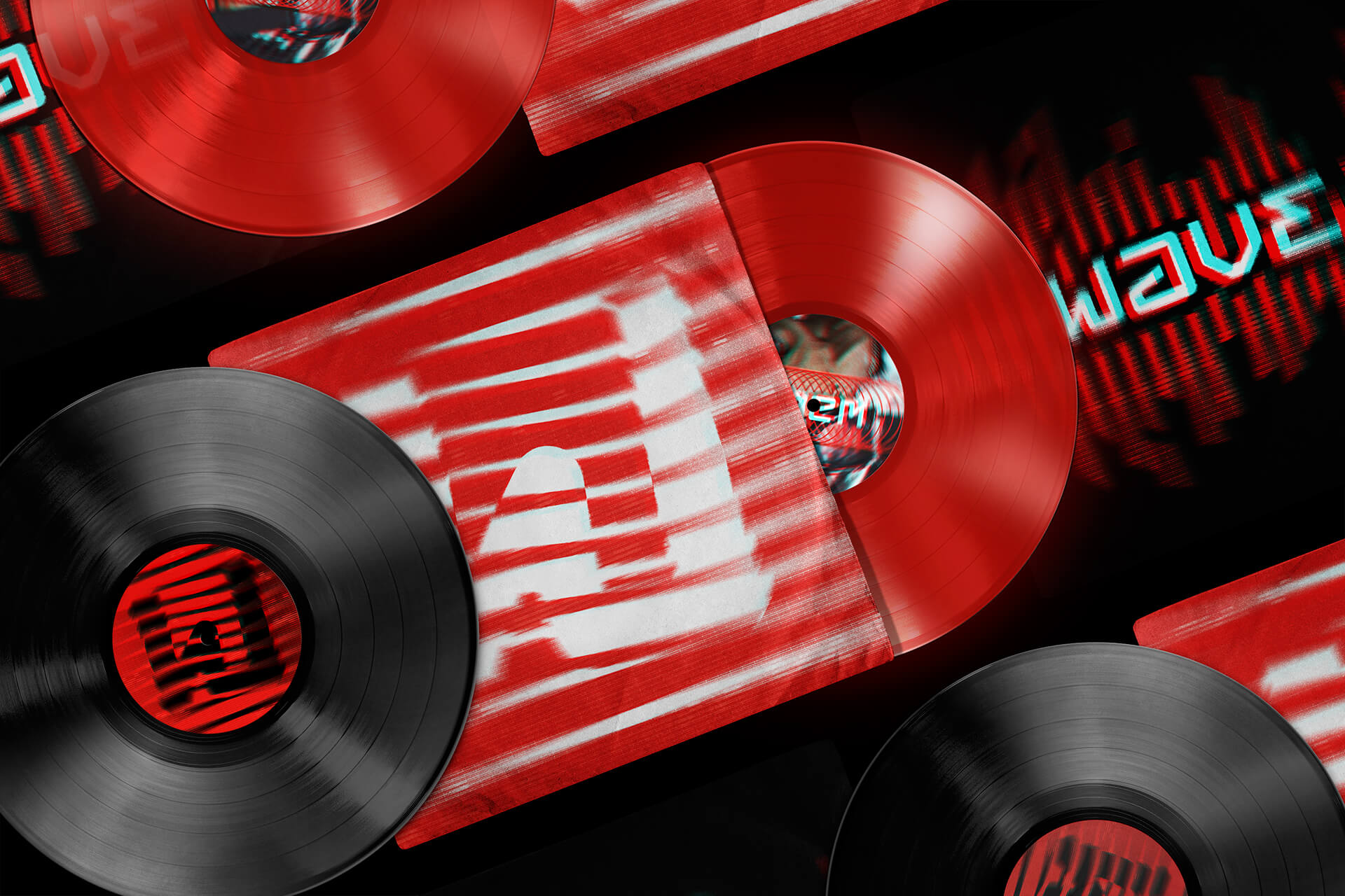
We aim for a distinctive logo, with bold typography and representative symbols. The colors red, black and white are central, symbolizing energy, boldness and innovation. Shapes and textures should capture the essence of sound waves, incorporating a sense of movement and musical vitality.
The construction of the WAVE brand is a symphony of boldness, innovation and sound aesthetics. Inspired by the vibrant and dynamic world of contemporary music production, the brand is a celebration of sound and art that intertwine to create unique and memorable experiences. WAVE is more than a brand;It is a reverberation of energy, creativity and passion for the musical universe.
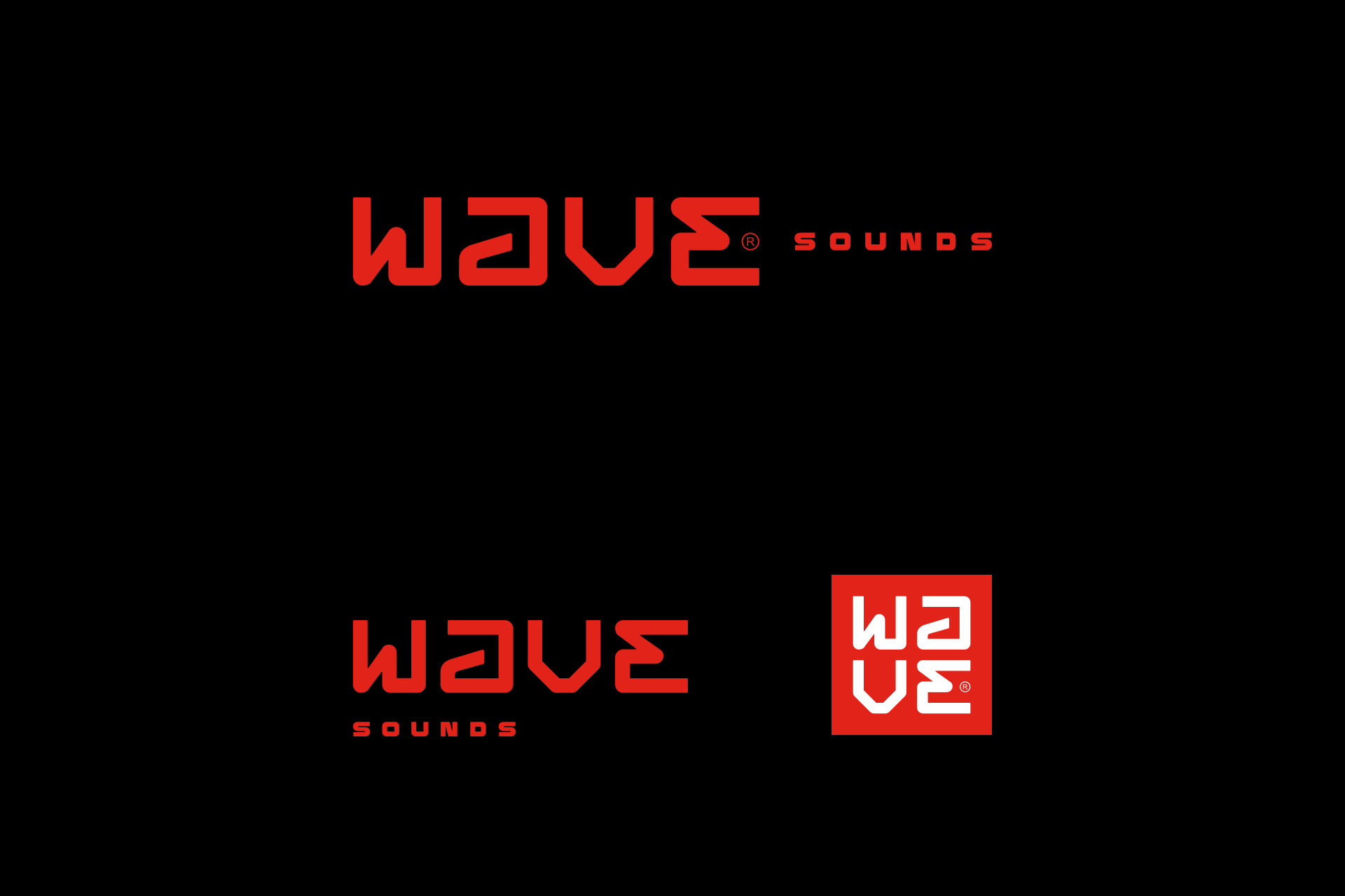
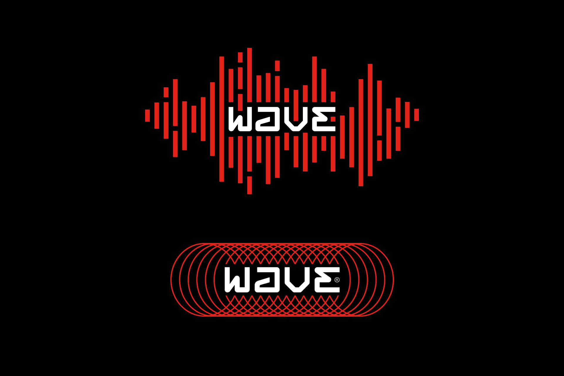
The “WAVE” lettering developed in a modular grid represents Bruce Lee’s philosophy of being like water: adaptable, flexible and capable of taking on any form. The modular grid symbolizes the necessary structure in music production, but its adaptability reflects the idea of fluidity and continuous innovation, essential characteristics for music producers. Just as Bruce Lee encouraged flexibility in one’s approach to life, the modular grid encourages flexibility and creativity in music production.
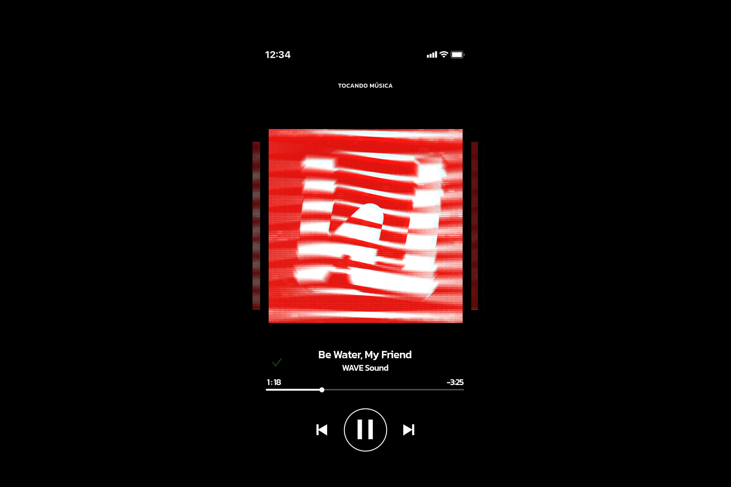
Special versions of the logo wrapped in waves represent WAVE’s essence and singular focus on music. The stylized waves surrounding the logo symbolize the music itself, with its signature Trap breadth, rhythm and energy. This representation is a visual manifestation of the immersive and pulsating sound that WAVE offers, immersing viewers in the striking universe of this musical style.
We developed a symbol that will be used in some promotional stuffs and that incorporates the letter “W”, the initial for WAVE, inside a red square. The square represents the structure, solidity and foundation necessary for musical production. Red, in turn, symbolizes the brand’s passion, energy and rebellious attitude. The stylized waves within the square represent the breadth of the brand, reflecting WAVE’s mission to provide quality and innovation in the music scene. The combination of the letter “W” deformed by the waves expresses the transformation of creative energy into an infinity of musical expressions.
The combination of black and red, in its boldness and modernity, creates a color palette that not only mirrors the brand’s personality, but also resonates with the young, music-loving target audience. These colors capture the futuristic vibe, rebellion, audacity and adventure that define the essence of WAVE.

CREDIT
- Agency/Creative: 268 Estúdio Design
- Article Title: WAVE Sounds Branding Created by 268 Estúdio Design
- Organisation/Entity: Agency
- Project Type: Identity
- Project Status: Published
- Agency/Creative Country: Brazil
- Agency/Creative City: Rio de Janeiro
- Market Region: North America, South America
- Project Deliverables: Brand Design, Brand Identity, Identity System, Logo Design
- Industry: Entertainment
- Keywords: wave sounds, music, logo, brand design, branding, visual identity, 268 estudio
-
Credits:
Graphic Designer: 268 Estúdio Design


