


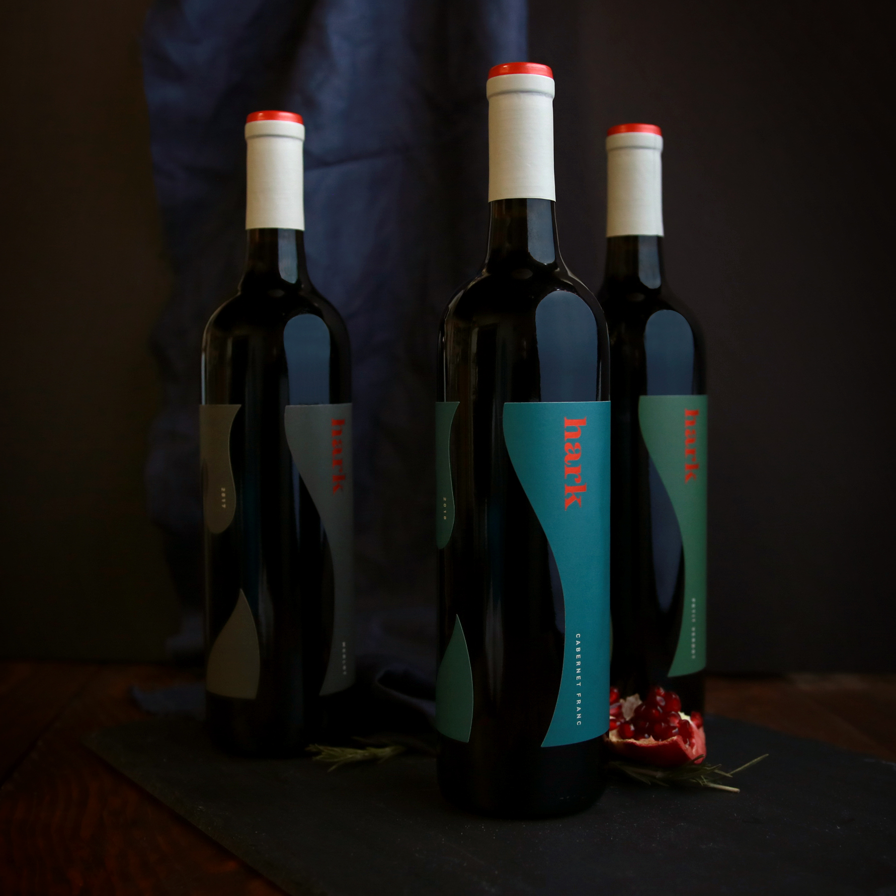
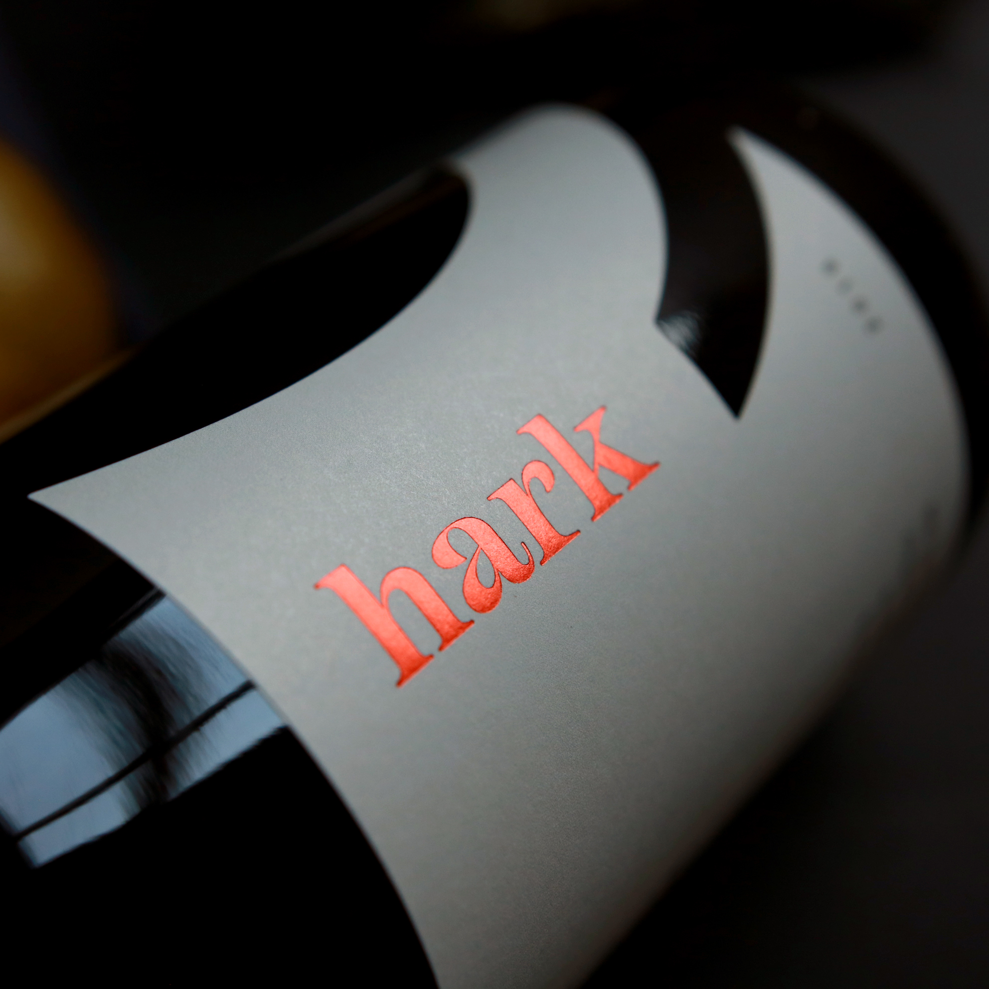
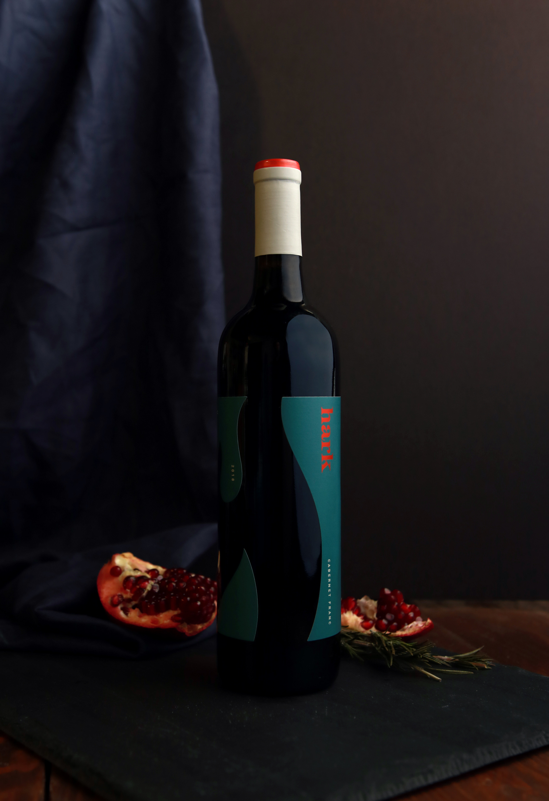
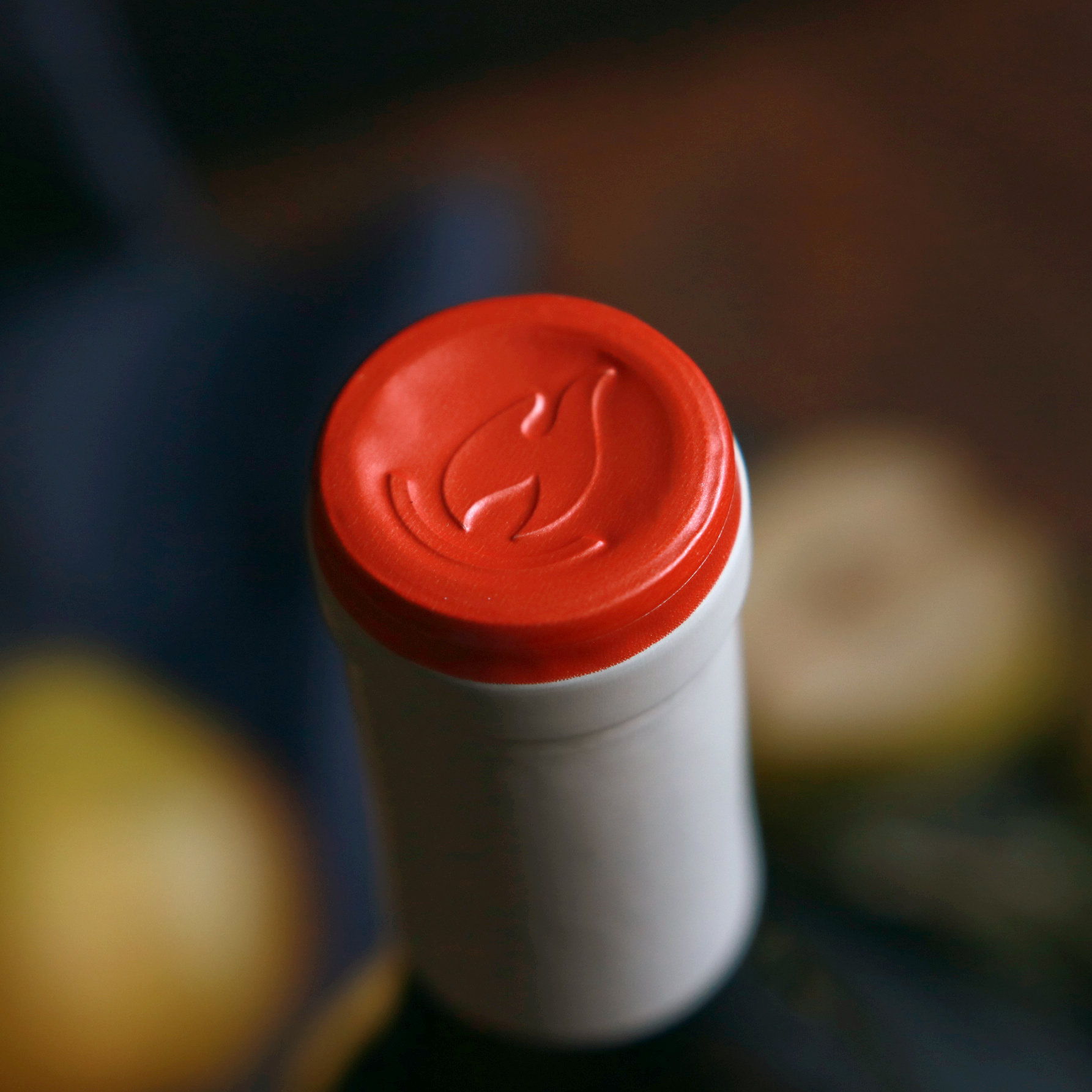
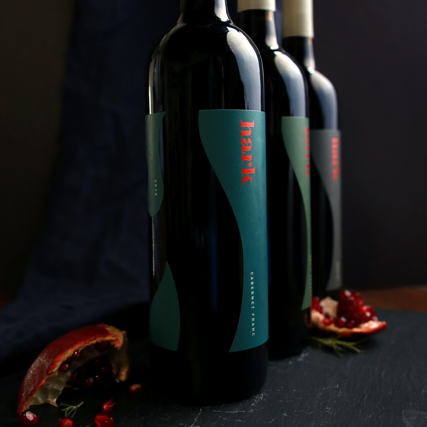
As many vineyards do, Hark started as a dream for the owners. Wanting to build a place that was approachable and welcoming, inviting you sit a while with some great wine by their outdoor fire places, and within the architecture designed to highlight the mountain vistas, vineyards and bring the outdoors in. Watermark designed a brand celebrating these goals, choosing contemporary typography that would stand out in a more traditional regional market, while also feeling friendly. The Hark label design challenged the accepted and in breaking the rules, shines in it’s simplicity, warmth and edge. Custom capsules keep a wide range of wines cohesive through a neutral palette and a pop of burnt orange, continuing to evoke the physical location through the branding & package design.
CREDIT
- Agency/Creative: Watermark Design
- Article Title: Watermark Brings the Outdoors Into the Hark Brand
- Organisation/Entity: Agency, Published Commercial Design
- Project Type: Packaging
- Agency/Creative Country: United States
- Market Region: North America
- Project Deliverables: Brand Architecture, Brand Identity, Brand Strategy, Branding, Graphic Design, Packaging Design
- Format: Bottle
- Substrate: Glass


