Dominic Sakalauskas – Island Green Water bottle label design
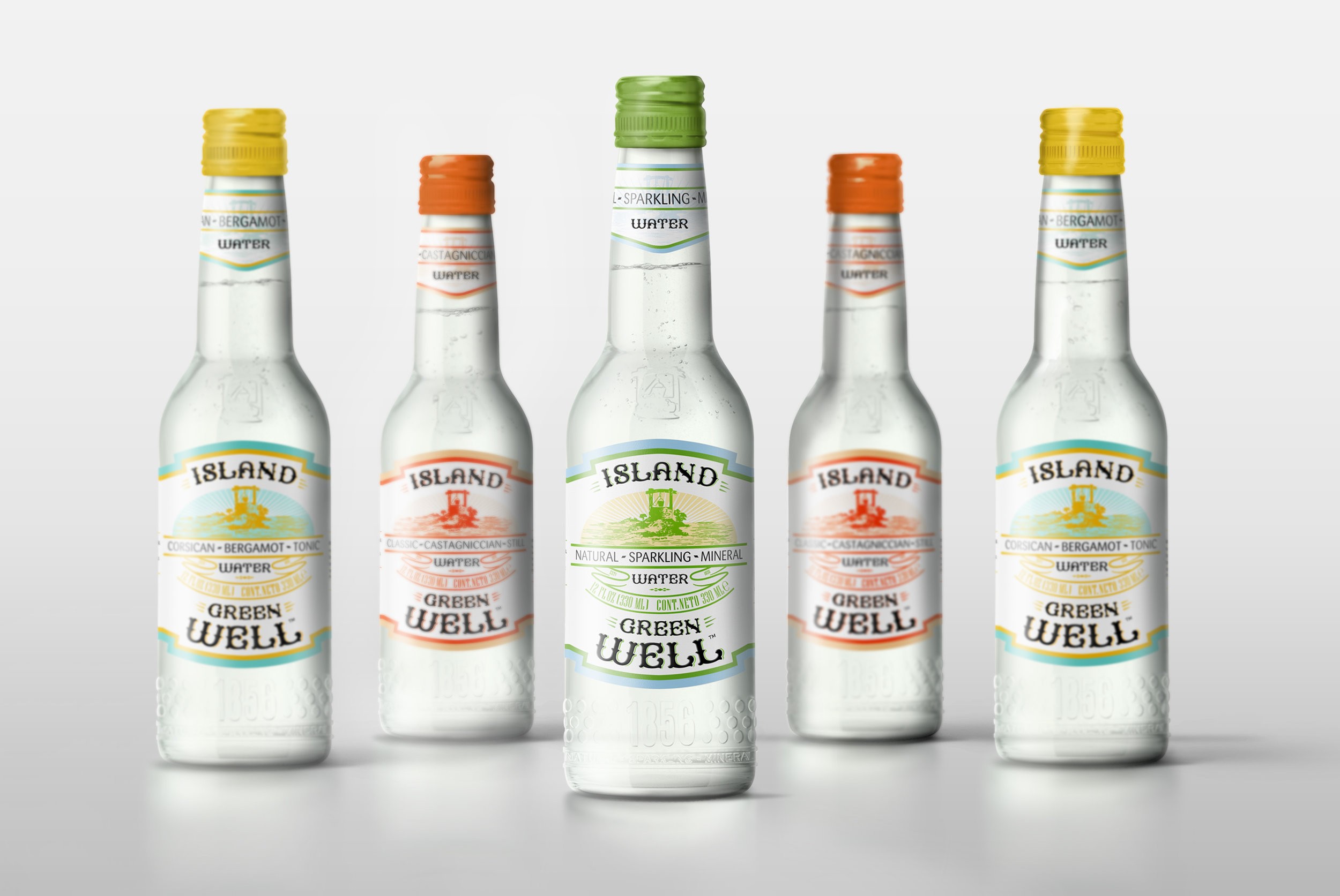
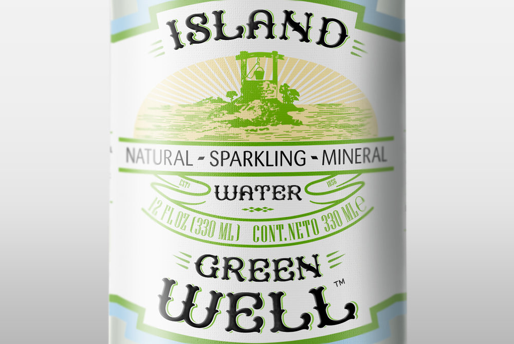
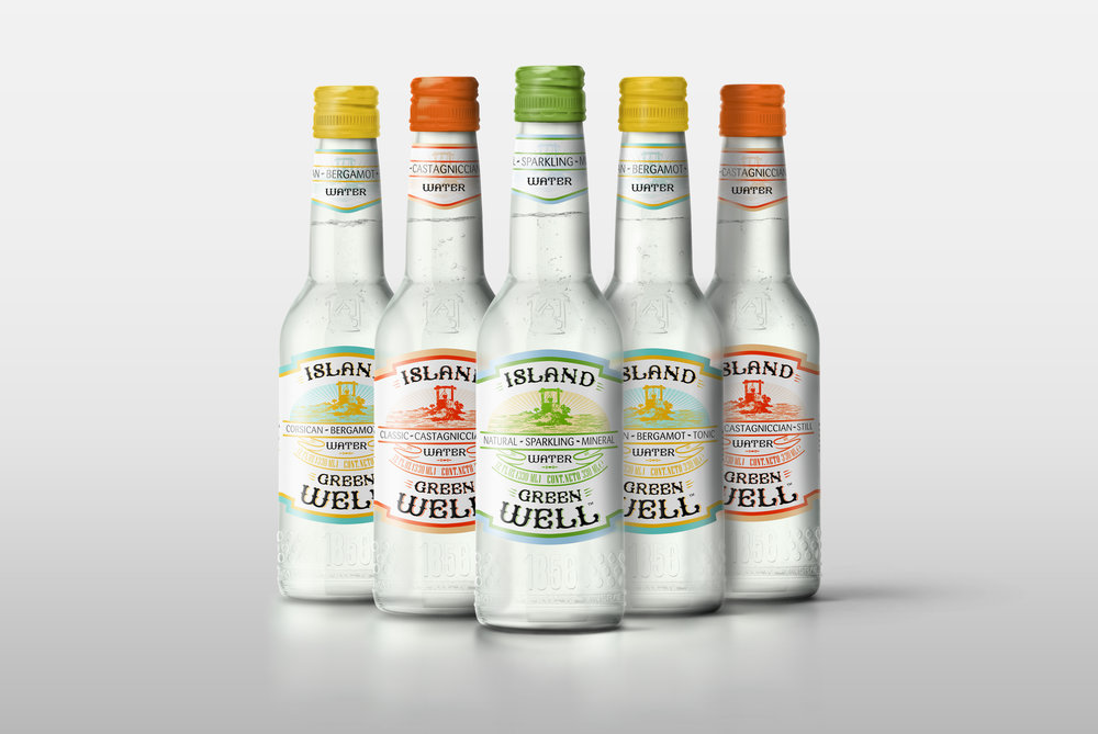
“Inspired by the Mediterranean island of Corsica and it’s natural habitat. Island Green Well mineral water comes from a spring in one of the most beautiful regions of the island called Castagniccia. This exceptional, delicately sparkling water, with a pleasant taste, contributes to well-being and health.
After finding this untapped resource the idea was to create a water brand that reflects the taste, value and the culture of Corsica.The name itself borrows much inspiration from the region surroundings and takes certain existing elements to help
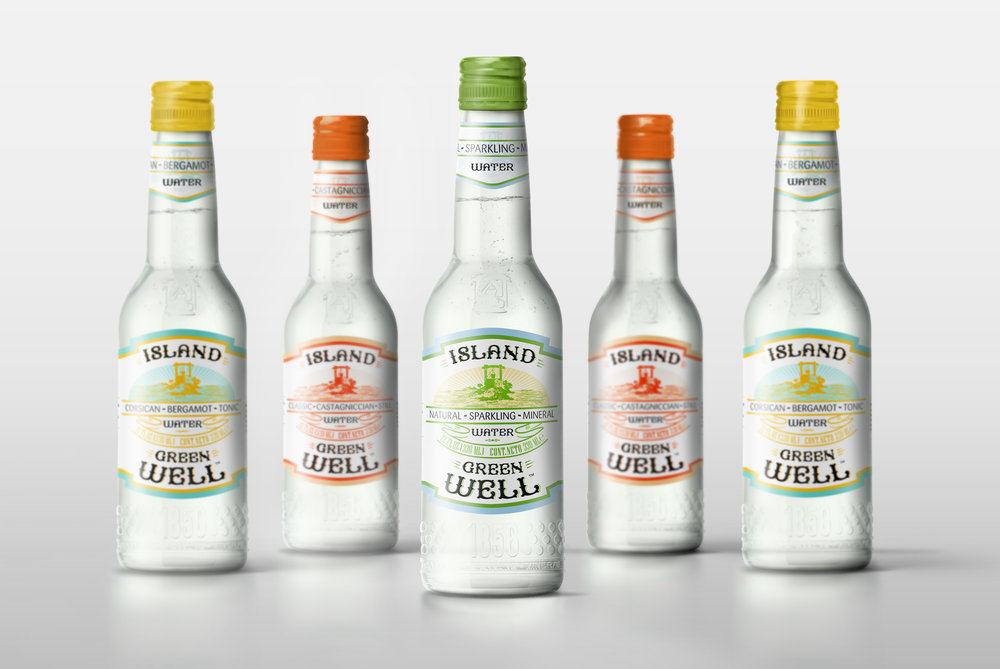
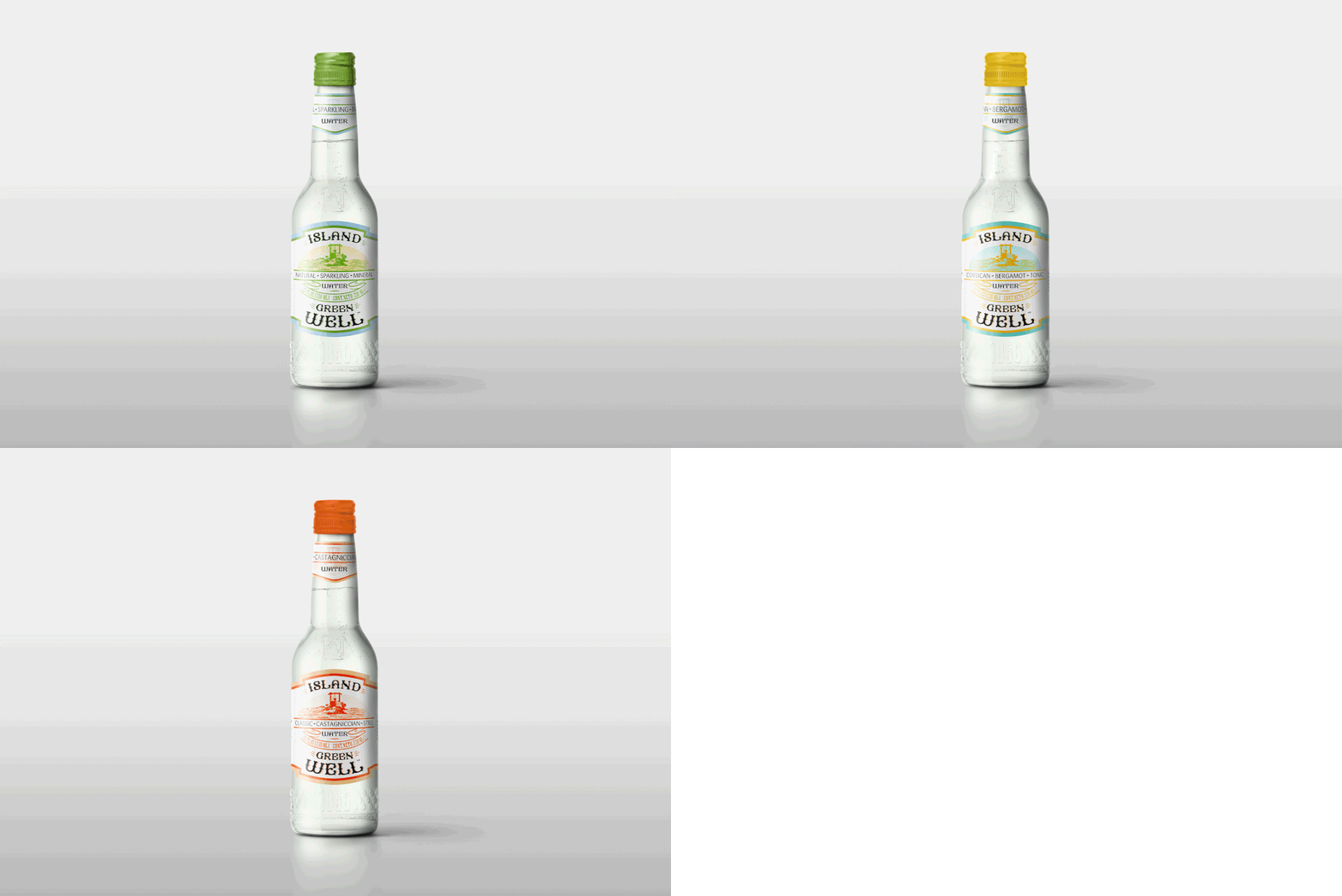
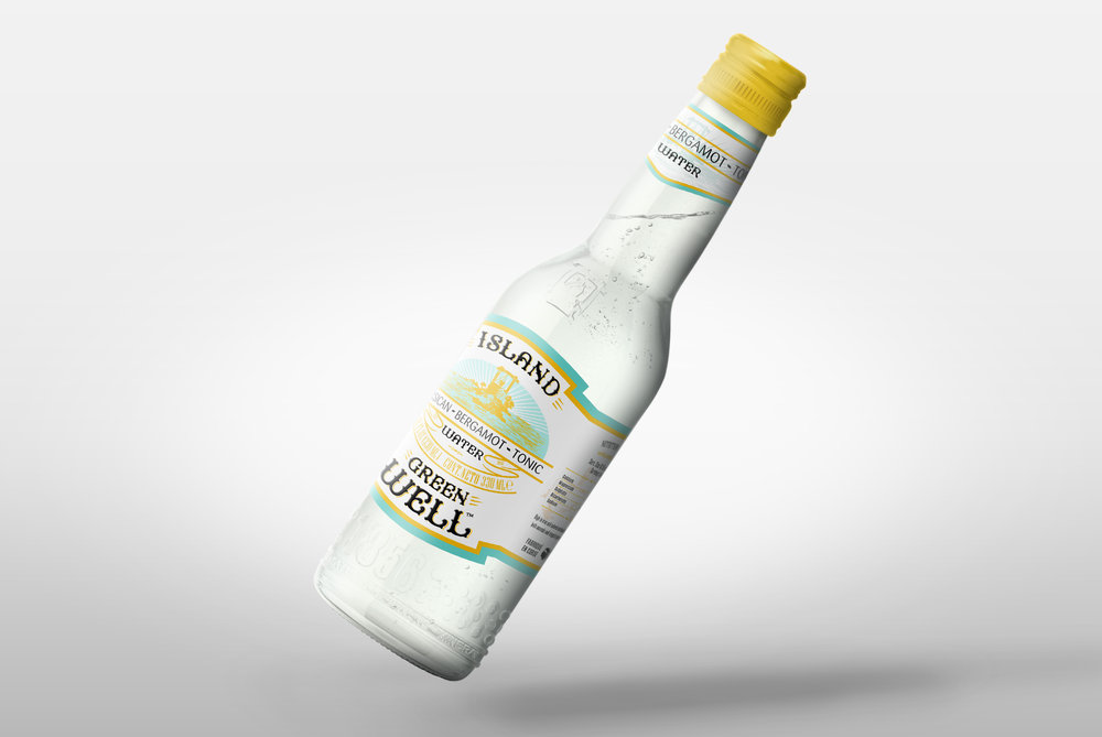
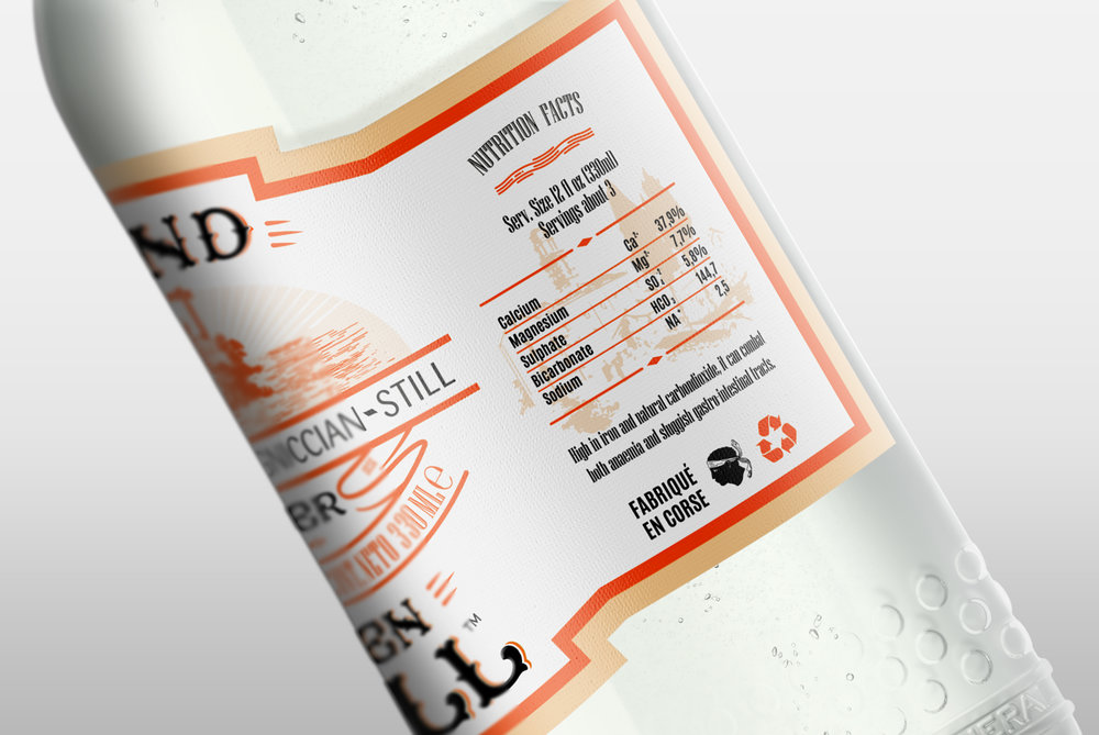
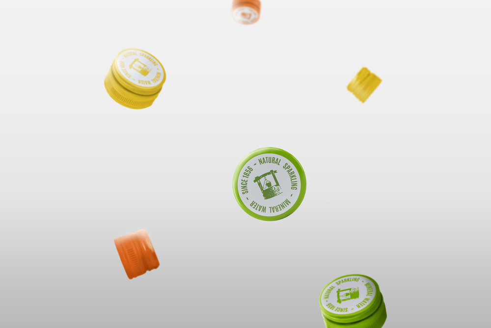
and tell the story. One which would resonate with consumer groups such as Y to Z. Main product being sparkling water, however intention was to also show variety and produce offspring products such as still water and Bergamot flavoured Tonic. The focus was to use colour and typography as the driving force behind it’s communication. Warm pastel like pantones were used with motive to separate itself amongst other competing brands, as well as show diversity and range between different products.
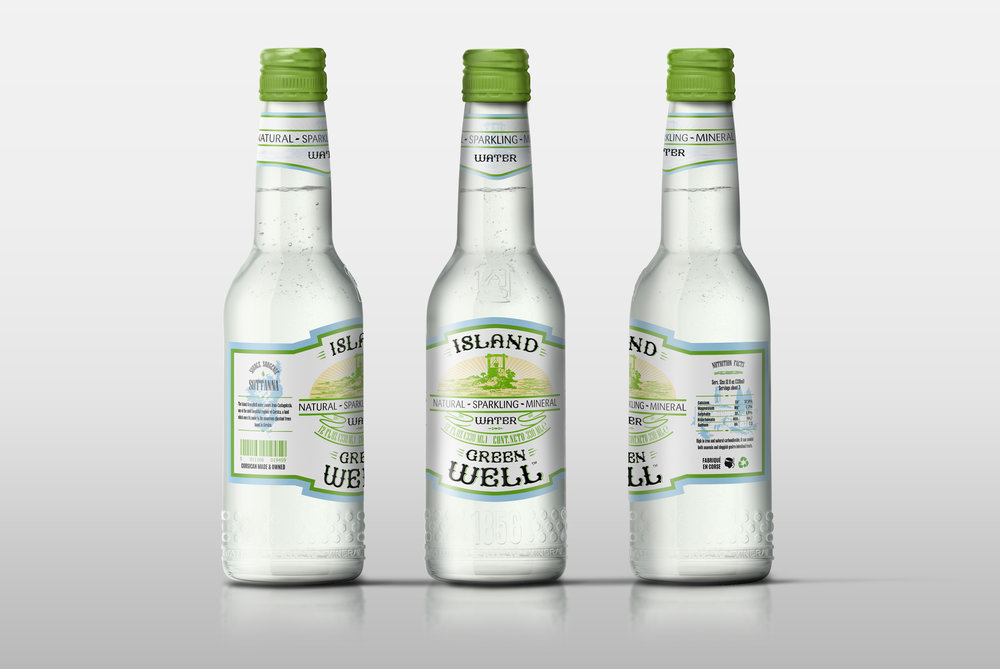
Three types of different typography styles were chosen. ‘Boulange’ type that is vintage with it’s decadent curves and gorgeous arches embodies the French spirit and it’s aesthetics that can be found both on the mainland as much as the island. What makes that ‘extra’ is the heat embossing.It separates itself and really gives the feeling the amount of attention to detail to which it was given. The supporting cast plays it’ role as well, in enhancing as much as communicating the right message. Additional graphics, although placed in the background. It brings life and visuals of the text. Glass was chosen for the numerous purposes; one being the design, and it’s range of possibilities. Feel and texture and last but not least it’s re-usability. Taking in consideration the recycling range. Beyond that It felt it was important to use glass as a platform to present the brand.
Embossing was chosen to enrich design and add more value to overal visual of the product.”

CREDIT
- Agency/Creative: Dominic Sakalauskas
- Article Title: Water Bottle Label Packaging Design for Brand from the Mediterranean Island of Corsica
- Organisation/Entity: Freelance Concept / Non Published
- Project Type: Packaging
- Agency/Creative Country: United Kingdom
- Market Region: Global
- Format: Bottle
- Substrate: Glass


