


Overview
Washen is the new identity of a well-established Chicago-based car wash formerly known as Clean and Bright, a family-owned business with a history spanning over 20 years. Renowned for its personal service and loyal customer base, the business had remained a trusted name in its neighborhood — but over time, it struggled to stay relevant in a fast-evolving, digitally-driven market.
In 2024, a new team of investors took over the business with a bold vision: to modernize the brand, improve customer experience, and appeal to a younger generation, all without losing the essence that made the business successful. They partnered with Belbrd, a branding and experience design agency, to guide a full transformation — from identity and customer journey to service innovation.
The Challenge
Despite its legacy, the original Clean and Bright brand was no longer resonating with modern customers. The business faced several critical issues:
• Outdated visual identity and name, making it look old-fashioned and disconnected from current market trends.
• Low appeal to younger demographics, who prefer brands that feel modern, convenient, and tech-enabled.
• Lack of digital infrastructure, including no online booking, mobile app, or loyalty integration.
• Increased competition from automated and express wash stations offering quicker, tech-supported services.
• Desire to modernize without alienating loyal long-time customers who value traditional full-service care.
Our mission was to reposition the business as a forward-looking, experience-driven brand that feels fresh yet familiar, sophisticated yet accessible.
Our Approach
We kicked off the project with in-depth research, team workshops, and customer interviews to better understand Washen’s unique value and long-term vision. The rebranding process was carried out in four structured phases:
1. Discovery & Brand Audit
We examined:
• Customer perceptions and behavior.
• Industry trends and best practices.
• Competitor analysis across the Chicago area and national chains.
• Operational strengths and gaps within the current service.
The insights helped us define a roadmap to shift the perception from “old-school and reliable” to “modern and trusted.”
2. Brand Strategy & Positioning
Through collaborative strategy workshops, we developed:
• A new brand platform focused on “modern care, everyday trust.”
• Core brand values: reliability, speed, sustainability, hospitality, and tech-forward service.
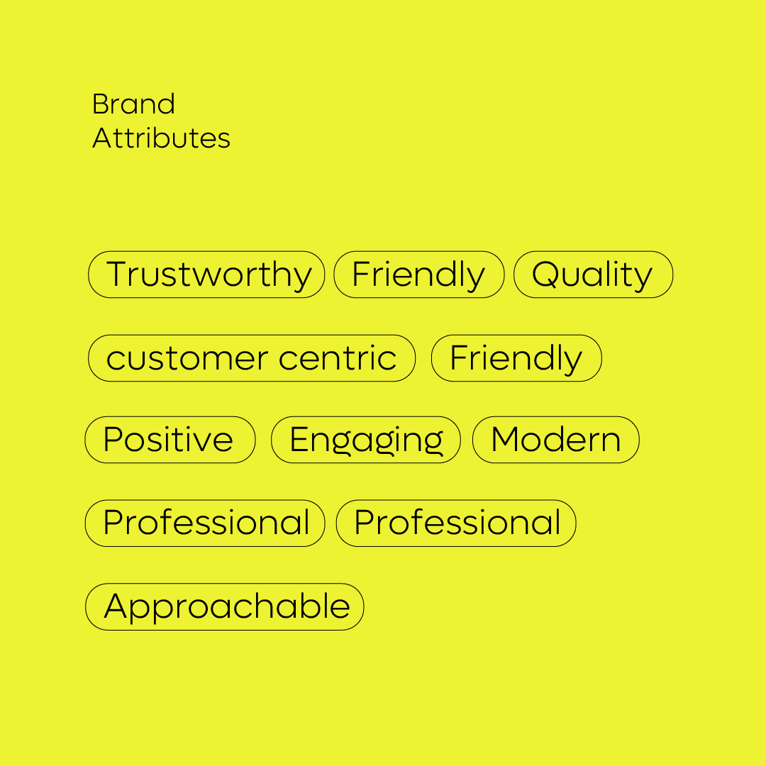
• Brand persona: youthful, confident, environmentally conscious, and welcoming.
• A unique brand tone and messaging style — conversational, friendly, but professional.
3. Visual Identity System
One of the most crucial steps was updating the brand’s visual expression:
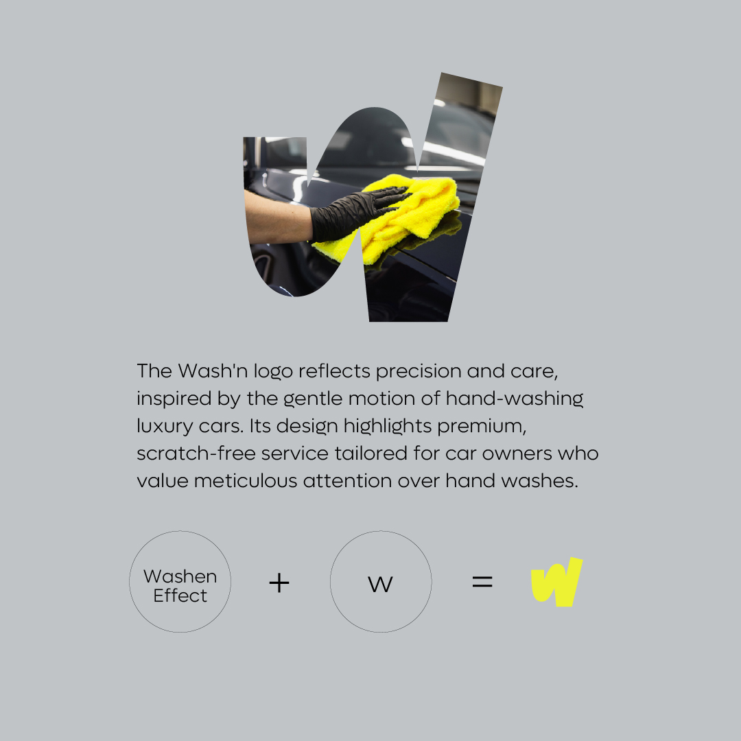
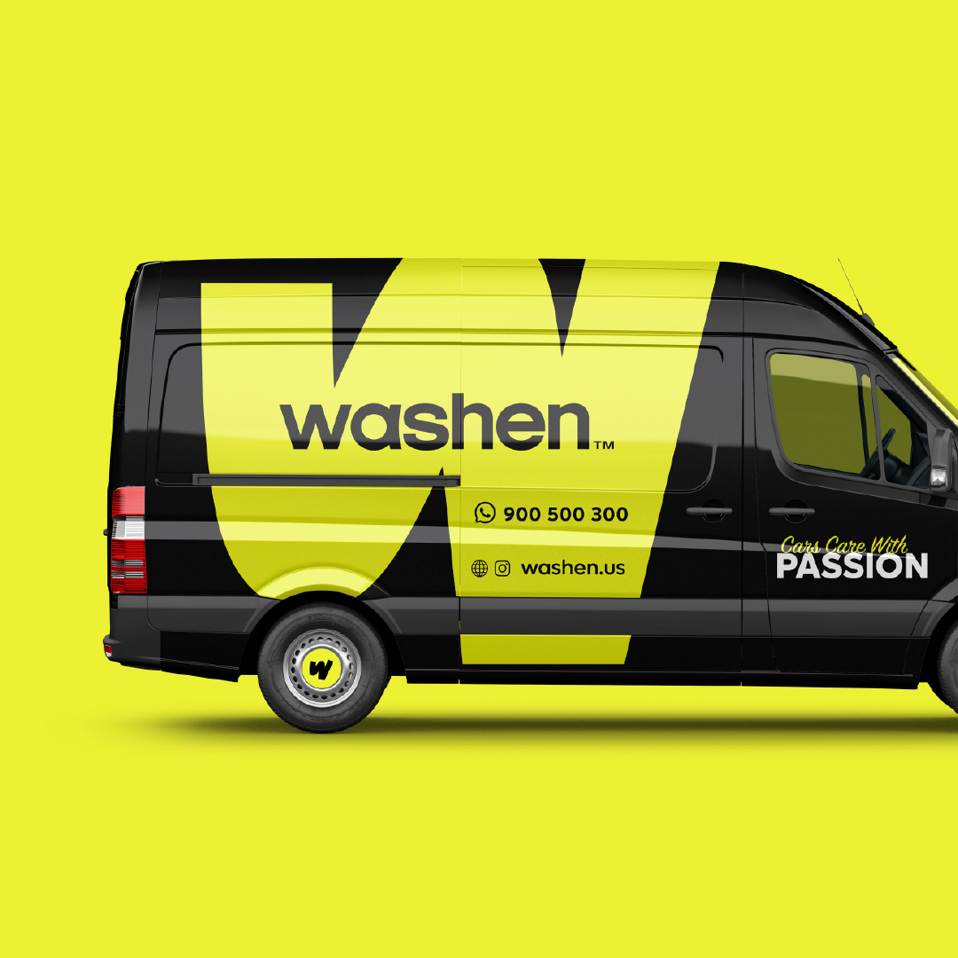
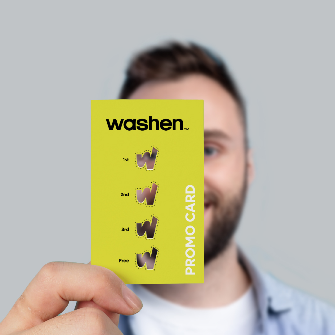
• New Name: “Washen” — a modern, catchy name that conveys action and ease. It drops the dated “Clean and Bright” while still retaining relevance.
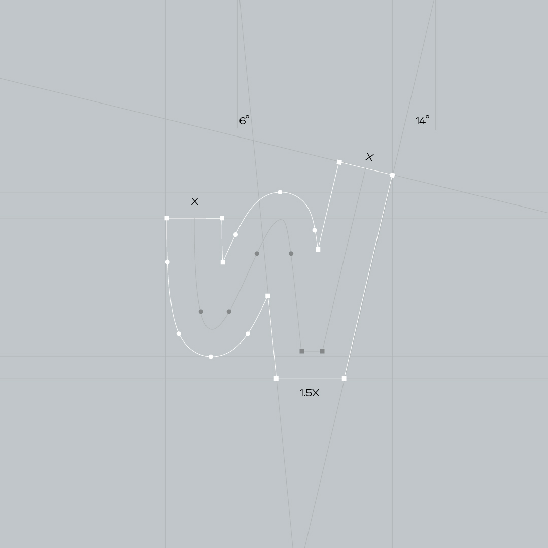
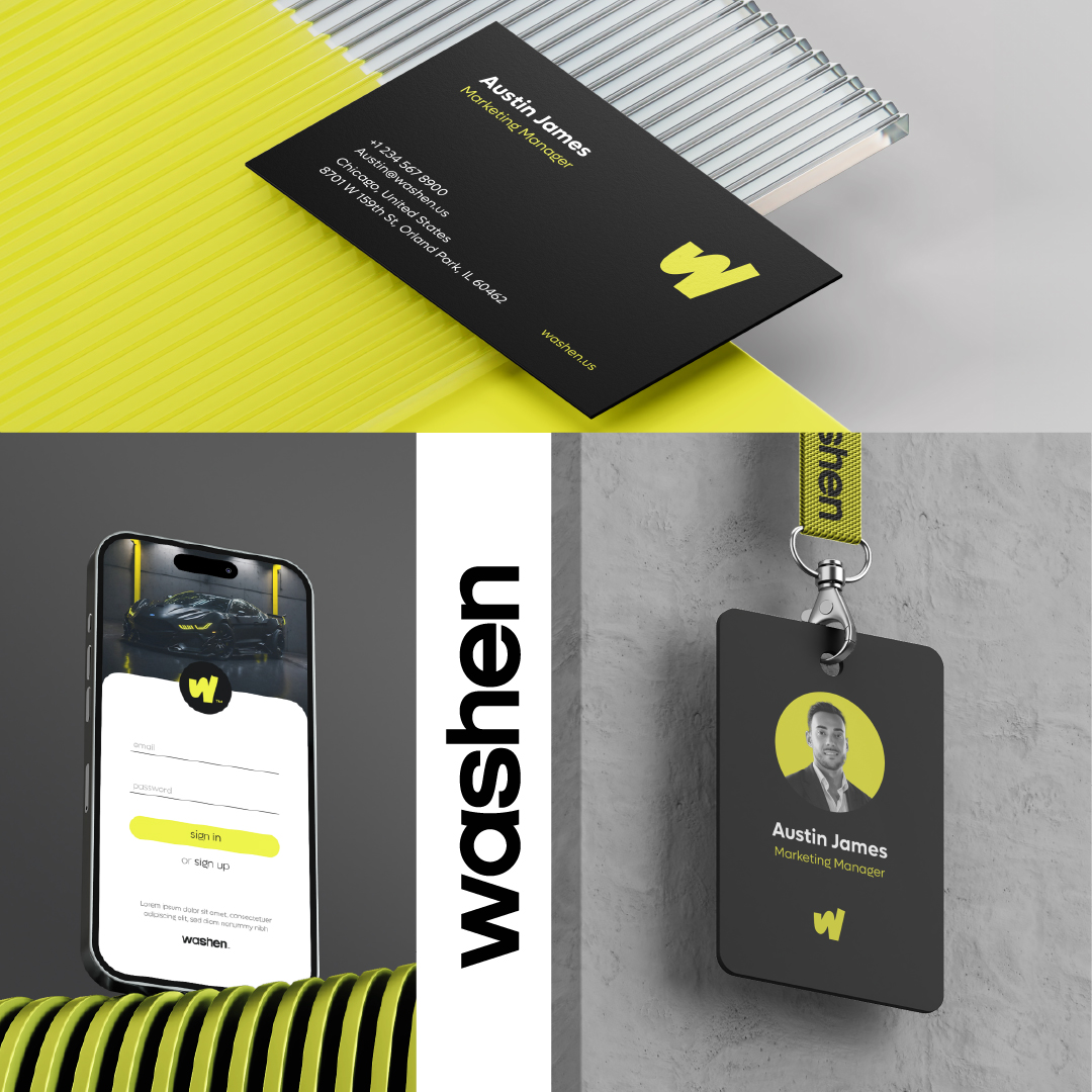
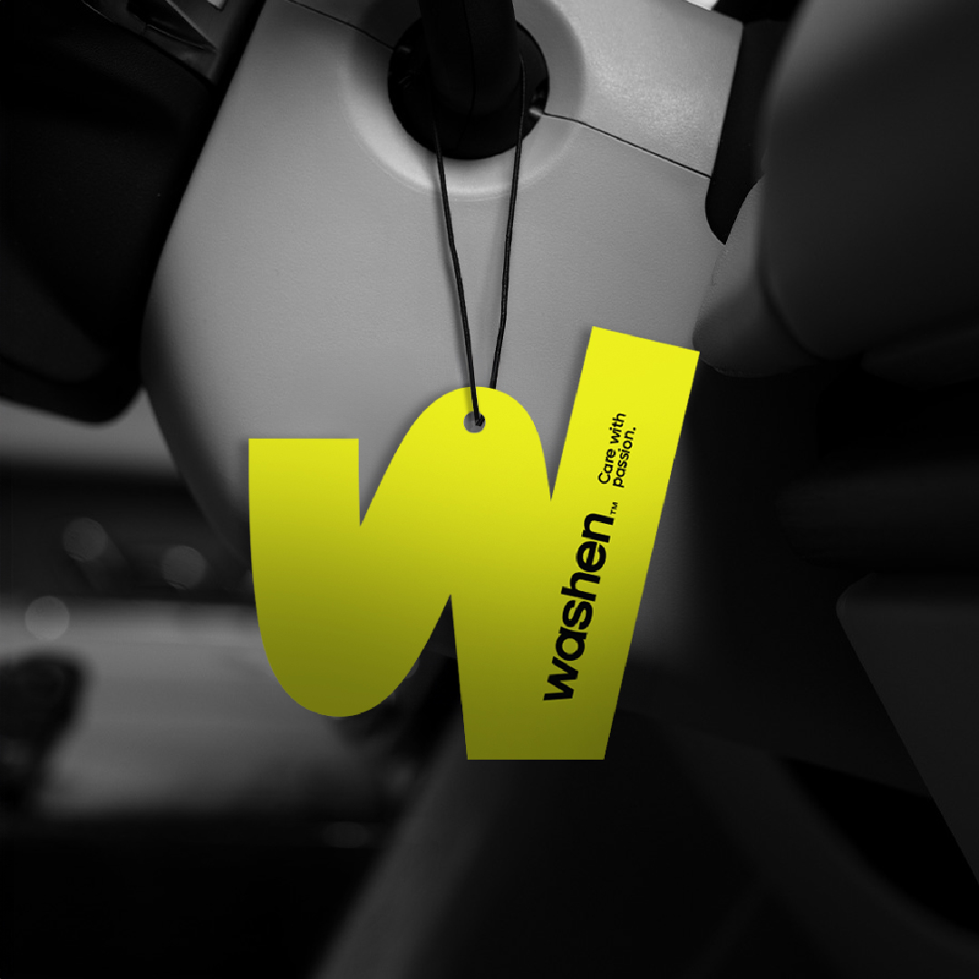
• Logo Design: A custom wordmark paired with fluid, dynamic design elements to reflect motion and clarity.
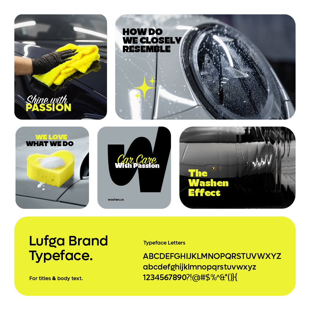
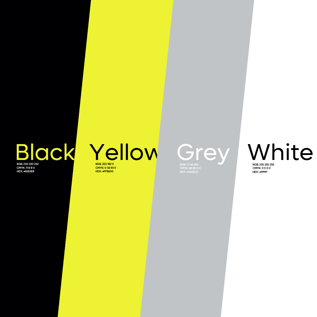
• Color Palette: A standout mix of lime yellow, black, light gray, and white — bold and clean, avoiding overused reds and blues in the industry.
• Typography & Icons: Sharp, legible sans-serif fonts and a custom icon system to improve signage, wayfinding, and digital clarity.
4. Experience & Service Innovation
In addition to rebranding the look and feel, we reimagined the full customer experience:
• Clear, tiered service offerings: Express, Full Service, and Detailing.
• Integration of a loyalty program for rewards, scheduling, and offers.
• Modernized customer flow: easier check-ins, clearer signage, and improved waiting areas with coffee stations and phone charging docks.
• Staff uniforms, air fresheners, and printed material redesigned to reflect the new identity.
• Sustainability integration: biodegradable soaps, reduced water consumption equipment, and paperless transactions.
The Solution: A Future-Ready Washen
Washen’s transformation was more than a visual refresh. It was a repositioning from top to bottom — designed to scale as a modern, trusted car care brand in a competitive urban market.
Key outcomes include:
• Modern Brand Identity: Visually dynamic and digitally adaptable.
• Reimagined Customer Experience: Better flow, digital tools, clearer service offerings.
• Stronger Youth Appeal: Aesthetic and messaging tuned to resonate with customers under 35.
• Operational Alignment: Enhanced staff engagement through training and brand purpose.
• Growth-Oriented: A brand system designed for multi-location expansion and potential franchising.

CREDIT
- Agency/Creative: belbrd
- Article Title: Washen – Transforming a Legacy into a Modern Car Wash Experience by belbrd
- Organisation/Entity: Agency
- Project Type: Identity
- Project Status: Published
- Agency/Creative Country: United States
- Agency/Creative City: Casper
- Market Region: North America, South America
- Project Deliverables: Art Direction, Brand Creation, Brand Design, Brand Identity, Brand Mark, Brand Naming, Brand Redesign, Brand Strategy, Branding, Logo Design
- Industry: Professional Services
- Keywords: Ca Wash Rebranding
-
Credits:
CEO/Creative director: Ali Sheikh Ali
Art director: Ahmad Hazouri
Graphic & Motion Designer: Mohamad Shilla


