


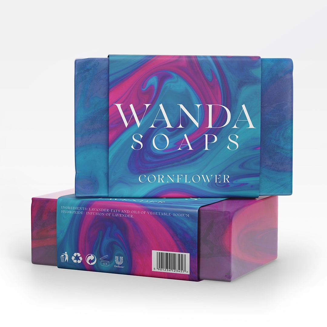
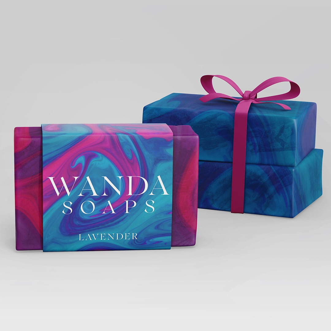
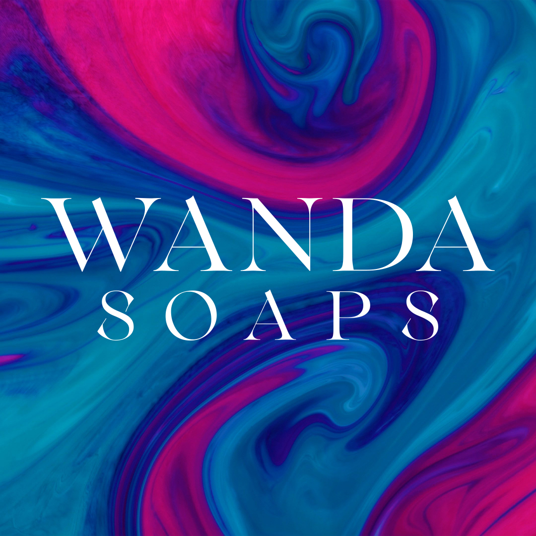
Wolfden created a packaging for two Wanda’s soaps, a little shop of skin care products. The package covers only part of the soap, it is made of cardboard and the design that Wolfden created is printed on all sides. We used the same colors that the two types of soaps have and mixed to appear liquid, colors range from midnight blue to cyan blue, along with a dark purple ranging from fluo pink. We made this pattern to match the colors of the soaps. After that we created an elegant logo that enclosed the word “Wanda” brand name, and underneath with the same font but reduced by 25% we wrote the product category in this case the soaps. Finally, we added the mandatory information on the underside of the package, and again in the main part we added the aroma of the soap, for example lavender.
Wolfden is a place where the lone wolf gives life to visual arts, such as videos, graphics or pictures, our goal is to achieve the best product in a creative and efficient way so it can make it unique, enter the den to find out more.
CREDIT
- Agency/Creative: Wolfden
- Article Title: Wanda Soaps Packaging Design
- Organisation/Entity: Agency
- Project Type: Packaging
- Project Status: Published
- Agency/Creative Country: United Kingdom
- Agency/Creative City: Lymington
- Market Region: Global
- Project Deliverables: Brand Design, Branding, Packaging Design
- Format: Wrap
- Substrate: Pulp Board
- Industry: Health Care
- Keywords: Soaps bar shampoo skin care products
-
Credits:
Graphics Designer: Riccardo Benfenati


