A fragrance for lovers and rebels
Amamo is a coffee shop enriching Cannes’ cultural scene with specialty coffee crafted by masters. Inspired by Brâncuși, its identity reflects the artistry of transforming ideas into form. We developed a visual identity that embodies this fusion of craftsmanship, culture, and creativity.
Being an emerging brand with a budget problem, Amamo could not afford high-volume packaging, a large number of colors, and fancy printing techniques. We solved this with a big idea and an easy way of transforming it into form. We created a packaging architecture that revolves around a set of stickers, preserving the spirit of craftsmanship. It allows the barista to pause and engage in a moment of meditation, turning each coffee bag into a unique, personal piece of art. Designed for both functionality and aesthetics, the system works as the perfect balance between practicality and creative expression.
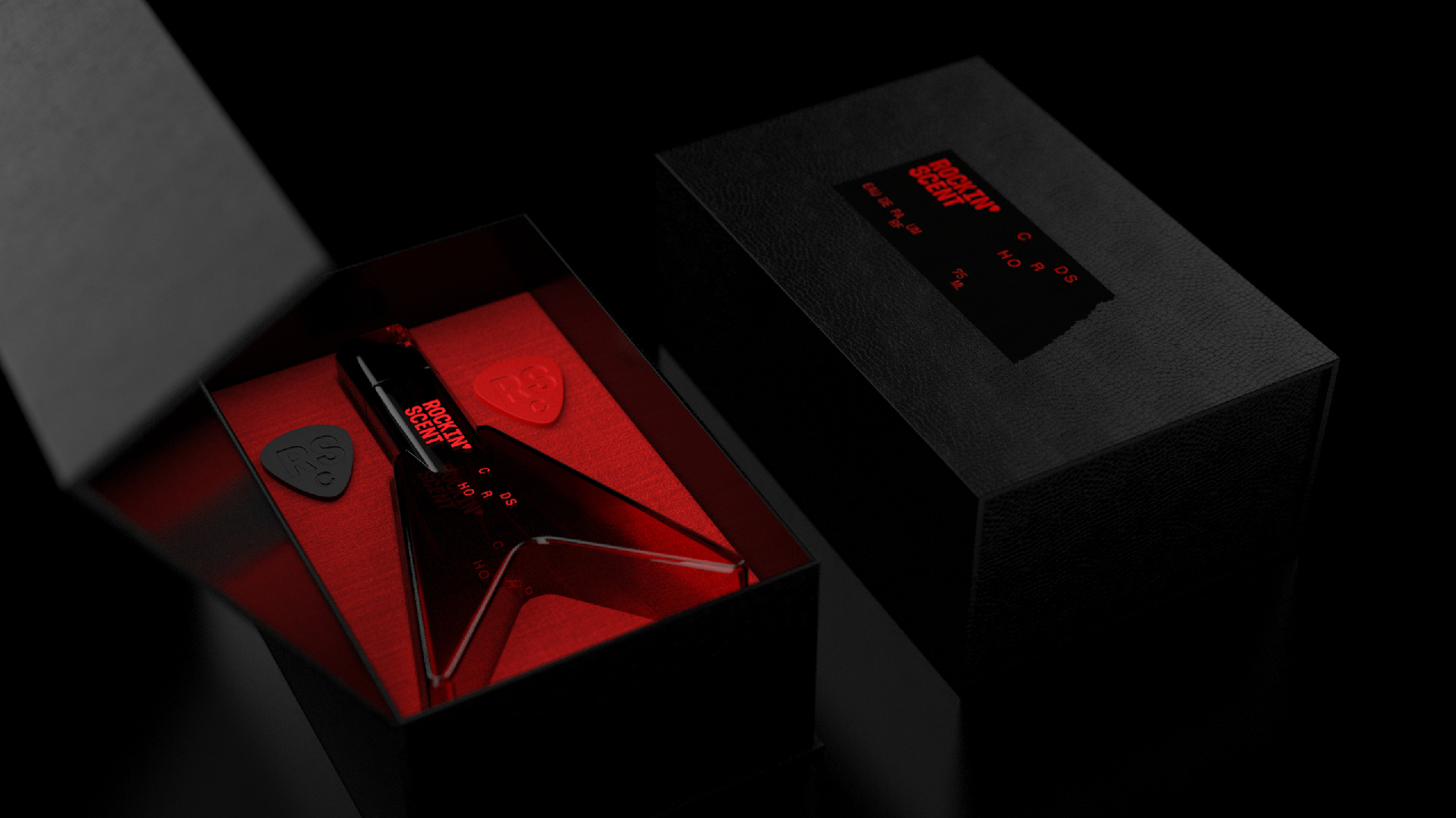
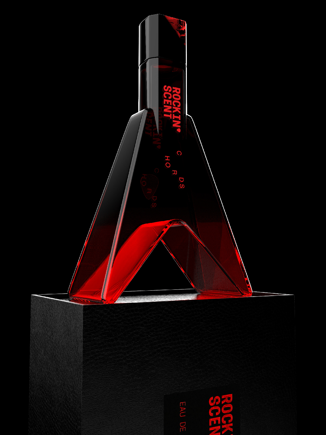
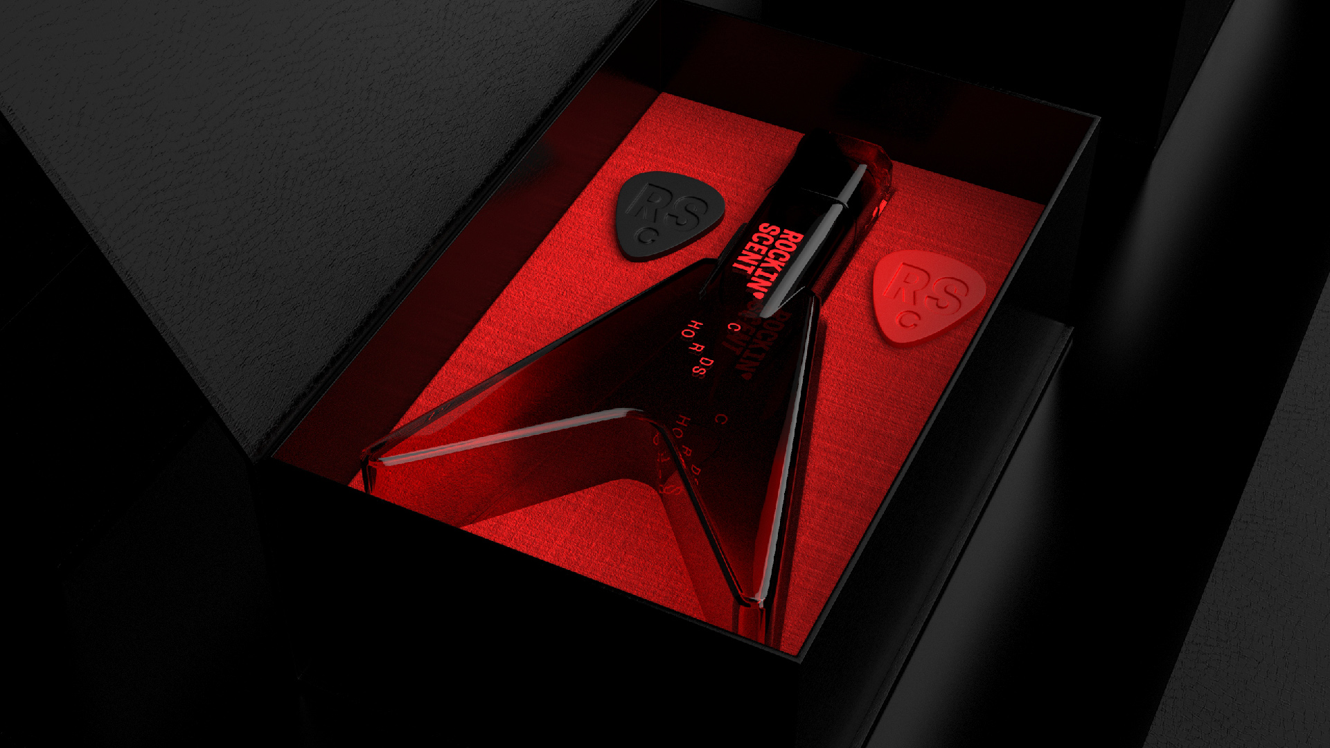
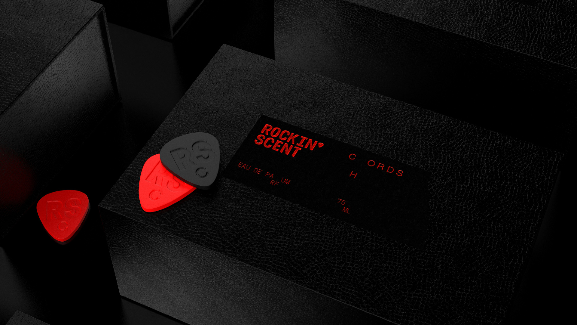
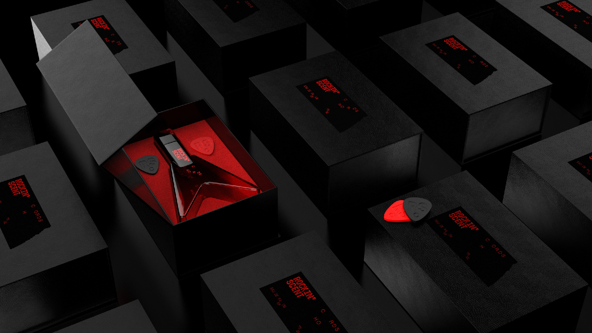
The logotype connects the experience of great coffee to modernist sculpture, embodying an aspirational lifestyle. It captures a moment of pause, inviting you to savor the aroma and taste, fully present in the now. Rockin’ Scent is more than a perfume, it’s a statement. It’s made for the bold, the passionate, the ones who turn the volume all the way up and never apologize for who they are. This fragrance was born from rebellion, shaped by emotion, and driven by the raw energy of post-punk culture. It’s for rebels, lovers, outsiders, and artists, for anyone who refuses to blend in or be silenced. With every note, it breaks conformity and demands attention, amplifying self-expression with unapologetic force.
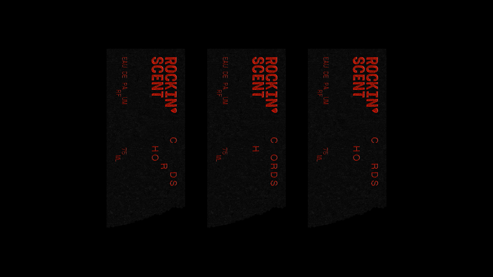
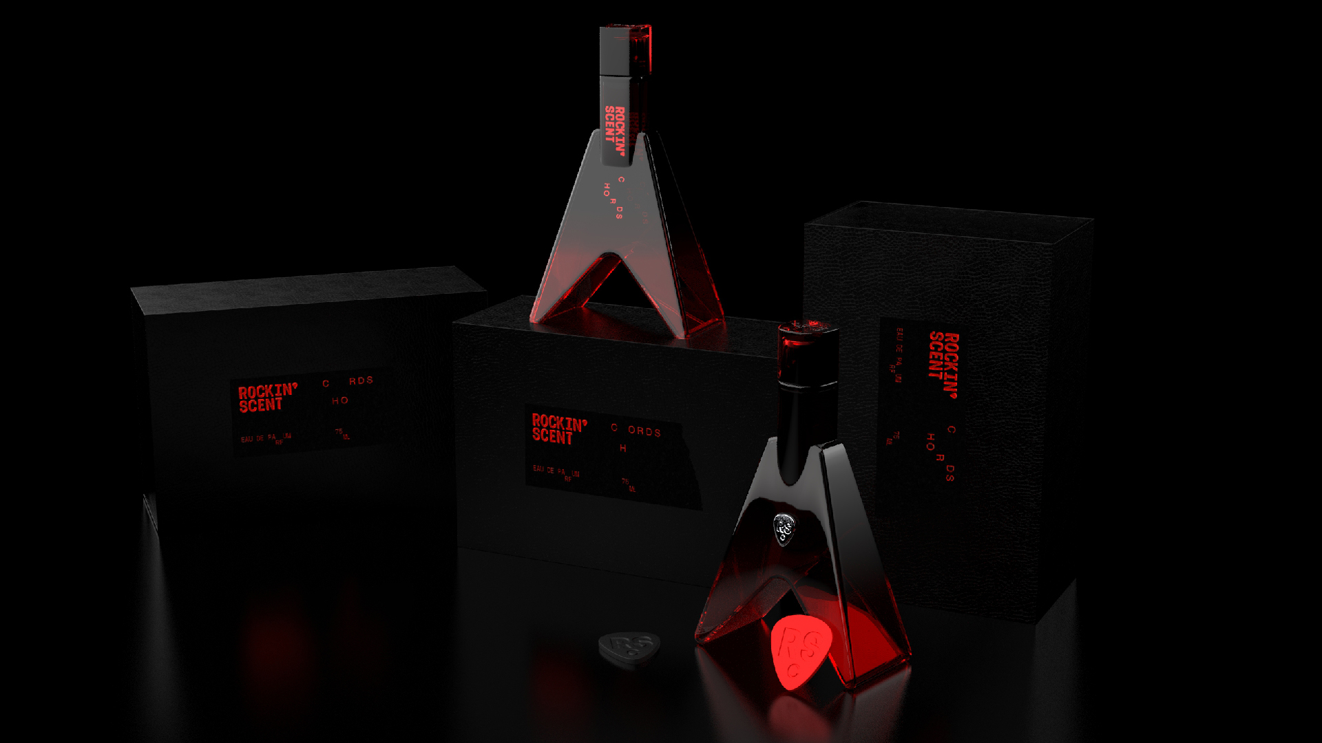
We approached the packaging with the same mindset. The visual identity doesn’t whisper; it shouts. It carries the same bold attitude as the scent itself, embracing imperfection, grit, and character. Rough textures, bold contrasts, and a logotype that pulses like a bassline: it’s a visual translation of noise, attitude, and soul. Each detail is intentional, a tribute to those who create their own path.
The logotype is crafted to echo music itself: each letter a sound, each curve a note. It resonates like distorted guitar chords, chaotic yet meaningful, transporting you to another dimension. Inspired by the rebellious spirit of the underground, we didn’t just design a perfume, we built a universe. A place where scent and sound don’t just coexist, they collide. A world where identity is a canvas, and perfume becomes a form of wearable art.
This is not about trends. This is about truth. This is your anthem.
CREDIT
- Agency/Creative: VRLN Studio
- Article Title: VRLN Studio Amplifies Rockin’ Scent with a Rebellious Identity That Translates Attitude into Design
- Organisation/Entity: Agency
- Project Type: Packaging
- Project Status: Published
- Agency/Creative Country: Romania
- Agency/Creative City: PIPERA (VOLUNTARI)
- Market Region: Europe
- Project Deliverables: Brand Identity, Branding, Logo Design, Packaging Design
- Format: Bottle, Box
- Industry: Beauty/Cosmetics
- Keywords: fragrance, punk, perfume, post-punk
-
Credits:
Design Director: Paul Virlan
Product Designer: Cosmin Panfil


