


Kleos+Klea: A Design System for Nutrient Only Skincare
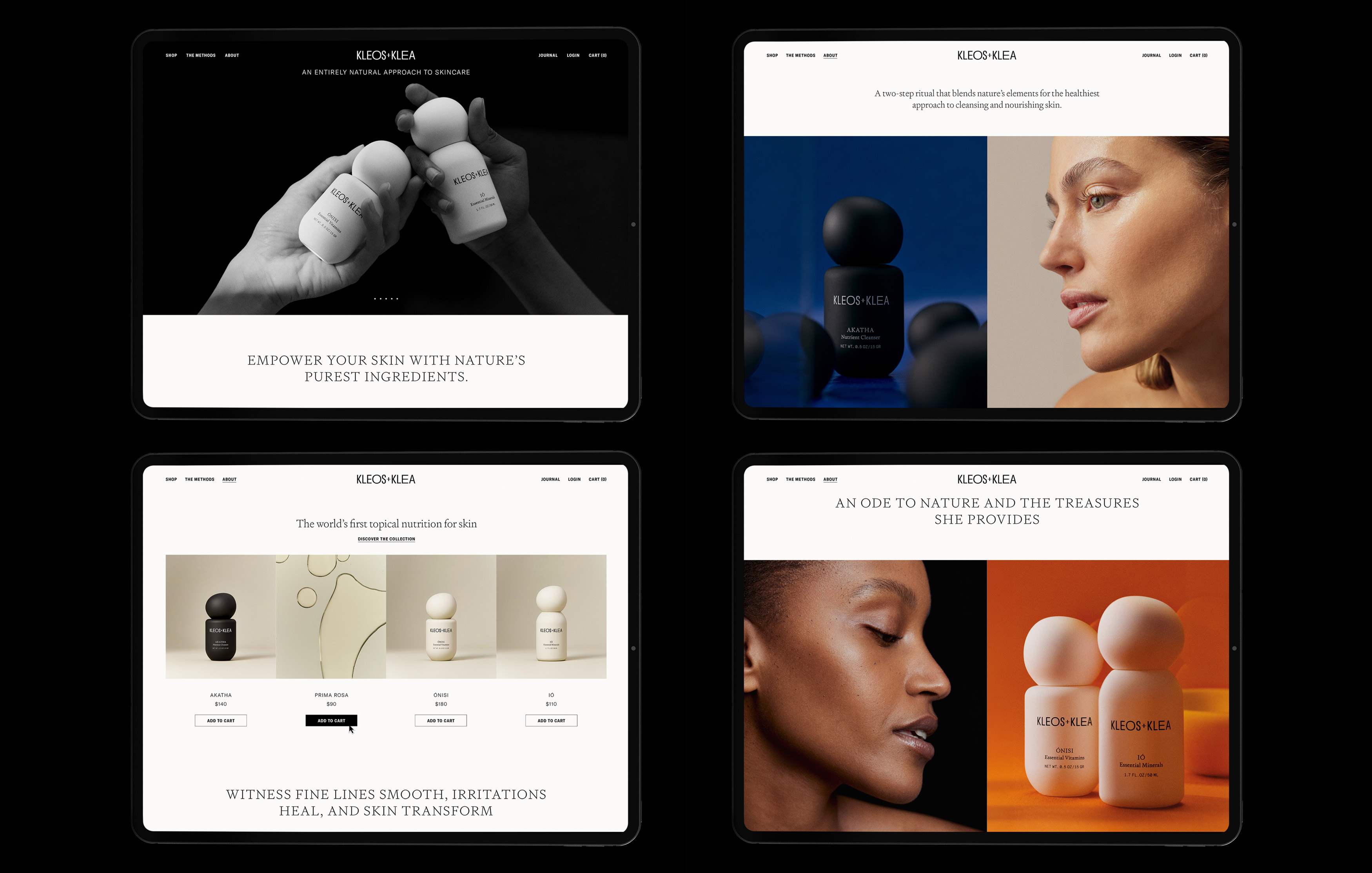
Kleos+Klea is a skincare brand born of elemental dualities earth and intellect, science and ceremony, precision and poetry. Designed by Voodoo Voodoo, the project spans naming, identity, product and packaging design, art direction, and brand collateral across print and digital. The result is a fully realised visual world centred on one guiding principle: Born to Nourish.
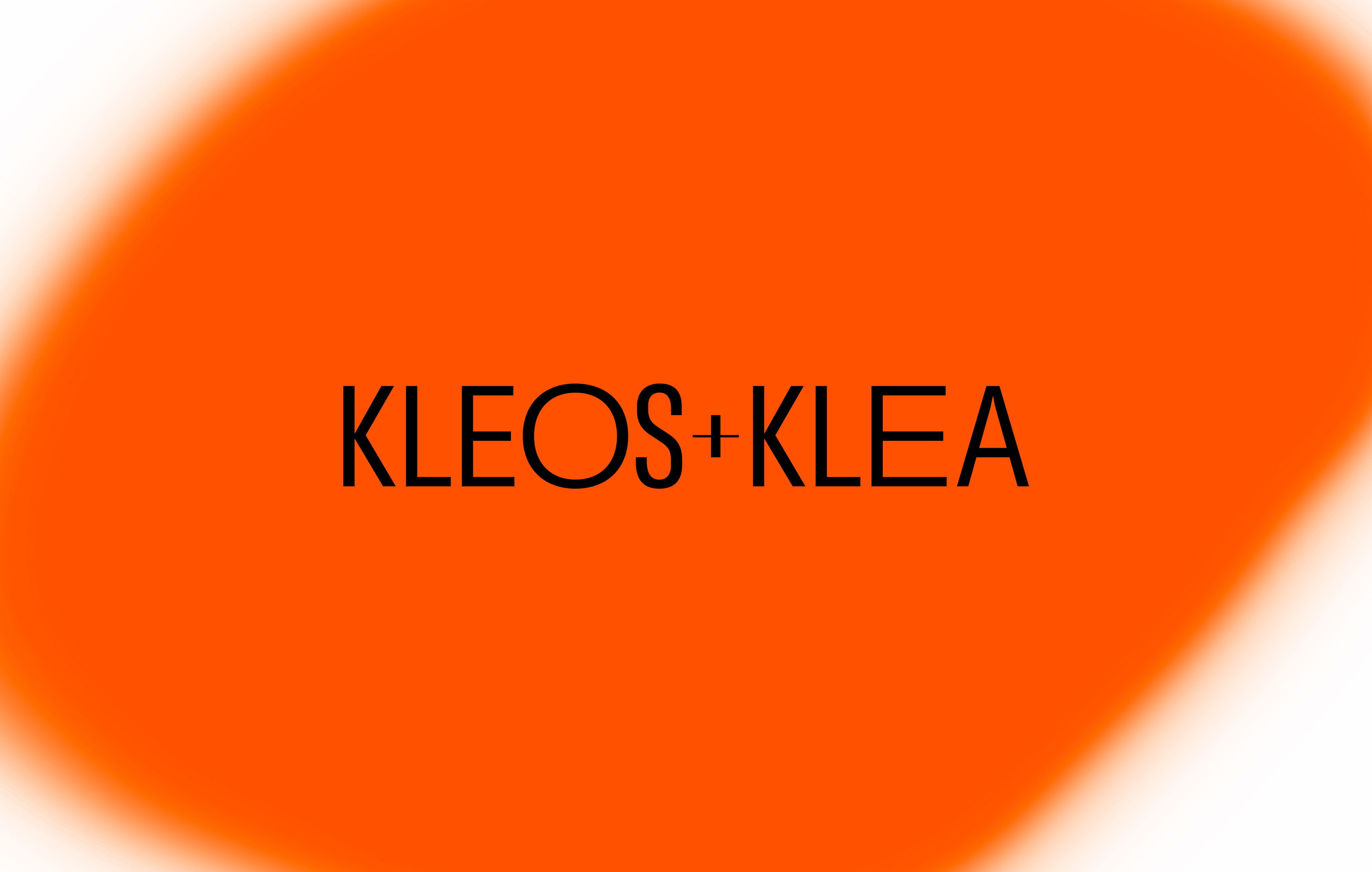
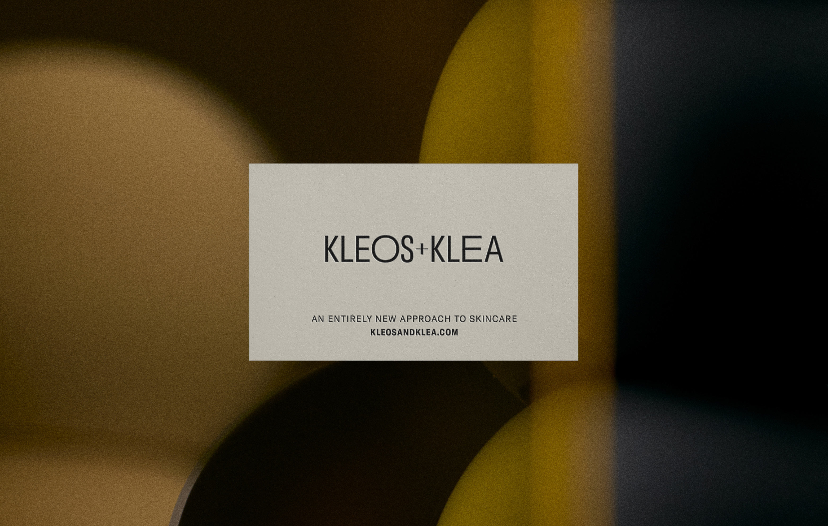
The brand’s identity is built on contrast between textures, typographic tones, and states of stillness and motion. The logotype is both bold and refined, with subtle typographic shifts echoing movement and growth. Gt America and Signifier are used in thoughtful tension structural sans-serif meets poetic serif creating a typographic rhythm that mirrors silent shifts and natural cadence.
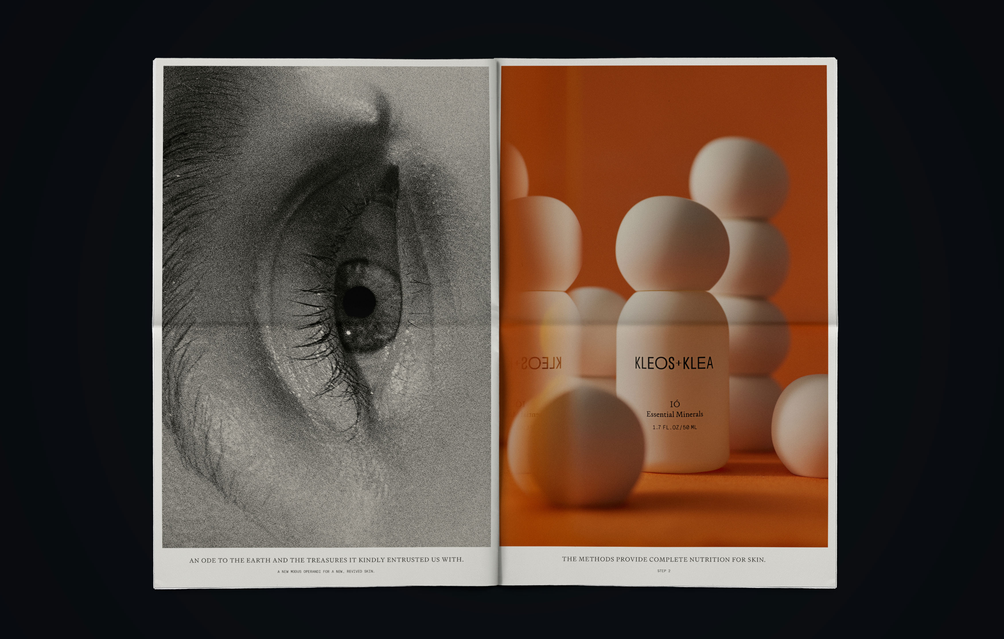
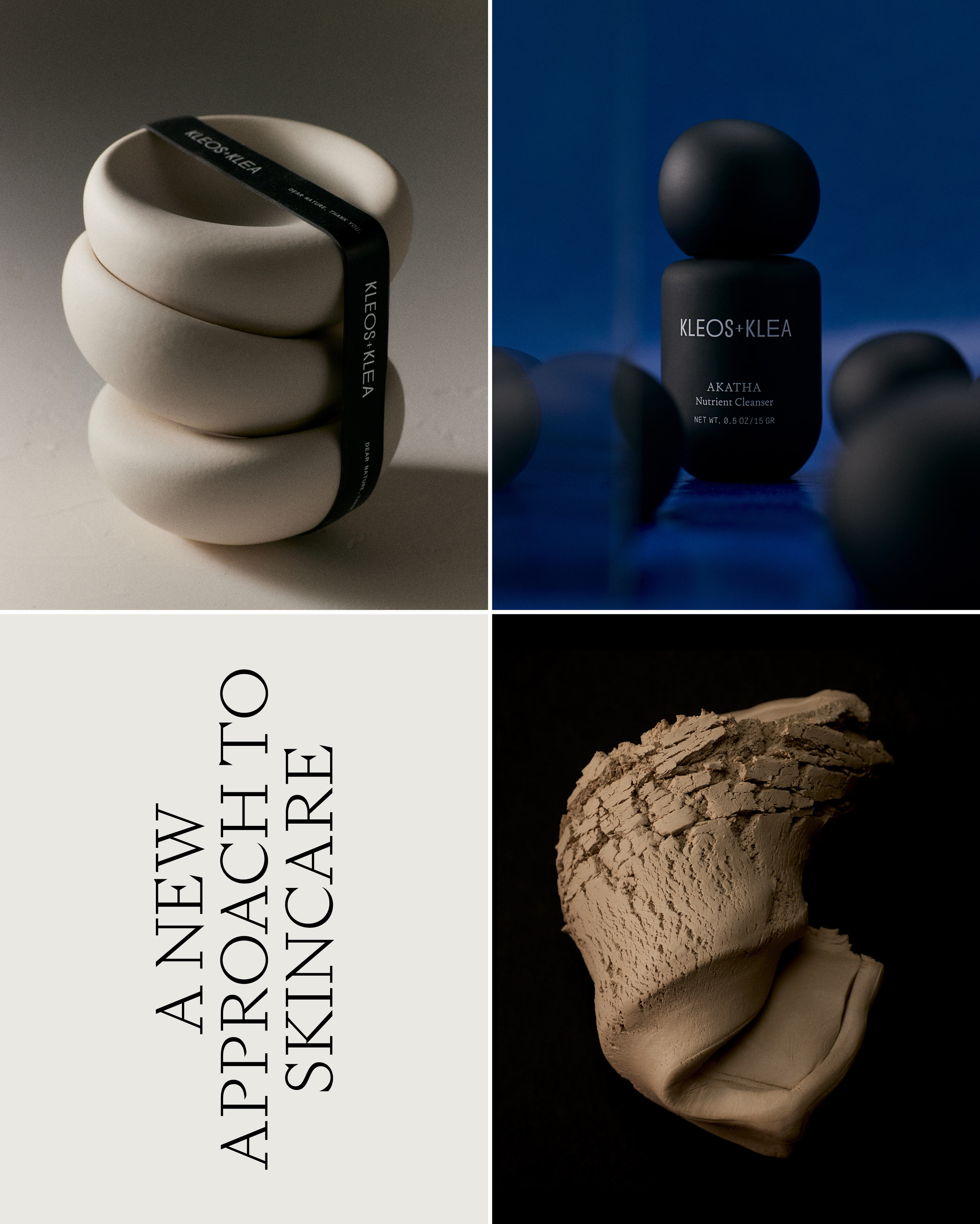
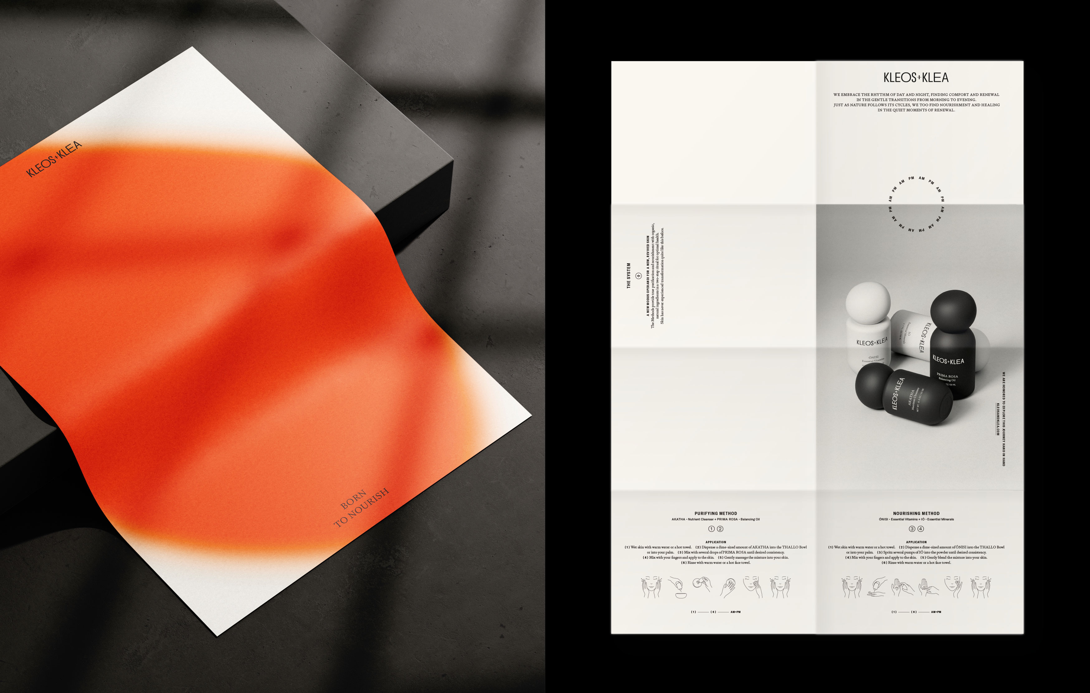
Colour plays a crucial expressive role. While black and white define the core product systems Purifying and Nourishing—carefully curated accent tones add depth and energy across editorial, print, and packaging. These vivid bursts of colour evoke the richness of seasonal change and the dynamic vitality of the natural world.
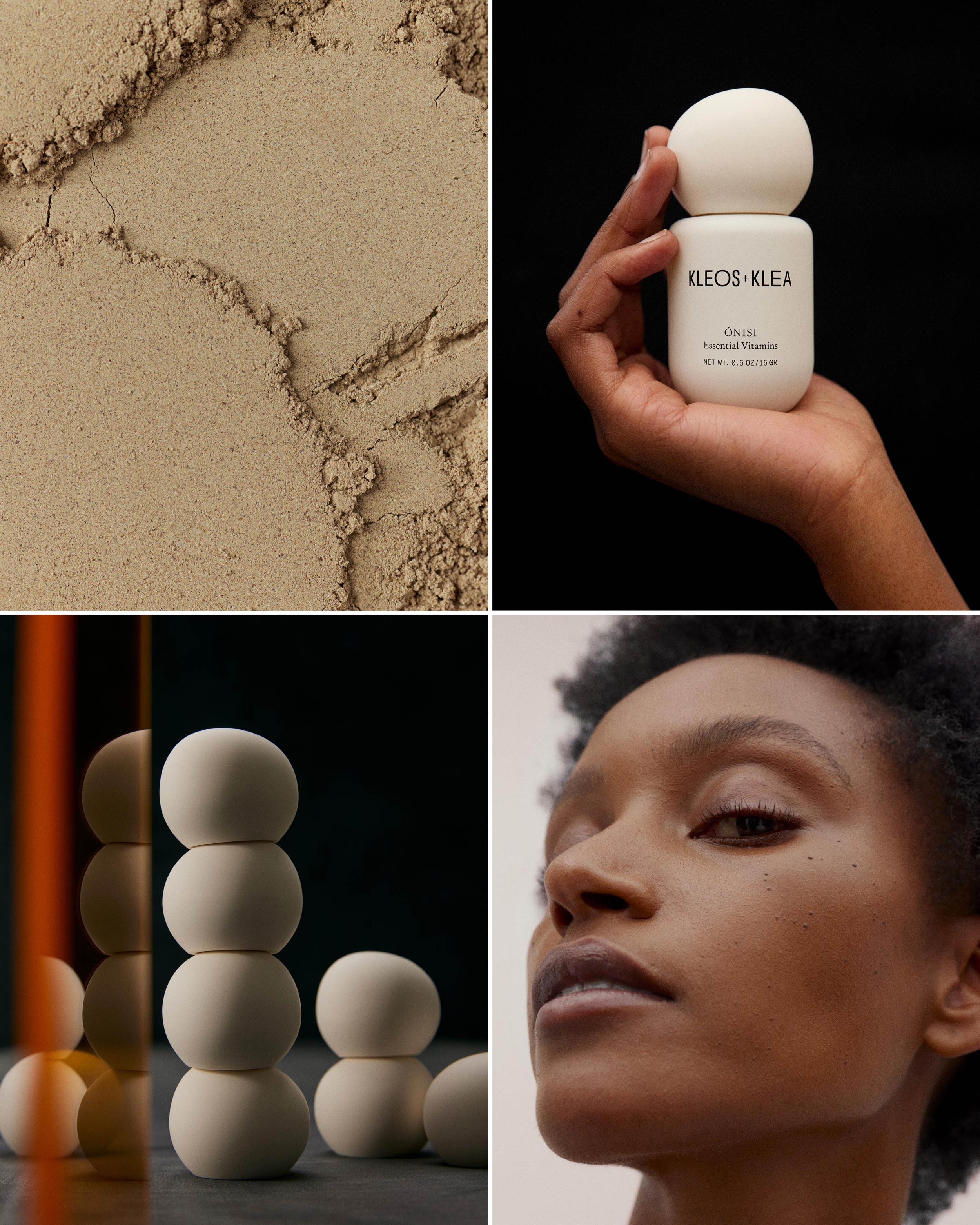
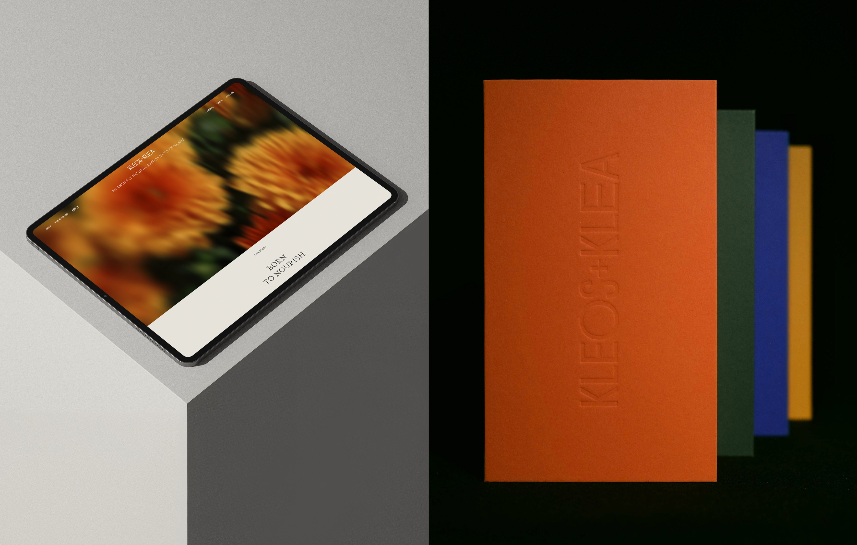
Packaging is quietly assured designed to be felt as much as seen. Opaque glass vessels feature a velvety soft-touch finish, paired with sculptural, pebble-like closures. Blind-embossed slipcases and eco-conscious elastic bands complete the tactile expression of purity and purpose. A custom ceramic bowl, designed with texture and ritual in mind, brings physical rhythm to the mixing process, reinforcing tactility and slowness.
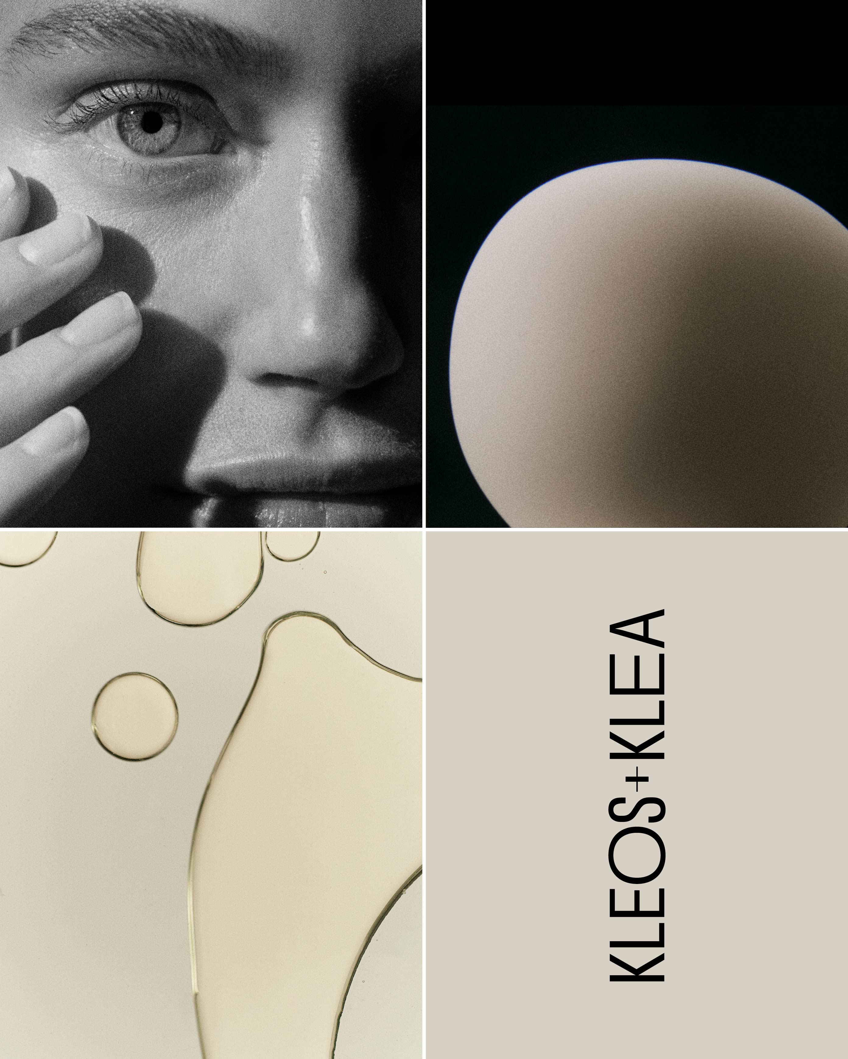
Photography and art direction reflect the brand’s central dichotomies: organic and structured, serene and vivid, intimate and expansive. Visual storytelling blends crisp skin close-ups with abstract gradients and botanical distortions that speak to a world in bloom, ever shifting. The work navigates multiple visual moods, always returning to the core message: nourishment is both science and soul.
Kleos+Klea emerges as a fully realised brand ecosystem strategically rooted and emotionally resonant. The project responds directly to the core challenge: to express a nutrient-only skincare philosophy through a design language that is both elevated and elemental.
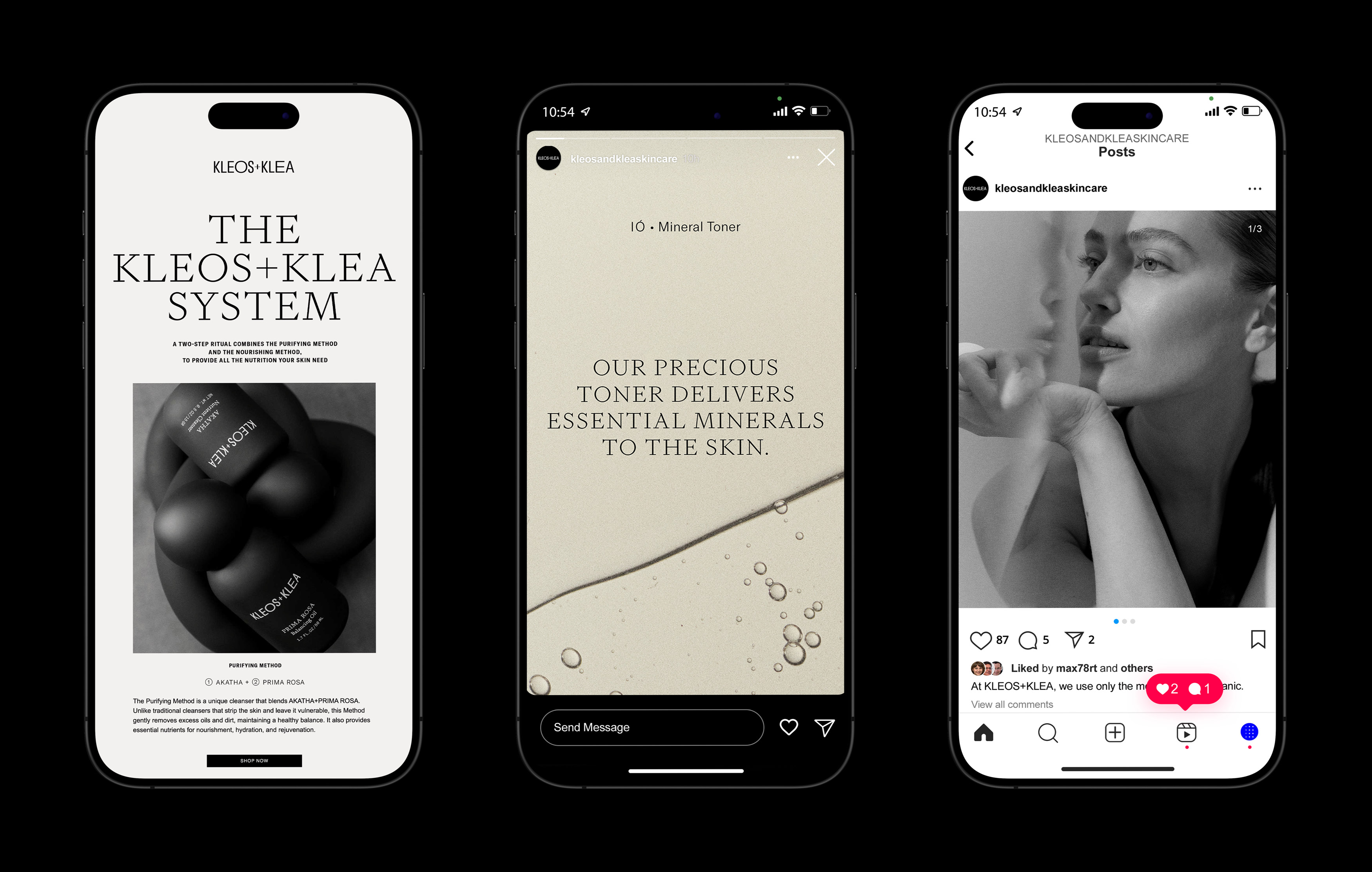
By anchoring the brand in a strong visual identity and extending it seamlessly into product and packaging design, social media, and editorial content, the result is a system that feels unified across every touchpoint. Each element typography, colour, materiality, photography, and tone works in concert to reflect the brand’s values of purity, clarity, and care.
The ability to ground and connect all executions into a single, coherent universe enables Kleos+Klea to speak in one voice calm yet assured, scientific yet sensory. It’s a brand that doesn’t just look consistent it feels intentional.
Purposeful design is a gesture of respect for your brand, your audience, and the stories you tell. At Voodoo Voodoo, we work with brands to shape how they look, sound, and show up in the world.
CREDIT
- Agency/Creative: Voodoo Voodoo
- Article Title: Voodoo Voodoo Shapes Kleos+Klea into a Sensory Skincare Brand Rooted in Contrast and Clarity
- Organisation/Entity: Agency
- Project Type: Identity
- Project Status: Published
- Agency/Creative Country: Germany
- Agency/Creative City: Berlin
- Market Region: North America
- Project Deliverables: Art Direction, Beauty Photography, Brand Creation, Brand Guidelines, Brand Identity, Brand Naming, Brand Tone of Voice, Brand World, Copywriting, Creative Direction, Editorial Design, Graphic Design, Identity System, Illustration, Label Design, Logo Design, Packaging Design, Photography, Poster Design, Product Design, Product Naming, Product Photography, Web Design
- Industry: Beauty/Cosmetics
- Keywords: Brand Identity, Art Direction, Packaging, Web Design
-
Credits:
Agency: Voodoo Voodoo
Creative Director / Design: Catarina Pereira
Art Director: Catarina Pereira
Lid Concept: Nazara Lázaro
Design: Rita Pereira
Photographer: Lina Zangers
Set Designer: Kristine Alksne


