Philipp Zurmöhle Illustration and Design – VON & ZU BUCH Book Shop
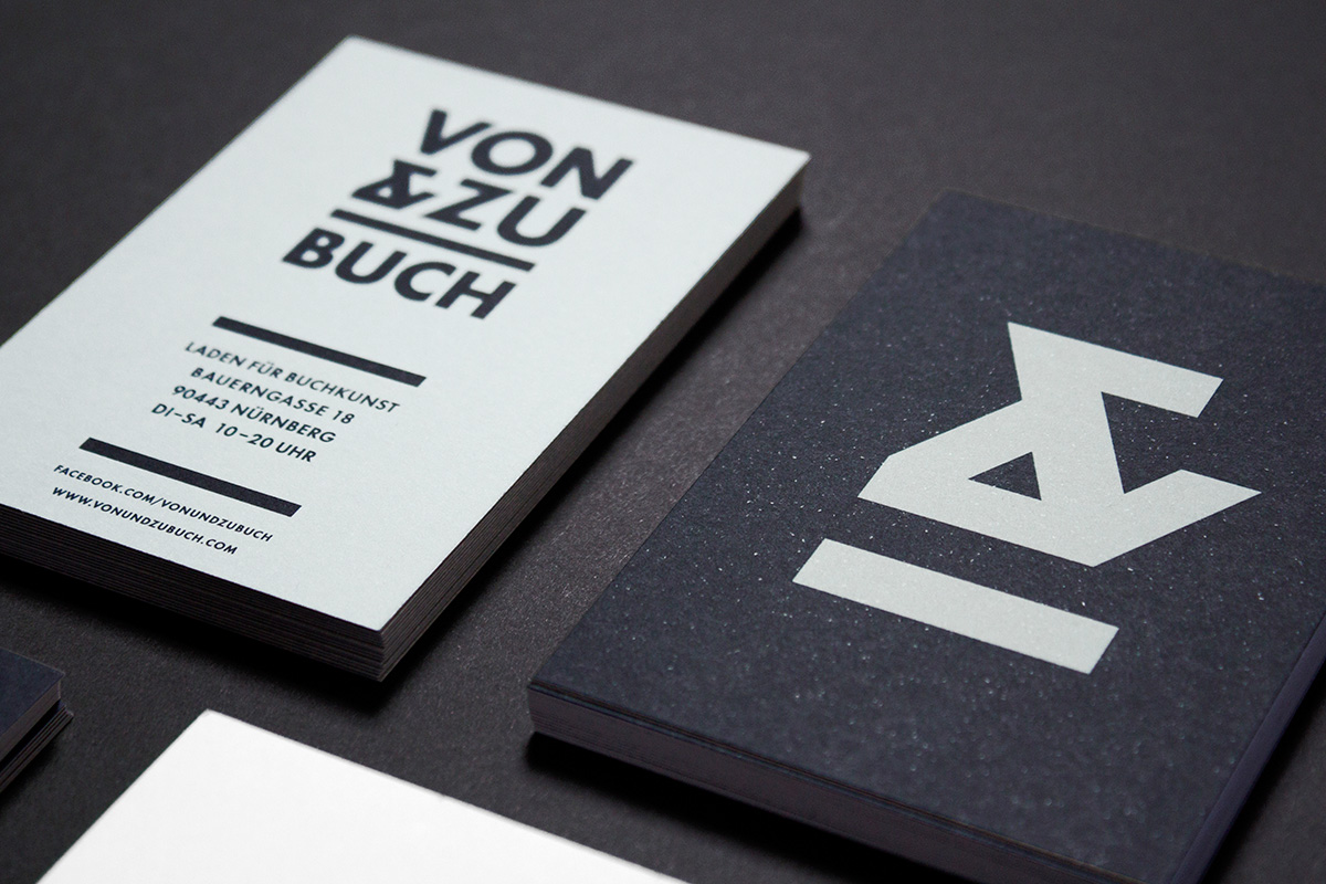
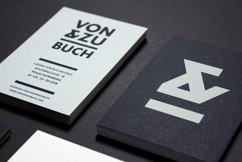
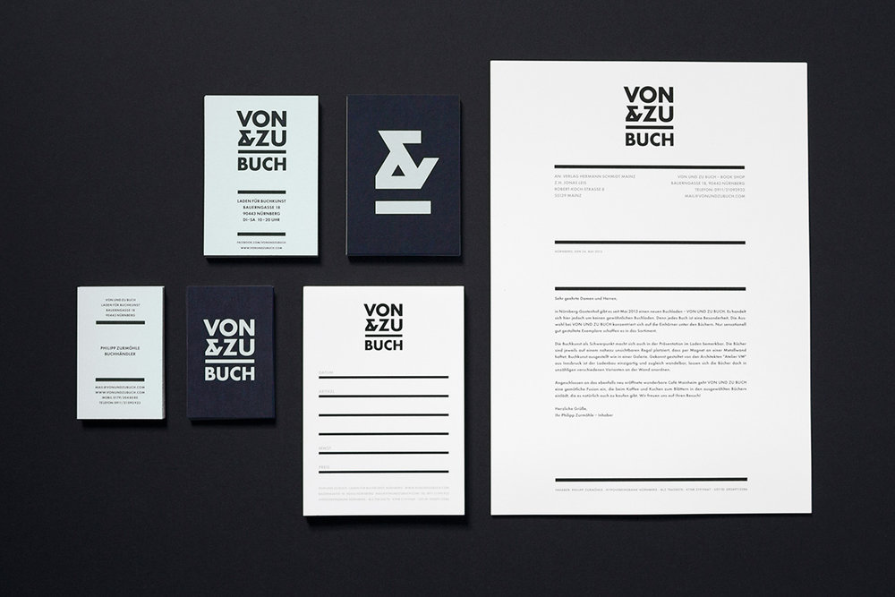
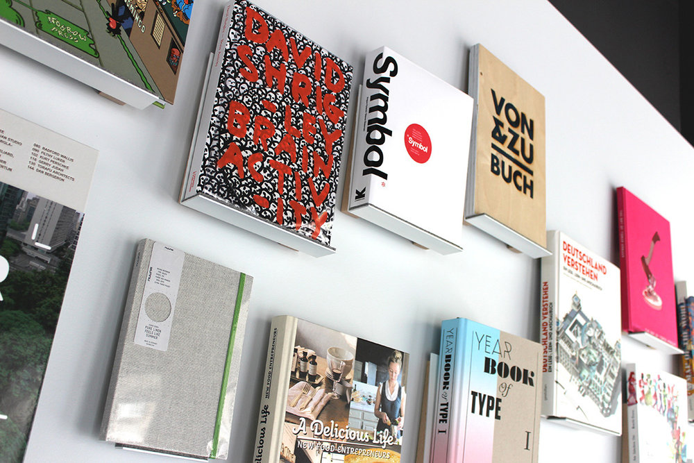
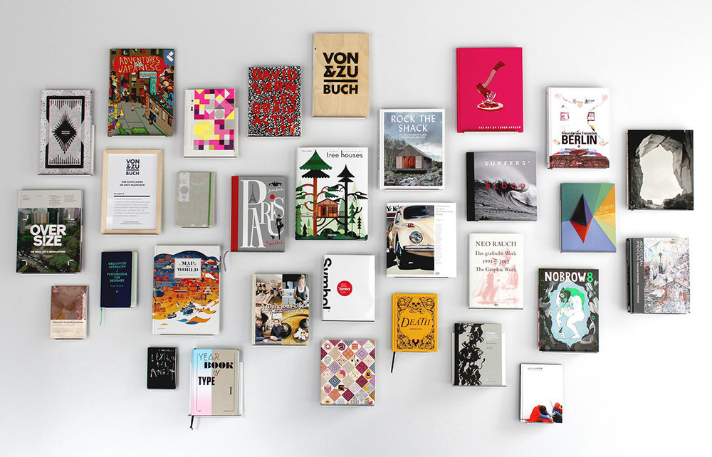
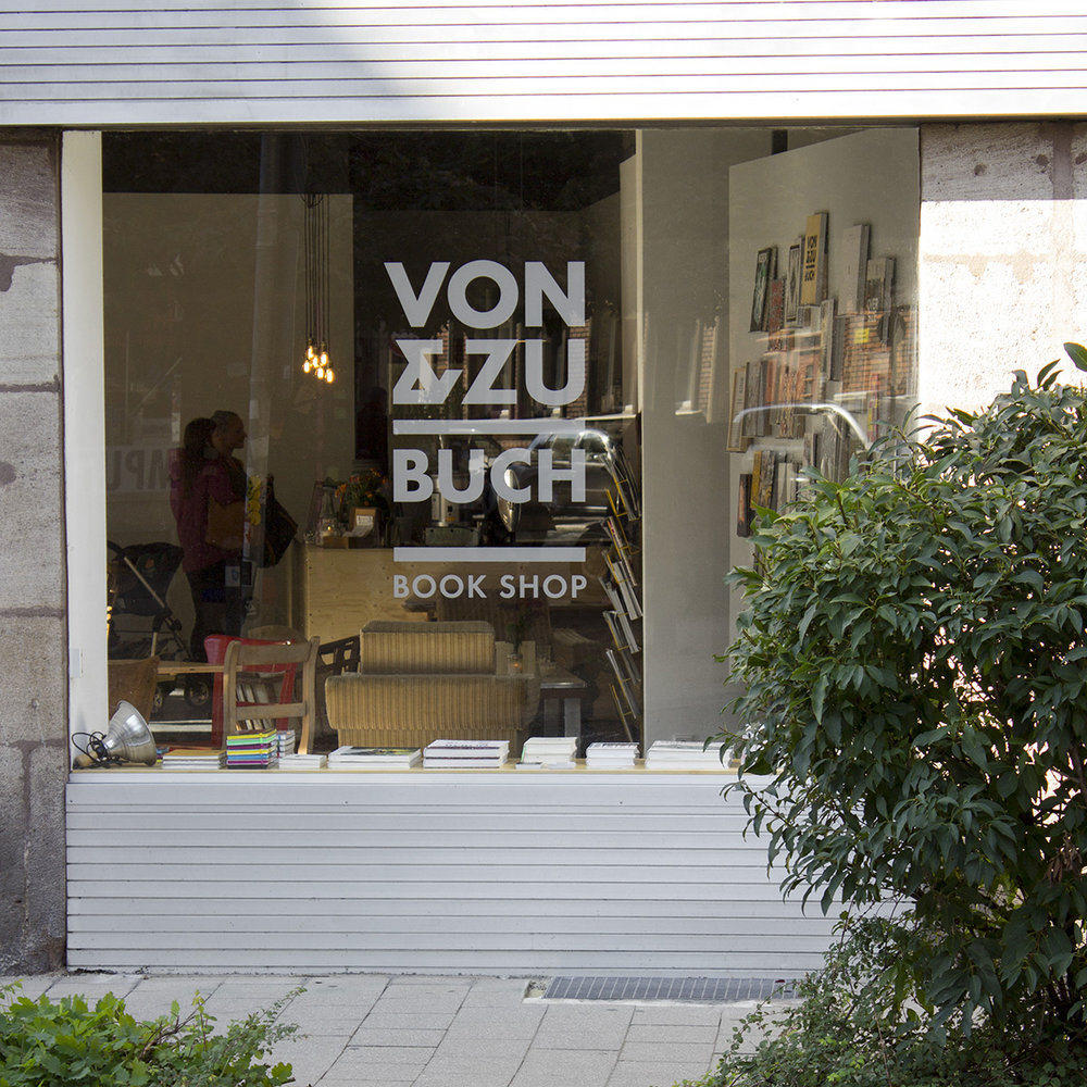
VON & ZU BUCH is a book store I used to run in Nürnberg. The assortment covered books that were especially well made.The horizontal line in the minimal logo resembles one of the little book shelves in the shop. The ampersand can be used as a secondary logo and contains the forms of the letters V and Z from the name.The retail wall is designed by Atelier VM architects from Innsbruck. Each book is placed on a little shelf that is mounted on the metal wall with magnets. That way the display can be changed now and then and the number of books shown can vary.The white wall reminds of a gallery wall showing artworks. In this case books are shown – as precious and beautiful as artworks.



CREDIT
- Agency/Creative: Philipp Zurmöhle Illustration and Design
- Article Title: VON & ZU BUCH Book Shop Identity
- Organisation/Entity: Agency Commercial, Published
- Project Type: Packaging
- Agency/Creative Country: United States America
- Market Region: Europe
- Industry: Real Estate
FEEDBACK
Relevance: Solution/idea in relation to brand, product or service
Implementation: Attention, detailing and finishing of final solution
Presentation: Text, visualisation and quality of the presentation


