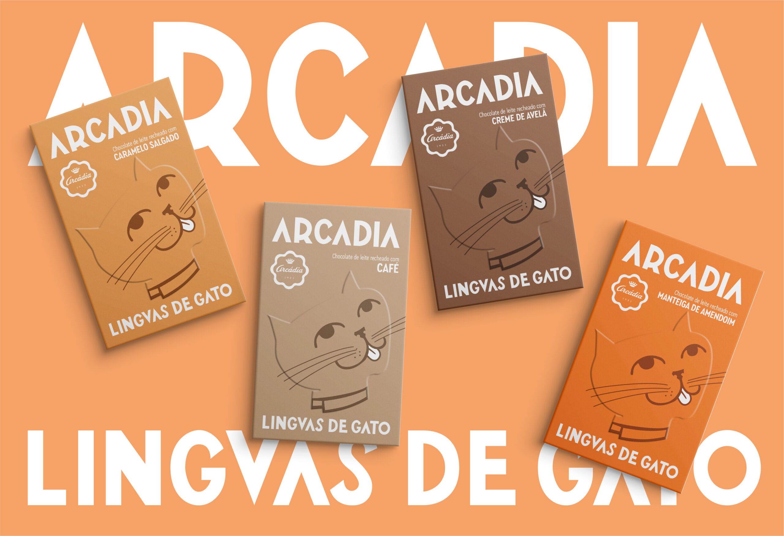
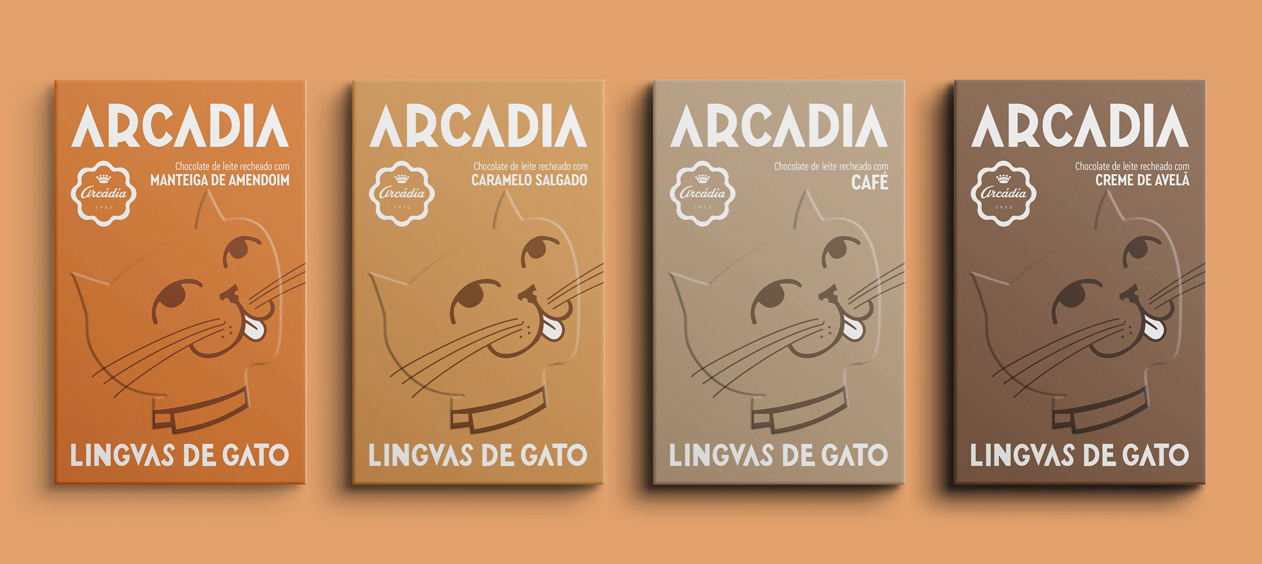
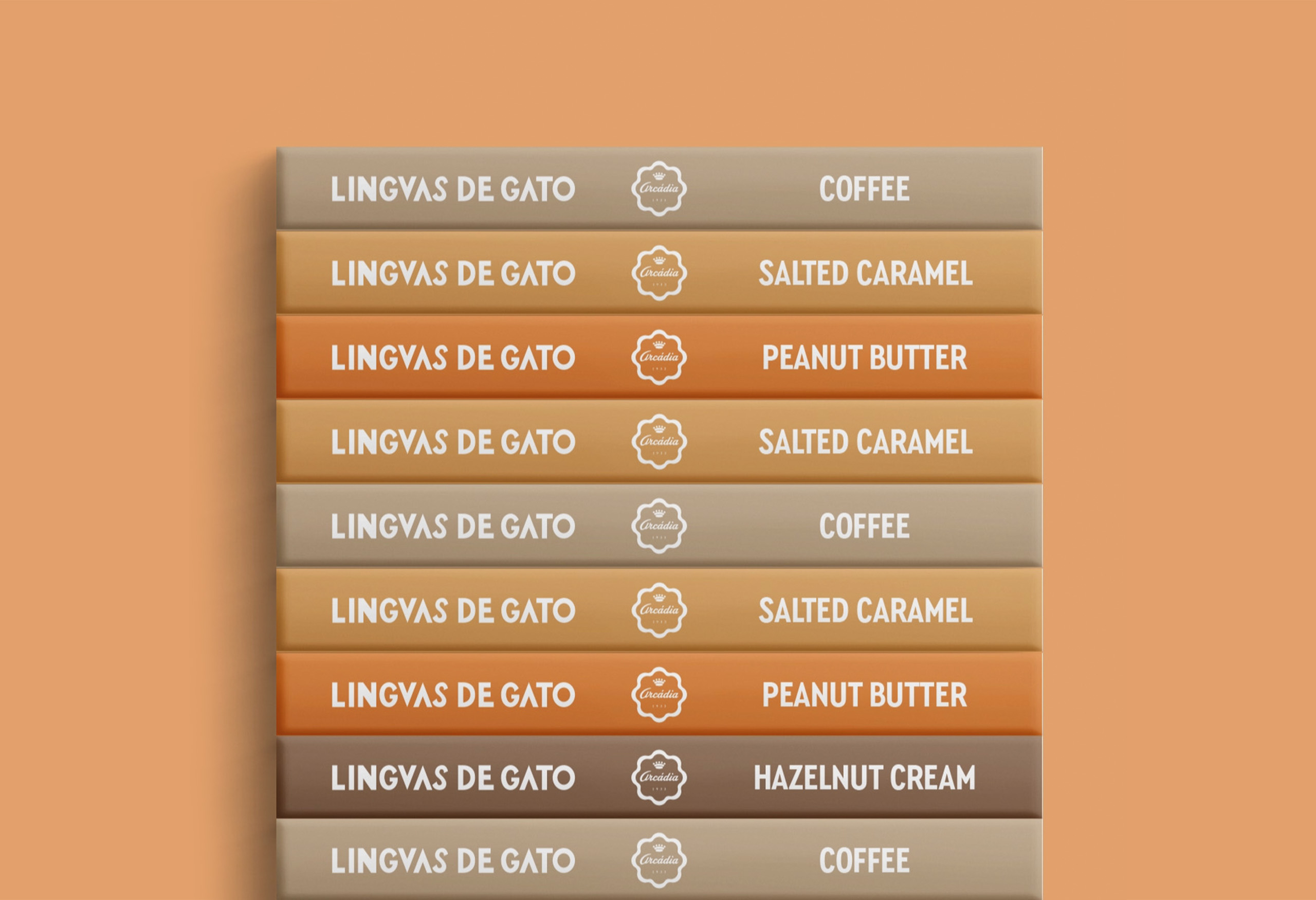
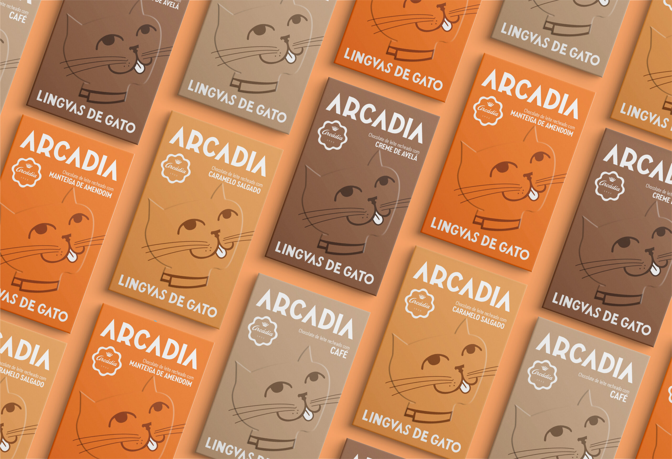
For their 90th birthday, Arcádia decided to reinvent one of their trademark products, the chocolate “cat tongues” a treat that has been a signature item since the 1940s. To mark this special anniversary, the brand introduced a new edition of the classic cat tongues with exciting flavour fillings—coffee, caramel, peanut butter, and hazelnut cream.
Volta’s main goal was to offer a fresh take on the traditional product, while creating a packaging that payed homage to that heritage and at the same time having the fun and pop effect of these new flavours.
The typography featured on the packaging is a carefully redesigned version of the original lettering seen on Arcádia’s first storefront. With a distinct retro feeling, this bold and strong type is displayed big and proudly on the pack, with the word ARCADIA on the very top of it. This design choice recalls the original placement of the brand name above the products on the store window, reinforcing the brand’s deep roots in tradition while bringing it into the present.
The illustration of the cat on the front of the package is borrowed directly from the very first “cat tongues” box, made in the 1940s. While keeping the original design, the cat’s silhouette is now made only with an embossing technique, which allows us to use it big, front and center and still maintain an elegant and refined feel to the product.
Each of the four new flavours are reflected on a new warn colour palette, which gives a new pop, young mood to the classical “cat tongues”.


CREDIT
- Agency/Creative: Volta Studio
- Article Title: Volta Studio Revives Arcádia’s Iconic Cat Tongues for a 90th Anniversary Celebration
- Organisation/Entity: Agency
- Project Type: Packaging
- Project Status: Published
- Agency/Creative Country: Portugal
- Agency/Creative City: Porto
- Market Region: Europe
- Project Deliverables: Packaging Design
- Format: Box
- Industry: Food/Beverage
- Keywords: packaging design, chocolates, food, branding
-
Credits:
Director: Lourenço Neves
Creative Director: Rui Magalhães


