


Grupo Rolo Family Business, Globally Capable
Founded as a family business, Grupo Rolo has evolved into a company with international reach and capabilities.
How do you communicate global high standards without losing the familiar core?
That was our challenge.
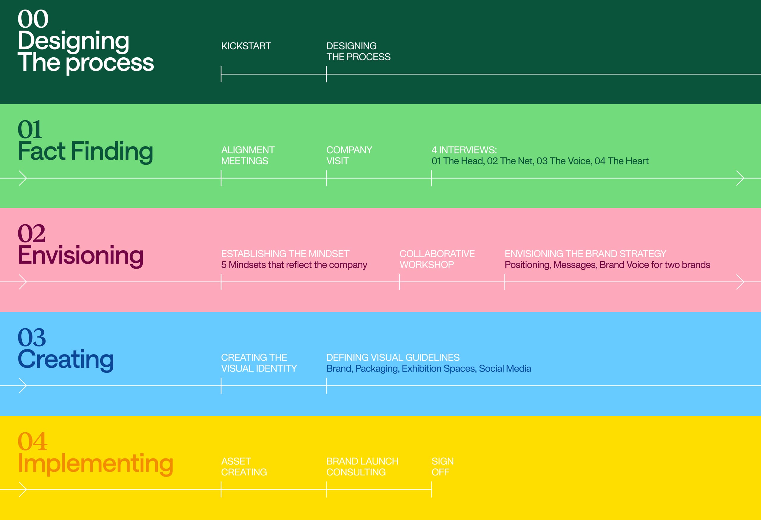
Volta Studio designed a collaborative process together with their marketing team, aimed at uncovering their reality, culture, and strengths.
From their words and stories, we gained a clear understanding that Grupo Rolo already had a strong identity — a family-driven approach combined with international standards and capabilities — resonating from the inside out.
They simply didn’t have a brand to express it.
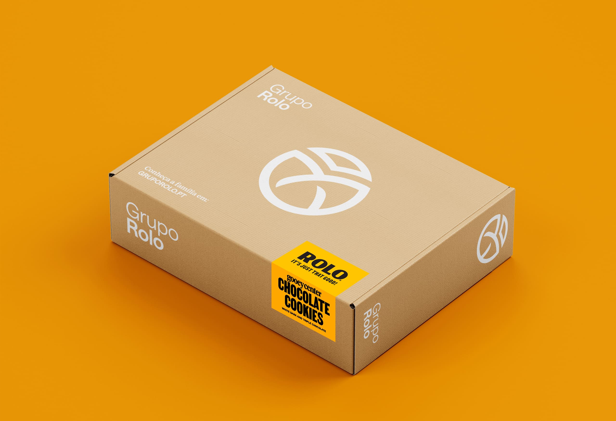
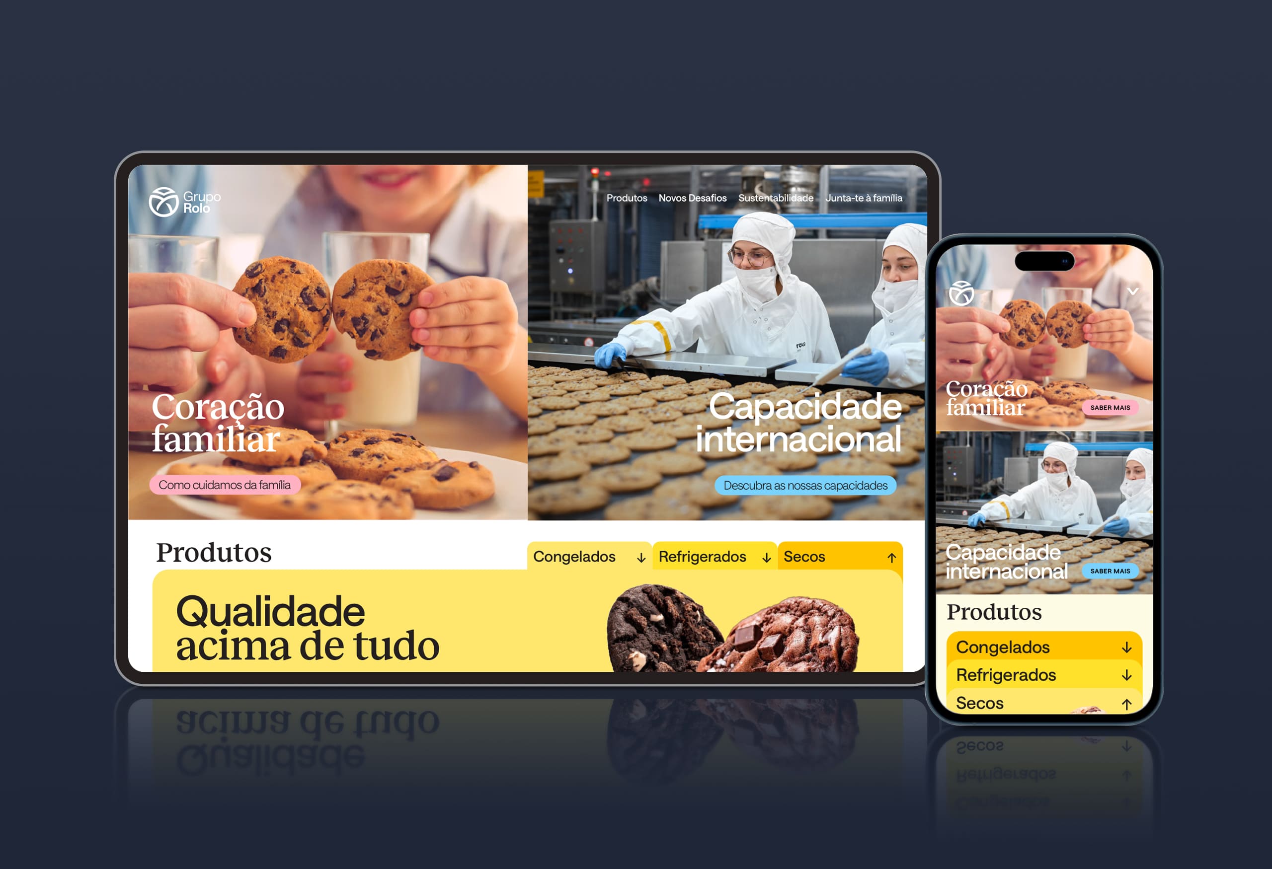
With the the main message being “Family Business, Globally capable” we set out to create a visual identity that could represent both sides.
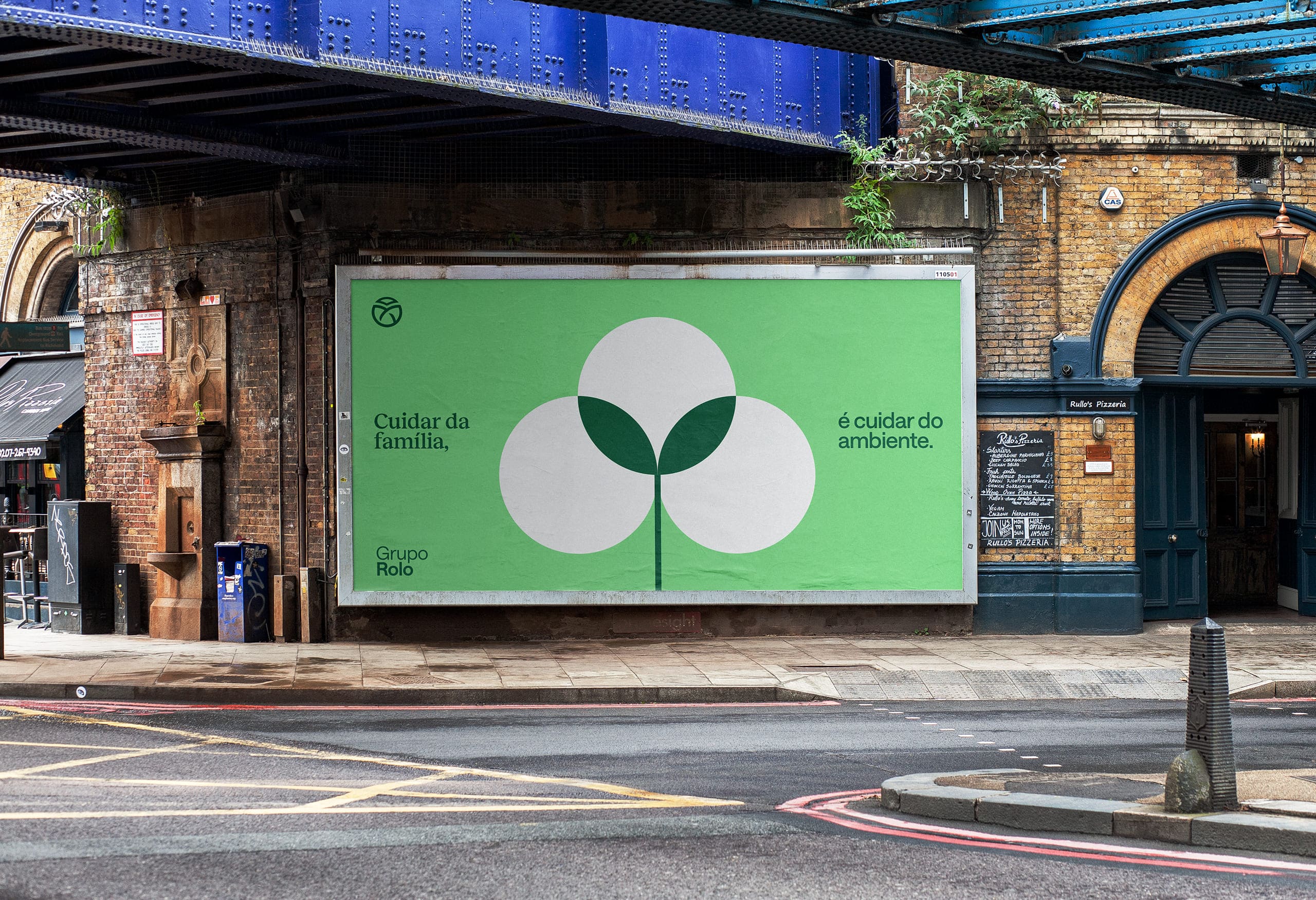
The logo is inspired by an ancient symbol representing family — the triquetra — formed by three equal elements united into a single, stronger shape. It also carries a vision for the future: the travelling swallow, symbolizing ambition to fly even further; the globe, expressing international reach; and the leaf, representing environmental responsibility.
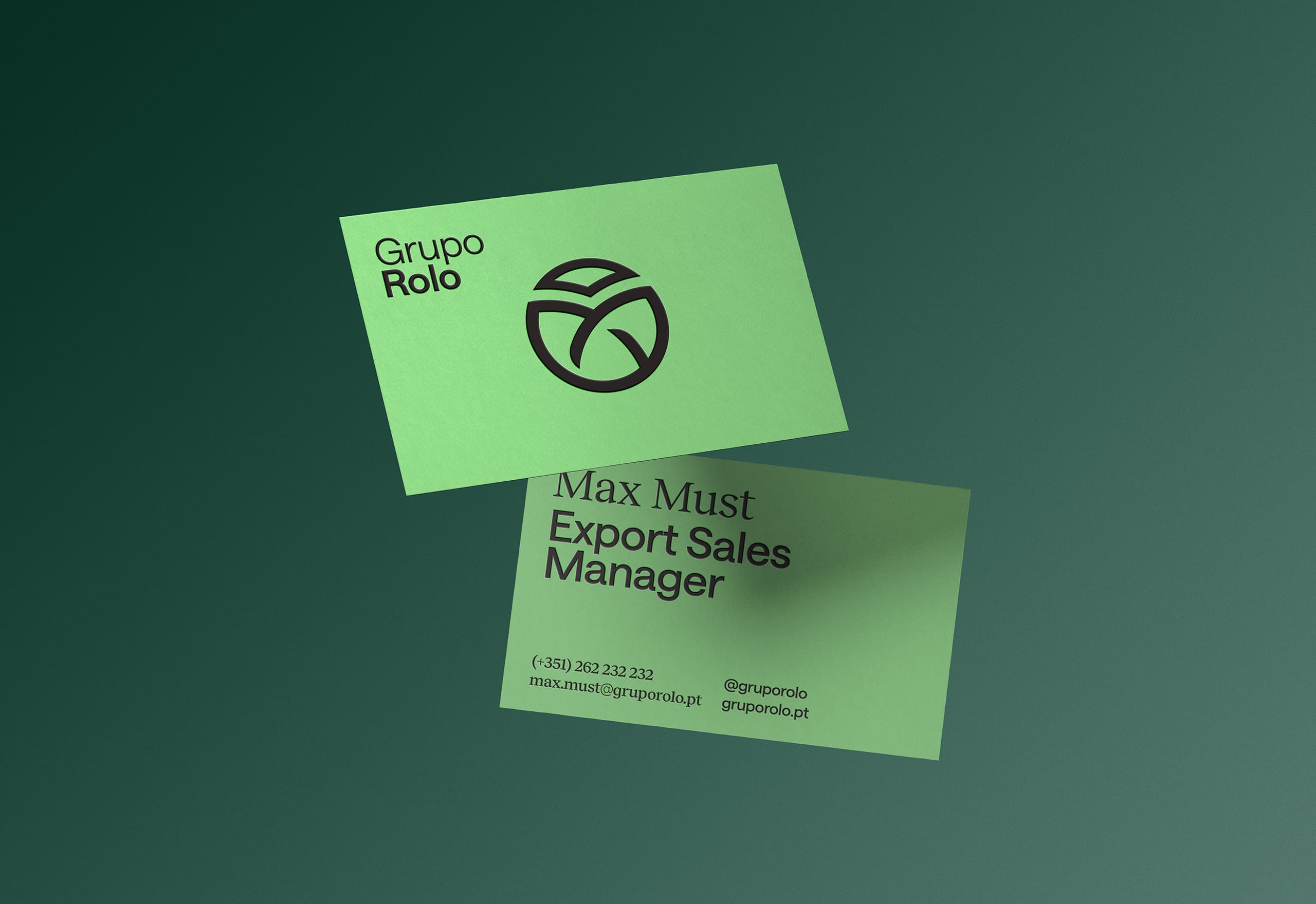
Using the overlapping shapes of the triquetra as inspiration, we designed a brand system built from simple geometric forms that blend together to create something greater — like the members of a family.
The two sides of the brand — familiar and professional — appear on the typography system, with two complementing styles of serif and non-serif fonts.
The colour palette, divided into four main tones, represents four pillars of Grupo Rolo’s action: Yellow for Quality of their products, Blue for their International Capability, Green for the efforts in Sustainability, and Magenta for their familiar Care.
Finally, the photographic direction highlights the true reason for Grupo Rolo’s success — the family — by featuring the people who build this company every day.


CREDIT
- Agency/Creative: Volta Studio
- Article Title: Volta Studio Designs Grupo Rolo With a Triquetra Inspired Logo and Geometric Brand System
- Organisation/Entity: Agency
- Project Type: Identity
- Project Status: Published
- Agency/Creative Country: Portugal
- Agency/Creative City: Porto
- Market Region: Europe
- Project Deliverables: Brand Creation, Brand Design, Brand Guidelines, Brand Identity, Brand Mark, Brand Strategy, Brand Tone of Voice, Branding, Icon Design, Packaging Design
- Industry: Food/Beverage
- Keywords: Family Business, Food, Branding, Strategy, Volta Studio
-
Credits:
General Director: Lourenço Vieira Neves
Creative Director: Rui Magalhães


