


Mimosa, a respected brand with over 50 years of experience in the dairy sector, was facing some challenges in the hyper-competitive yoghurt sector: its packaging lacked differentiation and consistency and did not convey the intended message of proximity and trust.
Therefore, it approached Volta Studio with very clear objectives: to restyle the image of its liquid (líquidos) and creamy (cremosos) yoghurts, making it more recognisable, modern and impactful on the shelves.
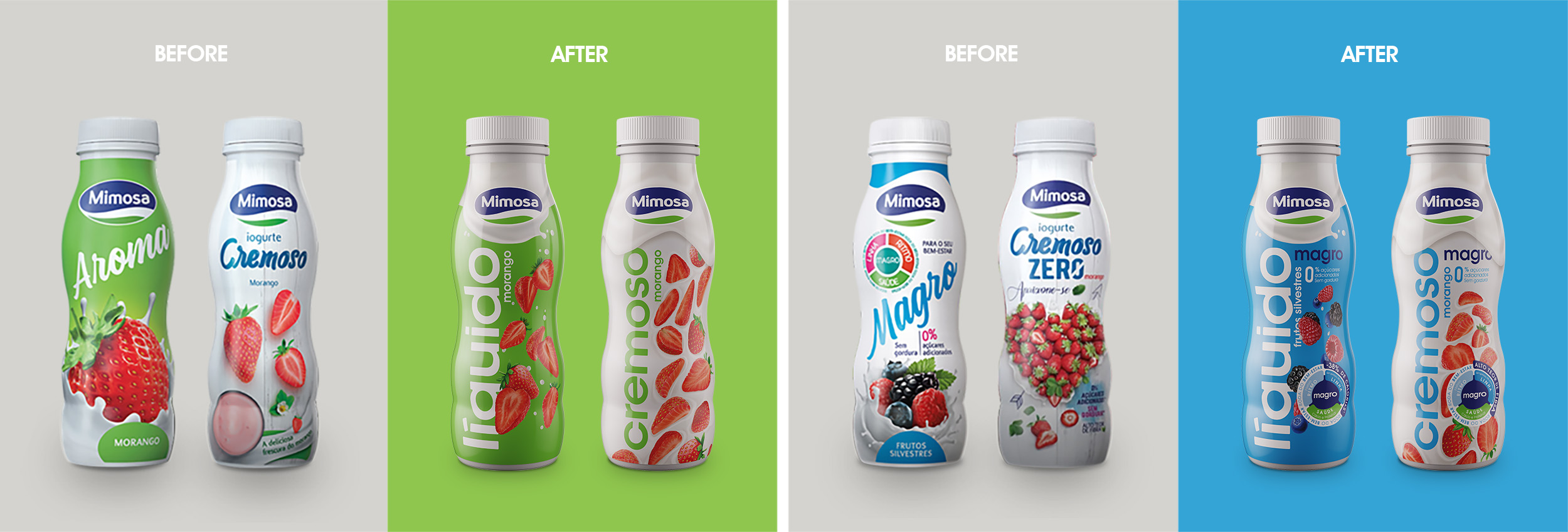
We started with a careful analysis of the strengths and weaknesses of the current packs: the strong colors, brand presence and clarity of the product were positive points, but the visual style, the yoghurt “splashes” and the typography used conveyed a low-cost image that Mimosa would have to move away from.
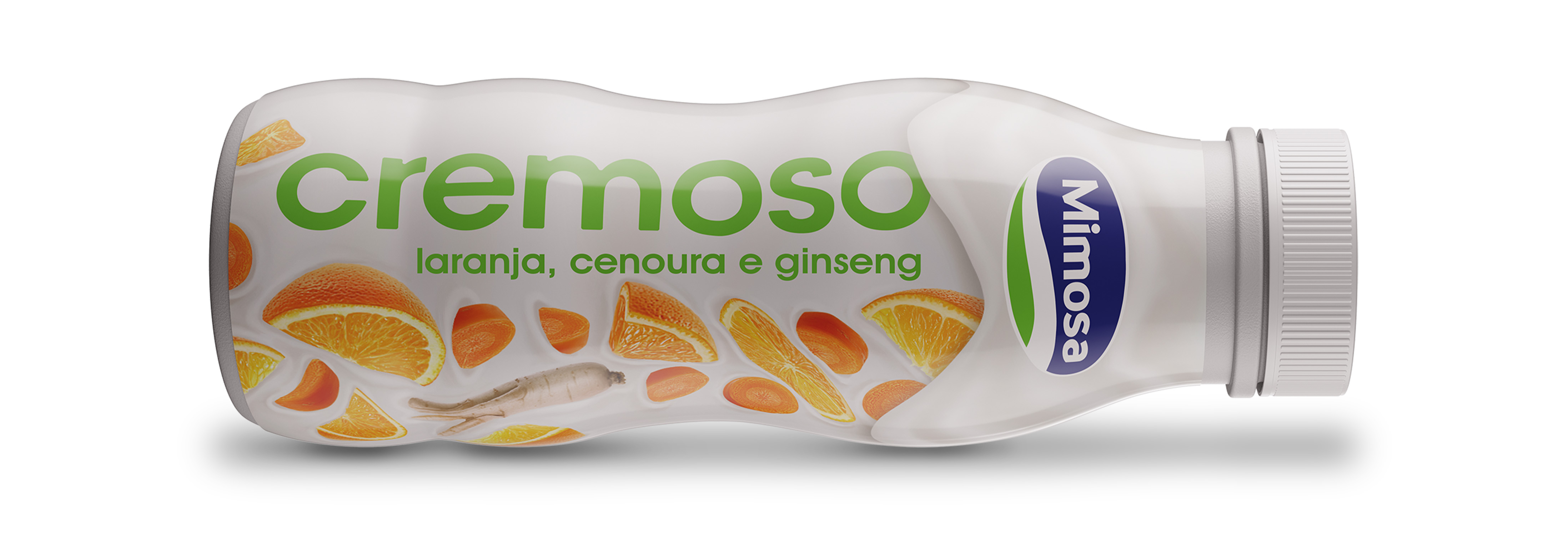
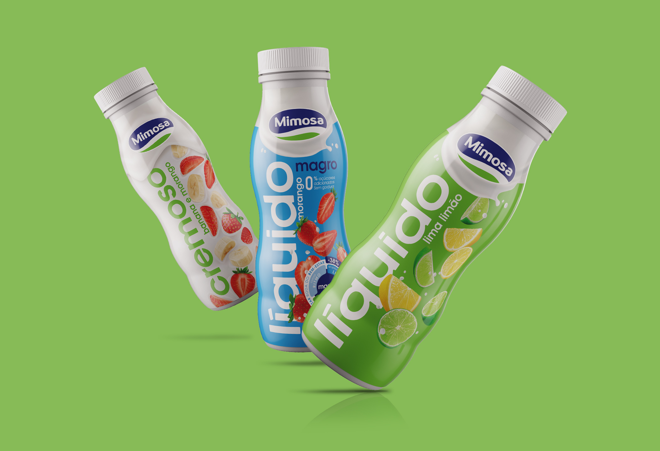
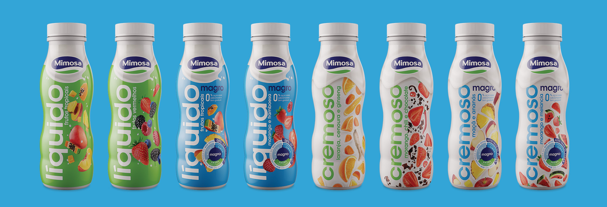
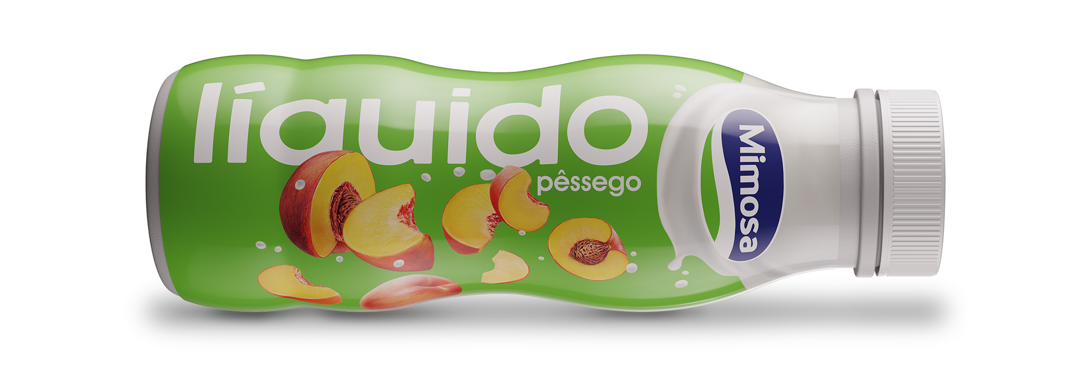
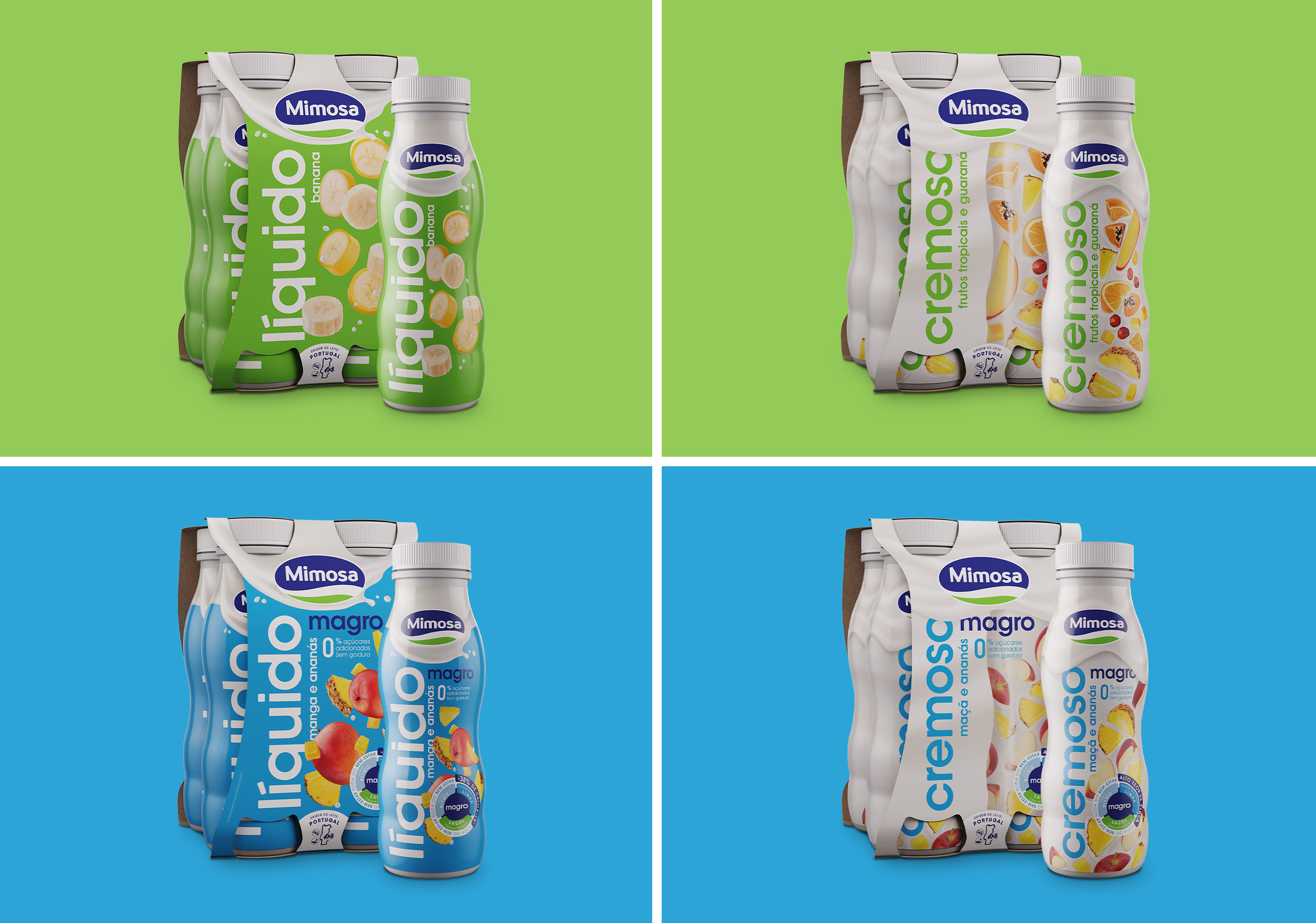
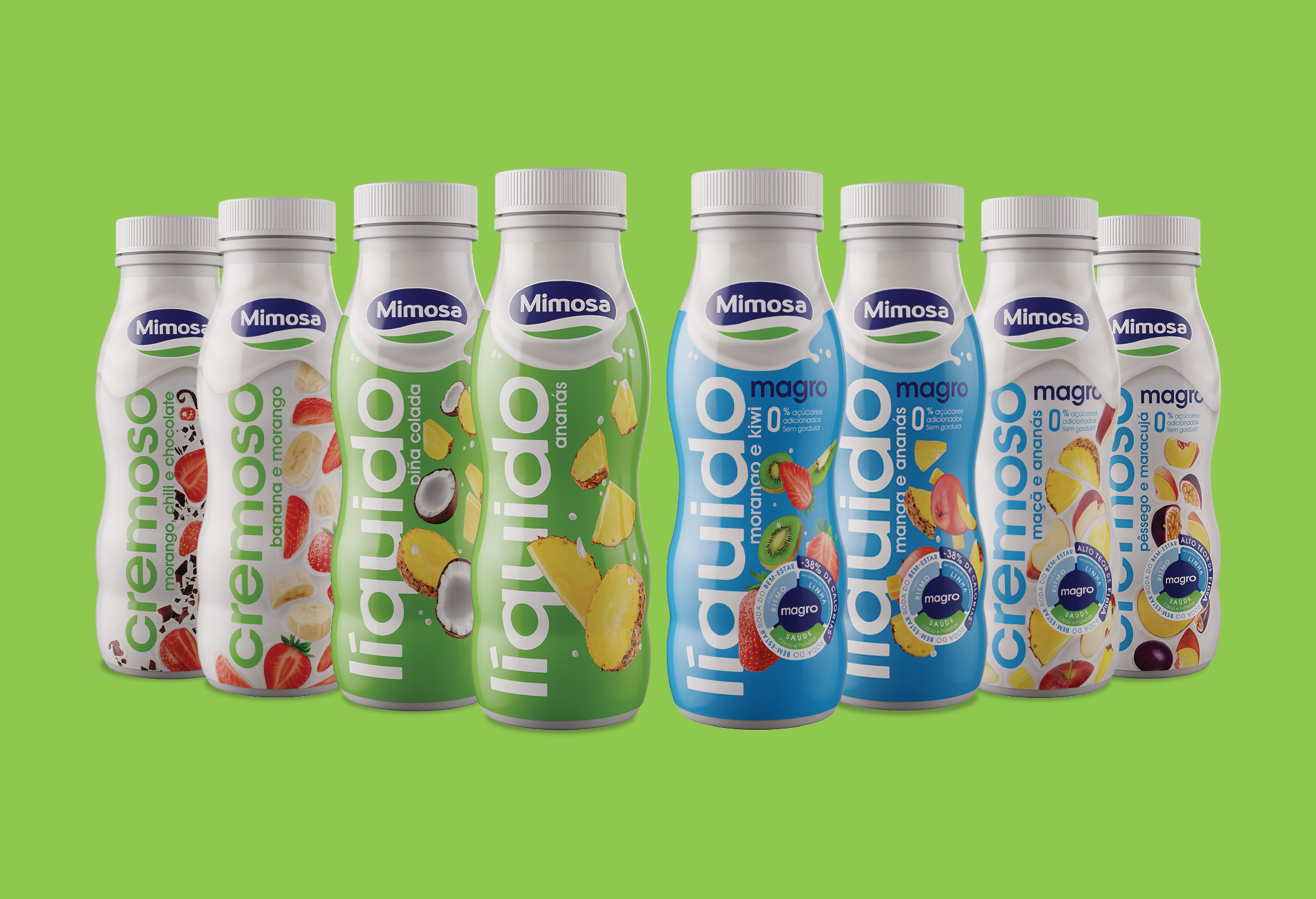
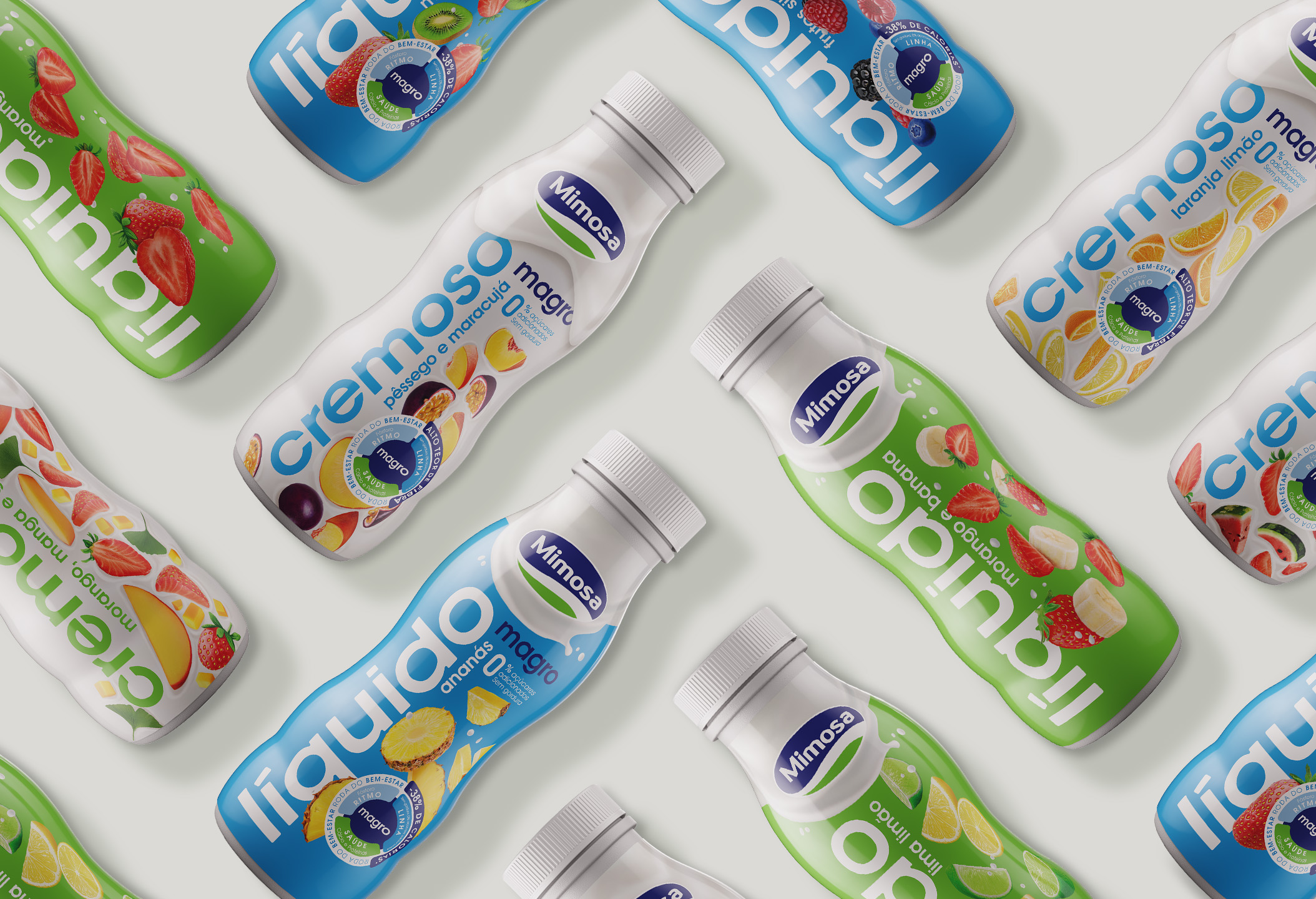
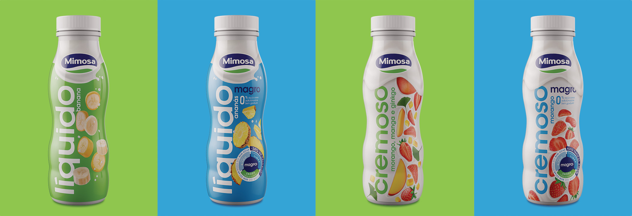
After this analysis, the small size and verticality of the bottles was our biggest challenge. But what once was a challenge became an advantage: rotating the names 90º, we brought a lot of impact, dimension, simplicity and clarity to the packaging.
The standardisation of yogurt types, their colors and names was also a key point: Liquids now have colored backgrounds (green, blue) with white letters and Creamy white backgrounds with colored letters (green, blue).
With an approachable, modern and innovating image of great versatility and coherence, Mimosa yoghurts are now a true reflection of the brand’s values, that now claims its spot as the Portuguese families choice for quality, convenience, happiness, and above all, lots of flavour.
CREDIT
- Agency/Creative: Volta Brand Shaping Studio
- Article Title: Volta Studio Creates Packaging Design for Mimosa Yoghurts
- Organisation/Entity: Agency
- Project Type: Packaging
- Project Status: Published
- Agency/Creative Country: Portugal
- Agency/Creative City: Porto
- Market Region: Europe
- Project Deliverables: Art Direction, Brand Rejuvenation, Branding, Graphic Design, Label Design, Packaging Design, Packaging Guidelines
- Format: Bottle
- Substrate: Plastic
- Industry: Food/Beverage
- Keywords: Dairy, Dairy Branding, Dairy Yoghurt, Dairy Packaging Design, Yoghurt Branding, Branding Studio, Yoghurt Packaging
-
Credits:
Creative Director: Pedro Vareta
Project Manager: Lourenço Neves
Designer: Rui Magalhães
Designer: Francisca Correia


