When redesigning a brand that is as beloved and has such deep roots in a country’s collective conscience as Aldeia Velha, one must find the perfect balance between respecting the brand’s rich heritage and introducing it to a more modern appeal. And that was our approach.
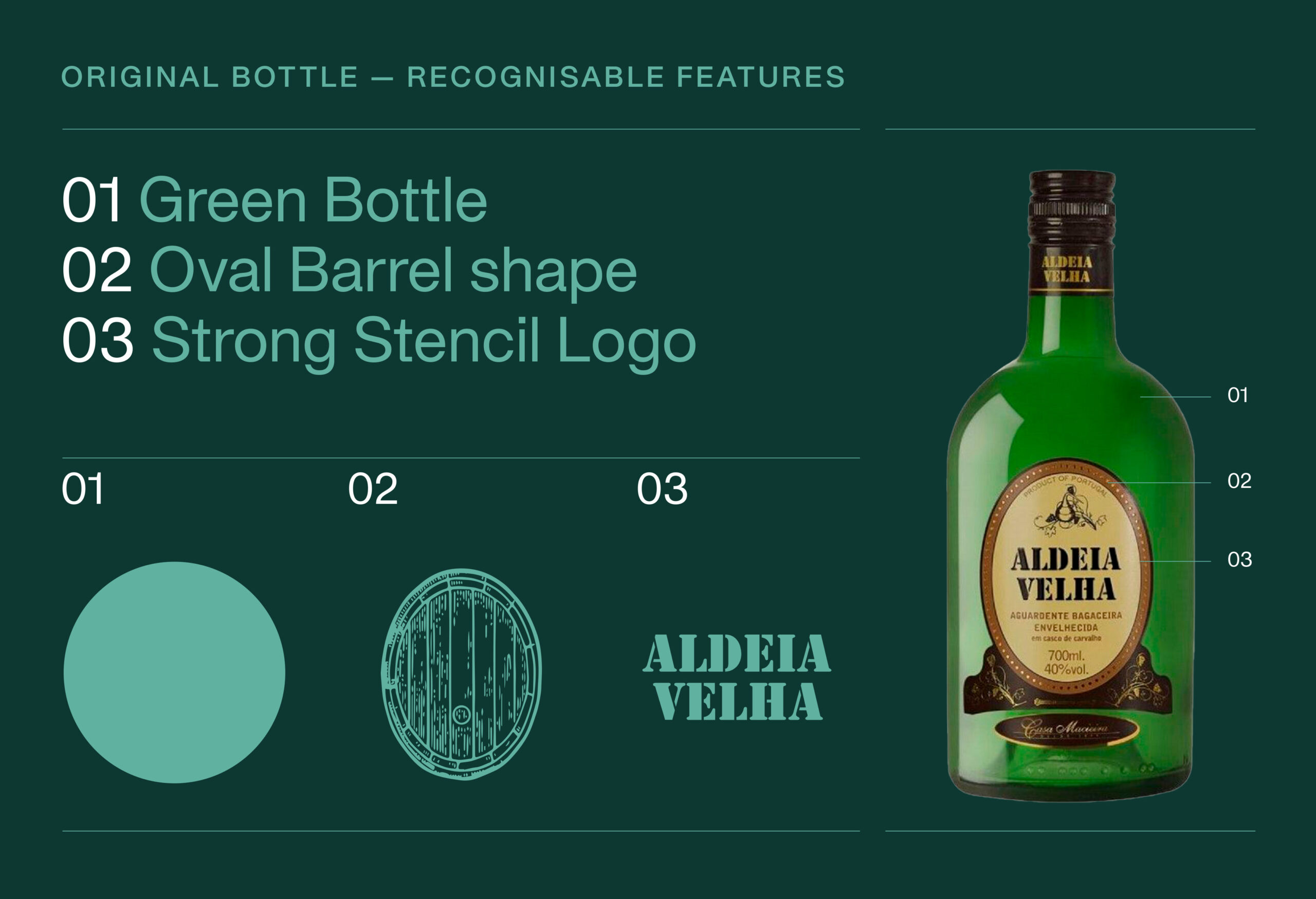
We started by identifying the brand’s most recognisable features: the green colour of the old bottle, the strong stencil font and the iconic oval barrels in which Aldeia Velha is produced: the three pillars upon which the new packaging was built.
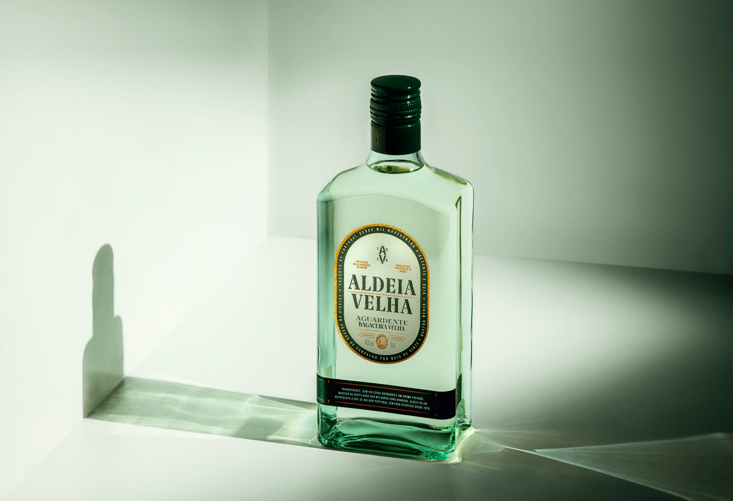
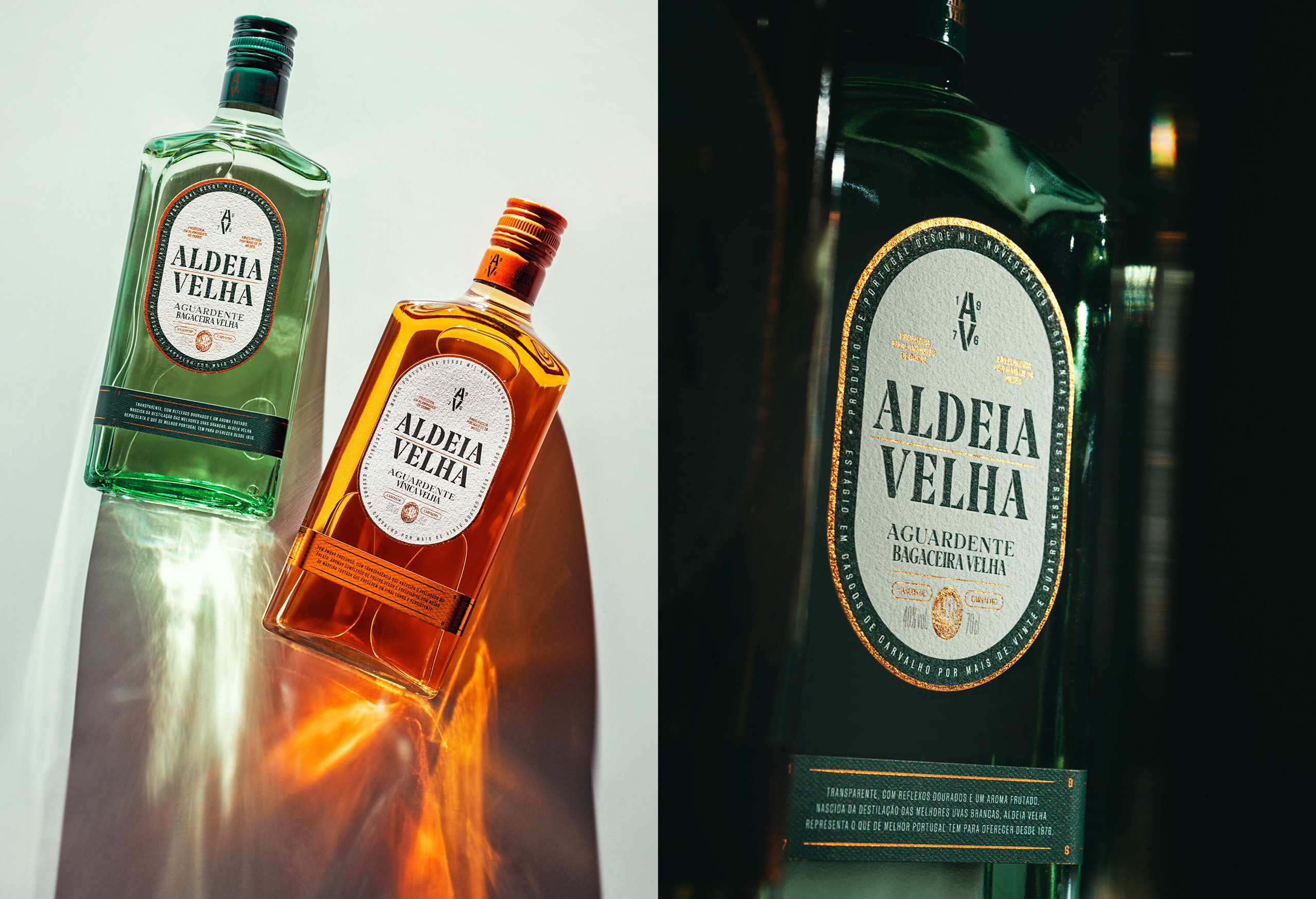
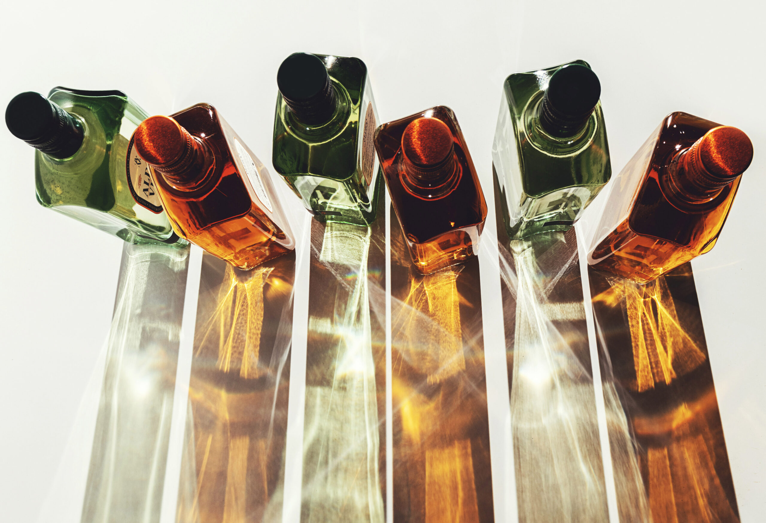
The new bottle, while still having strong shoulders and a recognisable shape like its predecessor, has a more contemporary feel, with lighter tinted glass and pronounced straight lines. The main label pays homage to the old label and barrel, adopting an oval shape with straight sides to match the new bottle design, while the secondary label hints at the tradicional wooden bases that hold the oval barrels in place.
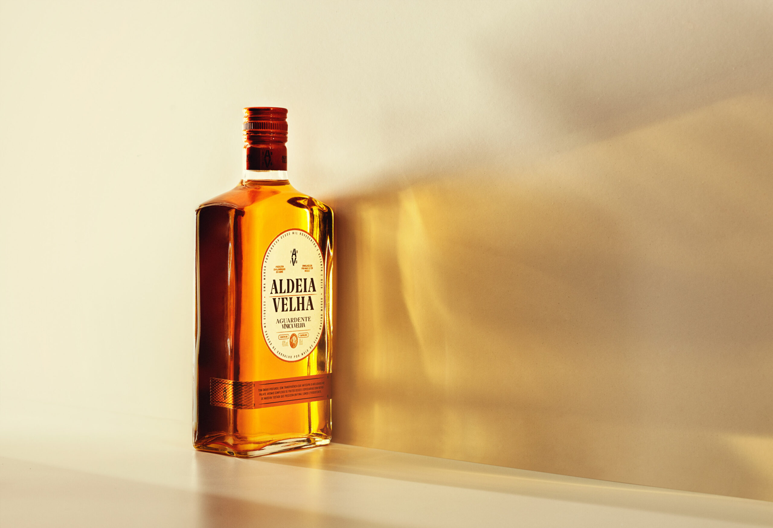
In the layout, a new logo typography was included, based on the sturdy stencil of the original bottle, but with redesigned sleek and timeless shapes. The recognisable green from the original bottle has bled into the layout, featuring now in the typeface and surrounding border in a new premium and sophisticated tone, accentuated by dark gold finishings. For the Aguardente Vínica — an older drink with a light orange hue — the green details disappear to give way for the product’s unique colour to shine.
In the end Aldeia Velha’s new image does what is set out to do: bringing a dear brand into the new age, without forgetting its past.

CREDIT
- Agency/Creative: Volta Studio
- Article Title: Volta Studio Bridges Heritage and Innovation in Aldeia Velha’s Rebranding
- Organisation/Entity: Agency
- Project Type: Packaging
- Project Status: Published
- Agency/Creative Country: Portugal
- Agency/Creative City: Porto
- Market Region: Europe
- Project Deliverables: Branding, Label Design, Packaging Design
- Format: Bottle
- Industry: Food/Beverage
- Keywords: Branding, Label Design, Packaging Design, Spirits, Drinks, Wine&Spirits
-
Credits:
Director: Lourenço Neves
Creative Director: Rui Magalhães
Photography: Nuno Moreira


