


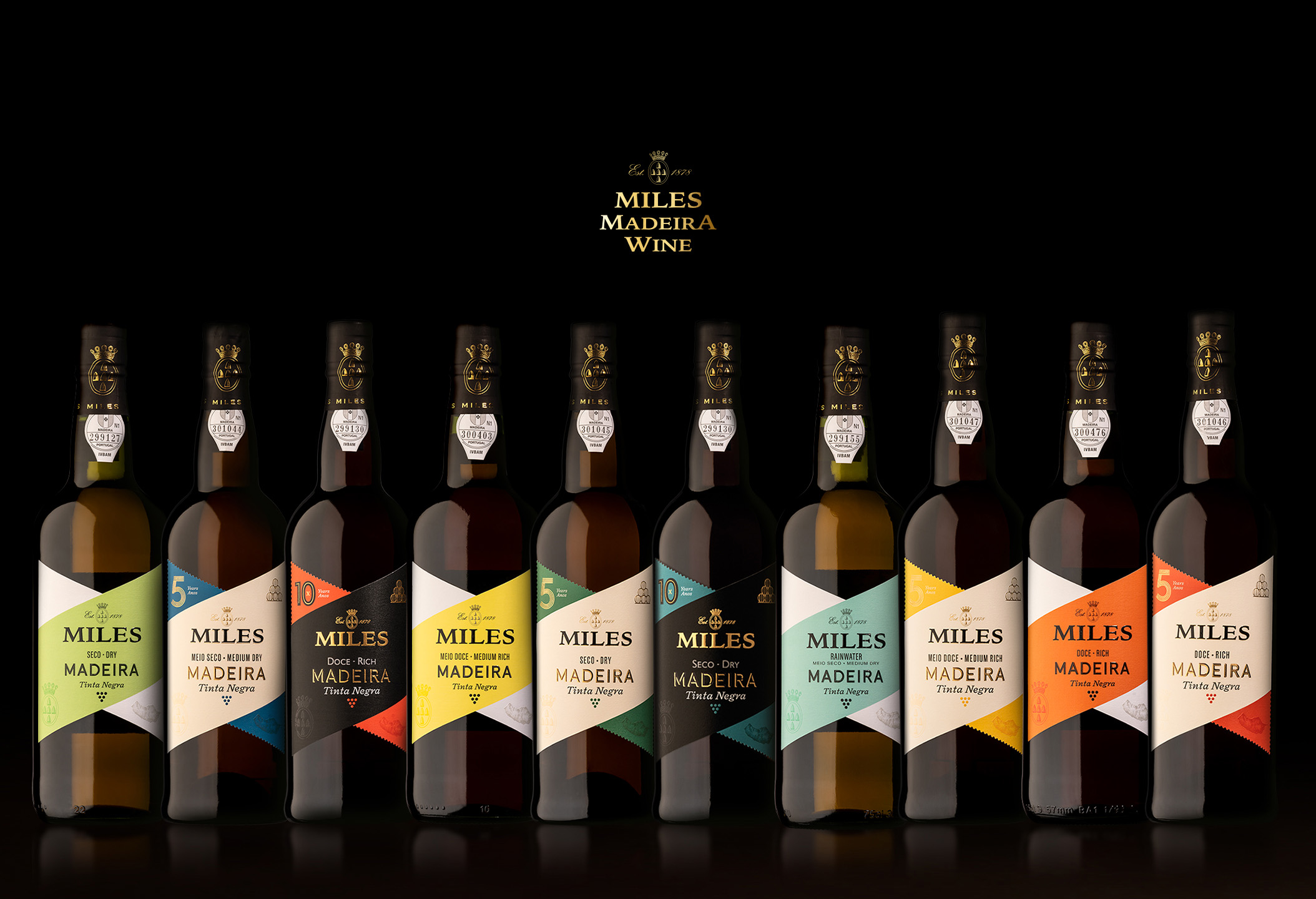
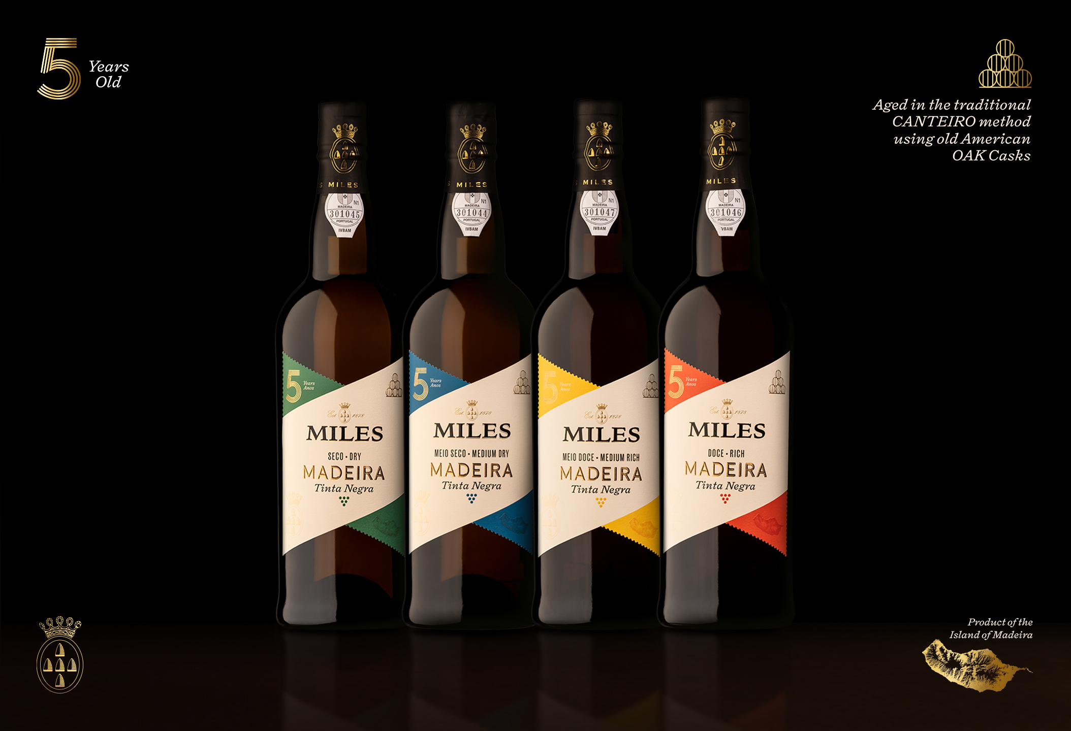
Miles Madeira Wine, a truly respected brand from the Madeira Wine Company, challenged Volta to redesign their wine labels with one main concern: make them more contemporary without falling into the easy “trendy” trap. In a market that has been quickly renewing itself and changing towards mixology oriented drinking experiences, Miles wine labels looked old and outdated: however, they didn’t want to lose or forget their rich history and positioning, as they are one of the oldest and most respected Madeira wine brands. Another focal point would have to be to guarantee an easy differentiation between their different wines (3, 5 and 10 years) and respective profiles while having a cohesive brand structure.
We approached the challenge by doing deep research of the brand graphic history to inform our decisions on what to keep, what to change and what new elements to introduce, in order to create a brand update that respected its legacy.
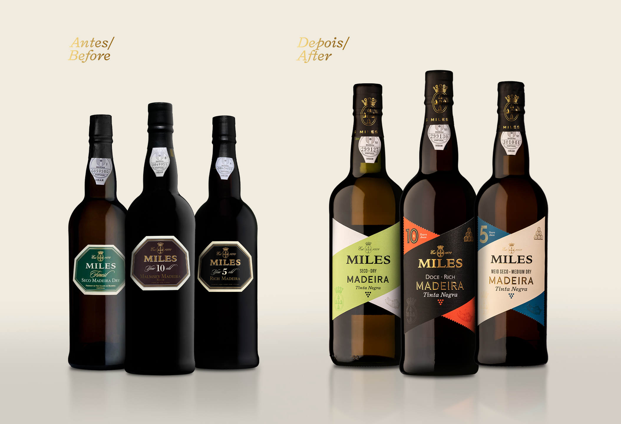
We soon understood the label shape clearly needed to be addressed because, while it was unconventional, it was not rooted in Miles history or brand assets and was shared with a different brand from the Madeira Wine Company. Regarding. As for the logo, we felt it was strong and recognisable, with a crest that added history and tradition, which we chose to highlight in several ways. The brand’s graphic heritage research also showed us typography-rich designs that we immediately wanted to revisit, where multiple type styles were blended into beautiful layouts — something that had been lost in their current labels: dated, bland and monotonic. And finally, we felt the need to change their colour palette, as it was old fashioned and dark, and didn’t have a rationale to help position the different wines in the brand/quality hierarchy (3, 5 and 10 years old).
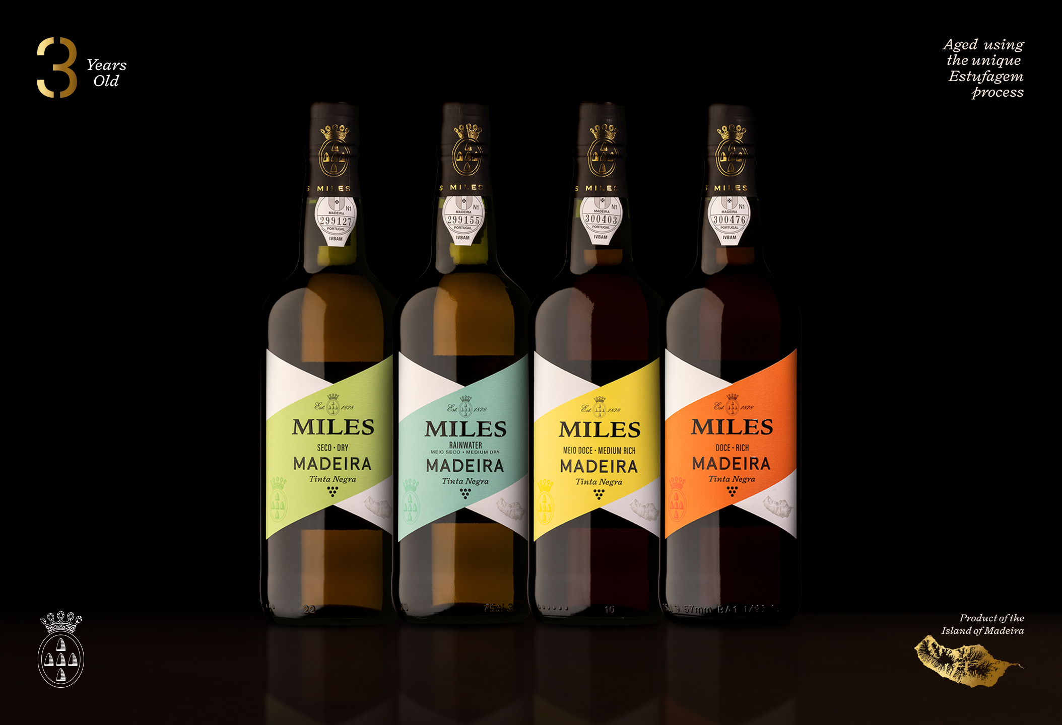
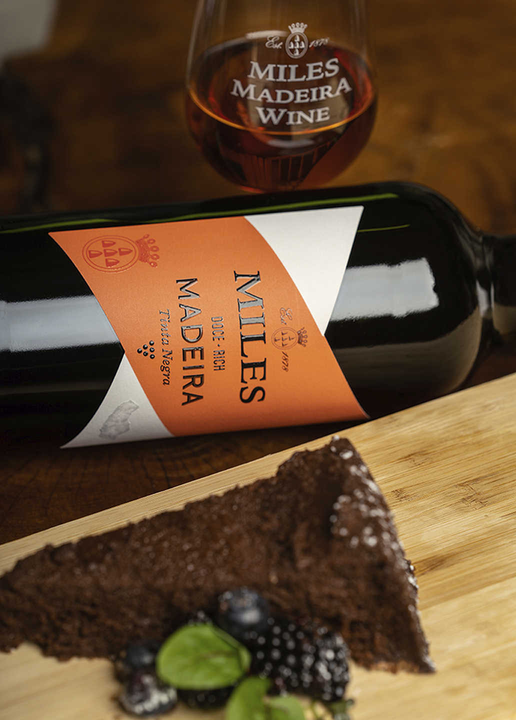
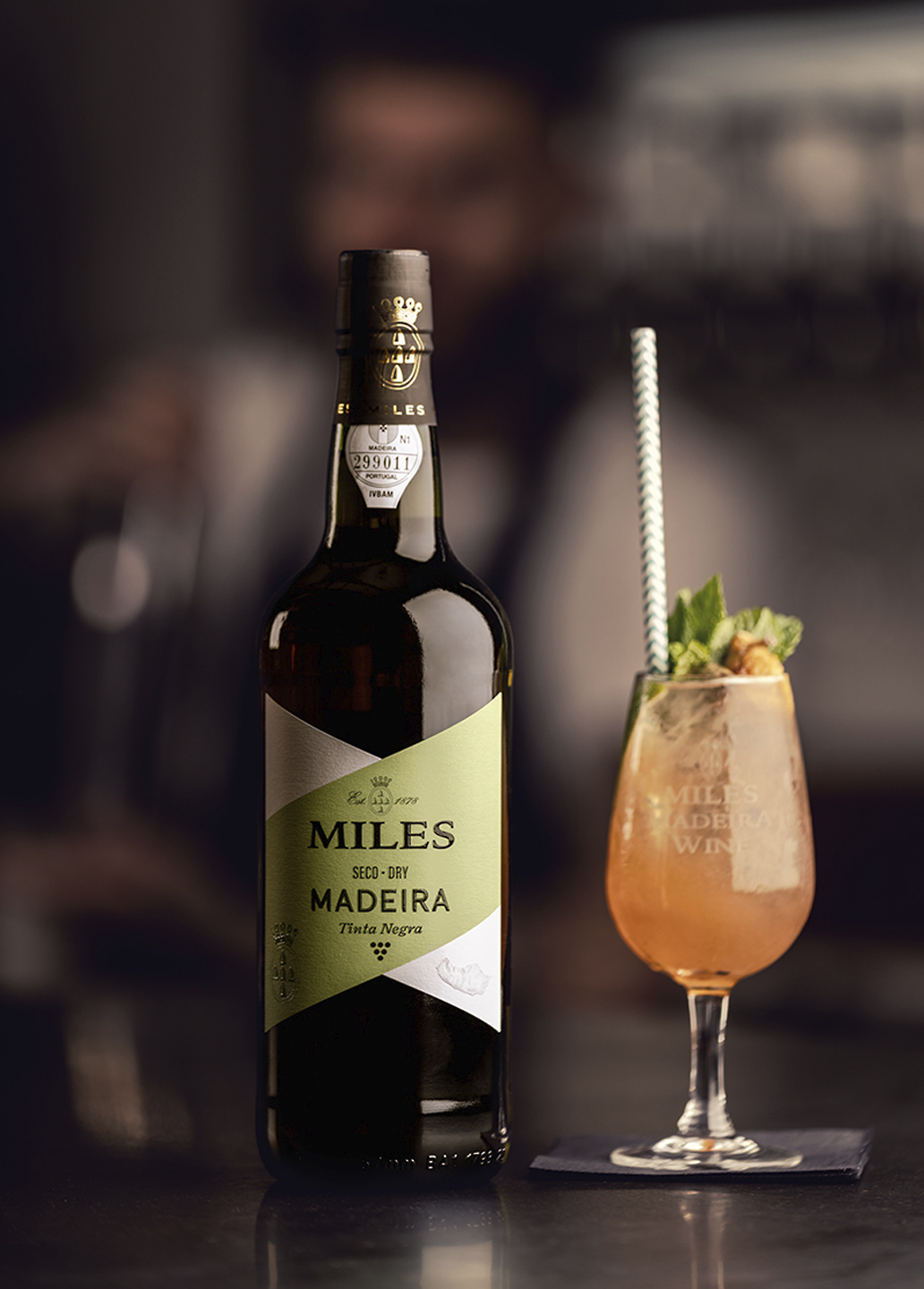
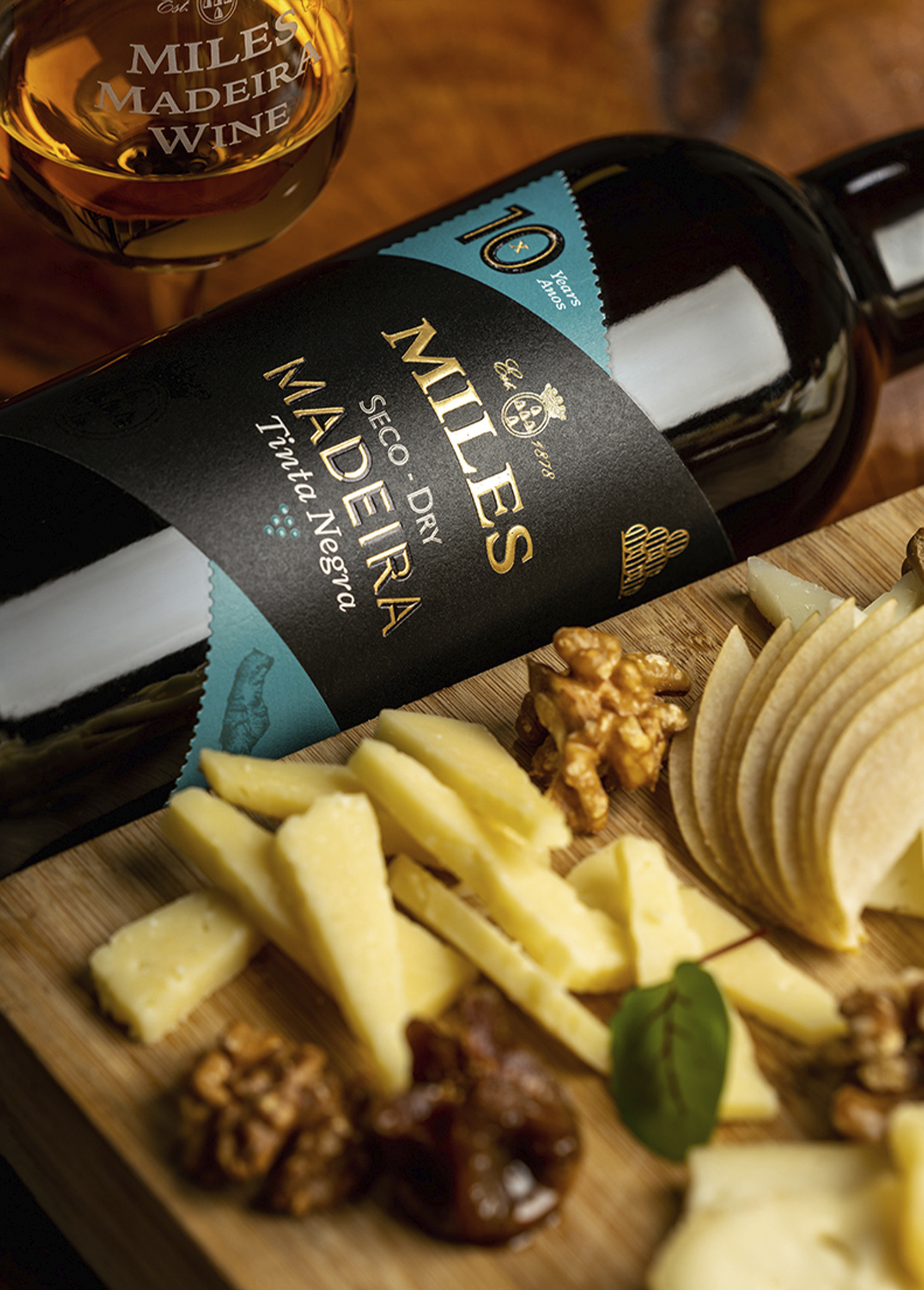
To come up with a new label shape we decided to create a design that would bring together the M and W shapes, from Miles Madeira Wine. This new shape is unique and rooted in the brand product and geography, which allows it to easily become a recognisable brand asset. The diagonal stripe it creates when introducing colour gives the impression of two different overlapping slashes, hinting at the mixology possibilities of these wines while focusing the viewer’s eye in the centre of the layout. The protruding corners also give a perfect opportunity to introduce brand assets and extra info, while having an open, free centre space in which to develop a type-rich layout.
In the label layout, we embraced the brand’s history by mixing different typographic styles, creating a complex yet clean design with well-defined hierarchies: a homage to Miles’ old labels with a modern approach. The iconic Miles crest is highlighted in the corners and bottle cap, and we introduced new assets such as the Madeira Island Map, the traditional resting wooden barrels and an icon for the Tinta Negra (the essential grape variety in Madeira wine). These were all produced with the most careful craftsmanship to best represent the product’s quality and brand positioning.
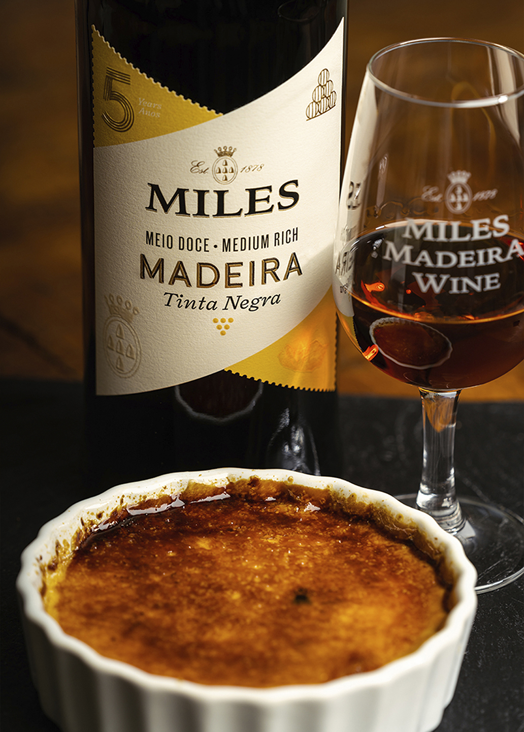
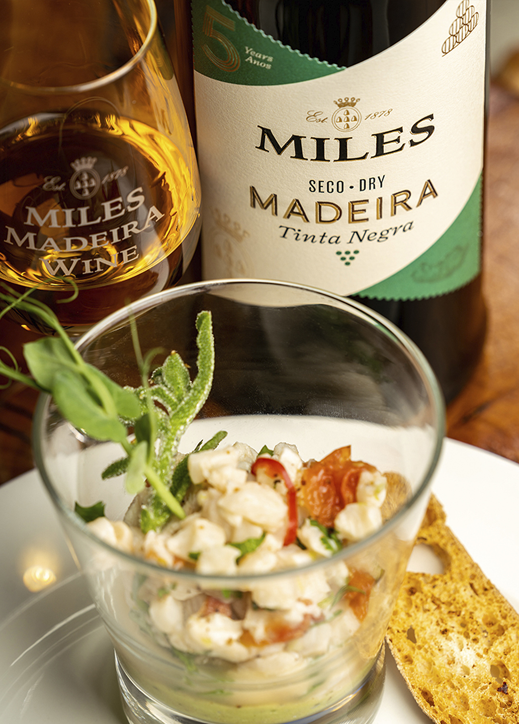
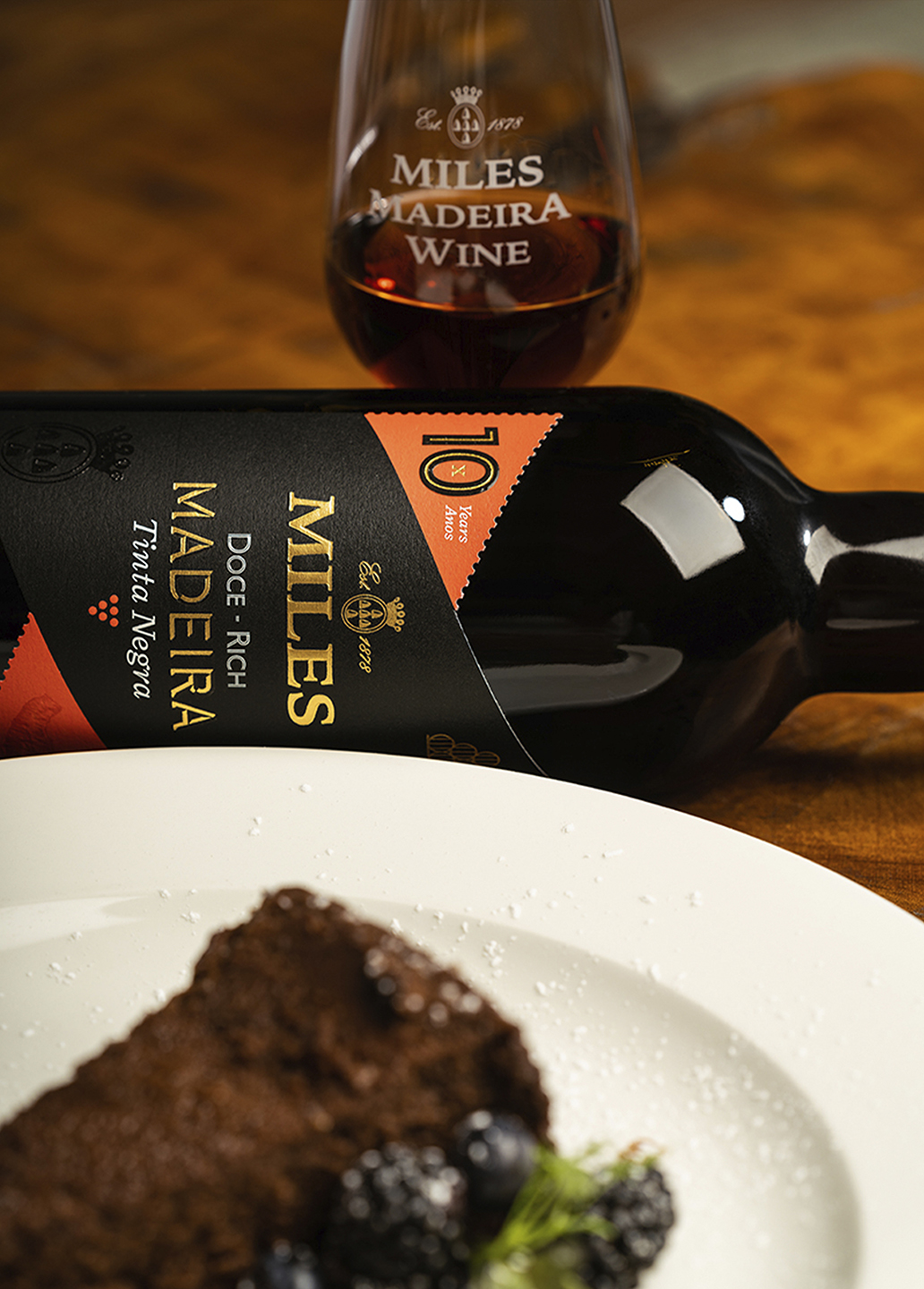
Miles brand hierarchy is now more structured and understandable. The 3-year-old wines, young and curious, are brought to life with bright colours that take centre stage, occupying the “front diagonal” of the label. The 5-year-old wines, complex and rich, have mostly beige labels with a slightly darker version of the 3-year-old colours in the corners. And finally, the 10-year-old wines, special and intimate, are presented with a dark, exclusive-looking black label, and elegant colour details.
In the end, we brought Miles what they had been missing: a design that respects and is informed by their legacy and history, that shows their positioning as a renowned Madeira wine brand and that, while being graphically timeless, is on par with the new market mixology trends.
CREDIT
- Agency/Creative: Volta Brand Shaping Studio
- Article Title: Volta Redesigns Miles Madeira Wines Range
- Organisation/Entity: Agency
- Project Type: Packaging
- Project Status: Published
- Agency/Creative Country: Portugal
- Agency/Creative City: Porto
- Market Region: Global
- Project Deliverables: Graphic Design, Label Design
- Format: Bottle
- Substrate: Glass Bottle
- Industry: Food/Beverage
- Keywords: Label, Madeira, Wine, Packaging, Fortified, Miles
-
Credits:
Creative Director/Deisgner: Pedro Vareta
Project Manager: Lourenço Neves


