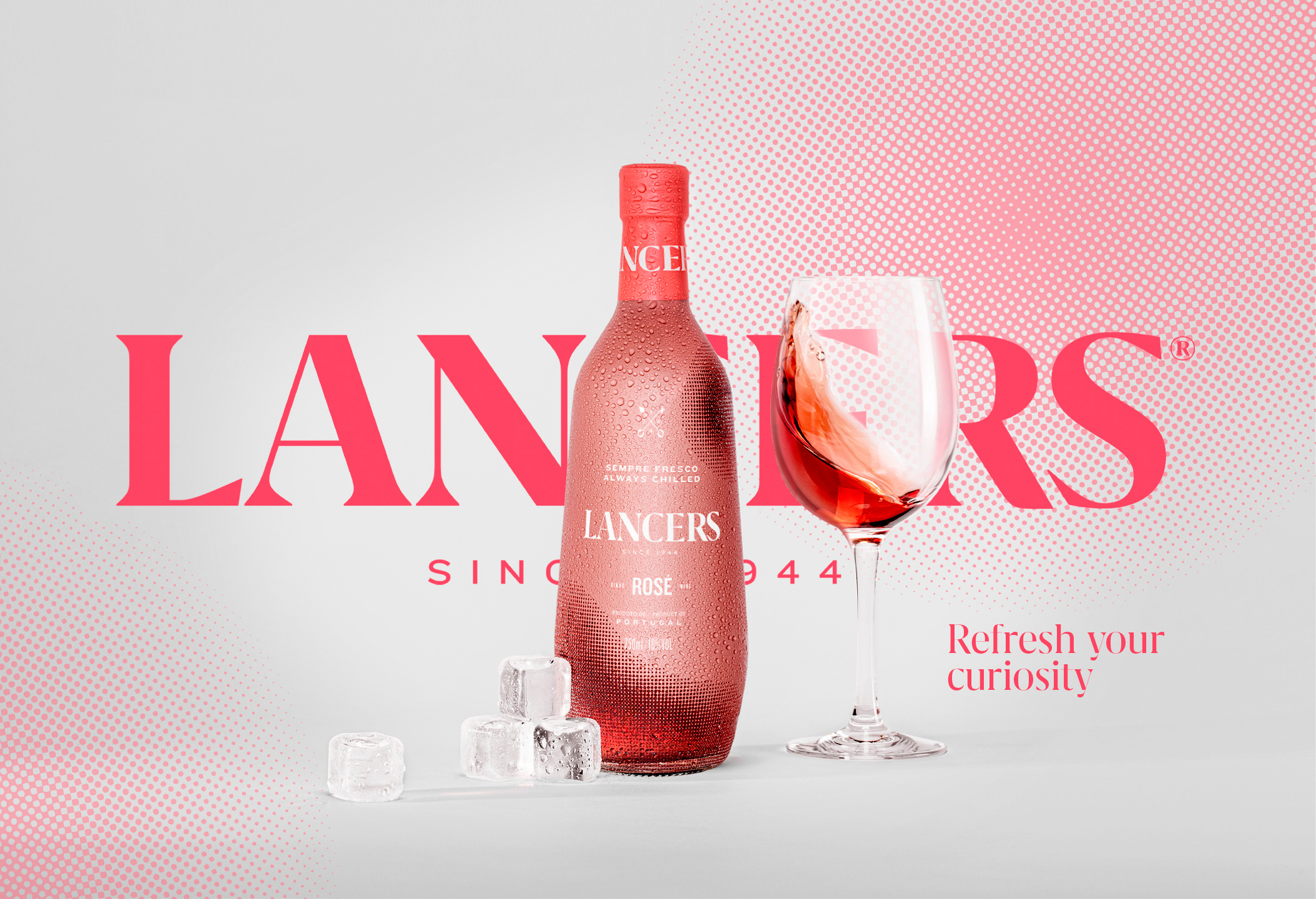
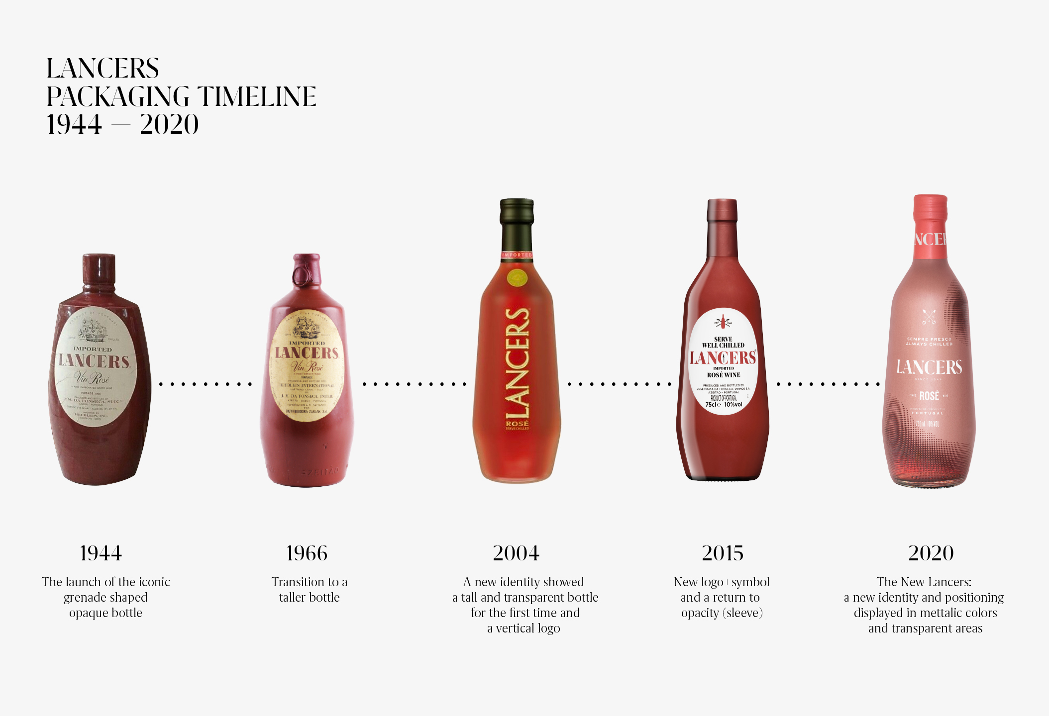
Lancers is an essential wine in Portugal and the world: more than 75 years of history and freshness, with a strong presence in markets such as the USA and Italy and an eternally young and uncompromising positioning. Lancers’ image has undergone several changes in the past, with the evolution of its iconic “grenade” bottle, but the brand felt that it was losing strength and relevance in its young, urban and increasingly digital target.
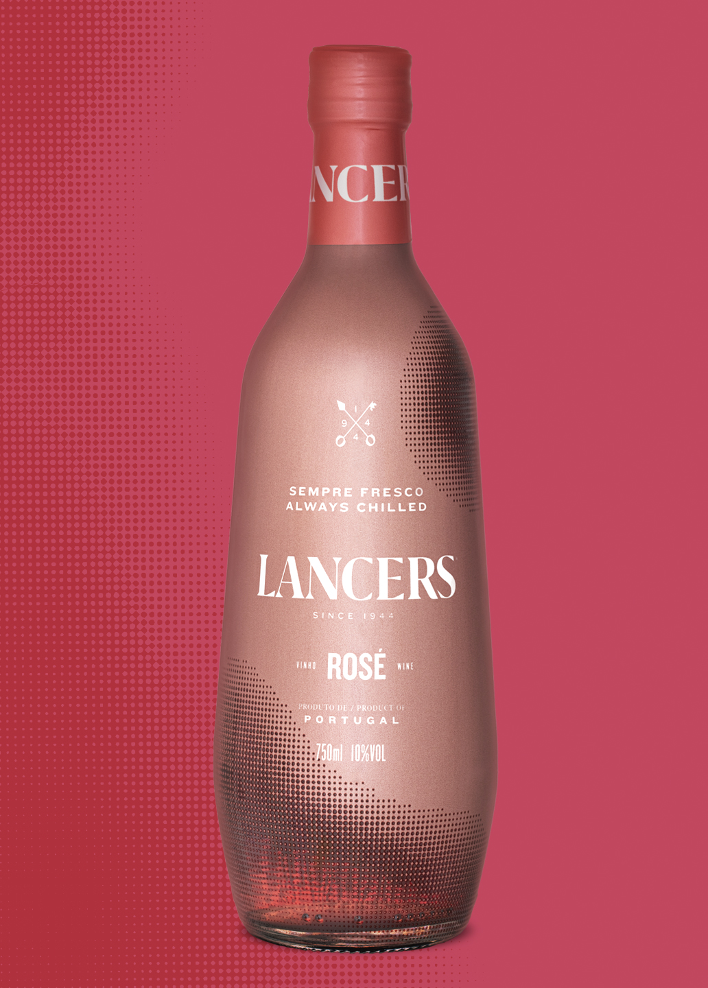
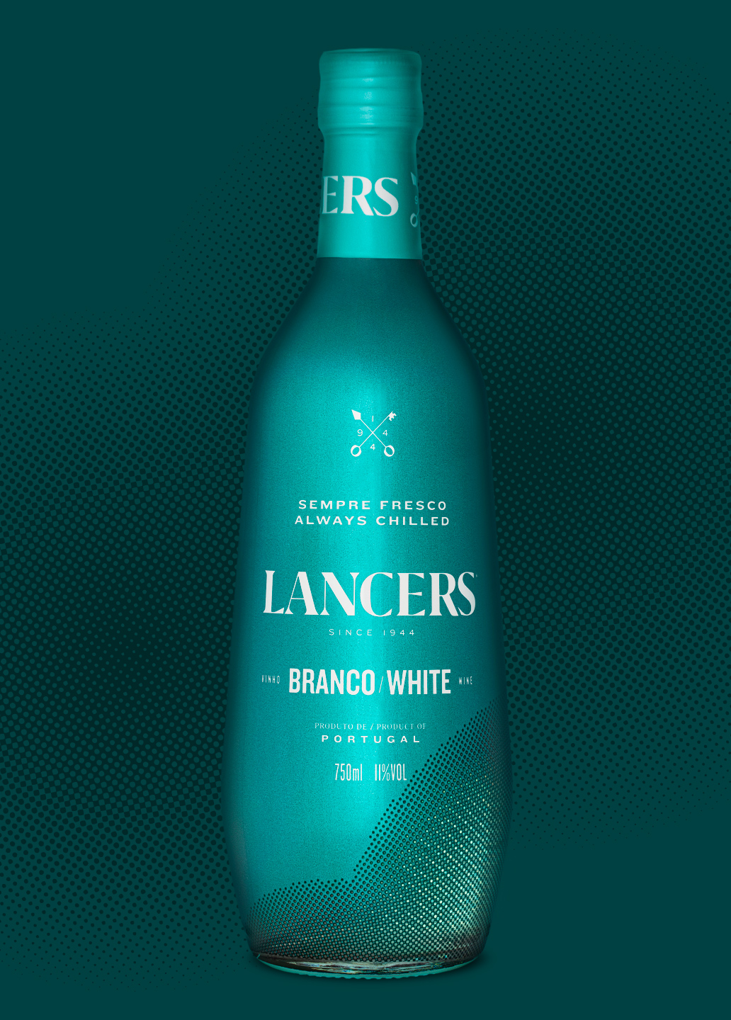
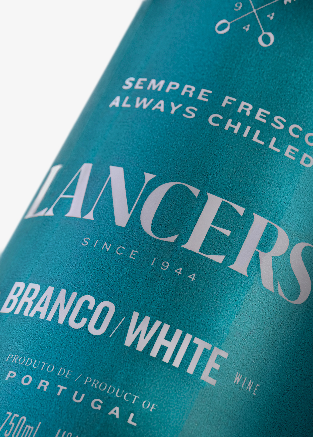
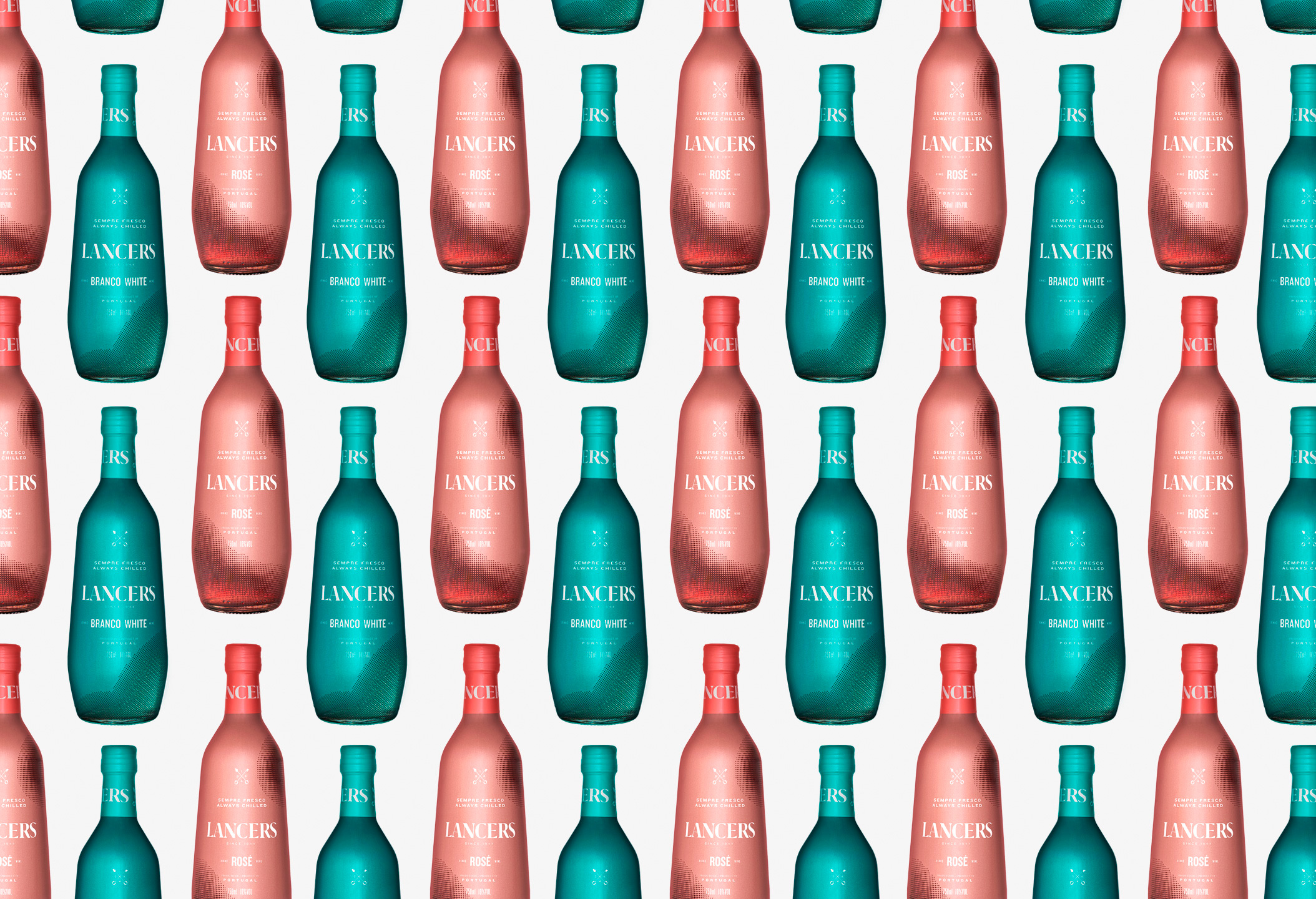
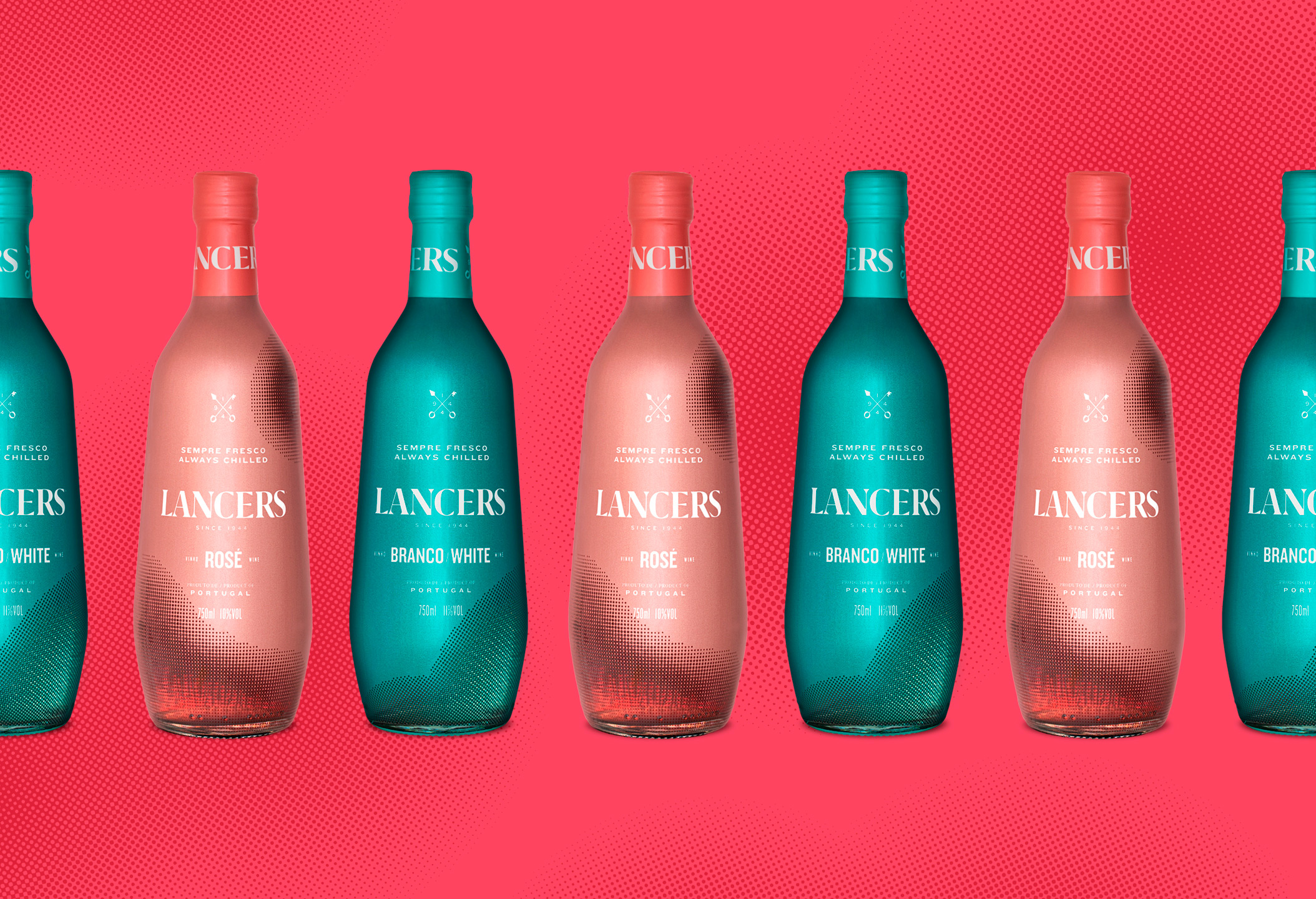
The work of Volta Studio was the result of a previous strategic work of brand positioning, that determined guidelines for our visual proposal. It was defined that it was imperative to create a more contemporary and premium packaging that would help uplift the brand’s value perception, while at the same time reinforcing its distinctive points: the opacity of the bottle and the curiosity that it causes. To solve this challenge, several contact points of the brand were addressed: the bottle decoration, the brand signature, its logo and finally its symbol. To define the bottle decoration, a historical analysis of its evolution was made to check if there were any points to be recovered. The solution to “lose the label” had been used before and set a clear change from the previous image: without the frame, the content is more prominent and at the same time less cluttered. The bottle sleeve is now metallic, bringing the premium and contemporary appeal that the brand was looking for.
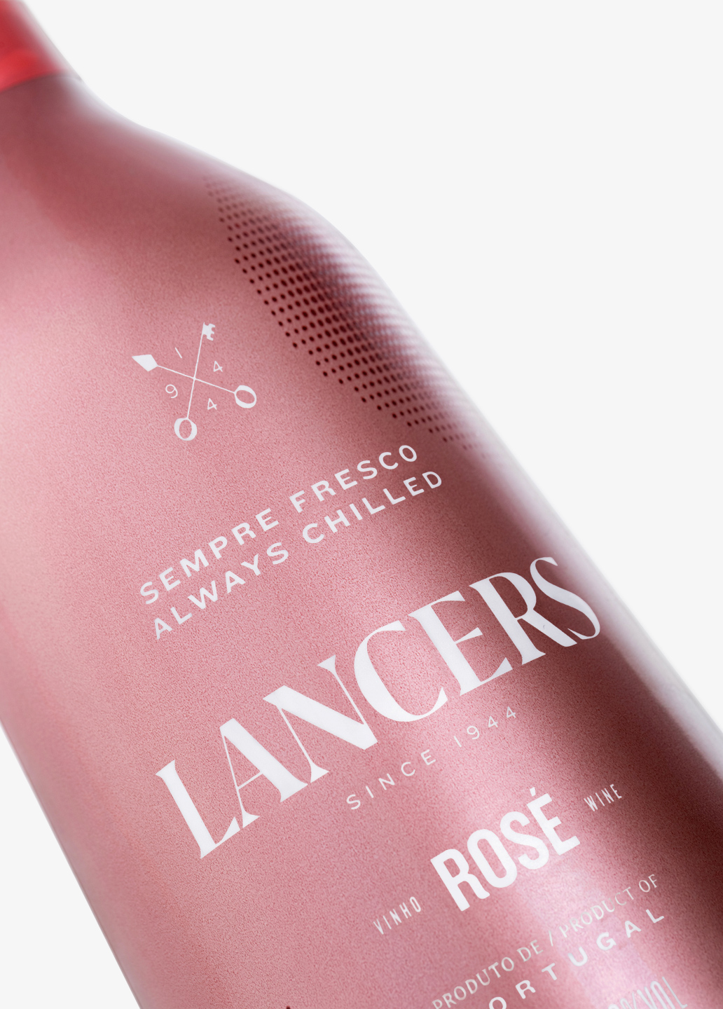
The logo is set in a new typography, with high stroke contrasts and sharp terminals: it’s modern and striking without losing its classic touch. As for the symbol, we studied the painting that was the initial inspiration for the creation of the Lancers brand: “La Rendicion de Breda” or “Las Lanzas” by Diego Velasquez. We crossed the iconic lances of the painting with the Breda city key that is handed to General Ambrosio de Spinola. If the lances represent an attitude of courage and will, the key is a symbol of security but also of curiosity (we always wonder what it opens). Finally, the signature “Refresh your curiosity”, reinforces the iconic opacity of the Lancers bottle and the curiosity it provokes, while referring to the freshness of the brand and the product. All of this raises the brand’s quality perception, while the sleeve’s transparent areas give us a glimpse of the wine, sharpening our curiosity and tempting us to try it. The end result is a packaging with a young, premium and accessible image, whose shine and transparencies increase the wanted freshness and refresh our curiosity to revisit this iconic wine.
CREDIT
- Agency/Creative: VOLTA Brand Shaping Studio
- Article Title: Volta Redesign the Iconic Lancers Wine
- Organisation/Entity: Agency, Published Commercial Design
- Project Type: Packaging
- Agency/Creative Country: Portugal
- Market Region: Multiple Regions
- Project Deliverables: Brand Identity, Brand Redesign, Brand Rejuvenation, Brand Strategy, Branding, Graphic Design, Packaging Design, Rebranding, Research
- Format: Bottle, Sleeve
- Substrate: Glass Bottle


