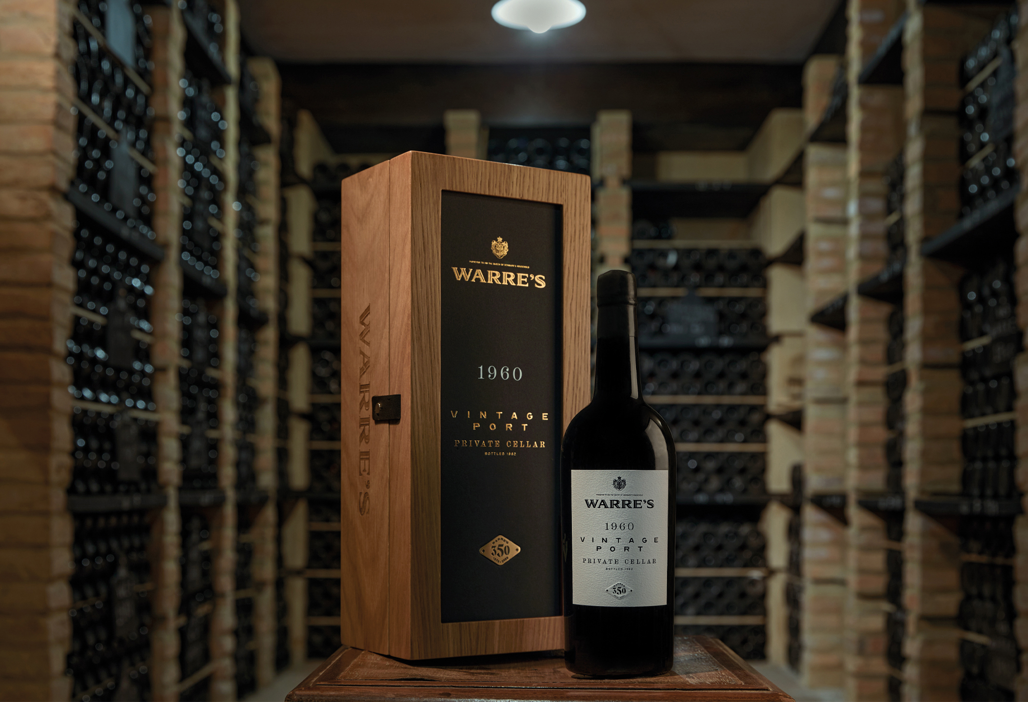
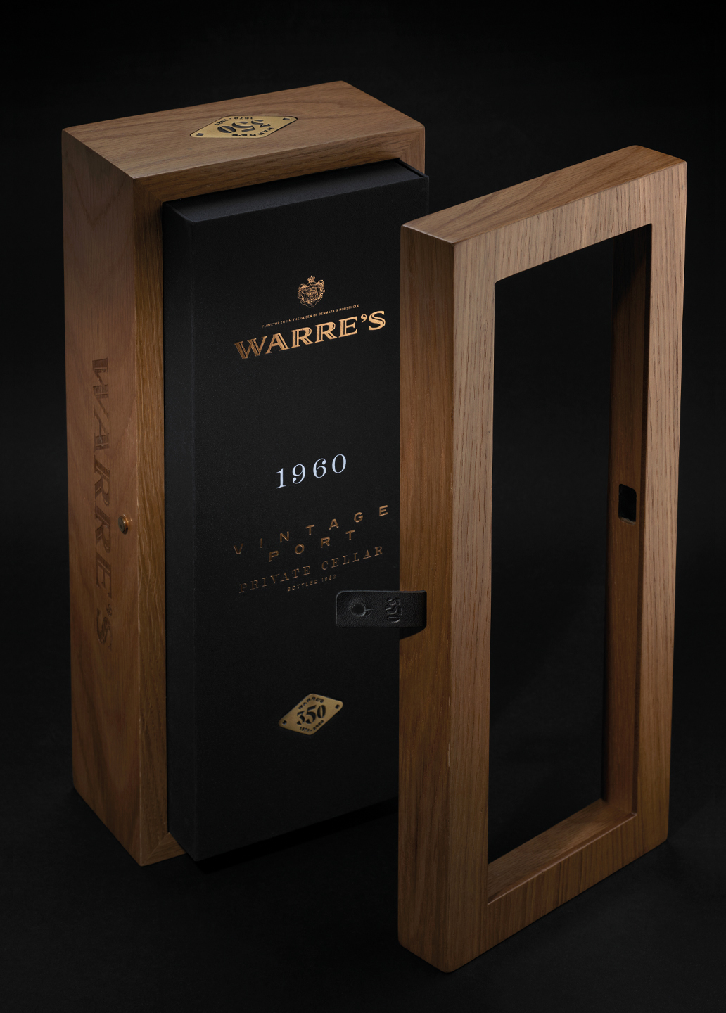
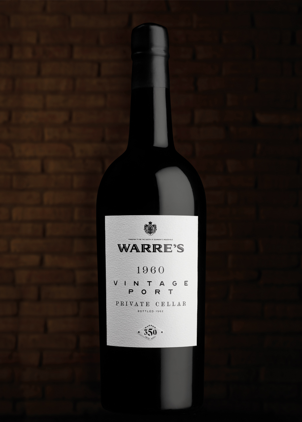
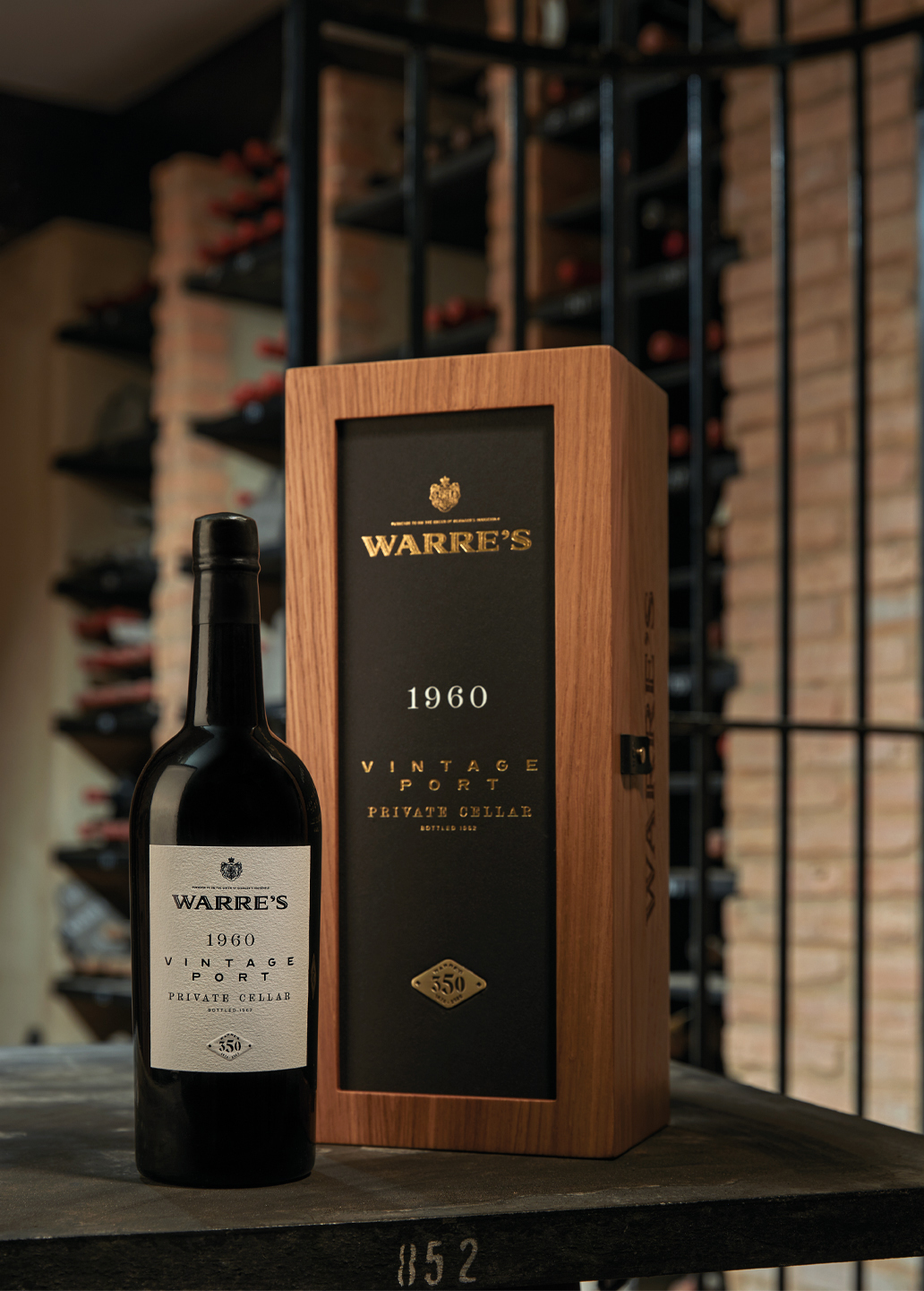
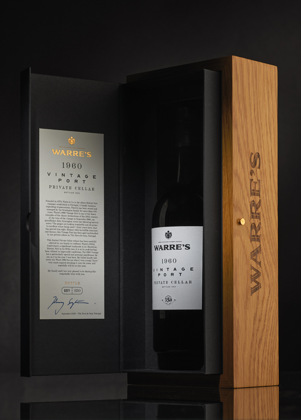
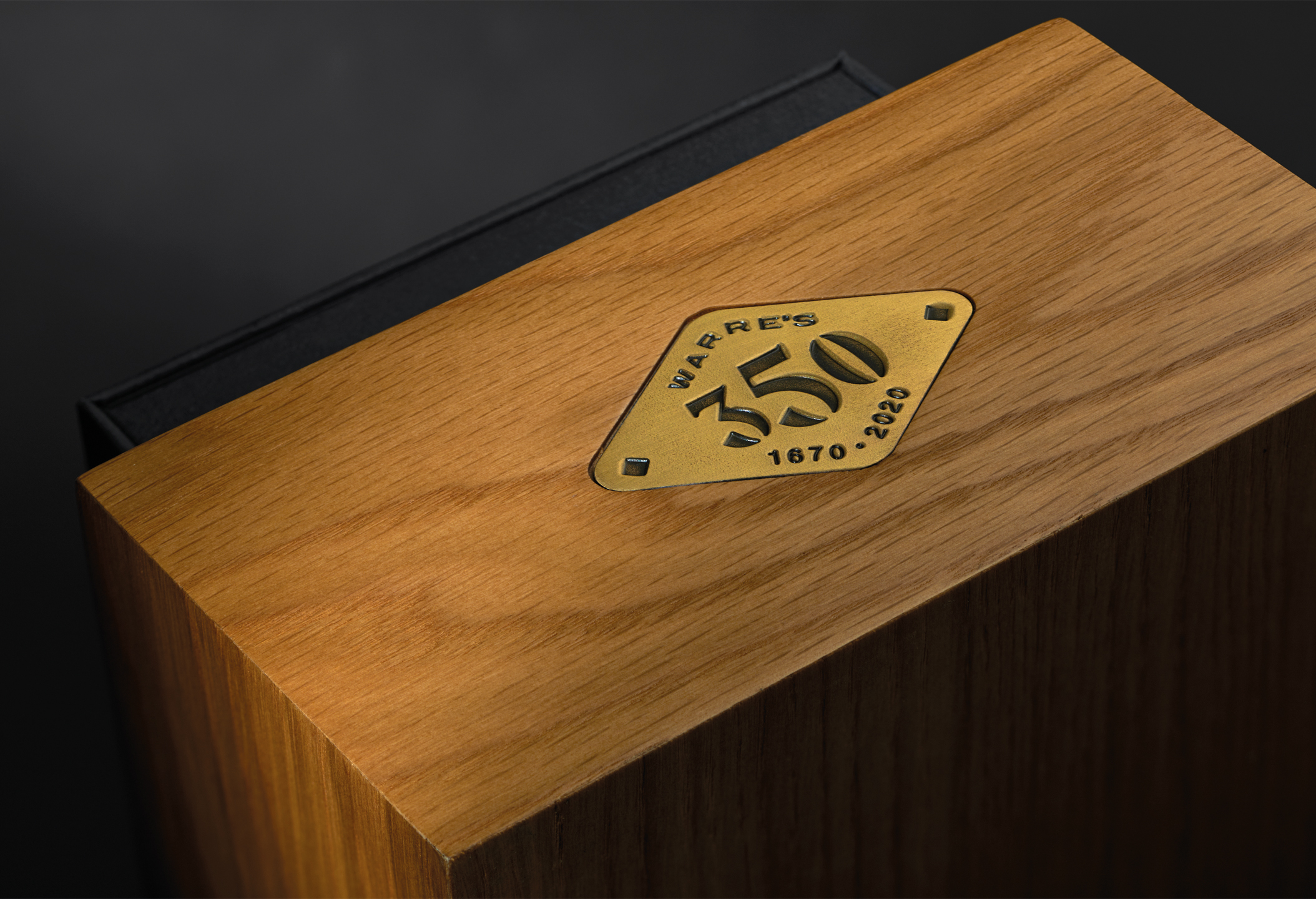
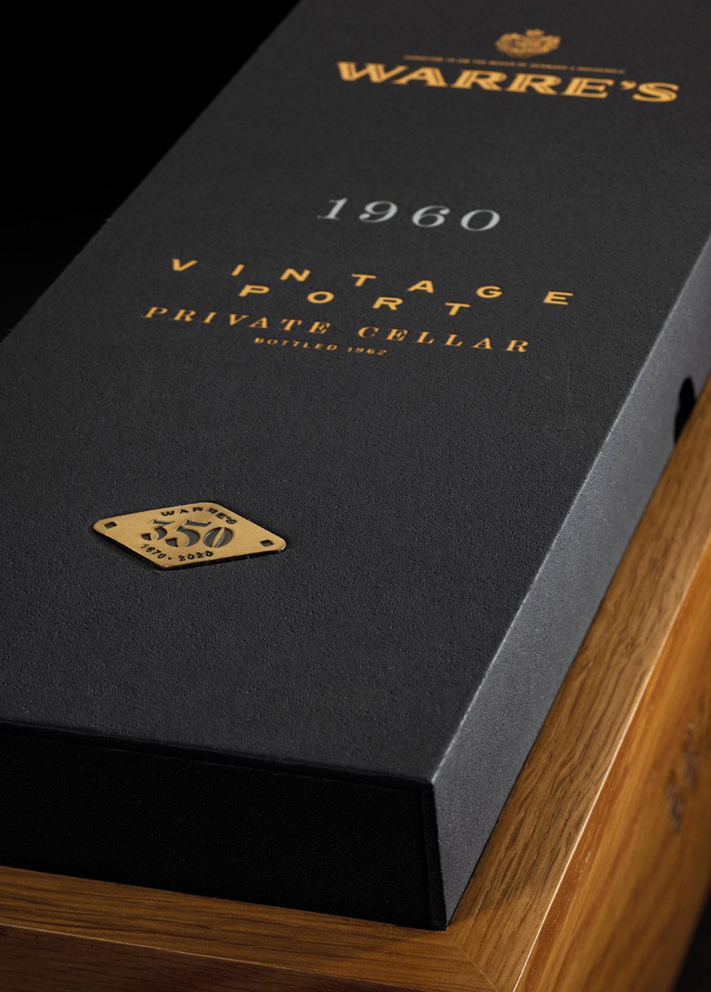
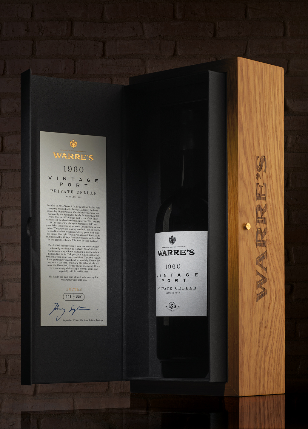
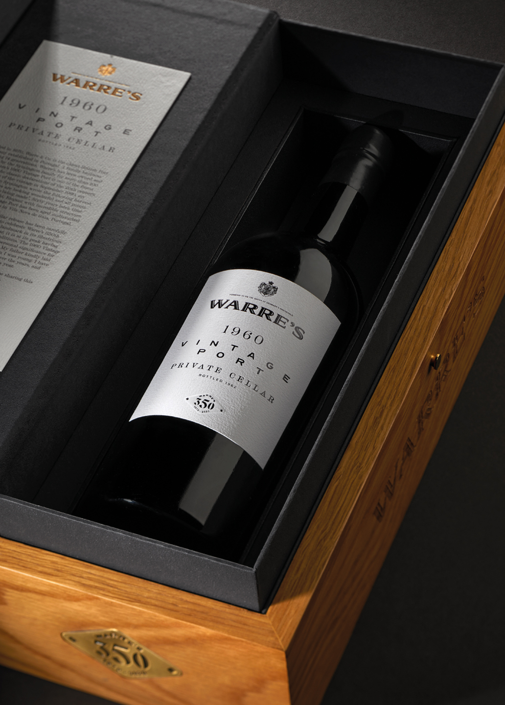
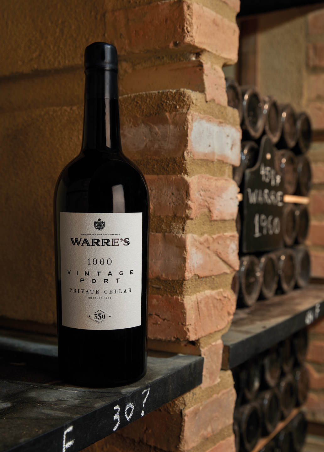
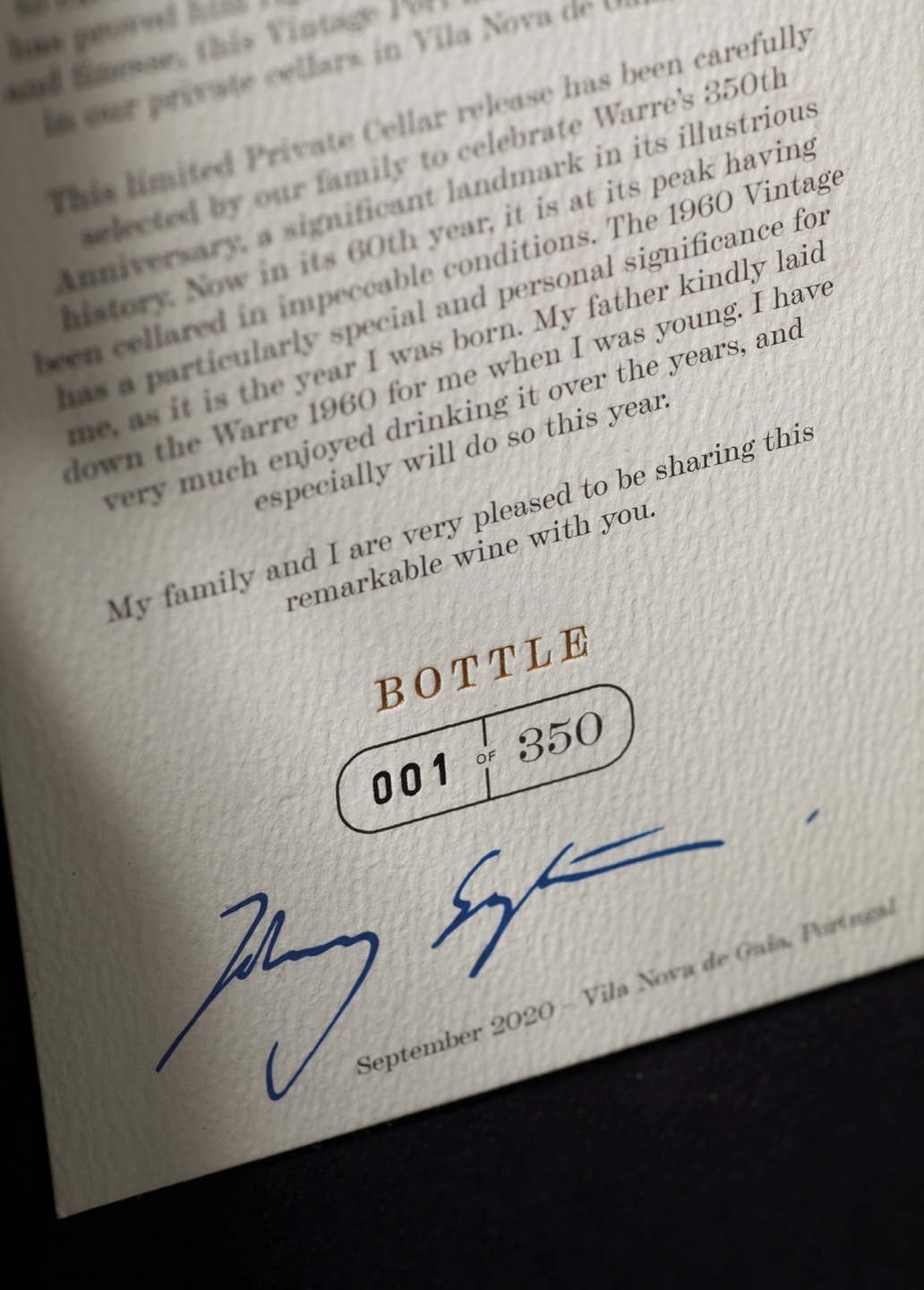
Warre’s is the oldest of the Symington Family Estates’ brands and in 2020 celebrates 350 years of producing unparalleled quality Port wines. To commemorate three and a half centuries of history, Warre’s decided to launch a fabulous Vintage 1960 Private Cellar and approached Volta Studio to design a commemorative badge for the 350 years, a label and packaging that would give life and respect this historic wine. Warre’s is a classic brand, proud of its legacy, so the intended visual language should be of great impact but with notorious values of tradition. For the label, our approach was one of total cleanliness: an artifice-free label, in line with the older vintages, with typography sets printed in black on very textured white paper. There are formulas that never fail. For the pack, we wanted to work with a mix of materials: an outer box in etched oak surrounds another inner box in black paper with a pumice stone texture, rough and distinct.Leather ribbons help keep the vintage on its bed, away from light. Finally, shiny metal plates celebrate the 350 years of the brand, giving a premium quality status to the pack and its content.
CREDIT
- Agency/Creative: VOLTA Brand Shaping Studio
- Article Title: Volta Branding and Packaging Design Opens the Doors of Warre’s Private Cellar
- Organisation/Entity: Agency, Published Commercial Design
- Project Type: Packaging
- Agency/Creative Country: Portugal
- Market Region: Multiple Regions
- Project Deliverables: Brand World, Branding, Graphic Design, Packaging Design
- Format: Bottle, Box
- Substrate: Glass Bottle, Pulp Carton, Wood


