


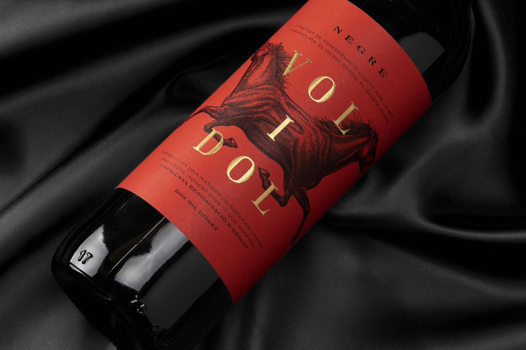
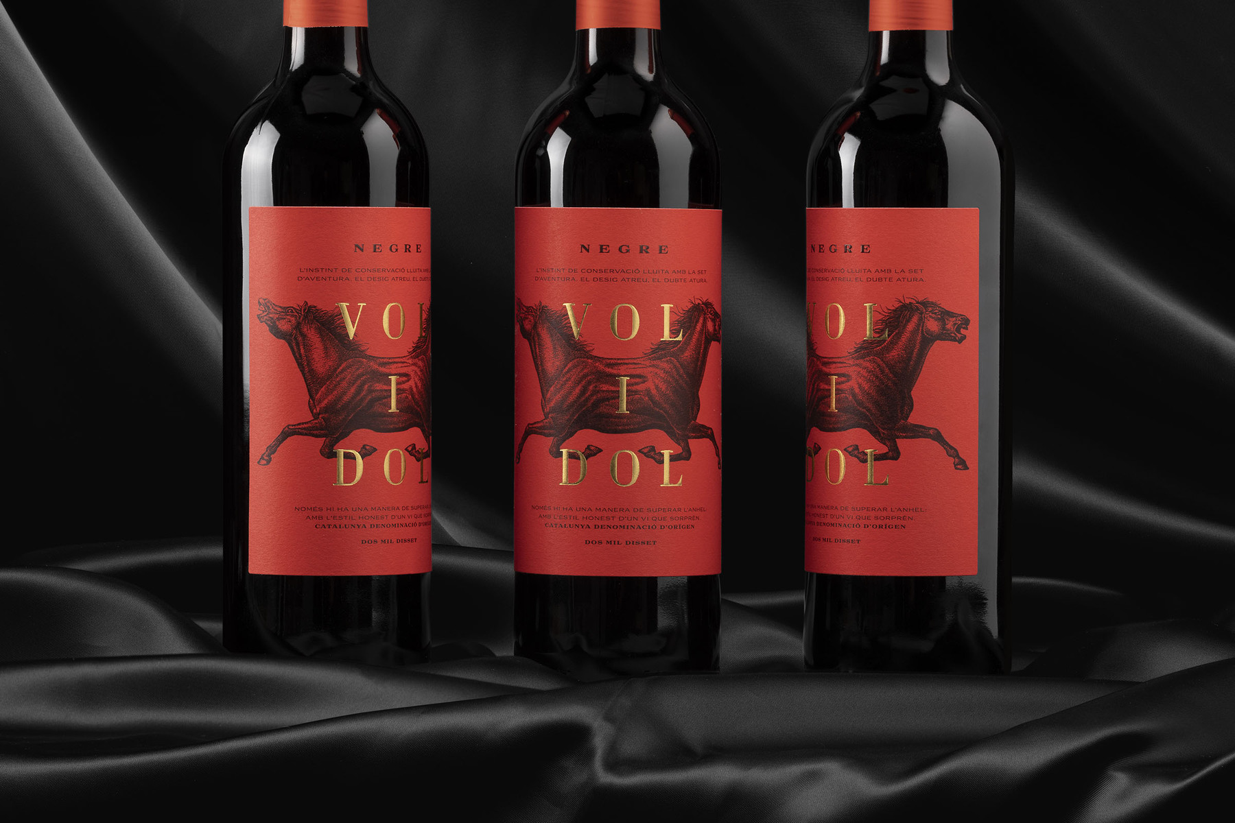
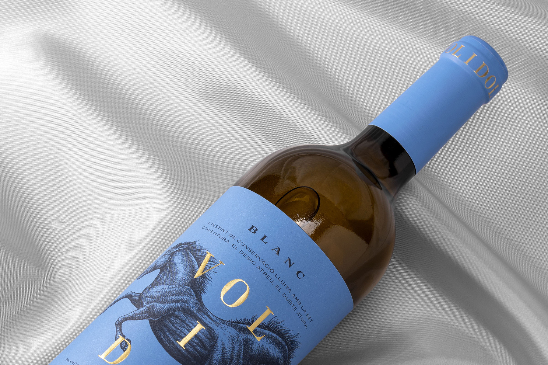
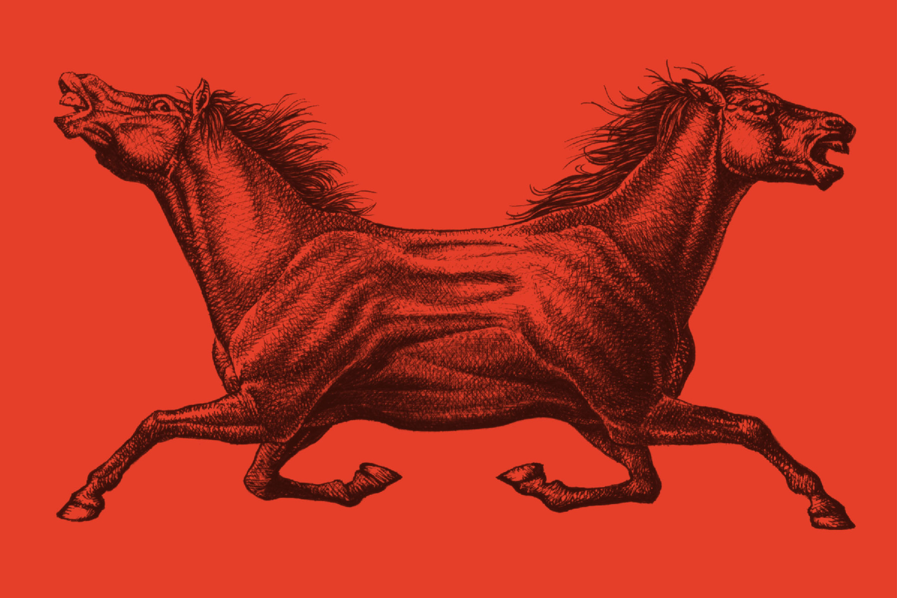
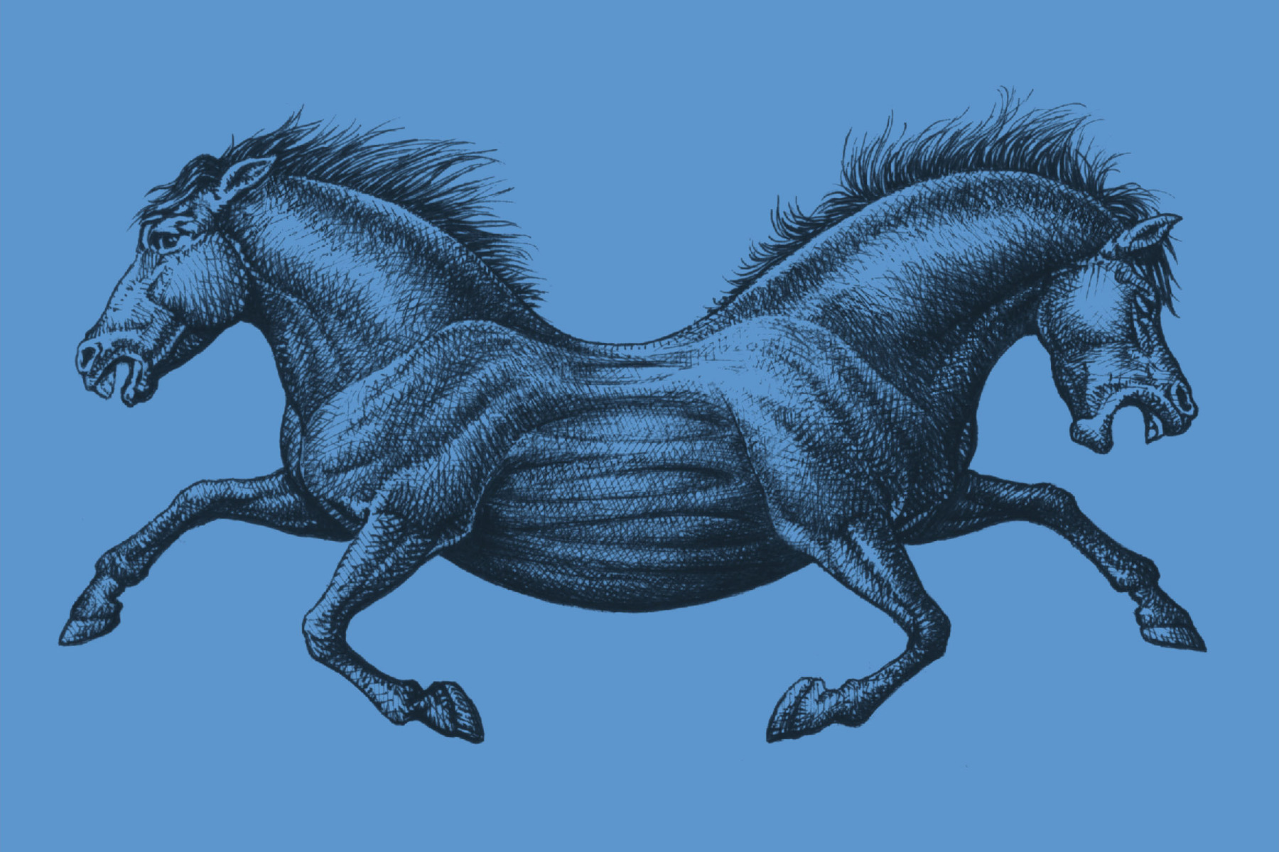
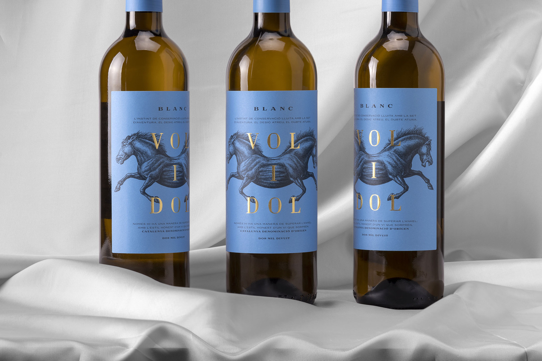
Conceptualization, art direction and design for ‘Vol i dol’. This wine would be placed in a very competitive segment. The objective was to create an elegant yet ironic label. ’Vol i Dol’ means to want but not being able to. Desire versus pain. This internal conflict, the indecision. We wanted to represent the symmetry of these opposing forces. ‘Desire attracts, doubt holds us back’.

CREDIT
- Agency/Creative: Atipus
- Article Title: Vol i Dol. Desire Versus Pain
- Organisation/Entity: Agency, Published Commercial Design
- Project Type: Packaging
- Agency/Creative Country: Spain
- Market Region: Europe
- Project Deliverables: Brand Naming, Branding, Graphic Design, Illustration, Packaging Design, Product Naming, Tone of Voice
- Format: Bottle, Box
- Substrate: Glass, Pulp Carton, Pulp Paper
FEEDBACK
Relevance: Solution/idea in relation to brand, product or service
Implementation: Attention, detailing and finishing of final solution
Presentation: Text, visualisation and quality of the presentation


