Design Activity – Vogel’s Bread
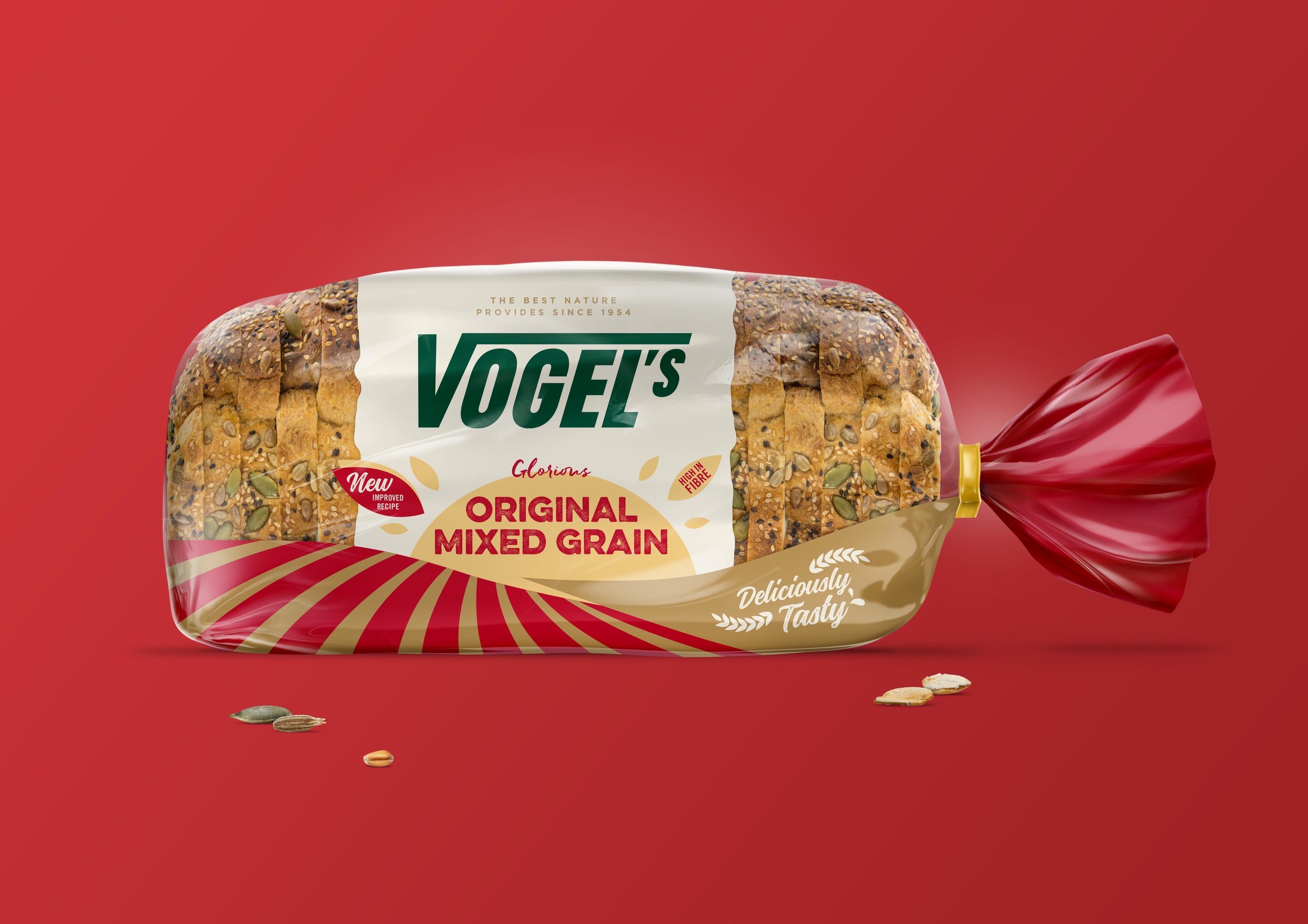
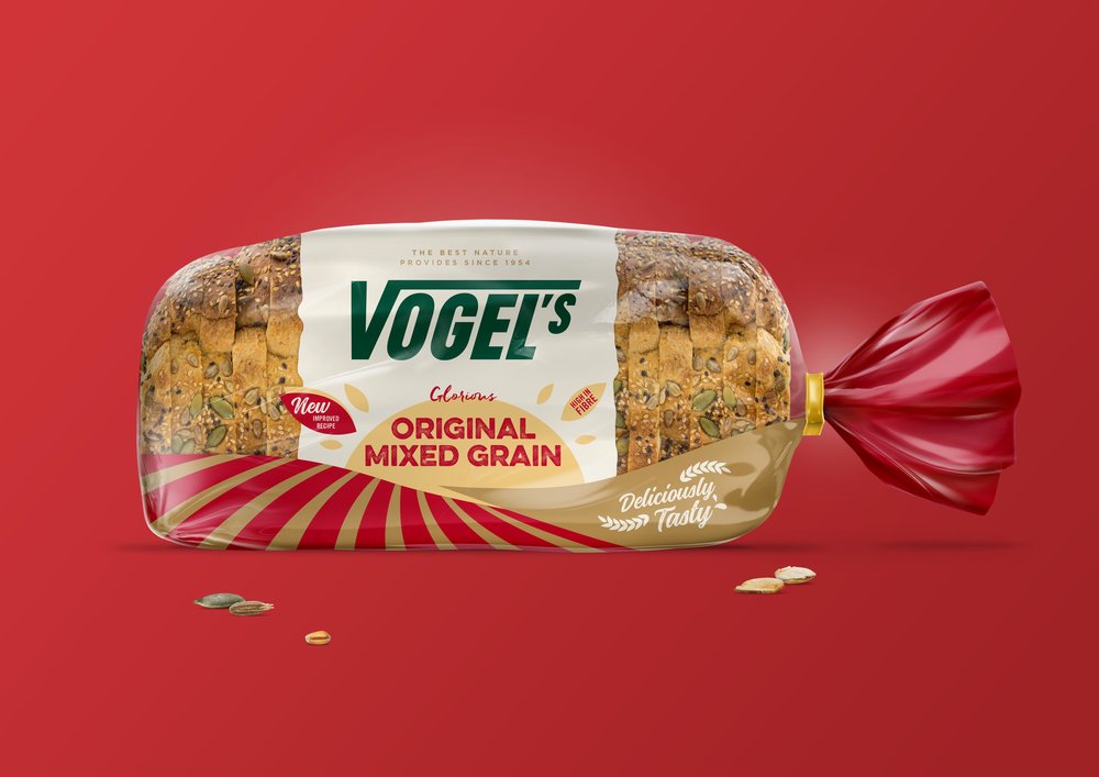
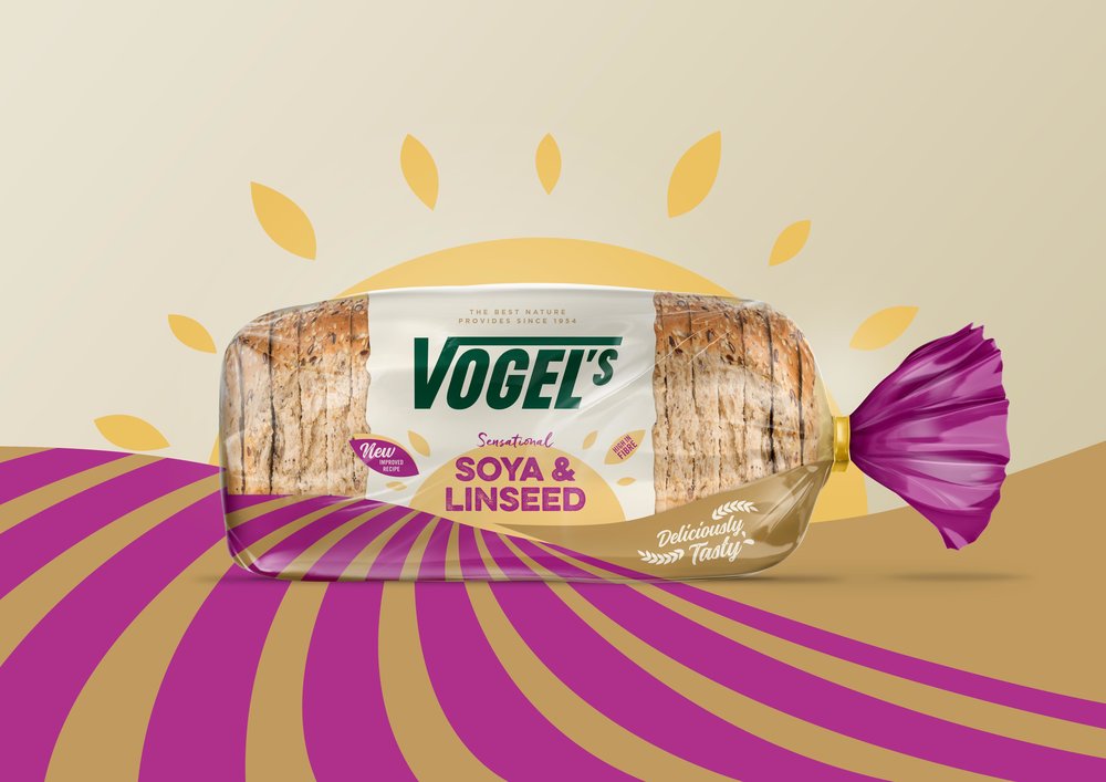
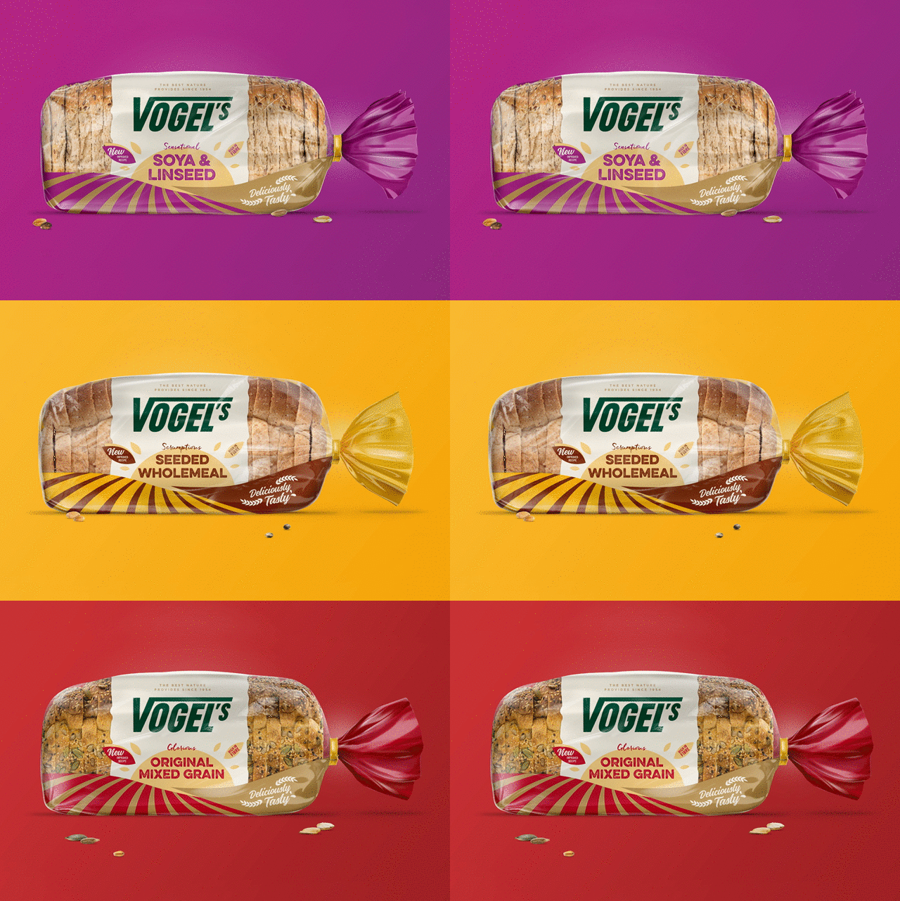
Vogel’s wanted to look and feel more like a challenger brand, to push back against the brand leaders whilst retaining the original branding and the naturalness the brand is known for.
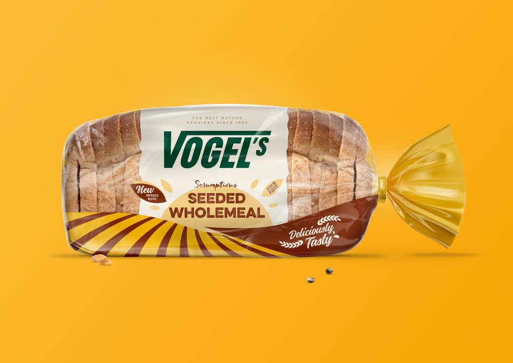
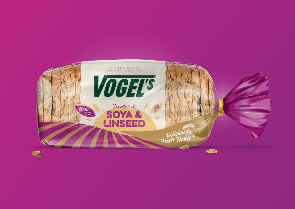
The design was born out of the brand’s principle that the most mouth-watering tastes and nutrition come from the very best ingredients nature provides. We bought a little country and sunshine back to the pack to create a feel-good scene that encapsulates the core proposition of the brand; at one with nature.
The new packaging brings the countryside to pack brighter and bolder than ever before.
CREDIT
- Agency/Creative: Design Activity
- Article Title: Vogel’s Bread Packaging Design, At One with Nature
- Organisation/Entity: Vogel's Bread Packaging Re-Design
- Project Type: Packaging
- Agency/Creative Country: United Kingdom
- Market Region: Europe
- Format: Bag
- Substrate: Plastic
FEEDBACK
Relevance: Solution/idea in relation to brand, product or service
Implementation: Attention, detailing and finishing of final solution
Presentation: Text, visualisation and quality of the presentation


