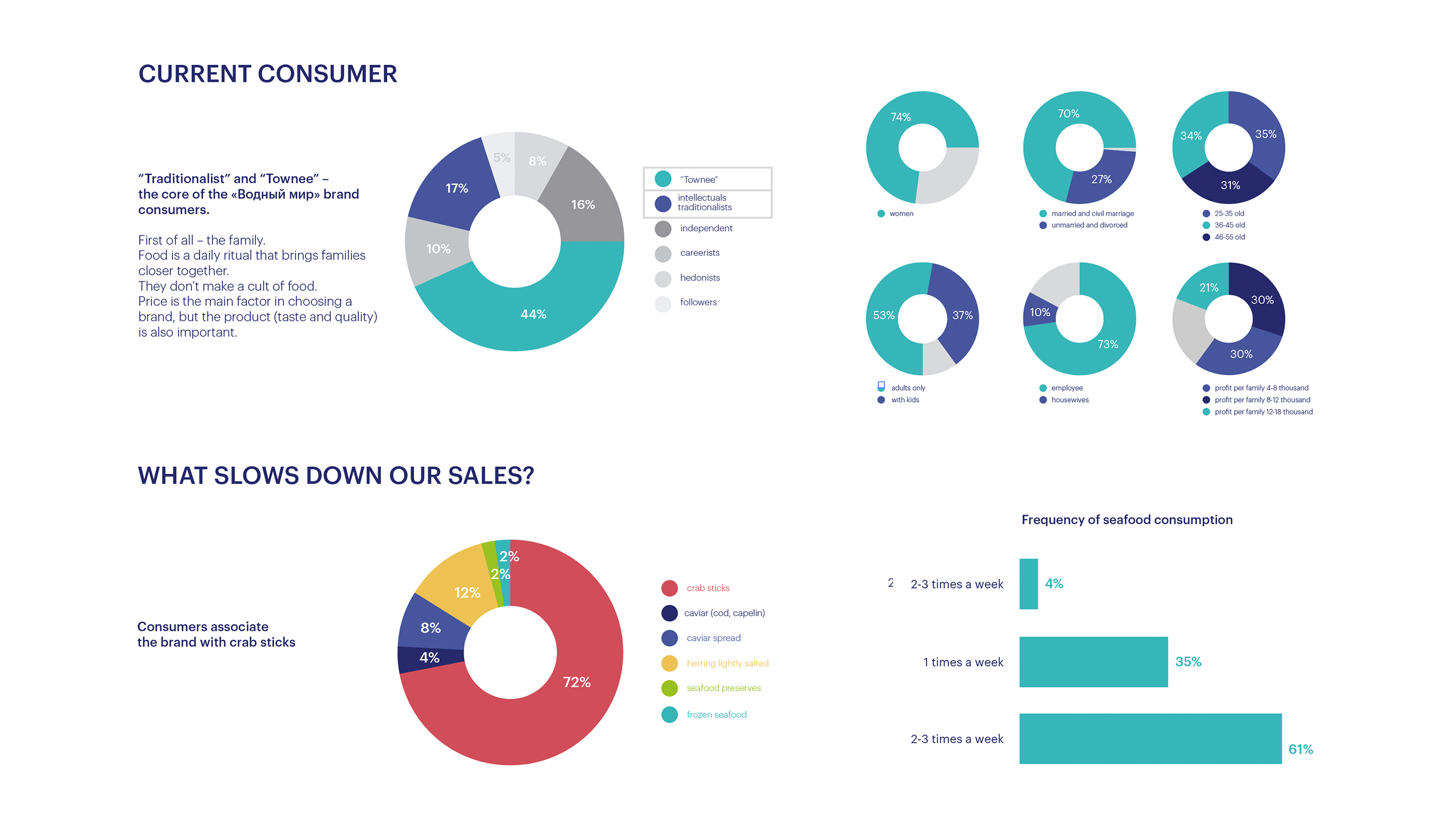
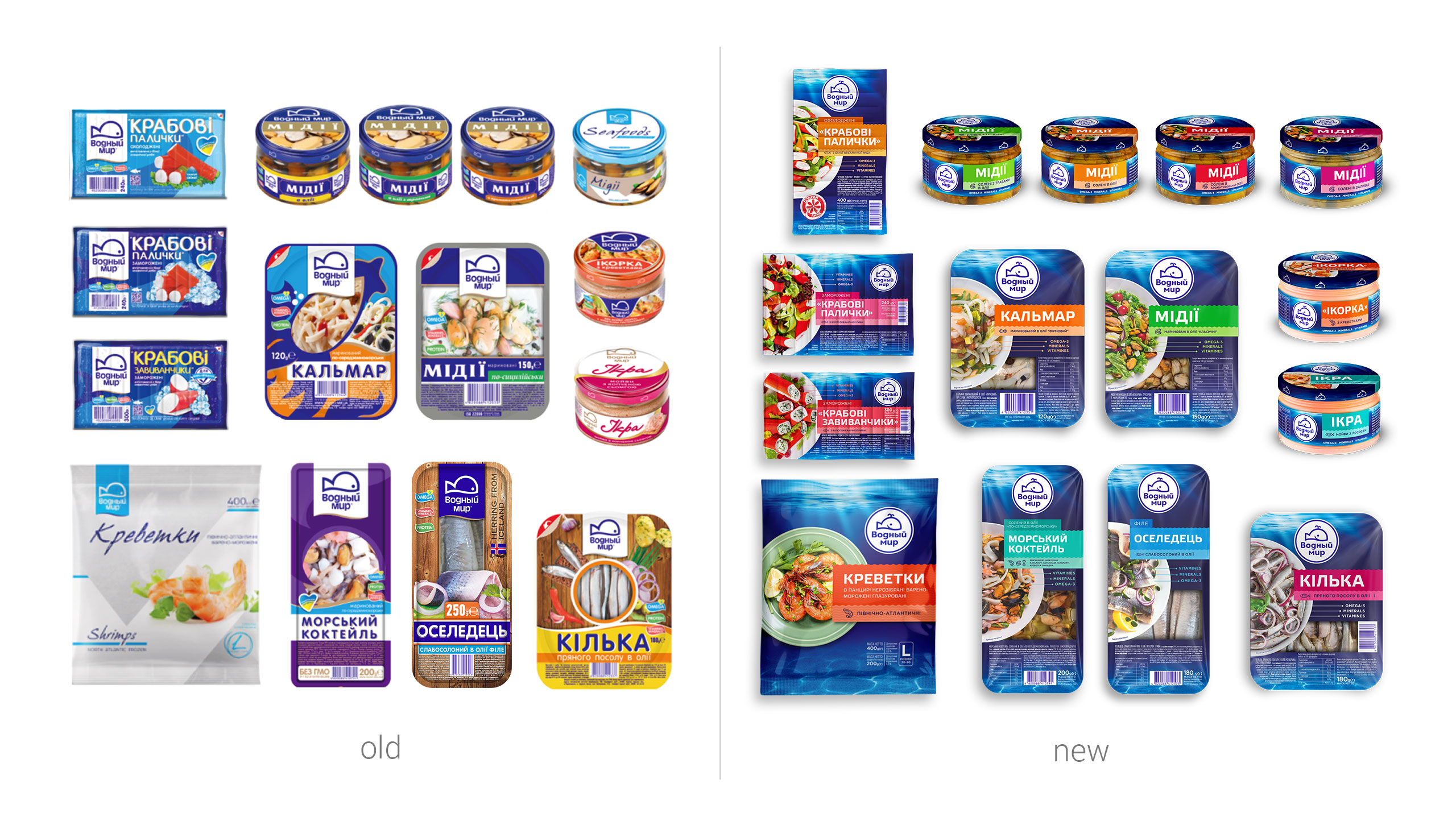
The Sea is Our Field: it provides both fish and a mind dish. Our partnership with Vodnyi Mir, a leading seafood manufacturer, began from deep diving into their range of problems and business tasks. To check the way a whale feels among the sharks, we conducted a brand audit, which resulted in several interesting facts. First of all, there is no seafood consumption culture as such in our country. Secondly, despite the variety of fruits the sea has, the brand is mostly associated with crab sticks. Thirdly, our consumer is a traditionalist, so we need to form a consumer culture and healthy eating habits step by step.
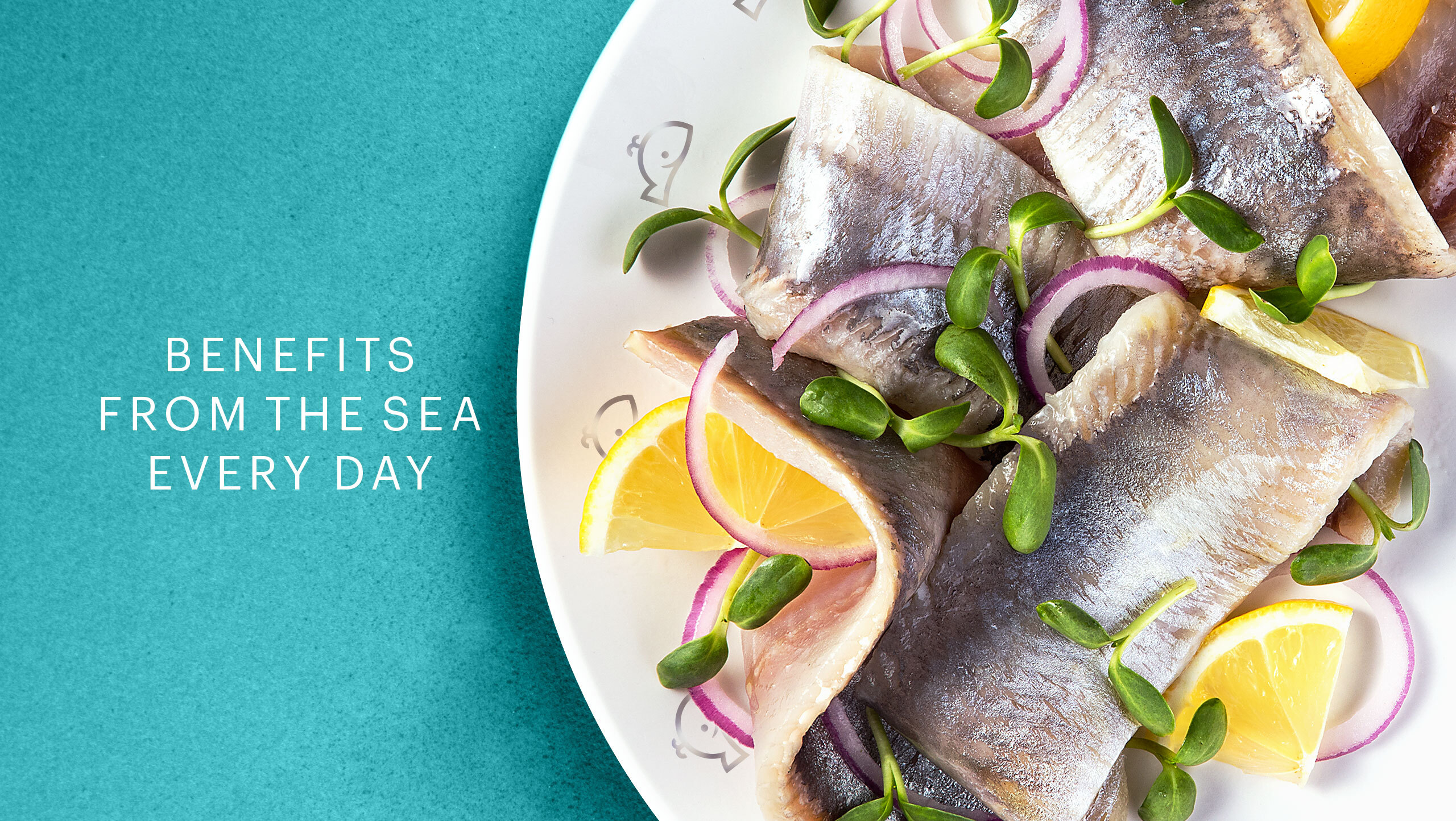
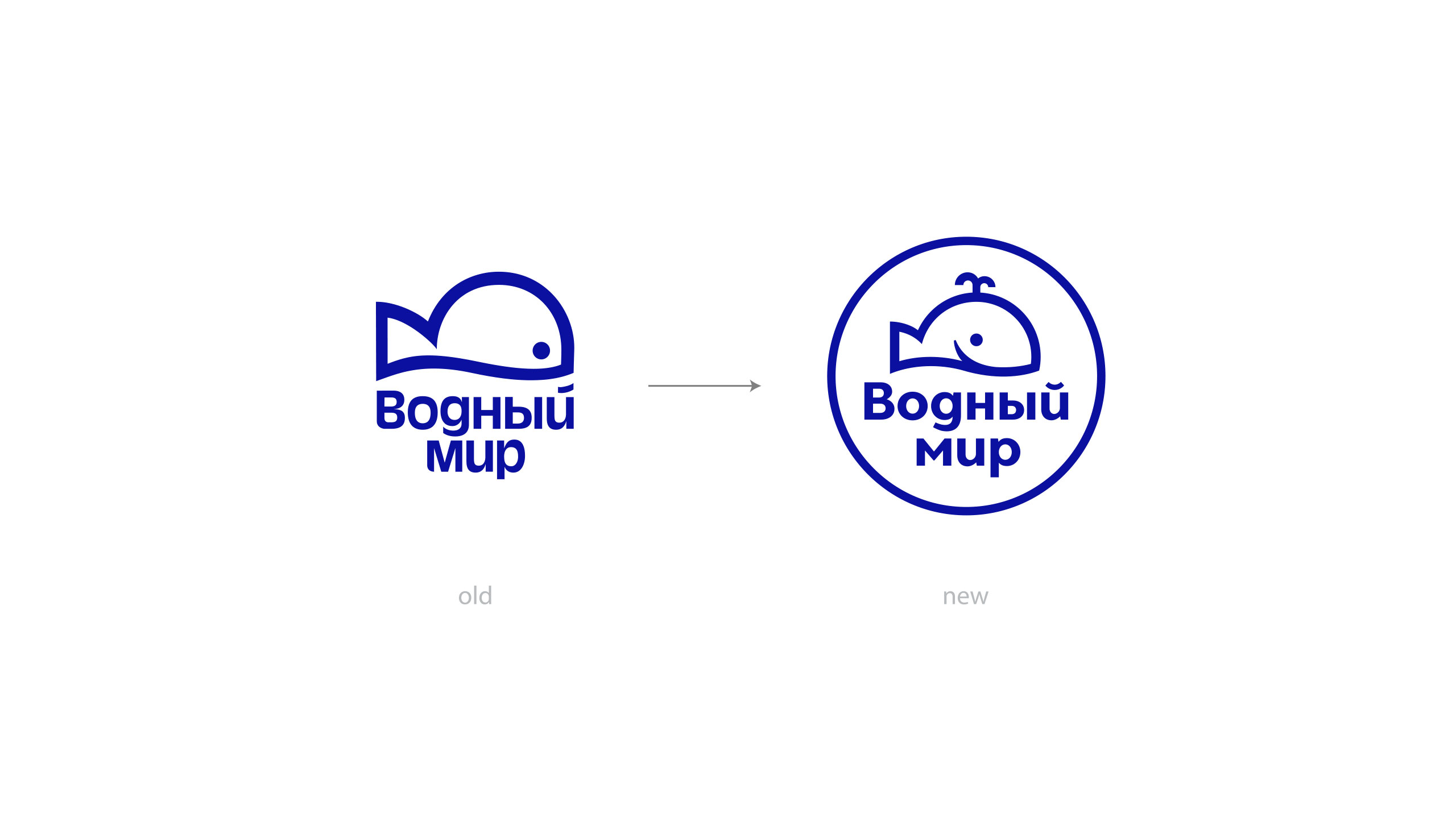
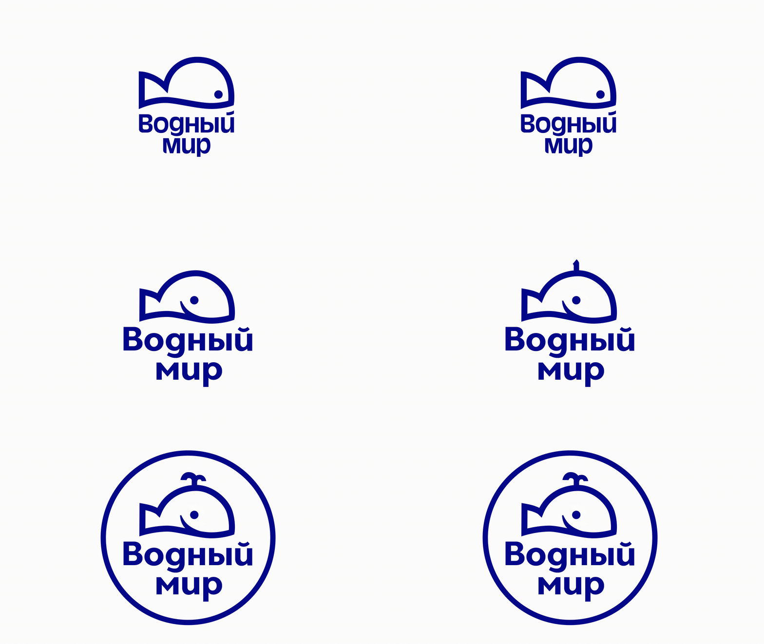
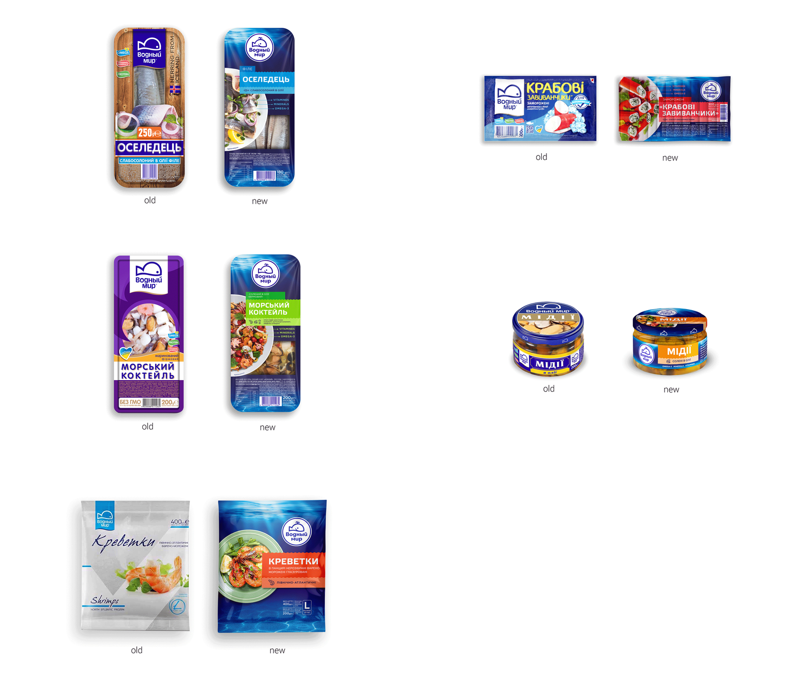
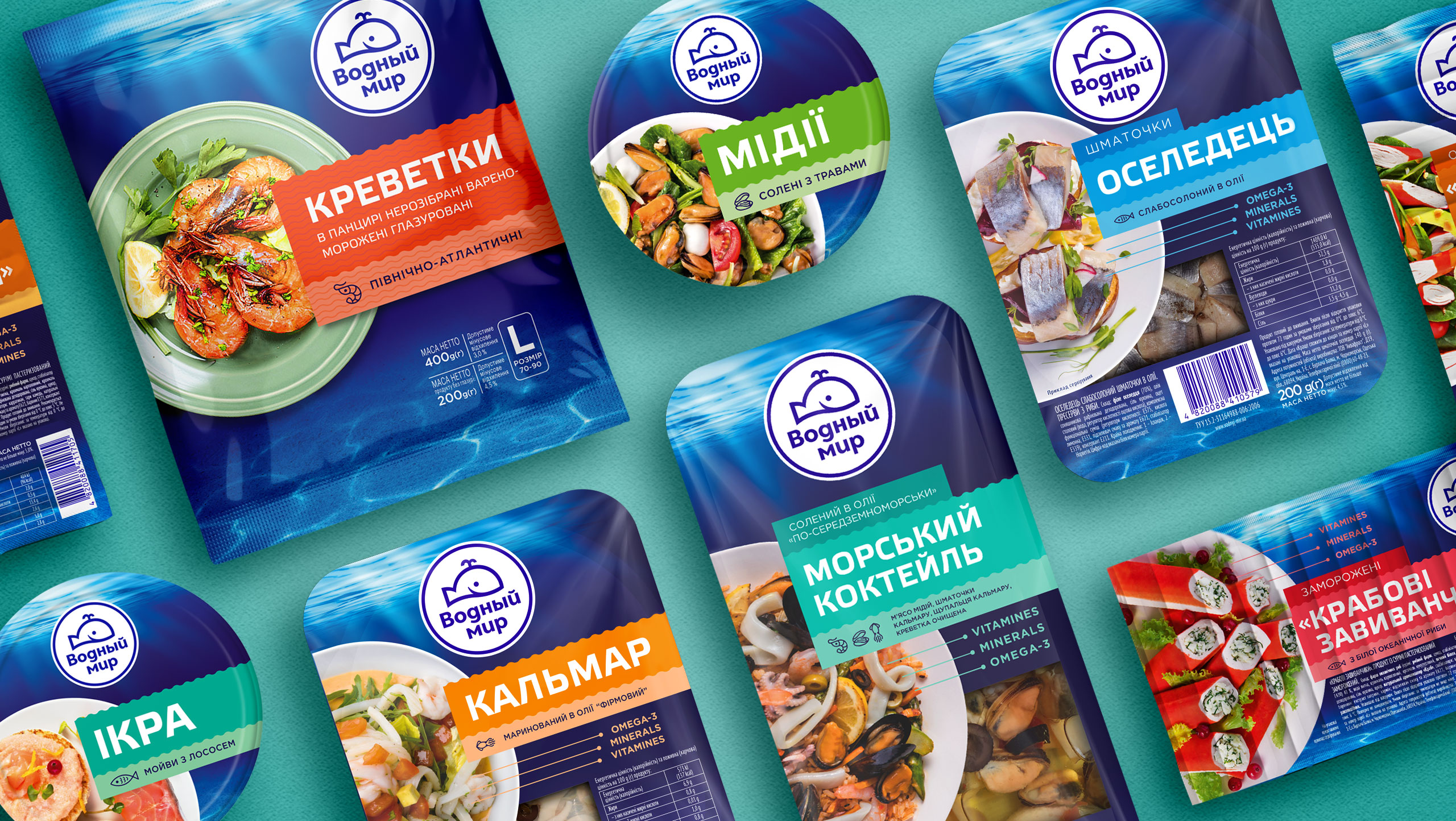
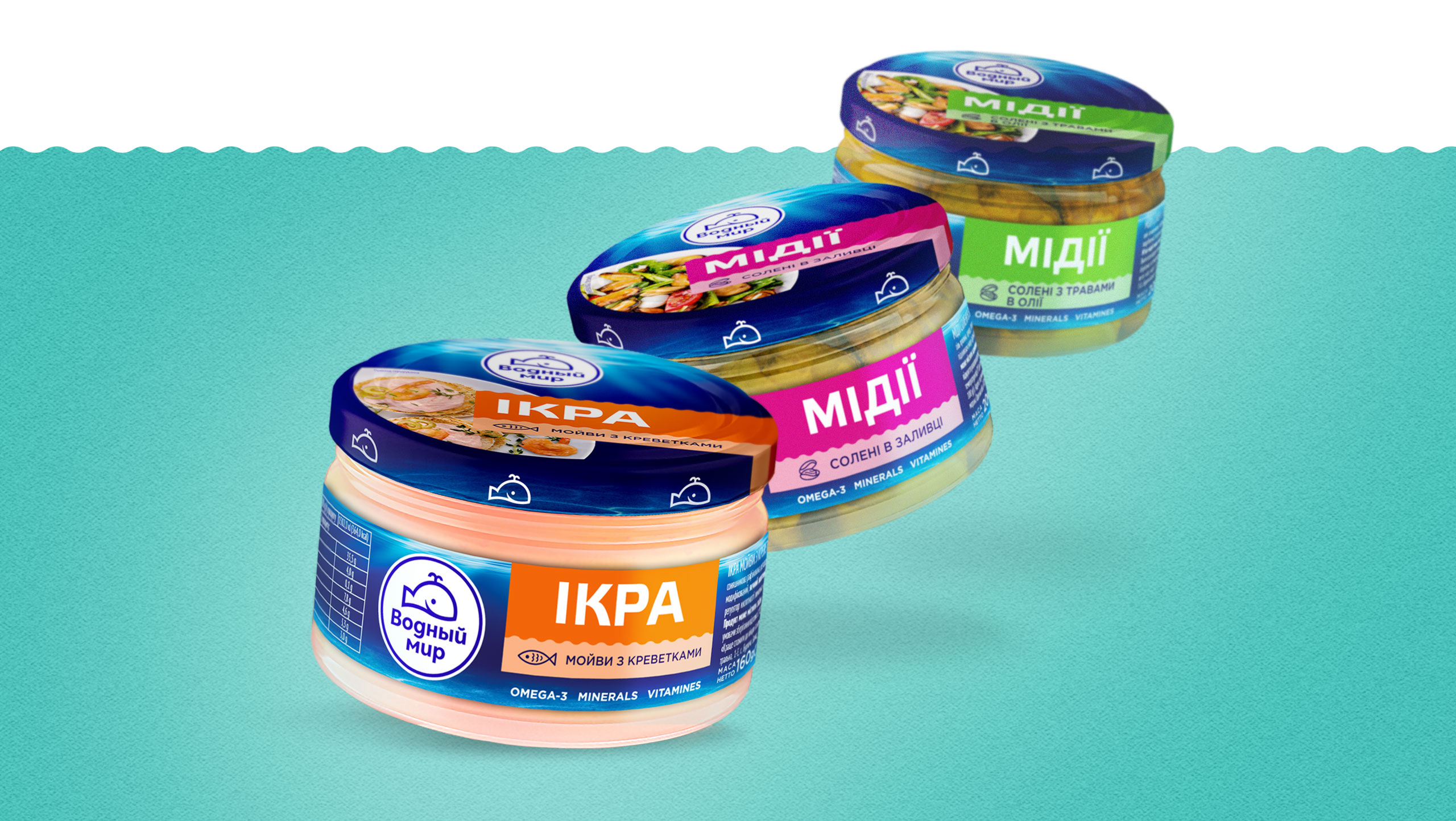
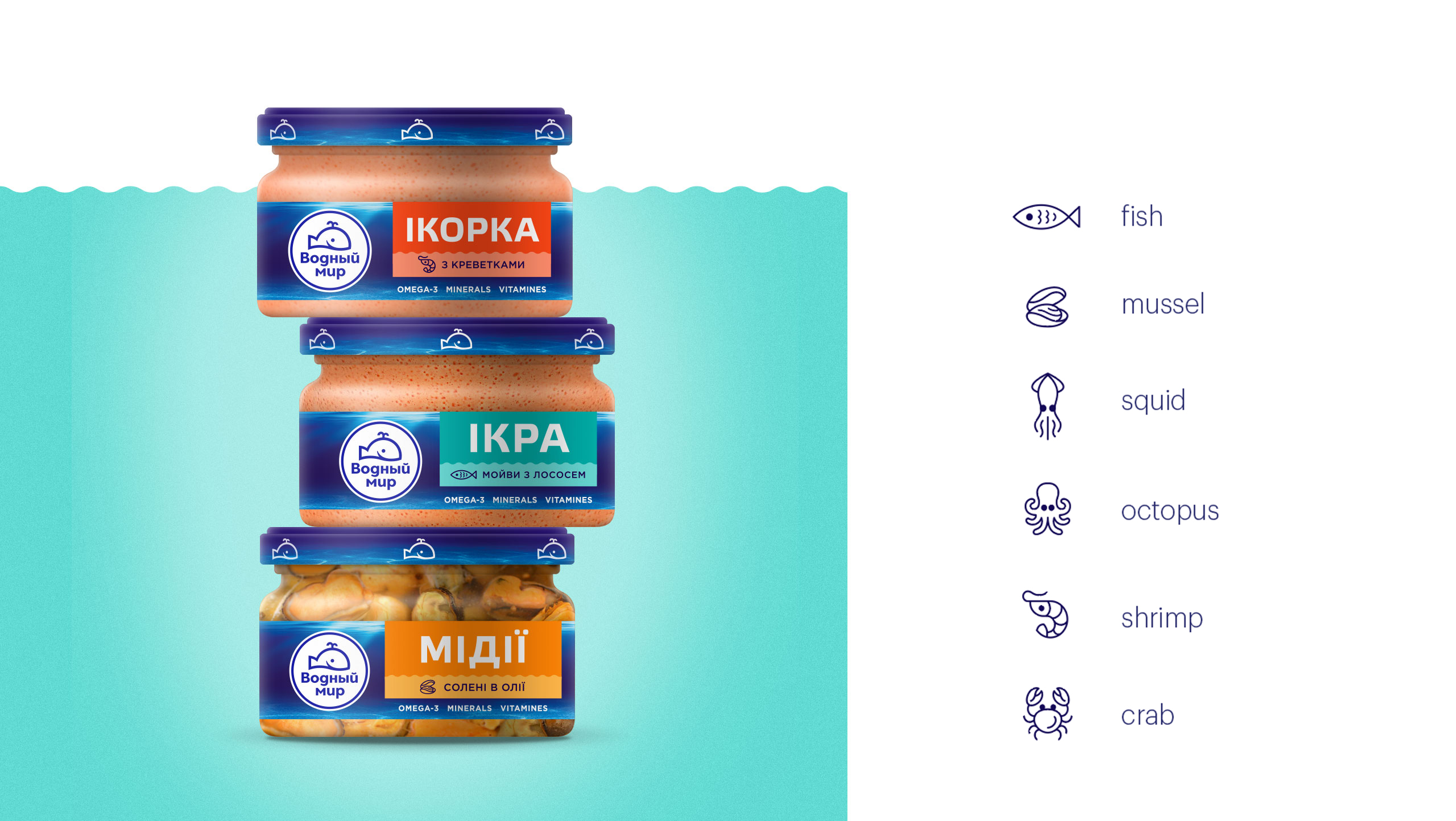
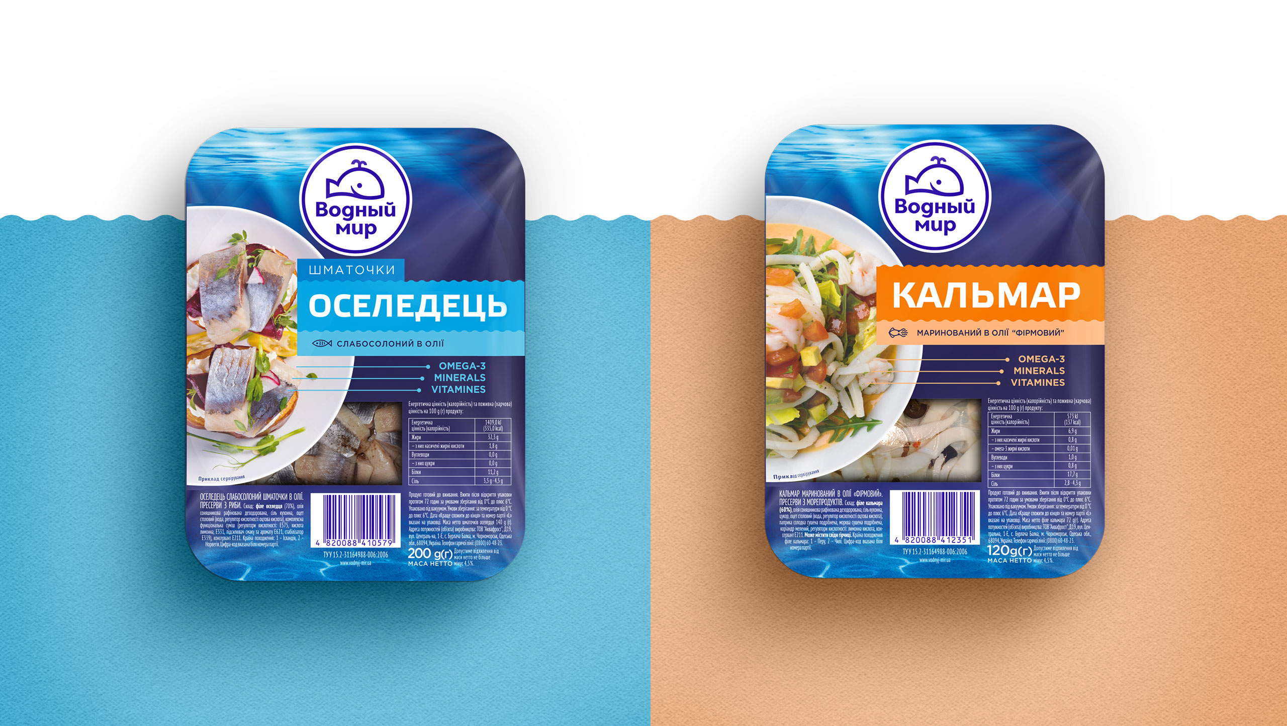
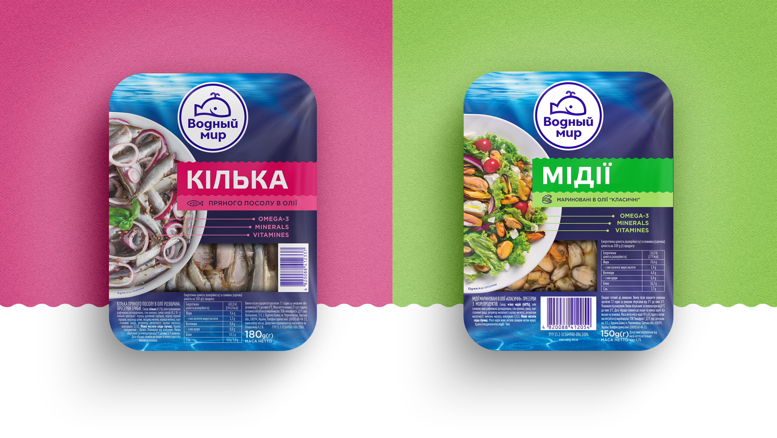
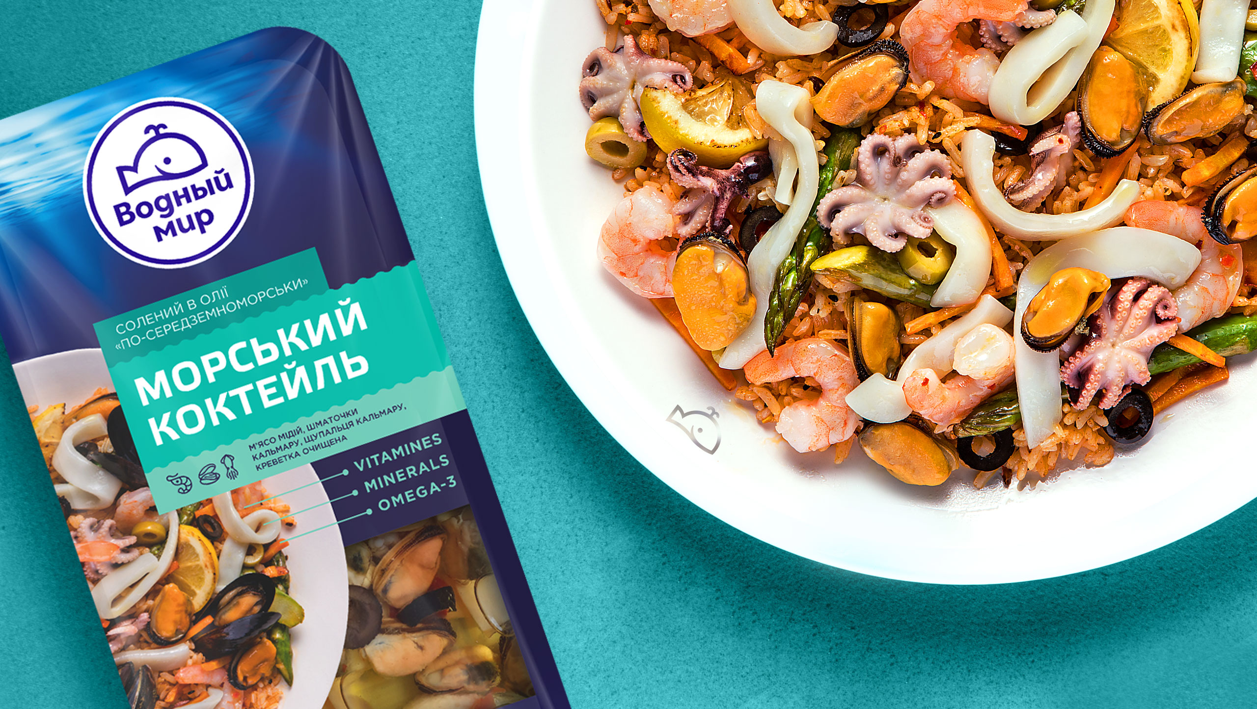
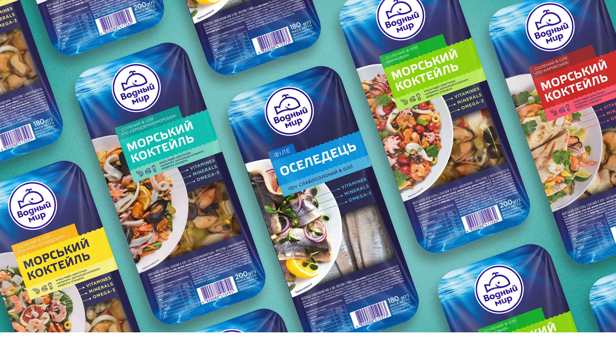
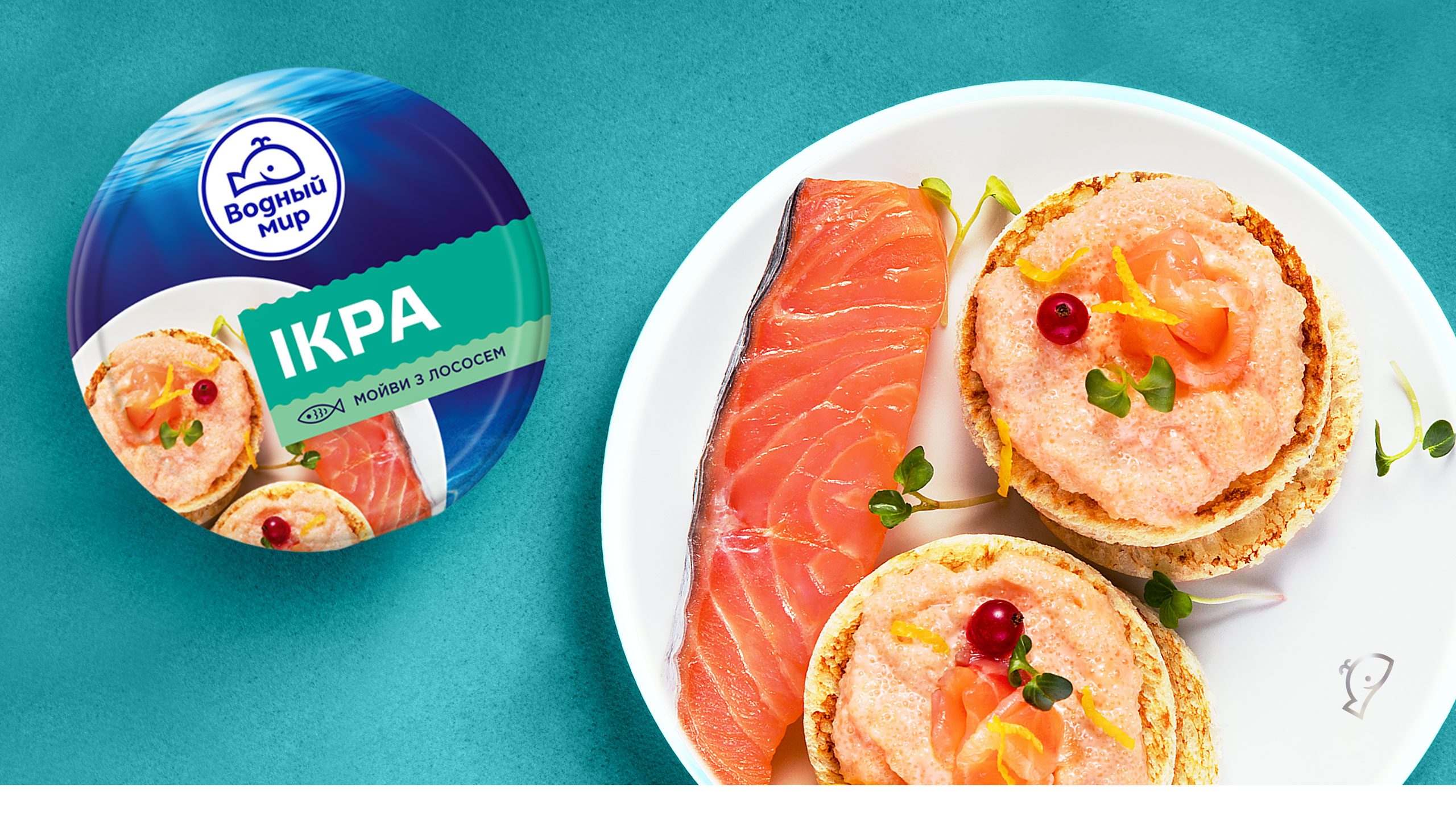
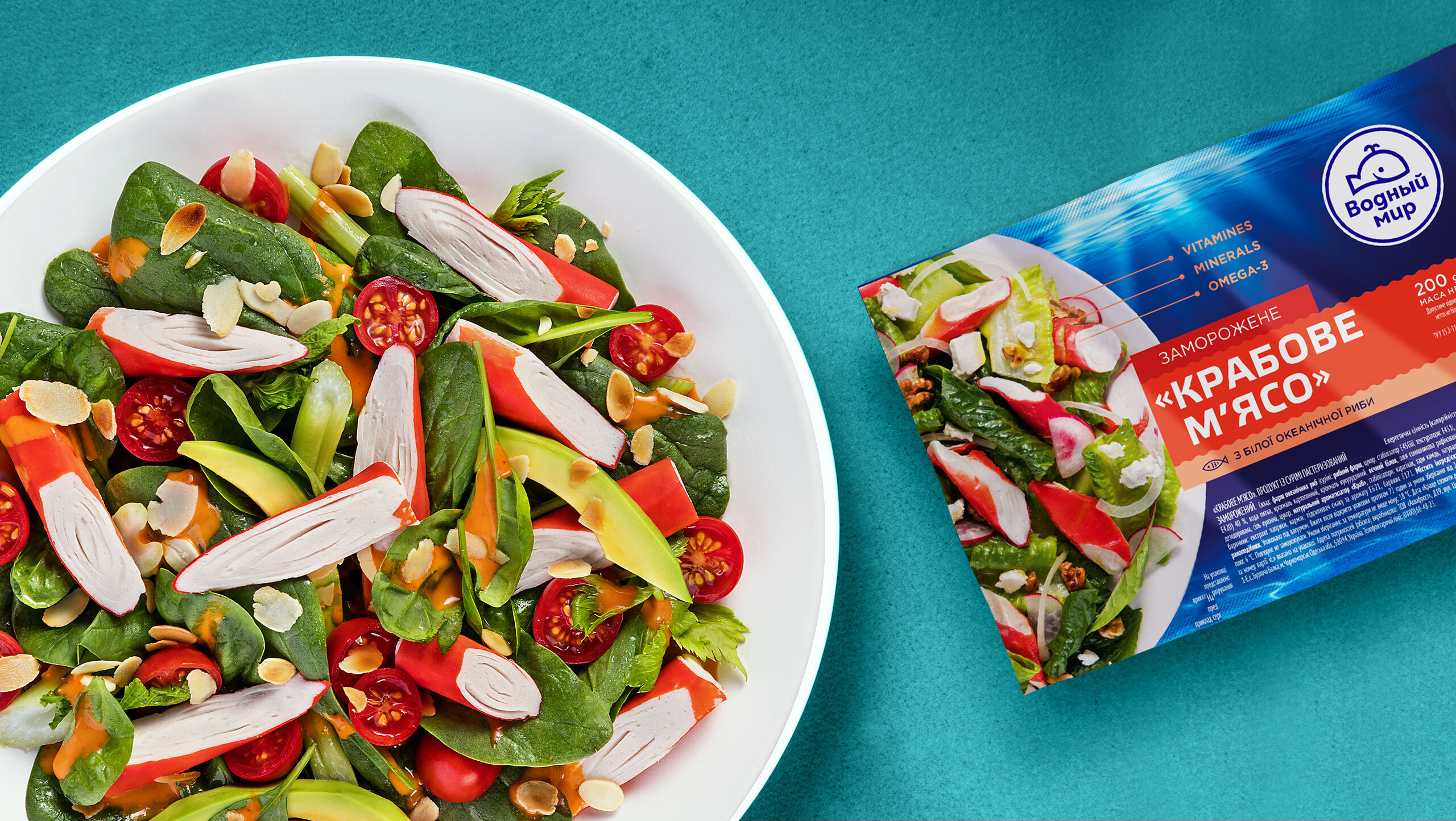
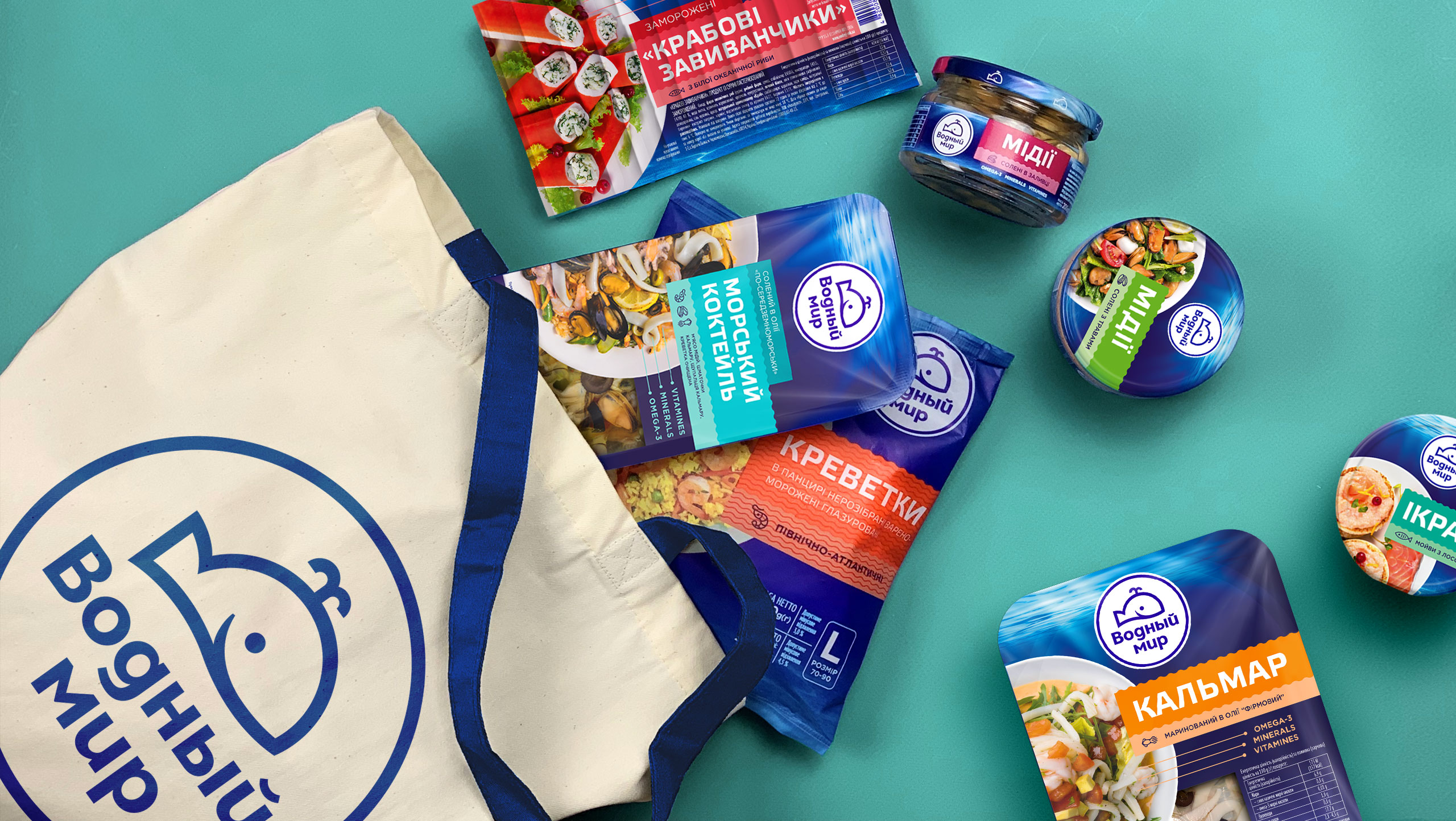
The Sea Favors The Brave and the smiling! The whale, our logo character, became more positive and emotional, thus, more resembling a whale in its proportions, and now has a fountain on the top of its head. The circle enclosing the whale suggests that all these sea delicacies can end up in your plate. In such a way, a plate with sophisticated seafood dishes became central to the package design. From the sun-lit sea to each family table. Vodnyi Mir is integral, bright, renewed, filling supermarket racks with its waves and acquainting the consumers with tasty and healthy seafood dishes on the website pages. So grab your nets and go for benefits from the sea every day!
CREDIT
- Agency/Creative: Dozen Agency
- Article Title: Vodnyi Mir New Packaging Design
- Organisation/Entity: Agency, Published Commercial Design
- Project Type: Packaging
- Agency/Creative Country: Ukraine
- Market Region: Europe
- Project Deliverables: Brand Advertising, Brand Refinement, Brand Strategy, Branding, Graphic Design, Packaging Design, Research, Tone of Voice
- Format: Box, Jar, Wrap
- Substrate: Glass Jar, Plastic, Pulp Paper


