Our daily life has become more complex, we have little time and that is why we look for allies who simplify our lives so we can dedicate ourselves to what is really important.
We know that good and efficient does not necessarily have to be complicated. It’s time to start focusing on what truly matters: those simple things that do us good.
A hug, a caress, a pamper, the motivation to share with those you love. That’s so small and big at the same time. A new type of care arrives, one that is simpler and more effective. Far from confusing proposals, from unnecessary steps, from benefits that are not understood. A care that takes us to the essential because it is simple and honest, and at the same time effective. With all the power of nature’s purest ingredients.
Welcome to a new way of care; simple, that speaks easily, that is understood, that is accessible. That takes care of you, taking care of your loved ones and responsible for the planet. Welcome VN; authentic, genuine, inclusive, realistic, responsible, SIMPLE.
VN, Everything you need and nothing you don’t need…
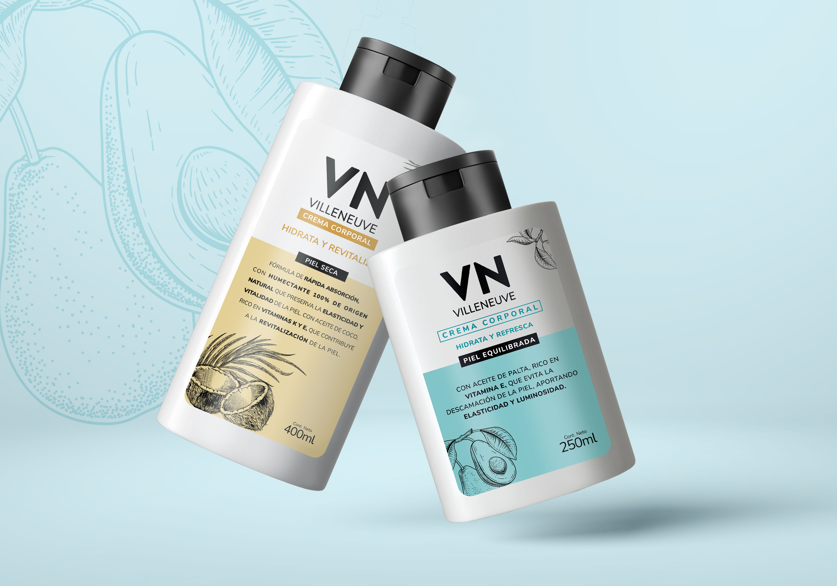
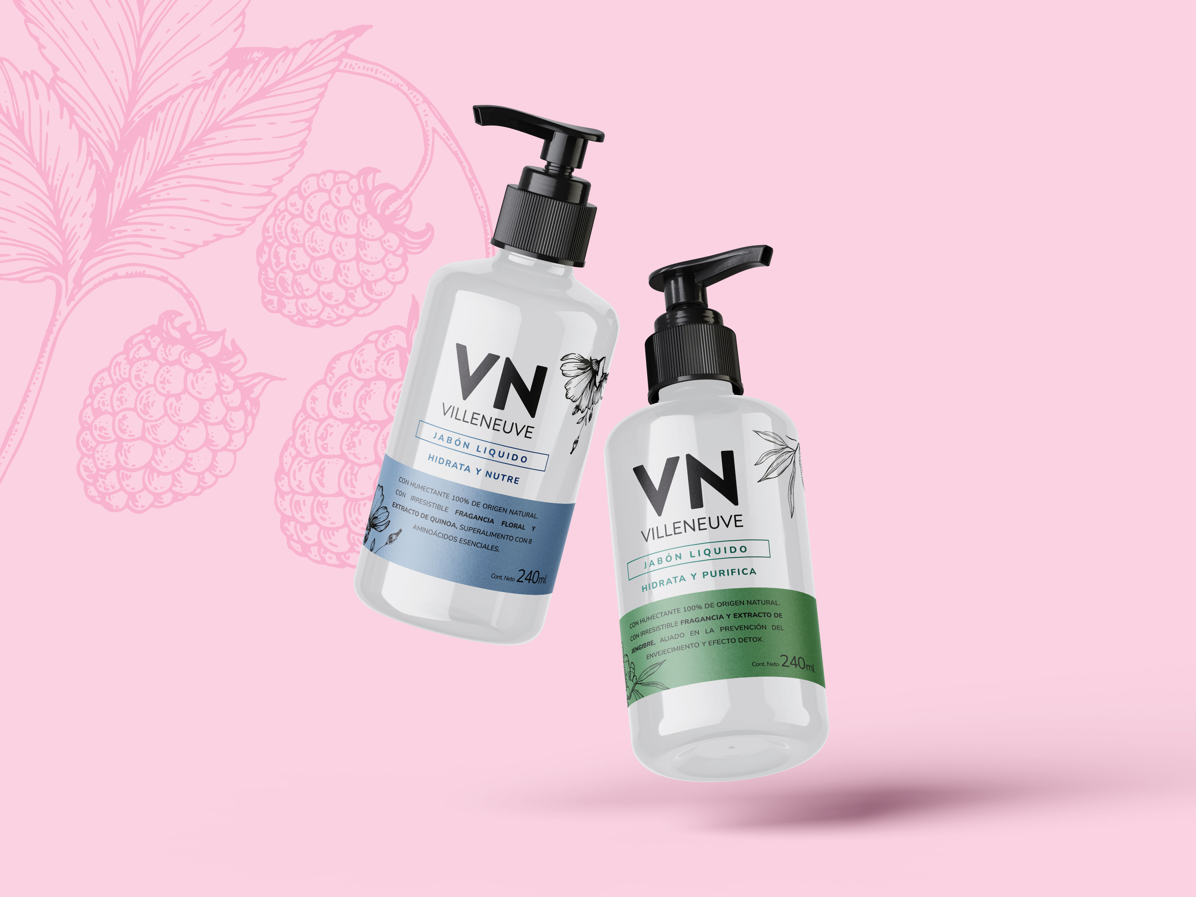
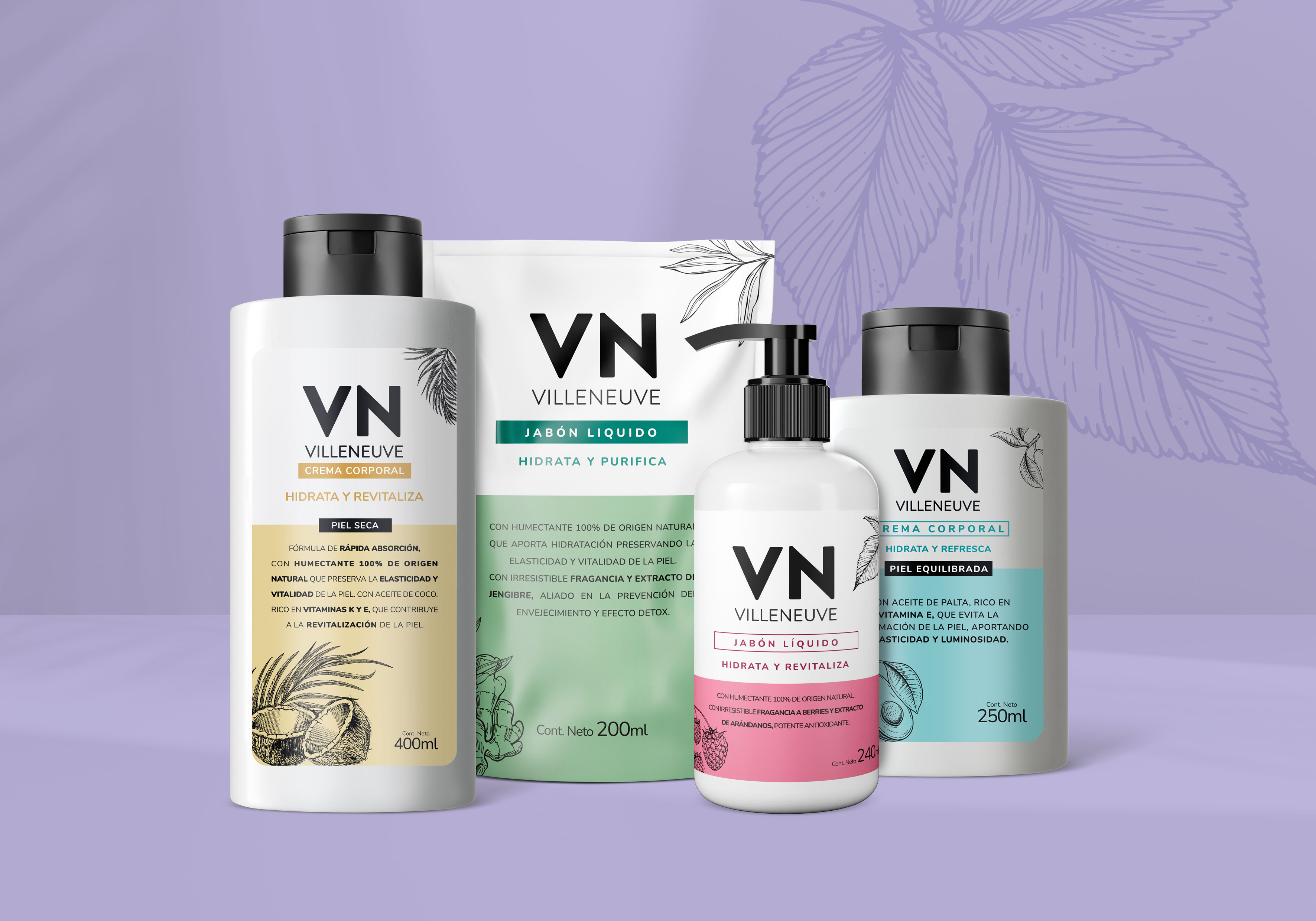
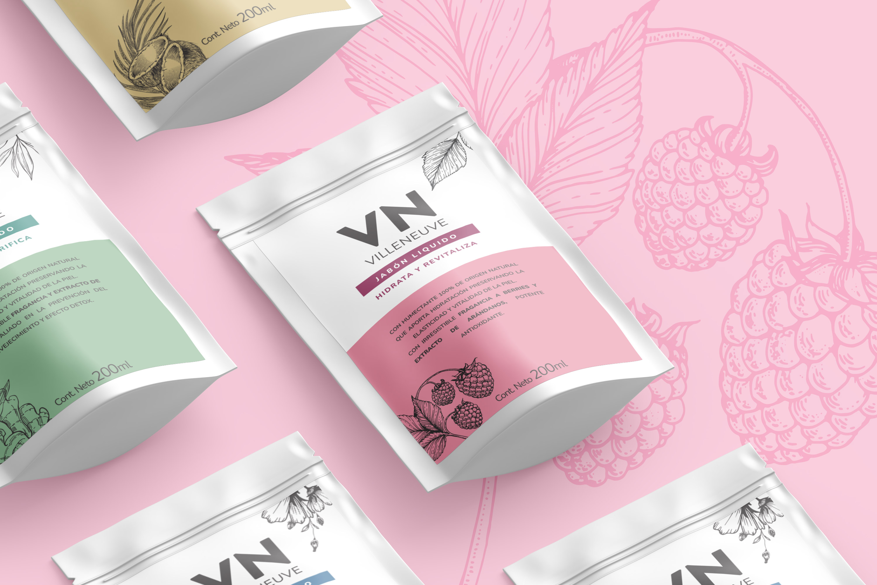
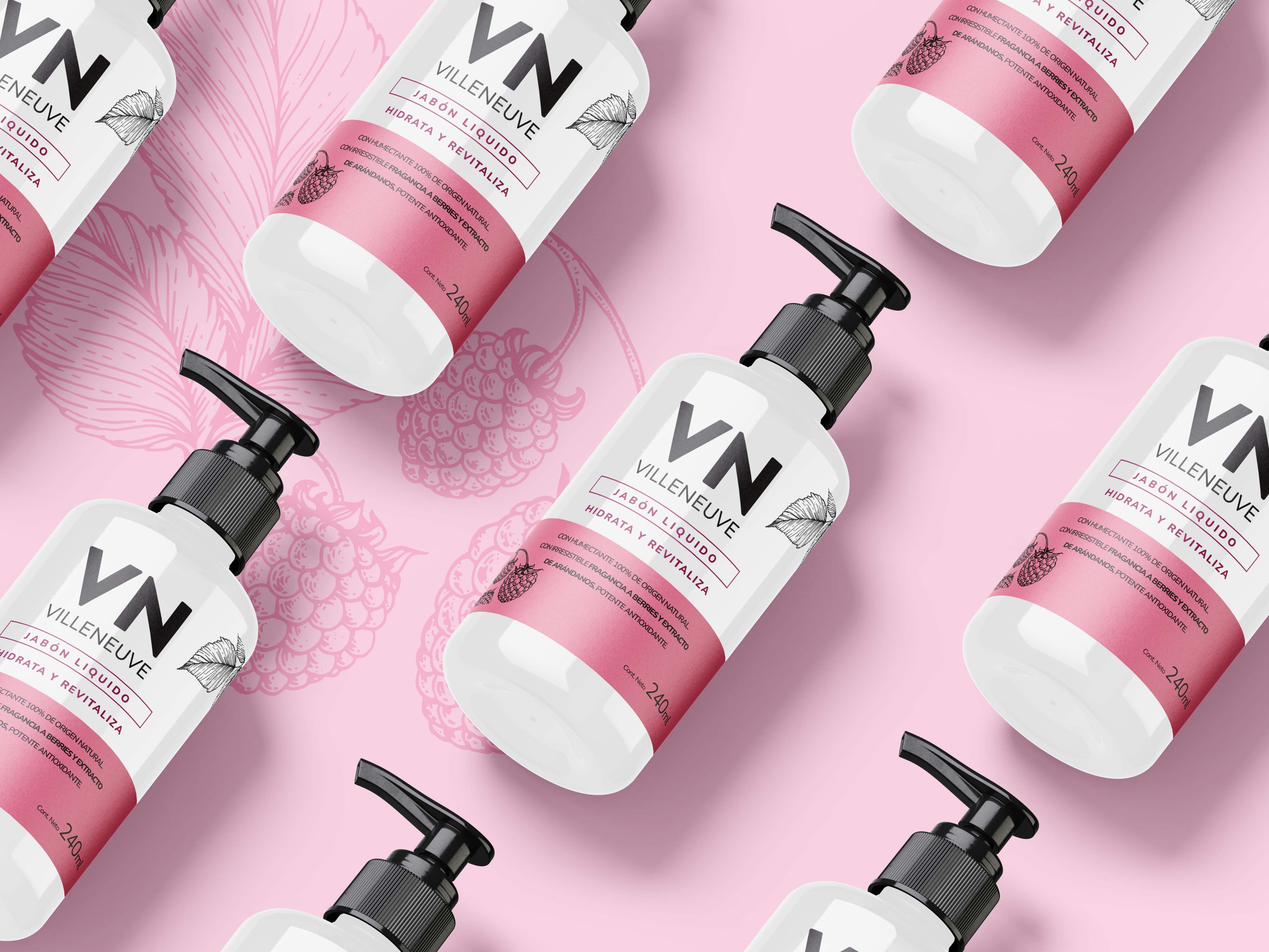
The main objective of this redesign is focused on unifying the aesthetics of the three legs of this brand, which had different aesthetics (creams, sunscreens and soaps).
It is based on having an interesting and current proposal that enhances sensoriality, that is simple in language, proposals and that is accessible.The creativity of these products were based on the idea that your care routine should adapt to your pace of life. We designed each product easy to understand because we believe that no one should have to be a chemist to understand a list of ingredients. A vibrant pastel color palette was used, accompanied by botanical illustrations that enhance the packaging.
We make it EASY so that anyone can practice a SIMPLE skin care routine, awakening sensoriality with soft fragrances, formulas enriched with noble ingredients and beautiful textures.
CREDIT
- Agency/Creative: Godrej Argentina
- Article Title: VN Brand Redesign, Naming and Graphic Unification of the Entire Line
- Organisation/Entity: In-House
- Project Type: Packaging
- Project Status: Published
- Agency/Creative Country: Argentina
- Agency/Creative City: Capital Federal
- Market Region: South America
- Project Deliverables: Label Design
- Format: Bottle
- Industry: Beauty/Cosmetics
- Keywords: Hand Soap and Body Cream


