


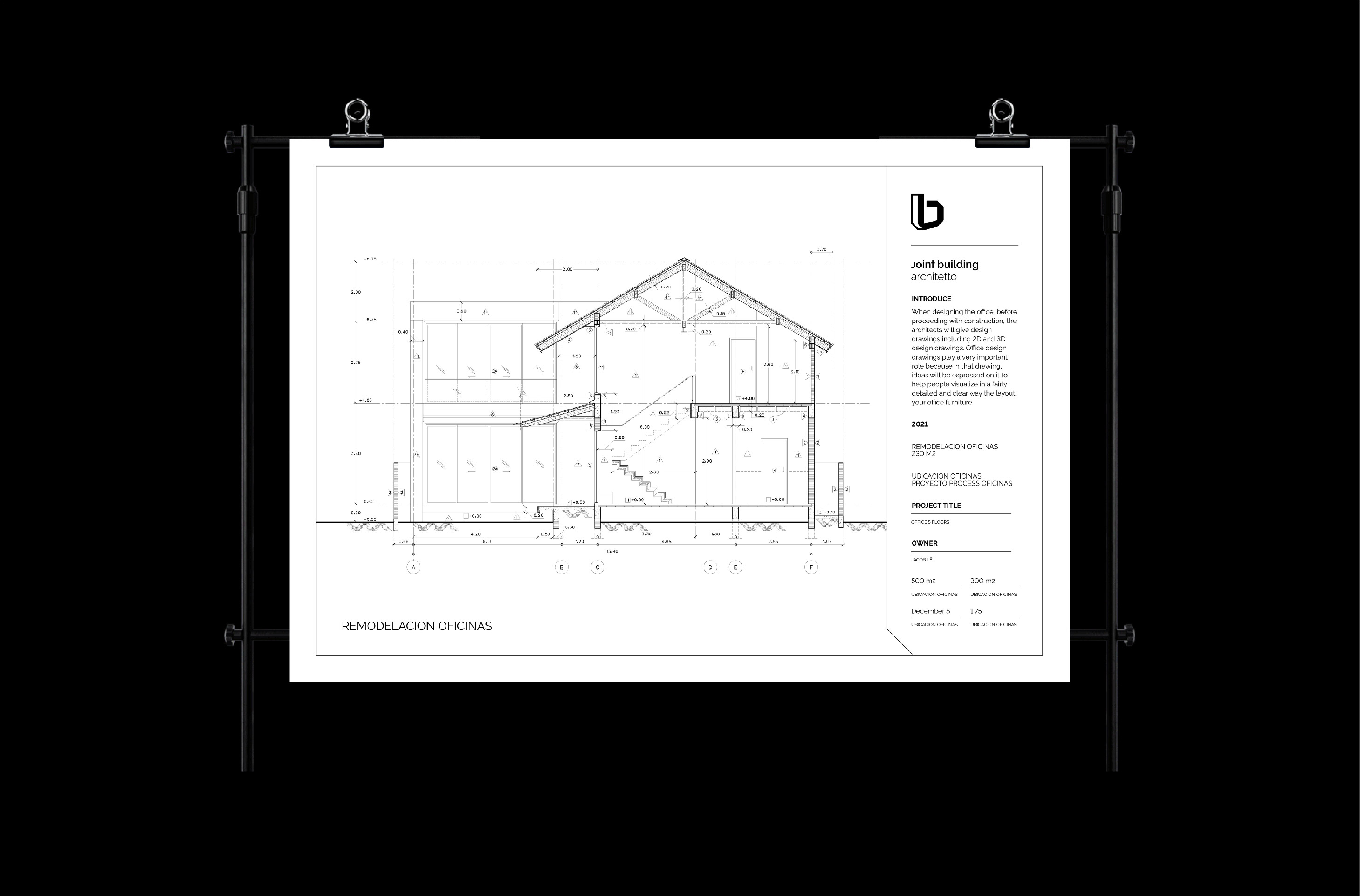
Interior design of apartments, villas, offices.
Scope of Work: Logo & Visual Identity
Joint Building Architetto is a dedicated partner for living spaces and construction works in particular to meet future social-related requirements. Emphasis is placed on the quality, strength, sustainability and reliability of the plan. Build with added values - Joint Building Architetto builds living space.
Joint Building – Design & Build
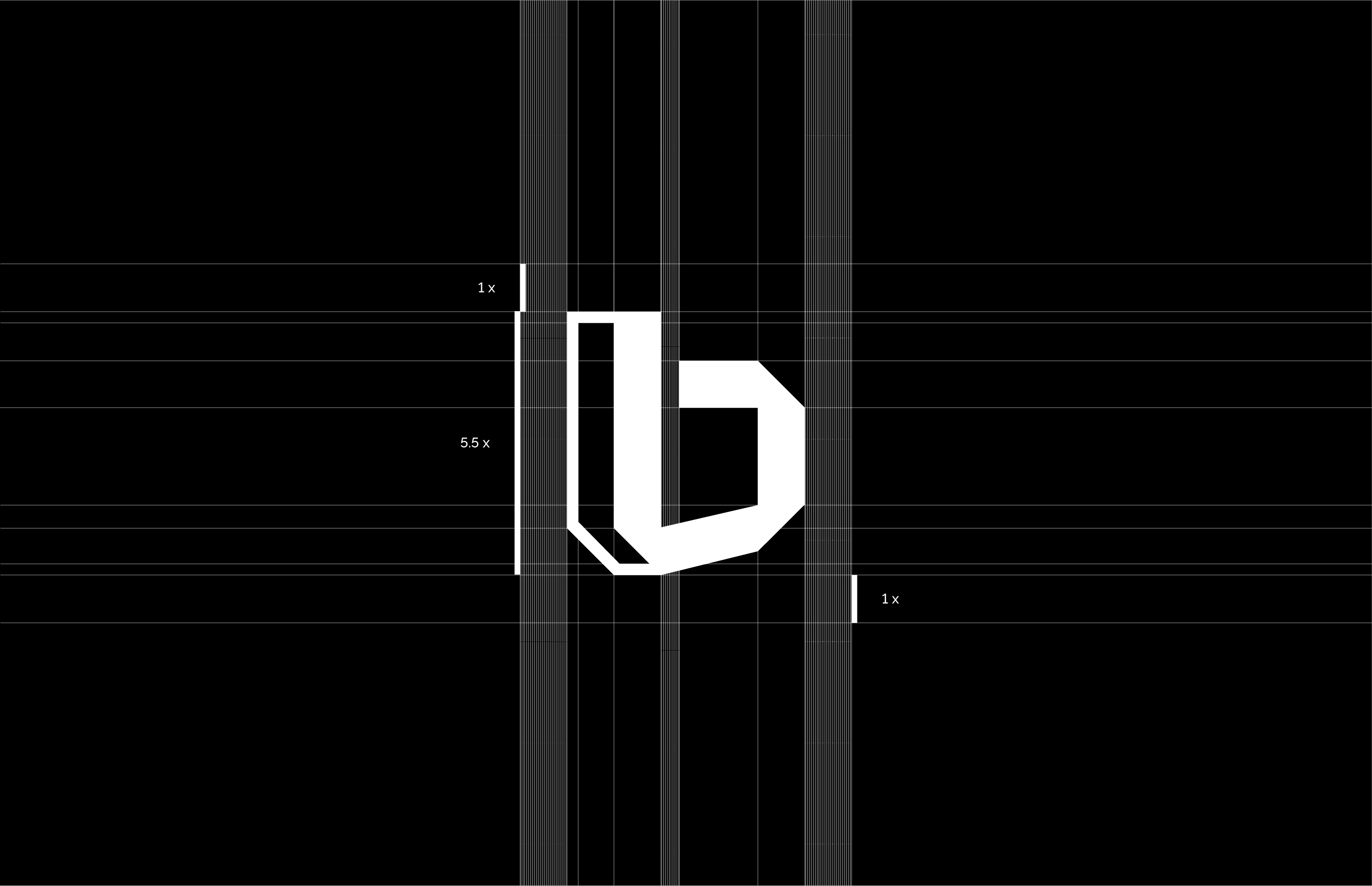
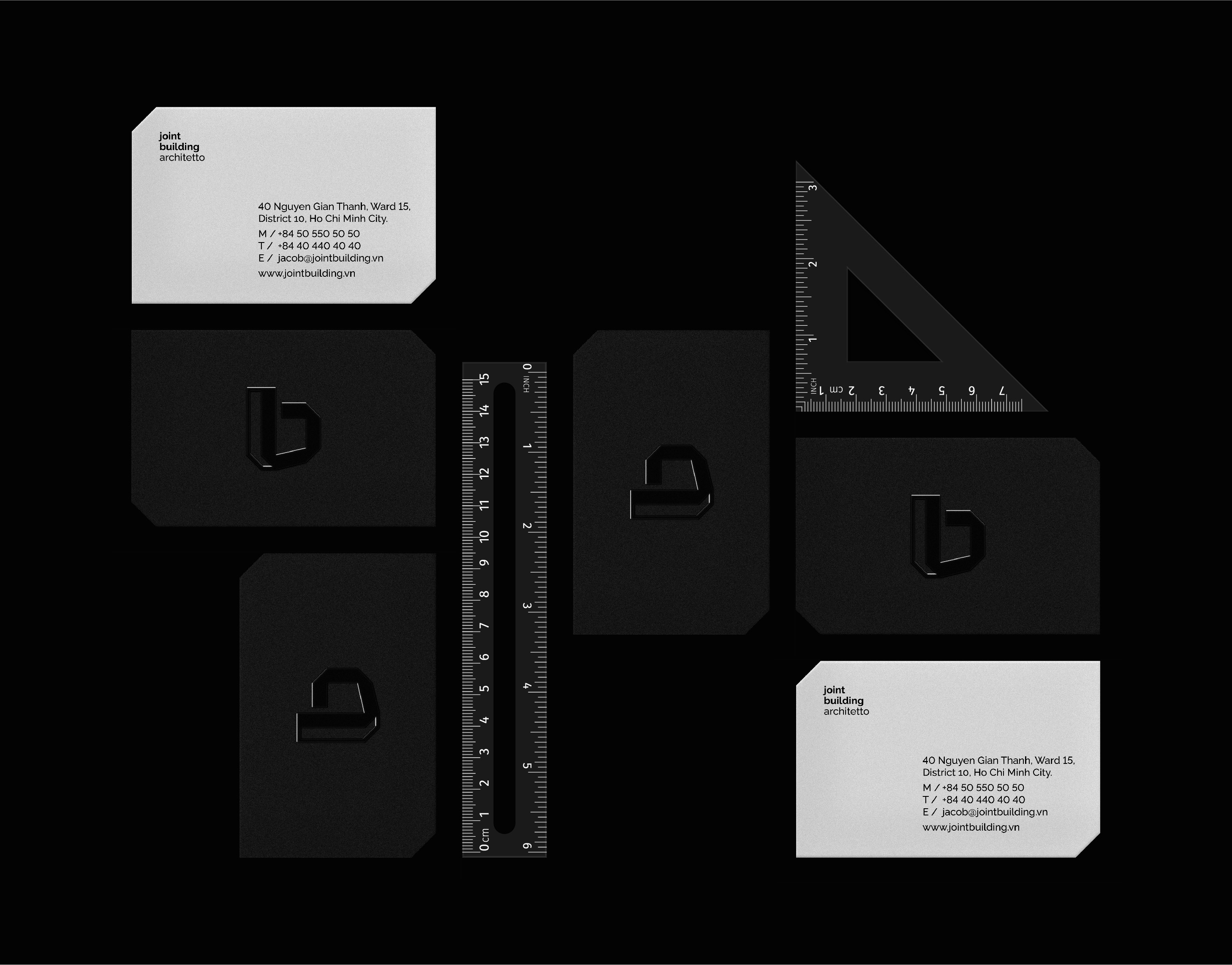
Our approach was to create a timeless and clean look and feel. The logo represents the pillars of architecture according to architect; it is also also an abstract monogram of their (b) building.
Our task is to build a bold, minimal and refined brand identity that reflects the values and philosophy of Joint Building based on the thorough research of architecture principles, structures and materials.
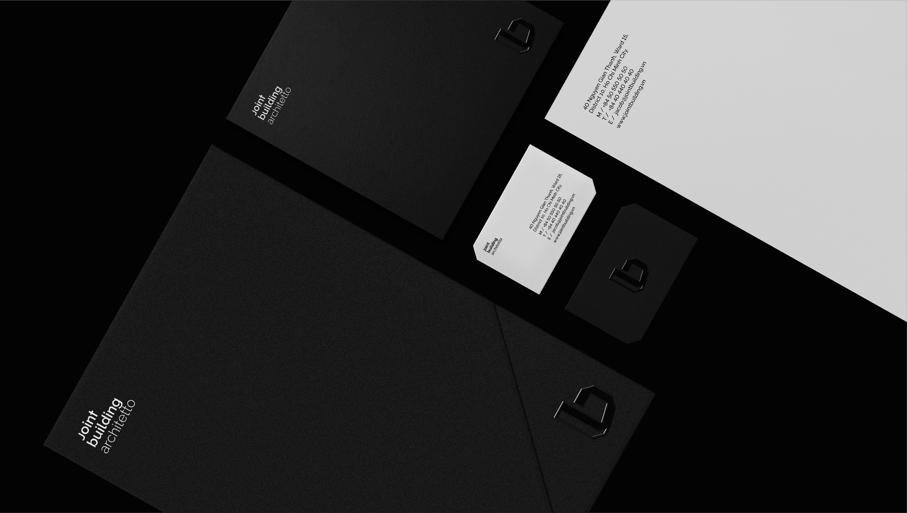
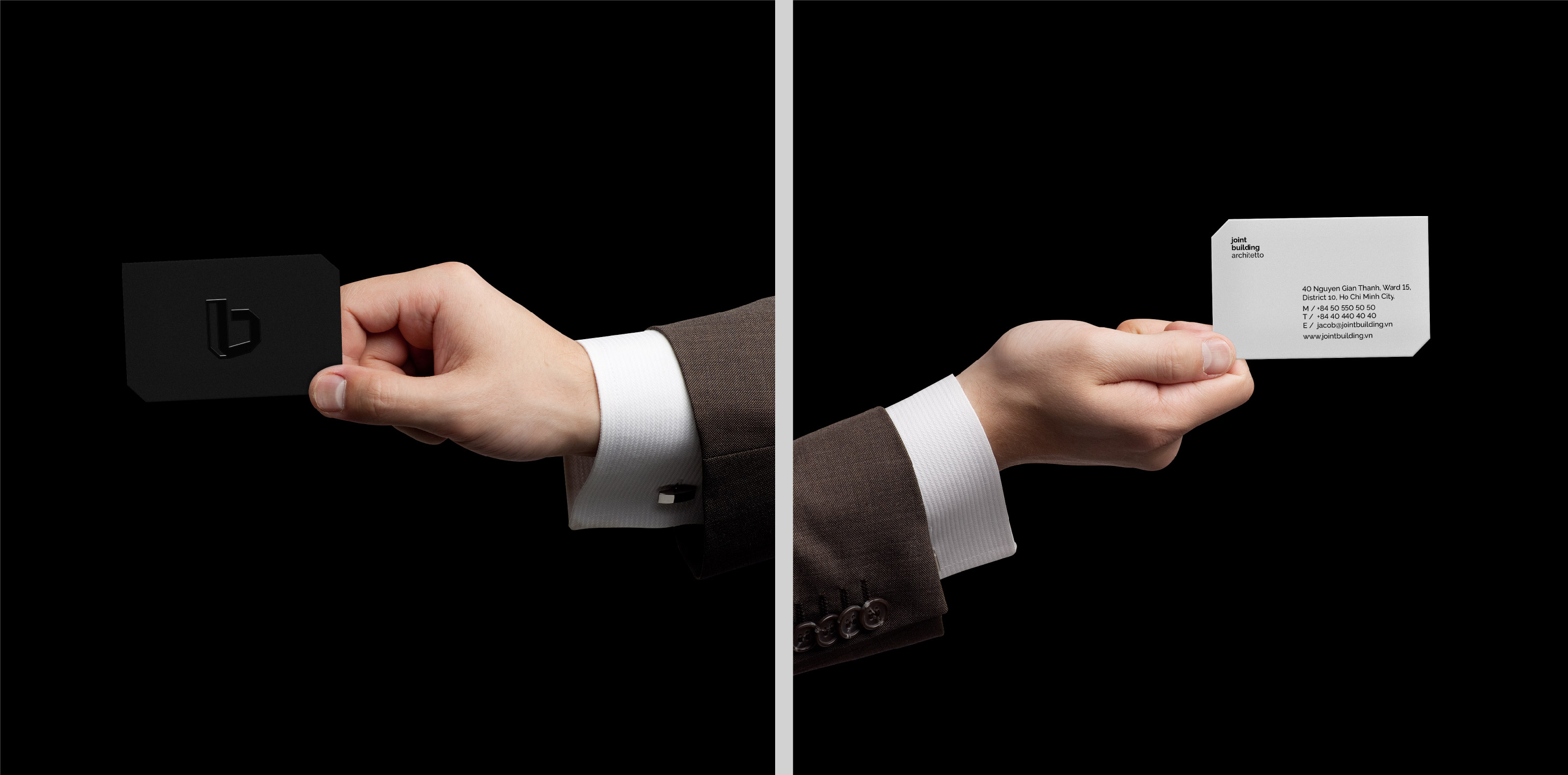
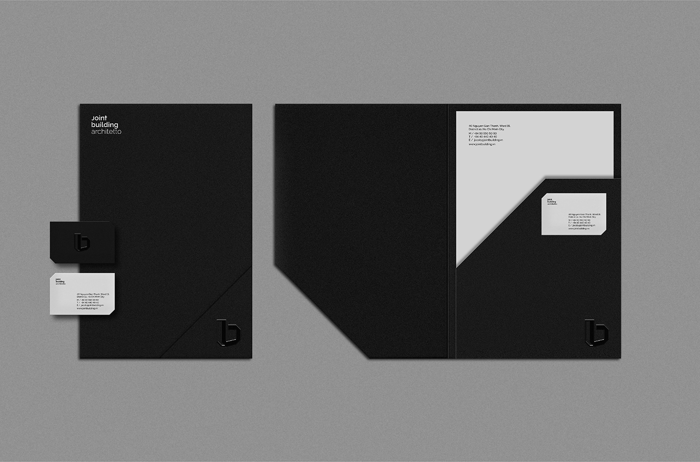
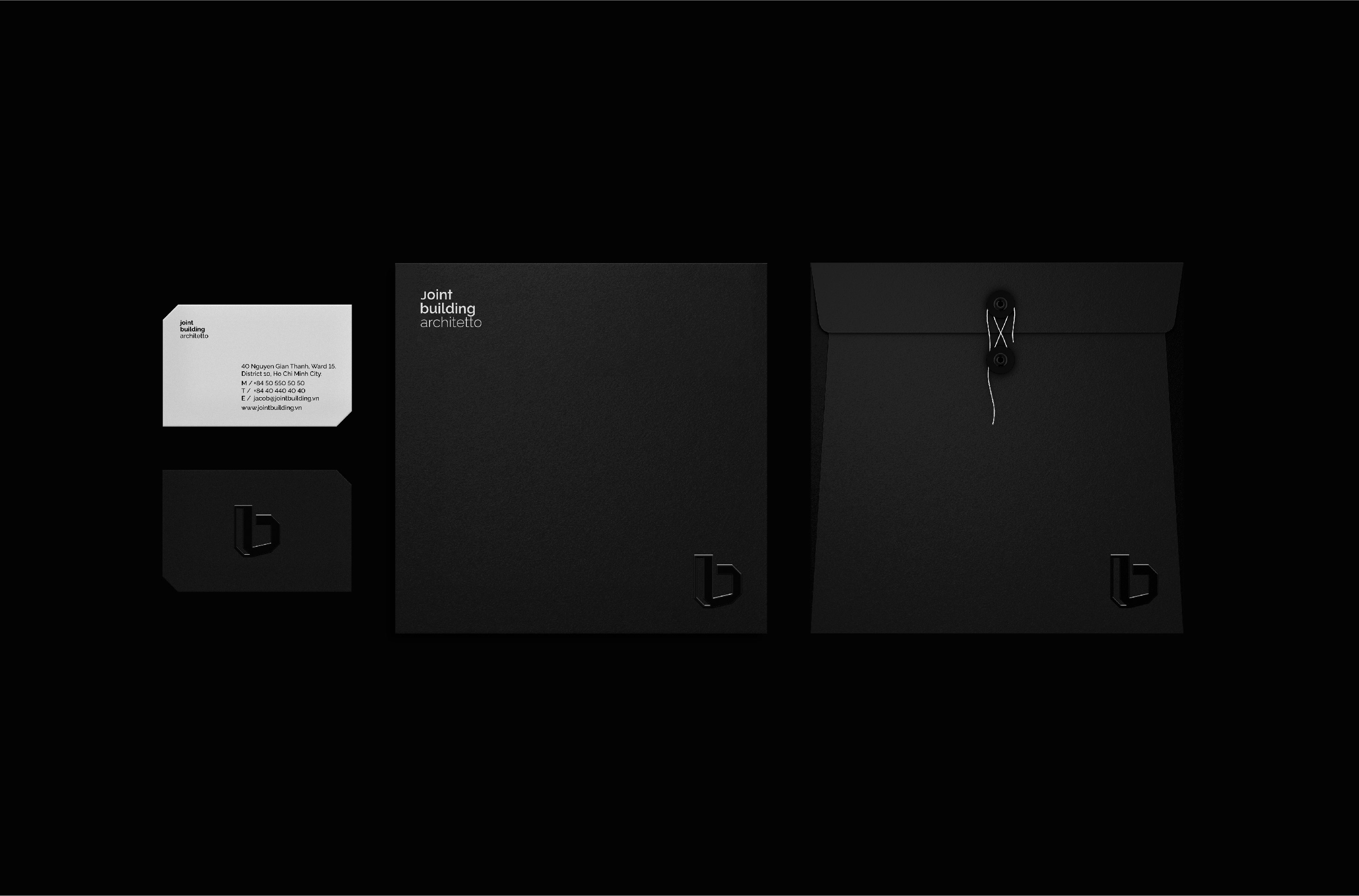
Die cuts are made subtly in name card, folders and some other stationaries, giving the emotive high-quality sense of finishing and more than that a playful interaction for the elements in connection with each other.
Grid Systems
Continuing with the inspiration behind the logo and typeface, the natural progression was to carry this through into the unique grid systems for print and digital. Using a simple square grid format, we use a combination of vertical and horizontal lines to frame the content in a unique and engaging way, maintain a premium-edge and overarching architectural feel to the content.
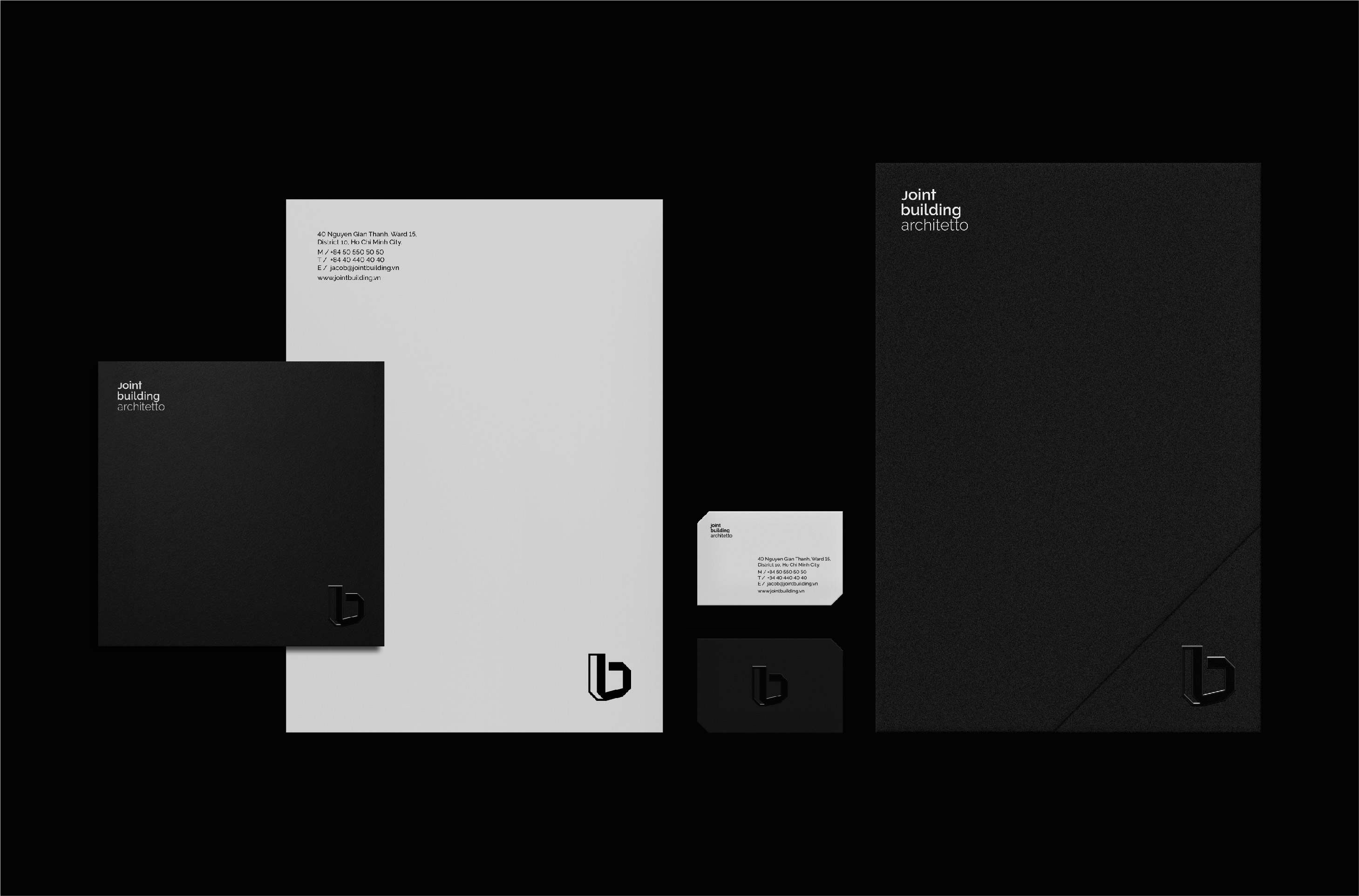
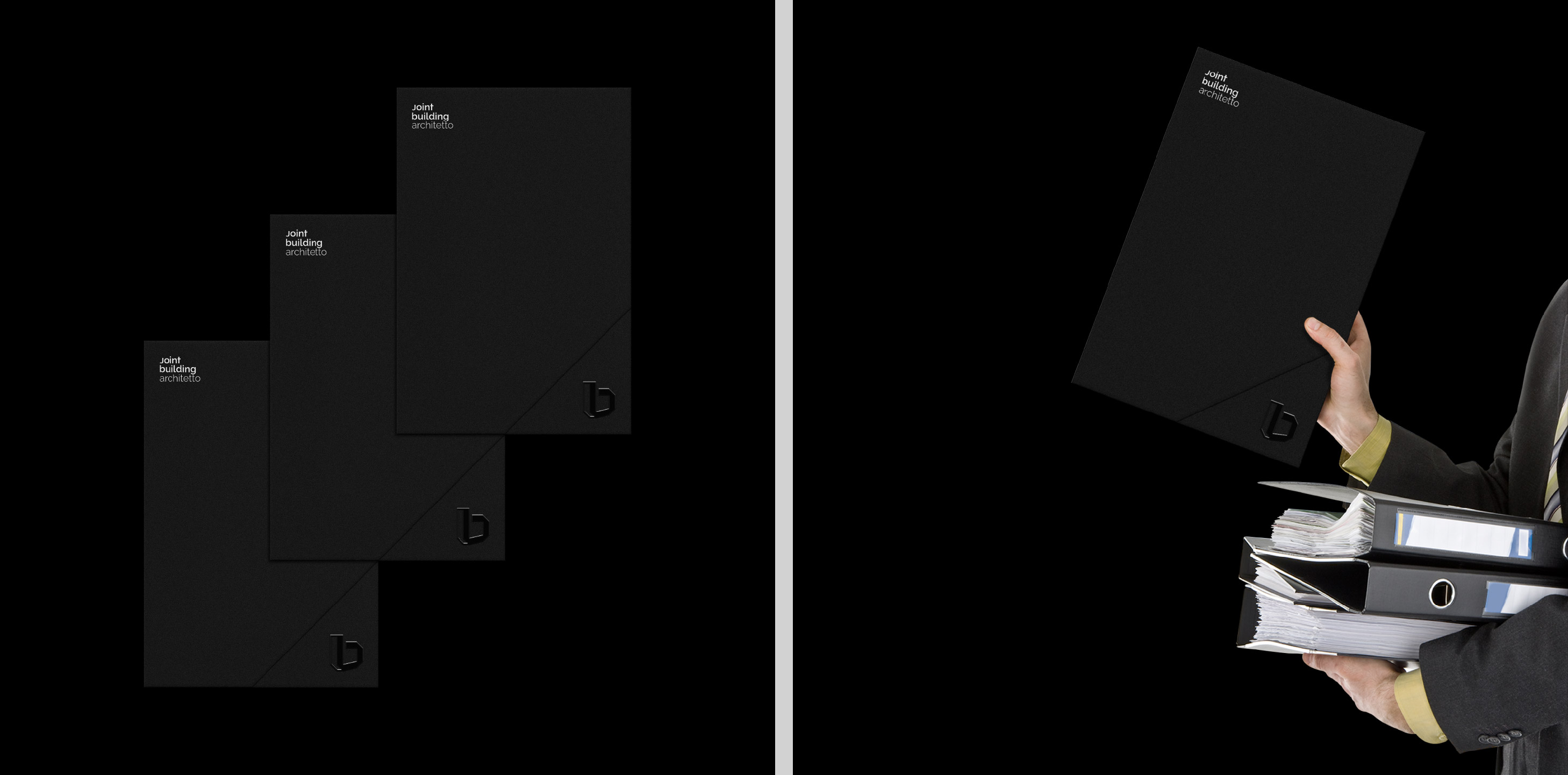
One key that can provide a brand launch is a package of product samples sent out to architects and designers. Using a monotone black and white color scheme, with a combination of high-quality materials, we have created pre-ordered office publications with a focus on enjoyable experiences.
Furthermore, the brand name draws a unique characters on the canvas of visual identity. Post and beams tells the story of architectural expression, function and universality. These components connection and architectural themes continues throughout the matt and uncoated paper choice, distinctive type, bold colors and the print finish.
“Vivian have been very proactive in their approach and meeting deadlines without any compromises on creativity and output. Despite our products and industry being out of their usual line of work, their quick understanding and interpretation was commendable. We are extremely happy we chose Vivian and would do so again.”
Ly Bang, CEO, Joint Building Architetto
CREDIT
- Agency/Creative: Vivian
- Article Title: Vivian – Joint Building Architetto
- Organisation/Entity: Agency
- Project Type: Identity
- Project Status: Published
- Agency/Creative Country: Vietnam
- Agency/Creative City: Ho Chi Minh City
- Market Region: Asia
- Project Deliverables: 2D Design
- Industry: Construction
- Keywords: Architecture
-
Credits:
Art Direction - Design: Jacob Lē


