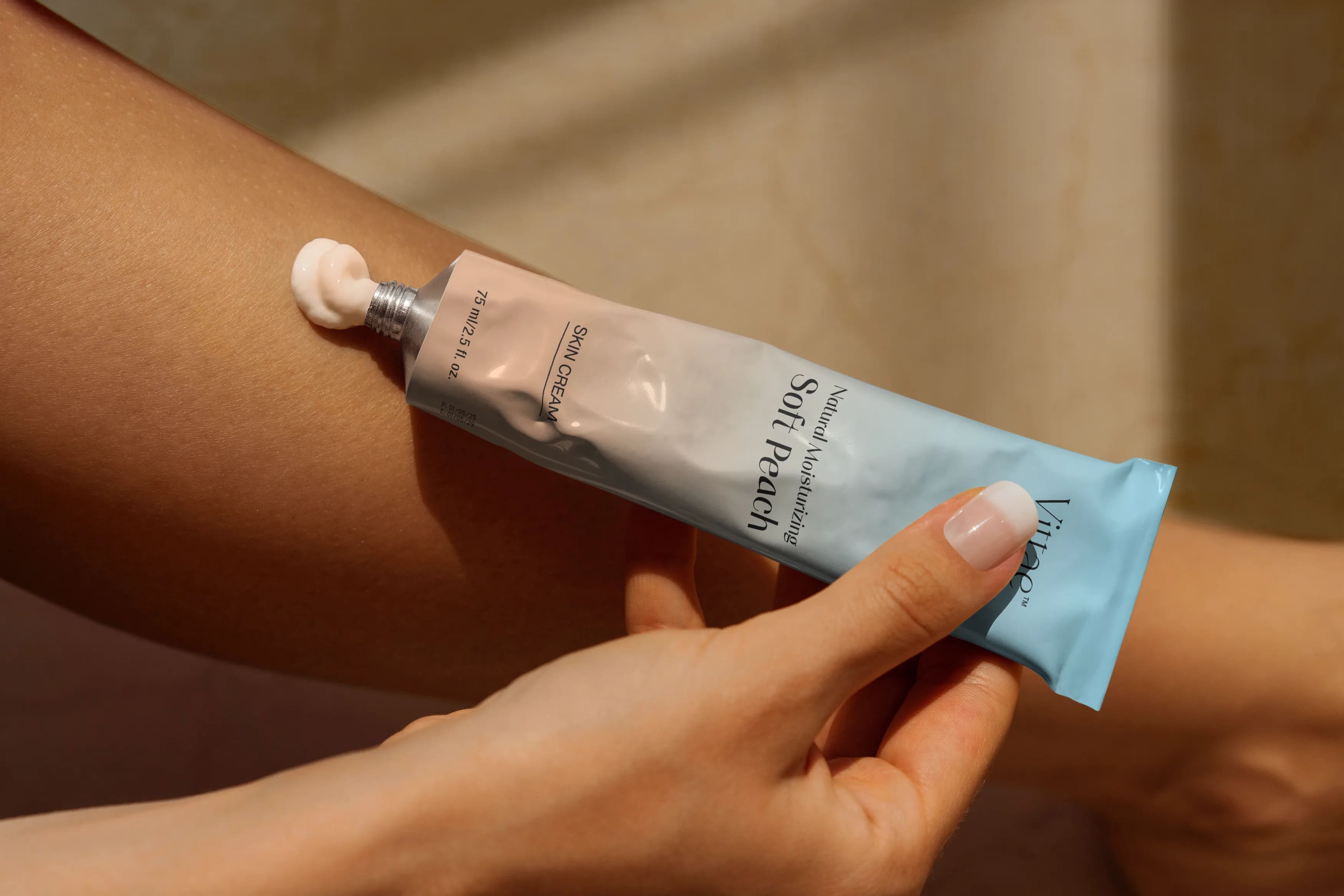
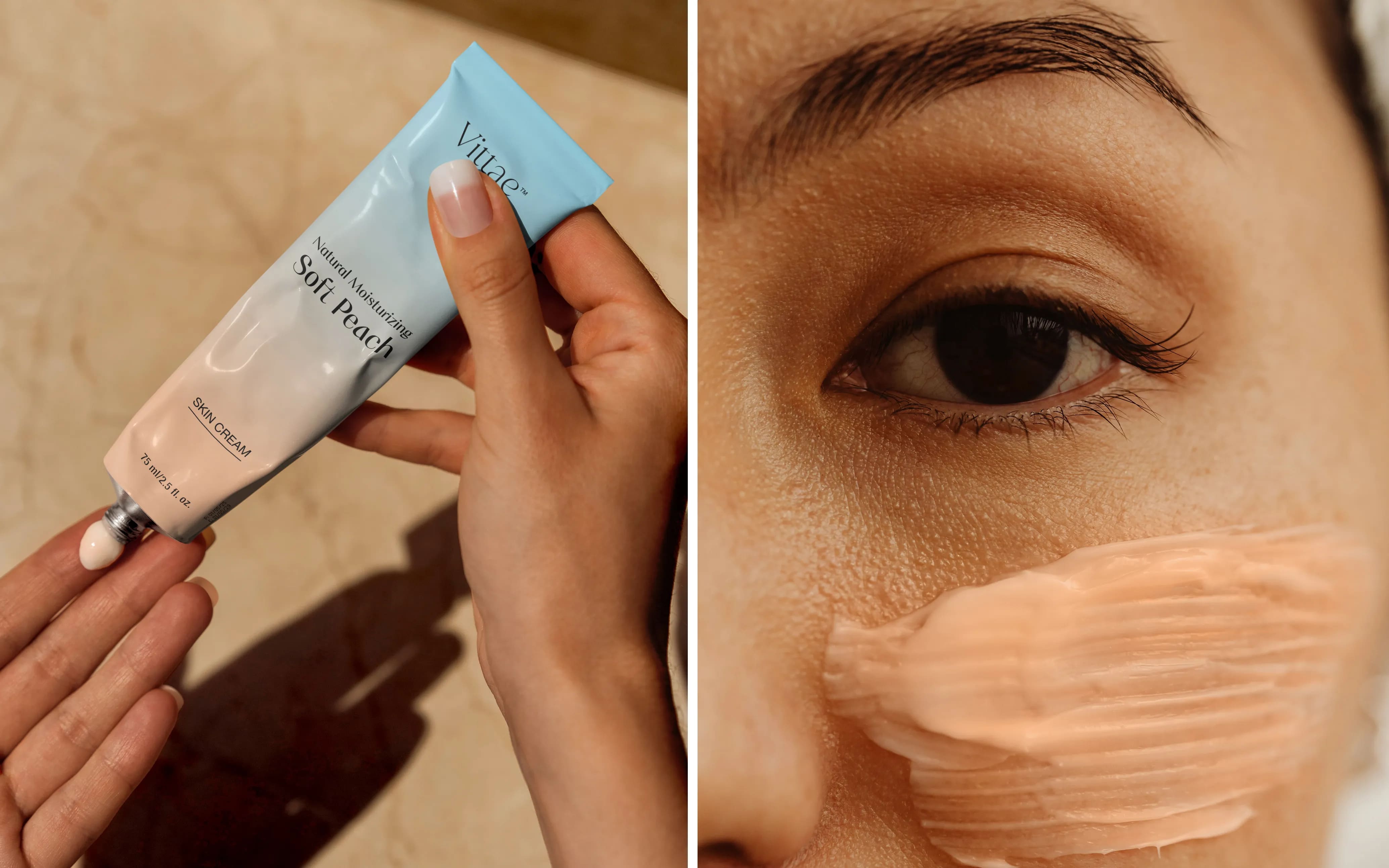
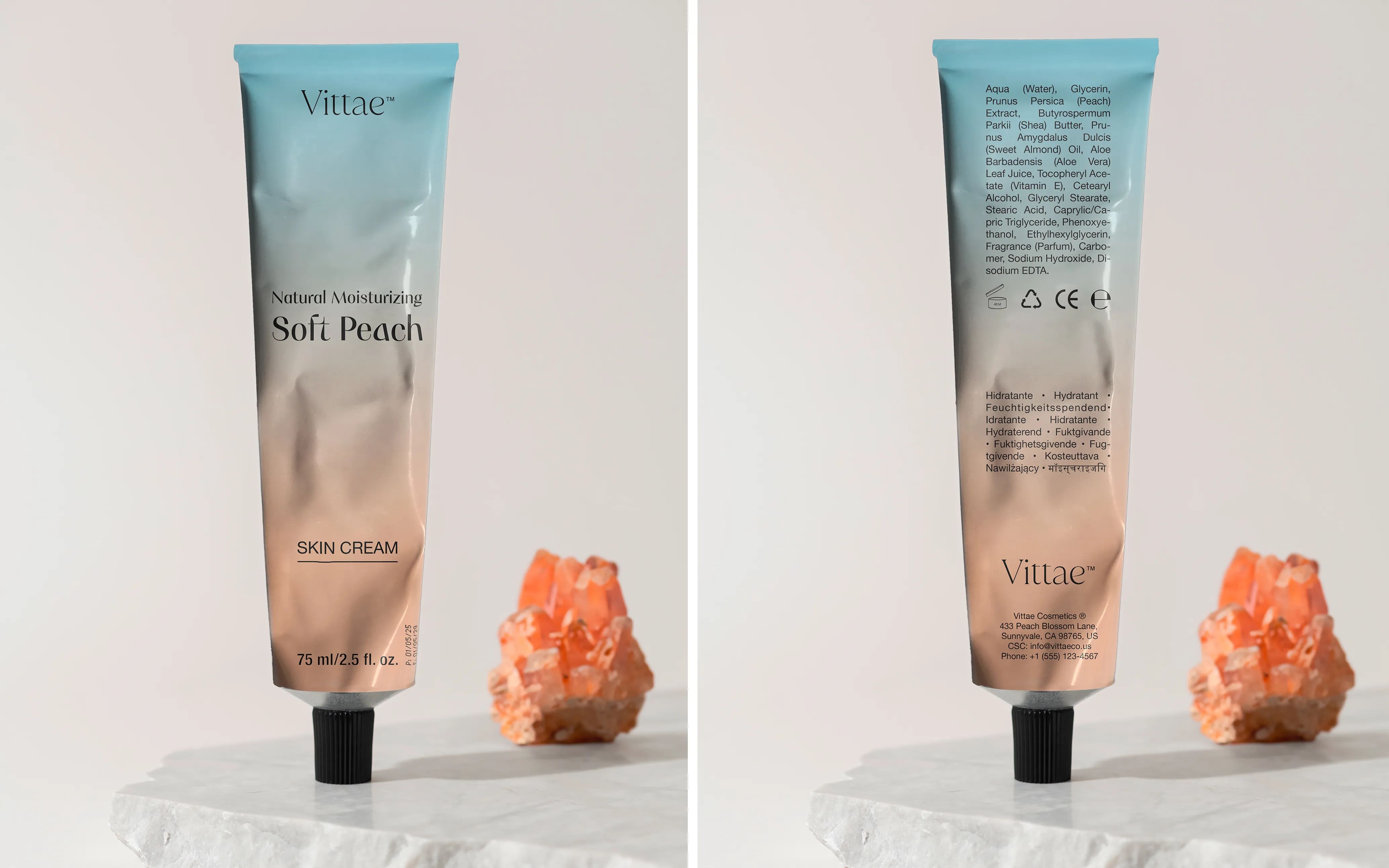
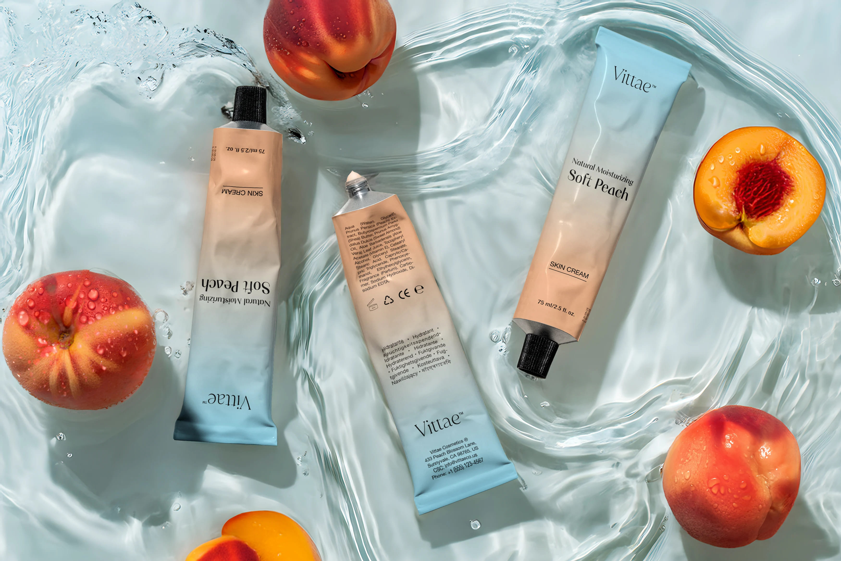
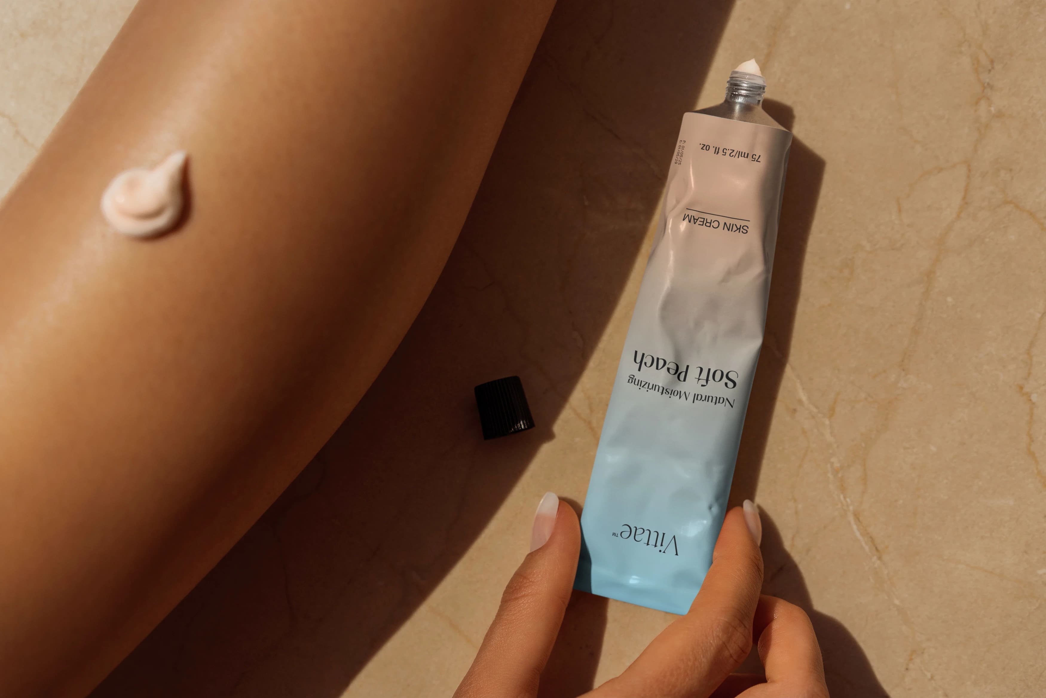
Vittae was born with the clear purpose of elevating the cosmetics segment in a natural way. We developed a moisturizing skin cream with a creamy peach touch, promising to leave the skin with a velvety texture, similar to that of the peach itself.
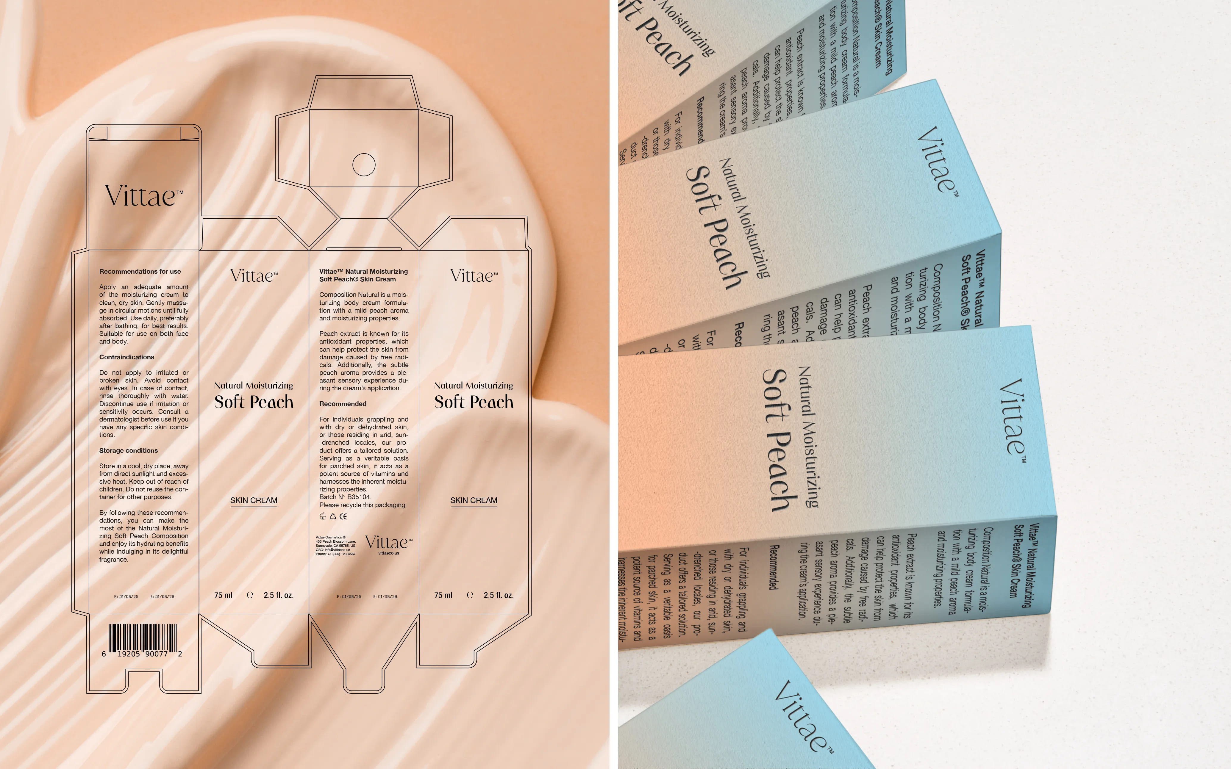
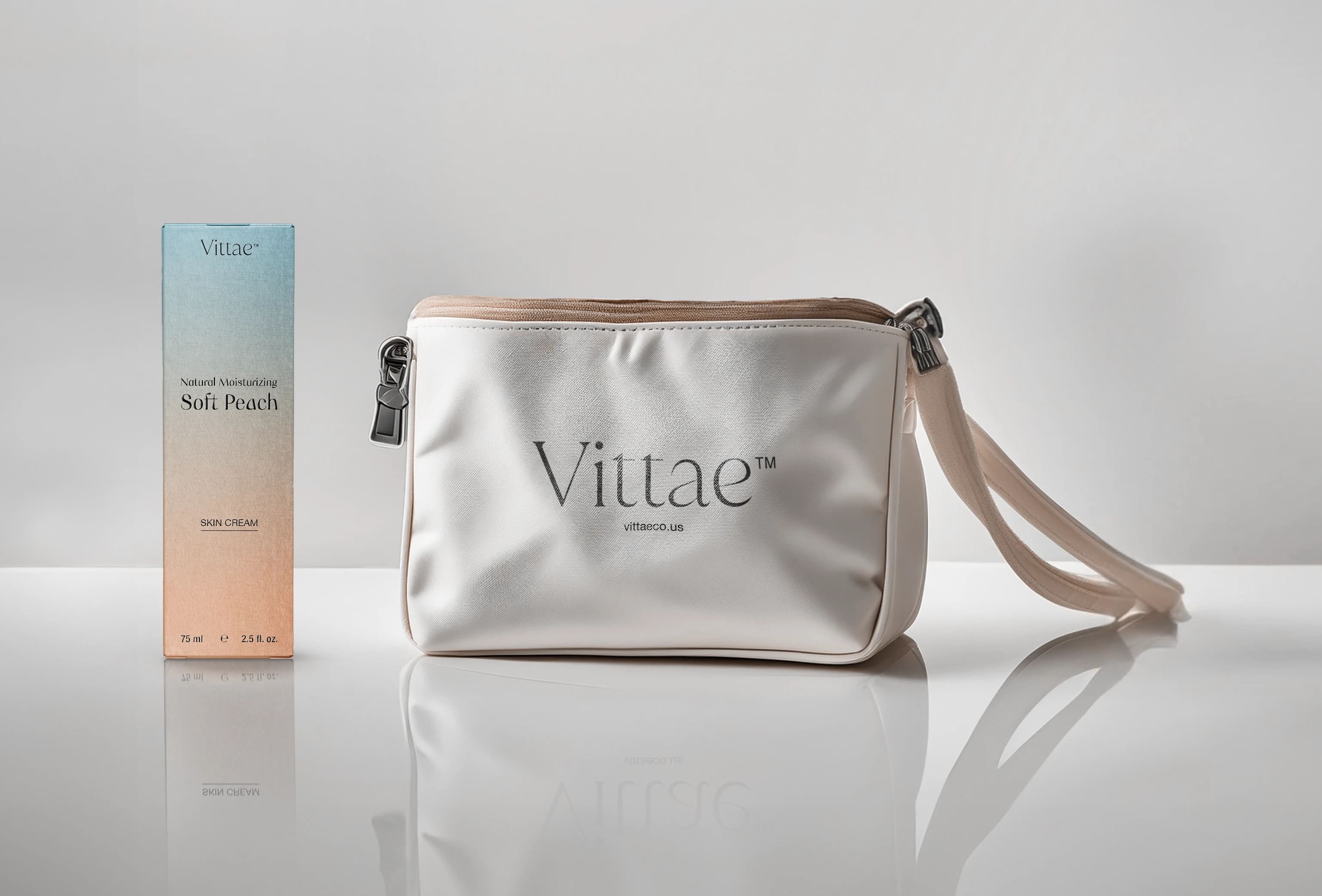
Our challenge was to create a visual identity, label and packaging that translated elegance and modernity in a captivating and engaging way. We chose the color of the year PANTONE 13-1023 Peach Fuzz, in perfect harmony with the product’s proposal. This shade not only reflects the softness and freshness of peach, but also evokes a feeling of well-being and tranquillity, taking care not only of the body, but also of the mind.
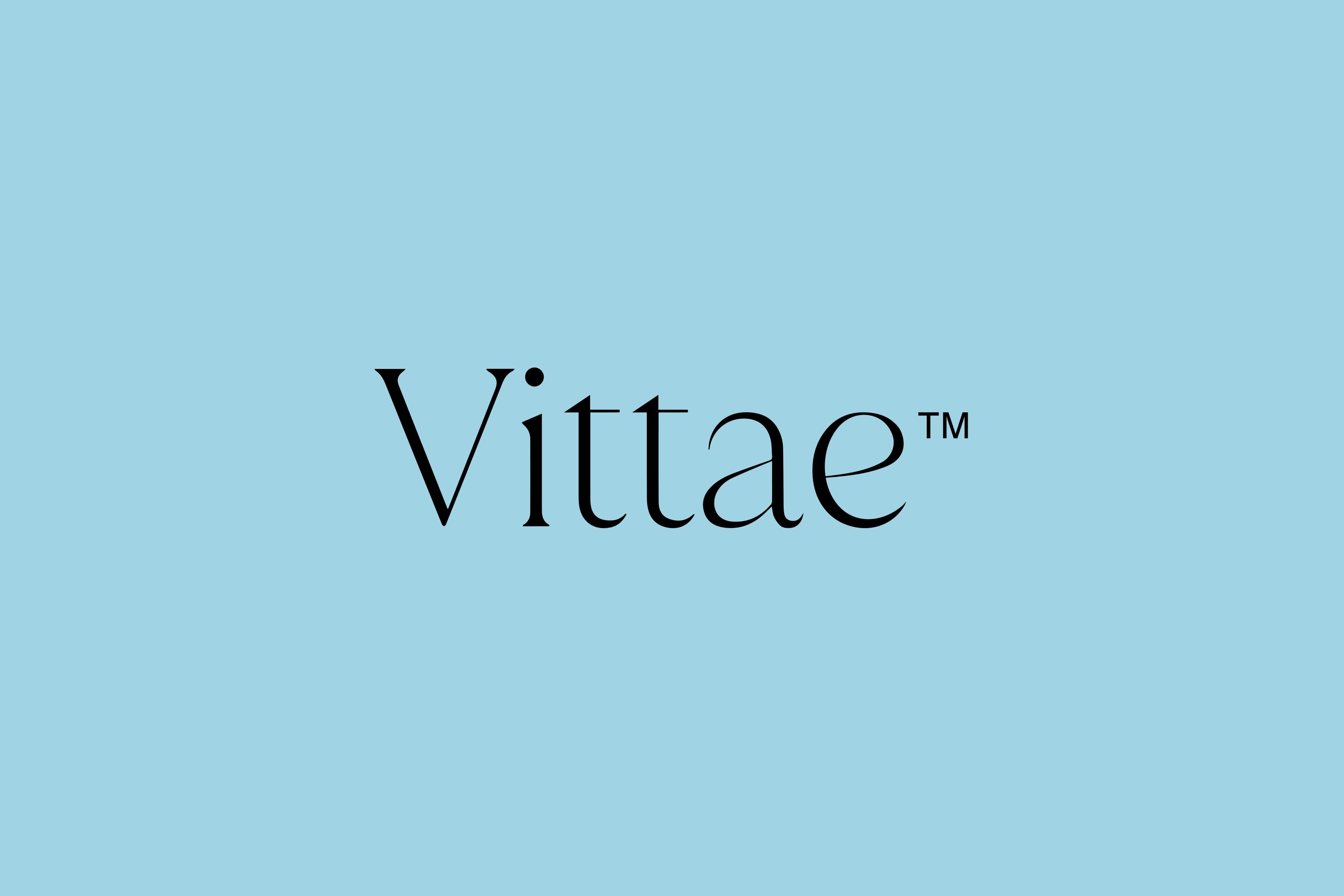
The brand name, Vittae, derived from the Latin “vitae” (life), was chosen to reflect the commitment to vitality, care and natural beauty.
The choice of typeface for the logo, with delicate and fine serifs, strikes a perfect balance between sophistication and contemporaneity

CREDIT
- Agency/Creative: João Brand Designer
- Article Title: Vittae Soft Peach Modern Visual Identity and Packaging Design
- Organisation/Entity: Freelance
- Project Type: Packaging
- Project Status: Published
- Agency/Creative Country: Brazil
- Agency/Creative City: Curitiba Paraná
- Market Region: South America
- Project Deliverables: Art Direction, Brand Design, Brand Identity, Brand Strategy, Brand Tone of Voice, Graphic Design, Logo Design, Packaging Design, Tone of Voice
- Format: Box, Tube
- Industry: Beauty/Cosmetics
- Keywords: #skincare #Packaging #packagingdesign #visualidentity #GraphicDesigner #brandidentity #Logo #Designcosmetics #cosmeticpackaging
-
Credits:
Strategic & Creative Leader: João Marcos
Brand Designer: João Marcos


