The Racing Manager came to us with a simple idea – to revolutionise horse racing. We helped build the brand from inception into the most progressive force in racing.
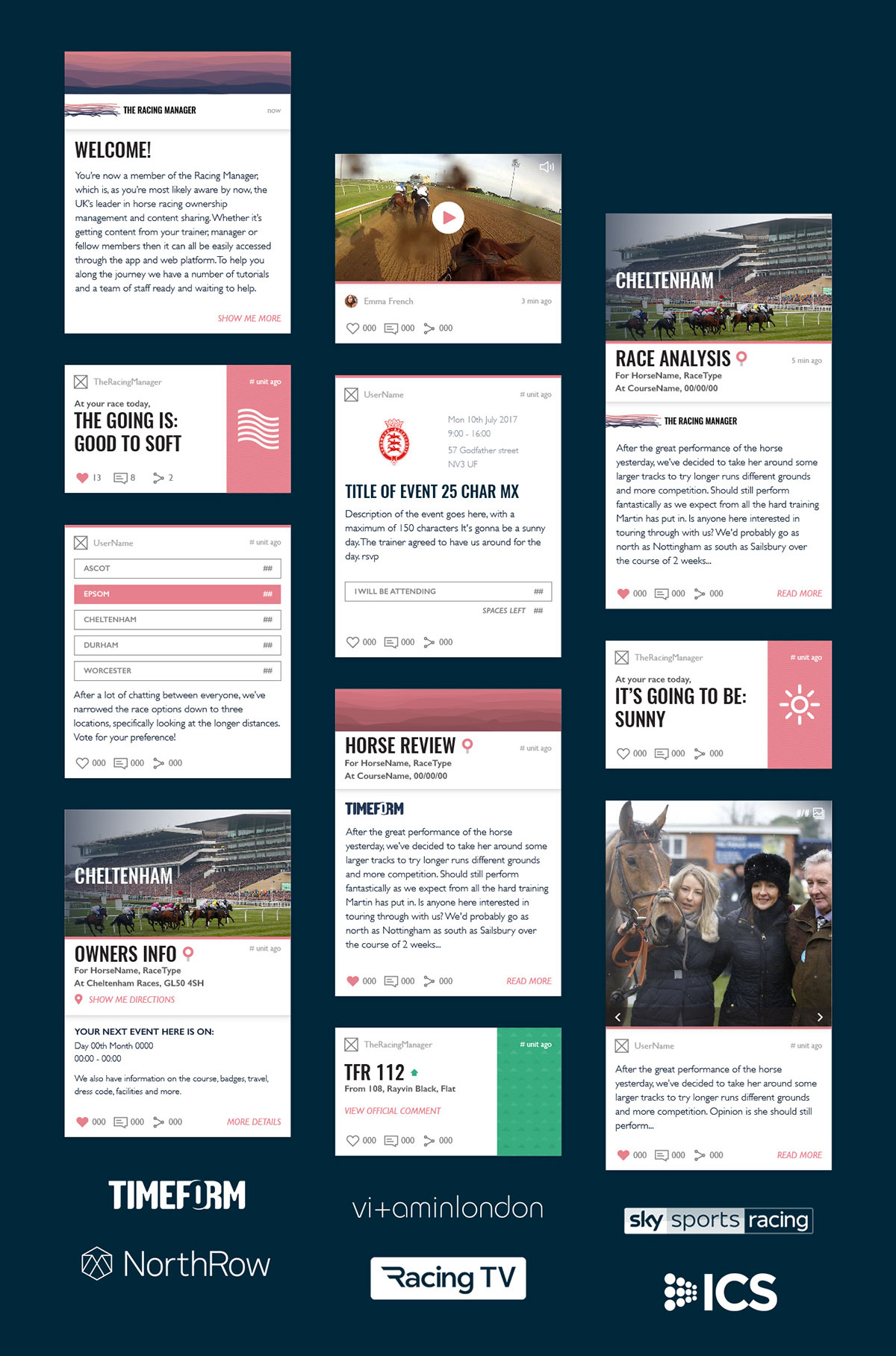
With ambitious growth plans and a diverse market we needed to design a brand that was flexible across applications, able to scale globally but also feature localised content.
One of the biggest challenges was serving the existing older demographic while opening up the horse racing experience to a new, younger and digitally focussed generation. The key insight was that while horse racing is the second most attended sport globally there are very few supporters or fans. This is largely due to the industries legacy.
The Challenge
We needed to create a brand that captured the excitement of attending a race and owning a horse but take it to the masses. The only was to do this is by translating the experience through new digital channels. This meant that every touchpoint had to not only be considered but maximised.
The Solution
Research showed that there was a familiar approach in horse racing branding; with simple motifs and classic typefaces being ubiquitous. We wanted to give a nod to this while anchoring TRM firmly in the tech sphere.
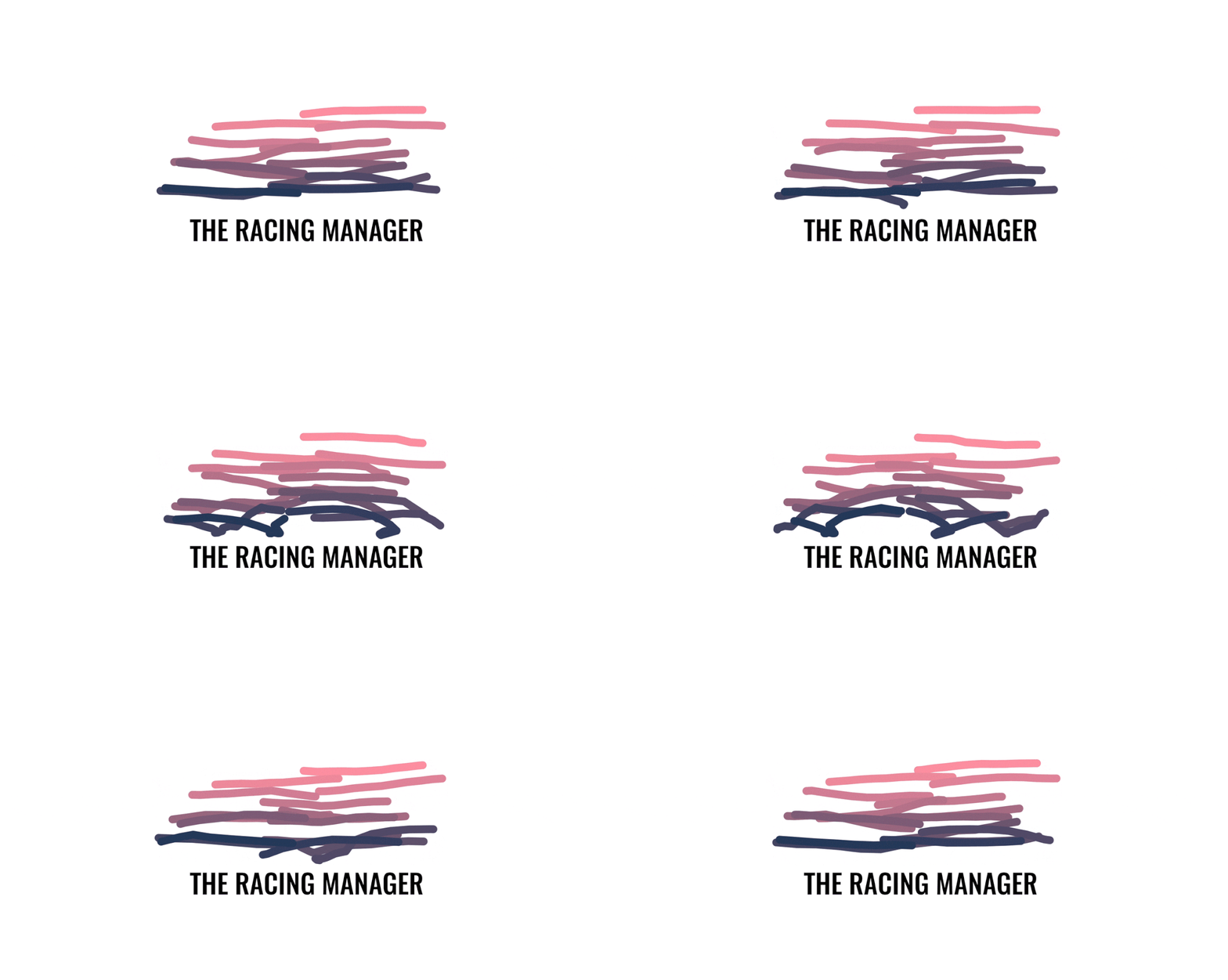
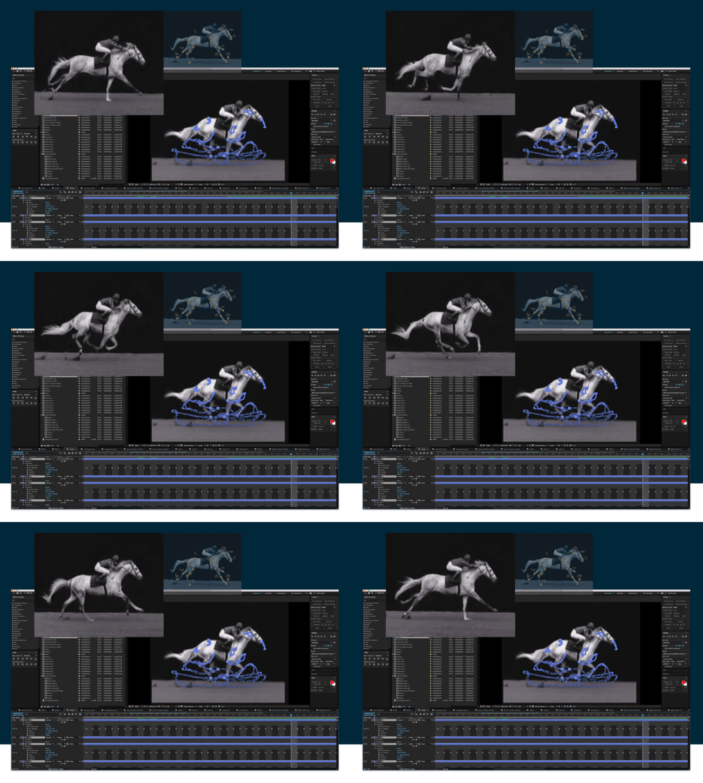
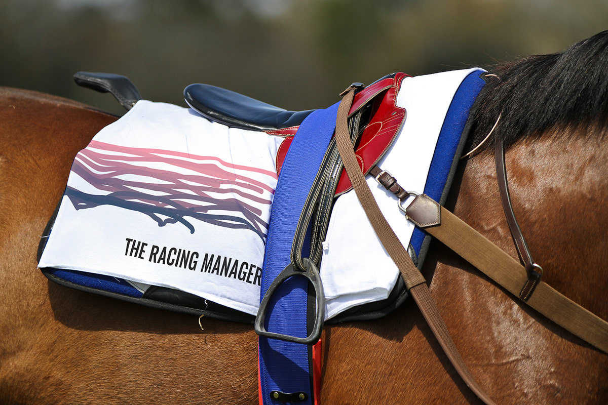
Horse racing people don’t just like racing, they’re obsessed with it down to the minutiae. This led us to a solution that took the horses galloping movement and abstracted it to a more abstract form to create both a dynamic logo and brand mechanism that was not only aesthetically pleasing but felt true to the excitement of the sport. It’s this mark and it’s translation into a brand mechanism that truly brings The Racing Manager to life.
CREDIT
- Agency/Creative: Vitamin London
- Article Title: Vitamin London – The Racing Manager
- Project Type: Packaging
- Project Status: Published
- Industry: Entertainment
- Keywords: WBDS Agency Design Awards 2019/20


