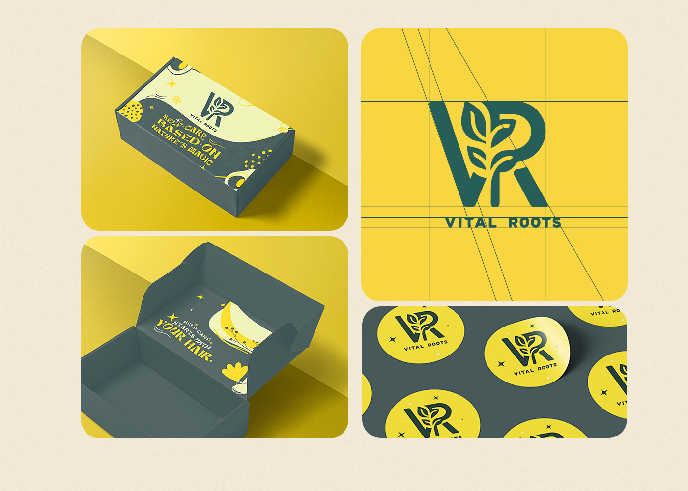
Vital Roots is more than a hair care brand; it’s a statement of purity, vitality, and elegance. From the concept to the final touch, Marklinica led the creation of this brand, developing a unique identity that seamlessly merges natural beauty with a premium, modern aesthetic. Every design element, from the logo to the packaging, tells a story of growth, strength, and self-care.
Inspiration:
Our inspiration for Vital Roots was deeply rooted in nature’s resilience and beauty. Marklinica envisioned a brand that not only represents nourishment but also embodies simplicity with a bold twist. The goal was to create a visually striking yet approachable identity that feels both luxurious and authentic.
Design Language:
The design language of Vital Roots is built around clean lines, soft earthy tones, and minimalistic elements. Each product is visually distinct yet remains part of a cohesive family. Marklinica carefully curated a color palette to reflect the brand’s natural origins while emphasizing its premium nature.
Color Palette:
Fresh greens and browns symbolizing nature and healthy neutral tones to evoke calm and purityTouches of deep blue and gold to add a sense of luxury and professionalism
Typography:
The font choice reflects the balance between elegance and simplicity. A clean sans-serif typeface was used to ensure legibility while maintaining a modern and upscale look. The minimalist approach allows the brand’s core message—natural care and premium quality—to shine through.
Packaging Design:
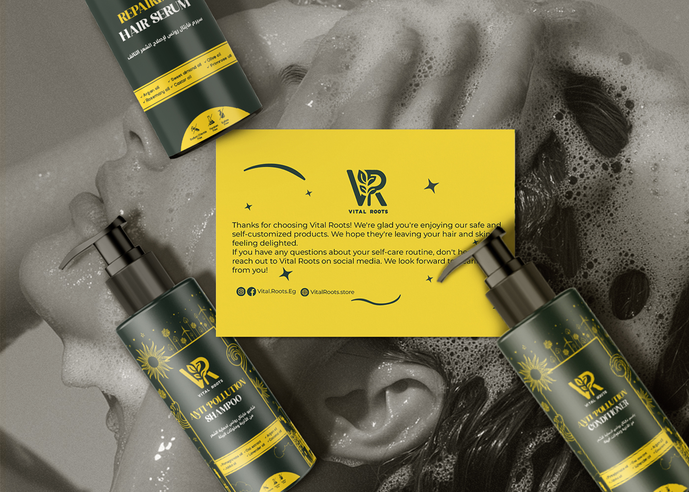
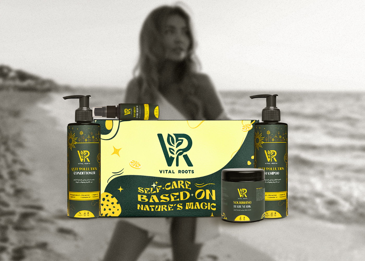
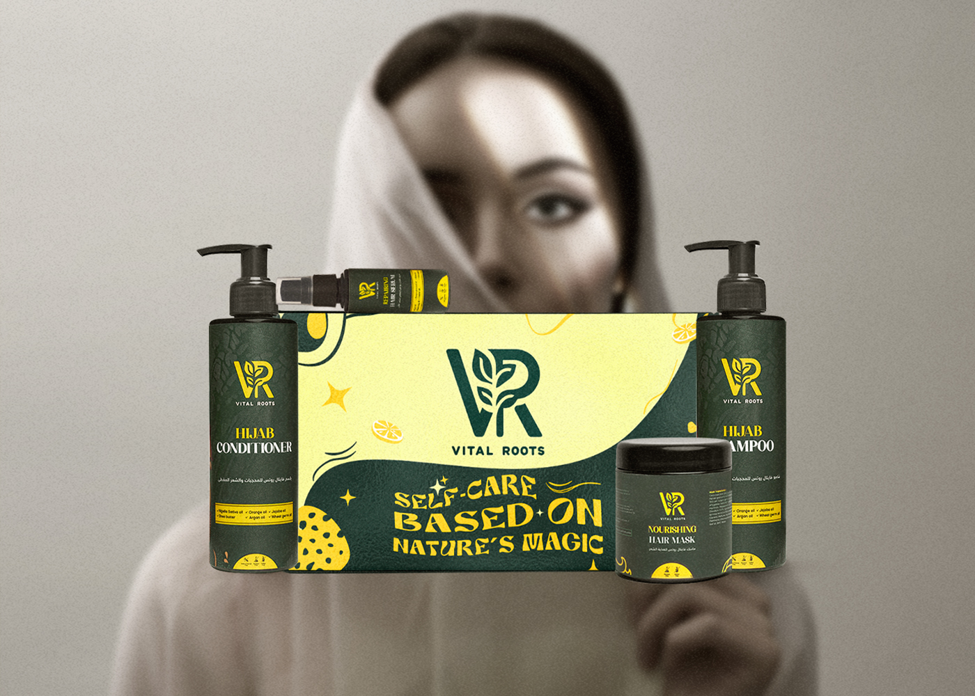
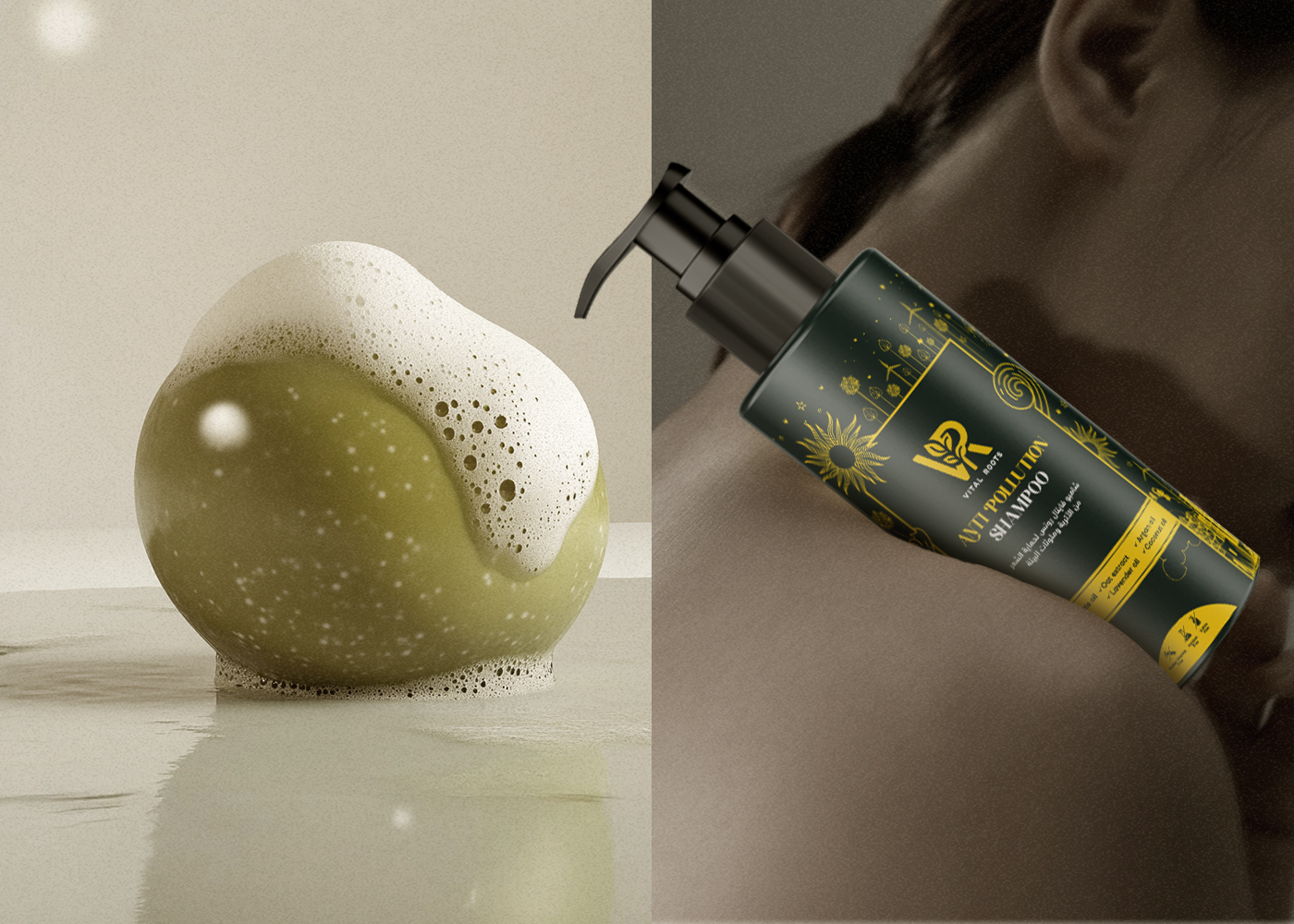
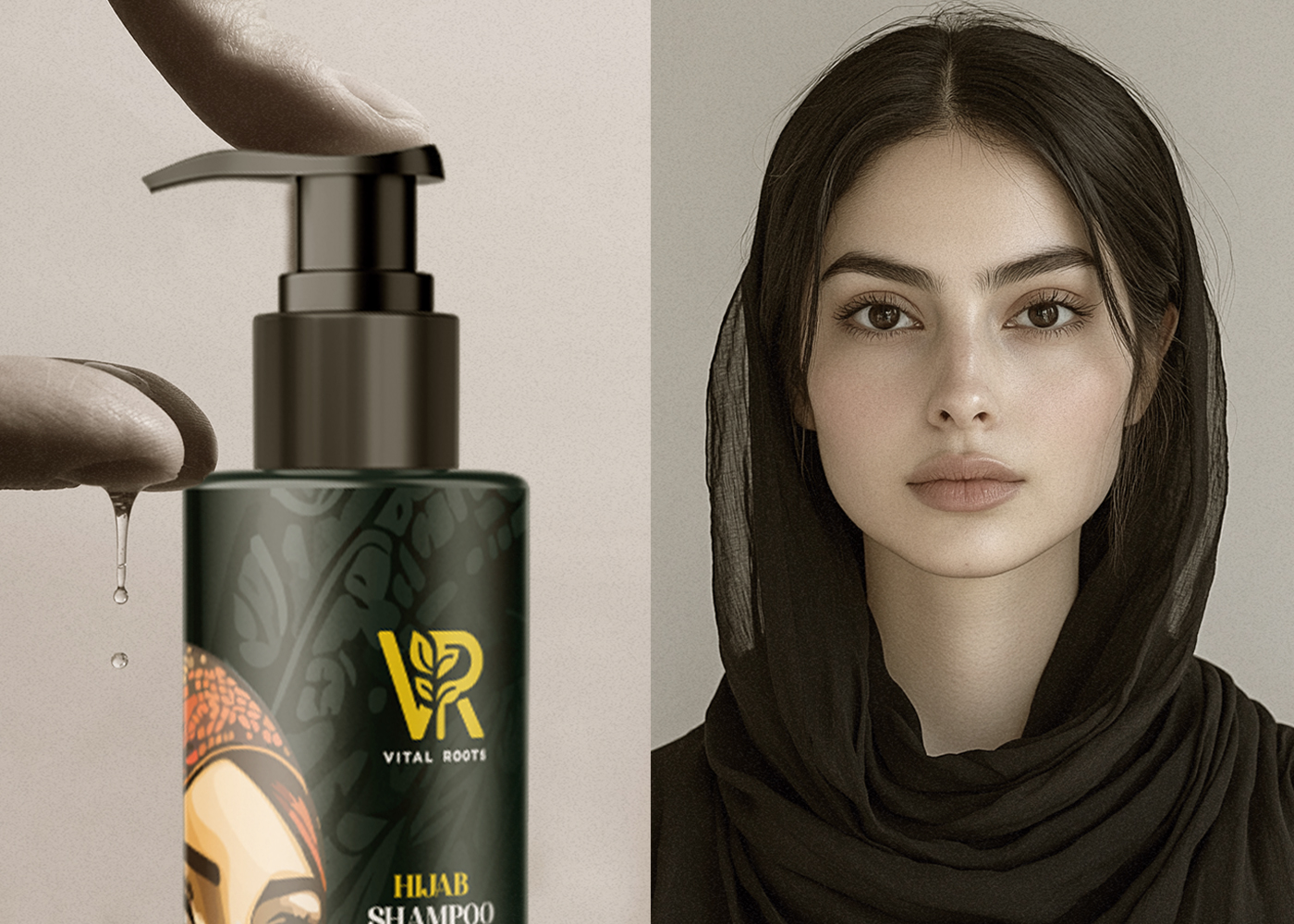
The packaging is designed to stand out while maintaining a sense of calm sophistication. Each product features a unique color accent, making it easy to identify while creating visual harmony across the line.
Key packaging features include:
Minimal, clutter-free layouts that ensure key information is clear and accessible.Subtle use of nature-inspired elements to reinforce the product’s focus on high-quality, natural ingredients.A premium feel achieved through the use of matte finishes and clean label designs.Brand Identity
Marklinica’s vision was to create a brand that feels fresh, vibrant, and timeless. Every element of Vital Roots reflects a commitment to quality and a deep respect for nature. The combination of minimalistic design, modern typography, and a carefully selected color palette resulted in a brand identity that exudes confidence and care.
Final Outcome:
The result is a brand identity and packaging design that perfectly balances art and functionality. Whether displayed on shelves or used at home, Vital Roots delivers an experience that feels premium, natural, and trustworthy. Through thoughtful design and creative direction, Marklinica has crafted a brand that speaks directly to consumers who value both quality and aesthetics.
With Vital Roots, we didn’t just create a brand, we created an experience that reflects what truly matters: care, authenticity, and elegance.



CREDIT
- Agency/Creative: Marklinica
- Article Title: Vital Roots: A Fresh Identity, Naturally Designed by Marklinica
- Organisation/Entity: Agency
- Project Type: Identity
- Project Status: Published
- Agency/Creative Country: Egypt
- Agency/Creative City: Alexandria
- Market Region: Middle East
- Project Deliverables: Art Direction, Brand Design, Brand Identity, Packaging Design, Product Design
- Industry: Beauty/Cosmetics
- Keywords: haircare, cosmetics, vital roots, cosmeceutical, brand identity, branding, packaging, product
-
Credits:
Art Director: Rana Mohsen
Brand Designer: Rowan Hamada


