


About Gooddaze:
The mission for Gooddaze CBD Gummies was to embody calmness, uniqueness, and organic principles in their brand identity. The founders envisioned a design that would resonate with their customers, reflecting their commitment to quality and tranquility. By working with the founders with a focus on their brand keywords, target audience, and competitors we were able to pinpoint where we wanted to go with the visual identity of this brand, making sure each design element had meaning to the strategy. The strategy sessions with the founders revolved around manifesting the three core values of calmness, uniqueness, and organic essence.
Visual Identity:
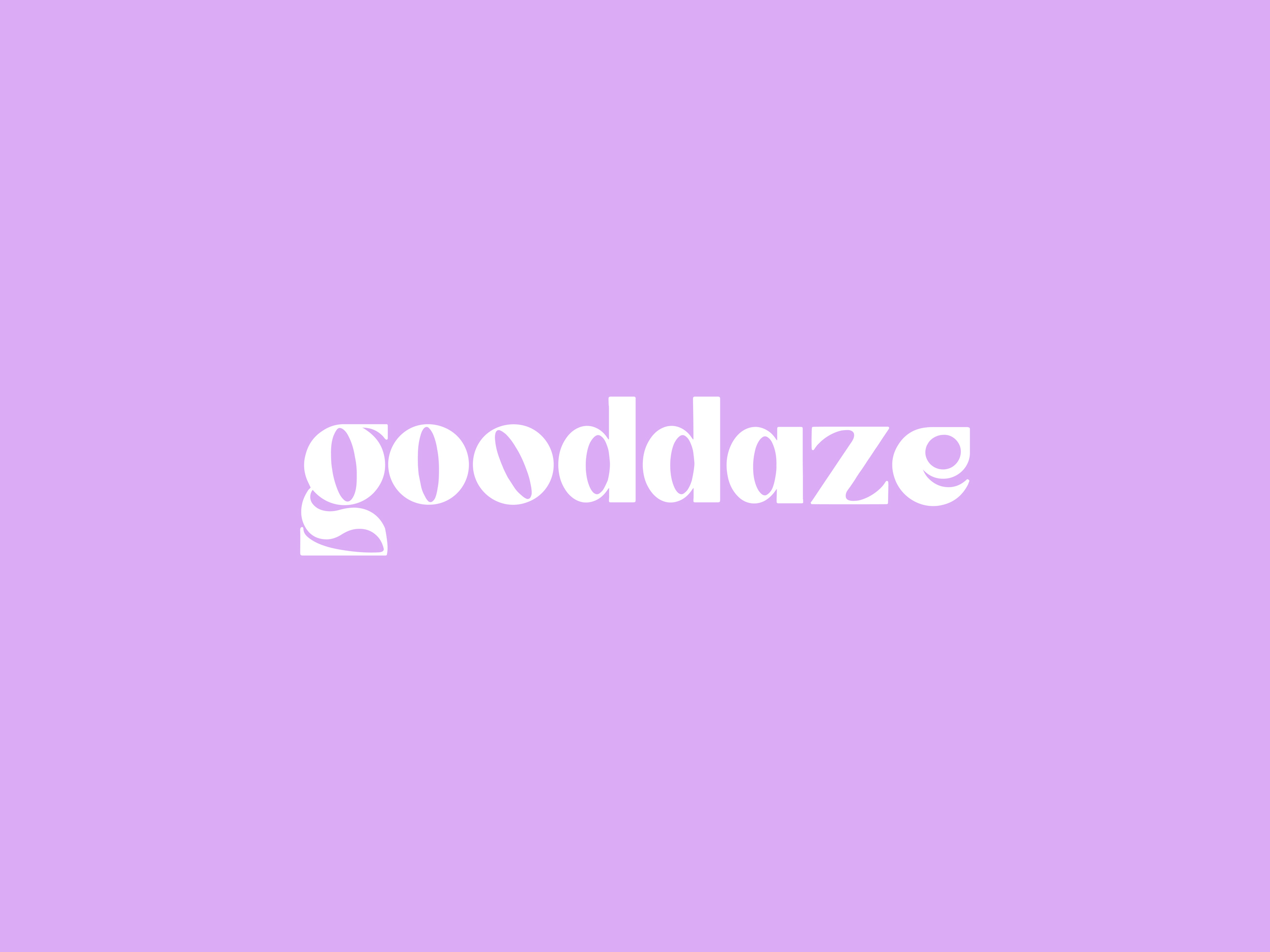
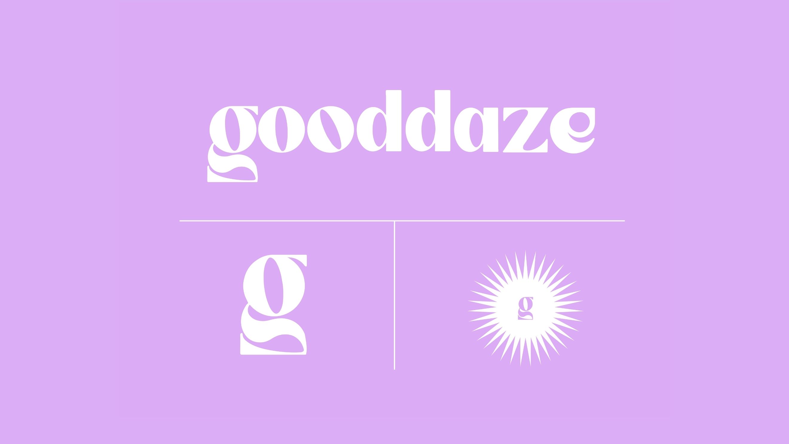
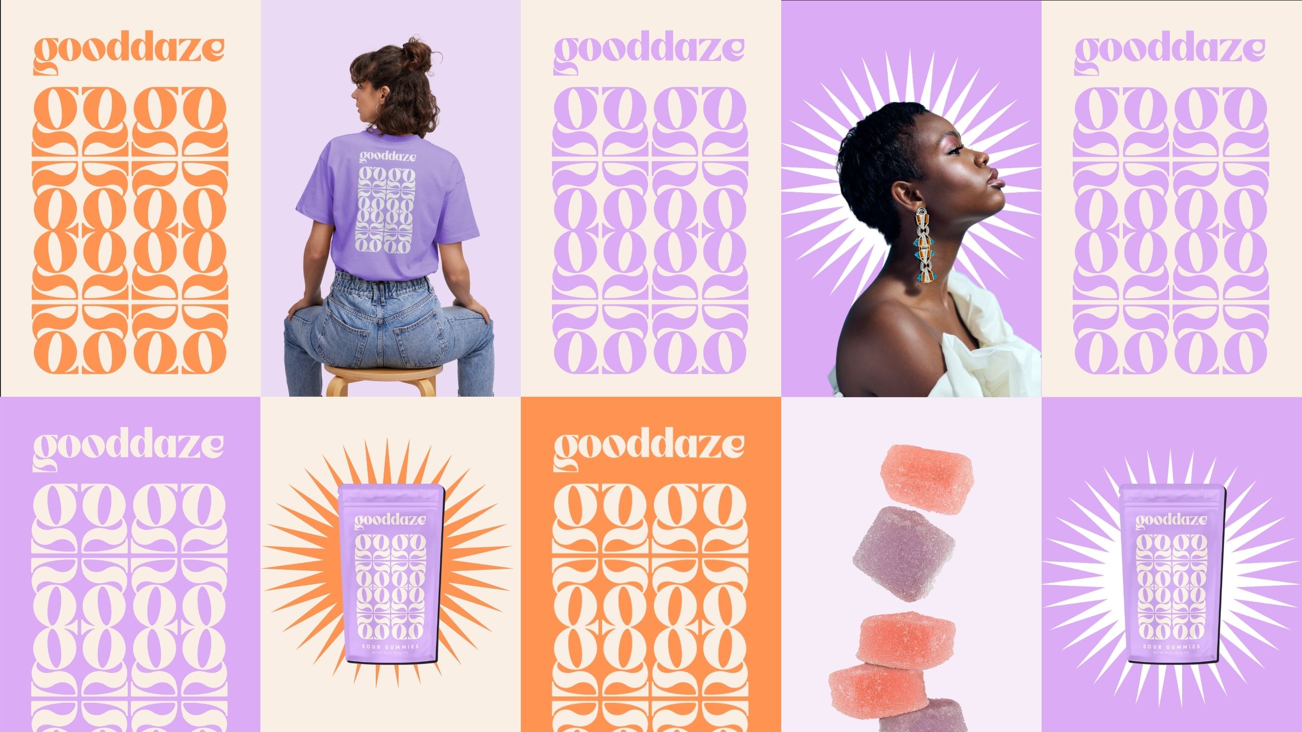
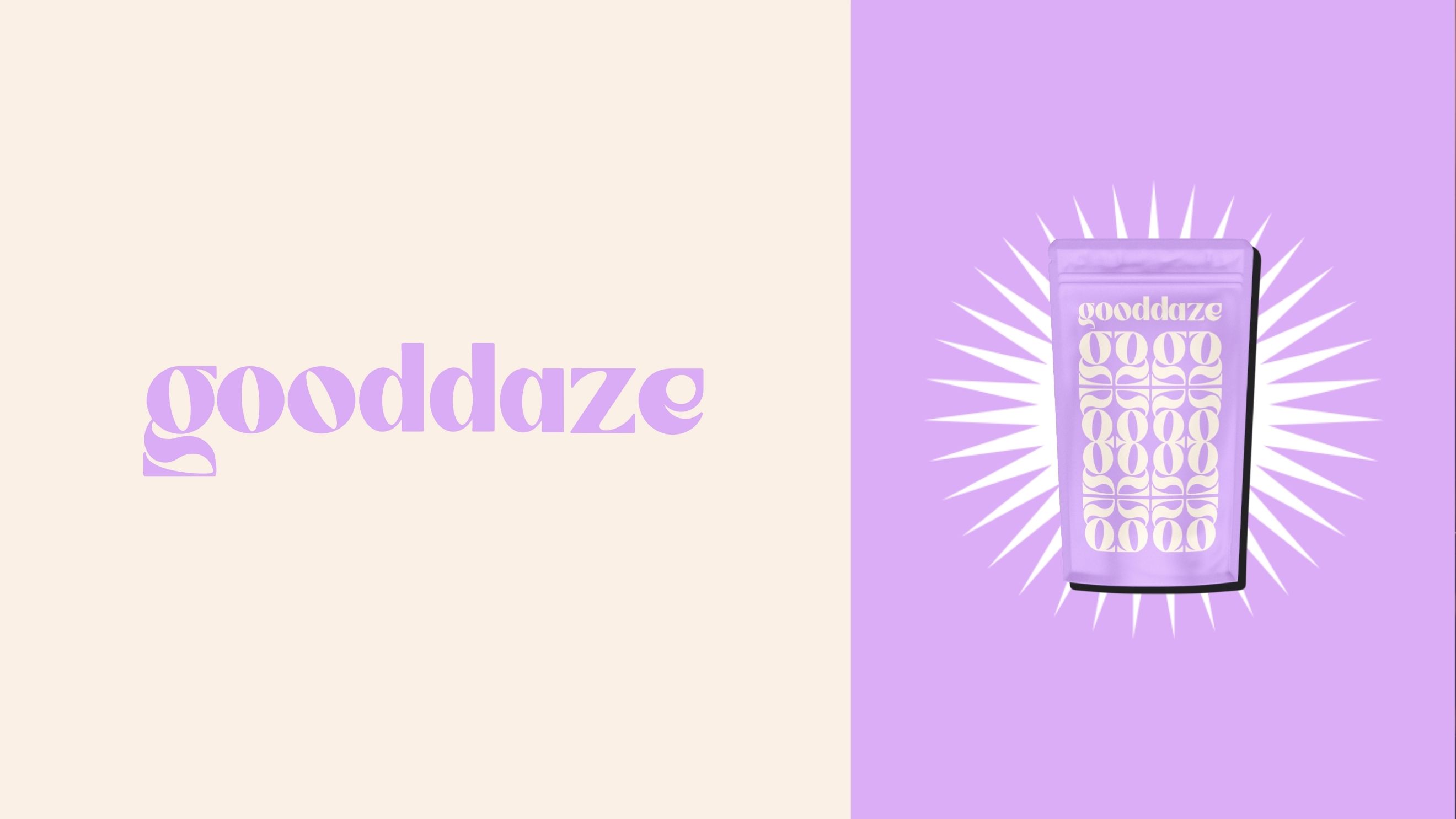
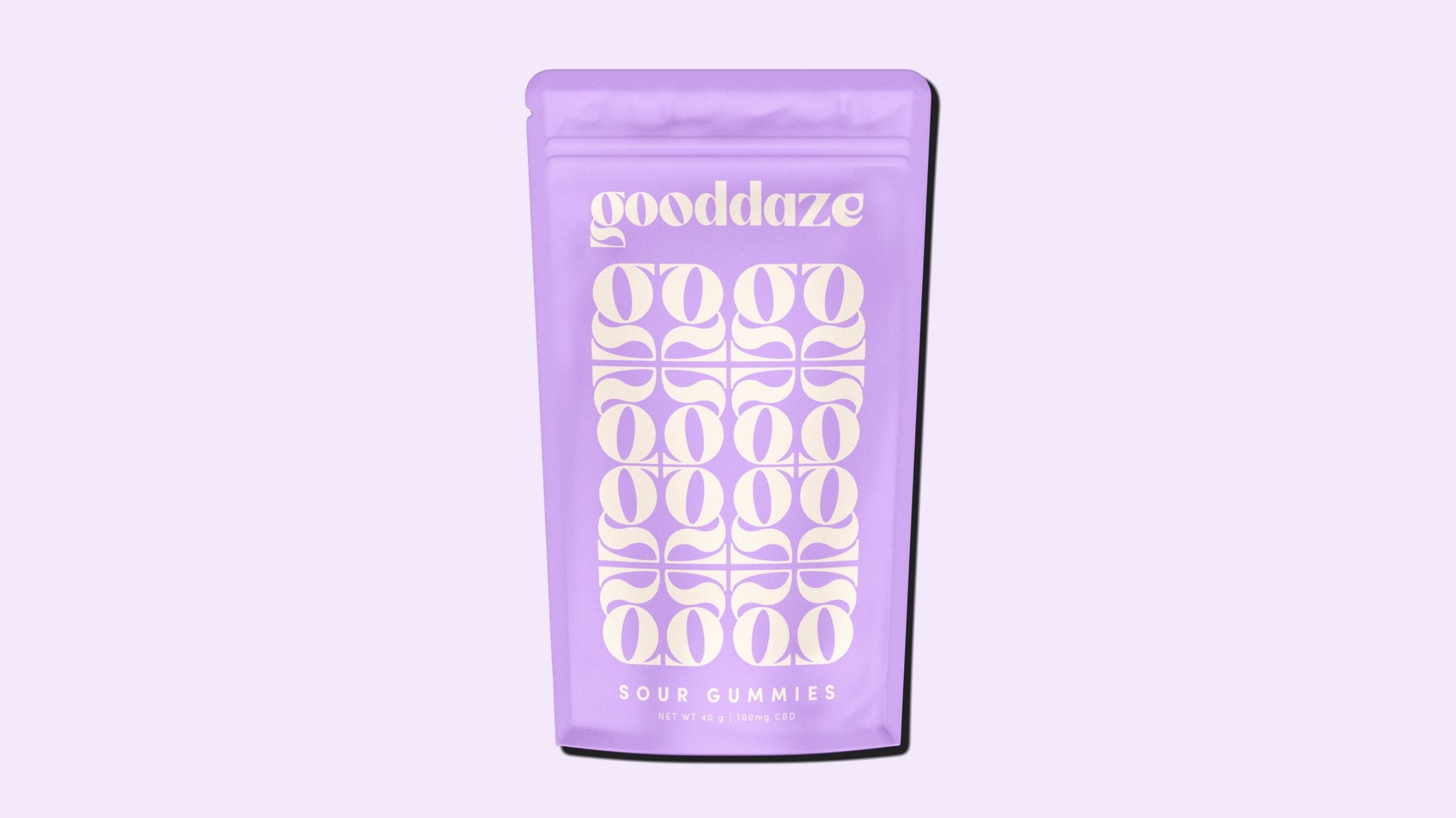
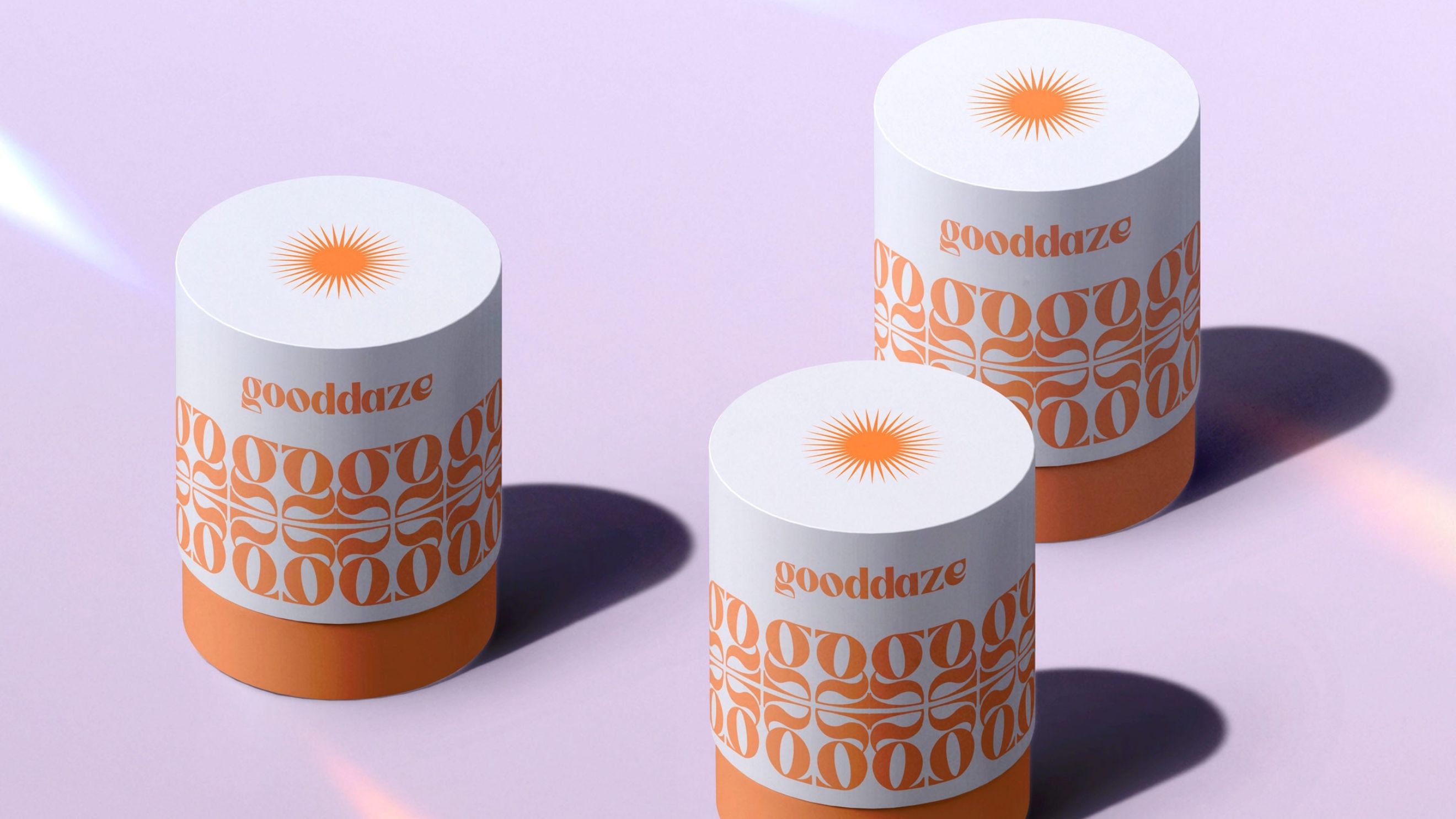
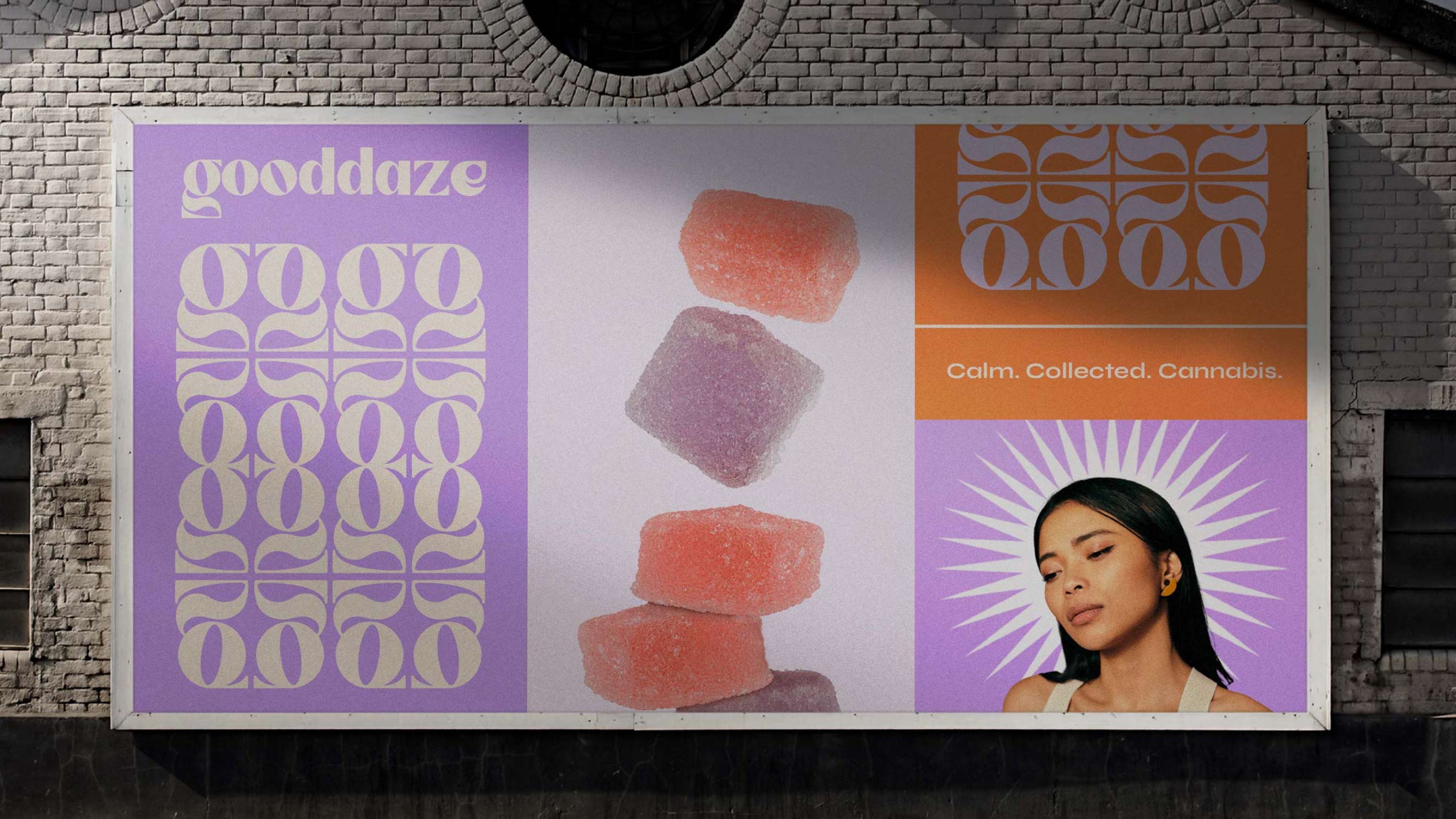
Gooddaze’s visual identity is anchored by a sun burst logo. This eye-catching design, subtly accented with the letter G, radiates a sense of calm and serenity. The logo is able to live on it’s own as well as accompanied by the brand logotype. This custom font, infused with organic-inspired elements, further enhances the overall aesthetic, creating a unique and memorable visual language. The chosen color palette of shades of lilac and orange symbolizes originality and warmth. This sophisticated combination sets the stage for a design that aligns with Gooddaze’s distinct identity. Typography for the brand was kept sleek with an alternative flair to not distract from the logo and other brand elements.
Package Design:
Delving deeper into the package design, Gooddaze offers a versatile range catering to various customer needs. The packaging comes in individual punches, embodying convenience and portability, while larger quantities are elegantly presented in tubes. Both formats feature the iconic Art Nouveau-inspired pattern, creating a cohesive and eye-catching typographic design. This consistent visual language extends across all packaging options, reinforcing brand recognition and a sense of unity.
Promotional Materials:
The brand’s story extends to a range of promotional materials, including outdoor pieces and apparel. Each promotional element is thoughtfully designed to amplify the essence of Gooddaze, ensuring consistency and resonance across various touchpoints.
Gooddaze is not just a CBD gummy company; it’s a mindful journey embodied in its design, reflecting the founders’ commitment to providing a unique and calming experience for their customers.
About Kevin Craft:
As a brand designer and strategist, Kevin uses meaning to guide the design process. Known for providing bold designs with depth and purpose, he has chosen coffee shops over conference rooms, believing that a personal approach is essential for memorable, tailor-made designs.

CREDIT
- Agency/Creative: Kevin Craft
- Article Title: Visualizing Calm: Inside the Design of Gooddaze CBD Gummies
- Organisation/Entity: Freelance
- Project Type: Identity
- Project Status: Non Published
- Agency/Creative Country: United States
- Agency/Creative City: Dallas
- Market Region: North America
- Project Deliverables: Brand Identity, Graphic Design, Logo Design, Packaging Design, Pattern Design
- Industry: Food/Beverage
- Keywords: package design, gummy, gummies, pattern, art nouveau, identity, tranquility, cbd
-
Credits:
Brand Designer: Kevin Craft


