


A lot of time passed in the time when the crowd was disbanded and forced to be personal. The physical and psychological distance between people is increasing, and the distance between relationships continues. I wanted to see this distance again in this project.
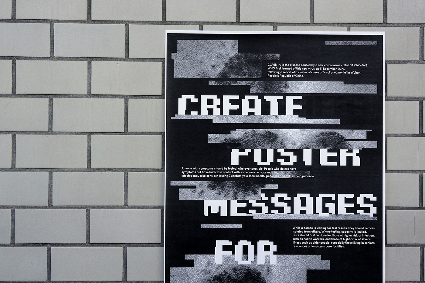
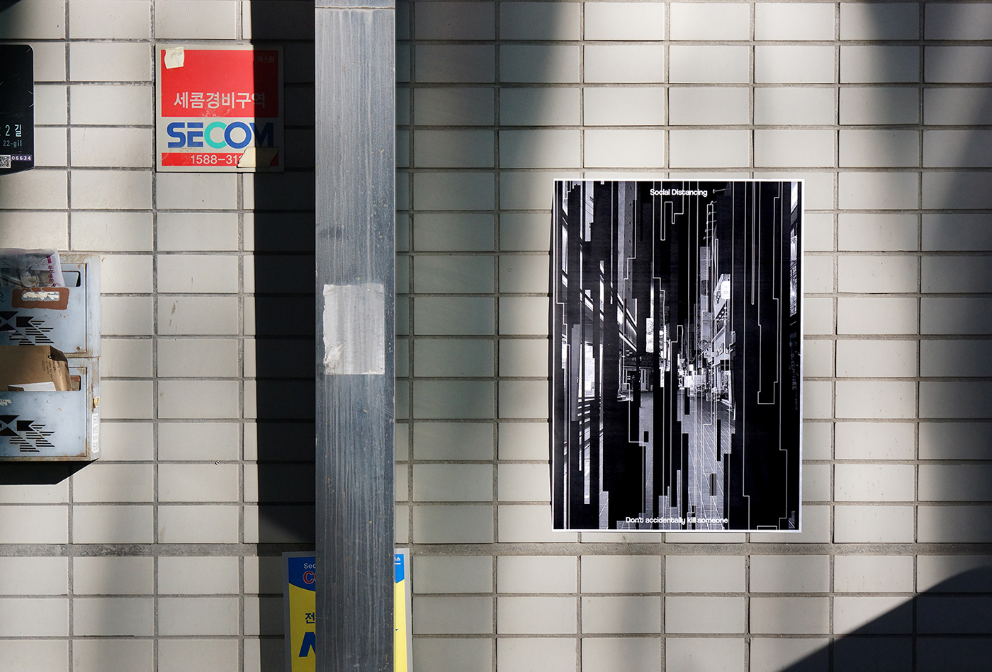
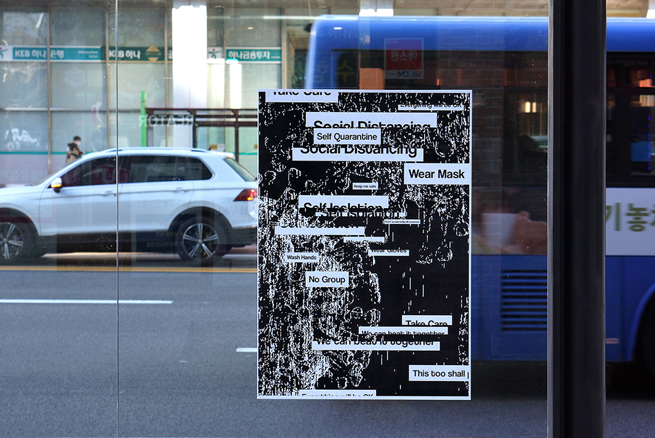
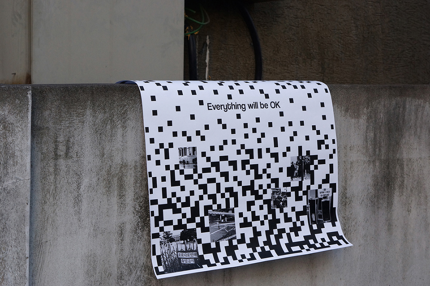
The visual interpretation of the COVID-19 phenomenon recorded the phenomenon of COVID-19 that first occurred in Wuhan, China in December 2019 and spread around the world. It is meaningful to view this phenomenon in the language of design and to provide a third interpretation to the viewer. Mask matrices continued, screening clinics were installed everywhere, and non-face-to-face contact with each other became commonplace. Various events, graduation ceremonies, weddings, and funerals have also appeared in a different way than before. In other words, everything around us has changed and is still changing.
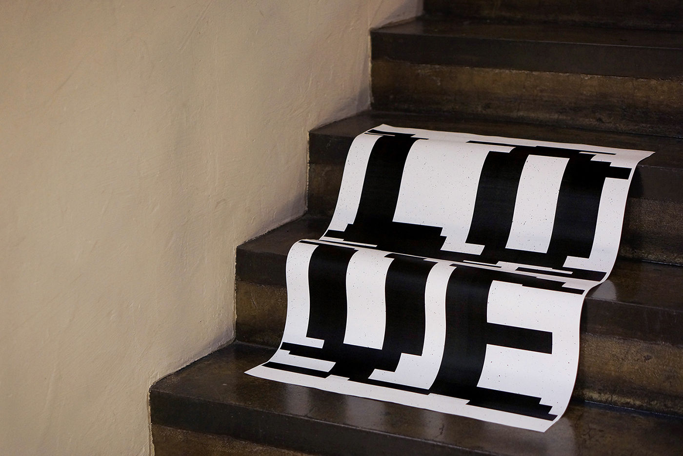
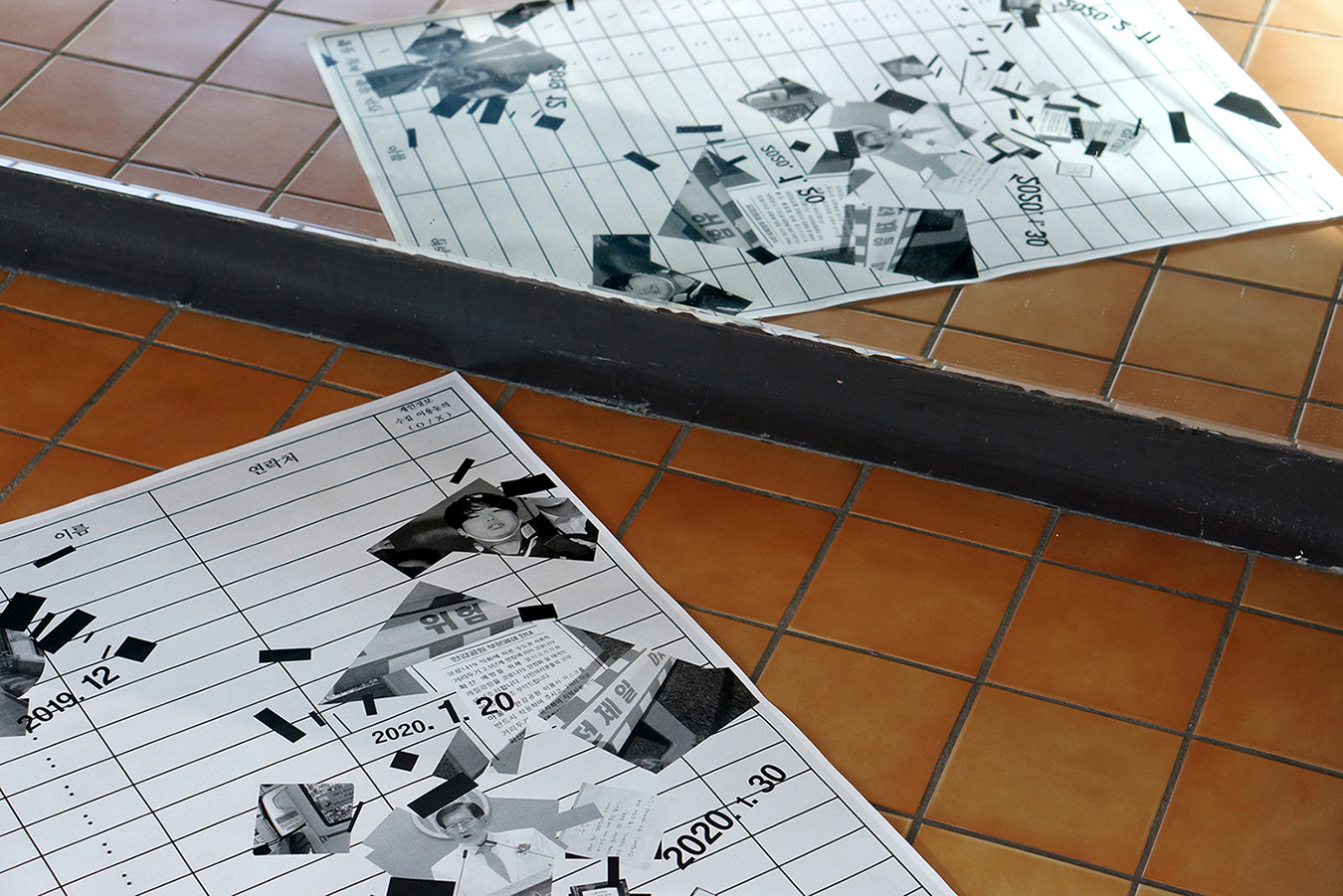
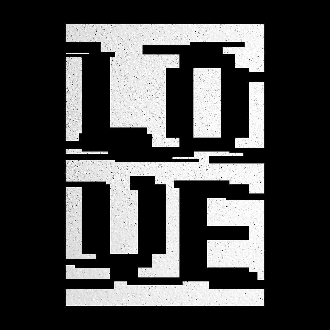
Through the poster, I tried to reinterpret it in 4 languages: “detach”, “split” , “remove”, and “break”. Starting with detachment, I tried to see in detail the reality that the broken phenomenon would not be divided. Images taken and collected are not fully visible and are expressed in each part or enlarged part, and appear with fragmented motifs. This looks close, but the image felt from not being able to see the damaged image properly resembles some of our minds suffering from the COVID-19 crisis.
Each poster organically exchanges meaning and complements each other. This is to examine various events intertwined under the name of COVID-19 with the eyes of a designer.
CREDIT
- Agency/Creative: Long & Short
- Article Title: Visual Interpretation of COVID-19 Phenomenon by Long & Short
- Organisation/Entity: Agency
- Project Type: Graphic
- Project Status: Published
- Agency/Creative Country: South Korea
- Agency/Creative City: Seoul
- Market Region: Asia
- Project Deliverables: Poster Design
- Industry: Non-Profit
- Keywords: COVID-19, Pandemic, Division, Community, Recovery
-
Credits:
Design: Joohyung Yun


